it’s been a challenging market this year, and making trading decisions has never been easy. Which direction the market is likely to move plays a huge part in stock trading decisions.
The Expert Rating system on the market with its combination of 400 rules on the Dow 30 index and the NYSE internals has always provided us an early indication of direction changes.
No system is infallible, and when the Expert System on the market was created, we noticed that ratings of 95 or higher to the upside or downside (maximum rating is 100 btw) were significant. We also noticed a marked improvement in the accuracy of the ratings if we used a confirmation technique with a momentum indicator.
After much research, we discovered that the Phase Indicator (a version of a MACD histogram) was the most accurate tool to confirm high ratings.
*** Here’s how we use Phase to confirm a high Expert Rating. ***
When a rating of 95 up or 95 down is triggered on the market, we look for the Phase histogram to change direction. The change in direction must be to the direction of the rating. This change does not have to happen on the day of the rating, but it must occur within 2 to 3 days on either side of the rating day.
If the Phase does not change direction, the rating is considered not confirmed.
This short video analysis of the last 4 ratings shows this process in action.
In this recent Zoom video Steve Hill, founder of WinWayCharts discusses the Group and Sector Reports, using them to identify groups that are moving up. He then uses Darren’s indicators to focus in on potential stock candidates within these groups.
The WinWay TradingExpert Pro Market Timing signals are not a perfect system. If they were no doubt the founders would have kept it secret and traded the signals themselves.
The signals that give us early waring of a change in direction of the market are proprietary. The 400 rules that are used by the Artificial Intelligence inference engine to determine change of market direction use many of the widely known technical tools, read review here.
The rating calculation and the indicators contributing to the ratings have not been changed for many years. A decision was made some years ago to avoid constantly moving the goalposts as the constant optimizing or back fitting erodes the validity of the system.
High ratings to the upside or downside of notice have to be 95 or greater (the maximum is 100). the ratings are considered confirmed when the Phase indicator that is outside of the AI system, changes in the direction of the high rating.
So ratings have fired in the last few months how do we confirm them?
We look for the Phase indicator ( a derivative of MACD) to change in the direction of the signal. This needs to occur within a 3 day window before or after the rating.
The last 2 market timing signals illustrate this nicely.
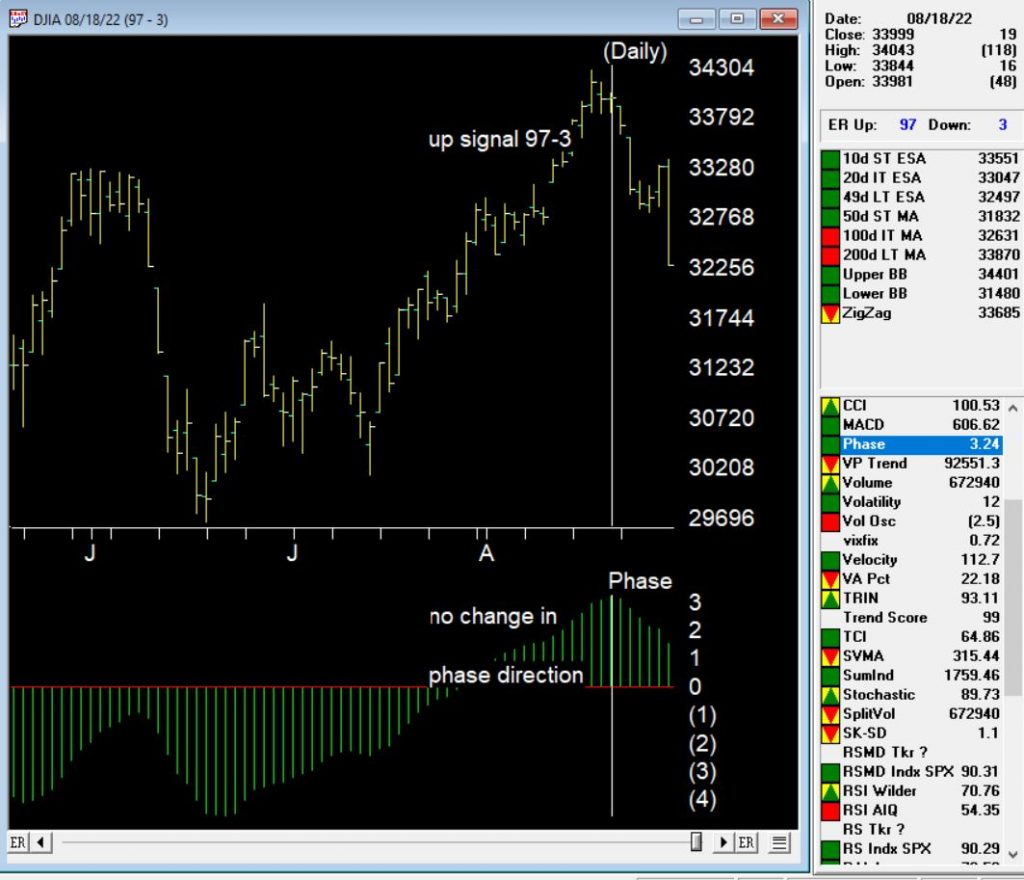
August 18, 2022 97-2 up signal on the market
The up signal occurred during a a 3 day down period on the uptrend, however the Phase indicator did not change direction (it would need to turn up after going down) within the window for confirmation. This signal is therefore unconfirmed by Phase.
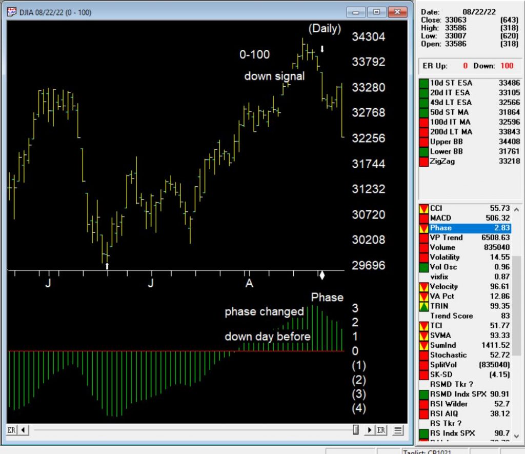
August 22, 2022 down signal on the market
The down signal occurred on 8-22-22. 100 down is the strongest signal the market timing generates. In this case the Phase turned down after a prolonged upward move, on the day before the signal. This is considered a confirmed down signal on the market.
The rules that contributed to 0-100 down on the market
The 100 down signal is the strongest signal the AI system generates. Here are the major technical events that contribute to this rating.
Trend Status has changed to a strong down trend. This indicates that a downward trend has started that may continue in this direction. This is a moderate bearish signal.
The 21 day stochastic has declined below the 80% line and the price phase indicator is decreasing. In this strongly downtrending market this is an indication that the downtrend will continue.
Volume accumulation percentage is decreasing and the 21 day stochastic has moved below the 80% line. In this strongly down market, this is taken as a very strong bearish signal that could be followed by a downward price movement.
The exponentially smoothed advance/decline line has turned negative when the up/down volume oscillator and the advance/decline oscillator are already negative. In this market, this is viewed as a bearish signal that could precede a downward price movement.
The up/down volume oscillator has turned negative when the exponentially smoothed advance/decline line and the advance/decline oscillator are already negative. In this market, this is viewed as a bearish signal that could precede a downward price movement.
The new high/new low indicator has reversed to the downside. This is a reliable bearish signal that is often followed by an downward price movement. In this market a continued strong downtrend can be expected.
September 7, 2022 – 3pm to 7pm London time, four hour in-depth webinar
covering these in-depth topics, crucial to your successful trading.
Early bird pricing now in effect, see below to book your discounted price and save over 20%
****** Includes PDF handouts and access to the recordings of the event ******
Session 1 – Power tools and features in your WinWayCharts and how to use them
Color Studies, Overlays, Custom Indicators, Seasonality, and Matchmaker. These are important and powerful tools in your WinWayCharts. In this session, we’ll show how to set a Color Study and why, what Overlays are useful for, and more. Learn how these tools will save you time and how they contribute to your trading decisions. Darren’s 3 favourite Bullish/Bearish strategies will be used as the basis for the color study.
Session 2 – Darren’s Indicators and how to apply them
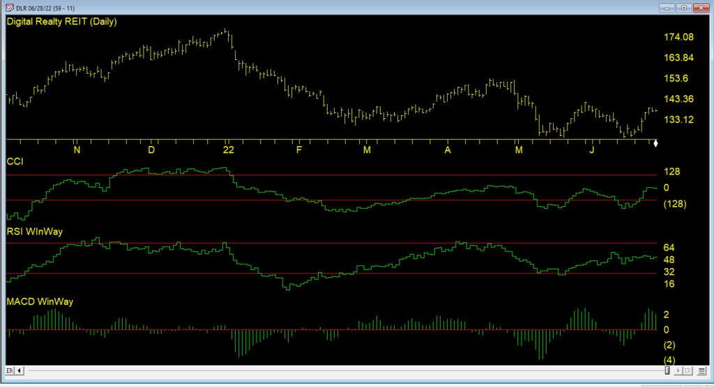
Some indicators are more reliable than others. In this session, we’ll look at some of the nuances of MACD WinWay, RSI WinWay and the CCI indicators and how they add confidence to our trading decisions. We’ll explore these 3 indicators in-depth with examples of them in action in the stock market.
Session 3 – Exchange traded funds rotation strategy so you never have to go short
Using the reports in WinWayCharts we’ll look at a tried and tested ETF rotation strategy that is simple and yet effective at getting you in the right market segment at the right time. This strategy is simple to execute and has consistently beat the market over multiple years. While this strategy doesn’t replace your regular trading, it’s a good place to consider for a segment of trading.
Session 4 – Live Trading using Darren’s Favorite Candlestick Strategy and ETF Strategy
Starting from Market Timing, then moving to the Darren’s 3 Favourite Candlestick Strategy and the ETF Rotation Report, we’ll look for candidate stocks. Using the WinWayCharts indicators we’ll look to confirm the best of the best stock and ETF candidates to place trades with stops using a live trading account.
Your Presenters: Ray Foreman UK director WinWayCharts and, Steve Hill, CEO AIQ Systems, and founder WinWayCharts
Master Trading with WinWayCharts Webinar
September 7, 2022
Early bird pricing now in effect save over 20%
ONLY $299 229
includes all handouts in PDF and access to recordings
The importable EDS file based on Markos Katsanos’ article in April 2022 issue of Stocks and Commodities magazine, “Stock Market Seasonality,” can be obtained on request via email to info@TradersEdgeSystems.com. The code is also available below.
Synopsis:
Should you sell in May, or later in the summer, or never? Is October the best reentry month? Which are the best and worst months for the stock market? And are there statistically significant seasonal patterns in the equity markets? Can we improve on a seasonal system using other technical conditions?
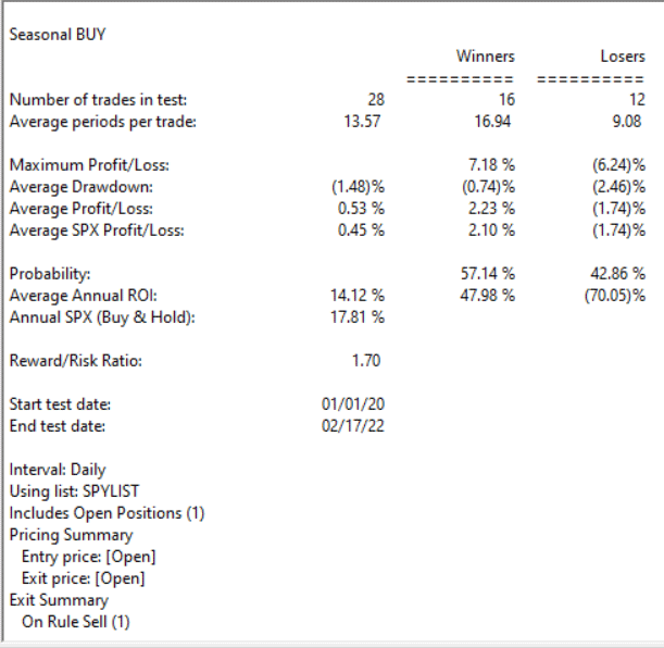
Code for the author’s system is set up in the AIQ code file. Figure 9 shows a summary EDS backtest of the system using the SPY ETF from 1/1/2000 to 2/17/2022.
FIGURE 9. This shows the summary EDS backtest of the system using the SPY ETF from 1/1/2000 to 2/17/2022.
!Stock Market Seasonality
!Author: Markos Katsanos, TASC April 2022
!Coded by: Richard Denning, 2/10/2022
C is [close].
C1 is valresult(C,1).
H is [high].
L is [low].
V is [volume].
Avg is (H+L+C)/3.
VIXc is TickerUDF(“VIX”,C).
VIXc1 is valresult(VIXc,1).
VIXllv is lowresult(VIXc,25).
VIXllv1 is valresult(VIXllv,1).
VIXhhv is highresult(VIXc,25).
VIXhhv1 is valresult(VIXhhv,1).
VIXDN is (VIXc1 / VIXhhv1)100. VIXUP is (VIXc1 / VIXllv1)100.
TR is max(max(C1-L,H-C1),H-L).
ATR is expavg(TR,152-1). ATR1 is valresult(ATR,1). ATRllv is highresult(ATR,25). ATRllv1 is valresult(ATRllv,1). ATRhhv is highresult(ATR,25). ATRhhv1 is valresult(ATRhhv,1). ATRDN is (ATR1 / ATRhhv1)100.
ATRUP is (ATR1 / ATRllv1)*100.
!VFI
Period is 130.
Coef is 0.2.
VCoef is 2.5.
inter is ln( Avg ) – ln( valresult( Avg, 1) ).
Vinter is Sqrt(variance(inter, 30 )).
Cutoff is Coef * Vinter * C.
Vave is valresult( simpleavg( V, Period ), 1 ).
Vmax is Vave * Vcoef.
VC is Min( V, Vmax ).
MF is Avg – valresult( Avg, 1 ).
VCP is iff(MF > Cutoff, VC, iff(MF < -Cutoff, -VC, 0 )).
VFI1 is Sum( VCP, Period ) / Vave.
VFI is expavg( VFI1, 3 ).
SELLMONTH is 8.
VIXUPMAX is 60.
CRIT is -20. !VFI SELL
K is 1.5. !ATR/VIX RATIO
VOLCONDITION is (VIXUPCRIT.
BUY if (Month()>=10 OR Month()2*VIXUPMAX. !VOLATILITY EXIT
SELLMF if CRIT > VFI AND valrule(CRIT < VFI,1) AND simpleavg(VFI,10)<valresult(simpleavg(VFI,10),1).
Sell if SELLSEASONAL OR valrule(SELLVOLATILITY,1) OR valrule(SELLMF,1).
Advance-Decline data is calculated from daily issues reported on the New York Stock exchange. The Basic formula for calculating the Advance-Decline is the difference between the number of Advancing Issues and the number of Declining Issues per day, and adding it to or subtracting it from the previous day’s total.
In simple terms, the AdvanceDecline Line shows the direction in which the majority of stocks are headed. In a more important sense, it can show whether buying enthusiasm during a rally is spread across a broad number of stocks (a positive indication), or whether buying is narrowly focused on just a few industry groups or sectors (a generally negative sign).
An Advance-Decline Line is a contract/expanding/short-term market indicator. It is also referred to as an “order of magnitude” indicator because it provides a quick estimate of the market’s internal strength by showing how the overall market (or a specific sector) is trading in relation to a moving average.
One of the most popular ways of judging the market strength of the overall market is by using the advancedecline line (ADVs), also known as the “AD Line.” This metric is calculated by subtracting the number of decliners from the number of advancers in a market index. During a strong bull market (when a bull market begins), an AD line that is rising indicates growing market breadth (better market breadth) and indicates that money is continuing to move into the market. Conversely, falling AD lines indicate shrinking market breadth (worse market breadth) and indicate that money is leaving the broader market.
Because of its elegant simplicity, and the valuable insights it has provided at market turning points, the AD Line has become a highly prized indicator by both fundamentalists and technicians throughout the decades. But, in recent years, something seems to have gone astray.
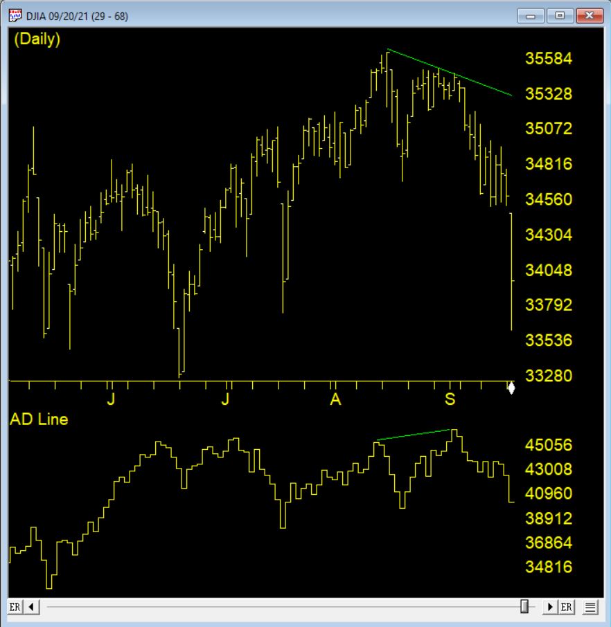
The AD Line against the DJIA 9/1/2021 clearly shows the indicator making a new high, however the market drops precipitously shortly after
How could the time-tested Advance-Decline Line give off such obviously false signals? The answer is simple, but not easily seen. The change has occurred, not in the indicator, but in the data it measures. Over the past 3 decades, the New York Stock Exchange has allowed trading in a growing number of issues that are not, or do not trade like, domestic common stocks.
The truth is that most of the issues currently listed on the NYSE are not really stocks, at least not what investors generally define as stocks. Their inclusion has created turbulence in the sea of securities that has been amplified by the Advance-Decline Line. These stock-like issues include closed end funds (CEFs), American Depository Receipts (ADRs), and exchange-traded funds (ETFs).
In other words, the common stock components of the Advance-Decline Line offset one another, while the bond-related components were rising strongly, giving the Advance-Decline Line a positive bias. In other words, during those periods, the Advance-Decline Line was, in essence, measuring the strength of the bond market, not the stock market. It’s no wonder that the signals were misleading!
As we reach the end of March 2022, the volatility in the markets continues with large range days and varying volume levels.
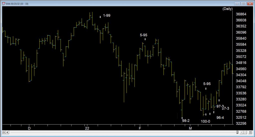
When the market is in a trend, we might see 2 or 3 high Expert Ratings warning us of a potential change in direction. At the tail end of 2021 and the first 10 days of 2022, we had 3 down signals, the last of the 3 at 1-99 was on 1/10/22. The market moved down solidly to the 33280 level before rallying 2/3rds of the down move.
There was no up rating at the bottom as prices moved back up and one up rating early February that didn’t pan out. However, between 2/24 and 3/16 there was six signals, 5 of them up. That’s in only 14 trading days.
Between the 2/24 up signal and the 3/14 up signal there were 9 distinct bullish ER rules showing. There was also several that were duplicated bullish ER rules. Add to this 4 new distinct ER rules on the up signal 3/16, that adds up to the busiest ER cluster for a very long time.
Here are the first 9 distinct rules contributing the cluster of ratings
The Money Flow Indicator has reversed and is now advancing. In this sideways market, this is read as a bullish indication that the market could move up from this point because of the inflow of funds.
The 21 day stochastic has advanced and crossed the 20% line and the price phase indicator is also in- creasing. In this strongly downtrending market this is taken as a strong bullish signal suggesting an increase in prices.
The price phase indicator is negative but volume accumulation has started to advance. This is a non-conformation that, regardless of the type of market, is a bullish signal which usually results in an upward movement of the market.
The Money Flow Indicator has reversed and is now advancing. In this downtrending market, this is taken as a weak bullish signal that could indicate an upward movement in the market averages.
The advance/decline oscillator has turned positive with volume accumulation already positive. In this strong downward trend this is read as a strong non- confirmation of the current trend which could be followed by a reverse in price direction to the upside.
The new high/new low indicator has reversed to the upside. This is a reliable bullish signal that is often followed by an upward movement in prices. In this strong downtrending market a reverse in trend could start shortly.
Volume accumulation percentage is increasing and the 21 day stochastic has moved above the 20% line. In this downtrending market, this is taken as a strong bullish signal that could be followed by an upward price movement.
The new high/new low indicator has reversed to the upside. This is a reliable bullish signal that is often followed by an upward movement in prices. In this weak downtrending market an uptrend could start shortly.
Intraday low prices of the market have declined to a 21 day low. But the volume accumulation percentage is positive. In this market, this is taken as a weak bullish signal that could be followed by an upward price movement.
So when was the last time we saw this many ratings so close together?
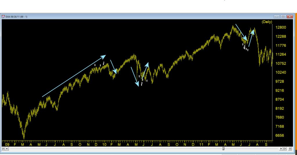
It happens in clusters particularly in advance of a move against the current trend of the market. The ER system is inherently counter trend. This chart shows some cluster from 2009 – 2011.
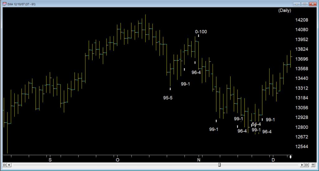
One example was way back at the tail end of 2007, when another cluster of buy signals occurred in a similar fashion. Following a 100 down on 11/01/07 the market gave ground until 11/08/07, the first of 6 buy signals in 13 trading days through to 11/28/07
The market ERs are not perfect but they provide us with key insights into the way the internals are performing.
Where does the market go from here?
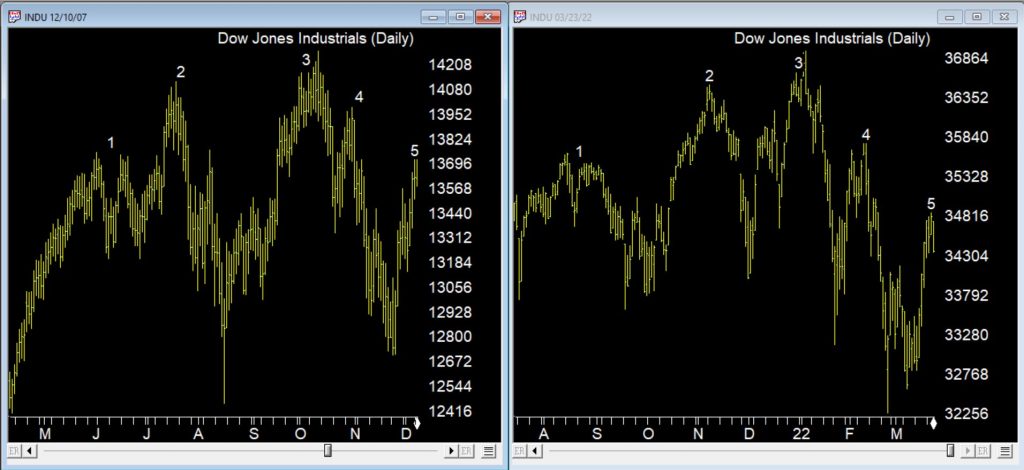
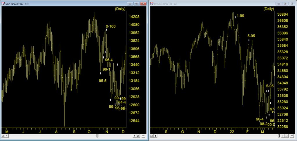
This chart above was back at the start of the 2007/8 bear market. So how do the chart patterns compare between 2022 and 2007/8? The chart below, on the left shows the 2007/8 market through early December 2007 following a strong move up after the cluster of up signals. The right charts shows current market with a strong up move following the cluster of up signals
There are some similarities between current price action and the topping pattern back in 2007, one being the measured way this pattern is emerging over several months. The chart below is the same time periods compared but with the ERs showing.
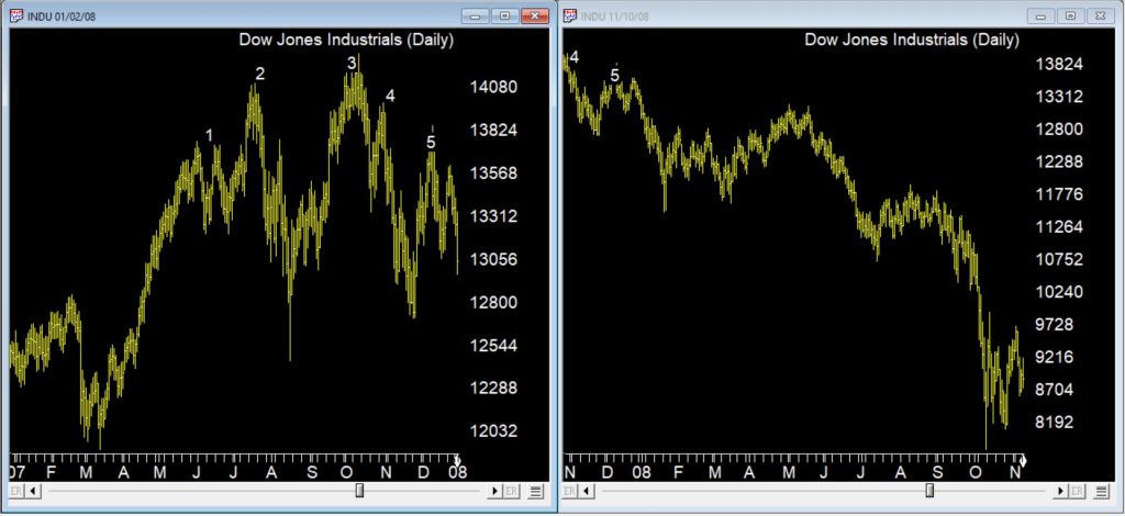
The bear market that followed in 2008 is in the Chart below.
The market moved down in a series of measured moves until we reached late September 2008 and the sharp downturn occurred. No guarantees we’re in the same market, but keep an eye out for those counter trend cluster ERs if we are, they may provide warning of rallies.
WinWay TradingExpert Pro is programmed with the knowledge and insight of respected technical analysts, experts who have developed technical analysis indicators and systems for the last 50 years. The up/down timing signals issued by TradingExpert Pro are based on this knowledge. Since TradingExpert Pro’s timing signals are generated on a scientific basis, free of bias or emotion, you get a disciplined, objective approach to stock market timing.
The timing signals produced by the WinWay expert system are in the form of Expert Ratings. Behind each Expert Rating is a set of rules that combine the sound principles of technical analysis with the experience of market professionals. Since no single technical indicator works all the time, using indicators in combination increases their reliability. For example, a rule is developed that combines the readings of two or more indicators.
This rule is then more reliable than the reading of a single indicator. Within TradingExpert Pro are two knowledge bases, one specifically designed to issue market timing signals and the other designed to issue stock timing signals. Each TradingExpert Pro knowledge base contains approximately 400 rules, but only a few “fire” on any given day.
In the language of expert systems, those rules that are found to be valid on a particular day are described as having “fired”. Rules can fire in opposite directions. When this happens, the bullish and bearish rules fight it out. It’s only when bullish rules dominate that the Expert Rating signal is bullish, or when bearish rules dominate that the Expert Rating signal is bearish.
Your WinWayCharts includes the AIQ Market Timing AI rating system. In this short video we’ll discuss the last 4 AI ratings on the Dow Jones Industrial average and examine the rules that fired to generate these signals.
AIQ TradingExpert Pro is programmed with the knowledge and insight of respected technical analysts, experts who have developed technical analysis indicators and systems for the last 50 years. The up/down timing signals issued by TradingExpert Pro are based on this knowledge. Since TradingExpert Pro’s timing signals are generated on a scientific basis, free of bias or emotion, you get a disciplined, objective approach to stock market timing.
The timing signals produced by the AIQ expert system are in the form of Expert Ratings. Behind each Expert Rating is a set of rules that combine the sound principles of technical analysis with the experience of market professionals. Since no single technical indicator works all the time, using indicators in combination increases their reliability. For example, a rule is developed that combines the readings of two or more indicators. This
rule is then more reliable than the reading of a single indicator. Within TradingExpert Pro are two knowledge bases, one specifically designed to issue market timing signals and the other designed to issue stock timing signals. Each TradingExpert Pro knowledge base contains approximately 400 rules, but only a few “fire” on any given day.
In the language of expert systems, those rules that are found to be valid on a particular day are described as having “fired”. Rules can fire in opposite directions. When this happens, the bullish and bearish rules fight it out. It’s only when bullish rules dominate that the Expert Rating signal is bullish, or when bearish rules dominate that the Expert Rating signal is bearish.
December 20, 2021 we published this seasonality article on the Santa Claus rally https://winwaycharts.com/wordpress/tis-the-season-to-be-cautious/ In a nutshell we looked at the last 5 trading days of the year and the first 2 trading days of the next year. We looked back over the last 7 years to see if the rally holds up.
The Dow clearly did show an average rally of over 1% during those 7 trading days.
So how did things go this Santa Claus rally?
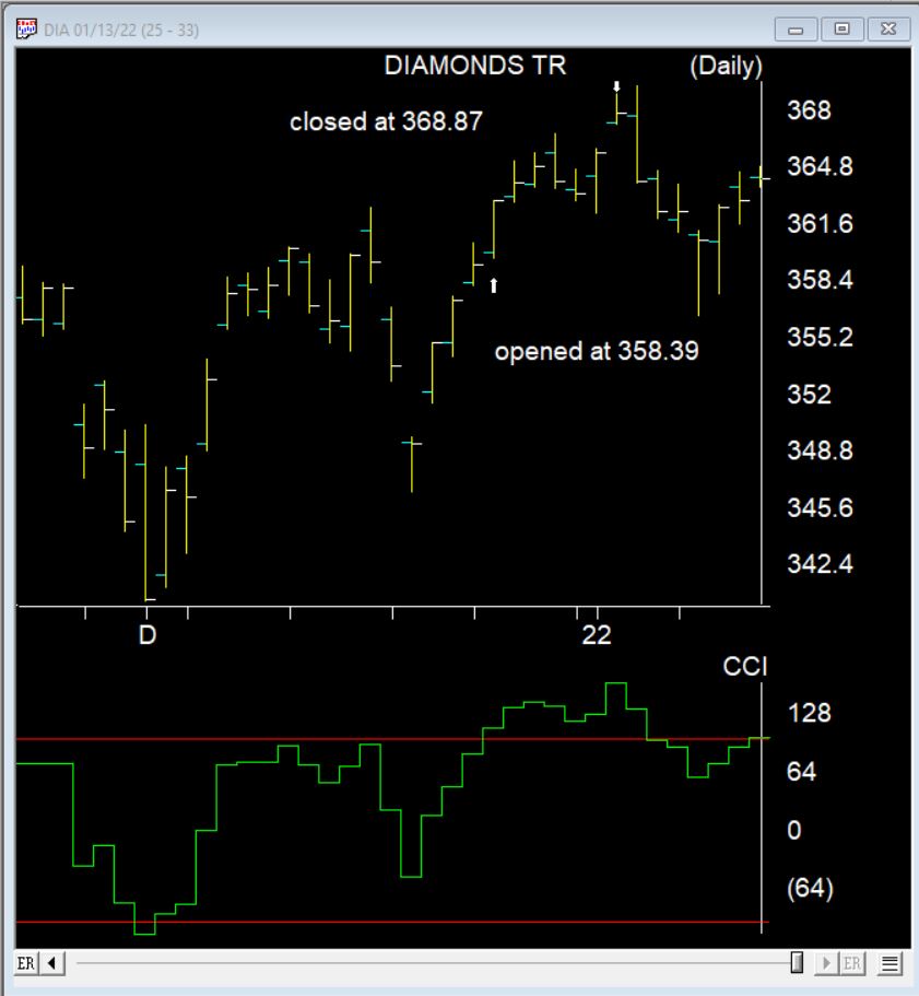
Here’s the DIA the ETF that follows the Dow during the 7 day Santa Claus rally. It made a nice gain of 2.9%. 2 days later things turned down.
This time of year you might expect us to be thinking about the Santa Claus rally, but after the beating we’ve had the last few days, lets check and see how effective this really is.
What Is a Santa Claus Rally?
I lifted this description from Investopedia
A Santa Claus rally describes a sustained increase in the stock market that occurs in the last week of December through the first two trading days in January. There are numerous explanations for the causes of a Santa Claus rally including tax considerations, a general feeling of optimism and happiness on Wall Street, and the investing of holiday bonuses. Another theory is that some very large institutional investors, a number of which are more sophisticated and pessimistic, tend to go on vacation at this time, leaving the market to retail investors, who tend to be more bullish.
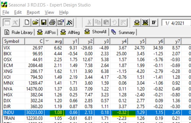
To test this in Expert Design Studio, I used the Seasonality3 ED built-in strategy. I set the Season Length days to 7 days to encompass the last 5 trading days of December and the first 2 days in the New Year.
By setting the date to 1/4/21, the rule looks back 7 trading days from January 4th, each of the last 7 years and gives us an approximate percentage return for each of those 7 days.
Some years with weekends and extra holiday days plus 252 is used as default trading days skew results a small amount. To compensate I also tested 10 trading days back from January 7. The results from the 7 days are below, I tested all the indices in my current database.
INDU is highlighted, this is the Dow 30 index. First it’s clear that in every year except for one, over the last 7 years the Dow has made gains in the Santa Claus period. The average gain Is over 1%. Not too bad for a 7 day trading period. BTW the results from the 10 days from January 7 were similar.
The NASDAQ on the contrary had 3 losing years out of the 7.
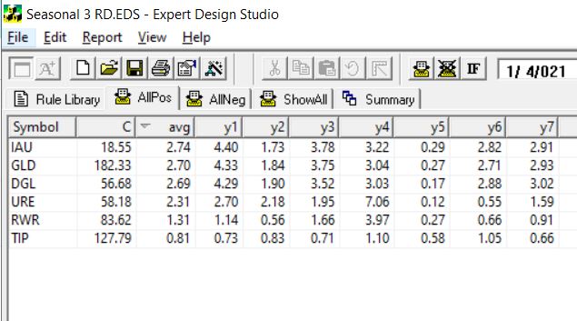
So next I decided to look at what ETFs are most likely to have a Santa Claus rally. Here’s the results using the 7 trading days back from Jan 4. This is the ETFs that had gains every year for the last 7.
The first 3 ETFS are all Gold related, the next two are real estate/REITs the last one is a bond fund. Hmm something to keep in mind.
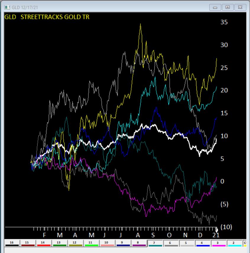
Here’s GLD seasonal charts the right hand side of each year shows the Santa Claus rally clearly. The White line is the average of all 7 years.
Clearly no guarantees what will happen this year, but something to keep in mind.



 English