AIQ code based on Markos Katsanos’s article in the October issue of Stocks & Commodities issue, “A Low-Risk ETF Trading Strategy,” is provided in a downloadable code file, available on request from rdencpa@gmail.com. The code is also shown here.
The strategy combines two complementary concepts: Wilder’s relative strength index (RSI) to identify ETFs that have recently declined and may be emerging from a short-term oversold condition, and a custom relative strength indicator to narrow the selection to
Using the EDS file, the trading strategy described in Katsanos’ article can be run. The file needs to be run using a list of only ETFs. I tried the list supplied by the author as well as a longer list. Both lists performed about the same.
! A low-Risk ETF Trading Strategy, TASC Oct 2026
! Author: Markos Katsanos
! Coded by: Richard Denning, 08/11/2026

!ABBREVIATIONS:
C is [close].
V is [volume].

!INPUTS:
timeExit is 30.
RSBARS is 35.
RSCRIT is 3.
MAR is 50.
RSIBARS is 10.
MABARS is 15.
RSIOS is 35.
CORMIN is 0.6.
PRFTGT is 25.
MinVol is 100000.

!INDICATORS:

!RSMK:
IND is tickerUDF("SPY",C).
RS is ln(C/IND) - ln(valresult(C/IND,RSBARS)).
RSMK is expavg(RS,4)*100.

!RSI:
 U  is C-valresult(C,1).
 D  is valresult(C,1)-C.
 L1 is 2 * RSIBARS - 1.
 AvgU  is ExpAvg(iff(U>0,U,0),L1).
 AvgD  is ExpAvg(iff(D>=0,D,0),L1).
 RSI  is 100-(100/(1+(AvgU/AvgD))).

!ROC:
ROC is (C / valresult(C,6) - 1).
RSMKavg is simpleavg(RSMK,MAR).
hiRSMK is  highresult(RSMK,3,1).
SPYroc is tickerUDF("SPY",ROC).

!PEARSON CORRELATION:
  N is 100.
! 1 BAR RETURNS
  rC is (C / val([close],1) - 1).
  SPYc is TickerUDF("SPY",C).
  SPYrc is (SPYc / valresult(SPYc,1) - 1).
! MEANS
  meanX is simpleavg(rC,N).
  meanY is simpleavg(SPYrc,N).
! STANDARD DEVIATIONS
  stdDx is sqrt(variance(rC,N)).
  stdDy is sqrt(variance(SPYrc,N)).
! COVARIANCE
  covXY is simpleavg((rC - meanX) * (SPYrc - meanY),N).
! PEARSON CORRELATION
  r is covXY / (stdDx * stdDy).


!ENTRY CONDITIONS:
con1 if simpleavg(V,5) > MinVol.
con2 if RSMK > RSMKavg.
con3 if RSMK > RSCRIT.
con4 if RSMK > highresult(RSMK,3,1).
con5 if RSMK < 25.
con6 if (tickerUDF("SPY",ROC) > -6  and r > CORMIN)
	or (tickerUDF("SPY",ROC) < -6 and r < -CORMIN).
  LLVrsi is lowresult(RSI,20) .
con7 if lowresult(RSI,20) < RSIOS.
  HHVrsi_1 is highresult(RSI,2,1).
con8 if RSI > highresult(RSI,2,1).
  esa5 is expavg(C,5).
  sma15_5 is valresult(simpleavg(C,MABARS),5).
con9 if expavg(C,5) > valresult(simpleavg(C,MABARS),5).

!EXIT CONDITIONS:
ex1 if RSMK < -RSCRIT and r > 0.8.
ex2 if {Position days} >= timeExit.
ex3 if (C / {Position Entry Price} -1) >= 0.25.

!ENTRY RULE:
Buy if con1 and con2 and con3 and con4 and con5
  and con6 and con7 and con8 and con9.

!EXIT RULE:
Sell if ex1 or ex2 or ex3.
FIGURE 4: AIQ. This shows a summary EDS report as of 4/22/2026, when there were buy signals on QQQ and XLK.
FIGURE 5: AIQ. This demonstrates a recent trade on QQQ with entry on 4/23/2026 (the next day at the open after the buy signal was generated) and an exit on 6/05/2026 (the next day after the exit signal was generated).
Whether you joined us live or couldn’t make it, the full Chaikin Volatility & Bollinger Bands: Reading Expansion and Contraction Together session is now up and ready to watch:
Steve Hill from AIQ Systems hosted a webinar on using Chaikin Volatility with Bollinger Bands for trading analysis. He explained how Bollinger Bands measure price relative to its recent range and how Chaikin Volatility tracks changes in the daily trading range. Steve demonstrated how combining these indicators can help confirm breakouts and identify potential trend continuations or reversals. He emphasized the importance of a close beyond a Bollinger Band for a valid breakout signal and used live charts of stocks like Apple and SPY to illustrate the concepts. Steve also shared custom indicators he created for Chaikin Volatility and Percentage B, offering to provide these files to attendees. The session concluded with a brief Q&A and the announcement that a recording would be shared.
EDS files used in this event
Download these two EDS files and save to your/wintes32/EDS strategies folder
From Charts menu select Charts Settings, Indicator Library, EDS Indicators.
Select Add and Locate the /wintes32/eds strategies/Bollinger%25B.EDS
For Indicator Type select One line with upper/lower limits
For UDF to plot use %B
Upper Limit 1
Lower Limit 0
Once you click finish the indicator will be in your Chart lower control panel.
Summary
Chaikin Volatility and Bollinger Bands
Steve Hill with AIQ Systems conducted a webinar on Chaikin Volatility and Bollinger Bands, explaining the concepts and their combination for trading analysis. He discussed Bollinger Bands’ measurement of price relative to recent range and the use of percentage B and bandwidth indicators. The session also covered Chaikin Volatility’s relationship to price action and its role in identifying market direction changes or continuations. Steve planned to demonstrate the concepts using live charts, including SPY and DAO30, focusing on breakout definitions and Bollinger Band squeezes.
Bollinger Bands and Chaikin Volatility
Steve explained how to use Bollinger bands in combination with Chaikin volatility to identify trading opportunities. He described three operating parameters for Bollinger bands, including when bands narrow and price breaks above or below a band. Steve noted that rising Chaikin volatility during a band squeeze indicates the compression may end soon and a move may be starting, while flat volatility suggests uncertainty about the trend’s continuation.
Bollinger Bands Trading Strategy
Steve discussed the significance of Bollinger Bands in trading, emphasizing that a price breakout is more reliable when the close is beyond the band rather than just the high or low. He explained that volatility provides confirmation of a breakout, with wider bands indicating higher volatility and potential for continued price movement. Steve also noted that a squeeze occurs when bands compress to their lowest levels during periods of lower volatility.
Bollinger Bands and Volatility Trading
Steve explained how to use Bollinger Bands and Chaikin Volatility to identify market squeezes and potential price movements. He outlined that a Bollinger Band squeeze occurs when the bands narrow to their lowest level over a 3-6 month period, and this compression combined with changes in Chaikin Volatility can signal an upcoming significant price move. Steve recommended using 3-5 bars for trend confirmation in both volatility and price breaks through bands, and demonstrated how to set up these indicators in the trading platform. He used Apple as an example to illustrate how to identify and analyze these patterns in real market data.
Bollinger Bands Trading Strategy
Steve discussed the use of Bollinger Bands and Chaikin Volatility to identify trading opportunities. He explained that a squeeze, indicated by narrowing Bollinger Bands, combined with increasing volatility over the past three to five days, confirms a potential breakout. Steve demonstrated this strategy using examples from Apple and NVIDIA charts, emphasizing that volatility trends are crucial for confirming whether a breakout will continue in the same direction. He also introduced a custom indicator called “Percentage B” to simplify the analysis process and mentioned ongoing work on additional indicators to automate the detection of Bollinger Band squeezes and breakouts.
The full session on how to read a range-bound market and trade it on purpose — momentum, breadth, and the boundary rules covered live are all here in the replay above
What’s covered in this session
Reading the regime — how to confirm a market is genuinely range-bound before you trade it that way.
Momentum and breadth confirmation — the indicators that tell you a boundary touch is worth acting on.
Risk management for chop — sizing and exit rules for a market that isn’t trending.
The Dow Jones Industrial Average just changed — Alphabet replaced Verizon on June 29. The Transportation Average changed too — FedEx Freight replaced American Airlines on June 1.
And while the “Industrials” sit at record highs, the Transports are roughly 12% off their peak, hammered by oil back above $100 a barrel.
Charles Dow Had a Name for This
Non-confirmation. It preceded the 1973 top. It preceded the 2000 top.
It also fired plenty of false alarms.
So which is it this time — warning or noise?
Opinions are cheap. Signals are testable. In 45 minutes, Steve Hill shows you how to read this divergence with rules, not guesswork.
What You’ll Walk Away With
01 · The 2026 Dow, Decoded
Exactly what changed in the Dow 30 and TRAN this year, and why “Industrial” is now mostly a nickname — Goldman, Nvidia, and Apple drive this index.
02 · Dow Theory in Plain English
What a DJIA/TRAN non-confirmation actually signals, when it has mattered historically, and when it hasn’t.
03 · The Oil Overlay
Why $100 crude hits the 20 Transports stocks directly (4 airlines, heavy trucking) while barely touching today’s Dow 30 — and making a group of fuel-sensitive names in TradingExpert Pro.
Steve Hill, Founder of WinWayCharts and CEO AIQ Systems, conducted a 45-minute Zoom session demonstrating how to use AI, specifically Claude by Anthropic, to create trading strategies and indicators within the TradingExpert Pro Expert Design Studio.
Steve showed how Claude can generate custom indicators and strategies from scratch, including a volume-weighted momentum indicator and a consecutive close filter indicator, which were successfully implemented and tested in the system.
He explained the process of creating these indicators, including debugging and testing them, and demonstrated how the AI-generated strategies could be backtested on a database of stocks.
Steve emphasized that while AI tools like Claude can significantly speed up the development process and create new indicators not previously available in the system, traders still need to validate and test the effectiveness of these strategies through backtesting and further refinement.
The last few weeks have been a gut-check: the Dow shed over 800 points in a session, the Nasdaq dropped 4% as the semiconductors rolled over, the VIX is spiking, and roughly a trillion dollars of market value has evaporated.
This is exactly the environment that separates disciplined traders from emotional ones.
Join Steve Hill,founder of WinWayCharts and CEO of AIQ Systems, as He Covers
01 · Before the Drop
What AIQ’s Market Timing model and Expert Rating were signaling before the drop
02 · Calling the Turn
How MACD divergence and Phase Analysis called the turn in the semiconductors
03 · Finding the Leaders
An EDS screen to surface the stocks quietly holding up while everything else sells off
It’s a demonstration of reacting to the rules instead of the noise — the whole point of trading a system.
Watch Steve Hill break down market internals — and reveal why the S&P 500’s biggest moves are hiding inside just one sector.
The market is sending mixed signals. The Dow hits new highs. But under the surface, most sectors are going nowhere.
In this free video session, WinWayChart’s Steve Hill walks you through exactly what’s happening right now — and how TradingExpert Pro’s Expert Rating is helping traders cut through the noise.
In This Session You’ll See
01 · The Warning Before the Noise
How two Expert Rating down signals in May flagged the warning before most traders noticed
02 · One Sector, 30% of the Move
Why the technology sector now drives 30% of S&P 500 movement — and what that means for your timing
03 · Sector Breadth, Rebuilt
The new sector breadth analysis approach using 11 S&P 500 segments to pinpoint where opportunity is building
04 · Early Buy Signals
Which sectors — healthcare, materials — are flashing early buy signals right now
05 · The Catch-Up Question
Why the equal-weighted S&P 500 is lagging badly — and what it takes for the broader market to play catch-up
Steve Hill just wrapped a fast-paced 10-minute deep dive into something most traders have never seen done before: using sector ETF breadth data inside TradingExpert Pro to spot market rotation before it shows up in price.
Here’s why this is different from anything else out there:
Most breadth analysis stops at the NYSE or NASDAQ level. You see advancing vs. declining stocks, and you get a general sense of market health. That’s useful — but it’s incomplete.
When you break the S&P 500 down into its eleven sectors and track each one’s internal breadth data, something remarkable happens. You can see which sectors are quietly leading… and which are fading, even when the headline index looks fine.
Steve walks you through exactly how to set this up in TradingExpert Pro using special sector ETF tickers — and how to read the combined picture to spot high-probability rotation opportunities.
This is institutional-level analysis, built right into the software. Here are the files to make it happen. Don’t have AIQ? There’s a $1 trial offer below for you to check it out.
The 11 SP500 Sector markets are available in this zip file, unzip these to your wintes32/mdata folder
The 11 State Street ETFs are likely already in your AIQ database but are available in this zip file, unzip these to your /wintes32/tdata folder.
The list file for the 11 SP500 Sector markets is here, save to your wintes32 folder.
Make sure you go to Data Manager and under Utilities perform a Rebuild Master Ticker List. Also when updating your data each day, select Update Breadth Tickers and Compute Markets are selected.
The Zweig Thrust was also used on this video, the EDS file for this is here, save to your /wintes32/EDS Strategies folder. In Charts go to Chart, Settings, Indicator Library, EDS Indicators. Add the location to the Zweig EDS file, and for indicator type select one line with upper/lower support. Upper support set to 61, lower support to 40.
Markets in March 2026 were doing what markets do best — confusing people. Prices were pulling back. Headlines were negative. The majority of traders were uncertain, defensive, or on the sidelines.
But inside TradingExpert Pro, the market timing model was building a case. Not based on opinion. Not based on news. Based on the systematic, rule-by-rule analysis that AIQ has refined over three decades. And by the end of March, that case was overwhelming.
Here’s exactly what the system saw — and what it meant.
March 18 & 19 — The Opening Signal
On March 18, the AIQ market timing model issued an Expert Rating of 96 — Up. The following day, March 19, it fired again: another 96 — Up.
Back-to-back readings above 95 in consecutive sessions are not noise. An Expert Rating above 95 represents a high-conviction bullish technical condition — the system telling you, in its clearest language, that the weight of technical evidence favours higher prices. When that reading repeats on consecutive days, the model is reinforcing its own conclusion.
At this point, the disciplined AIQ trader is already paying close attention.
March 25 — Phase Analysis Confirms the Direction
4 days later, on March 25, Phase Analysis confirmed what the Expert Rating had been signalling.
The market Phase changed to Up.
This is a pivotal moment in any signal sequence. The Expert Rating identifies the condition; Phase Analysis identifies the trend cycle. When a high Expert Rating is followed by a Phase change in the same direction, the two most important components of the AIQ market timing model are in full agreement. The signal is no longer early — it is confirmed.
March 31 — The Full Picture
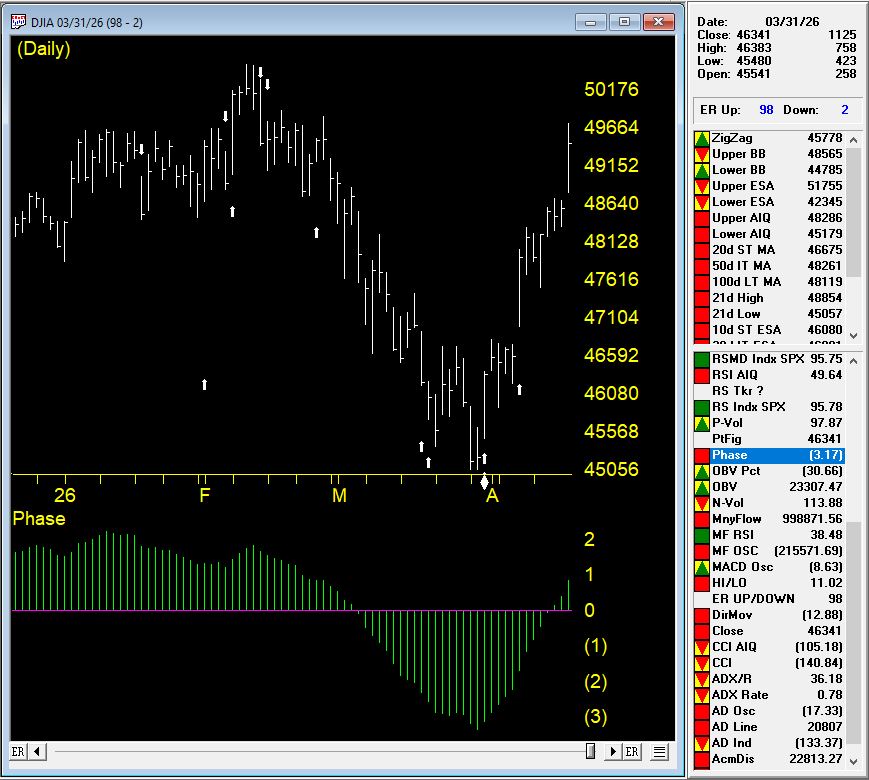
March 31 produced the most powerful single-day reading in the sequence — an Expert Rating of 98 — Up, arriving with Phase already turned upward. The individual timing rules that fired during this sequence tell a story that every AIQ trader should understand, because they illustrate precisely how the system thinks.
Rule 1: 21-Day Low Intraday Price with Positive Volume Accumulation
Intraday low prices declined to a 21-day low — a reading that, on the surface, looks bearish. But volume accumulation percentage was positive. In AIQ’s market timing logic, this non-confirmation is a weak bullish signal. Price is making new lows, but money is not leaving the market. That divergence matters.
Rule 2: 21-Day Low Closing Price with Rising Advance/Decline Breadth
Closing prices also reached a 21-day low. Again, superficially bearish. But market breadth — measured by advances versus declines — was increasing. When prices fall to new lows but more stocks are advancing than declining, the selling is not broad-based. This non-confirmation is a bullish signal indicating a possible upward price movement. The majority of the market is quietly holding up while the index prints a low.
Rule 3: 21-Day Low Closing Price with Rising Advance/Decline Oscillator
A third rule reinforced the same theme: closing prices at a 21-day low, but the advance/decline oscillator increasing. Another non-confirmation. Another bullish signal. Three separate breadth and price divergence rules all pointing the same direction — up.
Rule 4: 21-Day Stochastic Crossing the 20% Line with Rising Price Phase
The 21-day stochastic advanced and crossed the 20% line, while the price phase indicator was also increasing. In a weakly downtrending market, AIQ classifies this combination as a strong bullish signal suggesting an increase in prices. The stochastic crossing 20% from below is a classic oversold recovery signal — but paired with a rising price phase, it carries significantly more weight.
Rule 5: Rising Volume Accumulation with 21-Day Stochastic Above 20%
Volume accumulation percentage was increasing while the 21-day stochastic moved above the 20% line. In a downtrending market, AIQ rates this a strong bullish signal. Volume accumulation captures the relationship between buying and selling pressure over time. When it starts rising in a downtrend while momentum is recovering from oversold levels, the path of least resistance is shifting.
Rule 6: Negative Price Phase with Rising Volume Accumulation
Finally, even with the price phase still registering negative, volume accumulation had started to advance. In AIQ’s rules, this non-confirmation — volume diverging positively from a negative price phase — is a bullish signal regardless of market type. It doesn’t matter what the trend classification is. When volume accumulation turns up against a negative phase, the model says: the market is preparing to move higher.
What the Full Sequence Tells Us
Step back and look at this sequence as a whole.
March 18: Expert Rating 96 — Up. March 19: Expert Rating 96 — Up, confirmed. March 25: Phase changes to Up, validating both prior signals. March 31: Expert Rating 98 — Up, with six individual timing rules all firing bullish simultaneously, spanning price divergence, breadth divergence, volume accumulation, stochastic recovery, and phase analysis.
Every single component of the AIQ market timing model was in agreement. Rules that look at price. Rules that look at breadth. Rules that look at volume. Rules that look at momentum. All saying the same thing at the same time.
This is exactly the kind of multi-confirmation environment that the system is designed to identify — and that individual traders, relying on headlines or gut instinct, almost always miss. When prices are making 21-day lows and geopolitical news is negative, the human instinct is to step back. The AIQ system, by contrast, was reading below the surface and identifying that the internal structure of the market was quietly rebuilding.
The Lesson
Price can lie. Headlines always lie. But when multiple independent technical rules — breadth, volume, momentum, phase — all non-confirm a price low at the same time, the market is telling you something important: the selling is exhausted, and the buyers are already at work beneath the surface.
The March 2026 signal sequence is a textbook demonstration of why systematic, rule-based market timing produces results that emotional, discretionary trading cannot replicate. You don’t need to know whether the Iran conflict resolves or whether the Fed changes course. You need to know what the internals of the market are doing — and let a proven system tell you.
On March 18, the system said up. On March 19, it said it again. On March 25, Phase confirmed it. On March 31, rules piled on with a 98-rated exclamation mark.
The traders who followed the signals were on the right side of the move. That’s what systematic market timing is built for.
How Five Market Timing Signals Captured 4,500 Points While Avoiding Two Major Declines
One of the most common questions we hear from traders is: “Can a systematic approach really identify market turning points in real-time?” The answer is yes—when you have the right tools and a disciplined, rule-based methodology.
Let me show you exactly how AIQ Market Timing navigated a volatile 2.5-month period from October 2025 through January 2026, capturing three significant rallies totaling 4,500 points while protecting capital during two major reversals totaling over 3,000 points of decline.
The Setup: Multiple Bullish Confirmations (October 20, 2025)
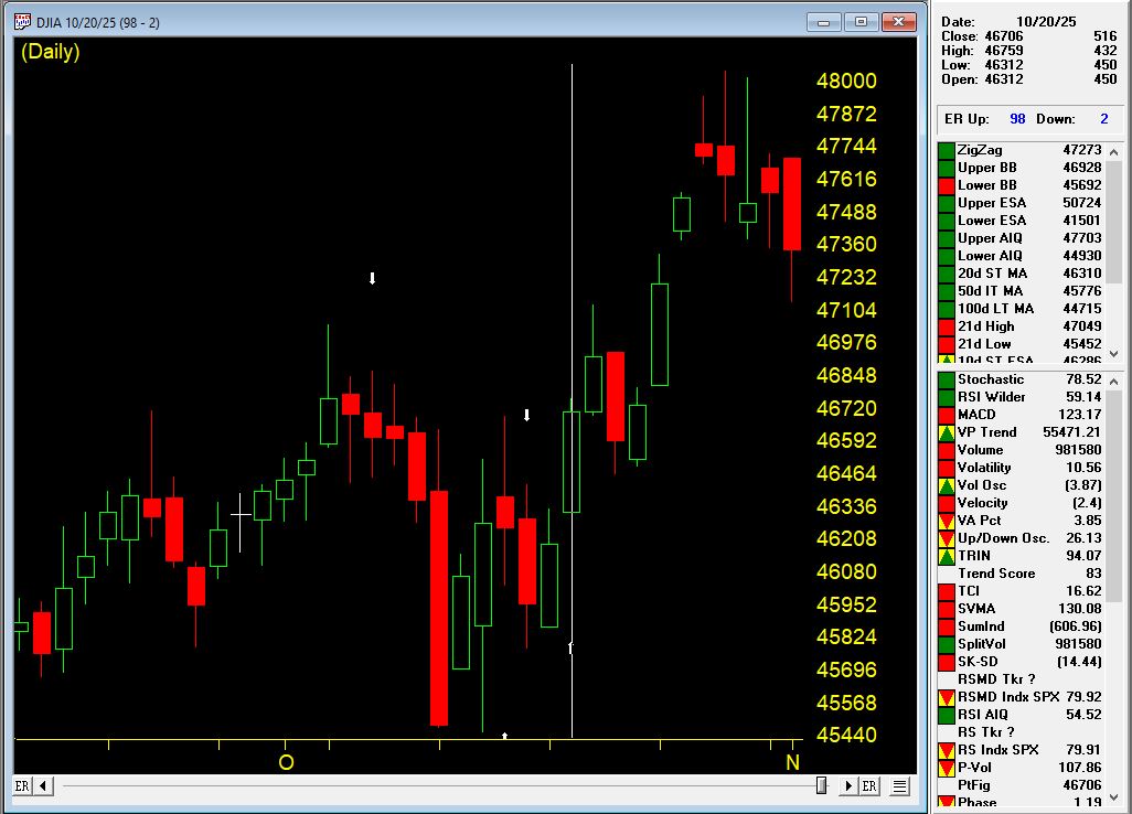
On October 20th, AIQ Market Timing issued a 98 UP signal at 46,707 on the Dow Jones Industrial Average. But this wasn’t just a single indicator flashing green—it was a confluence of five critical rules firing simultaneously:
Rule #1: Trend Status Confirmation
Trend Status changed to a weak upward trend
This indicated an upward trend was starting that could continue
Classification: Moderate bullish signal
Rule #2: Exponentially Smoothed A/D Line
The smoothed advance/decline line turned positive
Key factor: The UD volume oscillator and A/D oscillator were ALREADY positive
This alignment is viewed as bullish, often preceding upward price movement
Rule #3: Up/Down Volume Oscillator
The UD volume oscillator turned positive
Confirmation: A/D oscillator and smoothed A/D line were already positive
This convergence signaled institutional buying was building
Rule #4: Advance/Decline Oscillator
The A/D oscillator turned positive
Supporting indicators: UD volume and smoothed A/D line already positive
Multiple breadth measures confirming the move
Rule #5: Volume Accumulation Alignment
A/D oscillator turned positive with volume accumulation already positive
In a weak upward market, this signals prices could continue rising
Professional money was accumulating positions
The Result: +1,333 Points in 8 Days
The market moved from 46,707 on October 21st to 48,040 on October 29th—a gain of 1,333 points (+2.85%) in just eight trading days.
This is the power of waiting for multiple confirming indicators rather than jumping on single signals. The system identified strong internal market momentum that wasn’t yet obvious to casual observers.
The Top: System Catches the Reversal (October 30, 2025)
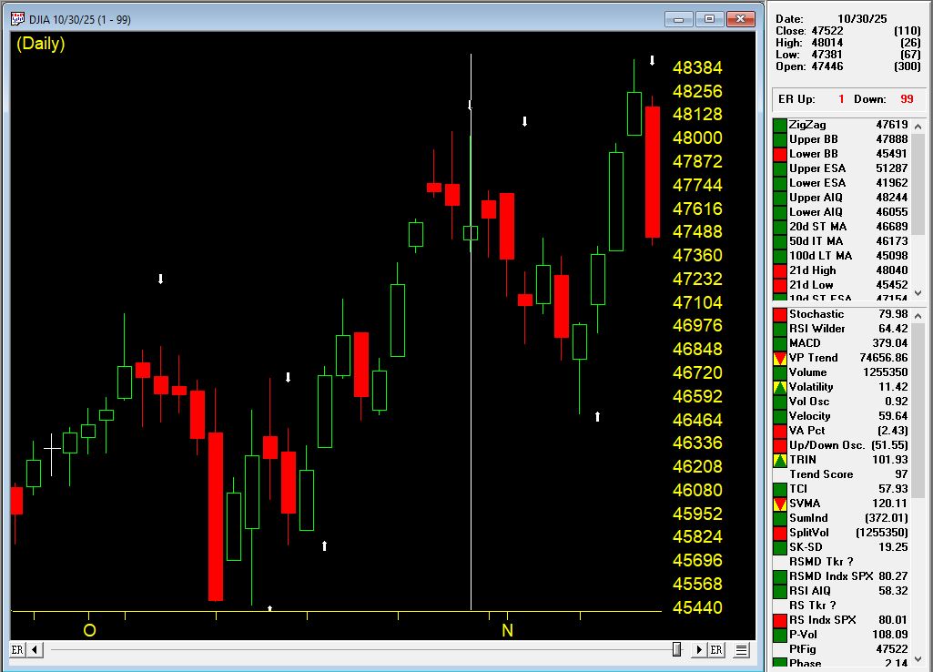
Just one day after the market high, on October 30th at 47,659, AIQ Market Timing 98 issued a DOWN signal. The system caught the top within just 11 points of the absolute high (48,040 vs. 47,659).
Two Critical Bearish Rules Fired:
Rule #1: Breadth Deterioration
The exponentially smoothed A/D line turned negative
Warning sign: UD volume oscillator and A/D oscillator were already negative
This indicated institutional distribution was underway
Rule #2: Volume Accumulation Breakdown
Volume accumulation turned negative
The A/D oscillator was already negative
In a downtrending market, this bearish signal often precedes price declines
Initial Decline: -1,164 Points in 7 Days
From the October 31st level of 47,659, the market dropped to 46,495 by November 7th—a decline of 1,164 points (-2.44%) in seven trading days.
Traders following these signals would have been long for the +2.85% rally and either flat or profitably short for the -2.44% decline.
The Confirmation: Second Down Signal (November 4, 2025)
On November 4th, while the market was still declining, AIQ Market Timing 98 issued a second DOWN signal, reinforcing the bearish outlook. This is where systematic trading truly shines—when multiple signals confirm the trend in real-time.
Three Additional Bearish Rules Fired:
Rule #1: Trend Status Reversal
Trend Status changed to a weak downward trend
This confirmed the downward trend was likely to continue
Classification: Moderate bearish signal
Rule #2: Stochastic and Volume Divergence
Volume accumulation percentage was decreasing
The 21-day stochastic moved below the 80% line
In a downtrending market: Strong bearish signal
This combination often precedes significant downward price movement
Rule #3: UD Volume Oscillator Breakdown
The UD volume oscillator turned negative
Critical context: Smoothed A/D line and A/D oscillator were already negative
This confirmed selling pressure was intensifying
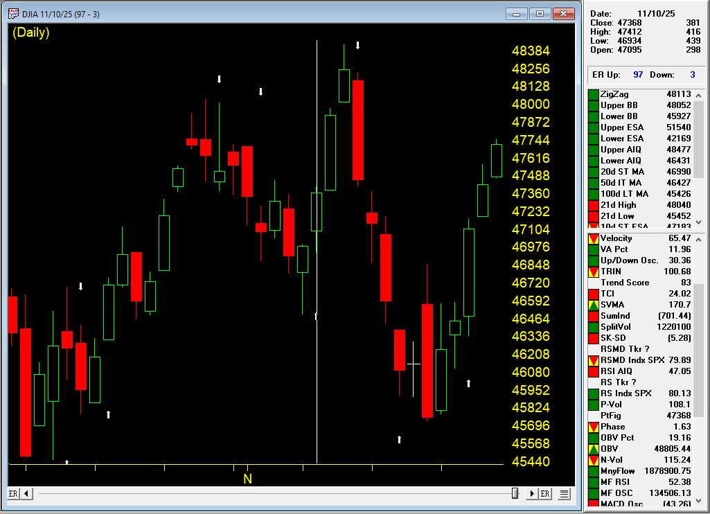
Signal #3: Back to Bullish (November 10, 2025)
On November 10th at 47,368, AIQ Market Timing issued an UP signal (97), indicating the correction had run its course and a new upward move was beginning.
Four Powerful Bullish Rules Fired:
Rule #1: Exponentially Smoothed A/D Line
Turned positive with UD volume oscillator and A/D oscillator already positive
This alignment indicated strong bullish internal momentum building
Rule #2: Advance/Decline Oscillator Confirmation
Turned positive with UD volume oscillator and smoothed A/D line already positive
Multiple breadth measures confirming the new uptrend
Rule #3: Volume Accumulation Alignment
A/D oscillator turned positive with volume accumulation already positive
In a sideways market, this signals prices could begin upward movement
Professional buying was returning
Rule #4: New High/New Low Reversal
The NH/NL indicator reversed to the upside
Classification: Reliable bullish signal
Often followed by upward price movement
In a sideways market, an uptrend could start shortly
The Rally: +1,063 Points in 3 Days
The market surged from 47,384 on November 11th to 48,431 on November 13th—a gain of 1,040 points (+2.22%) in just three trading days.
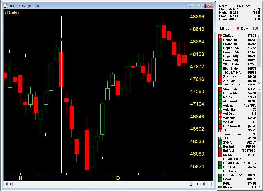
Signal #4: The Top Again (November 13, 2025)
At the market high of 48,233, AIQ Market Timing issued a DOWN signal (100), once again catching the reversal with precision.
Five Bearish Rules Fired:
Rule #1: Stochastic and Price Phase Weakness
21-day stochastic declined below the 80% line
Price phase indicator also decreasing
In the uptrending market: Weak bearish signal indicating possible near-term decline
Rule #2: Smoothed A/D Line Breakdown
Turned negative with UD volume and A/D oscillator already negative
Clear sign of breadth deterioration
Rule #3: UD Volume Oscillator Reversal
Turned negative with smoothed A/D line and A/D oscillator already negative
Institutional selling was intensifying
Rule #4: A/D Oscillator Breakdown
Turned negative with UD volume and smoothed A/D line already negative
All breadth measures aligned bearishly
Rule #5: New High/New Low Reversal
The NH/NL indicator reversed to the downside
Classification: Reliable bearish signal
Often followed by downward price movement
In an uptrending market, a trend reversal could occur
The Decline: -1,500 Points in 7 Days
From November 14th’s open of 47222, the market plunged to 45,728 on November 20th—a drop of nearly 1500 points (3.16%) in five trading days.
This was a significant correction that caught many traders off guard. But AIQ Market Timing identified it precisely at the top.
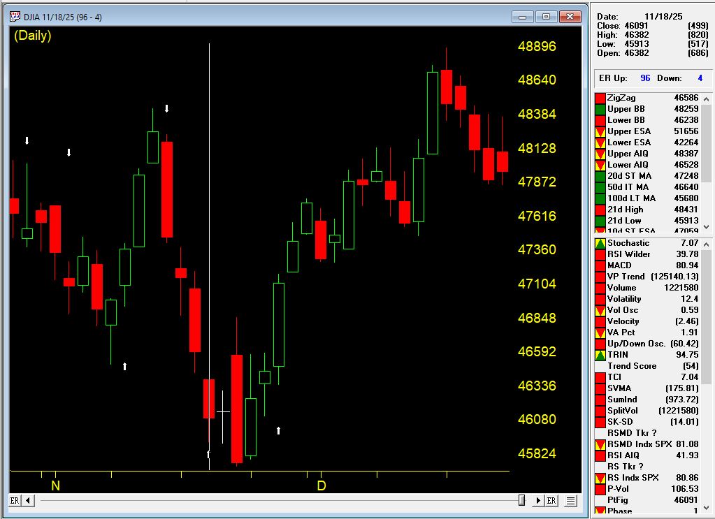
Signal #5: The Current Rally (November 18, 2025 – Present)
On November 18th at 46,091, AIQ Market Timing issued an UP signal (96), catching the bottom of the correction and positioning traders for what would become a powerful sustained rally.
The Rally Continues: over 3000 Points and Counting
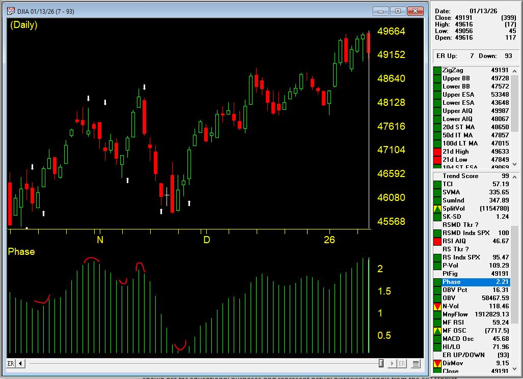
From the November 19th entry at 46,138, the market has surged to 49,616 as of January 13, 2026—a gain of over 3,300 points (+7.0%) that is STILL RUNNING.
This ongoing rally has already lasted 45 days and shows the power of staying with a trend when the system confirms the move.
The Complete Picture: What This Teaches Us
Over a 2.5-month period from October 21, 2025 to January 9, 2026, AIQ Market Timing issued five signals:
The Numbers Are Staggering
Total gains captured: over 5,000 points across three rallies Total declines avoided: over 3,000 points across two corrections Current position: Still long in a rally that has gained 7.0%
Compare this to buy-and-hold over the same period:
Started: 46,707 (Oct 21)
Current: 49,504 (Jan 9)
Buy-and-hold gain: +2,797 points (+5.99%)
This sequence demonstrates several critical principles of successful systematic trading:
1. Confirmation Over Single Indicators
Every up signal had multiple rules firing together—not weak, isolated signals but powerful confluences showing aligned market internals. Signal #1 had five rules, Signal #3 had four rules including the reliable NH/NL indicator.
2. Speed Matters
The system caught reversals with remarkable precision: one day after the October high, right at the November 13th high. Manual observation would have missed these turning points.
3. Internal Strength vs. Price Action
The breadth indicators (A/D measures, volume accumulation, UD volume, NH/NL) detected shifts in market character before they became obvious in price alone.
4. Consistency Across Different Market Conditions
This wasn’t a lucky streak. The system worked in:
Weak upward trends (October)
Weak downward trends (early November)
Sideways markets (mid-November)
Strong sustained uptrends (late November – January)
5. Multiple Cycles Compound Returns
Notice how the system didn’t just catch ONE move—it navigated FIVE distinct market phases. This is where systematic trading truly shines: the ability to stay on the right side of the market through multiple cycles.
6. Reliable Indicators Add Conviction
The New High/New Low indicator appeared in both Signal #3 (bullish reversal) and Signal #4 (bearish reversal), classified as “reliable” both times. When these high-probability signals appear, they deserve attention. Adding in the Phase indicator, confirmation was present for all the signals and is considered a valid confirmation within +/- 3 days of the signal.
7. Both Sides of the Market
This wasn’t just about catching rallies. The system protected capital by identifying when conditions changed, allowing traders to exit longs, stay in cash, or even profit from declines totaling 3,669 points.
Multiply this advantage over weeks, months, and years, and you begin to understand why systematic, rule-based trading provides such a significant edge.
The Bottom Line
AIQ Market Timing isn’t about predictions or gut feelings. It’s about:
Objective rules that fire based on market internals
Multiple confirming indicators that reduce false signals
Real-time alerts that keep you informed as conditions change
Historical validation proving the methodology works across different market environments
Consistent performance across multiple market cycles
Are you ready to trade with this level of systematic precision? $1 trial available
Learn more about AIQ Market Timing 98 and other professional-grade technical analysis tools at AIQ Systems.
Past performance does not guarantee future results. All trading involves risk. The examples shown are for educational purposes and represent act



 English