September 7, 2022 – 3pm to 7pm London time, four hour in-depth webinar
covering these in-depth topics, crucial to your successful trading.
Early bird pricing now in effect, see below to book your discounted price and save over 20%
****** Includes PDF handouts and access to the recordings of the event ******
Session 1 – Power tools and features in your WinWayCharts and how to use them
Color Studies, Overlays, Custom Indicators, Seasonality, and Matchmaker. These are important and powerful tools in your WinWayCharts. In this session, we’ll show how to set a Color Study and why, what Overlays are useful for, and more. Learn how these tools will save you time and how they contribute to your trading decisions. Darren’s 3 favourite Bullish/Bearish strategies will be used as the basis for the color study.
Session 2 – Darren’s Indicators and how to apply them
Some indicators are more reliable than others. In this session, we’ll look at some of the nuances of MACD WinWay, RSI WinWay and the CCI indicators and how they add confidence to our trading decisions. We’ll explore these 3 indicators in-depth with examples of them in action in the stock market.
Session 3 – Exchange traded funds rotation strategy so you never have to go short
Using the reports in WinWayCharts we’ll look at a tried and tested ETF rotation strategy that is simple and yet effective at getting you in the right market segment at the right time. This strategy is simple to execute and has consistently beat the market over multiple years. While this strategy doesn’t replace your regular trading, it’s a good place to consider for a segment of trading.
Session 4 – Live Trading using Darren’s Favorite Candlestick Strategy and ETF Strategy
Starting from Market Timing, then moving to the Darren’s 3 Favourite Candlestick Strategy and the ETF Rotation Report, we’ll look for candidate stocks. Using the WinWayCharts indicators we’ll look to confirm the best of the best stock and ETF candidates to place trades with stops using a live trading account.
Your Presenters: Ray Foreman UK director WinWayCharts and, Steve Hill, CEO AIQ Systems, and founder WinWayCharts
Master Trading with WinWayCharts Webinar
September 7, 2022
Early bird pricing now in effect save over 20%
ONLY $299 229
includes all handouts in PDF and access to recordings
For the record, I am an avowed “trend-follower.” But I also know that no trend lasts forever. So, while I have gotten pretty good at “riding along”, I do – like most people – like to “look ahead” since I do know that the landscape will forever be changing.
So, with the caveat that none of what follows should be considered a “call to action”, only as a “call to pay attention”, let’s venture out “into the weeds.”
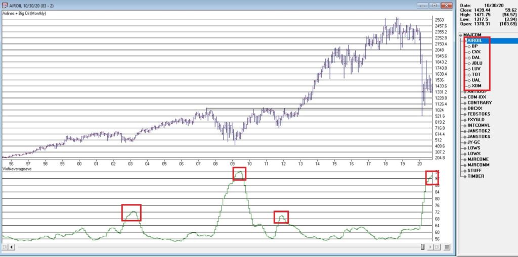
AIROIL
Here is an ugly pairing – airline stocks and traditional energy stocks – yikes! In Figure 1 you see an index that I created and followed call AIROIL comprised of three airline stocks and five “Big Oil” stocks. During the pandemic meltdown this index fell to a level not seen since 2007 before “bouncing”.
Editors Note:
Jay's AIROIL Index is built using the AIQ Data Manager by creating a list andcreating a group ticker (in this case AIROIL).
Stocks are inserted under the ticker and the index is then computed using  Compute Group/Sector indices.
In the bottom clip you see an indicator I call VFAA. Note that when VFAA tops out and rolls over, meaningful advances in the index tend to follow. In addition, VFAA is at a high level seen only once before in 2009. Following that reversal, the index rose almost 500% over the next 9 years.
So, is now a great time to pile into airlines and big oil? One would have to be a pretty hard-core contrarian to pound the table on this one. The airlines are in terrible shape due to the pandemic and vast uncertainty remains regarding when things might improve. And “Big Oil” is about as unloved as any sector has ever been.
So, am I suggesting anyone “load up” on airlines and oil? Nope. What I am saying is that I am watching this closely and that if and when VFAA “rolls over” I may look to commit some money to these sectors on a longer-term contrarian basis.
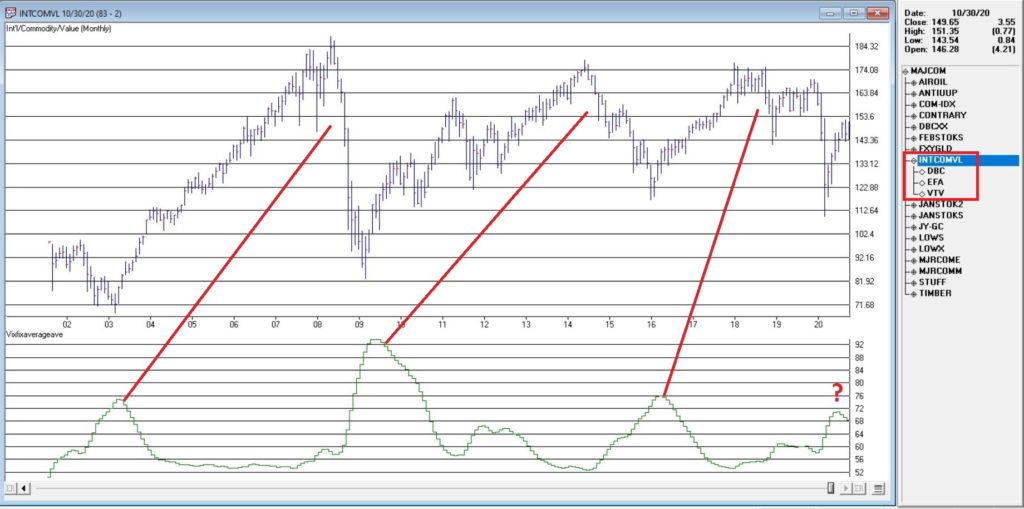
International/Commodities/Value
Also known of late as “the barking dogs”. If you have had money committed to any or all of these asset classes in recent years you are shaking your head right about now. These areas have VASTLY underperformed a simple “buy-and-hold the S&P 500 Index” approach for a number of years.
Is this state of affairs going to change anytime soon? Regarding “anytime soon” – it beats me. However, I am on the record as arguing that at some point this WILL change. History makes one thing very clear – no asset class has a permanent edge. So, given that the S&P 500 Index has beaten these above mentioned by such a wide margin for such a long time (roughly a decade or more) I am confident that one day in the next x years, the “worm will turn.”
Figure 2 displays an index that I created and follow that tracks an international ETF, a commodity ETF and a value ETF. The VFAA indicator appears in the bottom clip.
Now if history is a guide, then the recent “rollover” by VFAA suggests that this particular grouping of asset classes should perform well in the coming years. Two things to note:
1. There is no guarantee
2. There is absolutely no sign yet that “the turn” – relative to the S&P 500 – is occurring
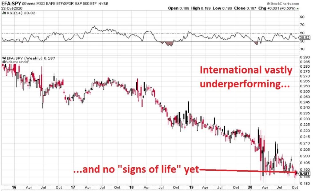
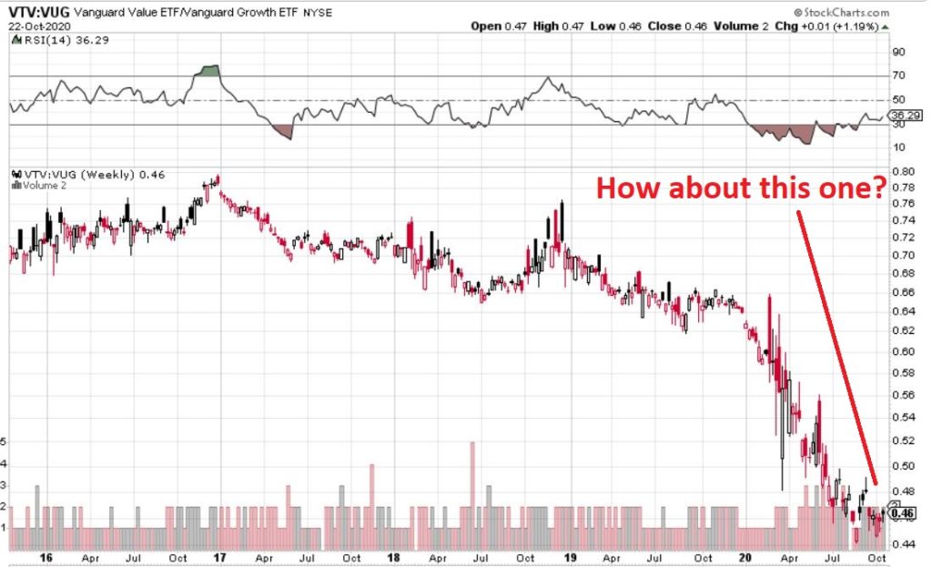
Figure 3, 4 and 5 are “relative strength” charts from www.StockCharts.com. They DO NOT display the price of any security; they display the performance of the first ETF list compared to the second ETF listed. So, Figure 3 displays the performance of ticker EFA (iShares MSCI EAFE ETF which tracks a broad index of stocks from around the globe, excluding the U.S.) relative to the S&P 500 Index.
When the bars are trending lower it means EFA is underperforming SPY and vice versa. The trend in Figure 3 is fairly obvious – international stocks continue to lose ground to U.S. large-cap stocks.
If your goal is to pick a bottom, have at it. As for me, I am waiting for some “signs of life” in international stocks relative to U.S. stocks before doing anything.
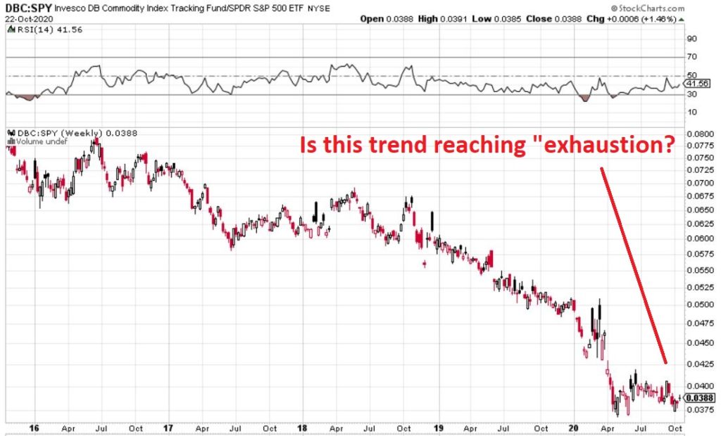
Figure 4 displays ticker DBC (a commodity-based ETF) versus SPY and Figure 5 displays ticker VTV (Vanguard Value ETF) versus ticker VUG (Vanguard Growth ETF). Both tell the same tale as Figure 3 – unless you are an avowed bottom-picker there is no actionable intelligence. Still, both these trends are now extremely overdone, so a significant opportunity may be forming.
*Nothing is happening at the moment with everything displayed above…
*…But something will (at least in my market-addled opinion) – so pay close attention.
Jay Kaeppel
Disclaimer: The information, opinions and ideas expressed herein are for informational and educational purposes only and are based on research conducted and presented solely by the author. The information presented represents the views of the author only and does not constitute a complete description of any investment service. In addition, nothing presented herein should be construed as investment advice, as an advertisement or offering of investment advisory services, or as an offer to sell or a solicitation to buy any security. The data presented herein were obtained from various third-party sources. While the data is believed to be reliable, no representation is made as to, and no responsibility, warranty or liability is accepted for the accuracy or completeness of such information. International investments are subject to additional risks such as currency fluctuations, political instability and the potential for illiquid markets. Past performance is no guarantee of future results. There is risk of loss in all trading. Back tested performance does not represent actual performance and should not be interpreted as an indication of such performance. Also, back tested performance results have certain inherent limitations and differs from actual performance because it is achieved with the benefit of hindsight.
For the record, I am a big believer in trend-following. Picking tops and bottoms with any consistency is essentially impossible (at least in my opinion and/or experience). So from that perspective going with the trend makes a lot of sense. I am also a big believer in relative strength. Much evidence over the years suggests that buying what is “already moving” is a very viable approach to investing. Other studies have demonstrated pretty clearly that you are generally much more likely to succeed by buying stocks making new highs than by buying stocks making new lows.
These approaches make good sense and they work very well over time. Despite this many (most?) investors still feel those pangs to “buy low” in hopes of getting in early and riding a major trend. And the truth (I think) is that this can work too, if done correctly.
Like I said, there are a lot of ways to play this game. But there is a definite “right” way and “wrong” way when it comes to “buying low.”
Buying Low (The Wrong Way): Buy things are plummeting or that have recently plummeted.
The Right Way (The Right Way): Buy things that have, a) plummeted, b) stopped plummeting and, c) have since been moving sideways for some period of time.
Last year I wrote about a “Buy Low” portfolio that I had concocted at the time. Unfortunately, several of the ETFs involved have since ceased trading. So in this piece I will introduce my updated “Buy Low” portfolio. For the record – and as always – I am not “recommending” this portfolio. It is essentially an experiment in one alternative approach to investing.
The “Buy Low” Portfolio
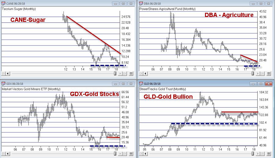
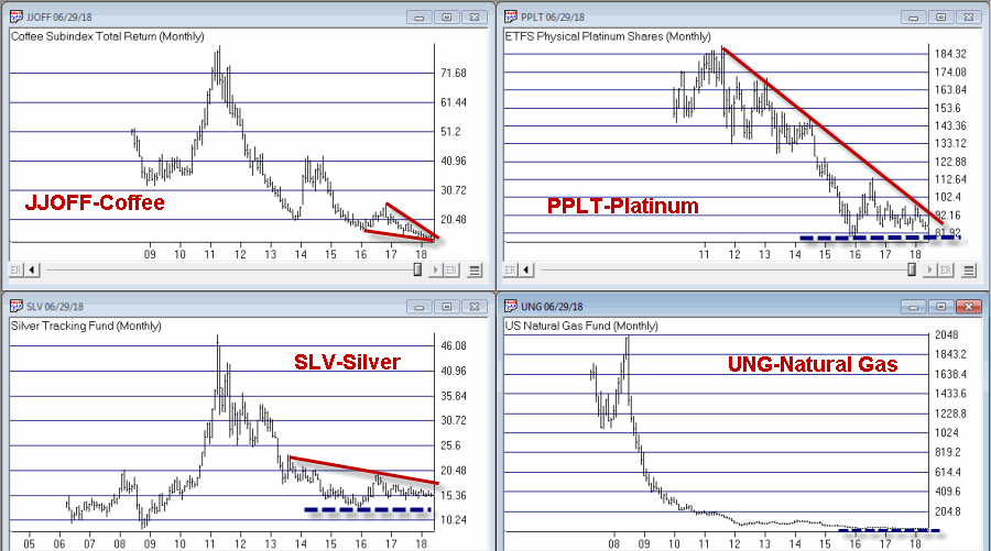
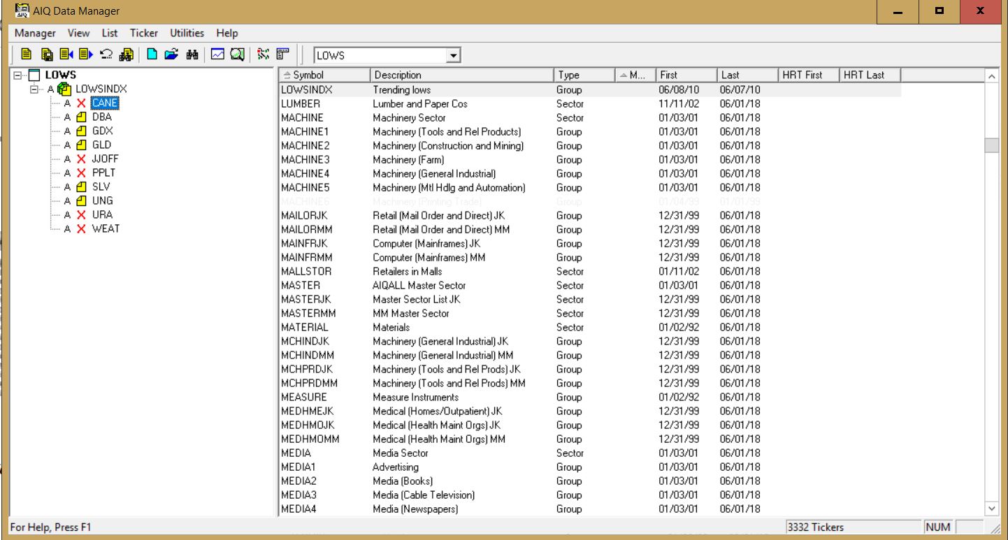
The Buy Low Portfolio consists of the following ETF’s and ETN’s:
CANE – Tecrium Sugar
JJOFF – Coffee Subindex Total Return
DBA – PowerShares Agricultural
WEAT – Tecrium Wheat
GLD – StreetTracks Gold Trust
PPLT – ETFS Physical Platinum Shares
SLV – iShares Silver Trust
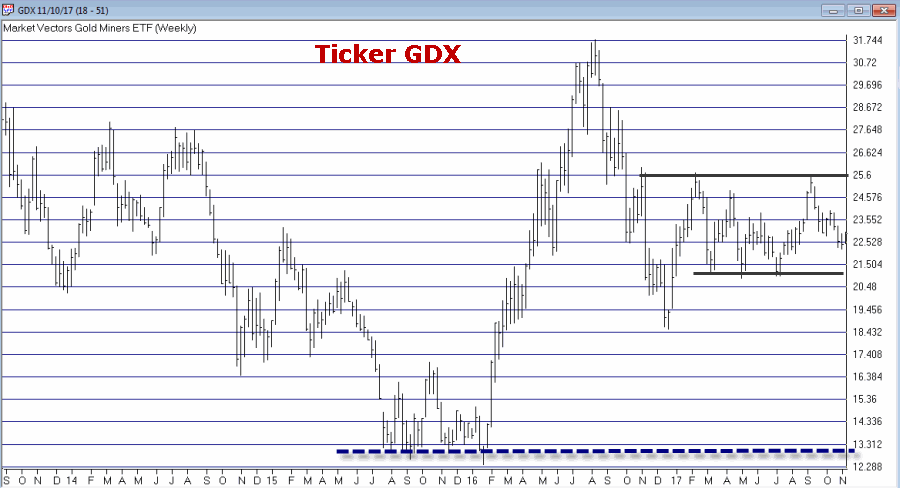
GDX – Market Vectors Gold Miners
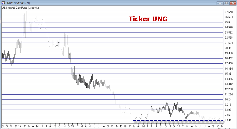
UNG – United States Natural Gas
URA – Global X Uranium
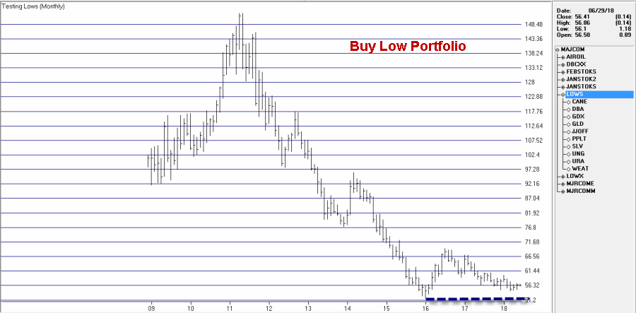
Monthly charts for these tickers appear in Figures 1 through 3. A chart of the composite index I created by combining all of these appears in Figure 4 (Click any chart to enlarge).
Editors note: To create an index like Jay’s Trending Low, follow the instructions at the end of this article ‘Creating an index for a group of tickers in Data Manager’
Summary
Securities that have plummeted in price and then moved sideways for a period of time can (unfortunately) continue to move sideways for quite a while longer before (hopefully) breaking out to the upside. Even worst, they can also fail and breakdown through the previous low. But extended consolidation patterns are often followed by something good.
As you can see all of the tickers in the list above are commodity related. As I’ve written about here and here there is reason to believe that commodities will outperform in the years ahead. That being said, with the stock market rallying in the near-term and with the U.S. Dollar strong there is no compelling reason to think that this “Buy Low Portfolio” is going to make a lot of headway anytime soon.
The Index in Figure 4 is presently 8.2% above its January 2016 low. As long as that low holds I’ll give this experiment more time to work out.
Jay Kaeppel
Disclaimer: The data presented herein were obtained from various third-party sources. While I believe the data to be reliable, no representation is made as to, and no responsibility, warranty or liability is accepted for the accuracy or completeness of such information. The information, opinions and ideas expressed herein are for informational and educational purposes only and do not constitute and should not be construed as investment advice, an advertisement or offering of investment advisory services, or an offer to sell or a solicitation to buy any security.
Creating an index for a group of tickers in Data Manager
NOTE: tickers with X in list need to be added to the Data Manager as new tickers and downloaded from your data service
When you create an index for a group of tickers, you can display a chart of the index as well as the underlying tickers. A group index can be analyzed on charts using technical indicators, and Expert Ratings are generated for the group index (except for mutual fund groups). The procedure for creating an index for a group of tickers is as follows:
First, create a group ticker for the index.
Then create a list to insert the group ticker into.
Add tickers to the group.
Finally, create the index by executing the Compute Group/Sector Indices function.
To create an index for a group of tickers, follow the steps below. First, create a group ticker: 1. First, add a new group ticker to your Master Ticker List. Select the Ticker command on the menu bar. Then select New to display the New Ticker dialog box. 2. Enter a ticker for the new group, then be sure to enter the proper Type designation (group or mutual fund group). 3. Click OK, and the second dialog box for entering a new ticker appears. 4. Type in a name (Description) and the First Date for data. The remaining default settings on this second dialog box can remain the same. 5. Click OK and the group ticker is added to your Master Ticker List. Then, create a list to insert the group ticker into: 1. Select the List command on the menu bar. 2. Select New on the drop-down menu and a dialog box appears. 3. Type in a name (8 characters maximum) in the text box. 4. Click OK and the list name appears in the Selected List text box located on the toolbar. 5. The list name is also displayed in the List window. Insert the group ticker from your Master Ticker List under the list name. To insert a ticker directly under a list, do the following:
Highlight (by clicking) the group ticker in the Master Ticker List.
Click the list name in the List window.
Click the Insert to List button on the toolbar (or select the Insert Ticker command from the List sub-menu).
The group ticker will appear in the List window under the list name.
6. Next, insert tickers into the group. To insert tickers into a group: Under the new group, insert all of the tickers that will make up the group by doing the following:
Select the group ticker in the List window by clicking on it.
Select in your Master Ticker List the tickers that you want to add to the group. If you are inserting multiple tickers, hold down the Ctrl key while clicking each ticker.
Click the Insert to List button on the toolbar (or select the Insert Ticker command from the List sub-menu).
The tickers will appear in the List window under the group ticker.
7. Finally, compute the index for the new group. To compute a group index:
Select Compute Group/Sector Indices from the Utilities sub-menu.
In the Compute Group/Sector Indices dialog box, click the Compute List(s) option button.
In the text box for Compute List(s), select the name of the list you created above.
Under Range, choose Update from Last Date of Data and click OK.
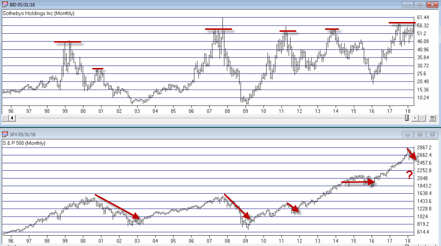
The question posed in the title is essentially, “does the fate of the stock market hinge on the action of Sotheby’s Holdings” (ticker BID)? Sotheby’s is the oldest stock on the NYSE and is the only publicly traded investment opportunity in the art market. As the art market is highly sensitive to the overall economy it has been argued that BID is a potential stock market “bellwether”.
Still, the most obvious answer to the question posed above is of course “No.” Of course the performance of the whole stock market does not come down to the performance of one stock. That’s the obvious answer.
The more curious answer is arrived at by first looking at Figure 1. Figure 1 displays a monthly bar chart for BID in the top clip and the S&P 500 Index in the bottom clip. What is interesting is that historically when BID tops out, bad things tend to follow for the broader stock market.
In Figure 2 we can see how poor performance for BID presaged an extended period of sideways trading for the SPX. At the far right we can also see that BID is at something of a critical juncture. If it punches through to the upside and moves higher it could be something of an “All Clear” sign for the market. On the other hand, if BID fails here and forms a clear multiple top, well, history suggests that that might be an ominous sign for the broader market.
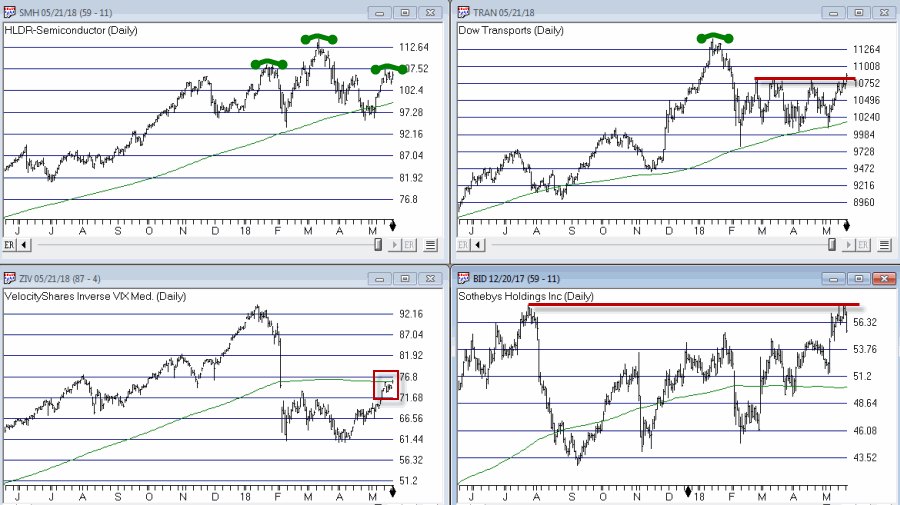
Other Bellwethers
BID is one of four market “bellwethers” that I like to monitor. The other 3 are SMH (semiconductor index), TRAN (Dow Transports) and ZIV (inverse VIX). You can see the status of each in Figure 3.
Figure 3 – Four stock market “Bellwethers” (Courtesy WinWay TradingExpert)
To sum up the current status of these bellwethers:
*All 4 (including ZIV as of the latest close) are above their respective 200-day moving average. So technically, they are all in “up trends.”
*All 4 are also threatening to create some sort of topping formation.
In sum, as long as all four of these bellwethers continue to trend higher, “Life is Good” in the stock market. At the same time, if some or all of these fail to break through and begin to top out, the broader market may experience more trouble.
Bottom line: Now is a good time to pay close attention to the stock market for “tells”.
Jay Kaeppel
Disclaimer: The data presented herein were obtained from various third-party sources. While I believe the data to be reliable, no representation is made as to, and no responsibility, warranty or liability is accepted for the accuracy or completeness of such information. The information, opinions and ideas expressed herein are for informational and educational purposes only and do not constitute and should not be construed as investment advice, an advertisement or offering of investment advisory services, or an offer to sell or a solicitation to buy any security.
In a recent articleI highlighted some stocks that appeared to have a chance of “putting in a low”. In another article, I highlighted the potential usefulness of “horizontal lines” on a chart. The phrase “putting in a low” is essentially a kindler, gentler version of the phrase “Hey, let’s pick a bottom”.
The reality is that the ability to “pick tops and/or bottoms” on any kind of a consistent basis is a skill that roughly 99.2% of all investors and traders do not possess. That being said, there is such a thing as a legitimate “bottom formation” (at least in my market addled opinion). A security that bounces several or more times off a particular price is sending information that the sellers may be running out of ammunition. These levels can be observed by drawing horizontal trend lines across a price chart – connecting recent highs and/or lows at roughly similar prices.
“Loading up” in this situation is not recommended. But committing an acceptable percentage of one’s portfolio (a level which each investor must decide on their own) to such opportunities is a perfectly acceptable form of speculation.
So for arguments sake, below is a “Bottom Pickers Portfolio”. As always, I am not recommending this as an investment, simply highlighting an alternative idea for your further consideration.
The Tickers
The tickers included in this portfolio are mostly all commodity related. That is not a purposeful choice; they simply “fit the model”.
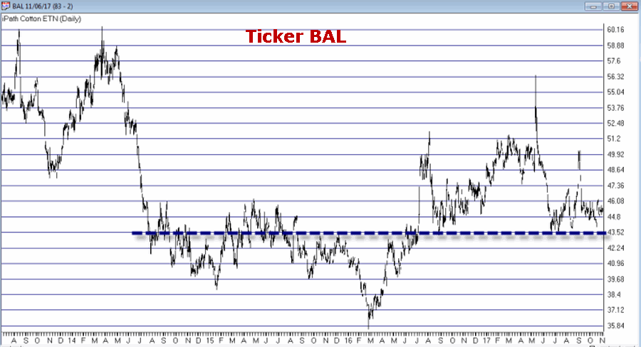
First is ticker BAL – an ETF that tracks the price of cotton futures. The critical level for BAL is roughly the $43.50 area.
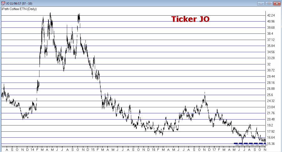
Ticker JO tracks the price of coffee futures. This is one of the weakest charts on the list and is dangerously close to failing to the downside. However, if the low holds this will strengthen the outlook a great deal.
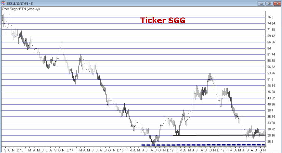
Ticker SGG tracks the price of sugar futures. SGG has been consolidating in a narrow range for about four months. Key price levels on the downside are $26.50 and the August 2015 low of $24.79.
Ticker UNG tracks natural gas futures. Thanks to the advent of fracking – which is made natural gas abundantly available – the price of natural gas has collapsed in recent years. In the past week it retested its 2016 low and then ticked higher. Like JO, this one is precariously close to “failing”. But for now…
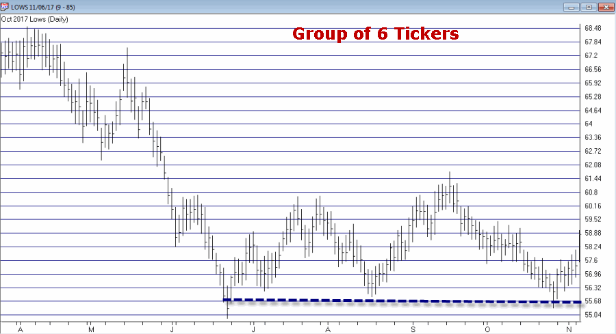
I use AIQ TradingExpert software to create my own “Groups”. So I created one called “Lows” to include the six tickers above. The group consists of an equal dollar investment in each ticker. The chart for this combination of tickers appears in Figure 7.EDITORS NOTE: Creating your own groups is accomplished in the TradingExpert Data Manager information can be found in this article ‘Adding groups and sectors to your Group/Sector List’
Figure 7 – The “Lows” Group (Courtesy TradingExpert)
Summary
Let me be blunt. There is every chance that the majority of the tickers highlighted above will continue their long-term bearish trends and break down to the downside causing further losses for those holding these shares.
The primary thing to highlight in this piece is a personal preference. I prefer “horizontal” lines on a chart – i.e., straight across, left to right – to the more typical slanted trend lines that most traders use. The reason is simply – upward or downward slanting trend lines require a trader to decide which two (or more) highs (or lows) to connect in order to draw the trend line. At the end of the day this is often a subjective decision.
Horizontal trend lines – which connect to (at least roughly equal) highs or lows – are generated by the market itself and as such, are more objective in nature. In other words, investor buying and selling determines these levels.
Will my “Bottom Pickers Portfolio” move to the upside or fail to the downside? We’ll just have to wait to find out.
Jay Kaeppel Chief Market Analyst at JayOnTheMarkets.com and AIQ TradingExpert Pro client.
Disclaimer: The data presented herein were obtained from various third-party sources. While I believe the data to be reliable, no representation is made as to, and no responsibility, warranty or liability is accepted for the accuracy or completeness of such information. The information, opinions and ideas expressed herein are for informational and educational purposes only and do not constitute and should not be construed as investment advice, an advertisement or offering of investment advisory services, or an offer to sell or a solicitation to buy any security.
In my last piece I note that the U.S. stock market presently stands alone in terms of recent performance. While virtually every major U.S. stock market average has run to new highs in the last several weeks, not one other individual country has really even come close. While this might induce spontaneous chants of “USA, USA”, the truth is that this may not necessarily be a good thing.
This current disconnect will likely be resolved in one of two ways:
A) The USA will drag the rest of the world screaming and kicking to enjoy in our newfound prosperity (assuming of course that we finally stumble upon that actual newfound prosperity that the stock market is telling us we should be celebrating).
B) The USA fails to pull up the rest of the world and the US stock market gets “dragged down” with the rest of the world’s bourses.
This is the part in the article where a skilled market analyst would offer up a clear and concise opinion of what will happen next and why. And if one happens to stop by the office in the next few minutes or so I will ask him or her what they think. All I know is that at the moment the US stock market is in an uptrend and that the majority of the rest of the world’s stock markets are fair to middling at best (with many looking much worse).
Until something changes I will stick to the US market, thank you very much.
A Little “Worldly” Perspective
What follows is essentially the world (stock markets) in pictures. The purpose is simply to provide you with some perspective regarding the state of the markets around the globe.
The key thing to note is:
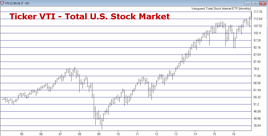
*Figure 1 shows U.S. stocks making new highs
*Figures 2 through 6 show the rest of the world’s stock markets lagging far behind
Click Figures 1 through 6 to enlarge
Figure 1 – U.S. Stocks soaring to new highs (Courtesy TradingExpert)
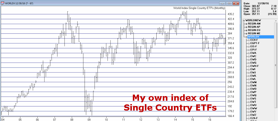
Figure 2 – My Own Index of Single Country ETFs; -17% below 2014 high (Courtesy TradingExpert)
Editor’s note: information on creating your own index of ETFs or any other tickers in TradingExpert can be found here http://www.aiqsystems.com/Feb06%20OBM.pdf on page 5, titled Ability to Create Industry Groups for Your Special Trading Needs….
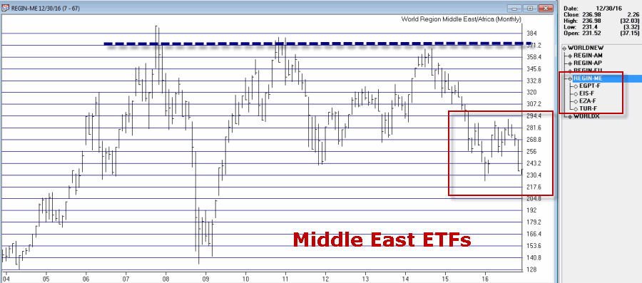
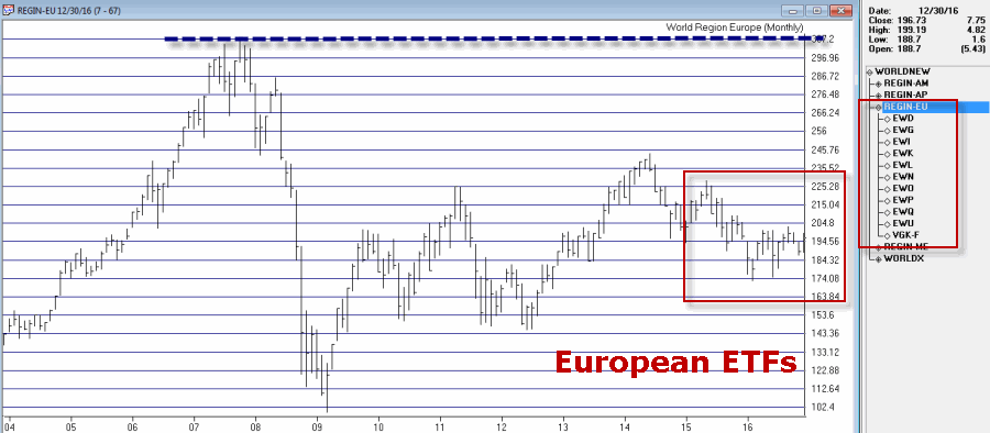
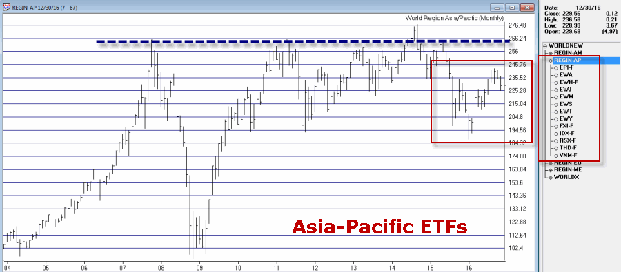
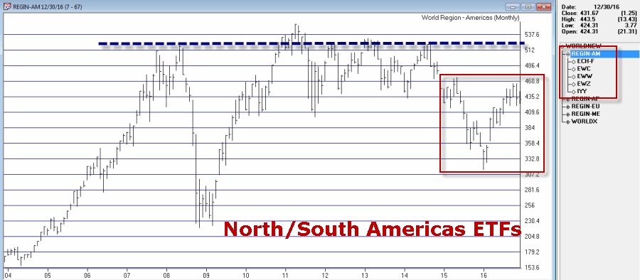
In Figures 3 through 6 note that the overall “stock market malaise” is not limited to one portion of our earth, but rather stretches pretty far East, West, North, South and pretty much all points in between.
Figure 3 – Middle East Stocks; -40% below 2007 high (Courtesy TradingExpert)
Figure 4 – European Stocks; -36% below 2007 high (Courtesy TradingExpert)
Figure 5 – Asia-Pacific Stocks;-17% below 2014 high (Courtesy TradingExpert)
Figure 6 – North/South America Stocks; -22% below 2011 high (Courtesy TradingExpert)
Wishing you (please choose any or all of the following that are applicable):
*Merry Christmas
*Happy New Year
*Happy Holidays
*Joy
*Peace on Earth
*[Some other phrase that you do not find offensive here]