September 7, 2022 – 3pm to 7pm London time, four hour in-depth webinar
covering these in-depth topics, crucial to your successful trading.
Early bird pricing now in effect, see below to book your discounted price and save over 20%
****** Includes PDF handouts and access to the recordings of the event ******
Session 1 – Power tools and features in your WinWayCharts and how to use them
Color Studies, Overlays, Custom Indicators, Seasonality, and Matchmaker. These are important and powerful tools in your WinWayCharts. In this session, we’ll show how to set a Color Study and why, what Overlays are useful for, and more. Learn how these tools will save you time and how they contribute to your trading decisions. Darren’s 3 favourite Bullish/Bearish strategies will be used as the basis for the color study.
Session 2 – Darren’s Indicators and how to apply them
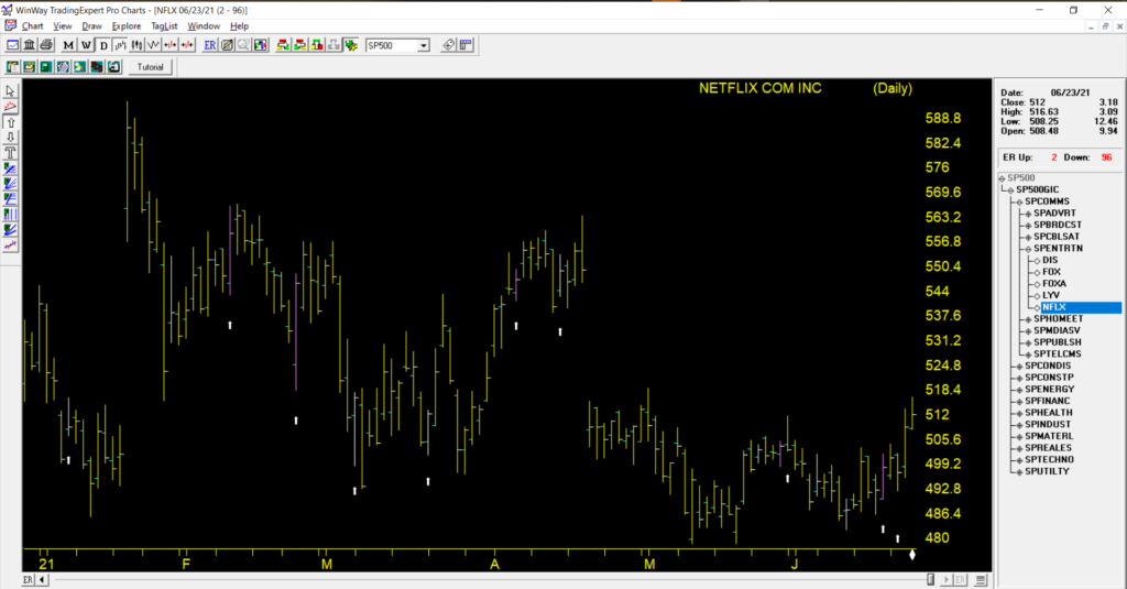
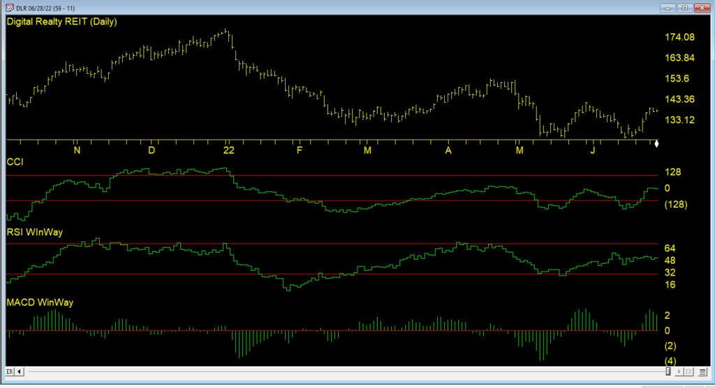
Some indicators are more reliable than others. In this session, we’ll look at some of the nuances of MACD WinWay, RSI WinWay and the CCI indicators and how they add confidence to our trading decisions. We’ll explore these 3 indicators in-depth with examples of them in action in the stock market.
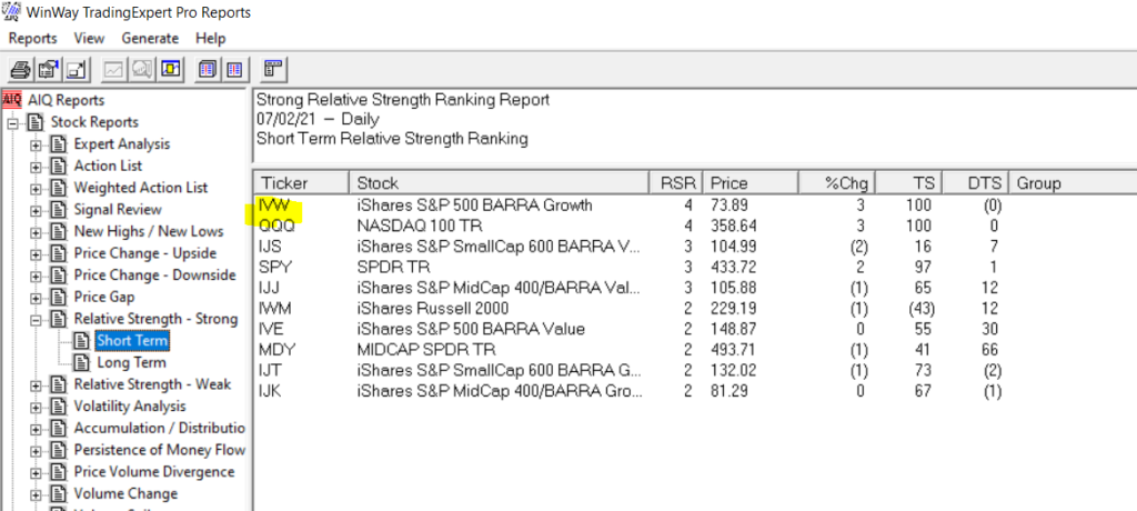
Session 3 – Exchange traded funds rotation strategy so you never have to go short
Using the reports in WinWayCharts we’ll look at a tried and tested ETF rotation strategy that is simple and yet effective at getting you in the right market segment at the right time. This strategy is simple to execute and has consistently beat the market over multiple years. While this strategy doesn’t replace your regular trading, it’s a good place to consider for a segment of trading.
Session 4 – Live Trading using Darren’s Favorite Candlestick Strategy and ETF Strategy
Starting from Market Timing, then moving to the Darren’s 3 Favourite Candlestick Strategy and the ETF Rotation Report, we’ll look for candidate stocks. Using the WinWayCharts indicators we’ll look to confirm the best of the best stock and ETF candidates to place trades with stops using a live trading account.
Your Presenters: Ray Foreman UK director WinWayCharts and, Steve Hill, CEO AIQ Systems, and founder WinWayCharts
Master Trading with WinWayCharts Webinar
September 7, 2022
Early bird pricing now in effect save over 20%
ONLY $299 229
includes all handouts in PDF and access to recordings
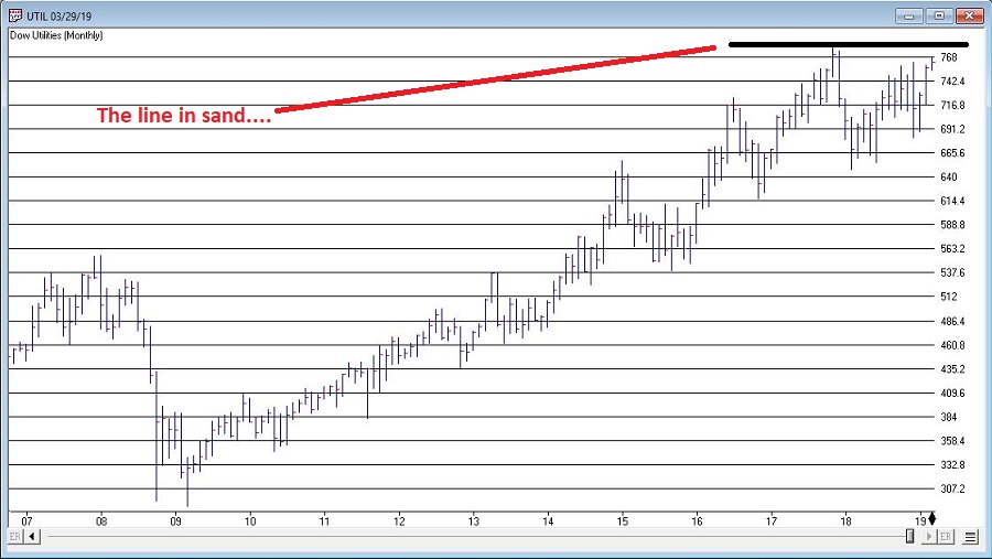
A lot of eyes are firmly fixed on Utilities at the moment. And for good reason. As you can see in Figure 1, the Dow Jones Utilities Average is presently facing a key resistance level. If it breaks out above the likelihood of a good seasonal rally (more in a moment) increases significantly.
Figure 1 – Utilities and resistance (Courtesy WinWayCharts TradingExpert)
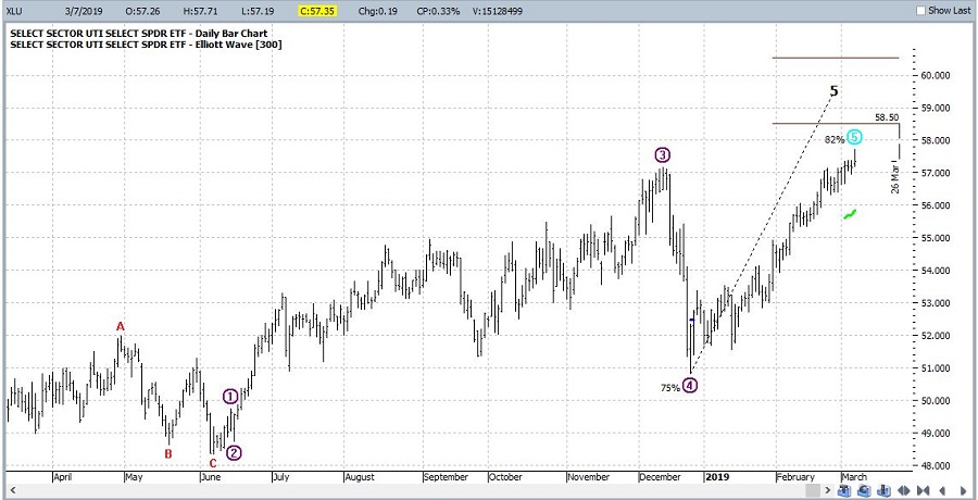
One concern may be the fact that a 5-wave Elliott Wave advance appears to possibly have about run its course (according to the algorithmically drawn wave count from ProfitSource by HUBB which I use). See Figure 2.
For what it is worth, the March through July timeframe is “typically” favorable for utilities. Figure 3 displays the growth of $1,000 invested in the Fidelity Select Sector Utilities fund (ticker FSUTX) ONLY during the months of March through July each year starting in 1982.
Figure 3 – Growth of $1,000 invested in ticker FSUTX Mar-Jul every year (1982-2018)
For the record:
*# times UP = 29 (78%)
*# times DOWN = 8 (22%)
*Average UP = +9.3%
*Average DOWN = (-5.8%)
*Largest UP = +21.1% (1989)
*Largest DOWN = (-25.8%) (2002)
*Solid performance but obviously by no means nowhere close to “a sure thing”.
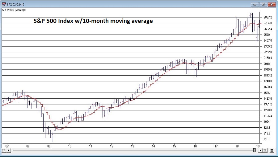
*It should be noted that several of the “Down” years occurred when the S&P 500 was already in a pretty clearly established downtrend (2001, 2002 and 2008), i.e., below its 10-month moving average. See Figure 4.
Figure 4 – S&P 500 Index w/10-month moving average (Courtesy WinWayCharts TradingExpert)
Summary
Utilities are flirting with new all-time highs and March through July is a “seasonally bullish” period for utilities. Does that mean “happy days are here again, and we should all be piling into utilities? Yeah, isn’t that always the thing about the markets? There is rarely a 100% clear indication for anything.
As always, my “prediction” about what will happen next in utilities is irrelevant and I am NOT pounding the table urging you to pile in. But I can tell you what I am watching closely at the moment:
*The S&P 500 Index is flirting right around its 10-month moving average (roughly 2,752 on the S&P 500 Index). If it starts to break down from there then perhaps 2019 may not pan out so well for utilities.
*The Dow Jones Utility Average is facing a serious test of resistance and may run out of steam (according to Elliott Wave).
*But a breakout to the upside could well clear the decks for utilities to be a market leader for the next several months
Focus people, focus.
Jay Kaeppel
Disclaimer: The data presented herein were obtained from various third-party sources. While I believe the data to be reliable, no representation is made as to, and no responsibility, warranty or liability is accepted for the accuracy or completeness of such information. The information, opinions and ideas expressed herein are for informational and educational purposes only and do not constitute and should not be construed as investment advice, an advertisement or offering of investment advisory services, or an offer to sell or a solicitation to buy any security.
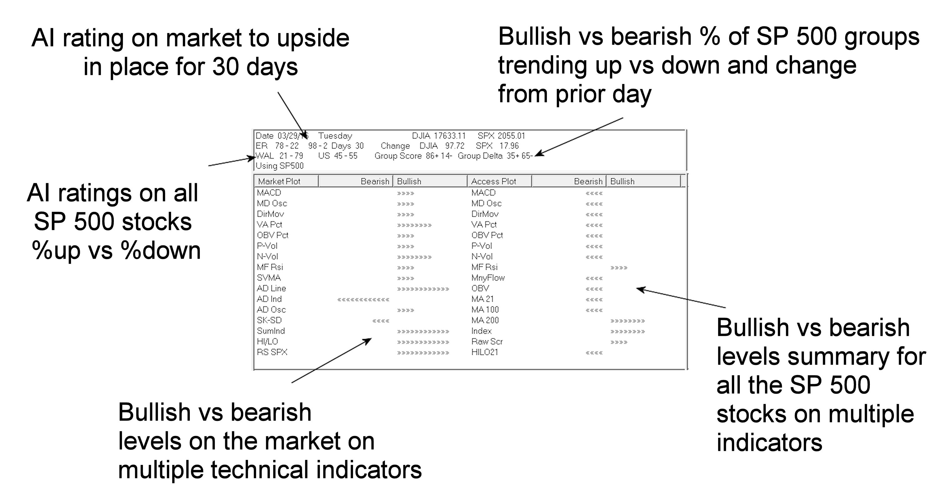
In your WinWay TradingExpert or TradingExpert Pro package, look for the icon for Reports and open it. The Market Log is toward the bottom of the list on the left.
Trading and investing becomes clearer when you’re armed with this snapshot of the market and SP 500 stocks every day.
– AI rating on the market and how long it has been in place
– AI rating on all Sp 500 stocks percentage showing up ratings vs down ratings
– Bullish vs bearish levels on the market on multiple techncial indicators
– Bullish vs bearish percentage of SP 500 groups trending up vs down and the change from prior day
– Bullish vs bearish levels summary for all the SP 500 stocks on multiple indicators
While looking through the seasonal trends in stocks and currencies, we decided to start running the seasonality scans on the S & P 500 groups. As a reminder here are the criteria we consider when running this.
Our study looks at 7 years of historical data and looks at the returns for all groups in the S & P 500 for the month of July from 2006 to 2013.
We do make an assumption that the month is 21 trading days and work our way back from the last day of the month. July also has the July 4th holiday and a half day trading on July 3rd. if the last day of the month falls on a weekend, then we use the first trading day prior to that date.
We make no assumptions for drawdown, nor do we look at the fundamentals behind such a pattern. We do compare the group to the market during the same period and look at the average SPY gain/loss vs. the average group gain/loss. This helps filter out market influence.
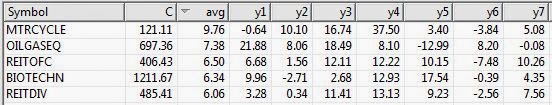
Finally we look at the median gain/loss and look for statistical anomalies, like meteoric gains/loss in one year. Here are top 5 performing groups based on average return.
Average return alone is misleading. In the seasonal analysis we need consistent patterns in the price action throughout the periods we are testing, in this case 7 years. While The S & P 500 Motorcycle manufacturers group (MTRCYCLE) looks good on average, it includes one stellar July of 37.50% back in 2010, and has 2 July’s that were negative returns. NOTE: there’s only one stock in the group (guess which one that is!).
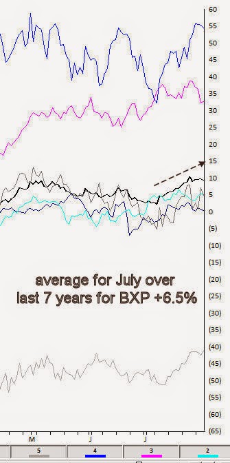
The office REITs group (REITOFC) is more consistent. It has an average return for the last 7 years in July of 6.50%, with the last 6 years Julys all positive. There are no stellar months skewing the average. The group also contains only one stock, Boston Properties [BXP].
Here’s the seasonal chart for BXP
Interestingly the other consistent group in July is another REIT, the Diversified REITs (REITDIV). It has an average return for the last 7 years in July of 6.06%, with the last 6 years Julys all positive. There are no stellar months skewing the average. The group also contains only one stock, Vonando Realty Trust [VNO].
A quick check on what the market did during the same period reveals an average return of 1.83% with 4 gaining Julys and 3 losing Julys.
The Oil & gas Equipment group (OILGASEQ) also had a decent average, but is more volatile over the past years, however the last 5 years have all been gainers.
Remember, we don’t draw conclusions here, just mine for information.
…and down will come, well just about everything, as far as I can tell.
OK, for the record maybe it should say “If the Dow Breaks.” After all I am still firmly ensconced here at “Camp Bull.” I would like to attribute this to disciplined nerves of steel, but it would be an understatement to say that that would be an overstatement. The truth is my crystal ball broke a very long time ago (sadly I continued believing what it portended for a long time before I realized it was actually broken). So I have long since held dual citizenship in “Camp Trend Follower”.
But I have got be honest…..I am feeling the urge to run like a sissy through the woods to “Camp Yikes”.
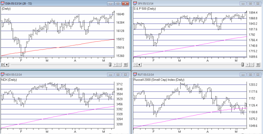
The Overall Market Defining the “overall” market is something of a crapshoot these days, as some of the “overall” market seems to be going one way and another part of the “overall” market seems to be going another way. In Figure 1 we see the Dow, the S&P 500, the Nasdaq 100 and the Russell 2000.
Figure 1 – The Four Major Averages with 200-day moving averages (charts courtesy AIQ TradingExpert Pro)
In a nutshell, the “Generals” are still marching but the “Troops” are in retreat. Now every market pundit seems to be offering up their opinion as to whether the “Generals” will ultimately lead the troops higher or the other way around. With my crystal ball still out of order I must unfortunately go with my stock answer here of “it beats the heck out me.” And “hey things are swell here at Camp Bull.” But I have been around this business long enough to remember several instance where the “Troops” led the way (1984, 1987, 1990, 2000, 2008) and the “Generals” followed. So we’ll see what we see.
OK, just in case that little segment was not foreboding enough, let’s get to the really “scary” part.
Sectors Suck in Summer (during Mid-term years) One caveat before I even launch, the sample size of what I am about to detail is very small (6 calendar years each four years apart starting in 1990). Also, that’s the good news. As a “seasonalaholic” (“Hi, my name is Jay”) I am acutely aware of the following facts:
1. The market tends to perform better between the end of October and the third trading day of the following May than it does from the third trading day of May through the end of October (also known as “Where We Are Now.”)
2. This is a mid-term election year.
I also do a lot of work with sectors and sector funds as I have found that investing at the right sector at the right time is – all kidding aside – one heck of a great way to invest. So I was curious as to which sectors tended to perform the best during the May to October period during mid-term election years. Here is the short list:
Health Care. Period.
Everything else. Well on a buy in May and sell in October basis – let’s just say it isn’t pretty. So here is the test I ran:
Tracking the growth of $1,000 invested in each Fidelity Select Sector fund only: *Between the close of May trading day 3 and the end of September (for the record, October tends to be an OK month during mid-term election years – more on this topic in a future article) during each mid-term election year.
The results appear below in Figure 2. If you are squimish you might want to brace yourself.
Fund
%+(-)
FBIOX
(12.1)
FBMPX
(34.5)
FBSOX
(36.9)
FCYIX
(28.8)
FDCPX
(42.4)
FDFAX
(3.7)
FDLSX
(45.9)
FIDSX
(55.9)
FNARX
(35.4)
FPHAX
(18.6)
FSAGX
(1.6)
FSAIX
(65.7)
FSAVX
(71.4)
FSCGX
(58.9)
FSCHX
(49.7)
FSCPX
(31.2)
FSCSX
(35.9)
FSDAX
(62.7)
FSDCX
(38.2)
FSDPX
(57.5)
FSELX
(71.0)
FSENX
(42.9)
FSESX
(65.3)
FSHCX
(20.1)
FSHOX
(79.1)
FSLBX
(59.1)
FSLEX
(49.6)
FSMEX
(12.0)
FSNGX
(47.5)
FSPCX
(27.2)
FSPHX
41.6
FSPTX
(42.0)
FSRBX
(59.5)
FRESX
(26.4)
FSRFX
(61.2)
FSRPX
(43.8)
FSTCX
(35.4)
FSUTX
(12.1)
FSVLX
(59.1)
FWRLX
(32.8)
FNARX
(35.4)
Figure 2 – Net %+(-) invested only between 3rd trading day of May and last trading day of September during mid-term election years (1990 , 1994, 1998, 2002, 2006, 2010, 2014)
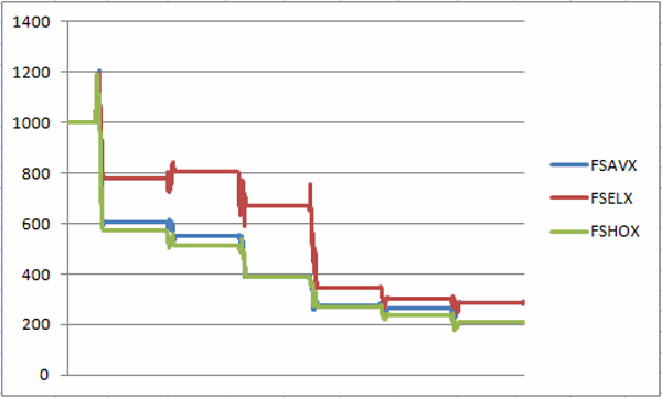
Anyone notice a trend? To see just how bad things can be, once you are able to work yourself back up out of the fetus position, take a glance at Figure 3, which shows the three worst performers during the May-Sep mid-term year period – FSAIX (-71%), FSELX (-71%) and FSHOX (-79%).
Figure 3 – FSAIX, FSELX, FSHOX – growth of $1,000 May through Sep of mid-term election years (1988-present)
Now I have an obvious flare for the obvious (which I think should be pretty obvious – also I tend to repeat myself) but I am not even going to comment on Figures 2 and 3.
The Good News The one mistake you should not make based on looking at these numbers and charts is to assume that it is not possible to make money in sector funds between May and September of mid-term years. It just requires something better than a buy and hold approach. Several momentum systems and seasonal plays that I have developed over the years have still managed to show some pretty good gains historically “among the ruins” of midterm election summer months.
But if you’re gonna play, you’d better bring your “A” game.
Summary Repeating now – I am still in “Camp Bullish.” And ideally I’d like to spend the summer. There seems to be a lot of fear and loathing among the “crowd” that I follow regarding the stock market. Typically that’s a good thing and suggests that the stock market just might surprise everyone this time around. And I hope that it does.
But I will be keeping a pretty close eye on my “camp mates” in the days and week ahead. Any sign of “trouble” (i.e., Dow, S&P breaking below 200-day moving averages) and they are going to have to send a search party out to find me……
Jay Kaeppel Chief Market Analyst at JayOnTheMarkets.com and AIQ TradingExpert Pro (http://www.aiq.com) client
Jay has published four books on futures, option and stock trading. He was Head Trader for a CTA from 1995 through 2003. As a computer programmer, he co-developed trading software that was voted “Best Option Trading System” six consecutive years by readers of Technical Analysis of Stocks and Commodities magazine. A featured speaker and instructor at live and on-line trading seminars, he has authored over 30 articles in Technical Analysis of Stocks and Commodities magazine, Active Trader magazine, Futures & Options magazine and on-line at www.Investopedia.com.
If there is one is universally true statement that I can make about trading systems in general and in specific, it is this – they sure are fun when they work.
When I first started trading – back in what I longingly refer to as the “Hair Era” in my life – I figured that I would be a “gut” trader – i.e., I was determined to rely on my keen instincts and intuitive reasoning to decide when to buy and sell based on current market conditions.
That was not fun. After continually getting sucked into the swirling vortex of emotion – not to mention the abject fear associated with seeing your money disappear – I found that I was getting the, um, back of my front so to speak, burned so many times that I was having difficulty, um, sitting down, so to speak.
Eventually I evolved into a systematic trader. Now I am able to sit down much more often. A few strategies that I have developed over the years have stood the test of time and become something of “bread and butter” strategies. And they sure are fun when they work. To wit….
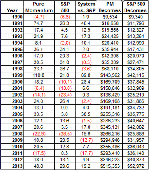
Jay’s Pure Momentum System
In 2001, I published an article in “Technical Analysis of Stocks and Commodities” magazine titled “Trade Sector Funds with Pure Momentum”, which detailed one specific and simple trading method. While in fact this is only one of many sector trading systems that I have developed over the years – and not necessarily the best one – it remains one of my favorites. Probably because it is just so gosh darn simple. When I was young my Momma told me to be a simple kind of man (or was it a Freebird she told me to be?). Well, in any event, here are the “simple kind of rules” using Fidelity Select Sector funds:
– After the close of the last trading day of the month identify the five Fidelity Select Sector funds that have the largest gain over the previous 240 trading days.
– For this system, ignore Select Gold (ticker FSAGX). If FSAGX appears in the top 5 funds then skip it and include the 6th highest rated funds.
– If fewer than five funds showed a gain over the previous 240 trading days, then hold cash in that portion of the portfolio (i.e., if only 3 funds showed a gain, then 60% of the portfolio would be in those funds and 40% of the portfolio would be in cash).
– If you sell more than one fund at the end of a month, then rebalance the proceeds in the new funds being purchased (example, you are selling Funds A and B and buying Funds C and D. You have $12,000 in Fund A and $10,000 in Fund B. Split the difference and put $11,000 each into funds C and D).
And that’s all there is to it.
The Results Figure 1 displays the annual results of this method.
Figure 1 – Jay’s Pure Momentum Annual Results
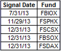
Figure 2 displays the current portfolio.
Figure 2 – Jay’s Pure Momentum Current Portfolio
My opinion as to why this system has performed well over the years is, well – what else – simple. The effects of a positive change in the fundamentals for a given industry or sector typically take a long time to play out. Thus, by finding the sectors that are performing well you very often find the sectors that are most likely to continue to perform well for a while.
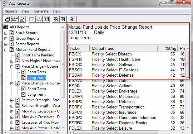
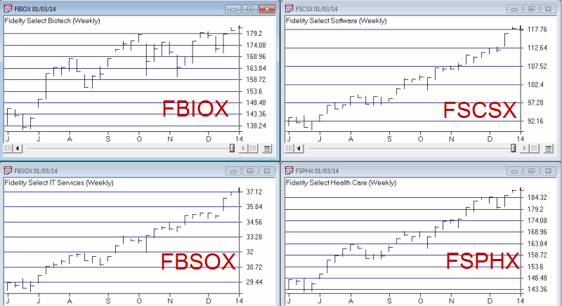
Figure 3 – 12/31/13 Test (Courtesy: AIQ TradingExpert)
Figure 4 – Several Current Sector Fund Holdings (Courtesy: AIQ TradingExpert)
Summary
Obviously 2013 was a banner year for this system. There is nothing like a rip roaring bull market to help things along. A couple of caveats:
*First off, sometimes people new to momentum investing will look at the charts in Figure 4 and say “Whoa, these things have already rallied sharply, I’m not jumping into those.” That’s something you’ll have to get over to use this system.
*Secondly, while the long-term yearly numbers look pretty good, there was about a 45% drawdown along the way in 2008. So it is not for the faint of heart.
*One other danger is that some people see +48.8% for the year in 2013 and get it in their head that this will occur again often. History suggests otherwise.
Still, an average annual return of +20.7% since 1990 (versus +8.9% for the S&P 500) isn’t bad – especially for a “Simple Kind of System.”
Best of Good Fortune in 2014. Jay Kaeppel
Chief Market Analyst at JayOnTheMarkets.com and AIQ TradingExpert Pro (http://www.aiq.com) client
Jay has published four books on futures, option and stock trading. He was Head Trader for a CTA from 1995 through 2003. As a computer programmer, he co-developed trading software that was voted “Best Option Trading System” six consecutive years by readers of Technical Analysis of Stocks and Commodities magazine. A featured speaker and instructor at live and on-line trading seminars, he has authored over 30 articles in Technical Analysis of Stocks and Commodities magazine, Active Trader magazine, Futures & Options magazine and on-line at www.Investopedia.com.