The importable EDS file based on Markos Katsanos’ article in April 2022 issue of Stocks and Commodities magazine, “Stock Market Seasonality,” can be obtained on request via email to info@TradersEdgeSystems.com. The code is also available below.
Synopsis:
Should you sell in May, or later in the summer, or never? Is October the best reentry month? Which are the best and worst months for the stock market? And are there statistically significant seasonal patterns in the equity markets? Can we improve on a seasonal system using other technical conditions?
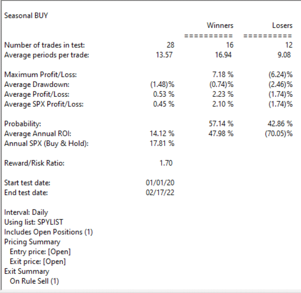
Code for the author’s system is set up in the AIQ code file. Figure 9 shows a summary EDS backtest of the system using the SPY ETF from 1/1/2000 to 2/17/2022.
FIGURE 9. This shows the summary EDS backtest of the system using the SPY ETF from 1/1/2000 to 2/17/2022.
!Stock Market Seasonality
!Author: Markos Katsanos, TASC April 2022
!Coded by: Richard Denning, 2/10/2022
C is [close].
C1 is valresult(C,1).
H is [high].
L is [low].
V is [volume].
Avg is (H+L+C)/3.
VIXc is TickerUDF(“VIX”,C).
VIXc1 is valresult(VIXc,1).
VIXllv is lowresult(VIXc,25).
VIXllv1 is valresult(VIXllv,1).
VIXhhv is highresult(VIXc,25).
VIXhhv1 is valresult(VIXhhv,1).
VIXDN is (VIXc1 / VIXhhv1)100. VIXUP is (VIXc1 / VIXllv1)100.
TR is max(max(C1-L,H-C1),H-L).
ATR is expavg(TR,152-1). ATR1 is valresult(ATR,1). ATRllv is highresult(ATR,25). ATRllv1 is valresult(ATRllv,1). ATRhhv is highresult(ATR,25). ATRhhv1 is valresult(ATRhhv,1). ATRDN is (ATR1 / ATRhhv1)100.
ATRUP is (ATR1 / ATRllv1)*100.
!VFI
Period is 130.
Coef is 0.2.
VCoef is 2.5.
inter is ln( Avg ) – ln( valresult( Avg, 1) ).
Vinter is Sqrt(variance(inter, 30 )).
Cutoff is Coef * Vinter * C.
Vave is valresult( simpleavg( V, Period ), 1 ).
Vmax is Vave * Vcoef.
VC is Min( V, Vmax ).
MF is Avg – valresult( Avg, 1 ).
VCP is iff(MF > Cutoff, VC, iff(MF < -Cutoff, -VC, 0 )).
VFI1 is Sum( VCP, Period ) / Vave.
VFI is expavg( VFI1, 3 ).
SELLMONTH is 8.
VIXUPMAX is 60.
CRIT is -20. !VFI SELL
K is 1.5. !ATR/VIX RATIO
VOLCONDITION is (VIXUPCRIT.
BUY if (Month()>=10 OR Month()2*VIXUPMAX. !VOLATILITY EXIT
SELLMF if CRIT > VFI AND valrule(CRIT < VFI,1) AND simpleavg(VFI,10)<valresult(simpleavg(VFI,10),1).
Sell if SELLSEASONAL OR valrule(SELLVOLATILITY,1) OR valrule(SELLMF,1).
This time of year you might expect us to be thinking about the Santa Claus rally, but after the beating we’ve had the last few days, lets check and see how effective this really is.
What Is a Santa Claus Rally?
I lifted this description from Investopedia
A Santa Claus rally describes a sustained increase in the stock market that occurs in the last week of December through the first two trading days in January. There are numerous explanations for the causes of a Santa Claus rally including tax considerations, a general feeling of optimism and happiness on Wall Street, and the investing of holiday bonuses. Another theory is that some very large institutional investors, a number of which are more sophisticated and pessimistic, tend to go on vacation at this time, leaving the market to retail investors, who tend to be more bullish.
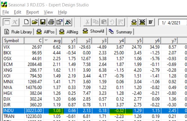
To test this in Expert Design Studio, I used the Seasonality3 ED built-in strategy. I set the Season Length days to 7 days to encompass the last 5 trading days of December and the first 2 days in the New Year.
By setting the date to 1/4/21, the rule looks back 7 trading days from January 4th, each of the last 7 years and gives us an approximate percentage return for each of those 7 days.
Some years with weekends and extra holiday days plus 252 is used as default trading days skew results a small amount. To compensate I also tested 10 trading days back from January 7. The results from the 7 days are below, I tested all the indices in my current database.
INDU is highlighted, this is the Dow 30 index. First it’s clear that in every year except for one, over the last 7 years the Dow has made gains in the Santa Claus period. The average gain Is over 1%. Not too bad for a 7 day trading period. BTW the results from the 10 days from January 7 were similar.
The NASDAQ on the contrary had 3 losing years out of the 7.
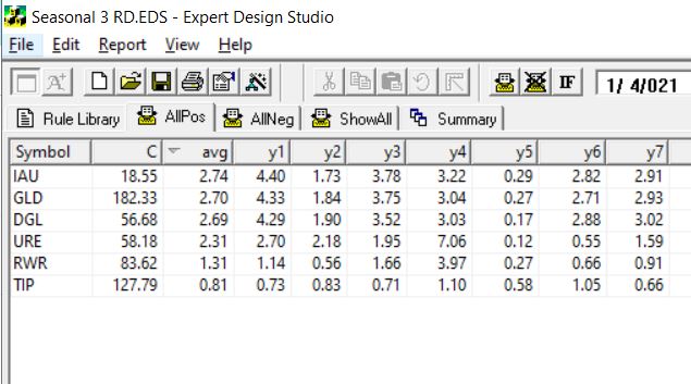
So next I decided to look at what ETFs are most likely to have a Santa Claus rally. Here’s the results using the 7 trading days back from Jan 4. This is the ETFs that had gains every year for the last 7.
The first 3 ETFS are all Gold related, the next two are real estate/REITs the last one is a bond fund. Hmm something to keep in mind.
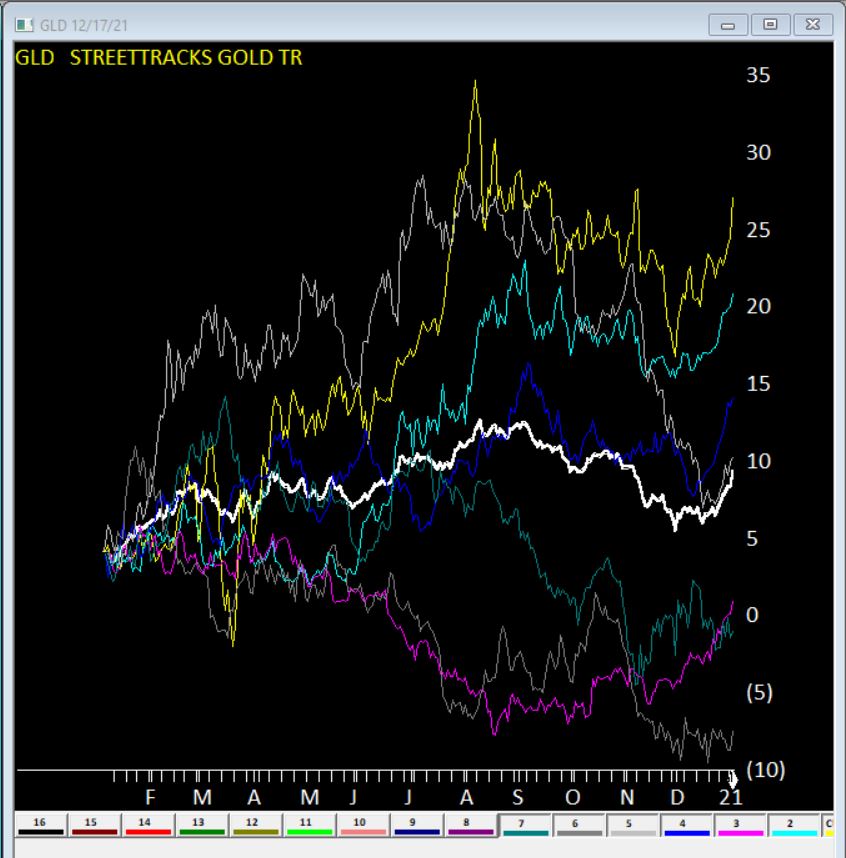
Here’s GLD seasonal charts the right hand side of each year shows the Santa Claus rally clearly. The White line is the average of all 7 years.
Clearly no guarantees what will happen this year, but something to keep in mind.
OK, for the record, I have stood in enough long lines next to impossibly sweaty people (Full Disclosure: They likely feel the same way about me) to know that all of the talk of “Disney” and “Magic” is strictly for marketing consumption. That being said – and despite the fact that you cannot attend the flagship property in sunny CA, and likely will not be able to for some time – there is something about “going to Disney” that still strikes a chord with a whole lot of people.
Of course, my interest here is more financial in nature.
Now the “rational” thing to do in the minds of most investors is to ask and answer some serious questions regarding “theme park attendance.” in the age of COVID-19. Questions like “will attendance pick up anytime soon” and “will DIS continue to be an economic powerhouse if attendance does not return to pre-Covid levels?”
Here is a link to a factual, well-researched and well-written article noting that Disney World attendance as of 8/21/20, attendance was down 80% from a year earlier. Scary stuff, right? And the snap implication is fairly obvious – theme parks are suffering and may continue to do so for the foreseeable future.
But as I mentioned, my interest is more financial in nature. And I tend to look at things from a slightly different angle than a lot of other people. Part of that is because I have come to recognize that (like a lot of other people, but sadly unbeknownst to a lot of those same people) I (and they) am not very good at accurately answering “questions about the future”, such as those posed above about theme parks.
I read that theme park attendance is “down 80%” and instantly that voice in my head loudly issues that age-old “DANGER! WARNING WILL ROBINSON” alert and I feel the urge to scurry off in the other direction. But fortunately, I have gotten pretty good at not overreacting to that initial warning and coming back for a second glance.
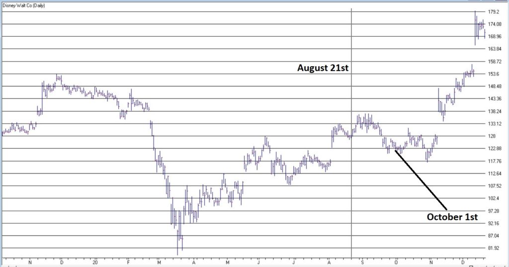
Consider Figure 1. The date marked by the vertical line is August 21, 2020, i.e., the day that the news came out that “Disney World attendance is down 80%, that heavy discounting going on, that Disney stock is down for the year and that it is lagging the major stock indexes.”
Since that “DANGER! WARNING WILL ROBNINSON” moment, DIS is up +34% in 4 months, versus +9% for the S&P 500 Index (FYI, DIS is now up 18% for 2020 vs. 14%+ for the S&P 500).
Are the financial markets a perverse beast, or WHAT!?
The “Real Magic” of Disney Stock
So, what the heck happened to make DIS stock burst higher even in the face of seemingly very bad fundamental news? Well, long story short, October 1st happened. Wait, what? October 1st? Surely it can’t be that simple!?
Here’s the thing: it probably should not be that simple. And there is absolutely no guarantee that it will continue to be that simple. But for the past roughly 6 decades…. it has been just about that simple. Consider Figure 2.
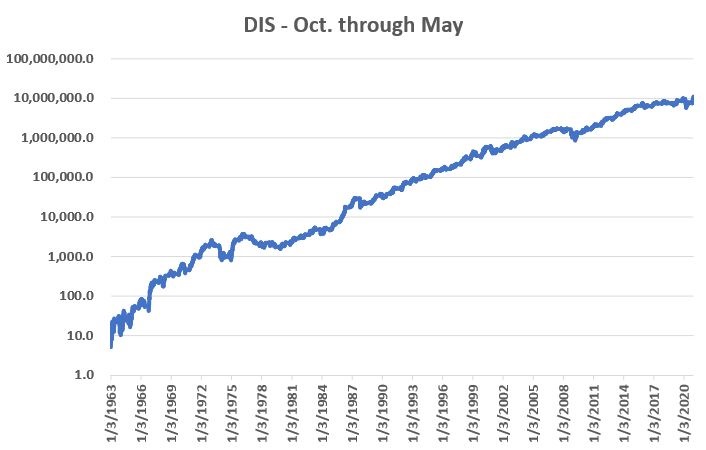
Figure 2 displays the cumulative % gain for DIS stock held ONLY from October 1st each year through the end of May the following year, every year since 1962.
Figure 2 – DIS % +(-) during October through May (logarithmic scale)
An initial $1,000 investment in DIS stock held only October through May starting in 1962 is worth $108,512,237 as of 12/18/2020, or a gain of +10,851,124%.
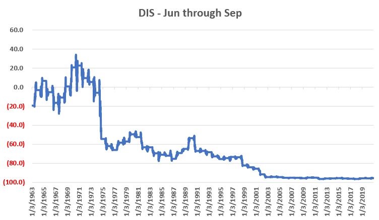
Figure 3 displays the cumulative % gain for DIS stock held ONLY from June 1st each year through the end of September that same year, every year since 1962.
Figure 3 – DIS % +(-) during June through September (non-logarithmic scale)
An initial $1,000 investment in DIS stock held only June through September starting in 1962 is worth $44.86 as of 12/18/2020, or a loss of -95.5%.
The Upshot
Many investors will ask the obvious question of “Why does this work?” And the most succinct answer I can proffer is “It beats me.” Obviously, many investors will not be satisfied with that answer. And that is perfectly OK by me. As a proud graduate of “The School of Whatever Works” I tend to value “consistency” more than I do cause and effect. Not everyone is wired that way and that’s OK.
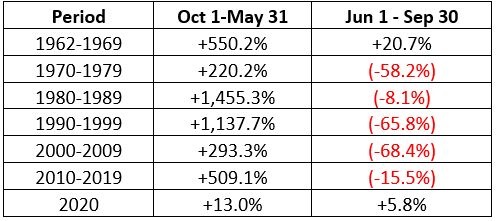
Speaking of consistency, for what it is worth Figure 4 displays decade-by-decade results for the Oct-May period versus the Jun-Sep period.
Figure 4 – DIS decade-by-decade
The key things to note are that:
*The Oct-May period showed a pretty substantial gain during each of the 6 previous decades.
*The Jun-Sep period showed a gain during the 60’s but lost money in every subsequent decade
(Note 2020 results through 12/18 are included in the table but are not a part of the commentary above).
Summary
Clearly the Oct-May period has been pretty “magical” for DIS stock investors for a long time. Will this continue to be the case in the future? Ah, there’s the rub. And as always, I must repeat once again my stock answer of “It beat’s me.”
But the real point is that in the long run investment success has a lot to do with finding and “edge” and exploiting it repeatedly. Or as I like to say:
“Opportunity is where you find it.”
Jay Kaeppel
Disclaimer: The information, opinions and ideas expressed herein are for informational and educational purposes only and are based on research conducted and presented solely by the author. The information presented represents the views of the author only and does not constitute a complete description of any investment service. In addition, nothing presented herein should be construed as investment advice, as an advertisement or offering of investment advisory services, or as an offer to sell or a solicitation to buy any security. The data presented herein were obtained from various third-party sources. While the data is believed to be reliable, no representation is made as to, and no responsibility, warranty or liability is accepted for the accuracy or completeness of such information. International investments are subject to additional risks such as currency fluctuations, political instability and the potential for illiquid markets. Past performance is no guarantee of future results. There is risk of loss in all trading. Back tested performance does not represent actual performance and should not be interpreted as an indication of such performance. Also, back tested performance results have certain inherent limitations and differs from actual performance because it is achieved with the benefit of hindsight.
Well that got ugly quick. For the record, if you have been in the markets for any length of time you have seen this kind of action plenty of times. An index, or stock, or commodity or whatever, trends and trends and trend steadily and relentlessly higher over a period of time. And just when it seems like its going to last forever – BAM. It gives back all or much of its recent rally gains very quickly. Welcome to the exciting world of investing.
I make no claims of “calling the top” – because I never have actually (correctly) called one and I don’t expect that I ever will. But having written Part I and Part IIof articles titled “Please Take a Moment to Locate the Nearest Exit” in the last week, I was probably one of the least surprised people at what transpired in the stock market in the last few sessions.
Of course the question on everyone’s lips – as always in this type of panic or near panic situation – is, “where to from here?” And folks if I knew the answer, I swear I would tell you. But like everyone else, I can only assess the situation, formulate a plan of action – or inaction, as the case may be – and act accordingly. But some random thoughts:
*Long periods of relative calm followed by extreme drops are more often than not followed by periods of volatility. So, look for a sharp rebound for at least a few days followed by another downdraft and so on and so forth, until either:
a) The market bottoms out and resumes an uptrend
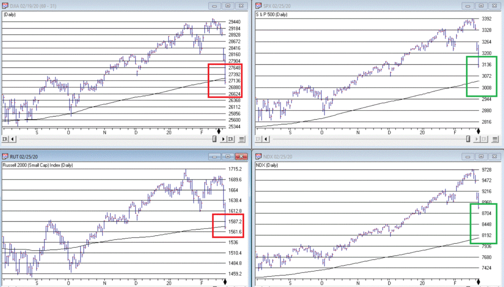
b) The major indexes (think Dow, S&P 500, Nasdaq 100, Russell 2000) drop below their 200-day moving averages. As of the close on 2/25 both the Dow and the Russell 2000 were below their 200-day moving average. That would set up another a) or b) scenario.
If the major indexes break below their long-term moving averages it will either:
a) End up being a whipsaw – i.e., the market reverses quickly to the upside
b) Or will be a sign of more serious trouble
The main point is that you should be paying close attention in the days and weeks ahead to the indexes in Figure 1.
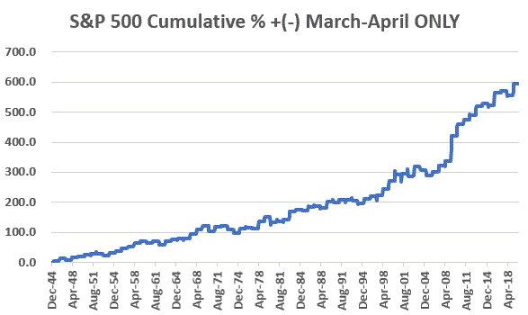
One reason for potential optimism is that the two-month period of March and April has historically been one of the more favorable two-month periods on an annual basis. Figure 2 displays the cumulative price gain achieved by the S&P 500 Index ONLY during March and April every year since 1945. The long-term trend is unmistakable, but year-to-year results can of course, vary greatly.
Figure 2 – S&P 500 cumulative price gain March-April ONLY (1945-2019)
For the record:
S&P 500 March-April
Result
Number of times UP
55 (73%)
Number of times DOWN
20 (27%)
Average UP%
+5.0%
Average DOWN%
(-3.4%)
Figure 3 – Facts and Figures
Will March and April bail us out? Here’s hoping.
As an aside, this strategy is having a great week so far.
Jay Kaeppel
Disclaimer: The information, opinions and ideas expressed herein are for informational and educational purposes only and are based on research conducted and presented solely by the author. The information presented does not represent the views of the author only and does not constitute a complete description of any investment service. In addition, nothing presented herein should be construed as investment advice, as an advertisement or offering of investment advisory services, or as an offer to sell or a solicitation to buy any security. The data presented herein were obtained from various third-party sources. While the data is believed to be reliable, no representation is made as to, and no responsibility, warranty or liability is accepted for the accuracy or completeness of such information. International investments are subject to additional risks such as currency fluctuations, political instability and the potential for illiquid markets. Past performance is no guarantee of future results. There is risk of loss in all trading. Back tested performance does not represent actual performance and should not be interpreted as an indication of such performance. Also, back tested performance results have certain inherent limitations and differs from actual performance because it is achieved with the benefit of hindsight.
OK, so this particular piece clearly does NOT qualify as “timely”. Hey, they can’t all be “time critical, table-pounding, you must act now” missives. In any event, as part of a larger project regarding trends and seasonality in the market, I figured something out – we “quantitative analyst types” refer to this as “progress.”
So here goes.
The Month of October in the Stock Market
The month of October in the stock market is something of a paradox. Many investors refer to it as “Crash Month” – which is understandable given the action in 1929, 1978, 1979, 1987, 1997, 2008 and 2018. Yet others refer to it as the “Bear Killer” month since a number of bear market declines have bottomed out and/r reversed during October. Further complicating matters is that October has showed:
*A gain 61% of the time
*An average monthly gain of +0.95%
*A median monthly gain of +1.18%
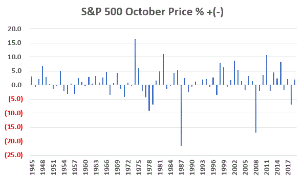
Figure 1 displays the monthly price return for the S&P 500 Index during every October starting in 1945.
Figure 1 – S&P 500 Index October Monthly % +(-)
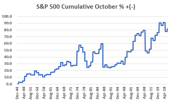
Figure 2 displays the cumulative % price gain achieved by holding the S&P 500 Index ONLY during the month of October every year starting in 1945.
Figure 2 – S&P 500 Index Cumulative October % +(-)
So, you see the paradox. To simply sit out the market every October means giving up a fair amount of return over time (not to mention the logistical and tax implications of “selling everything” on Sep 30 and buying back in on Oct 31). At the same time, October can be a helluva scary place to be from time to time.
One Possible Solution – The Decennial Pattern
In my book “Seasonal Stock Market Trends” I have a section that talks about the action of the stock market across the average decade. The first year (ex., 2010) is Year “0”, the second year (ex., 2011) is Year “1”, etc.
In a nutshell, there tends to be:
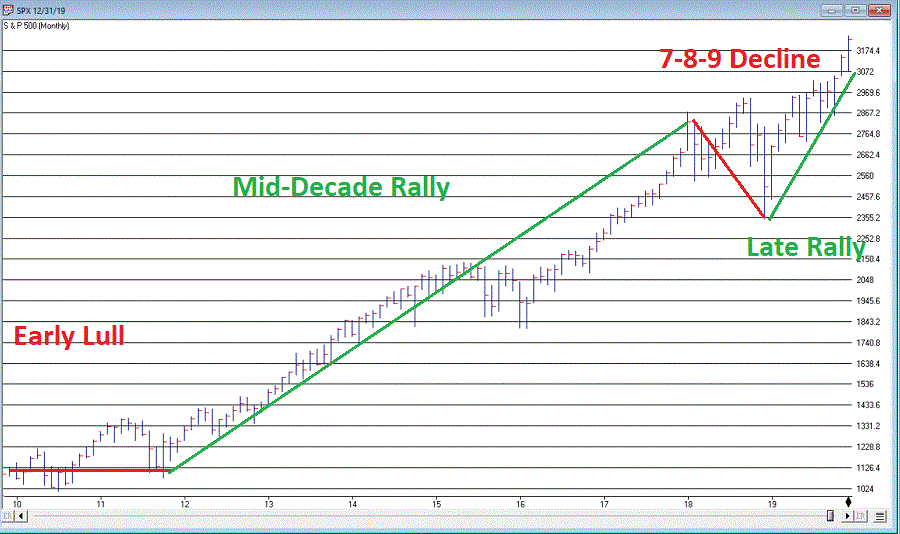
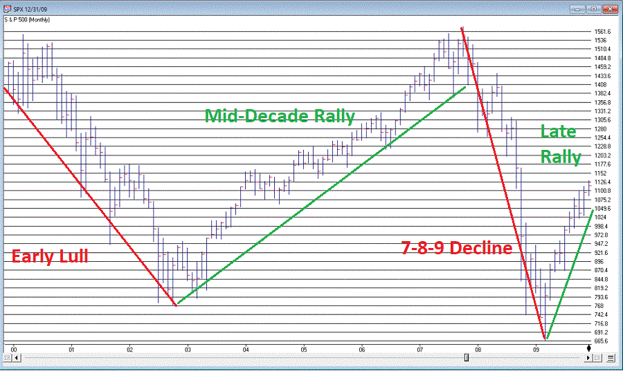
The Early Lull: Often there is weakness starting in Year “0” into mid Year “2”
The Mid-Decade Rally: Particularly strong during late Year “4” into early Year “6”
The 7-8-9 Decline: Often there is a significant pullback somewhere in the during Years “7” or “8” or “9”
The Late Rally: Decades often end with great strength
Figures 3 and 4 display this pattern over the past two decades.
(Charts courtesy of WinWayCharts)
Figure 3 – Decennial Pattern: 2010-2019
(Charts courtesy of WinWayCharts)
Figure 4 – Decennial Pattern: 2000-2009
Focusing on October
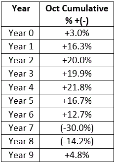
So now let’s look at October performance based on the Year of the Decade. The results appear in Figure 5. To be clear, Year 0 cumulates the October % +(-) for the S&P 500 Index during 1950, 1960, 1970, etc. Year 9 cumulates the October % +(-) for the S&P 500 index during 1949, 1959, 1969, 1979, etc.
Figure 5 – October S&P 500 Index cumulative % +(-) by Year of Decade
What we see is that – apparently – much of the “7-8-9 Decline” takes place in October, as Years “7” and “8” of the decade are the only ones that show a net loss for October.
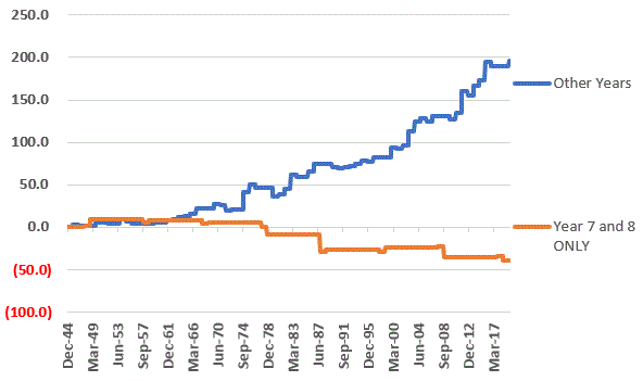
Let’s highlight this another way. Figure 6 displays the cumulative % return for the S&P 500 Index during October during all years EXCEPT those ending “7” or “8” versus the cumulative % return for the S&P 500 Index during October during ONLY years ending in “7” or “8”.
Figure 6 – S&P 500 cumulative October % +(-); Years 7 and 8 of decade versus All Other Years of Decade
For the record:
*October during Years “7” and “8” lost -39%
*October during all other Years gained +196%
Summary
So, does this mean that October is now “green-lighted” as bullish until 2027? Not necessarily. As always, that pesky “past performance is no guarantee of future results” phrase looms large.
But for an investor looking to maximize long-term profits while also attempting to avoid potential pain along the way, the October 7-8 pattern is something to file away for future reference.
Jay Kaeppel
Disclaimer: The information, opinions and ideas expressed herein are for informational and educational purposes only and are based on research conducted and presented solely by the author. The information presented does not represent the views of the author only and does not constitute a complete description of any investment service. In addition, nothing presented herein should be construed as investment advice, as an advertisement or offering of investment advisory services, or as an offer to sell or a solicitation to buy any security. The data presented herein were obtained from various third-party sources. While the data is believed to be reliable, no representation is made as to, and no responsibility, warranty or liability is accepted for the accuracy or completeness of such information. International investments are subject to additional risks such as currency fluctuations, political instability and the potential for illiquid markets. Past performance is no guarantee of future results. There is risk of loss in all trading. Back tested performance does not represent actual performance and should not be interpreted as an indication of such performance. Also, back tested performance results have certain inherent limitations and differs from actual performance because it is achieved with the benefit of hindsight.
If you follow jay Kaeppel’s posts in this blog, you’ll know that he’s the master of research on all things seasonal. This past week he posted a seasonal article on energy using FSESX – Fidelity Select Energy Services. Previously he had noted the bullish tendency for ticker FSESX during the months of February, March and April. In his follow up piece, he added one more “favorable” month and then also looked at a 6-month “unfavorable” period. The article is included at the end of this post so you can see the results.As Mutual funds are not for everyone, we went in search of alternative tickers that could closely match FSESX in performance characteristics. Using WinWay Matchmaker we compared the price action of FSESX against our universe of stocks and ETFs looking for a match.
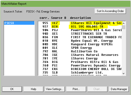
Matchmaker uses Spearman Rank Correlation analysis to identify a close match to FSESX. The closer the result to 1000, the higher the correlation. Anything over 950 is a very close match. Here’s the results.
Figure 1. MatchMaker correlation for last 4 years – FSESX vs stocks and ETFs
The ETF IEZ – iShares Oil and Equipment & Services showed a very high correlation over the 4 years we tested. OIH – Oil Service Holders, another ETF, also showed high correlation.
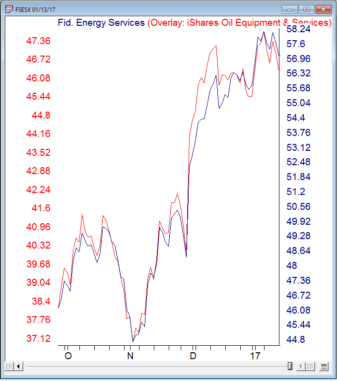
Here’s a WinWay overlay chart of recent daily price action comparing FSESX vs IEZ.
Figure 2. Recent daily price action comparing FSESX vs IEZ.
IEZ appears to be a good surrogate for FSESX at least over the last 4 years.
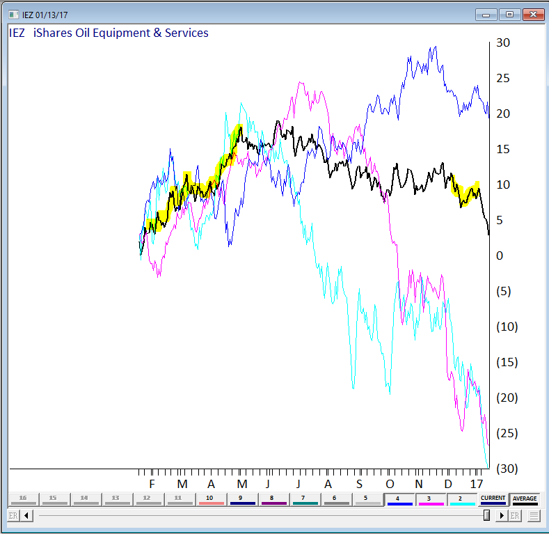
We also wanted a visual of the seasonal pattern in action. Fortunately we have a tool still in development at WinWay that’s just right for this. Basically it provides a price comparison of ‘x’ numbers of years of the same ticker overlaid on each other.
Here’s 3 of the last 4 years on IEZ, the average of the years displayed is in black. We highlighted the Feb, Mar, Apr and Dec in yellow. We could have included more years but for illustration purposes it was easier to show the 3 years (the chart gets busy with too many lines on it!)
Figure 3 – IEZ seasonal chart (beta) for 3 years with average.
The Feb, Mar, Apr period has a definite bullish tendency, the Dec period does Ok too. You’ll notice the tendency for IEZ to fall sharply in January. Conclusion? IEZ is a reasonable surrogate for FSESX if you’re contemplating this seasonal move.
The article this follow up is based upon is by Jay Kaeppel and is included below. Jay is Chief Market Analyst at JayOnTheMarkets.com and TradingExpert Pro client. http://jayonthemarkets.com/
If you are looking for a market sector with some serious seasonal trends, look no further than the energy sector. Previously I had noted the bullish tendency for ticker FSESX during the months of February, March and April. In this piece, we will add one more “favorable” month and then also look at a 6-month “unfavorable” period.
For the record, the information that follows is not being recommended as a standalone strategy. It is presented simply to make you aware of certain long-term trends that have been very persistently bullish (or bearish as the case may be) in the energy sector.
4 Favorable Months
*The four “favorable” months for our test are February, March, April and December
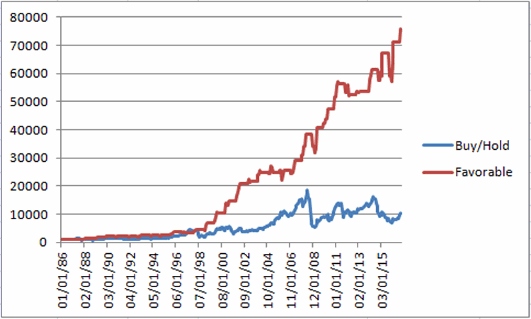
Figure 1 displays the growth of $1,000 invested in ticker FSESX only during these four months every year since 1986 versus simply buying-and-holding ticker FSESX.
Figure 1 – Growth of $1,000 invested in FSESX only during Feb, Mar, Apr, Dec every year since 1986
Starting in 1986, an initial $1,000 investment grew to $76,019 (or +7,500%) versus $10,237 (or 923%) using a buy-and-hold strategy.
6 Unfavorable Months
The six “Unfavorable” months are June, July, August, September, October and November.
First the “positive” news:
*This 6-month period has managed to show a gain 14 times in 31 years – so by no means should you consider this period a “sure thing” loser
*During 4 separate years – 1997, 2003, 2004 and 2010 – the “unfavorable” months registered a cumulative gain in excess of +30%.
Doesn’t sound all that “unfavorable” so far does it? But here’s the catch: Despite the occasional 30%or more gain, it is fair to refer to this 6-month period as “unfavorable” as the cumulative long-term results of buying and holding FSESX during these months has been nothing short of devastating.
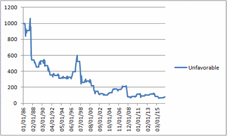
Figure 2 displays the growth of $1,000 invested in ticker FSESX only between the end of May and the end of November every year starting in 1986.
Figure 2 – Growth of $1,000 invested in FSESX only during June through November every year since 1986
Starting in 1986, an initial $1,000 investment declined to just $82, or a cumulative loss of -91.8%
Figure 3 displays some comparative data between favorable and unfavorable periods as well as using a Buy-and-Hold strategy.
Measure
Buy-and-Hold
4 Favorable Months
6 Unfavorable Months
Average Annual % +(-)
12.8
16.5
(-4.2)
Median Annual % +(-)
8.7
15.5
(-1.8)
Standard Deviation
33.4
20.1
24.6
# Years UP
18
26
14
# Years DOWN
13
5
17
Worst Year
(-55.4) 2008
(-7.6) 1994
(-62.8) 2008
$1,000 becomes
$10,237
$76,019
$82
Cumulative % +(-)
+923%
+7,500%
(-92%)
Figure 3 – Comparative Results
Figure 4 displays the year-to-year results for a Buy-and-Hold approach versus holding only during the 4 “favorable” months or the “Unfavorable” 6 months.
Year
All 12 months % +(-)
4 Favorable % +(-)
6 Unfavorable % +(-)
1986
(8.9)
(5.2)
(9.2)
1987
(20.7)
22.9
(40.1)
1988
(4.2)
22.8
(16.3)
1989
50.3
27.1
16.2
1990
8.7
4.9
(11.2)
1991
(19.9)
4.1
(25.0)
1992
4.9
(1.6)
(1.3)
1993
16.4
24.5
(10.7)
1994
(0.5)
(7.6)
3.1
1995
40.0
33.7
2.0
1996
45.9
22.5
20.8
1997
43.9
(4.9)
32.9
1998
(41.4)
26.5
(50.5)
1999
80.9
74.1
7.5
2000
51.7
77.6
(21.1)
2001
(22.4)
20.8
(32.4)
2002
2.2
26.2
(18.0)
2003
13.1
15.5
(16.0)
2004
26.2
1.2
30.2
2005
47.4
4.8
34.0
2006
(9.1)
(4.1)
(1.8)
2007
58.3
25.6
16.7
2008
(55.4)
10.5
(62.8)
2009
60.4
24.5
9.6
2010
31.7
21.6
33.7
2011
(18.5)
3.1
(16.8)
2012
(3.9)
0.7
9.6
2013
14.1
0.3
11.5
2014
(19.5)
7.2
(26.7)
2015
(19.7)
2.9
(17.9)
2016
44.2
28.4
20.1
Figure 4 – Yearly % +(-) for Buy-and-Hold versus 4 Favorable Months versus 6 Unfavorable Months
Summary
There is no guarantee from year-to-year results of buying and holding ticker FSESX during the “Favorable 4” months will show a gain and/or outperform the “Unfavorable 6” months. And there is by no means any guarantee that the “Unfavorable 6” will show a loss during any given year (note that 2016 saw the Unfavorable 6 generate a cumulative gain of +20.1%!). So just remember that we are talking about some very long-term trends here.
Still, most investors can discern the difference between:
*Favorable 4 months gain = +7,500%
*Unfavorable 6 months loss = (-92%)
This type of difference is what we “quantitative types” refer to as “statistically significant.”