Aug 18, 2017 | chart patterns, educational newsletters, jay kaeppel
If I were the type to make bold proclamations I would probably consider “taking my shot” right here and shout “This is the Top” and/or “The Market May Crash.” Unfortunately, on those occasions (well) in the past when I would make bold public predictions of what was about to happen in the financial markets I would almost invariably end up looking pretty stupid. So even if I did make a “bold proclamation” it wouldn’t necessarily mean that anyone should pay any attention.
Besides all that the last thing I want is for “the party to end”. Even if you do think the market is about to tank it’s a pretty crummy thing to have to root for. Even if you did manage to “call the top”, the ripple effect of the ramifications associated with a serious stock market decline can have pretty negative effect on just about everyone’s life.
So let’s put it this way: I am concerned – and prepared to act defensively if necessary – but still have money in the market and am still hoping for the best.
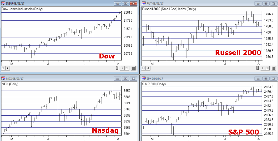
Reasons for Caution (Indexes)
Figure 1 displays four major indexes. The Dow keeps hitting new highs day after day while the others – at the moment – are failing to confirm. That doesn’t mean that they won’t in the days ahead. But the longer this trend persists the more negative the potential implications.
Figure 1 – Dow at new highs, small-caps, Nasdaq and S&P 500 not quite (Courtesy
TradingExpert)
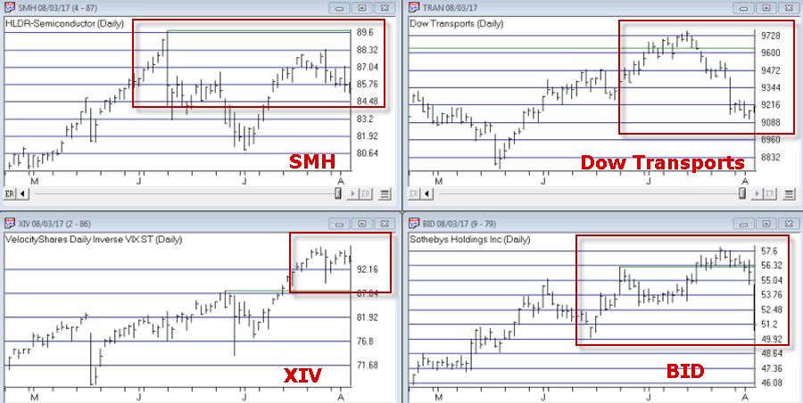
Reasons for Caution (Bellwethers)
Figure 2 displays 4 “bellwethers” that I follow which may give some early warning signs.
Figure 2 – Market Bellwethers possibly flashing some warning signs (Courtesy
TradingExpert)
*SMH soared to a high in early June and has been floundering a bit since.
*Dow Transports tried to break out to the upside in July but failed miserably.
*XIV is comfortably in new high territory.
*BID tried to break out in July and then collapsed. It is presently about 12% off of its high.
In a nutshell – 3 of the 4 are presently flashing warning signs.
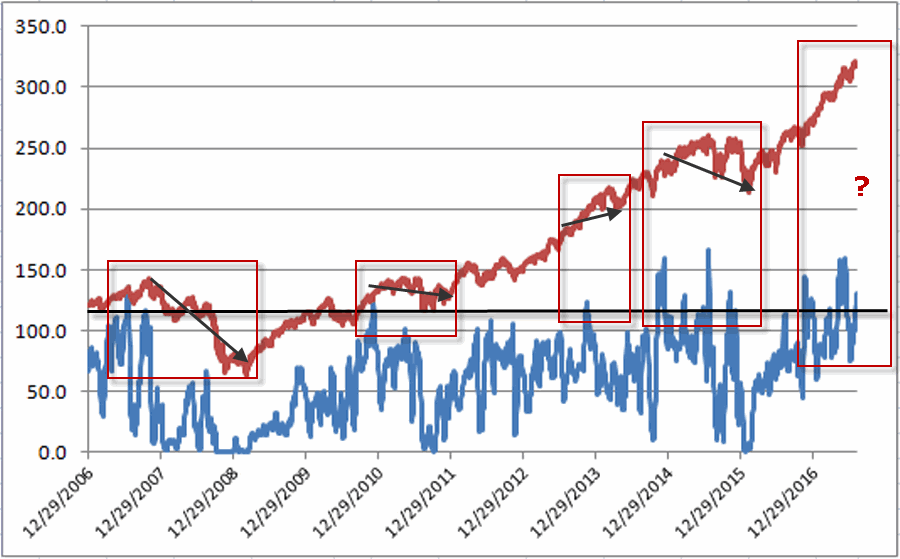
Reasons for Caution (Market Churn)
In this article I wrote about an indicator that I follow that can be useful in identify market “churn” – which can often be a precursor to market declines. Spikes above 100 by the blue line often signify impending market trouble
It should be noted that the indicators signals are often early and occasionally flat out wrong. Still, a churning market with the Dow making new highs has often served as a “classic” warning sign.
Figure 3 – JK HiLo Index (blue) versus Nasdaq Compsite / 20 (red); 12/31/2006-present
Summary
Again, and for the record, I do not possess the ability to “predict” the markets. But I have seen a few “warning signs” flash bright red at times in the past. As a general rule, it is best to at least pay attention – and maybe make a few “contingency plans” – you know, just in case.
Here’s hoping my gut is wrong – again.
Disclaimer: The data presented herein were obtained from various third-party sources. While I believe the data to be reliable, no representation is made as to, and no responsibility, warranty or liability is accepted for the accuracy or completeness of such information. The information, opinions and ideas expressed herein are for informational and educational purposes only and do not constitute and should not be construed as investment advice, an advertisement or offering of investment advisory services, or an offer to sell or a solicitation to buy any security.
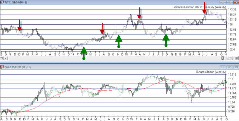
Nov 11, 2016 | bonds, chart patterns, educational newsletters, ETFs, indexes, jay kaeppel
In real estate, it’s “Location, Location, Location.” In the financial markets it’s “the Trend, the Trend, the Trend.” There is a great deal of certainty about what will happen next in stocks, bonds and gold. But the key to successfully navigating these turbulent times starts not with predicting the future but rather with identifying the current trend in the here and now and going from there. So let’s take a look at, well, what else, the trends.
I have certain trend-following models that I follow to help me to determine which way to be leaning in the markets. Like any trend-following method they are far from perfect (my stock market model for example, suffered not one but two significant whipsaws in the last year+). But for me there is no expectation that they will be perfect. The only goal is to catch most of the upside during major bull markets, and miss much of the downside during major bear markets.
Stocks
For stocks I look at the 10-month and 21-month moving averages for the S&P 500 Index and use the following rules:
*A sell signal occurs when the S&P 500 closes 2 consecutive months below its 21-month moving average AND is also below its 10-month moving average
*Following a sell signal a new buy signal occurs when the S&P 500 registers a monthly close above its 10-month moving average
Figure 1 – Stock Market trend-following signals (Courtesy TradingExpert)
This method avoided much of the 1973-1974, 2000-2002 and 2008 bear market destruction. That’s the good news. The bad news is that it sold at the end of September 2015 and at the end of February 2016 – both just prior to powerful upside reversals (like I said, trend-following models ain’t perfect).
The most recent signal was a buy signal on 3/31/2016.
So the trend for stocks is presently BULLISH
Bonds
I have written several posts about this in the past. My favorite bond timing indicator is Japanese stocks. No seriously. They have a string tendency to trade inversely to the 30-yr US t-bond. I track ticker EWJ and watch the 5-week and 30-week moving averages. Because Japanese stocks and t-bonds trade inversely I use the following rules:
*A buy signal for bonds occurs when the 5-week moving average for EWJ drops below the 30-week moving average for EWJ
*A sell signal for bonds occurs when the 5-week moving average for EWJ rises above the 30-week moving average for EWJ
The most recent signal was a sell signal for t-bonds on 6/10/2016
So the trend for bonds is presently BEARISH
Figure 2 – Bond trend-following signals(Courtesy TradingExpert)
Gold
For gold I use two moving averages on a weekly chart for something I refer to as Jay’s Anti-Gold Index. Rather than go into a long explanation I will link to the
original article on the topic and offer a short explanation. In AIQ TradingExpert I created a ticker comprised of 4 other tickers (GLL, RYSDX, SPX and YCS) which all trade in a negatively correlated manner to the price of gold (er, usually).
One moving average I call the “FrontWeighted36DayMA” (“FrontWeightedMA” for short. The calculations are based on someone else’s work – unfortunately I cannot recall the person’s name so cannot give proper credit. Hopefully Karma will work and somewhere that person will Have a Nice Day without really knowing why. The calculations are a bit long-winded so the AIQ TradingExpert code appears at the end of this article.
The other is the 55-week exponential moving average.
(CAVEAT: Because some of these tickers did not exist until 2006 trading signals began on 12/31/1996, so yes, it is by my standards a relatively short test period for a long -term moving average method. To put it another way, don’t bet the ranch on gold basedon this one indicator)
The trading rules are as follows:
*When the FrontWeightedMA closes a week BELOW the 55-week MA then a BUY signal for gold occurs.
*When the FrontWeightedMA closes a week ABOVE the 55-week MA then a BUY signal for gold occurs.
Figure 3 – Gold Trading Signals (Courtesy TradingExpert)
The most recent signal was a buy signal on 3/18/16.
So the trend for gold is presently BULLISH.
Summary
These indicators represent “my opinion as to where the markets are headed next” (because the truth is I don’t know). There are objective, mechanical measures of where things stand today. Nothing more, nothing less.
Also, none these indicators falls into the “World Beater” or “You Can’t Lose in Investing” categories. But then again they are not really designed to (BTW if you do posses methods that do fit into either of the aforementioned categories, I would love to hear from you – off the record, of course). What they do achieve is to offer a decent frame of reference during times of doubt.
And that is one of the most powerful tools any investor can possess.
So in sum, the current trend (at least according to what you’ve seen here) for stocks and gold is bullish and the current trend for bonds is bearish.
How long any of these trends will remain in place is anyone’s guess. So enjoy them while they last.
Jay Kaeppel
Chief Market Analyst at JayOnTheMarkets.com
Jul 26, 2016 | chart patterns, EDS, stock market
Why add Chart Pattern to your TradingExpert Pro?
- 16 different patterns tracked
- 6 gauges of each pattern's quality
- Automatically generate report every night
- Built in EDS file so you can backtest and add to your own strategy
- Completed and emerging patterns
OR CALL AIQ SALES on 1-800-332-2999 or 775-832-2798
LOCK in 2008 pricing
If you order before July 31, 2016
you'll get the 2008 pricing!
OR CALL AIQ SALES on 1-800-332-2999 or 775-832-2798
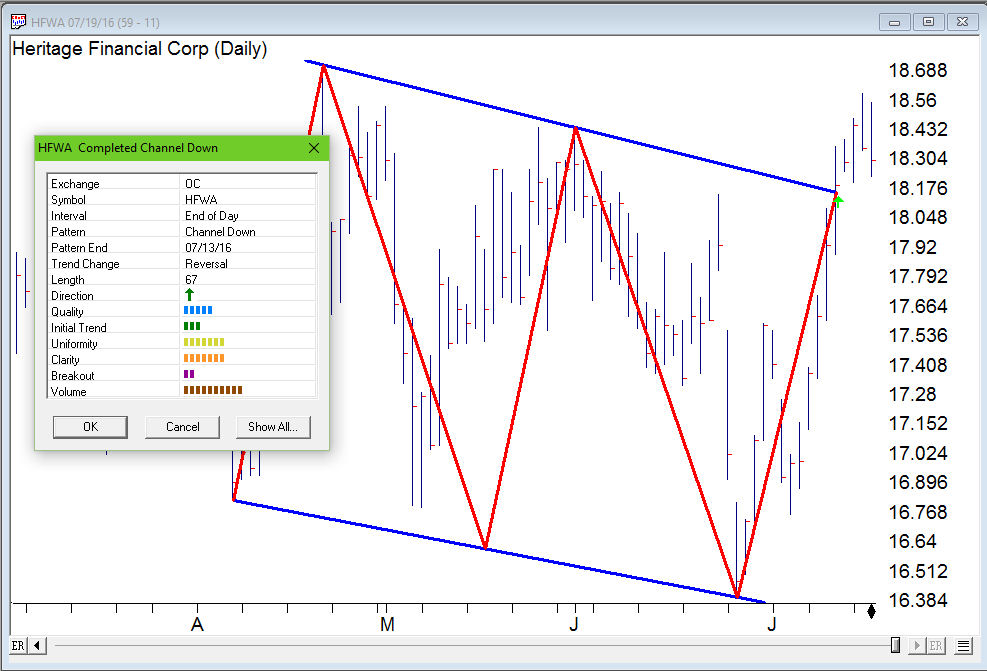
Apr 13, 2016 | chart patterns, swing trading, trading strategies
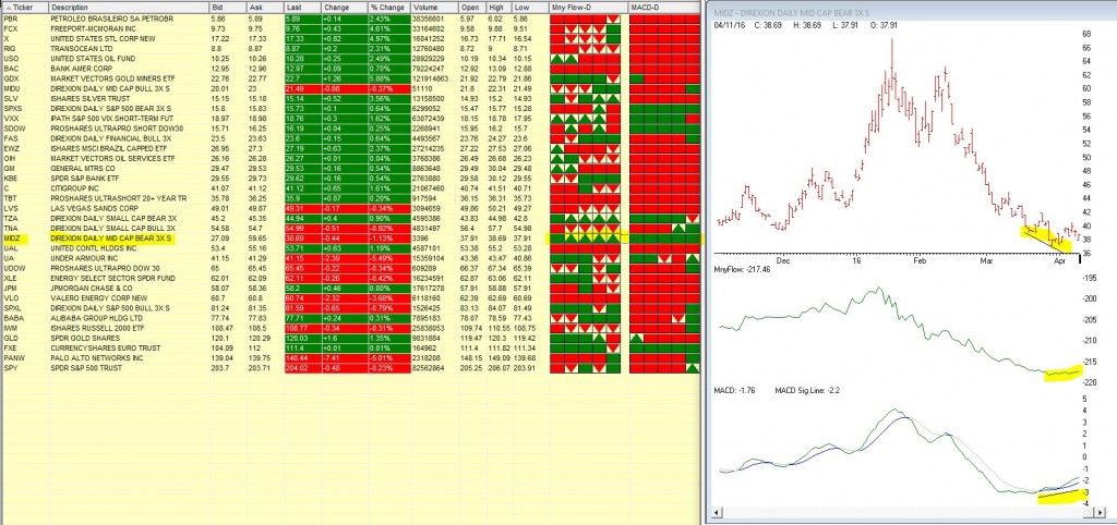
We’ve been watching MIDZ – Direxion Daily Mid Cap bear 3X in our barometer the last few trading days. This 3 x bearish ticker has been in a long down trend, but recently Moneyflow has begun to show signs of accumulation and the MACD diverged up when the price was still heading down.
The 5 day barometer readings on Moneyflow and MACD in our Quotes montage are showing some bullish signs either all green or green arrow up. Maybe times are a changing.
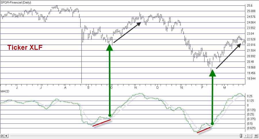
Apr 7, 2016 | chart patterns, MACD, options
In this article I detailed one relatively “simple” approach to using the MACD indicator to identify potentially bullish opportunities. In this piece we will look at one to actually put those signals to use.
The Limited Risk Call Option
One possibility upon generating a bullish signal as described in the last article is to buy shares of the stock/ETF/index/etc in question. Not a thing wrong with that. But there is a less expensive alternative.
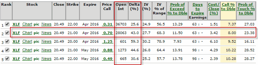
Figure 1 reproduces Figure 1 from the last piece showing ticker XLF. Let’s look at the signal generated on 2/12/16.
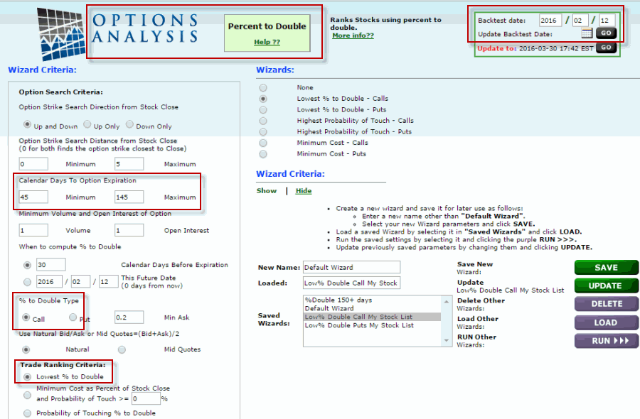
One alternative that I like is to use the “Percent to Double” routine at
www.OptionsAnalysis.com to find an inexpensive call option that has lot of upside potential. The input screen with a few key input selections highlighted appears in Figure 1a (if it looks intimidating please note that a reusable set of criteria can be captured in a “Saved Wizard”, which appear towards the lower right of of Figure 1a. Once a set of criteria is saved it can be reused by simply clicking on the Wizard name and clicking “Load”.)
NOTE: My own personal preference is to consider options that have at least 45 days left until expiration (as time decay can become a very negative factor as option expiration draws closer).
Figure 1a – Percent to Double
Figure 1b displays the output screen.
NOTE: For my own purposes I like to see a Delta of at least 40 for the option I might consider buying (nothing “scientific” here. It is just that the lower the Delta the further out-of-the-money the option strike price is. I prefer to buy a strike price that is not too far from the current price of the stock; hence I look for a Delta of 40 or higher). With XLF trading at $20.49, in Figure 1b I have highlighted the 2nd choice on the list – the April 21 call – which has a delta of 43.
So a trader now has two alternatives:
*Buy 2 Apr 21 strike price XLF calls for $70 apiece ($140 total cost; 86 total deltas)
*Buy 86 shares of XLF at $20.49 apiece ($1,760 total cost, 86 total deltas)
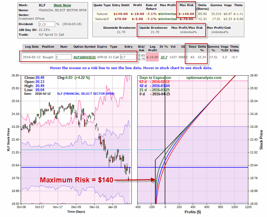
Figure 1c displays the particulars for buying a 2-lot of the April 21 call for a total cost of $140.
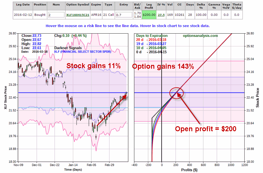
By 3/18 the shares had gained 11% and the Apr 21 call had gained 143%. See Figure 1d.
Summary
Obviously not every trade works out as well as this one. Still, the key things to remember are:
*The option trade cost $140 instead of $1760
*The worst case scenario was a loss of $140.
Something to think about.
Chief Market Analyst at JayOnTheMarkets.com and TradingExpert Pro client
Jul 31, 2014 | chart patterns, Seasonality, swing trading, trading strategies, Uncategorized
It’s the beginning of the month and time to check the seasonal patterns for August 2014. First off some background.
Our study looks at 7 years of historical data and looks at the returns for all optionable stocks for the month of August from 2006 to 2013.
We filter to find two sets of criteria
– Stocks with gains in all 7 years during August
– Stocks with losses in all 7 years in August
We do make an assumption that the month is 21 trading days and work our way back from the last day of the month. If the last day of the month falls on a weekend, then we use the first trading day prior to that date.
We make no assumptions for drawdown, nor do we look at the fundamentals behind such a pattern. We do compare the stock to the market during the same period and look at the average SPY gain/loss vs. the average stock gain/loss. This helps filter out market influence. We are now including group information to identify particular segments that might display a seasonal bias.
Finally we look at the median gain/loss and look for statistical anomalies, like meteoric gains/loss in one year.
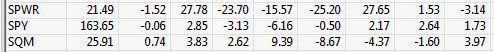
So here are the tickers that met the scan on the loss side, There was only 1 stock on the gainers side. So we’ll look at the down plays only.
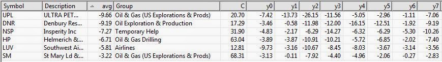
Figure 1 shows the stocks that have had losses in August, 7 years in row.
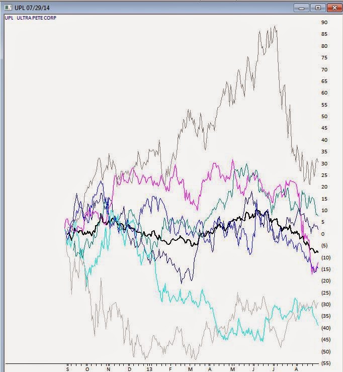
It’s almost immediately apparent that 4 of the 6 losers are in the Oil & Gas sector, one in the Drilling group, and 3 in Exploration and Production (2 US) groups. Not looking like a good month to be long this sector. The biggest loser is UPL, UltraPete Corp with an average -9.66% in August. A couple of years have seen significant losses in August, but the median is still -7.42%. Not being one to speculate on why the Oil & Gas sector has so many stocks taking a hit in August, but there it is. Here’s the seasonal chart of UPL through 8/31/2013, the prominent black line is the average of the 7 years in the study.
Figure 2 seasonal for UPL for last 7 years, average line in black
During the same period the market, as measured by SPY declined an average of -0.06, so there was no overriding market influence during this period.
Figure 3 shows SPY for the same period.
Interestingly a quick check of the Oil & Gas US Explorations and Production group for the same period revealed an average decline of -3.67% in August. The entire group was down 6 of the last 7 years in August. I have 38 stocks in this group in my database.
Figure 4 seasonal average for Oil & Gas US Explorations and Production group
We’ll keep track of the top 2 stocks in the August analysis. UPL and DNR and let you know how they preform.
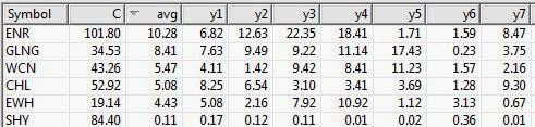
In July, GLNG was the seasonal star with an average of +8.41% for the 7 years through July 30, 2013. Tracking how it performed this July, GLNG opened at 60.73 on July 1, 2014 and reached a high of 65 on July 30, 2014. Some pullback occurring on July 31, 2014 with the entire market down, but still a gain for the month.
Figure 5 shows the stocks that have had gains in July, 7 years in row.
With seasonality you have to figure out what timeframe you want to analyze before anything else. Logic would seem to dictate that one week; comparing this week to the same period over X years would be the smallest time period you might consider. However there are events that seem to be seasonally predictable that occur at the end of a month or the beginning of the month. We’ll look at some these in a future article.
We don’t draw conclusions here, just mine for information.