Aug 27, 2018 | chart patterns, educational newsletters
According to one simple technique the “Magic Number” for the S&P 500 Index is 2872.87. According to this simple technique if the S&P 550 Index closes above this number the stock market “should” continue to be bullish for at least another year.
Sounds optimistic? Well, there certainly are no “sure things” in the financial markets. Still, let’s take a closer look.
The technique I mentioned works like this:
*Closes at its highest price in the past 252 trading days
*For the 1st time in the most recent 126 trading days
*It generates a bullish signal for the next 252 trading days
In essence, we are talking about buying when the index makes a 1-year high for the 1st time in 6 months and holding for 1 year.
Figure 1 displays the most recent previous buy signal that occurred on 7/11/16. The sell date was 252 trading days later on 7/11/17.
Figure 1 – 2016 Signal (Courtesy TradingExpert)
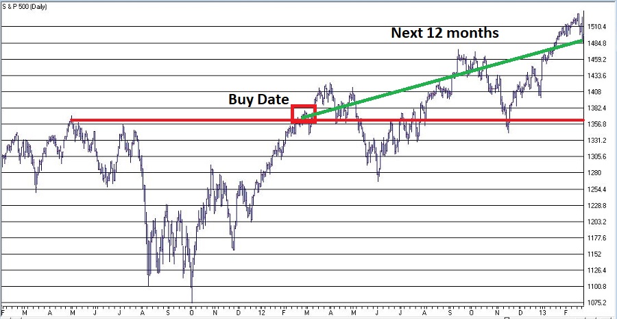
Figure 2 displays the signal before that which occurred on 2/27/12. The sell date was 252 trading days later on 2/26/13.
Figure 3 displays all the signals since 1933.
| Buy Date |
Sell Date |
Buy Price |
Sell Price |
%+(-) |
| 5/27/33 |
4/6/34 |
9.64 |
10.95 |
+13.6 |
| 5/18/35 |
3/20/36 |
9.87 |
15.04 |
+52.4 |
| 10/6/38 |
8/9/39 |
12.82 |
11.78 |
(8.1) |
| 10/7/42 |
8/10/43 |
9.17 |
11.71 |
+27.7 |
| 6/1/44 |
4/7/45 |
12.31 |
13.84 |
+12.4 |
| 5/15/48 |
4/8/49 |
16.55 |
14.97 |
(9.5) |
| 10/5/49 |
8/23/50 |
15.78 |
18.82 |
+19.3 |
| 3/5/54 |
3/4/55 |
26.52 |
37.52 |
+41.5 |
| 8/4/58 |
8/4/59 |
47.94 |
60.61 |
+26.4 |
| 1/10/61 |
11/2/62 |
58.97 |
57.75 |
(2.1) |
| 4/15/63 |
4/15/64 |
69.09 |
80.09 |
+15.9 |
| 4/24/67 |
4/25/68 |
92.62 |
96.62 |
+4.3 |
| 4/30/68 |
6/9/69 |
97.46 |
101.2 |
+3.8 |
| 1/8/71 |
1/6/72 |
92.19 |
103.51 |
+12.3 |
| 2/7/72 |
2/8/73 |
104.54 |
113.16 |
+8.2 |
| 6/24/75 |
6/22/76 |
94.19 |
103.47 |
+9.9 |
| 8/1/78 |
7/31/79 |
100.66 |
103.81 |
+3.1 |
| 8/14/79 |
8/12/80 |
107.52 |
123.79 |
+15.1 |
| 10/8/82 |
10/6/83 |
131.05 |
170.28 |
+29.9 |
| 11/7/84 |
11/7/85 |
169.17 |
192.62 |
+13.9 |
| 10/19/88 |
10/18/89 |
276.97 |
341.76 |
+23.4 |
| 5/30/90 |
2/13/92 |
360.86 |
413.69 |
+14.6 |
| 7/30/92 |
7/29/93 |
423.92 |
450.24 |
+6.2 |
| 2/6/95 |
2/5/96 |
481.14 |
641.43 |
+33.3 |
| 9/3/03 |
9/2/04 |
1026.27 |
1118.31 |
+9.0 |
| 11/5/04 |
11/4/05 |
1166.17 |
1220.14 |
+4.6 |
| 10/13/09 |
10/13/10 |
1073.19 |
1178.1 |
+9.8 |
| 11/5/10 |
11/4/11 |
1225.85 |
1253.23 |
+2.2 |
| 2/27/12 |
2/26/13 |
1367.59 |
1496.94 |
+9.5 |
| 7/11/16 |
7/11/17 |
2137.16 |
2425.53 |
+13.5 |
Figure 3 – Previous Signals
*27 of the 30 signals (i.e., 90%) have witnessed a 12-month gain
*3 of 30 signals (i.e., 10%) have witnessed a loss
*The last “losing trade” occurred in 1961-1962
*The last 20 signals have been followed by a 12-month gain for the S&P 500
*The average of all 30 signals is +13.9%
*The average for all 27 winning trades is +16.1%
*The average of all 3 losing trades is -6.6%
*The worst losing trade was -9.5%
Believe it or not, into the early 1950’s the stock market used to be open on Saturday. So those days counted toward the 126 and 252 trading days counts. This explains why the buy and sell dates prior to 1954 were less than one calendar year apart.
It is possible to get a new signal before an existing signal reaches it’s Sell Date. In those rare cases we simply extend the holding period an additional 252 trading days. This occurred in 1961-1962, 1968-1969, 1990-1992.
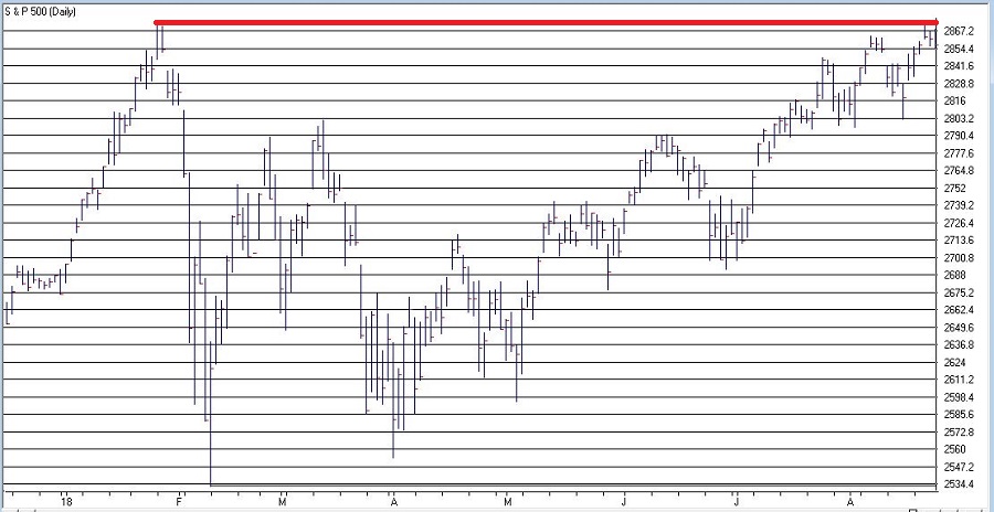
Figure 4 shows that SPX is very close to generating a new signal. The most recent high close was in January at 2872.87 which was more than 126 trading days ago. A new signal will occur if SPX closes above that level.
The Good News is that this technique has a 90% accuracy rate and that one good day in the market could generated a new buy signal. The Bad News is that – as I mentioned earlier – there are no “sure things” in the market. Given that this particular method is on a 20-trade winning streak, it is understandable to think that maybe the law of averages is against it this time.
We’ll just have to wait and see what happens.
Disclaimer: The data presented herein were obtained from various third-party sources. While I believe the data to be reliable, no representation is made as to, and no responsibility, warranty or liability is accepted for the accuracy or completeness of such information. The information, opinions and ideas expressed herein are for informational and educational purposes only and do not constitute and should not be construed as investment advice, an advertisement or offering of investment advisory services, or an offer to sell or a solicitation to buy any security.
Jul 13, 2018 | chart patterns, educational newsletters, ETFs, gold
This week it is the U.S. dollar and Gold taking their turns testing critical inflection points.
As you can see in Figure 1, on a seasonal basis the dollar is moving into a traditionally weaker time of year.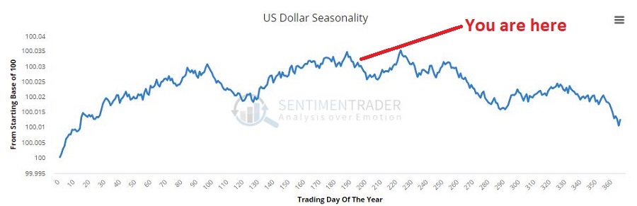 Figure 1 – U.S. Dollar seasonality (Courtesy Sentimentrader.com)
In Figure 2 you can see that traders have been and remain pretty optimistic. This is traditionally a bearish contrarian sign.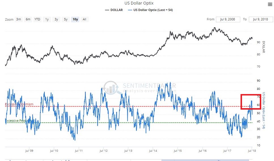 Figure 2 – U.S. Dollar trade sentiment (Courtesy Sentimentrader.com)
In Figure 3 we see the “line in the sand” for ticker UUP – an ETF that tracks the U.S. Dollar. Unless and until UUP punches through to the upside there is significant potential downside risk.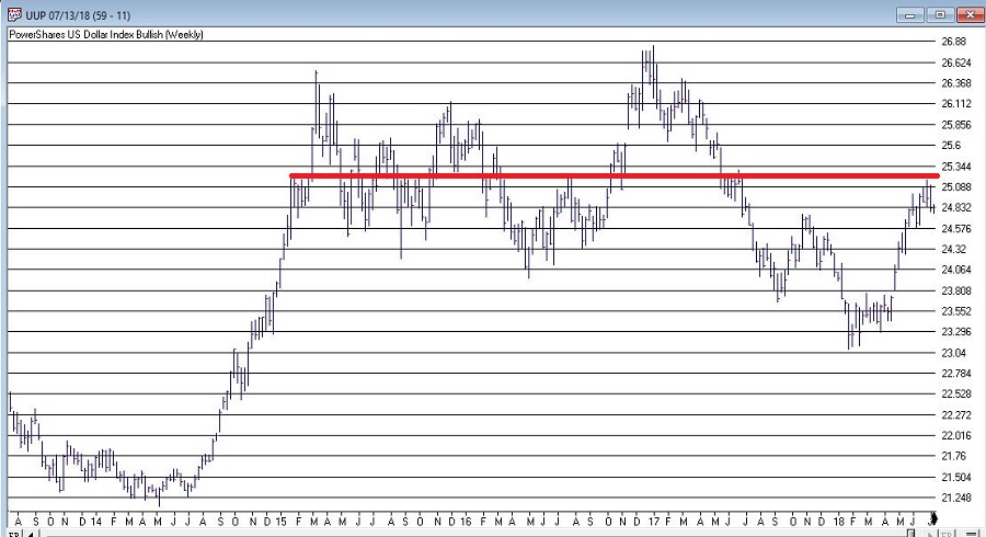 Figure 3 – U.S. Dollar w/resistance (Courtesy TradingExpert)
As you can see in Figure 4, on a seasonal basis the dollar is moving into a traditionally stronger time of year.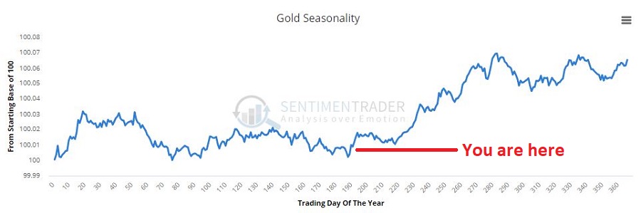 Figure 4 – Gold seasonality (Courtesy Sentimentrader.com)
In Figure 5 you can see that traders have been and remain pretty pessimistic. This is traditionally a bullish contrarian sign.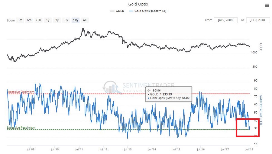 Figure 5 – Gold trader sentiment (Courtesy Sentimentrader.com)
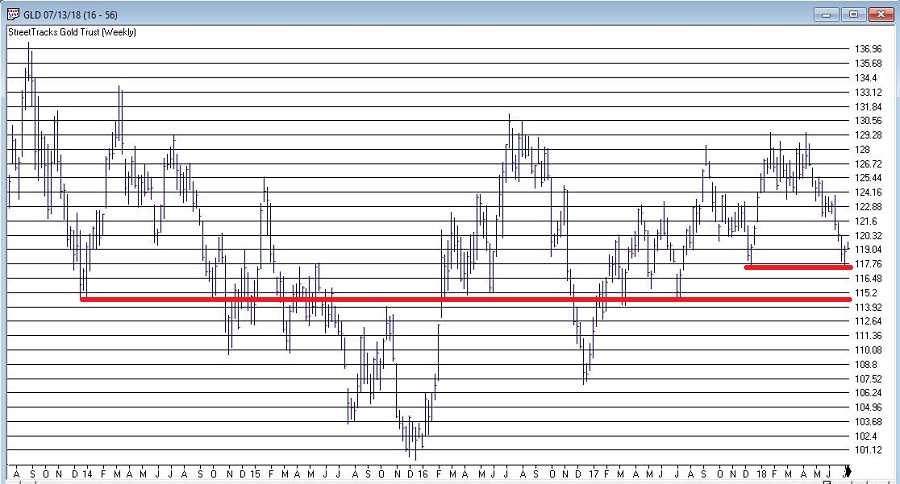
In Figure 6 we see the “line(s) in the sand” for ticker GLD – an ETF that tracks gold bullion.
I would be hesitant about trying to “pick a bottom” as gold still looks pretty week. But if:
a) GLD does hold above the support area in Figure 6 and begins to perk up,
b) Ticker UUP fails to break out to the upside
Things could look a lot better for gold very quickly.
As usual I am not actually making any “predictions” here or calling for any particular action. I mainly just want to encourage gold and/or dollar traders to be paying close attention in the days and weeks ahead, as the potential for a major reversal in both markets appears possible.
Likewise, if no reversal does take place – and if the dollar breaks out to the upside and gold breaks down, both markets may be “off to the races.”
So dollar and gold traders – take a deep breath; focus your attention; and prepare for action…one way or the other.
Disclaimer: The data presented herein were obtained from various third-party sources. While I believe the data to be reliable, no representation is made as to, and no responsibility, warranty or liability is accepted for the accuracy or completeness of such information. The information, opinions and ideas expressed herein are for informational and educational purposes only and do not constitute and should not be construed as investment advice, an advertisement or offering of investment advisory services, or an offer to sell or a solicitation to buy any security.
Jul 5, 2018 | chart patterns, educational newsletters, ETFs, indexes, jay kaeppel, market timing
Here’s a number for you – 88%. Since 1948, over any 10-year period the Dow has showed a gain 88% of the time. That’s a pretty good number. It also explains why we should give bull markets the benefit of the doubt (for the record, if you only hold the Dow between the end of October and the end of May every year you would have a showed a 10-year gain 98% of the time! But this article is not about seasonality per se, so that’s a topic for another day).
Of course, there is a lot of variability along the way, and if you Google “current signs of a bear market” you come up with 4,280,000 articles to peruse. So, few investors ever feel “contented”. We’re always waiting for the “other shoe to drop.”
Some Warning Signs to Look For
#1. Major Indexes
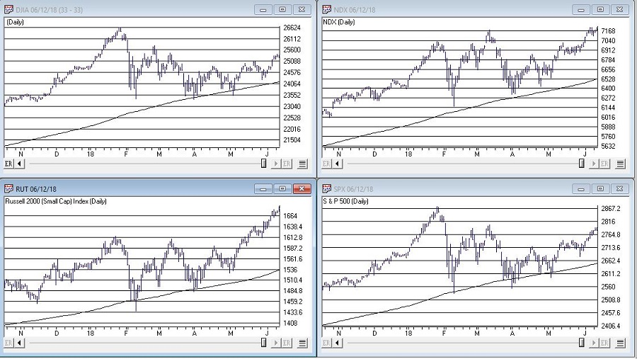
Figure 1 displays the four major average – Dow, S&P 500, Nasdaq 100 and Russell 2000 with their respective 200-day moving averages. In the last few days the Dow slipped a little below its 200-day average, the other three remain above.
(click to enlarge)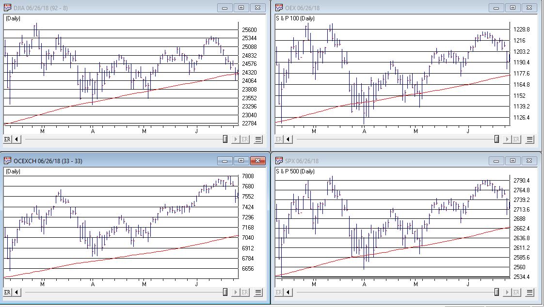 Figure 1 – Four major market averages with 200-day moving averages (Courtesy TradingExpert)
Warning Sign to Watch For: If 3 or more of these averages drop below their 200-day moving average.
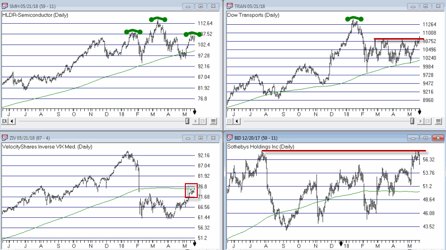
#2. Market Bellwethers
Figure 2 displays my four market “bellwhethers” – tickers SMH (semiconductors), TRAN (Dow Transports), ZIV (inverse VIX) and BID (Sotheby’s Holdings) with their respective 200-day moving averages. At the moment only ZIV is below it’s 200-day moving average but some of the others are close
(click to enlarge)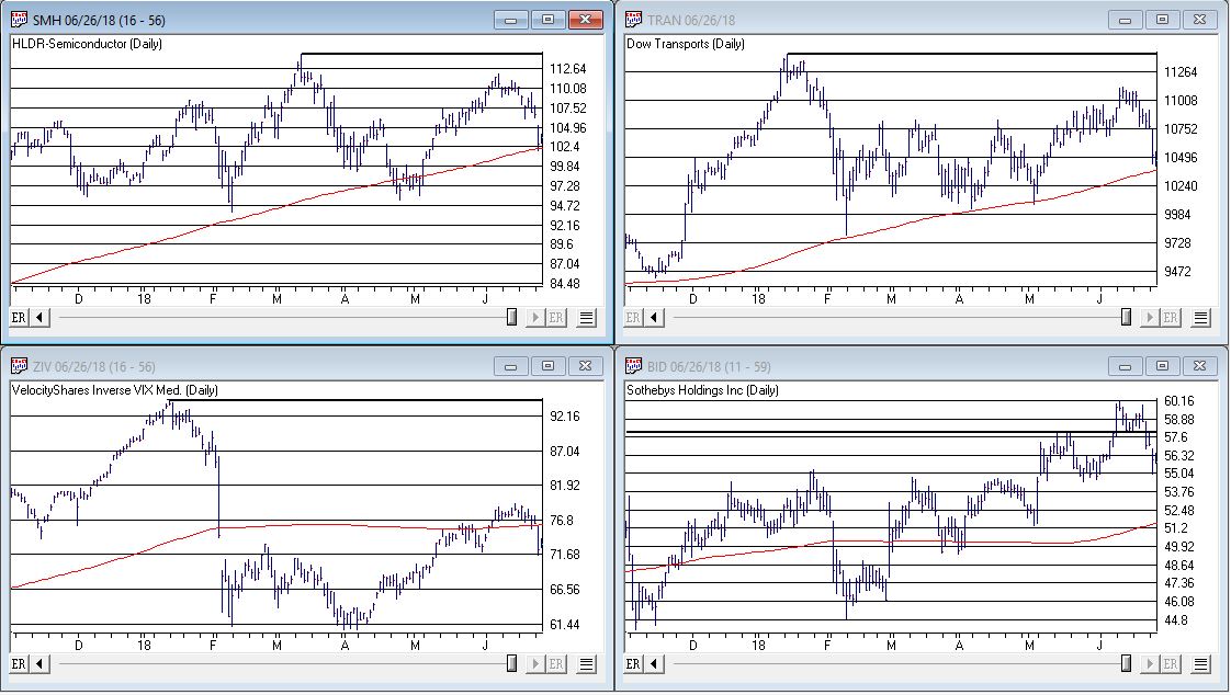 Figure 2 – Four market bellwethers with 200-dqy moving averages (Courtesy TradingExpert)
Warning Sign to Watch For: If 3 or more of these averages drop below their 200-day moving average.
#3. S&P 500 Monthly Method
In this article I detailed a simple timing method using S&P 500 Index monthly closing prices. Figure 3 show the S&P 500 Index with it’s “trigger warning” price of 2,532.69 highlighted.
(click to enlarge)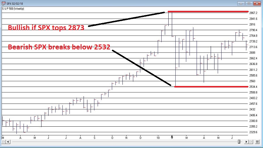 Figure 3 – S&P 500 Index Monthly Method Trigger Points (Courtesy TradingExpert)
Warning Sign to Watch For: If SPX closes below 2532.69 without first taking out the January high of 2872.87
#4. International Growth Stocks
When growth stocks around the world are performing well, things are good. When they top out, try to rebound and then fail, things are (typically) not so good. The last two major U.S. bear markets were presaged by a break in ticker VWIGX (Vanguard International Growth) as seen in Figure 4.
(click to enlarge)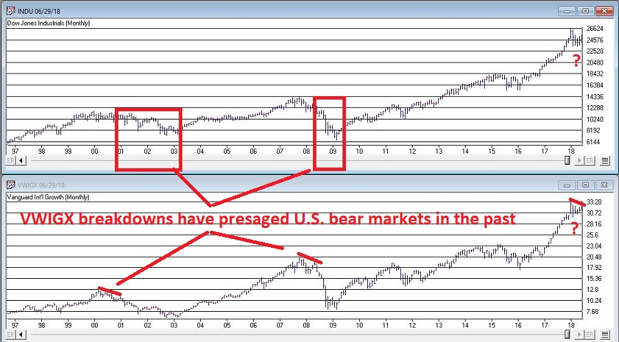 Figure 4 – Dow Jones Industrials Average (top) and previous warnings from ticker VWIGX (bottom)(Courtesy TradingExpert)
Warning Sign to Watch For: Technically this one is currently flashing a warning sign. That warning will remain active unless and until VWIGX takes out the January high of 33.19.
#5. The 10-Year minus 2-Year Yield Spread
This is one of the most misrepresented indicators, so I will state it as plainly as possible:
*A narrowing yield curve IS NOT a bearish sign for the stock market
*An actual inverted yield curve IS a bearish sign for the stock market
Figure 5 displays the latest 10-year minus 2-year spread. Yes, it has narrowed quite a bit. This has launched a bazillion and one erroneously frightening articles. But remember the rules above.
(click to enlarge)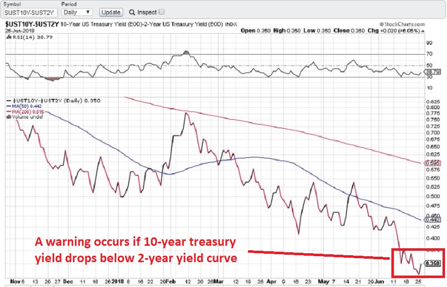 Figure 5 – 10-year treasury yield minus 2-year treasury yield (Courtesy: www.StockCharts.com)
Warning Sign to Watch For: If the 10-year yield minus the 2-year yield falls into negative territory it will flash a powerful warning sign for the stock market and the overall economy. Until then ignore all the hand-wringing about a “flattening” yield curve.
Summary
We are in a seasonally unfavorable period for the stock market and – as always – we are bombarded daily with a thousand and one reasons why the next bear market is imminent.
So my advice is to do the following:
1. Ignore it all and keep track of the items listed above
2. The more warning signs that appear – if any – the more defensive you should become
In the meantime, try to go ahead and enjoy your summer.
Jay Kaeppel
Disclaimer: The data presented herein were obtained from various third-party sources. While I believe the data to be reliable, no representation is made as to, and no responsibility, warranty or liability is accepted for the accuracy or completeness of such information. The information, opinions and ideas expressed herein are for informational and educational purposes only and do not constitute and should not be construed as investment advice, an advertisement or offering of investment advisory services, or an offer to sell or a solicitation to buy any security.
Jun 27, 2018 | chart patterns, educational newsletters, ETFs, indexes, jay kaeppel
If an investor were to sit down and peruse the Web looking for guidance regarding the stock market, there is a good chance they would come away bewildered and confused.
So, let’s try to simplify things a bit.
Jay’s Trading Maxim #14: When in doubt, usually the best question to ask is “What is the trend right now?”
There are always a million and one reasons why an investor may feel doubt. But answering that simple question can often lead to a much greater deal of clarity. Like now for instance.
In Figure 1 we see the Dow, Nasdaq 100, Russell 200 small-cap index and the S&P 500. The key thing to note is that all 4 of them are above their respective 200-day moving average, i.e., “right now” the trend is up.
Jay’s Trading Maxim #14a: If the trend right now is “Up”, act accordingly. At least until the answer changes.

Figure 1 – Major U.S. Indexes in Up Trends (Courtesy TradingExpert)
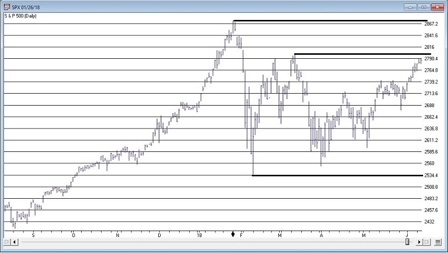
SPX Monthly Trend-Following
I wrote here and here about a simple monthly trend-following method using the S&P 500 Index.
This method gave an “alert” when the S&P 500 went 3 calendar months (Feb, March and April) without making a new high.
The “line in the sand” is the low during this period of 2532,69. As long as price holds above this level, this method deems the trend as still “Up”.
It will take a move above the January high 2872.87 to eliminate this line in the sand. Between here and there there is resistance at 2801.90.

Figure 2 – S&P 500 Index key support and resistance (Courtesy TradingExpert)
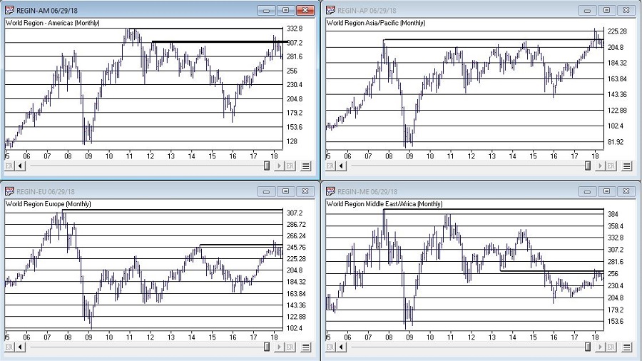
I am not speaking in any geopolitical sense here. And I don’t want to sound like the Ugly American. But while the U.S. stock market is “taking care of business” and moving higher, the stock markets of much of the rest of the world are not. And I am not sure if I should worry about this or not.
But for what it is worth, all 4 regional single country ETF indexes that I created (Americas, Asia/Pacific, Europe and Middle East) and follow are not looking terribly inspiring at the moment.
The trend “right now” is “Up”. So enjoy.
But maybe check back again soon. Just in case.
Disclaimer: The data presented herein were obtained from various third-party sources. While I believe the data to be reliable, no representation is made as to, and no responsibility, warranty or liability is accepted for the accuracy or completeness of such information. The information, opinions and ideas expressed herein are for informational and educational purposes only and do not constitute and should not be construed as investment advice, an advertisement or offering of investment advisory services, or an offer to sell or a solicitation to buy any security.
May 24, 2018 | chart patterns, educational newsletters, ETFs, group and sector, jay kaeppel
The question posed in the title is essentially, “does the fate of the stock market hinge on the action of Sotheby’s Holdings” (ticker BID)? Sotheby’s is the oldest stock on the NYSE and is the only publicly traded investment opportunity in the art market. As the art market is highly sensitive to the overall economy it has been argued that BID is a potential stock market “bellwether”.
Still, the most obvious answer to the question posed above is of course “No.” Of course the performance of the whole stock market does not come down to the performance of one stock. That’s the obvious answer.
The more curious answer is arrived at by first looking at Figure 1. Figure 1 displays a monthly bar chart for BID in the top clip and the S&P 500 Index in the bottom clip. What is interesting is that historically when BID tops out, bad things tend to follow for the broader stock market.
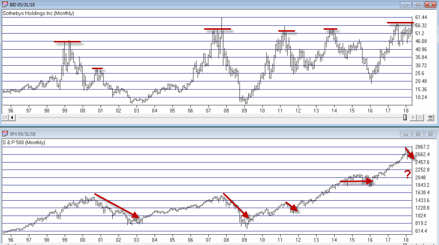
Figure 1 – BID tops often foreshadow SPX weakness (Courtesy WinWay
TradingExpert)
Consider:
*The bear market of 2000-2002 was presaged by a dramatic top for BID in 1999, and confirmed again in late 2000.
*The great bear market of 2008 was also preceded by a top and breakdown in BID.
*The 2011 top in BID was followed by a quick but sharp -21% SPX decline.
*The 2013-2014 BID top was followed by roughly 2 years of sideways SPX price action.
*More recently the top in 2017-2018 top has been accompanied by much volatility and consternation in the broader market.
Figure 2 “zooms in” to recent years using weekly data.
In Figure 2 we can see how poor performance for BID presaged an extended period of sideways trading for the SPX. At the far right we can also see that BID is at something of a critical juncture. If it punches through to the upside and moves higher it could be something of an “All Clear” sign for the market. On the other hand, if BID fails here and forms a clear multiple top, well, history suggests that that might be an ominous sign for the broader market.
Other Bellwethers
BID is one of four market “bellwethers” that I like to monitor. The other 3 are SMH (semiconductor index), TRAN (Dow Transports) and ZIV (inverse VIX). You can see the status of each in Figure 3.
Figure 3 – Four stock market “Bellwethers” (Courtesy WinWay
TradingExpert)
To sum up the current status of these bellwethers:
*All 4 (including ZIV as of the latest close) are above their respective 200-day moving average. So technically, they are all in “up trends.”
*All 4 are also threatening to create some sort of topping formation.
In sum, as long as all four of these bellwethers continue to trend higher, “Life is Good” in the stock market. At the same time, if some or all of these fail to break through and begin to top out, the broader market may experience more trouble.
Bottom line: Now is a good time to pay close attention to the stock market for “tells”.
Jay Kaeppel
Disclaimer: The data presented herein were obtained from various third-party sources. While I believe the data to be reliable, no representation is made as to, and no responsibility, warranty or liability is accepted for the accuracy or completeness of such information. The information, opinions and ideas expressed herein are for informational and educational purposes only and do not constitute and should not be construed as investment advice, an advertisement or offering of investment advisory services, or an offer to sell or a solicitation to buy any security.
May 10, 2018 | chart patterns, educational newsletters, jay kaeppel
Gold, gold stocks and commodities in general are starting to get a lot of notice lately. And not without good reason. Consider the bullish implications for all things precious metal in the articles below – one from Tom McClellan of the McClellan Report and one from the Felder Report.
I have also previously touched on these themes time or two (or four) of late.
Where We Are Now
So on the one hand, it can be argued that gold, mining stocks and commodities in general are poised for a significant move to the upside.
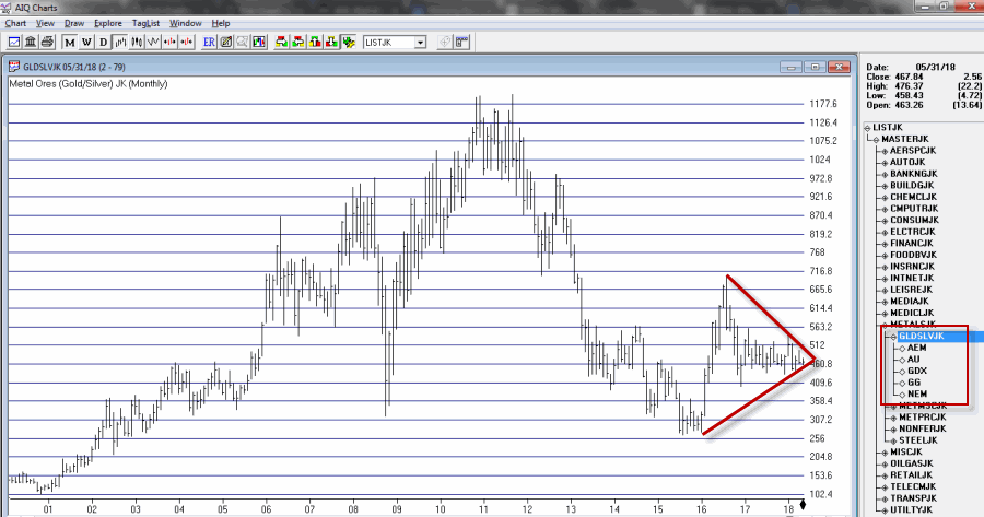
Consider the “coiling” action displayed in Figure 1, which is a monthly chart for a mining index that I track that I’ve labeled GLDSLVJK.
Figure 1 – Jay’s Gold Stock (GLDSLV) Index (Courtesy
TradingExpert)
I look at the coiling action displayed in Figure 1 – in conjunction with the information contained in the articles linked above – and I can’t help but to think that a big upside breakout in gold stocks is imminent.
The “Fly in the Ointment”
When it comes to all of this metals/miners/commodities bullishness there’s just one “fly in the ointment” – the U.S. Dollar. Let’s be succinct here and invoke:
Jay’s Trading Maxim #102: Whichever way the dollar goes, a lot of things go the other way.
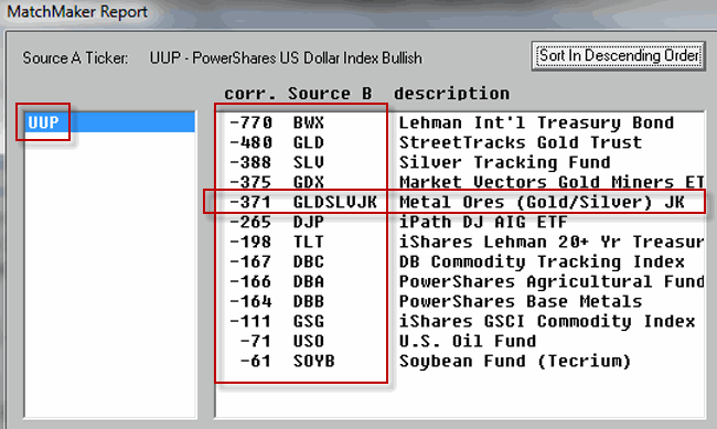
To wit, see Figure 2, which highlights the inverse nature of, well, a lot of things to the U.S. Dollar (a value of 1000 means 100% correlation and a value of -1000 means a 100% inverse correlation.
Figure 2 – Things that trade inversely to the U.S. Dollar (Courtesy
TradingExpert)
In other words, when the U.S. dollar goes up, the things listed on the right hand side of Figure 2
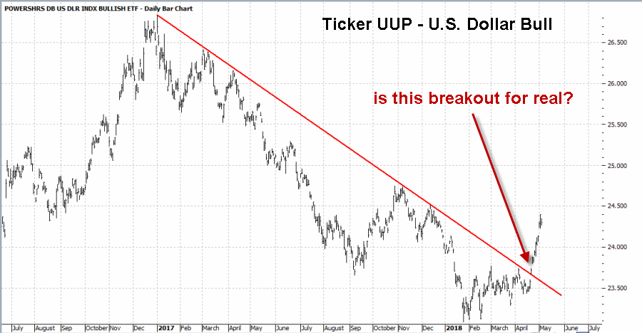
Now consider Figure 3 – which appears to be showing a potential upside breakout for the U.S. dollar.
Which brings us back to the title – Dollar or Miners, it’s One or the Other.
If the U.S. Dollar is truly staging an upside breakout, chances are gold miners will not.
Stay tuned….and keep a close on the buck.
Jay Kaeppel
Disclaimer: The data presented herein were obtained from various third-party sources. While I believe the data to be reliable, no representation is made as to, and no responsibility, warranty or liability is accepted for the accuracy or completeness of such information. The information, opinions and ideas expressed herein are for informational and educational purposes only and do not constitute and should not be construed as investment advice, an advertisement or offering of investment advisory services, or an offer to sell or a solicitation to buy any security.