Jul 7, 2016 | earnings, educational newsletters, fundamental analysis, Top Stock analyzer
Have you ever bought a stock you thought had great earnings, only to see it fail miserably?
It is not enough to have a list of great fundamental stocks. You must go deeper into the analysis of each final candidate on the list. But, what other analysis can be done? At Top Stock Analyzer we use our own proprietary tool, we call the the FATI® Score to help us unlock profits.
The FATI® Score is based upon leading investment research studies which show stocks with a lower standard deviation of earnings estimates from the consensus (higher degree of agreement among analysts) the better performance of the stock.
The study concluded stocks with a higher degree of earnings certainty (lower standard deviation of estimates) outperformed stocks with a lower degree of earnings certainty by +8.7% per year over a fifteen-year period. That is a significant performance enhancement. One which cannot be ignored.
With out FATI® Score we fine tune stock selection beyond a list of great fundamentally screened stocks. There is no magic here, nor any guarantees, but face it; investing is hard enough. Why not select stocks which have a high probability of outperforming the markets both long and short?
Each week we generate a report of high scoring stocks both long and short, then feature one stock for an in-depth analysis.
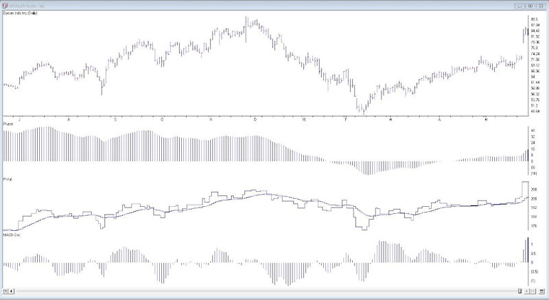
Here’s an excerpt from our May 30, 2016 newsletter and the long stock that the FATI® Score highlighted
Featured Stock – Dycom Industries – DY
Industry – Heavy Construction
Dycom Indiustries is a specialty contracting firm servicing
the telecom and utilities industries. The firm provides engineering, construction and maintenance services. They
have a long list of prominent clients, such as AT&T, Verizon, Comcast and Century Link.
Dycom is experiencing enormous
growth due to the high demand for network and mobile bandwidth. As the bandwidth demand grows, customers need to
expand the capacity of their networks. This demand has created a backlog of over $5.6 billion is contract work
for Dycom. With this years sales growth estimated at over 26% earnings should continue to be outstanding.
As of 7/6/2016 DY was up 6.59%
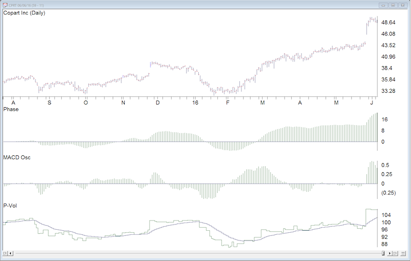
Here’s an excerpt from our June 6, 2016 newsletter and the long stock that the FATI® Score highlighted
Featured Stock – Copart, Inc. – CPRT
Industry – Auction/Valuation Services
Copart, Inc. provides online auction and related services to
process or sell salvage and marketable vehicles. The buyers and sellers include
insurance companies, banks and financial institutions, car dealerships, fleet
operators, and vehicle rental companies, licensed dealers and of course the
general public as well.
The company’s operations span the globe. Operations are well
established in Canada, Europe, South America and India. With increasing
revenues. declining expenses and global expansion into the Middle East, Copart
has been hitting on all cylinders. So far in 2016 the company has added 4 new
facilities to handle the increase in volume. Two in Colorado and two in Texas.
Earnings revisions are strong and are coming in higher
across quarterly and annual estimates. With a three year projected EPS growth
rate of 27% the party is not over yet. The P/E of 23 may sound expensive on a
relative basis, but with its EPS growth rate, it is actually reasonable.
As of 7/6/2016 CPRT was up 1.15%
The ‘Short Side’ List
We also analyze for candidates to consider shorting for downward trending markets. The criterion for screening is not exactly the opposite of the long screen. To be most effective with the short list and minimize your risk associated with shorting, it is best to look for newcomers to the short list on a weekly basis.
Remember, shorting is an advanced trading technique. You have unlimited loss potential, so remember to be selective, use a stop loss order and only short in a confirmed downward trending market.
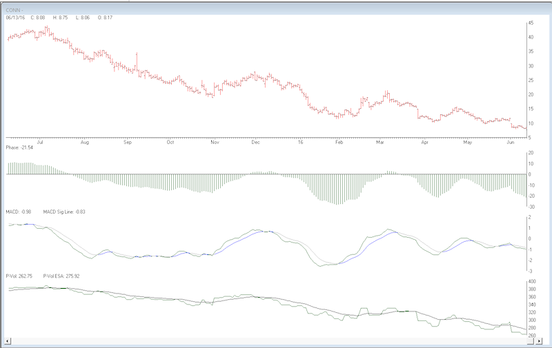
Here’s an excerpt from our June 13, 2016 newsletter and the short stock that the FATI® Score highlighted
Featured Stock – Conn, Inc. – CONN
Industry – Specialty Retailer
Conn, Inc is a regional specialty retailer in the southern
part of the U.S., in particular Texas and Louisiana. They sell home appliance
and garden equipment along with an array of other electronics. The company has
seen their gross margin severely impact by the rising cost of goods. In
addition their interest expense has doubled over the past year. These items, as
well as others have cause a severe contraction in earnings.
There doesn’t seem to be any daylight coming for Conn.
Earnings are expected to decline -89% this year, the P/E stands at 73 and F1
estimates have fallen from $1.77 to $0.11 over the past 90 days. Of the six
analysts following the stock, there doesn’t appear to be any agreement on the
actual EPS as depicted in a FATI Score of 534. Remember, anything over a score
of 12 or higher is disqualified from our long recommendations list.
With a pending market decline and the growing deterioration
of Conn, Inc. fundamentals, we see this as a good shorting opportunity. As with
any short trade, place a stop order and monitor the stock daily.

As of 7/6/2016 CONN was up 12.73%
Putting it All Together
There you have it. “Fundamentals Made Simple”. Just select your stocks from the list and go right into your technical analysis. All the fundamental screening has already been done for you. Each and every week you will receive an updated screening of Top Stock Analyzer with the power of the FATI® Score. You can see the score of each stock.
Here’s our featured stock performance as of 7/6/2016
Our weekly newsletter is a collaboration between AIQ Systems LLC and Fortunatus Advisors, Inc. if you want to learn more about our service visit
Jun 14, 2016 | Uncategorized
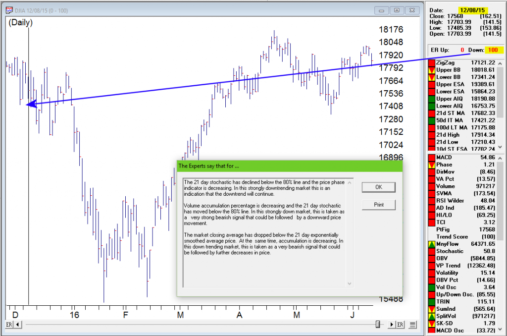
Artificial Intelligence Market Signal issues a 0-100 to the downside on June 10, 2016
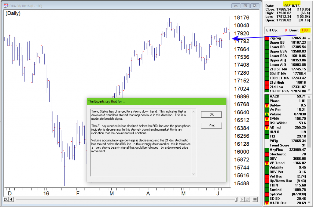
WinWay TradingExpert AI signals are designed to anticipate changes in the direction of price movement. Some are accurate and some are not. However, more often than not, the Expert Rating signals are accurate. The strongest level of confirmation for market timing signals like this 0-100 down on June 10, 2016 can be found by examining one of TradingExpert’s other market indication components.
One possible confirmation of market timing signals (Expert Ratings of 95 or greater) is the the Up/Down Signal Ratio, on the Weighted Action List (WAL), an AIQ report. A Signal Ratio of 85 or greater in the direction of the signal could be viewed as significant, as the AI system used for stocks is completely separate in terms of expert system knowledge base and data, and share no information or expert rules with the market timing system.
The image below is taken from the WinWay Reports Daily Market Log. This report pulls elements from various parts of TradingExpert. You’ll notice the 0-100 down signal on DJIA on 6/10/2016. Just below that is WAL 5-95. This is the Up/Down Signal Ratio from the Weighted Action List (WAL) in this case using SP500 stocks. This 5-95 confirms that 95% of the SP500 stocks have down signals according to the stock expert system.
The Access Plot area on the right gives a bullish/bearish consensus for the SP 500 stocks using 16 technical indicators.
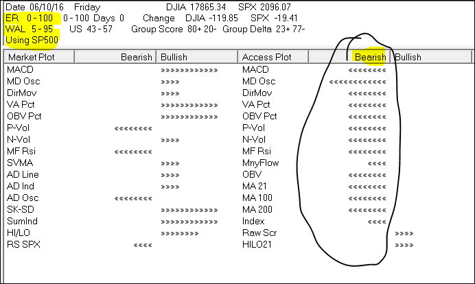
The two independent components of TradingExpert are in agreement calling for the market to move in the same direction. This is a very powerful type of validation, both the equity and market timing systems have signaled a change in market direction at the same time.
While no system is perfect, it is interesting to note the previous 0-100 market timing signal occurred December 8, 2015 prior to the correction at the start of 2016.
May 2, 2016 | indicators, options, Seasonality
Not every indicator that you look at needs to generate exact buy and sell signals. There are many useful indicators that offer “perspective” more than “precision market timing.” It can be very helpful to track some of these.
The downside of course is that the more indicators you follow the more you can be susceptible to “analysis paralysis” – plus at some point you do have to have “something” that tells you “make this trade NOW!”
But the basis for considering tracking certain “perspective indicators” is that they can help to keep you from falling for those age-old pitfalls, “fear” and “greed”. As the market falls – and especially the harder it falls – the more likely an investor is to start to feel fear. And more importantly, to start to feel the urge to “do something” – something like “sell everything” to alleviate the fear.
On the flipside, when things are going great there is a tendency to ignore warning signs and to “hope for the best”, since the money is being made so easily.
In both cases a perspective indicator can serve as – at the very least – a slap upside the back of the head that says “Hey, pay attention!”
So today let’s review one of my favorites.
The JK HiLo Index
OK, I will admit it is one of my favorites because I developed it myself. Although in reality the truth is that it simply combines one indicator developed long ago by Norman Fosback and another that I read about in a book my either Martin Pring or Gerald Appel.
The calculations are as follows:
A = the lower of Nasdaq daily new highs and Nasdaq daily new lows
B = (A / total Nasdaq issues traded)*100
C = 10-day average of B
D = Nasdaq daily new highs / (Nasdaq daily new highs + Nasdaq daily new lows)
E = 10-day average of D
JK Hi/Lo Index = (C * E) * 100
In a nutshell:
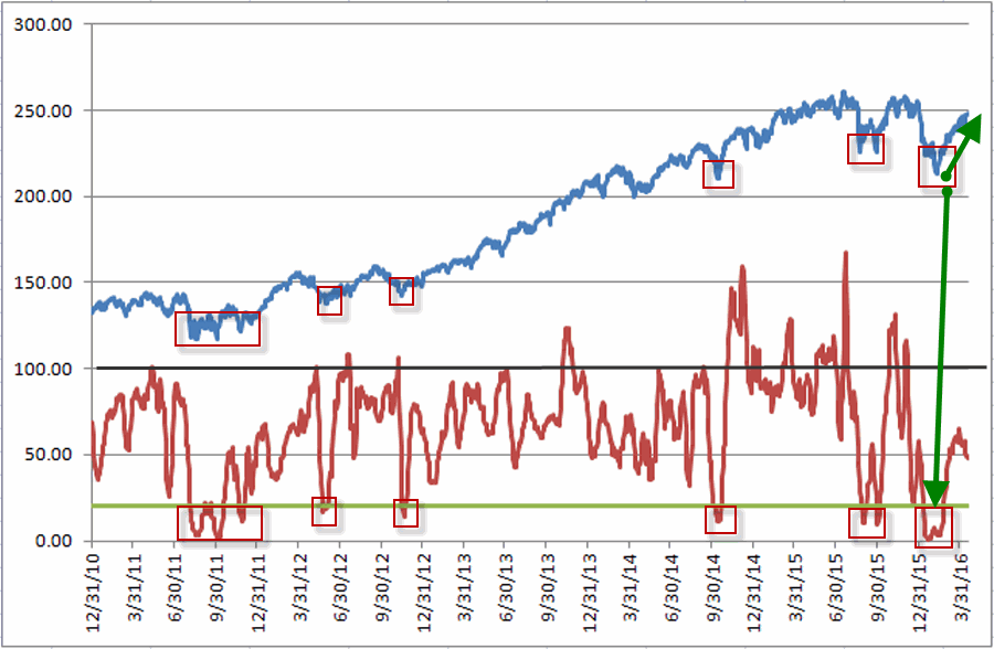
*High readings (90 or above) suggest a lot of “churning” in the market and typically serve as an early warning sign that a market advance may be about to slow down or reverse. That being said, a close look at Figure 1 reveals several instances where high readings were NOT followed by lower prices. However, as a perspective indicator note the persistently high reading starting in late 2014. This type of persistent action combined with the “churning” in the stock market could easily have served as a warning sign for an alert investor.
*Low readings (20 or below) indicate a potential “washout” as it indicates a dearth of stocks making new highs. Readings under 10 are fairly rare and almost invariably accompany meaningful stock market lows.
Figure 1 displays the Nasdaq Composite (divided by 20) with the JK Hi/Lo Index plotted since 2011.
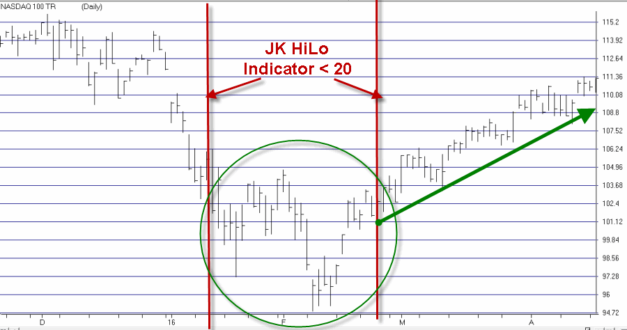
Regarding the difference between a “timing” indicator and a “perspective” indicator, note the two red lines in Figure 2. The JK HiLo Index first dropped below 20 on the date marked by the first red line. It finally moved back above 20 on the date marked by the second red line.
Figure 2 – JK HiLo Index (red line) versus Nasdaq Composite (/20) since 2015 (Courtesy TradingExpert)
Can we say that the JK HiLo Index “picked the bottom with uncanny accuracy”? Not really. The Nasdaq plunged another 10% between the first date the indicator was below 20 until the actual bottom.
Still, can we also say that it was useful in terms of highlighting an area where price was likely to bottom? And did it presage a pretty darn good advance? I think a case can be made that the answers to those questions are “Yes” and “Yes”.
Summary
The bottom line is that while there was a great deal of fear building in the market during January and February, an indicator such as this one can help alert an investor the fact an opportunity may be at hand.
Jay Kaeppel
Chief Market Analyst at JayOnTheMarkets.com and TradingExpert Pro client
http://jayonthemarkets.com/
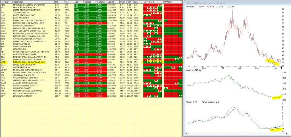
Apr 13, 2016 | chart patterns, swing trading, trading strategies
We’ve been watching MIDZ – Direxion Daily Mid Cap bear 3X in our barometer the last few trading days. This 3 x bearish ticker has been in a long down trend, but recently Moneyflow has begun to show signs of accumulation and the MACD diverged up when the price was still heading down.
The 5 day barometer readings on Moneyflow and MACD in our Quotes montage are showing some bullish signs either all green or green arrow up. Maybe times are a changing.
Apr 7, 2016 | chart patterns, MACD, options
In this article I detailed one relatively “simple” approach to using the MACD indicator to identify potentially bullish opportunities. In this piece we will look at one to actually put those signals to use.
The Limited Risk Call Option
One possibility upon generating a bullish signal as described in the last article is to buy shares of the stock/ETF/index/etc in question. Not a thing wrong with that. But there is a less expensive alternative.
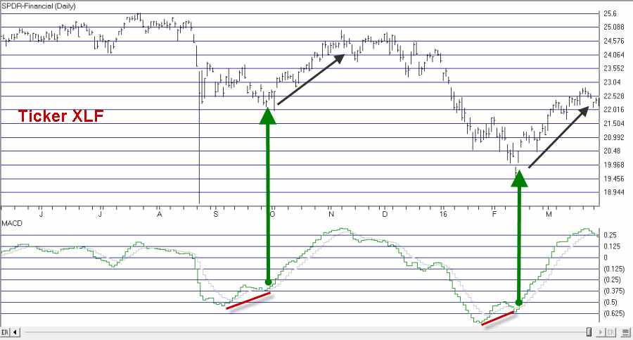
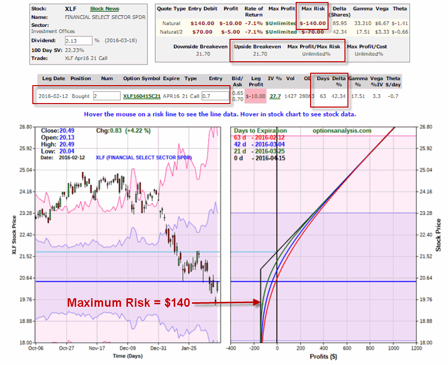
Figure 1 reproduces Figure 1 from the last piece showing ticker XLF. Let’s look at the signal generated on 2/12/16.
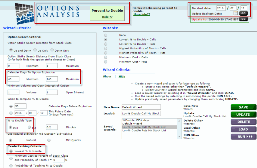
One alternative that I like is to use the “Percent to Double” routine at
www.OptionsAnalysis.com to find an inexpensive call option that has lot of upside potential. The input screen with a few key input selections highlighted appears in Figure 1a (if it looks intimidating please note that a reusable set of criteria can be captured in a “Saved Wizard”, which appear towards the lower right of of Figure 1a. Once a set of criteria is saved it can be reused by simply clicking on the Wizard name and clicking “Load”.)
NOTE: My own personal preference is to consider options that have at least 45 days left until expiration (as time decay can become a very negative factor as option expiration draws closer).
Figure 1a – Percent to Double
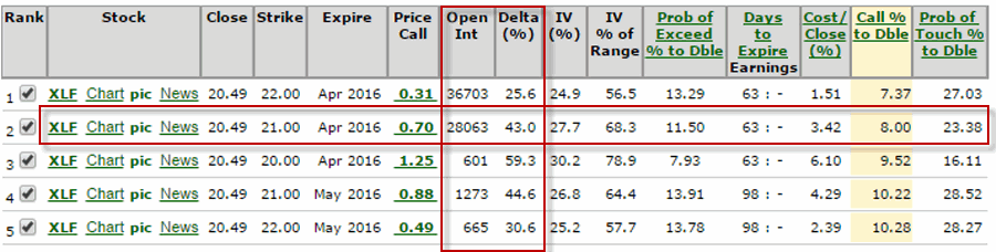
Figure 1b displays the output screen.
NOTE: For my own purposes I like to see a Delta of at least 40 for the option I might consider buying (nothing “scientific” here. It is just that the lower the Delta the further out-of-the-money the option strike price is. I prefer to buy a strike price that is not too far from the current price of the stock; hence I look for a Delta of 40 or higher). With XLF trading at $20.49, in Figure 1b I have highlighted the 2nd choice on the list – the April 21 call – which has a delta of 43.
So a trader now has two alternatives:
*Buy 2 Apr 21 strike price XLF calls for $70 apiece ($140 total cost; 86 total deltas)
*Buy 86 shares of XLF at $20.49 apiece ($1,760 total cost, 86 total deltas)
Figure 1c displays the particulars for buying a 2-lot of the April 21 call for a total cost of $140.
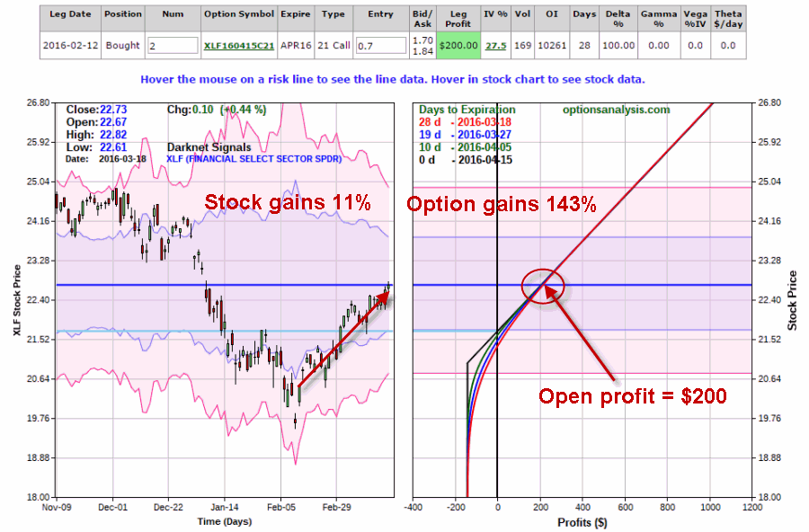
By 3/18 the shares had gained 11% and the Apr 21 call had gained 143%. See Figure 1d.
Summary
Obviously not every trade works out as well as this one. Still, the key things to remember are:
*The option trade cost $140 instead of $1760
*The worst case scenario was a loss of $140.
Something to think about.
Chief Market Analyst at JayOnTheMarkets.com and TradingExpert Pro client