Feb 16, 2017 | EDS, EDS code, indicators, Stocks & Commodities Traders Tips
The AIQ code based on Vitali Apirine’s article in the 2017 issue of Stocks & Commodities magazine, “Exponential Standard Deviation Bands”
Editor note: “Author Vitali Apirine presented a method intended to help traders see volatility while a stock is trending. These bands, while similar to Bollinger Bands, are calculated using exponential moving averages rather than simple moving averages.
Like Bollinger Bands, they widen when volatility increases and narrow as volatility decreases. He suggests that the indicator can be used as a confirming indication along with other indicators such as the ADX.
Here’s a WinWay Chart with the Upper, Lower and Middle Exponential SD added as custom indicators.”
To compare the exponential bands to Bollinger Bands, I created a trend-following trading system that trades long only according to the following rules:
- Buy when there is an uptrend and the close crosses over the upper band. An uptrend is in place when the middle band is higher than it was one bar ago.
- Sell when the low is less than the lower band.
Figure 8 shows the summary test results for taking all signals from the Bollinger Band system run on NASDAQ 100 stocks over the period 12/9/2000 to 12/09/2016. Figure 9 shows the summary test results for taking all signals from the exponential band system on NASDAQ 100 stocks over the same period. The exponential band system improved the average profit per trade while reducing the total number of trades.
FIGURE 8: WinWay EDS. Here are summary test results for taking all signals from the Bollinger Band system run on NASDAQ 100 stocks over the period 12/9/2000 to 12/09/2016.

FIGURE 9: WinWay EDS. Here are summary test results for taking all signals from the exponential band system run on NASDAQ 100 stocks over the period 12/9/2000 to 12/09/2016.
!Exponential Standard Deviation Bands
!Author: Vitali Apirine, TASC February 2017
!Coded by: Richard Denning 12/11/2016
!INPUT:
xlen is 20.
numSD is 2.
!INDICATOR CODE:
ExpAvg is expavg([close],xlen).
Dev is [close] – ExpAvg.
DevSqr is Dev*Dev.
SumSqr is sum(DevSqr,xlen).
AvgSumSqr is SumSqr / xlen.
ExpSD is sqrt(AvgSumSqr).
!UPPER EXPONENTIAL SD BAND:
UpExpSD is ExpAvg + numSD*ExpSD. !PLOT ON CHART
!LOWER EXPONENTIAL SD BAND:
DnExpSD is ExpAvg – numSD*ExpSD. !PLOT ON CHART
!MIDDLE EXPONENTIAL SD BAND:
MidExpSD is ExpAvg.
!BOLLINGER BANDS FOR COMPARISON:
DnBB is [Lower BB]. !Lower Bollinger Band
UpBB is [Upper BB]. !Upper Bollinger Band
MidBB is simpleavg([close],xlen). !Middle Bollinger Band
!REPORT RULE TO DISPLAY VALUES:
ShowValures if 1.
!TRADING SYSTEM USING EXPPONENTIAL SD BANDS:
UpTrend if MidExpSD > valresult(MidExpSD,1).
BreakUp if [close] > UpExpSD.
BuyExpSD if UpTrend and BreakUp and valrule(Breakup=0,1).
ExitExpSD if [Low] < DnExpSD. ! or UpTrend=0. !TRADING SYSTEM USING BOLLINGER BANDS: UpTrendBB if MidBB > valresult(MidBB,1).
BreakUpBB if [close] > UpBB.
BuyBB if UpTrendBB and BreakUpBB and valrule(BreakupBB=0,1).
ExitBB if [Low] < DnBB. ! or UpTrend=0.
May 2, 2016 | indicators, options, Seasonality
Not every indicator that you look at needs to generate exact buy and sell signals. There are many useful indicators that offer “perspective” more than “precision market timing.” It can be very helpful to track some of these.
The downside of course is that the more indicators you follow the more you can be susceptible to “analysis paralysis” – plus at some point you do have to have “something” that tells you “make this trade NOW!”
But the basis for considering tracking certain “perspective indicators” is that they can help to keep you from falling for those age-old pitfalls, “fear” and “greed”. As the market falls – and especially the harder it falls – the more likely an investor is to start to feel fear. And more importantly, to start to feel the urge to “do something” – something like “sell everything” to alleviate the fear.
On the flipside, when things are going great there is a tendency to ignore warning signs and to “hope for the best”, since the money is being made so easily.
In both cases a perspective indicator can serve as – at the very least – a slap upside the back of the head that says “Hey, pay attention!”
So today let’s review one of my favorites.
The JK HiLo Index
OK, I will admit it is one of my favorites because I developed it myself. Although in reality the truth is that it simply combines one indicator developed long ago by Norman Fosback and another that I read about in a book my either Martin Pring or Gerald Appel.
The calculations are as follows:
A = the lower of Nasdaq daily new highs and Nasdaq daily new lows
B = (A / total Nasdaq issues traded)*100
C = 10-day average of B
D = Nasdaq daily new highs / (Nasdaq daily new highs + Nasdaq daily new lows)
E = 10-day average of D
JK Hi/Lo Index = (C * E) * 100
In a nutshell:
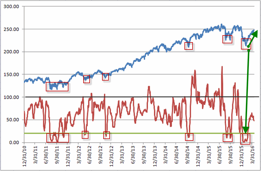
*High readings (90 or above) suggest a lot of “churning” in the market and typically serve as an early warning sign that a market advance may be about to slow down or reverse. That being said, a close look at Figure 1 reveals several instances where high readings were NOT followed by lower prices. However, as a perspective indicator note the persistently high reading starting in late 2014. This type of persistent action combined with the “churning” in the stock market could easily have served as a warning sign for an alert investor.
*Low readings (20 or below) indicate a potential “washout” as it indicates a dearth of stocks making new highs. Readings under 10 are fairly rare and almost invariably accompany meaningful stock market lows.
Figure 1 displays the Nasdaq Composite (divided by 20) with the JK Hi/Lo Index plotted since 2011.
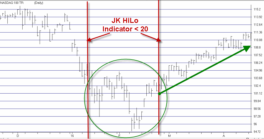
Regarding the difference between a “timing” indicator and a “perspective” indicator, note the two red lines in Figure 2. The JK HiLo Index first dropped below 20 on the date marked by the first red line. It finally moved back above 20 on the date marked by the second red line.
Figure 2 – JK HiLo Index (red line) versus Nasdaq Composite (/20) since 2015 (Courtesy TradingExpert)
Can we say that the JK HiLo Index “picked the bottom with uncanny accuracy”? Not really. The Nasdaq plunged another 10% between the first date the indicator was below 20 until the actual bottom.
Still, can we also say that it was useful in terms of highlighting an area where price was likely to bottom? And did it presage a pretty darn good advance? I think a case can be made that the answers to those questions are “Yes” and “Yes”.
Summary
The bottom line is that while there was a great deal of fear building in the market during January and February, an indicator such as this one can help alert an investor the fact an opportunity may be at hand.
Jay Kaeppel
Chief Market Analyst at JayOnTheMarkets.com and TradingExpert Pro client
http://jayonthemarkets.com/
Mar 30, 2016 | indicators, MACD
One danger of getting “way to into” the financial markets is that you can find yourself progressing into some needlessly complicated stuff (“Hi, my name is Jay”). I mean it is only natural to wonder “hey, what if I divided this indicator value by that indicator value” and such. But once you start finding yourself taking an exponential moving average of a regression line with a variable lag time, well, you can find yourself “a tad far afield.” (Trust me on this one). Which leads us directly to:
Jay’sTradingMaxim #44: Every once in awhile it pays to remember that the end goal is simply to make money. The more easily the better.
So today let’s go back to a simple “basic approach.”
The Bullish MACD Divergence
We will define an “asset” as any stock, ETF, commodity, index, etc. that can be traded on an exchange (and for my purposes, there should be a liquid market for options on that asset).
Step 1. An asset price falls to a new 20-day low and the MACD value is less than 0. Note the MACD value on this date.
Step 2. Not less than one week but not more than 2 months later:
*Price closes below its closing level in Step 1
*The MACD indicator is above its level at the time of Step 1
Step 3. The next time the daily MACD indicator “ticks higher” a buy alert is triggered
Can it really be that simple? The Good News is “Yes, it can.” The Bad News is that “It isn’t always.” To put it another way, like a lot of trading methods it can generate a surprising abundance of useful trading signals. However, there is no guarantee that any given signal will turn out to be timely. In other words:
This method gives you a good guideline for when to get in, but:
*It may be early at times (i.e., price will move lower still before advancing)
*It will at times be flat out wrong
*You still have to decide when to exit the bullish position.
*Call options are useful with this approach as it allows you to risk a limited amount of capital.
Examples
Figures 1 through 4 highlight some recent examples using this method. Note that the charts show only entry points. Exit points are “a separate topic”.
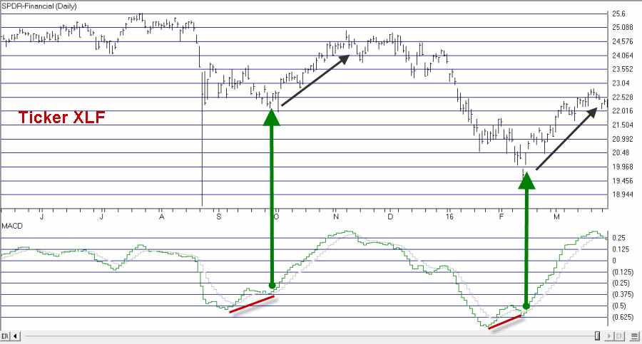
Figure 1 – Ticker XLF (Courtesy TradingExpert Pro)
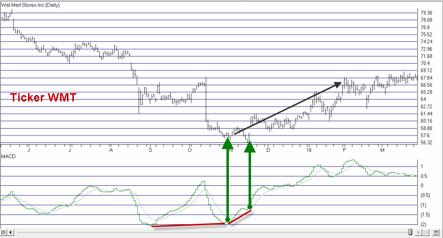
Figure 2 – Ticker WMT (Courtesy TradingExpert)
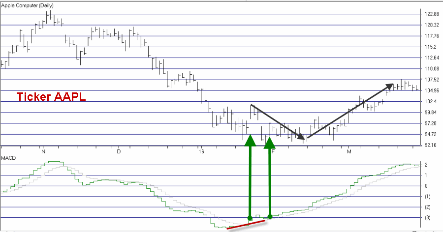
Figure 3 – Ticker AAPL (Courtesy TradingExpert)
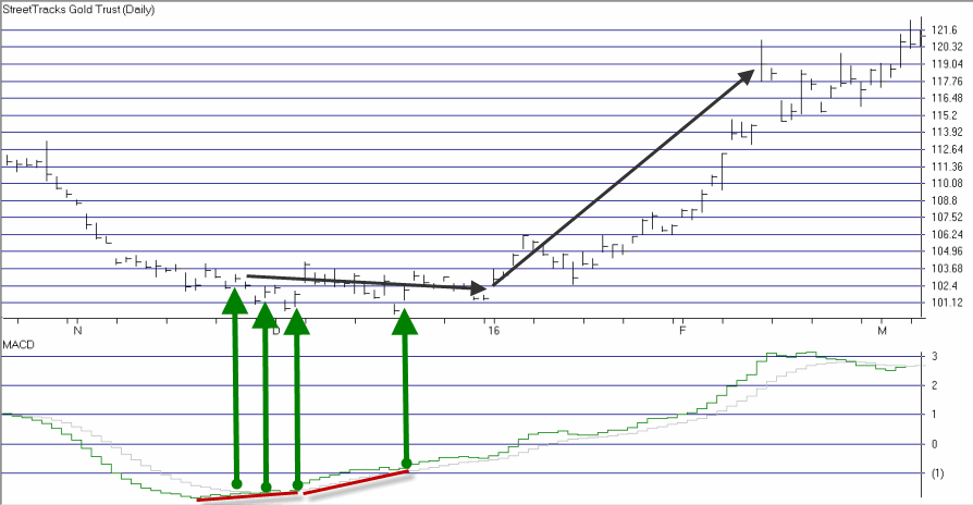
Figure 4 – Ticker GDX (Courtesy TradingExpert)
As you can see, some signals were quite timely while others were quite early. For the record, I started getting bullish on gold and gold stocks early in 2016 based in part on the multiple alerts that appear in Figure 4.
Chief Market Analyst at JayOnTheMarkets.com and TradingExpert Pro client
Mar 29, 2016 | EDS code, Expert Design Studio, indicators
Here is some code for use in AIQ based on Markos Katsanos’s article in this issue, “Trading The Loonie.” The code and EDS file can be downloaded from www.TradersEdgeSystems.com/traderstips.htm.
The code I am providing contains both the divergence indicator and a long-only trading system for the NASDAQ 100 list of stocks. Along with fx trading online, I wanted to try the divergence idea and the author’s entry rules on the NASDAQ 100 stocks. The stocks are traded long using the author’s entry rules with two of the parameters adjusted as shown at the top of the code file. The exit has been changed completely to use a profit protect (protect 50% of profits once a 20% profit is reached), a stop-loss (protect 75% of capital), and a time-stop exit (exit after 21 days). I used the NASDAQ 100 index (NDX) in place of the crude oil futures. The assumption is that since the stocks on the list are all in the NDX, they would generally be correlated to the index. The author’s entry rule filters out those with a negative correlation to the index. Note that I changed the minimum correlation from a -0.4 to 0.0. In addition, I found that increasing the minimum divergence from 20 to 2,000 increased the Sharpe ratio and decreased the maximum drawdown without affecting the annualized return.
Figure 6 shows the equity curve versus the NASDAQ 100 index for the period 1/5/2000 to 10/14/2015. Figure 7 shows the metrics for this same test period. The system clearly outperformed the index.
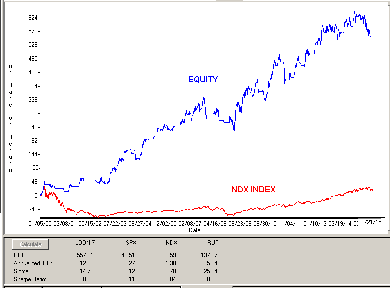
FIGURE 6: AIQ. Here is a sample equity curve for the modified divergence system versus the NASDAQ 100 index for the period 1/5/2000 to 10/14/2015.
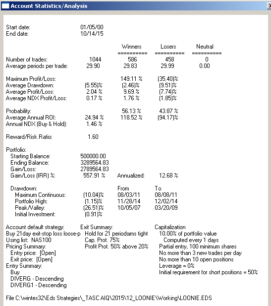
FIGURE 7: AIQ. Here are the metrics for the modified system and the test settings.
!TRADING THE LOONIE
!Author: Markos Katsanos, TASC December 2015
!coded by: Richard Denning 10/17/15
!www.TradersEdgeSystems.com

!Set parameters:
 Define Len        20. !Default is 20
 Define F1          2. !Default is 2
 Define F2          4. !Default is 4
 IDX is         "NDX". !NASDAQ 100 index
 IDXsLen is        40. !Default is 40
 minDIVERG is    2000. !Default is 20
 minROC is          0. !Default is 0
 minCorrel is     0.0. !Default is -0.4

!Close percent relative to BB band width for stock:
Variance is Variance([close],Len).
StdDev is Sqrt(Variance).
SMA is simpleavg([close],Len).
stkBB is 1+([close]-SMA+F1*StdDev)/(F2*StdDev).

!Close percent relative to BB band width for index:
IDXc is tickerUDF(IDX,[close]).
VarianceIdx is Variance(IDXc,Len).
StdDevIDX is Sqrt(Variance).
SMAidx is simpleavg(IDXc,Len).
idxBB is 1+(IDXc-SMAidx+F1*StdDevIDX)/(F2*StdDevIDX).

DIVERG is (idxBB-stkBB)/stkBB*100.     !PLOT AS CUSTOM INDICATOR
DIVERG1	is valresult(DIVERG,1).
ROC2 is ([close]/val([close],2)-1)*100.
ROC3 is ([close]/val([close],3)-1)*100.
ROC3idx is tickerUDF(IDX,ROC3).
IDXsma is simpleavg(IDXc,IDXsLen).
IDXsma2 is valresult(IDXsma,2).
HHVdiverg is highresult(DIVERG,3).

Setup1 if highresult(DIVERG,3) > minDIVERG.
Setup2 if DIVERG < valresult(DIVERG,1).
Setup3 if ([close]/val([close],2)-1)*100 > minROC.
Setup4 if IDXsma > valresult(IDXsma,2).
Setup5 if pCorrel > minCorrel.

Buy if 	Setup1 and
	Setup2 and
	Setup3 and
	Setup4 and
	Setup5.

BuyAlt if Buy.

LongExit1 if MACD<sigMACD and valrule(MACD>sigMACD,1) and
	     Stoch > 85.
LongExit2 if lowresult(DIVERG,3)<-20 and ROC3idx<-0.4.
LongExit3 if [close]<loval([close],15,1) and pCorrel<minCorrel.
LongExit if LongExit1 or LongExit2 or LongExit3.

AlterLongExit if {position days} >=21 or [close] <= (1-0.25)*{position entry price}.

!Code to Calculate Pearson's R [for entry]:
! PeriodtoTest is the number of lookback days.
! IndexTkr is the Instrument that you which to compare your list to.
PeriodToTest is Len.
IndexTkr is IDX.
ChgTkr is ([open] / val([open],PeriodToTest)-1)*100.
ChgIdx is TickerUDF(IndexTkr,ChgTkr).
Alpha is ChgTkr - ChgIdx.

ValUDF is (([close]-[open])/[open]) * 100.
ValIndex is TickerUDF(IndexTkr, ValUDF).
ValTkr is ValUDF.
SumXSquared is Sum(Power(ValIndex,2), PeriodToTest).
SumX is Sum(ValIndex, PeriodToTest).
SumYSquared is Sum(Power(ValTkr,2), PeriodToTest).
SumY is Sum(ValTkr, PeriodToTest).
SumXY is Sum(ValTkr*ValIndex, PeriodToTest).
SP is SumXY - ( (SumX * SumY) / PeriodToTest ).
SSx is SumXSquared - ( (SumX * SumX) / PeriodToTest ).
SSy is SumYSquared - ( (SumY * SumY) / PeriodToTest ).

!Pearson's R and Pearson's Coefficient of Determination:
pCorrel is SP/SQRT(SSX*SSY).

!Code to Calculate Pearson's R [for exit]:
! PeriodtoTest is the number of lookback days.
! IndexTkr is the Instrument that you which to compare your list to.
PeriodToTestX is 3*Len.
IndexTkrX is IDX.
ChgTkrX is ([open] / val([open],PeriodToTestX)-1)*100.
ChgIdxX is TickerUDF(IndexTkrX,ChgTkrX).
AlphaX is ChgTkrX - ChgIdxX.

ValUDFX is (([close]-[open])/[open]) * 100.
ValIndexX is TickerUDF(IndexTkrX, ValUDFX).
ValTkrX is ValUDFX.
SumXSquaredX is Sum(Power(ValIndexX,2), PeriodToTestX).
SumXX is Sum(ValIndexX, PeriodToTestX).
SumYSquaredX is Sum(Power(ValTkrX,2), PeriodToTestX).
SumYX is Sum(ValTkrX, PeriodToTestX).
SumXYX is Sum(ValTkrX*ValIndexX, PeriodToTestX).
SPX is SumXYX - ( (SumXX * SumYX) / PeriodToTestX).
SSxX is SumXSquaredX - ( (SumXX * SumXX) / PeriodToTestX ).
SSyX is SumYSquaredX - ( (SumYX * SumYX) / PeriodToTestX ).

!Pearson's R and Pearson's Coefficient of Determination:
pCorrelX is SPX/SQRT(SSXX*SSYX).

!MACD code:
S is 12.
L is 25.
X is 9.

ShortMACDMA is expavg([Close],S).
LongMACDMA is expavg([Close],L).

MACD is ShortMACDMA-LongMACDMA.
SigMACD is expavg(MACD,X).

!Stochastic
StochLen is 30.
Stoch is 100 * (([Close]-LoVal([Low],StochLen)) /
	(HiVal([High],StochLen) - LoVal([Low],StochLen))).

List if 1.
—Richard Denning
info@TradersEdgeSystems.com
Aug 27, 2014 | indicators, MACD
The MACD indicator is a useful addition to any stock trading strategy. It is a good measure of momentum, trend direction and can also be a good guide to the relative strength of the market, indicating whet…her the market is overbought or oversold.
However, like all technical indicators there are a number of advantages and disadvantages that any trader should know before incorporating it into their strategy.

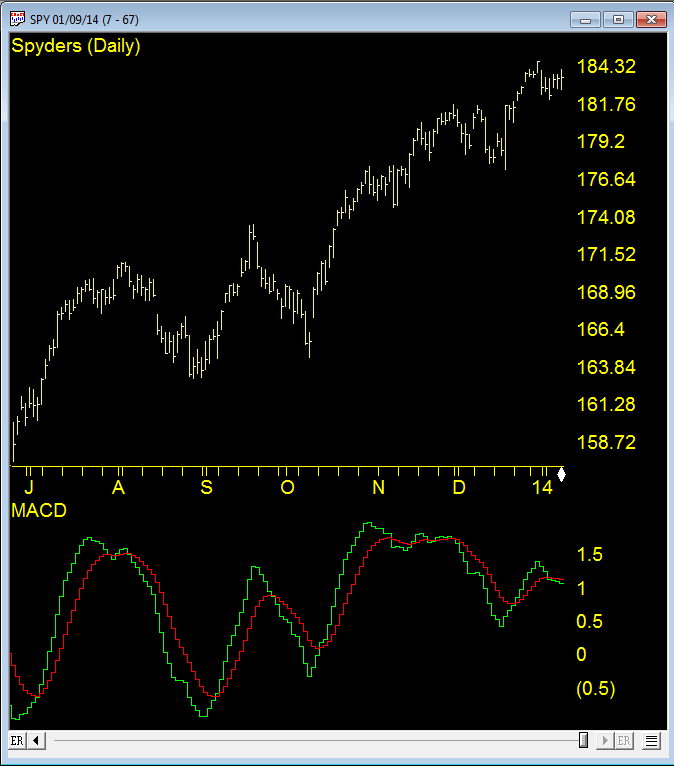
WinWay TradingExpert Pro chart of MACD with default 12, 26, 9 settings on SPY
Disadvantages
The main disadvantage of the MACD indicator is that it is subjective to the user. Like many technical indicators , the MACD has settings that can be changed to give almost limitless numbers of variations which means results will always differ from person to person. A trader must decide for example what moving averages to choose. The suggested settings are the 12 day moving average, 26 day and 9, however, these can easily be changed. Secondly, a trader must know what timeframe the MACD works best on and there are no easy answers, since the MACD will tend to work differently across different markets. Generally, however, the MACD works best when it is confirmed across several different timeframes – especially further out timeframes such as the weekly chart.
Lagging indicator
Unless using the momentum divergence strategy which seeks to pick tops and bottoms before they occur, the MACD has an inherent disadvantage that occurs with all technical indicators that concern price history such as moving averages. Since moving averages are lagging indicators, in that they measure the change in a stock price over a period of time (in the past), they tend to be late at giving signals. Often, when a fast moving average crosses over a slower one, the market will have already turned upwards some days ago. When the MACD crossover finally gives a buy signal, it will have already missed some of the gains, and in the worst case scenario it will get whipsawed when the market turns back the other way. The best way to get around this problem is to use longer term charts such as hourly or daily charts (since these tend to have fewer whipsaws). It is also a good idea to use other indicators or timeframes to confirm the signals.
Early signals
While the crossover strategy has the limitation of being a lagging indicator, the momentum divergence strategy has the opposite problem. Namely, it can signal a reversal too early causing the trader to have a number of small losing traders before hitting the big one. The problem arises since a converging or diverging trend does not always lead to a reversal. Indeed, often a market will converge for just a bar or two catching its breath before it picks up momentum again and continues its trend.
The solution to such limitations, once more, is to combine it with other indicators and use different confirmation techniques. The ultimate test is to set the MACD up in code and test the indicator yourself on historical data. That way you are able to find out when and in which situations and conditions the indicator works best.
The MACD is one of over 100 indicators available in WinWay TradingExpert Pro, Darren Winter’s preferred trading software. Existing WinWay TradingExpert Pro clients can find the indicator in their Chart Control Panel (MACD).
New to WinWay TradingExpert Pro? Try a FREE trial of Darren Winter’s preferred trading software at https://winwaycharts.com/wordpress/tradingexpert-pro-free-trial/
Aug 11, 2014 | indicators, swing trading, trading strategies
In my last article (http://tinyurl.com/mzhstm2) I wrote about a simple entry method I have dubbed “The RSI 3 Strikes and You’re Out Play” or TSYO, for short.
The RSI 3 Strikes and You’re Out Method is a good candidate for option traders as it offers the potential to “make a few bucks” when the market experiences a pullback. So this week I want to offer a few examples.
In the interest of full disclosure I had planned to do it last week, but once my family and I arrived in Aruba I quickly settled into the “Sleep Late, Run on the Beach, Lay on the Beach, Swim in the Ocean and the Pool, Shower, Go to Dinner, Repeat” routine. And in the midst of that “busy” schedule I found little time to write.
TSYO Examples
I have a list of stocks and ETFs that I follow for option trading purposes. Not necessarily the “definitive” list but a good mix of tickers that trade lots of option volume. The list in Figure 1 displays some recent TSYO signals for some of the stocks on my list.
*The first column shows the stock ticker.
*The second column shows the date of the “Alert” signal (i.e., the 2nd non confirmation by RSI).
*The third column shows the date that the stock or ETF takes out the low of the previous three days.
|
Ticker
|
Alert
|
3-Day Low
|
|
AMGN
|
7/3
|
7/8
|
|
AMZN
|
7/22
|
7/25
|
|
EEM
|
7/28
|
7/30
|
|
F
|
7/24
|
7/25
|
|
GM
|
7/3
|
7/17
|
|
IBM
|
7/18
|
7/21
|
|
IBM
|
7/24
|
7/30
|
|
IWM
|
7/1
|
7/7
|
|
JPM
|
7/28
|
7/29
|
|
SLV
|
7/2
|
7/7
|
|
SMH
|
7/22
|
7/24
|
|
TXN
|
7/11
|
7/17
|
Figure 1 – TSYO Alerts and Triggers
For the purposes of this article we will assume that a put option is bought at the close of the “3-Day Low” day. For deciding which put option to buy we will use the “Percent to Double” routine found at www.Optionsanlysis.com.
One note, while I will highlight the profit potential for each trade reviewed, I will not detail any specific “exit criteria”. My goal is to highlight the entry signal and not necessarily create a mechanical “system”. I also think that each trader should do some thinking and consider their own criteria for when to take a profit or cut a loss.
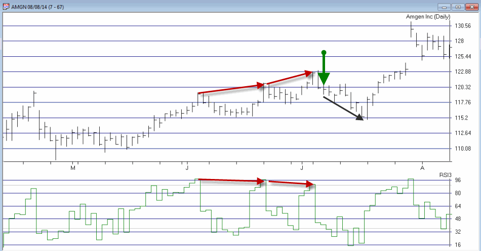
Ticker AMGN
As you can see in Figures 1 and 2, AMGN triggered an “Alert” on 7/3 and made a new 3-day low on 7/8.
Figure 2 – AMGN (Courtesy: AIQ TradingExpert)
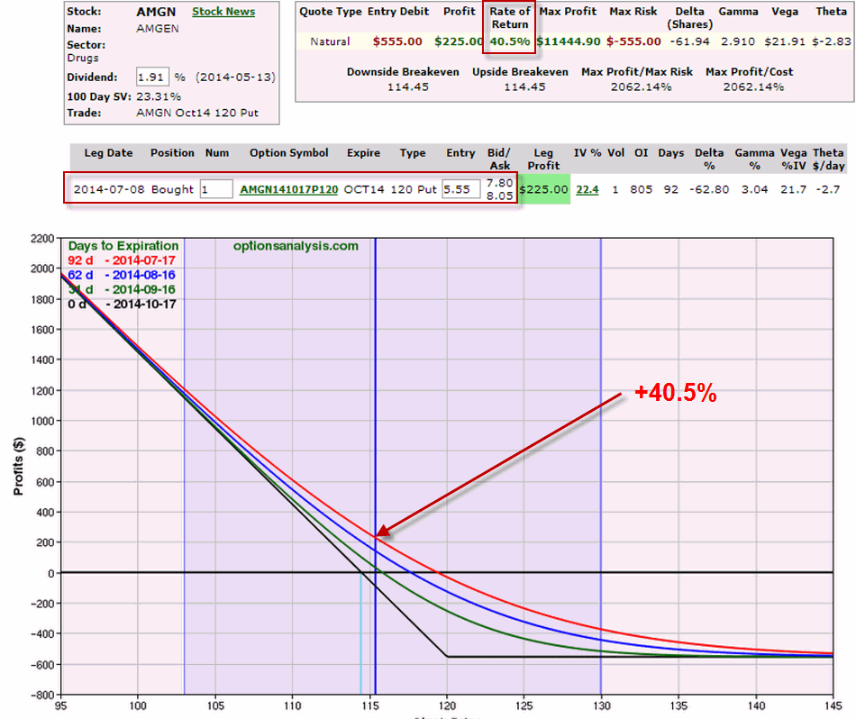
What followed was little more than a modest short-term pullback. Still, as you can see in Figure 3, if a trader bought the October 120 put option on 7/8, by 7/17 he or she would have had an open profit of +40.5%.
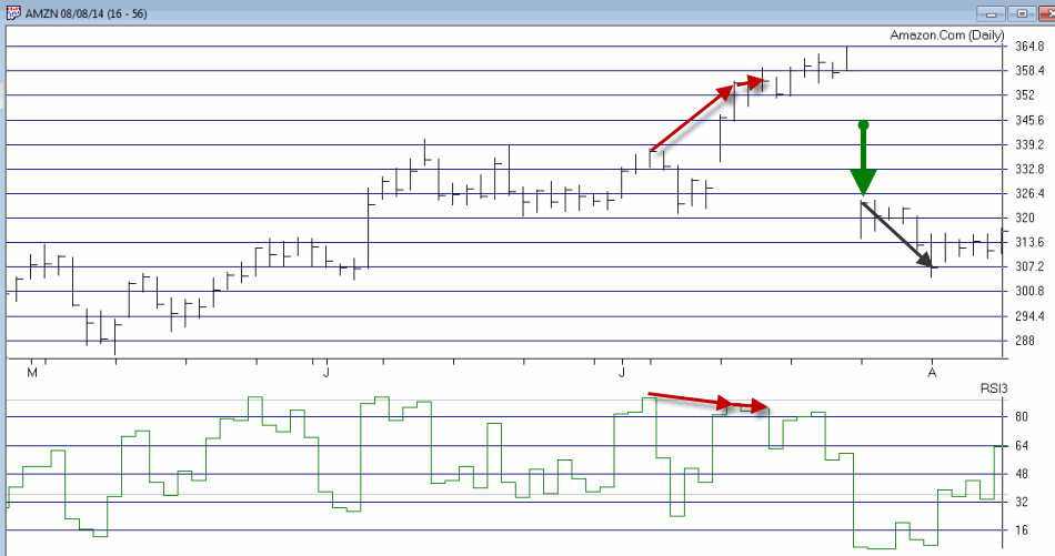
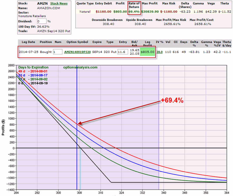
Ticker AMZN
In this example waiting for a 3-day low before entering actually worked against a trader because on 7/25 AMZN gapped significantly lower as you can see in Figure 4.
Figure 4 – AMZN (Courtesy: AIQ TradingExpert)
Nevertheless, if a trader had bought the September 320 put option at the close on 7/25, by 8/1 he or she would have had an open profit of +69.4%.
Ticker F
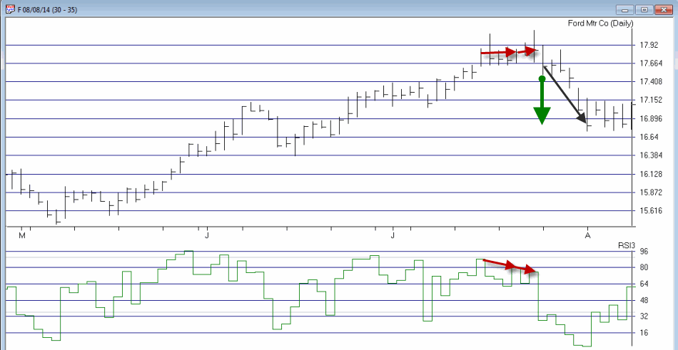
The example that follows for Ford (ticker F) highlights two things:
1. The ability to essentially “bet” on a short-term pullback while risking a relatively small amount of capital
2. The above average profit potential associated with trading options.
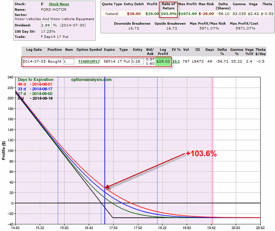
Ticker F triggered an “Alert” on 7/24 and made a new 3-day low on 7/25.
Figure 6 – F (Courtesy: AIQ TradingExpert)
If a trader had bought the September 17 put option at the close on 7/25, by 8/1 he or she would have had an open profit of +103.6%.
Summary
So once again, the point of all of this is not to attempt to promote the “be all, end all” of trading. Because the TSYO method is most certainly not that. But it can do a pretty decent job of identifying opportunities (especially after the overall market has experienced an extended run up and may be running out of team near term). For traders who are willing to consider alternative (though simple) strategies such as buying put options, a method such as this can offer the potential to make money even as the overall market pulls back.
No one should go out and start making trades using the method I have detailed here without doing some further study/analysis/etc. But the real point of all of this is that it is possible to use relatively simple ideas and relatively little capital to achieve trading success.
Jay Kaeppel
Chief Market Analyst at JayOnTheMarkets.com and AIQ TradingExpert Pro (http://www.aiq.com) client
Jay has published four books on futures, option and stock trading. He was Head Trader for a CTA from 1995 through 2003. As a computer programmer, he co-developed trading software that was voted “Best Option Trading System” six consecutive years by readers of Technical Analysis of Stocks and Commodities magazine. A featured speaker and instructor at live and on-line trading seminars, he has authored over 30 articles in Technical Analysis of Stocks and Commodities magazine, Active Trader magazine, Futures & Options magazine and on-line at www.Investopedia.com.