Sep 17, 2018 | educational newsletters, ETFs, gold, indicators, jay kaeppel, MACD
Most people are familiar with ADHD, manic-depressive disorder, depression and schizophrenia. But one common affliction within our trading community that gets almost no attention is WESS. That stands for “Wild-Eyed Speculation Syndrome”. And it’s more common than you think (“Hi, my name is Jay”).
The exact symptoms vary, but generally speaking they go something like this:
*A person gets up in the morning with a hankering to make a trade
*Said person then finds “some reason” to make some trade in something
*If the person happens to make money on that trade then the affliction is reinforced by virtue of IGTS (“I’ve Got the Touch Syndrome”, which is one of the occasional side effects of WESS)
*If the person loses money on the trade the side effects can vary but may include: angry outbursts, kicking oneself in the head (typically figuratively), vows to either stop the behavior or at least do it better, and so on.
*The most common side effect of WESS is a declining trading account balance (which not coincidentally is how this disorder is most commonly diagnosed).
For those suffering from WESS – with the caveat/disclosure that I am not a medical professional (although I have found that ibuprofen really clears up a lot of stuff, but I digress) – I am here to help.
If you find yourself suffering from Symptom #1 above:
The most effective step is to go back to bed until the urge passes. If this doesn’t work or is not possible (for instance, if you have one of those pesky “jobs” – you know, that 8-hour a day activity that gets in the way of your trading), repeat these two mantras as many times as necessary:
Mantra 1: “I must employ some reasonably objective, repeatable criteria to find a trade with some actual potential”
Mantra 2: “I will risk no more than 2% of my trading capital” on any WESS induced trade (and just as importantly, you must fend off the voice on the other shoulder shouting “But this is the BIG ONE!!”)
Repeat these mantras as many times as necessary to avoid betting the ranch on some random idea that you “read about on the internet, so it must be true.”
Regarding Mantra 1
There are a million and one ways to find a trade. There is no one best way. But just to give you the idea I will mention one way and highlight a current setup. IMPORTANT: That being said, and as always, I DO NOT make recommendations on this blog. The particular setup I will highlight may work out beautifully, or it may be a complete bust. So DO NOT rush out and make a trade based on this just because you read it – you know – on the internet.
The Divergence
Lots of trades get made based on “divergence”. In this case we are talking about the divergence between price and a given indicator – or even better, series of indicators. There is nothing magic about divergence, and like a lot of things, sometimes it works and sometimes it doesn’t. But the reason it is a viable consideration is that when an indicator flashes a bullish divergence versus price it alerts us to a potential – nothing more, nothing less – shift in momentum.
Let’s look at ticker GDX – an ETF that tracks an index of gold mining stocks. In Figure1 1 through 4 below we see:
*GDX price making a lower low
*A given indicator NOT confirming that new low (i.e., a positive divergence)
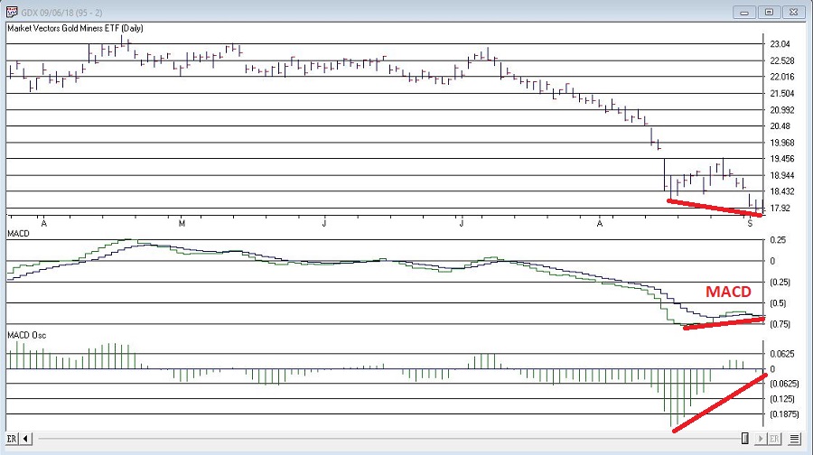
Figure 1 – GDX and MACD (Courtesy WinWayCharts TradingExpert)
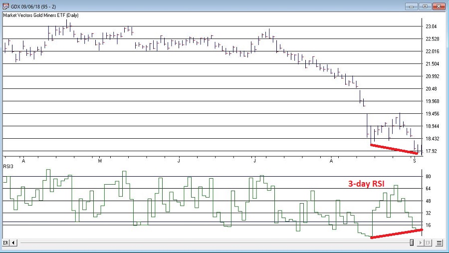
Figure 2 – GDX and 3-day RSI (Courtesy WinWayCharts TradingExpert)
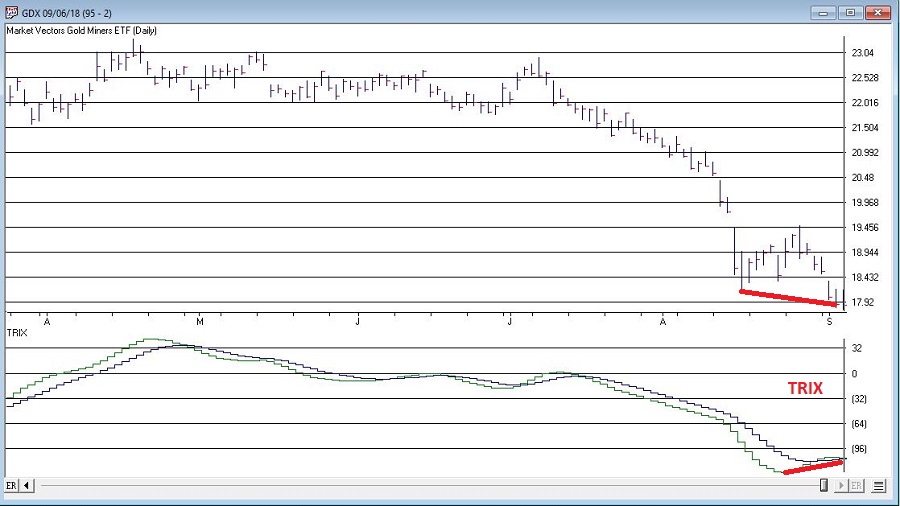
Figure 3 – GDX and TRIX (Courtesy WinWayCharts TradingExpert)
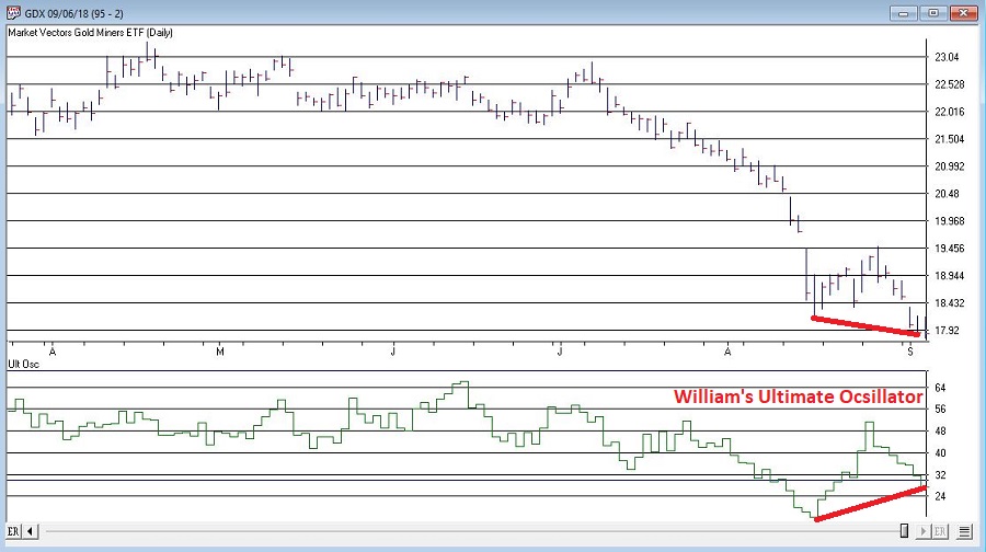
Figure 4 – GDX and William’s Ultimate Oscillator (Courtesy WinWayCharts TradingExpert)
So, do the divergences that appear in Figures 1 through 4 justify a trade? Well, here is where the aforementioned affliction comes into play.
Average Trader: “Maybe, maybe not. In either case I am not entirely sure that trying to pick a bottom in gold stocks based solely on indicator divergences is a good idea”
WESS Sufferer: “Absofreakinglutely!! Let’s do this!!”
You see the problem.
So, let’s assume that a WESS Sufferer likes what he or she sees in Figures 1 through 4. The good news is that we have met the minimum criteria for Mantra #1 above – we have employed some reasonably objective, repeatable criteria (i.e., a bullish divergence between price and a number of variable indicators) to spot a potential opportunity.
Now we must follow Mantra #2 of risking no more than 2% of my trading capital. Let’s assume our WESS Sufferer has a $25,000 trading account. So he or she can risk a maximum of $500 ($25,000 x 2%).
In Figure 5 we see a potential support area for GDX at around $16.40 a share.
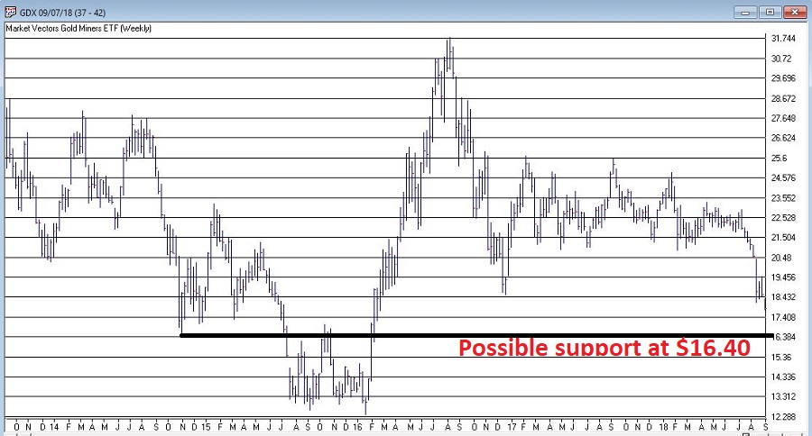
Figure 5 – Ticker GDX with support at $16.40 (Courtesy WinWayCharts TradingExpert)
So, one possibility would be to buy 300 shares of GDX at $17.84 and place a stop loss order below the “line in the sand” at say $16.34 a share. So if the stop is hit, the trade would lose -$450, or -1.8% of our trading capital (17.84 – 16.34 = -1.50 x 300 shares = -$450).
Summary
Does any of the above fit in the category of “A Good Idea”. That’s the thing about trading – and most things in life for that matter – it’s all in the eye of the beholder. Remember, the above is NOT a “recommendation”, only an “example.”
The real key thing to note is that we went from being just a random WESS Sufferer to a WESS Sufferer with a Plan – one that has something other than just an “urge” to find a trade, AND (most importantly) a mechanism for limiting any damage that might be done if things don’t pan out.
And if that doesn’t work, well, there’s always ibuprofen.
Jay Kaeppel
Disclaimer: The data presented herein were obtained from various third-party sources. While I believe the data to be reliable, no representation is made as to, and no responsibility, warranty or liability is accepted for the accuracy or completeness of such information. The information, opinions and ideas expressed herein are for informational and educational purposes only and do not constitute and should not be construed as investment advice, an advertisement or offering of investment advisory services, or an offer to sell or a solicitation to buy any security.
Apr 30, 2018 | Charts, EDS code, indexes, indicators, jay kaeppel
Last week I wrote an article purporting to highlight significant levels of support and resistance across a variety of financial markets. Well, it turns out there are more.
More Notes on “Lines”
I certainly look at the markets more from the “technical” side than the “fundamental” side (not even a conscious choice really – I just never really had much success buying things based on fundamentals. That doesn’t mean I think fundamentals are useless or that they don’t “work” – they just didn’t work for me).
Once I settled on the technical side of things, I started reading books about technical analysis. All the classics. I learned about chart patterns and trend lines. By definition, a trend line is a line drawn on a price chart that connects two or more successive lows or highs.
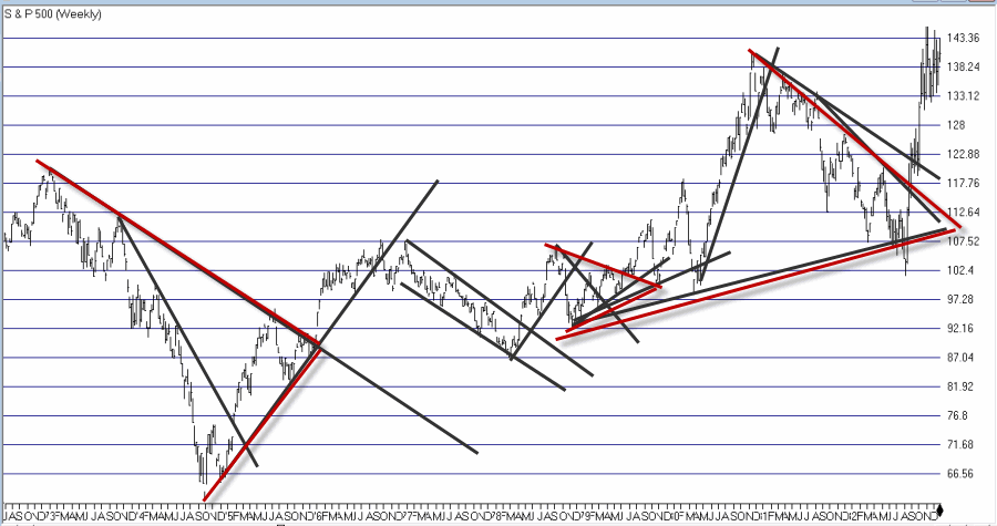
And then I got to work looking through charts and applying everything that I thought I had learned. And like a lot of “newbie” technicians – and a surprising number of seasoned ones – I typically ended up drawing “lines on charts” that would resemble something like what you see in Figure 1.
Figure 1 – “Important” trend lines (or not?) (Courtesy
TradingExpert)
For a technical analyst this is sort of the equivalent of “throwing up” on a chart (and the real pisser was that back in the day a fresh updated booklet of charts would show up in the mail each week – so you had to “throw up’ all over all the charts again and redraw every #$^& “important” line!!).
At some point I realized that perhaps every “important” line that I was drawing on a multitude of charts was perhaps maybe not so “important” after all. This revelation led me to establish the following maxim (as much to force me to “fight the urge” as anything:
Jay’s Trading Maxim #18: If you draw enough lines on a bar chart, price will eventually hit one or more of them.
True Confession Time
There are certain dirty little secrets that no respectable technician should ever utter. But just to “get a little crazy” (OK, at last by my standards – which are quite low, apparently) I’m going to put it down in print:
I hate trend lines
There, I said it. Now for the record, up sloping and down sloping trend lines are a perfectly viable trading tool if used properly. I personally know plenty of people trading successfully using trend lines drawn on a price chart. Sadly, I’m just not one of them.
So remember the lesson I learned the hard way – “There is no defense for user error.”
The full truth is that I have nothing against trend lines, and yes I understand that there are “objective” methods out there detailing the “correct” method for choosing which two points to connect to draw a proper trend line (DeMark, Magee, I think Pring to name a few). But I somehow seem to have failed that lesson.
One Line I Do Like
I still draw slanting trend lines from time to time. But the only lines I really like are lines that are drawn horizontally across a bar chart – i.e., “support” and “resistance” lines. A multiple top or a multiple bottom marks a level where the bulls or the bears made a run and could not break through. Now that’s an “important” price level. If that price level ultimately holds it means the charge failed and that a significant reversal is imminent. If it ultimately fails to hold it means a breakout and a possible new charge to ever further new highs or lows as the case may be (for the record, it could also mean that a false breakout followed by a whipsaw is about to occur. But, hey, that’s the price of admission).
I also like horizontal lines because even if very single horizontal line does not prove to be useful as a trading tool, it can still serve a purpose as a “perspective tool”. Rather than explaining that theory let’s just “go to the charts.”
More “Lines in the Sand”
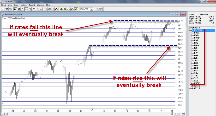
Figure 2 displays an index of bond and income related ETFs that I created. Roughly half of the ETFs have a higher correlation to treasury bonds and the other half to the S&P 500 Index (i.e., CWB – convertible bonds, JNK – high yield corporate, PFF – preferred stock and XLU – utilities all react to interest rates but are more correlated to the stock market than to treasury bonds).
Figure 2 – Bond and Income Related ETF Index (Courtesy
TradingExpert)
This monthly chart clearly illustrates the struggle going on in the interest rate related sector. Interest rates mostly bottomed out in 2013 and have been grinding sideways to higher since. As you can see, interest rate related securities have been trapped in a sort of large trading range for years. Eventually, if the long-term trend in rates turns higher this chart should be expected to break through the lower (support) line Figure 2.
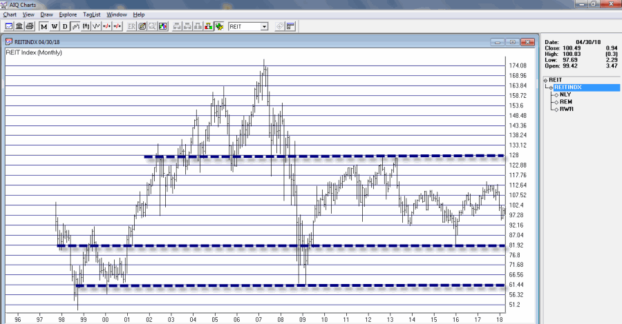
Still focusing on interest rate related sectors, Figure 3 displays a monthly index comprised of 3 REITs. Talk about a market sector trapped in a range.
For what it is worth, Figure 4 displays a weekly chart of the same index with an indicator I call Vixfixaverage (code for this indicator appears at the end of the article). Typically, when this indicator exceeds 60 and then tops out, a decent rally often ensues (one word of warning, there is also often some further downside before that rally ensues to caution is in order).
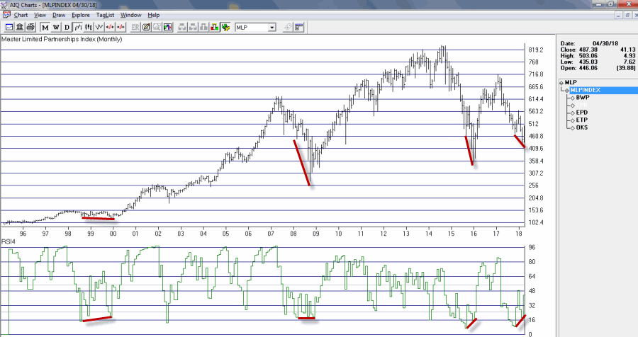
Speaking of oversold “things”, Figure 5 displays an index of Master Limited Partnerships (MLP’s). As you can see in Figure 5, a) divergences between price and the 4-month RSI are often followed by significant rallies, and b) a new such divergence has just been established. Does this mean that MLP’s are destined to rally higher? Not necessarily, but given the information in Figure 5 and the fact that everybody hates MLP’s right now, it’s something to think about.
AIQ TradingExpert Code for Vixfixaverage
hivalclose is hival([close],22).
vixfix is (((hivalclose-[low])/hivalclose)*100)+50.
vixfixaverage is Expavg(vixfix,3).
Jay Kaeppel
Disclaimer: The data presented herein were obtained from various third-party sources. While I believe the data to be reliable, no representation is made as to, and no responsibility, warranty or liability is accepted for the accuracy or completeness of such information. The information, opinions and ideas expressed herein are for informational and educational purposes only and do not constitute and should not be construed as investment advice, an advertisement or offering of investment advisory services, or an offer to sell or a solicitation to buy any security.
Apr 2, 2018 | educational newsletters, indexes, indicators, jay kaeppel, stock market
A glance at the history of the Presidential Election Cycle in the stock market suggests that we should:
*Not be surprised that the stock market is foundering a bit at the moment
*Not be terribly surprised if things get worse – particularly during the months of June through September of this year
*Anticipate that if the market does take a bigger hit in the months ahead that it may well set the stage for another significant advance into the middle of the mid-term election year.
A Little Presidential Election Cycle History
For our purposes we will start the test on 12/31/1932 and define the cycle as containing the following four years:
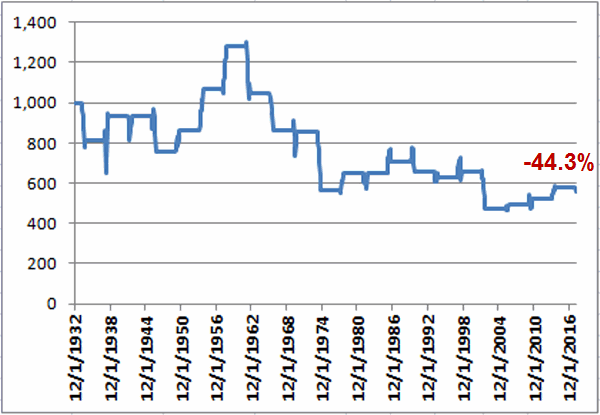
First the Bad News: Figure 1 displays the growth of $1,000 invested in the S&P 500 Index (using monthly closing price data) ONLY from the end of January of each Mid-Term Election Year through the end of September of each Mid-Term Election Year (i.e., the latest iteration began on 1/31/2018 and will extend through 9/30/2018).
Figure 1 – Growth of $1,000 invested in S&P 500 Index ONLY from Jan31 through Sep30 of each Mid-Term Election Year (1932-2018)
As you can see, the cumulative performance for the S&P 500 Index during the Mid-Term February through September period is a fairly painful -44.3% (for the record, the cumulative gain from buying and holding the S&P 500 from 12/31/1932 through 2/28/2018 was +39,288%, so yes, this qualifies as a period of some serious under performance).
That being said, it should be noted that this Mid-Term Feb through Sep period showed a gain 12 times and a loss only 9 times. So a “rough patch” is no sure thing. The problem is that when this period is bad, it is “very bad”. As you can see in Figure 3 later, this period experienced 6 losses in excess of -17.5% (FYI, a -17.5% decline from the 1/31/2018 close of 2823.81 would see the S&P 500 Index hit 2330).
Then the Good News: On the brighter side, Figure 2 displays the growth of $1,000 invested in the S&P 500 Index (using monthly closing price data) ONLY from the end of September of each Mid-Term Election Year through the end of July of each Pre-Election Year (i.e., the latest iteration begins on 9/30/2018 and will extend through 7/31/2019).
Figure 2 – Growth of $1,000 invested in S&P 500 Index ONLY from Sep30 of each Mid-Term Election Year through Jul31 of each Pre-Election Year (1932-2018)
Notice any difference between Figures 1 and 2? This favorable period saw the S&P 500 register a gain during 20 of the past 21 completed election cycles (i.e., 95% of the time), with an average gain of +21.6%, and a cumulative gain of +3,730%.
Figure 3 displays the numerical results for each cycle.
| Mid-Term |
Pre-Election |
Mid-Term Feb through Sep |
Mid-Term Oct thru Pre-Election July |
| 1934 |
1935 |
(18.5) |
21.8 |
| 1938 |
1939 |
14.5 |
(1.6) |
| 1942 |
1943 |
0.5 |
32.0 |
| 1946 |
1947 |
(19.4) |
5.3 |
| 1950 |
1951 |
14.1 |
15.2 |
| 1954 |
1955 |
23.9 |
34.7 |
| 1958 |
1959 |
20.0 |
20.9 |
| 1962 |
1963 |
(18.3) |
22.9 |
| 1966 |
1967 |
(17.6) |
23.8 |
| 1970 |
1971 |
(0.8) |
13.4 |
| 1974 |
1975 |
(34.2) |
39.7 |
| 1978 |
1979 |
14.9 |
1.2 |
| 1982 |
1983 |
0.0 |
35.0 |
| 1986 |
1987 |
9.2 |
37.8 |
| 1990 |
1991 |
(7.0) |
26.7 |
| 1994 |
1995 |
(3.9) |
21.5 |
| 1998 |
1999 |
3.7 |
30.6 |
| 2002 |
2003 |
(27.9) |
21.5 |
| 2006 |
2007 |
4.4 |
8.9 |
| 2010 |
2011 |
6.3 |
13.2 |
| 2014 |
2015 |
10.6 |
6.7 |
Figure 3 – Unfavorable versus Favorable portions of Election Cycle
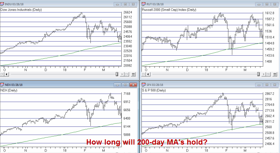
So what does it all mean? Well, it means a few things. By my objective measurements the overall trend is still “bullish” and a number of “oversold” indicators are suggesting that a bounce of some significance may be at hand. That being said, if the major market indexes do start to break down below their respective 200-day moving averages investors may be wise to take some defensive action. If the market does experience a further break between now and the end of September, it may well be “one of the painful kind.” So if you haven’t already, make your contingency plans now.
Figure 4 – Major Market Indexes with 200-day moving averages (Courtesy TradingExpert)
At the same time, as the end of September of 2018 nears – especially if the stock market has experienced or is experiencing at the time, a significant break – remember that history suggests that that will be a good time to “think bullish.”
Call me a cynic, but my guess is that alot of investors will do exactly the opposite on both counts (i.e., hang on if the market breaks down and then sell as the next bottom forms – Same it as ever was….)
Disclaimer: The data presented herein were obtained from various third-party sources. While I believe the data to be reliable, no representation is made as to, and no responsibility, warranty or liability is accepted for the accuracy or completeness of such information. The information, opinions and ideas expressed herein are for informational and educational purposes only and do not constitute and should not be construed as investment advice, an advertisement or offering of investment advisory services, or an offer to sell or a solicitation to buy any security.
Oct 10, 2017 | Charts, EDS, EDS code, indicators, jay kaeppel
First the Bad News: There are no “magic bullets” when it comes to trading. There are people in this industry who have literally tested somewhere in the range of six bazillion “indicators” – give or take (“Hi. My name is Jay”). Every trend following indicator looks like a gold mine when it latches onto a huge trend and rides it (but not so much when it starts getting whipsawed). And every overbought/oversold indicator looks like a gift from heaven from time to time when it somehow manages to peak (or valley) and then reverses right at a high (or low). And then the next time the thing gets oversold the security in question just keeps plunging and the previously “amazingly accurate” indicator just gets more and more oversold.
Bottom line: what I am about to discuss is likely no better or worse than a lot of other indicators. And it is no holy grail. Still, I kinda like it – or whatever that is worth.
EDITORS NOTE an WinWay EDS file for this indicator with the 3 step rules outlined can be downloaded from here you will need to copy or save this file into your wintes32/eds strategies folder. Alternatively the code is available at the end of this article for copying and pasting into a new EDS file.
UpDays20
I call this indicator UpDays20 and I stole, er, learned it originally from Tom McClellan of McLellan Financial Publications. My calculation may be slightly different because I wanted an indicator that can go both positive and negative.
For a given security look at its trading gains and losses over the latest 20 trading days.
UPDays20 = (Total # of Up days over the last 20 trading days) – 10
So if 10 of the last 20 trading days showed a gain then UpDays20 would read exactly 0.
If only 6 of the last 20 trading days showed a gain then UpDays20 would read -4
You get the idea (and proving once again that it “doesn’t have to be rocket science”). As a “trading method” it is always advised that this indicator – like most all other indicators – NOT be used as a standalone approach to trading. That being said, the way I follow this indicator is as follows.
Step 1) UpDays20 drops to at least -2
Step 2) UpDays20 rises 2 points from a low
Step 3) The security in question then rises above its high for the previous 2 trading days
It is preferable to follow this setup hen the security in question is above its 200-day moving average, but that is up to the trader to decide (the danger to using this with a security below its 200-day moving average is that it might just be in the middle of a freefall. The upside is that counter trend rallies can be fast and furious – even if sometimes short-lived).
Again, there is nothing magic about these particular steps. They are simply designed to do the following:
1) Identify an oversold condition
2) Wait for some of the selling pressure to abate
3) Wait for the security to show some sign of reversing to the upside
Like just about every other indicator/method, sometimes it is uncannily accurate and sometimes it is embarrassingly wrong (hence the reason experienced traders understand that capital allocation and risk management are far more important than the actually method you use to enter trades).
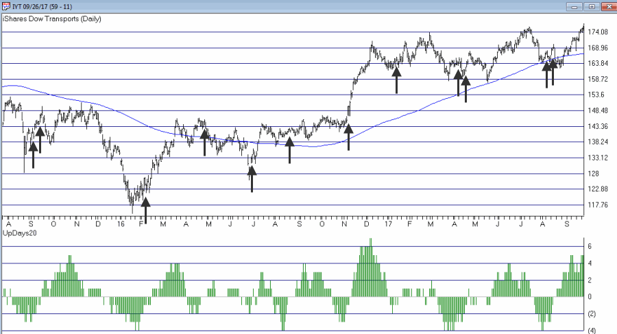
In this previous article (in Figures 3 and 4) I wrote about using this indicator with ticker TLT. Figure 1 and 2 display the “buy” signals generated using the rules above for tickers IYT and GLD.

Figure 1 – UpDays20 “Buy” Alerts for ticker IYT (Courtesy TradingExpert)

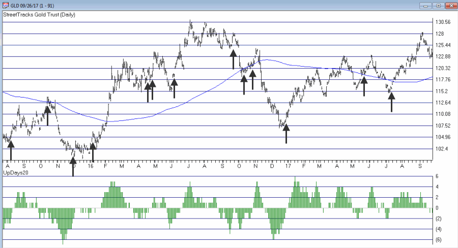
Figure 2 – UpDays20 “Buy” Alerts for ticker GLD (Courtesy TradingExpert)
Are these signals good or bad? That is in the eye of the beholder and not for me to say. One big unanswered question is “when do you exit”? That is beyond the scope of this “idea” article – however, “sell some at the first good profit and then use a trailing stop” looks like a decent approach to consider) but would have a profound effect on any actual trading results.
Some of the signals displayed in Figures 1 and 2 are obviously great, others are maybe not so hot. Interestingly, some of the signals in Figure 1 and 2 that don’t look to timely at first blush actually offered a profitable opportunity to a trader who was inclined to take a quick profit. Again, how you allocate capital and when you exit with a profit and when you exit with a loss would likely have as much impact on results as the raw “buy” signals themselves.
Summary
No one should go out and start trying to trade tomorrow based on UpDays20. No claim is being made that the steps detailed herein will result in profits nor even that this is a good way to trade.
But, hey, it’s one way.
Jay Kaeppel Chief Market Analyst at JayOnTheMarkets.com and TradingExpert Pro client.
Disclaimer: The data presented herein were obtained from various third-party sources. While I believe the data to be reliable, no representation is made as to, and no responsibility, warranty or liability is accepted for the accuracy or completeness of such information. The information, opinions and ideas expressed herein are for informational and educational purposes only and do not constitute and should not be construed as investment advice, an advertisement or offering of investment advisory services, or an offer to sell or a solicitation to buy any security.
EDITORS NOTE an WinWay EDS file for this indicator with the 3 step rules outlined can be downloaded from here you will need to copy or save this file into your wintes32/eds strategies folder. Alternatively the code is available at the end of this article for copying and pasting into a new EDS file.
! UpDays20 – I call this indicator UpDays20. For a given security look at its trading gains and losses over the latest 20 trading days.
! UPDays20 = (Total # of Up days over the last 20 trading days) – 10!
So if 10 of the last 20 trading days showed a gain then UpDays20 would read exactly 0.
! If only 6 of the last 20 trading days showed a gain then UpDays20 would read -4
Upday if [close]>val([close],1).
totalupdayslast20days is CountOf(upday,20).
updayindicator is totalupdayslast20days – 10.
! How to follow this indicator
! Step 1) UpDays20 drops to at least -2
! Step 2) UpDays20 rises 2 points from a low
! Step 3) The security in question then rises above its high for the previous 2 trading days
UpDays20rises2points if updayindicator>valresult(updayindicator,1) and valresult(updayindicator,1)>valresult(updayindicator,2).
updays20atminus2orlower if valresult(updayindicator,2)<=-2.
closesabovehighof2priordays if [close]>val([high],1) and [close]>val([high],2).
Upsignal if UpDays20rises2points and updays20atminus2orlower and closesabovehighof2priordays.
Apr 7, 2017 | educational newsletters, ETFs, indicators, jay kaeppel
First things first: I am primarily a trend-follower (this is based on, a) the relative long-term benefits of following trends and b) my lack of ability to actually “predict” anything – but I digress).
As a trend-follower I love the fact that the stock market has been trending higher and the fact that there is so much “angst” regarding the “inevitable top.” Still, like a lot of investors I try to spot “early warning signs” whenever possible. Here are the four “things” I am following now for signs of trouble.
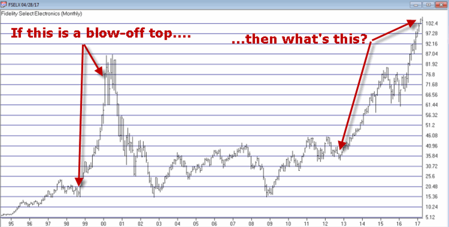
Fidelity Select Electronics
In Figure 1 you see, a) the blow-off top of 1999-2000 and b) today. Are the two the same? I guess only time will tell. But the point is, I can’t help but think that if and when the bloom comes off of the electronics boom, overall trouble will follow. Here is hoping that I am not as correct here as I was
here.
Just asking.
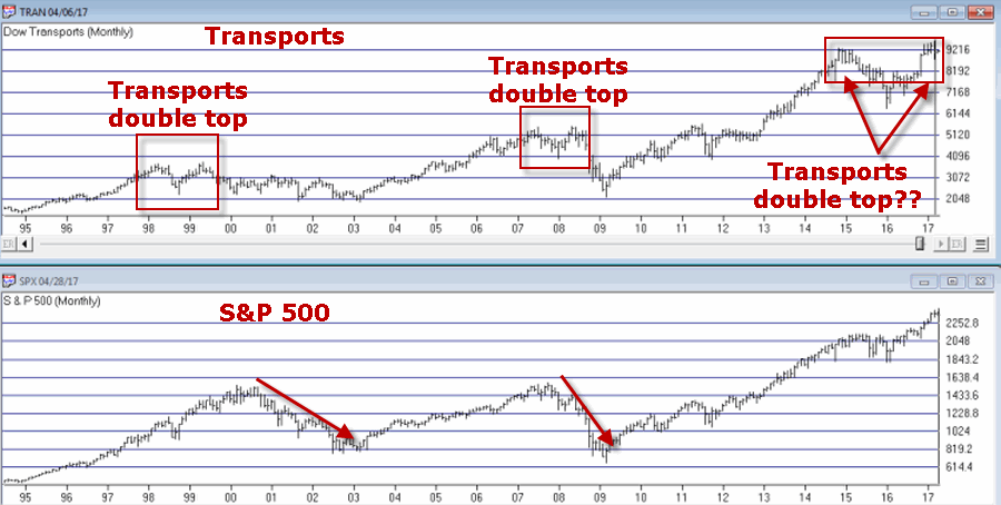
Transportation Index
As you can see in Figure 2, the Dow Transports has a history of making double tops which is followed by trouble in the broader market. Are we in the process of building another double top? And will trouble follow if we are? Dunno, hence the reason it is on my “Watch List” rather than on my “OH MY GOD SELL EVERYTHING NOW!!!!! List”.
I guess we’ll just have to wait and see.
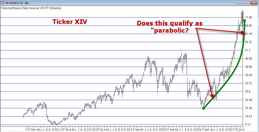
Ticker XIV
Ticker XIV is an ETF that is designed to track inverse the VIX Index. As a refresher, the VIX Index tends to “spike” higher when stocks fall sharply and to decline when stocks are rising and/or relatively quiet. To put it in simpler terms, in a bull market ticker XIV will rise. As you can see in Figure 3 one might argue that XIV has gone “parabolic”. This is a potential warning sign (assuming you agree that the move is parabolic) as a parabolic price move for just about anything is almost invariably followed by, well, let’s just say, “not so pretty”.
Let’s hope not. Because if it does qualify as parabolic that’s a very bad sign.
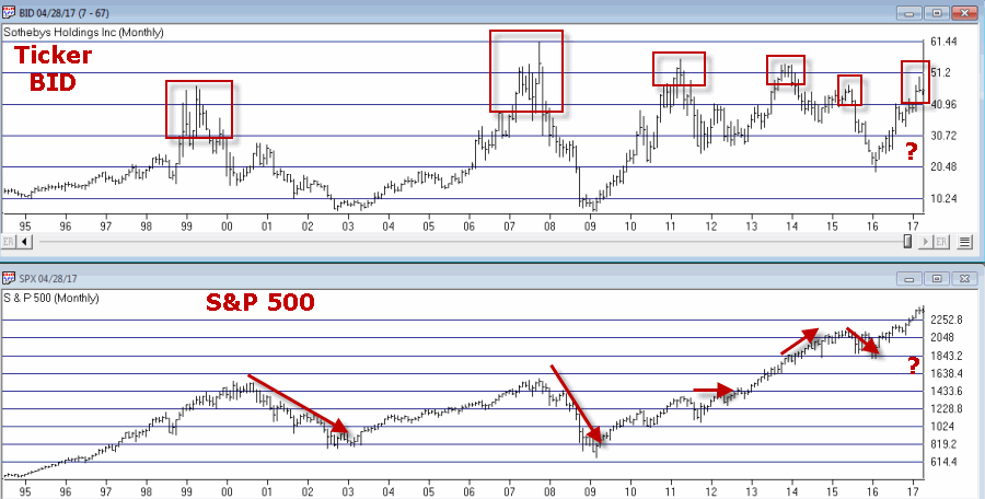
Ticker BID
This one may or may not be relevant but for what it is worth, Sotheby’s (ticker BID) has on several occasions served as something of a “leading indicator” at stock market tops (for the record it has also given some false signals, so this one is more for perspective purposes rather than actual trading purposes). Still, if this one tops out in conjunction with any or all of the above, it would likely serve as a useful warning sign.
Summary
There is no “urgent action” to be taken based on any of this. Bottom line: Nothing in this article should trigger you to run for the exits.
Still, it might be wise to at least take a look around and “locate the exit nearest you.”
You know, just in case.
Disclaimer: The data presented herein were obtained from various third-party sources. While I believe the data to be reliable, no representation is made as to, and no responsibility, warranty or liability is accepted for the accuracy or completeness of such information. The information, opinions and ideas expressed herein are for informational and educational purposes only and do not constitute and should not be construed as investment advice, an advertisement or offering of investment advisory services, or an offer to sell or a solicitation to buy any security.
Mar 23, 2017 | educational newsletters, indicators, MACD
There are many ways to use the MACD indicator developed long ago by Gerald Apel. This is one of them. Maybe. Nothing more, nothing less.
First the caveat: what follows is NOT a “trading system” or even something that you should consider on a standalone basis.
MACD
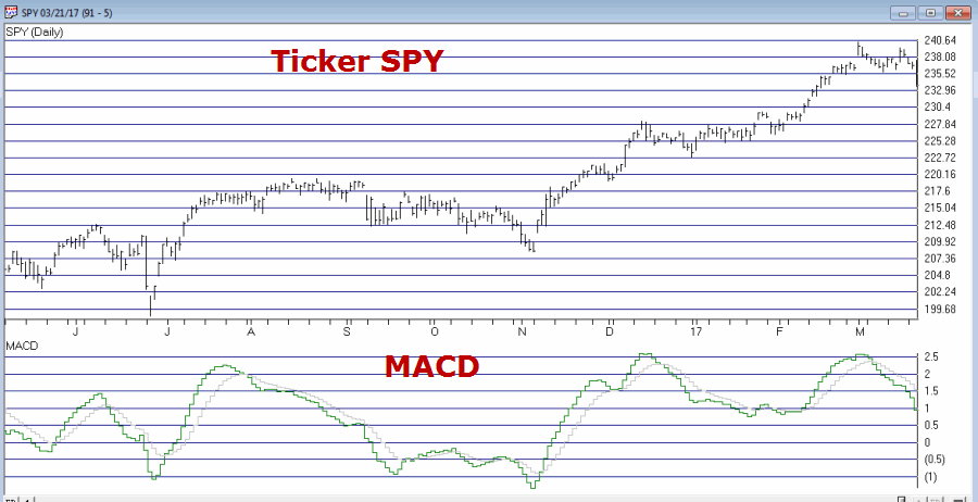
The MACD indicator uses exponential moving averages to identify the underlying trend for a given security and is also used by many traders to identify divergences which may signal an impending change of trend.
Figure 1 displays the daily MACD for ticker SPY.
Figure 1 – Ticker SPY with MACD Indicator (Courtesy
WinWay Charts )
While this is NOT intended to be a mechanical signal, I am going to put specific rules on it just to give it some structure. The rules:
1) If the daily MACD (12,26,9) has declined for at least 7 consecutive trading days AND
2) The 2-day RSI is at 64 or above
Then an “alert” signal is flashed. The key thing to note is that if the MACD ticks higher on the day that the 2-day RSI rises above 64, the signal is negated.
Before proceeding please note that the 12,26,9 parameter selection is simply the “standard” for MACD. Also, there is nothing magic about 7 consecutive days – so one might experiment with different values there. Finally, using the 2-day RSI and a “trigger” value of 64 are also both arbitrary. There may be better values and/or different overbought/oversold indicators to use.
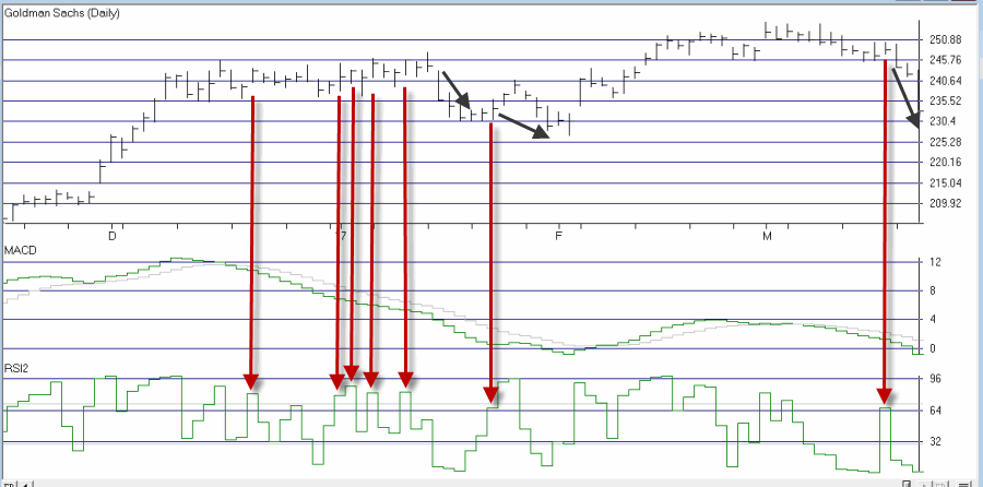
Ticker GS
A “classic” example of the MACD Tell appears in Figure 2 using ticker GS.
The MACD Tell is typically best used as a short-term indicator. In this case a short-term trader might have considered playing the short side of GS – or even better – using option strategies such as buying puts or selling bear call spreads.
Summary
No one should rush out and start trading put options based on this indicator (or any other indicator for that matter) without spending some time doing some homework and testing out the viability for producing profits.
In reality, this is the type of indicator that should typically be combined with “something else” and/or used as a confirmation rather than as a standalone approach.
Jay Kaeppel
Disclaimer: The data presented herein were obtained from various third-party sources. While I believe the data to be reliable, no representation is made as to, and no responsibility, warranty or liability is accepted for the accuracy or completeness of such information. The information, opinions and ideas expressed herein are for informational and educational purposes only and do not constitute and should not be construed as investment advice, an advertisement or offering of investment advisory services, or an offer to sell or a solicitation to buy any security.