They always say you should buy when there is “blood in the street.” They also say, “buy them when nobody wants them.” So, let’s consider today what could be the most unloved, bombed out, everybody hates it “thing” in the world – coal.
Ugh, just the mention of the word coal elicits a recoiling response. “Dirty energy!” “Climate change inducing filth!” “Ban coal!”. And so and so forth. And maybe they have a point. But “they” also say “facts are stubborn things” (OK, for the record, I think it’s a different “they” who says that but never mind about that right now).
So here is a stubborn fact: coal supplies about a quarter of the world’s primary energy and two-fifths of its electricity. As I write, two of the fastest growing economies (at least they were as of a few months ago) – China and India – are not only heavily reliant upon coal for energy, but are still building more and more coal-fired plants. Now I am making no comment on whether this is a good thing or a bad thing but the point is, it most definitely is a “thing.”
So however one feels about coal, the reality is that it is not going to go away anytime soon. Does this mean it will “soar in value” anytime soon – or even ever for that matter? Not necessarily. But as an unloved commodity it’s sure is hard to beat coal. And as “they” (they sure are a bunch of know it all’s they?) say, “opportunity is where you find it.”
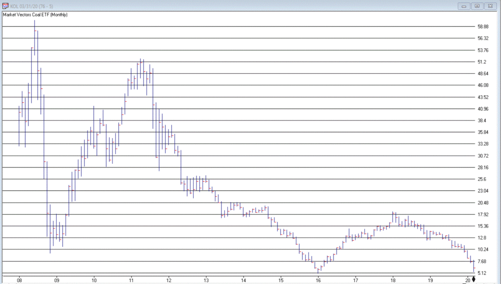
Ticker KOL is an ETF that invests in coal industry related companies. And what a dog it has been. Figure 1 displays a monthly chart of price action. Since peaking in June 2008 at $60.80 a share, it now stands at a measly $6.29 a share, a cool -89.6% below its peak. And like a lot of things it has been in a freefall of late.
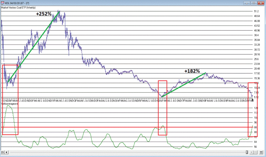
So, is this a great time to buy KOL? That’s not for me to say. But for argument’s sake, Figure 2 displays a weekly chart of KOL with an indicator I call Vixfixaverageave (I know, I know), which is a version of an indicator developed a number of years ago by Larry Williams (Indicator code is at the end of the article).
Note that Vixfixaverageave is presently above 90 on the weekly chart. This level has been reached twice before – once in 2008 and once in 2016. Following these two previous instances, once the indicator actually peaked and ticked lower for one week, KOL enjoyed some pretty spectacular moves.
To wit:
*Following the 12/19/08 Vixfixaverageave peak and reversal KOL advanced +252% over the next 27.5 months
*Following the 2/19/16 Vixfixaverageave peak and reversal KOL advanced +182% over the next 23.5 months
When will Vixfixaverageave peak and reverse on the weekly KOL chart? There is no way to know. One must just wait for it to happen. And will it be time to buy KOL when this happens? Again, that is not for me to say. None of this is meant to imply that the bottom for KOL is an hand nor that a massive rally is imminent.
Still, if there is anything at all to contrarian investing, its hard to envision anything more contrarian that KOL.
Vixfixaverageave Calculations
hivalclose is hival([close],22). <<<<<The high closing price in that last 22 periods
vixfix is (((hivalclose-[low])/hivalclose)*100)+50. <<<(highest closing price in last 22 periods minus current period low) divided by highest closing price in last 22 periods (then multiplied by 100 and 50 added to arrive at vixfix value)
vixfixaverage is Expavg(vixfix,3). <<< 3-period exponential average of vixfix
vixfixaverageave is Expavg(vixfixaverage,7). <<<7-period exponential average of vixfixaverage
Jay Kaeppel
Disclaimer: The information, opinions and ideas expressed herein are for informational and educational purposes only and are based on research conducted and presented solely by the author. The information presented does not represent the views of the author only and does not constitute a complete description of any investment service. In addition, nothing presented herein should be construed as investment advice, as an advertisement or offering of investment advisory services, or as an offer to sell or a solicitation to buy any security. The data presented herein were obtained from various third-party sources. While the data is believed to be reliable, no representation is made as to, and no responsibility, warranty or liability is accepted for the accuracy or completeness of such information. International investments are subject to additional risks such as currency fluctuations, political instability and the potential for illiquid markets. Past performance is no guarantee of future results. There is risk of loss in all trading. Back tested performance does not represent actual performance and should not be interpreted as an indication of such performance. Also, back tested performance results have certain inherent limitations and differs from actual performance because it is achieved with the benefit of hindsight.
The old adage is that we should “buy when there is blood in the streets.” It basically means to buy when things look their worst. Well, for the record I am not actually a fan of this intonation. While it is probably a fair statement, I for one prefer to see some sign of hope – some sign of a trend reversal at the very least – before taking the plunge.
One historically useful indicator suggests we may be nearing that point.
I refer to this indicator as JKHiLo. I included my initials in the acronym because I “developed” it. OK, all I really did was take one guy’s useful indicator and multiply it by another guy’s useful indicator and voila.
In a nutshell JKHilo multiplies Norman Fosback’s HiLo Logic Index by Gerald Appel’s High/Low Indicator.
The Fosback HiLo Logic Index (FHLLI)
I wrote two articles here and here about this indicator. In short, a very low number of stocks making new lows is bullish for the stock market – it indicates that stocks overall are going up and is bullish. At the same time, a very low number of stocks making new highs is also (typically) ultimately bullish going forward, as it tends to signal a “washed out” market.
So this indicator:
*takes the lower of new highs and new lows each day
*divides that number by the total number of issues trades
*takes a 10-day moving average of daily readings
Specifically, the Fosback HiLo Logic Index (HLLI) is calculated as follows:
A=Daily Nasdaq New Highs
B=Daily Nasdaq New Lows
C=The lower of A and B
D=The total number of Nasdaq issues traded
E = (C / D) * 100
FHLLI = 10-day average of E
Readings above 2.15% are considered a sign of “churning”, i.e., a lot of new highs AND new lows. Reading below 0.40% are considered “bullish” because either new highs OR new lows is very low.
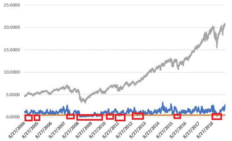
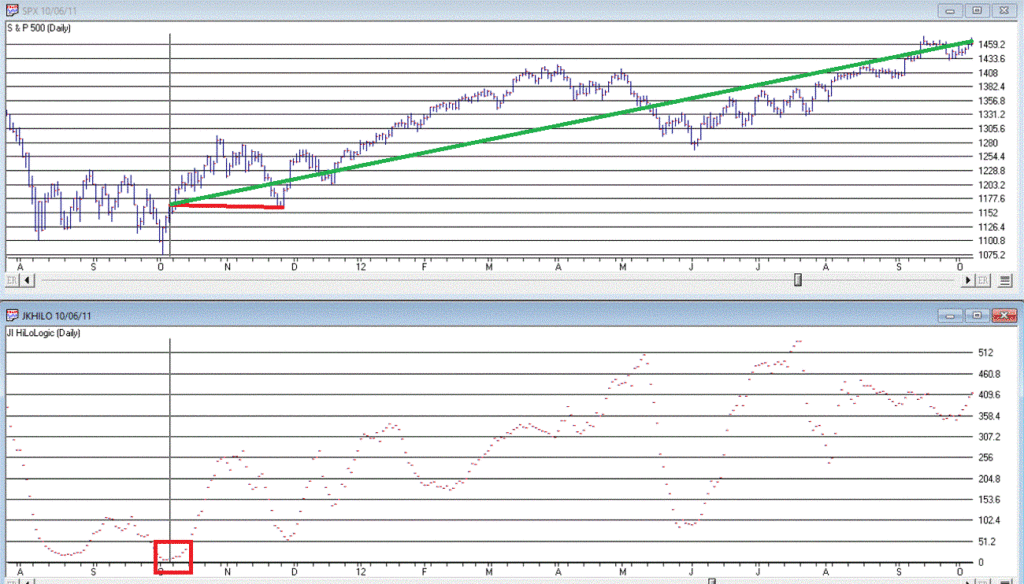
The Fosback HiLo Logic Index finally dropped below 0.40% on 3/23/20. Figure 1 displays the OTC Composite Index with this indicator through 12/31/2019.
Figure 1 – Fosback HiLo Logic Index
The Appel High/Low Indicator
This indicator (heretofore AHLI) is more of a trend-following indicator. It simply divides the number of new highs each day by the total of new highs AND new lows, then takes a 10-day average.
The AHLI is calculated as follows:
A=Daily Nasdaq New Highs
B=Daily Nasdaq New Lows
C = A / (A+B)
AHLI = 10-day average of C
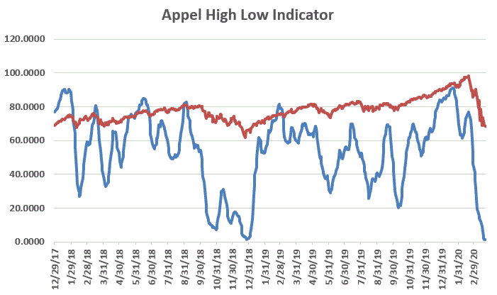
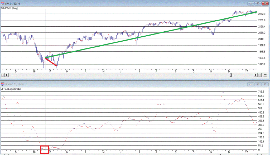
Figure 2 displays this indicator versus the OTC Composite from 12/29/17 through 3/23/20.
Figure 2 – Appel High/Low Indicator (x100; blue line) with OTC Composite (/100; red line); Dec17 through 3/23/20
Extremely low readings tend to highlight oversold market conditions. For the record, an actual “buy signal” for this indicator occurs when it drops below 0.20 (or 20 in Figure 3 since the blue line is the indicator x 100) and then rises back above that level.
The JK Hilo Index (JKHiLo)
So then one day some young punk comes along and multiplies the Fosback indicator by the Appel indicator and has the audacity to add his own initials. Some people. Anyway:
JKHiLo = (FHLLI x AHLI) x 500
A “12-month Buy Signal” occurs when this indicator:
*drops below 5.00
*then turns higher for one day
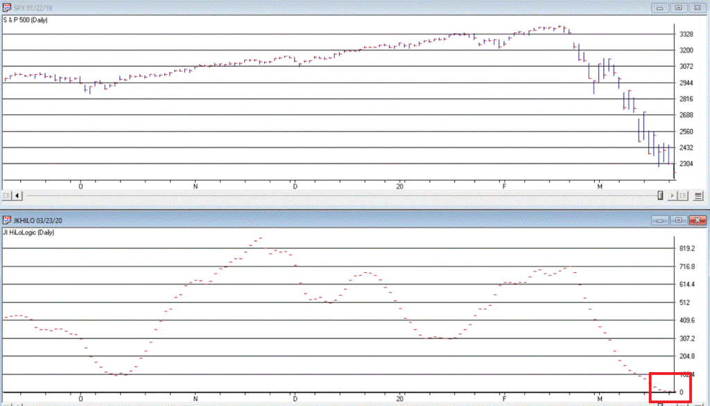
The first part of this signal has happened. As of the close on 3/23/20 JKHL has plunged to 1.8.
Let’s look at previous instances when JKHL fell below 5.00 and then ticked higher for one day.
IMPORTANT: This upside reversal technically constitutes a “12-month buy signal”. What does that mean? It means:
*We expect the market to be higher 12-months later
*HOWEVER, it is NOT an “All Clear, Everything is Great, You Can’t Lose” signal
The bottom line is that it typically does NOT mark the actually bottom. In most cases, another new low or at least a retest of the low follows within a few months. But not always.
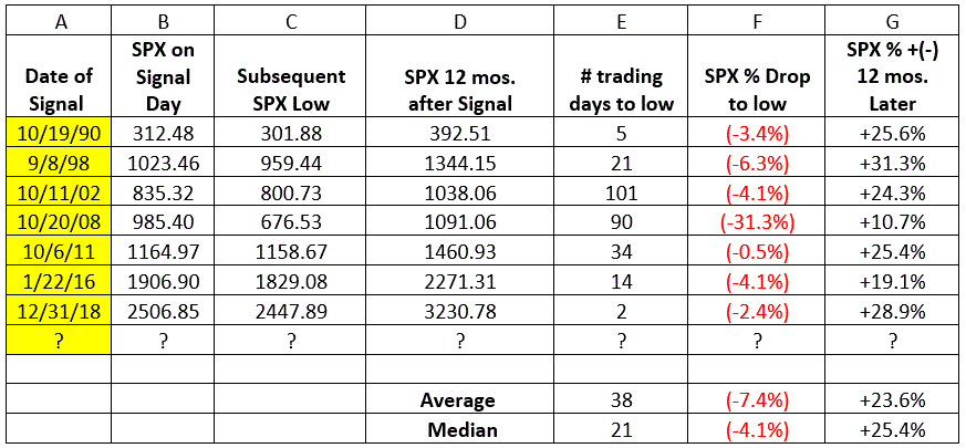
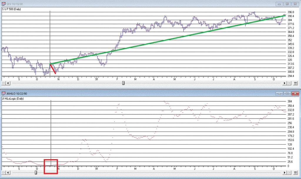
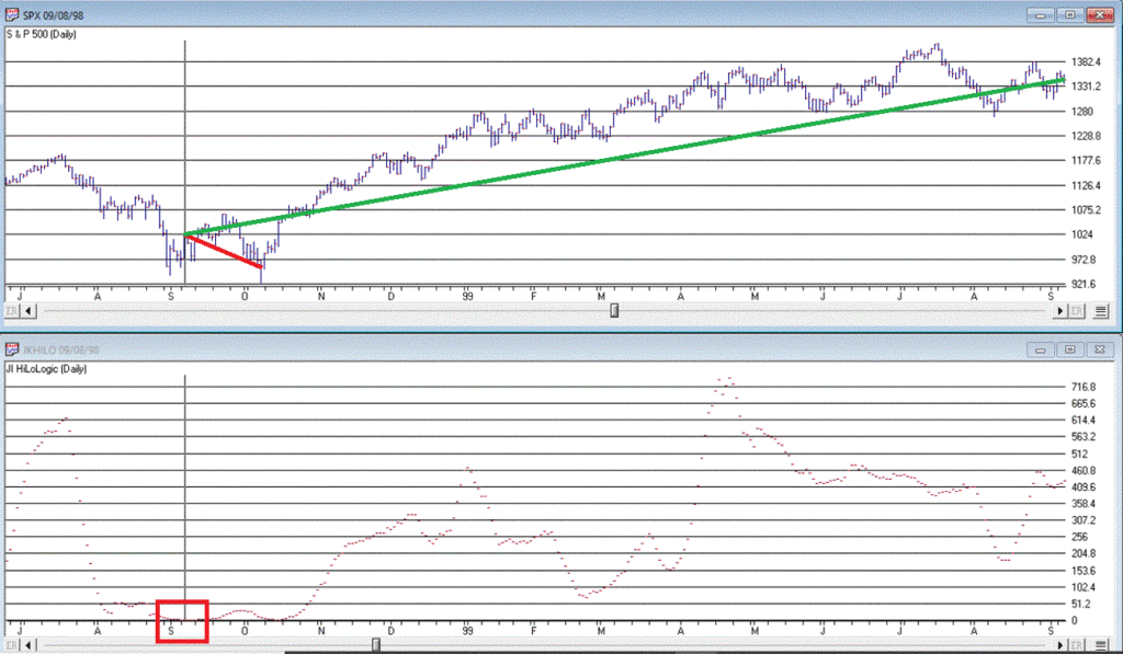
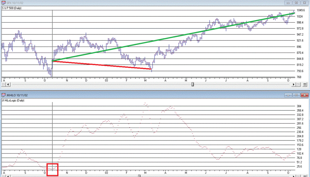
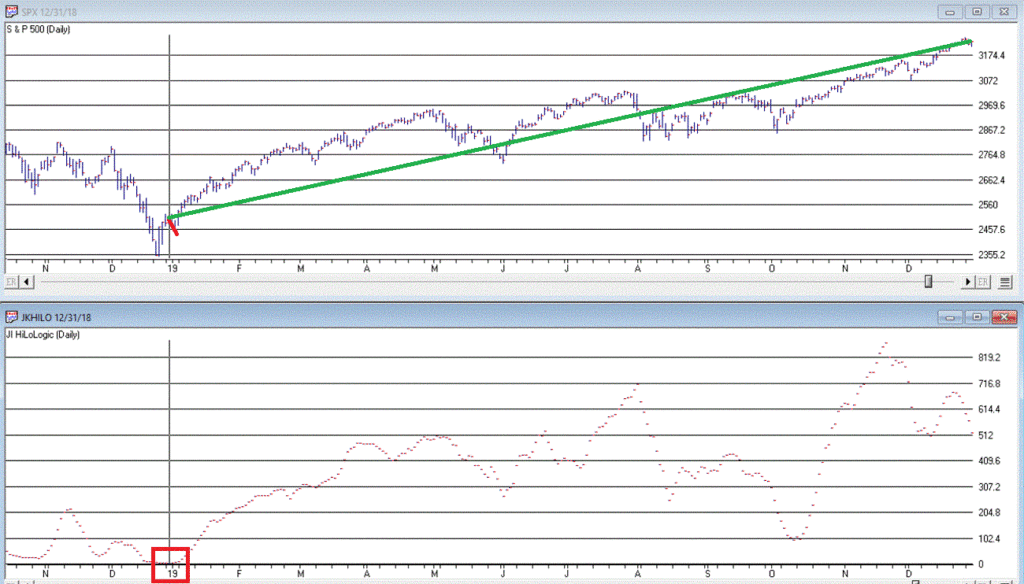
Figure 3 displays the 7 buy signals that have occurred since 1990.
A = Date of signal – i.e., date the JKHL indicator ticked up one day after dropping below 5
B = SPX closing price on date of signal
C = Subsequent low closing price for SPX
D = SPX closing price 12 months after signal date
E = # of trading days between date of signal and ultimate low
F = % decline by SPX from date of signal to ultimate low
G = % change in SPX closing price 1 year after date of signal
Figure 3 – JKHL 12-month buy signals
It is important to note that each previous “buy signal” was followed by further downside price movement prior to the ultimate low. It ranged from 2 trading days in 2018 to 101 trading days in 2008. 6 of the 7 signals saw a further decline of no more than -6.3%. But the 2008 signal saw the market continue to plunge another -31% of the following 3+ months.
So, like I said earlier, even when this indicator does turn up and generate a new signal, that DOES NOT mean “All Clear”. Still, to get an idea of what we might expect, each of the previous signals are displayed in the Figures below.
We DO NOT have a new signal yet, but JKHiLo is below 5, so it is just a matter of waiting for the daily value to tick higher for one day (and then – if history is a guide – waiting for the ultimate low to be put in before a subsequent rally).
Are we on the cusp of a new opportunity? Or on the edge of a cliff? In this time of unprecedented uncertainty, I can’t pretend to know the answer. So, I rely on objective indicators to guide me.
At this moment in time the “trend-following” indicators are bearish and so caution is undoubtedly in order. But other indicators such as the one discussed here remind us to remain alert to new opportunities.
Jay Kaeppel
Disclaimer: The information, opinions and ideas expressed herein are for informational and educational purposes only and are based on research conducted and presented solely by the author. The information presented does not represent the views of the author only and does not constitute a complete description of any investment service. In addition, nothing presented herein should be construed as investment advice, as an advertisement or offering of investment advisory services, or as an offer to sell or a solicitation to buy any security. The data presented herein were obtained from various third-party sources. While the data is believed to be reliable, no representation is made as to, and no responsibility, warranty or liability is accepted for the accuracy or completeness of such information. International investments are subject to additional risks such as currency fluctuations, political instability and the potential for illiquid markets. Past performance is no guarantee of future results. There is risk of loss in all trading. Back tested performance does not represent actual performance and should not be interpreted as an indication of such performance. Also, back tested performance results have certain inherent limitations and differs from actual performance because it is achieved with the benefit of hindsight.
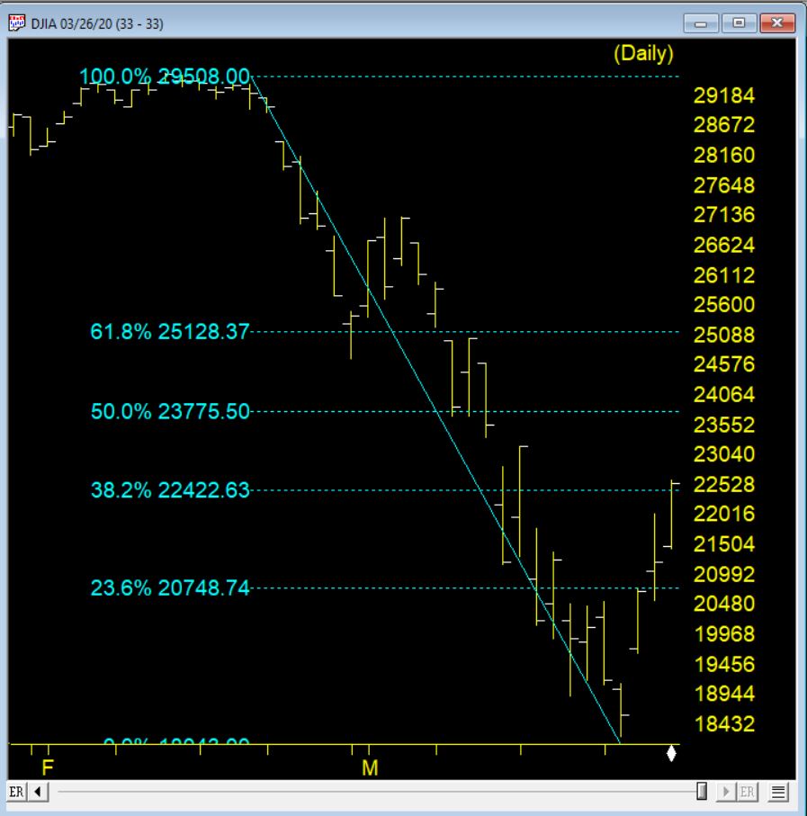
3-26-20 saw the market on the third day of a rebound from the low of 18213 on 3-23-20. The chart below shows the Fibonacci retracements from the recent high to this low. Since that time prices have been a narrow range for this volatile market
The retracement hit the 38.2% level and this level can offer resistance. The market is down again and could be we are headed down to retest at or near the last low.
If we rally passes the 38.2% the next resistance level will be at 23775 or so at the 50% retracement level.
Market Timing signals
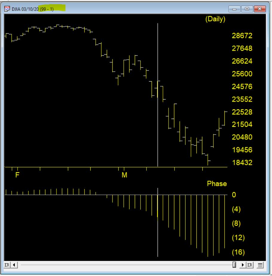
The Market Timing system issued a 99-1 up signal on 3-10-20, the chart below shows the signal. The Phase indicator changing direction in the direction of the signal (moving down then moves up) provides confirmation market Timing signals. IN this case that didn’t happen.
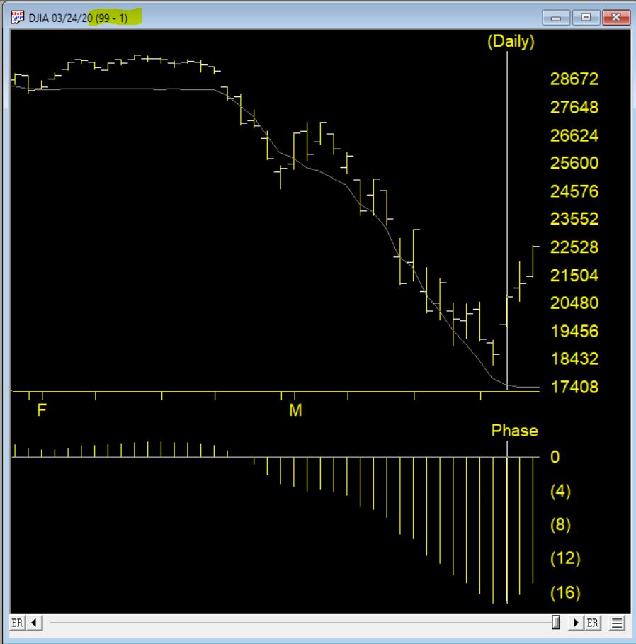
Another up signal 99-1 fired on 3-24-20 and this time the phase turned up the same day and confirmed the signal.
Here are 3 of the bullish rules that fired to create this high up signal
The 21 day stochastic has advanced and crossed the 20% line and the price phase indicator is also increasing. In this weakly downtrending market this is taken as a strong bullish signal suggesting an increase in prices.
Volume accumulation percentage is increasing and the 21 day stochastic has moved above the 20% line. In this downtrending market, this is taken as a strong bullish signal that could be followed by an upward price movement.
The price phase indicator is negative but volume accumulation has started to advance. This is a non-conformation that, regardless of the type of market, is a bullish signal which usually results in an upward movement of the market.
The counter trend AI system that generates these signals can be early in their firing. While the market moved up 2000 a nice move in most markets, in prior trading environments this would have taken a number of weeks, in our current volatility the market moved from the up signal in 2 days.
Trend-following is essentially a “tried and true’ approach to investing. But overbought/oversold (i.e., attempting to buy low/sell high) – that’s where the “excitement” is. Of course, when it comes to trading and investing, “excitement” can be highly overrated. Nevertheless, in this piece I want to talk about a relatively obscure indicator that may be useful in identifying vastly oversold situations.
EDITORS NOTE: The WinWay EDS file for Jay Kaeppel’s indicator is available to download here
The VixRSI14 Indicator
Part of the reason this indicator is obscure is because I think I “invented” it – but only by mashing together an indicator from Larry Williams and an indicator from Welles Wilder. The first part is the standard Welles Wilder 14-day Relative Strength Index, more commonly referred to as “RSI”.
The 2nd part of VixRSI14 is an indicator created by famed trader Larry Williams which he dubbed “VixFix”. This indicator is an effort to create a “Vix Index-like” indicator for any security.
WinWay TradingExpert code for these indicators appears at the end of the article.
A Few Notes
*For the record, VixRSI14 is calculated by taking a 3-day exponential average of VixFix and dividing that by a 3-day exponential average of RSI14 (are we having fun yet?). Please see code at the end of the article.
*I prefer to use VixRSI14 using weekly data rather than daily data
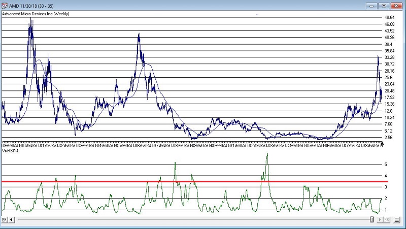
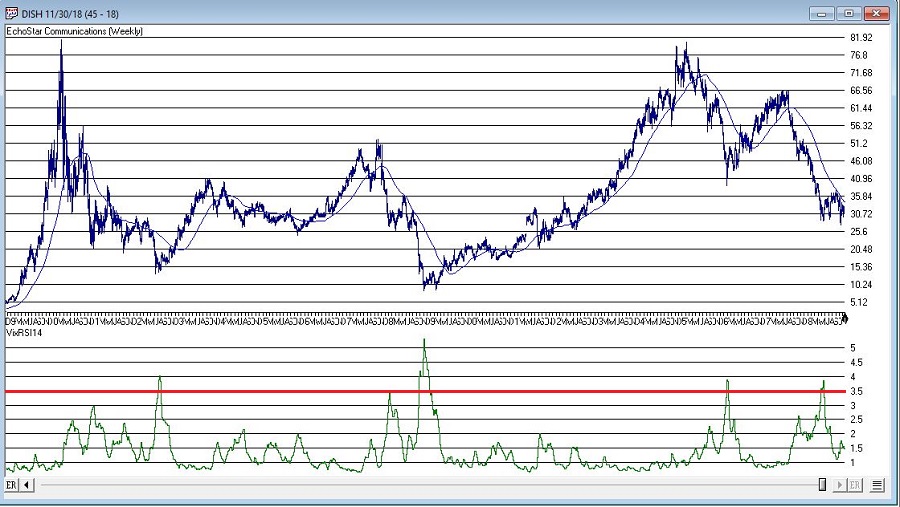
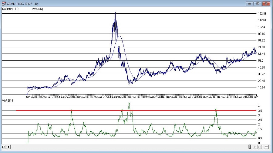
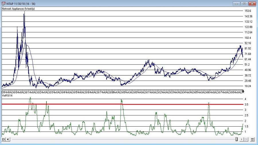
*(Unfortunately) There are no “magic numbers” that indicate that a completely risk-free, you can’t lose, just buy now and watch the money roll in” buying opportunity is at hand (Disclaimer: If there was, I would probably just keep it to myself and not bother writing the article – sorry, it’s just my nature). That being said, a decent “rule of thumb” is to look for a reading above 3.5 followed by a downside reversal.
(Click any chart below to enlarge)
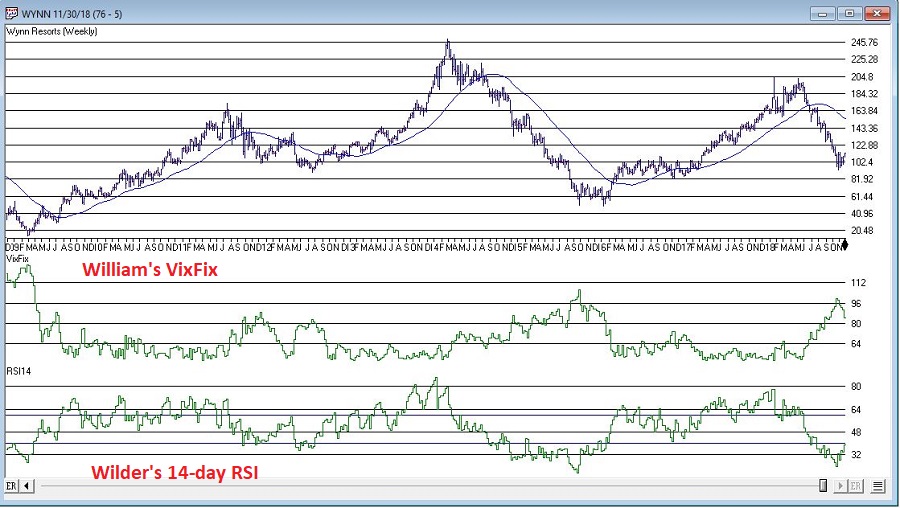
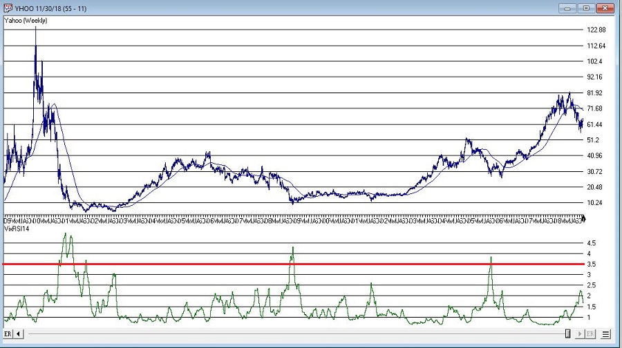
With those thoughts in mind, Figure 1 displays a weekly chart of Wynn Resorts (WYNN) with the two indicators plotted separately below the bar chart.
Figure 1 – WYNN with William’s VixFix and Wilder’s RSI 14-day (Courtesy WinWay TradingExpert)
Note that as price declines, VixFix tends to rise and RSI14 tends to fall. VIXRSI14 essentially identifies “extremes” in the difference between these two. Figure 2 displays WYNN with VixRSI14 plotted below the bar chart.
Figure 2 – WYNN with VixRSI14 (Courtesy WinWay TradingExpert)
More “examples” appear in Figures 3 through 8 below.
As always, I merely present “ideas” here at JOTM. So, do not assume from the charts above that you have found the “keys to the kingdom”. But if used in conjunction with other confirming indicators – and remembering to employ some sort of risk control for those instances when a stock price decline fails to arrest itself even after VixRSI4 peaks above 3.5 – VixRSI14 may hold some value.
Indicator Code
EDITORS NOTE: The WinWay EDS file for Jay Kaeppel’s indicator is available to download here
Below is the code for VixFix, RSI14 and VixRSI14 from AIQ Expert Design Studio.
!#######################################
!VixFix indicator code
hivalclose is hival([close],22).
vixfix is (((hivalclose-[low])/hivalclose)*100)+50.
!#######################################
!#######################################
!RSI14 code
Define days14 27.
U14 is [close]-val([close],1).
D14 is val([close],1)-[close].
AvgU14 is ExpAvg(iff(U14>0,U14,0),days14).
AvgD14 is ExpAvg(iff(D14>=0,D14,0),days14).
RSI14 is 100-(100/(1+(AvgU14/AvgD14))).
!#######################################
!#######################################
!VixRSI14 code
VixRSI14 is expavg(vixfix,3)/expavg(RSI14,3).
!#######################################
Jay Kaeppel
Disclaimer: The data presented herein were obtained from various third-party sources. While I believe the data to be reliable, no representation is made as to, and no responsibility, warranty or liability is accepted for the accuracy or completeness of such information. The information, opinions and ideas expressed herein are for informational and educational purposes only and do not constitute and should not be construed as investment advice, an advertisement or offering of investment advisory services, or an offer to sell or a solicitation to buy any security.
The AI in TradingExpert Pro is programmed with the knowledge and insight of many stock market professionals, and is capable of making market recommendations based on this knowledge and insight; recommendations are made on a scientific basis free of bias, emotion, or hidden motives.
The AI or expert systems are programmed with rules that combine sound principles of technical analysis with the knowledge and experience of market professionals. Technical analysis, as used by AIQ, is based on the logic that price is the result of supply and demand. An AIQ timing signal, therefore, reflects all available knowledge and opinions such as news of the day, earnings, product reports, and company forecasts.
Technical analysis recognizes price and volume movement as the voice of the market itself and hence the only data necessary to determine what the market is likely to do next.
The AIQ Expert System
As an expert system, TradingExpert Pro is comprised of two knowledge bases – one for market timing and a second for stock selection – and an inference engine. Knowledge, in the form of rules, is stored in the knowledge bases. The inference engine is the thinking component of an expert system.
Each of the two knowledge bases within TradingExpert Pro has its own unique rules. The rules operate on facts which are values of the technical indicators. The indicators are computed from daily price, volume, and breadth data.
The rules employed in ATQ TradingExpert Pro are derived from the knowledge of many experts of market action and market timing. The reliability of these rules is maximized by combining them into a higher level of Expert Rules. Market analysts have found that no single rule or indicator works all the time. In AIQ, the Expert Rules and technical indicators work together to generate upside and downside signals.
Different knowledge bases for different market cycles
Continuing research at AIQ has shown that a single knowledge base can be improved if it is split into several knowledge bases, one for each phase of the market cycle. This advancement has been incorporated in the market timing knowledge base. The crest, trough, up slope, and down slope are each addressed by a specific set of rules specialized and weighted for that specific phase of the market cycle.
Each market day, then, the system determines the strength and direction of the phase, or trend. If there is no trend, it is first determined if the cycle is at a crest prior to a downtrend, or in a trough before the next uptrend. A more specialized knowledge base is used for each of these conditions, increasing the overall market timing effectiveness.
The inference engine
The knowledge base fuels the second part of the AIQ expert system, the inference engine. The inference engine is the thinking component of an expert system, and mimics the way humans think.
To understand how the AIQ inference engine works, picture a decision tree. The procedure starts from the tree’s trunk, where the major rules are located. Each rule is represented as a node, or fork, where the tree splits into three branches-representing a yes, a no, or a maybe. If the expert system determines that the premise of a rule is true, then the rule is considered to have fired, giving one of those three answers.
As each rule is evaluated, the process moves on to the next node and subsequent branches and continues to move on through the tree. Each rule node has an assigned value. That value is added to a node total that is accumulated as the inference engine passes through the tree. When all the rules have been evaluated, the resulting node total is normalized and becomes an AIQ Expert Rating.
Finally
The Expert Ratings are based on a scale of 0 to l00. The higher the Expert Rating, the stronger the signal. An Expert Rating of 95 or higher is considered a strong signal, meaning that there is a strong possibility that the price trend is about to change direction.
Confirmation of Expert Ratings
Research has shown that a change in direction of the Phase indicator (changing up for up ER, changing down for down ER) at or close to the high Expert Rating date provides a higher degree of confidence in the rating. Phase is not part of the Expert System.
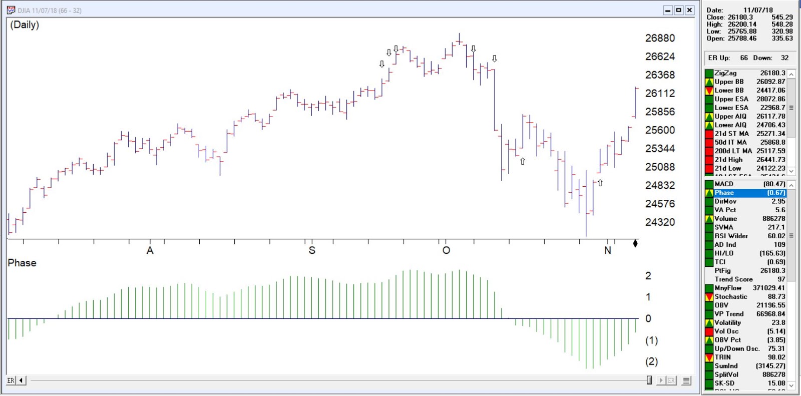
So let us examine the last 7 weeks market action.
2-98 down signal 9/18/2018, 9/18/18 and 9/20/18 all with these primary riles firing confirmed by phase
Intraday high prices of the market have increased to a 21 day high. Never the less, the advance/decline oscillator is negative. This unusual event is read as a very strong bearish signal that is often followed by an downward price movement.
Closing prices on the market have increased to a 21 day high but market breadth as measured by advances and declines is declining. This non-confirmation in a trading market is a weak bearish signal indicating a possible downward price movement.
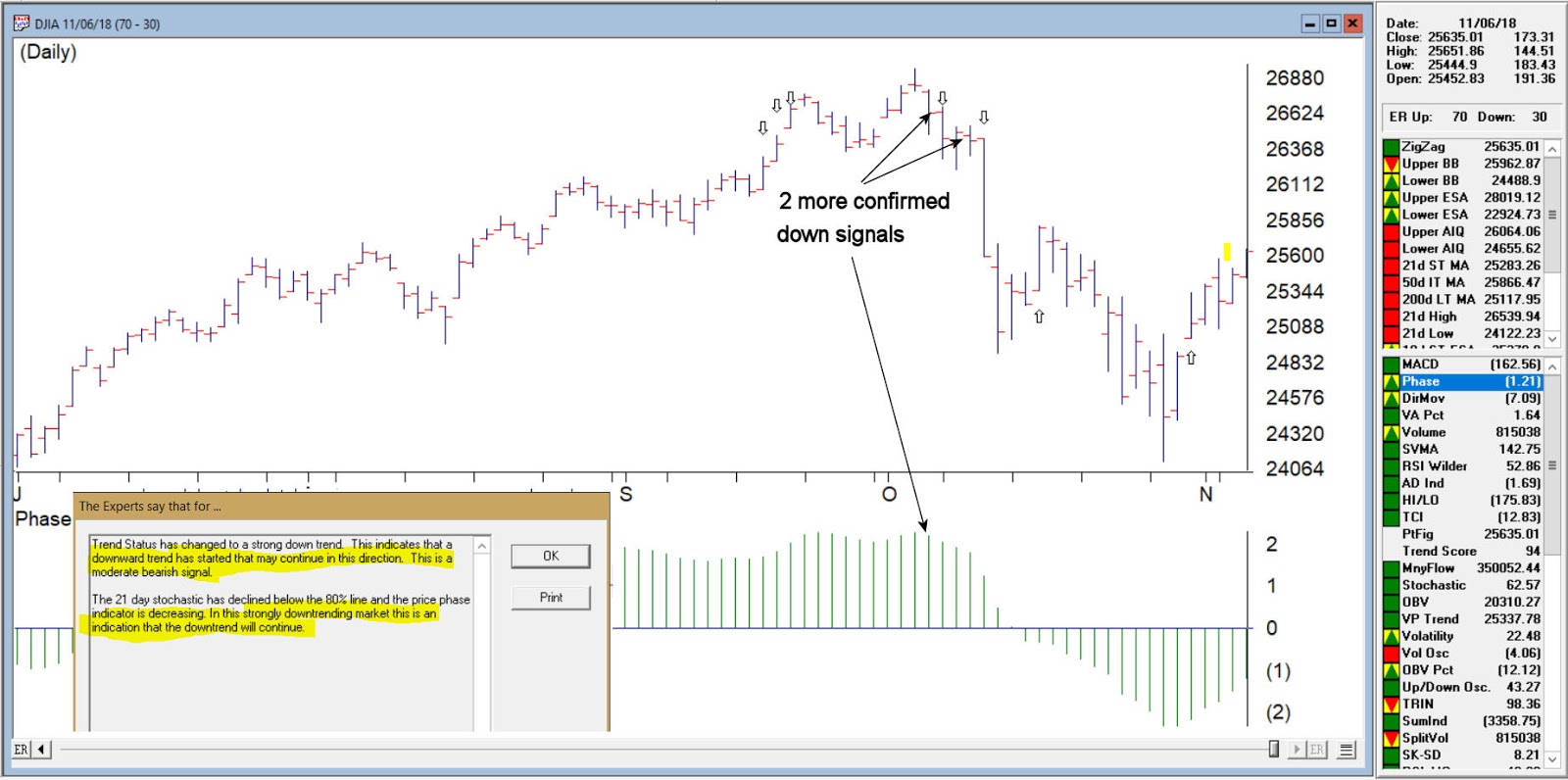
DJIA with the 3 successive down signals
Confirmed down signal 4-96 on 10/05/18 these primary rules fires
Trend Status has changed to a strong down trend. This indicates that a downward trend has started that may continue in this direction. This is a moderate bearish signal.
The 21 day stochastic has declined below the 80% line and the price phase indicator is decreasing. In this strongly downtrending market this is an indication that the downtrend will continue.
Confirmed down signal 5-95 on 10/18/2018 these primary rules fires
The market closing average has dropped below the 21 day exponentially smoothed average price. At the same time, accumulation is decreasing. In this down trending market, this is taken as a very bearish signal that could be followed by further decreases in price.
The price phase indicator is positive but volume distribution has started to advance. This is a nonconformation that, regardless of the type of market, is a bearish signal which usually results in an downward movement of the market.
DJIA with 2 more down signals confirmed by phase
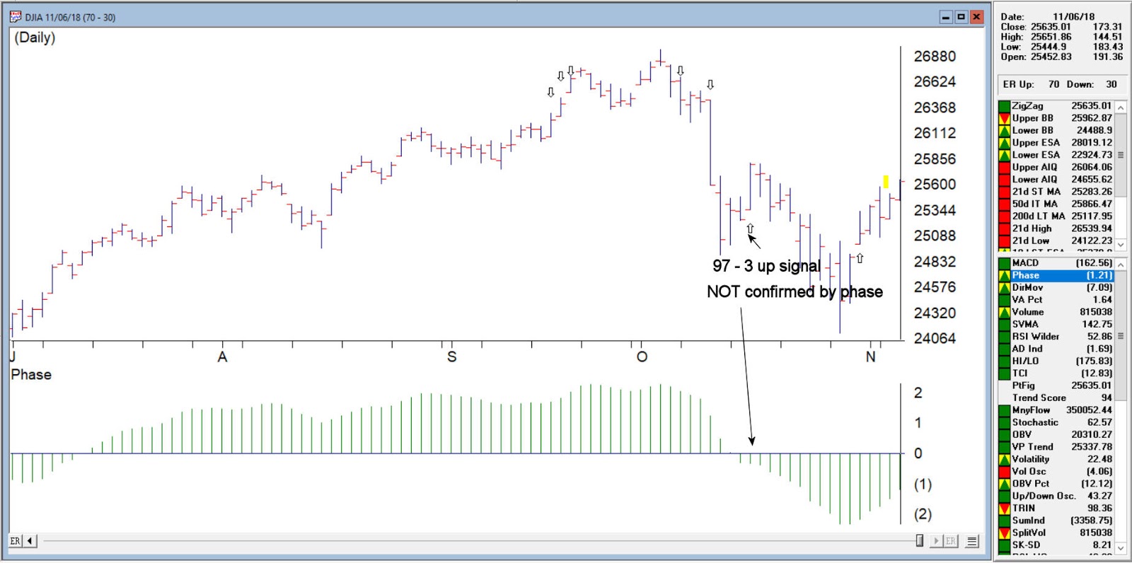
Unconfirmed up signal on 10/16/18 – phase did not change direction
Volume accumulation percentage is increasing and the 21 day stochastic has moved above the 20% line. In this downtrending market, this is taken as a strong bullish signal that could be followed by an upward price movement.
The price phase indicator is negative but volume accumulation has started to advance. This is a non-conformation that, regardless of the type of market, is a bullish signal which usually results in an upward movement of the market.
The new high/new low indicator has reversed to the upside. This is a reliable bullish signal that is often followed by an upward movement in prices. In this weak downtrending market an uptrend could start shortly.
DJIA on 10/16/18 97-3 up no phase confirmation
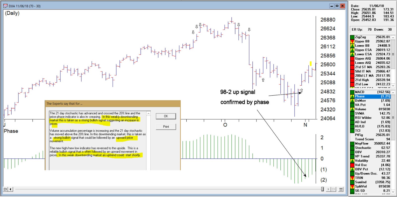
Confirmed up signal 10/31/18 98-2
The 21 day stochastic has advanced and crossed the 20% line and the price phase indicator is also in- creasing. In this weakly downtrending market this is taken as a strong bullish signal suggesting an increase in prices.
Volume accumulation percentage is increasing and the 21 day stochastic has moved above the 20% line. In this downtrending market, this is taken as a strong bullish signal that could be followed by an upward price movement.
The new high/new low indicator has reversed to the upside. This is a reliable bullish signal that is often followed by an upward movement in prices. In this weak downtrending market an uptrend could start shortly.
DJIA on 10/31/18 with confirmed up signal 98-2
While never perfect, the Expert rating provides a formidable advantage to the trader looking for signs of direction changes in the market. As of 11/7/18 close the DJIA was at 26180
So, the big question on every investor’s mind is “What Comes Next?” Since this is not an advisory service (and given the fact that I am not too good at predicting the future anyway) I have avoided commenting on “the state of the markets” lately. That being said, I do have a few “thoughts”:
*The major averages (as of this exact moment) are still mostly above their longer-term moving averages (200-day, 10-month, 40-week, and so on and so forth). So, on a trend-following basis the trend is still “up”.
*We are in the most favorable 15 months of the 48-month election cycle (though off to a pretty awful start obviously) which beings Oct.1 of the mid-term year and ends Dec. 31st of the pre-election year.
*Investors should be prepared for some volatility as bottoms following sharp drops usually take at least a little while to form and typically are choppy affairs. One day the market is up big and everyone breathes a sigh of relief and then the next day the market tanks. And so on and so forth.
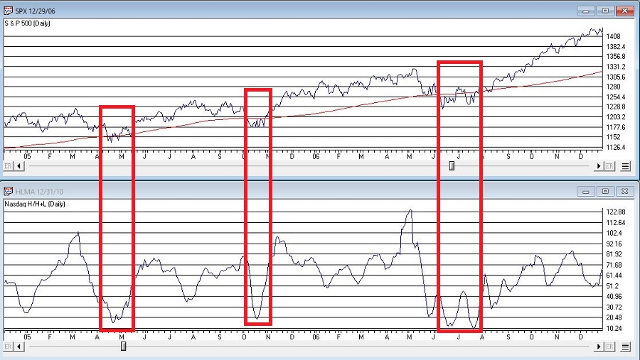
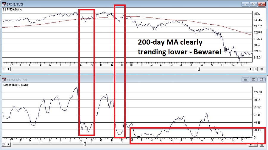
An Indicator to Watch
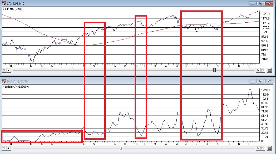
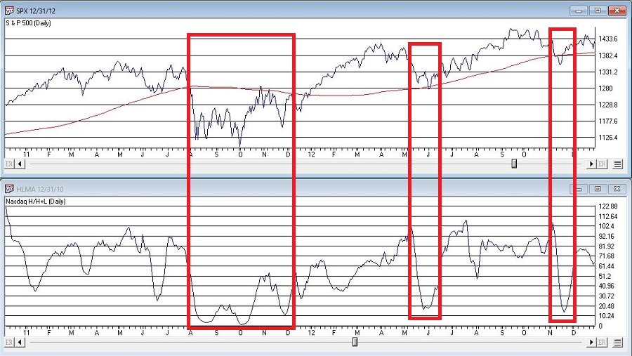
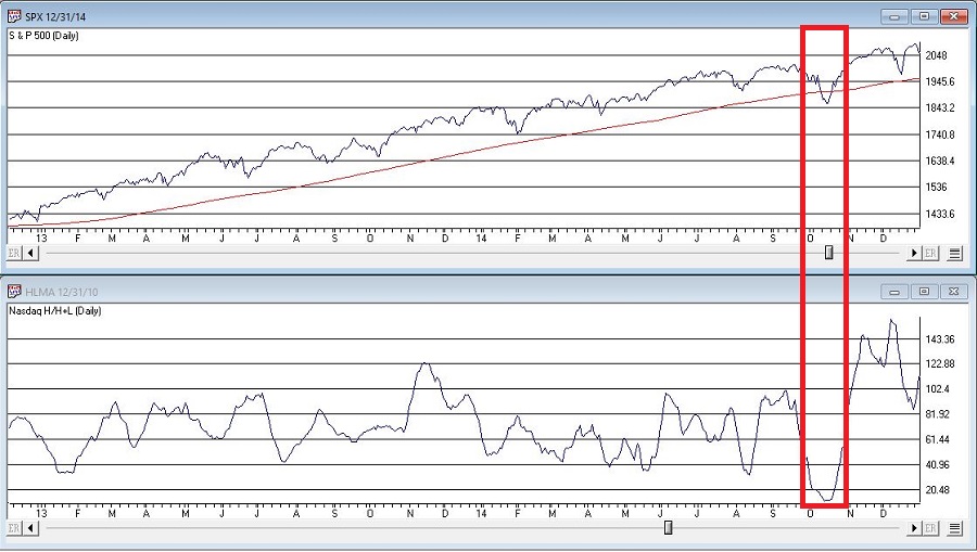
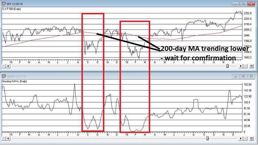
At the outset let me state that there are no “magical” indicators. Still, there are some that typically are pretty useful. One that I follow I refer to as Nasdaq HiLoMA. It works as follows:
A = Nasdaq daily new highs
B = Nasdaq daily new lows
C = (A / (A+B)) * 100
D = 10-day moving average of C
C can range from 0% to 100%. D is simply a 10-day average of C.
Nasdaq HiLoMA = D
Interpretation: When Nasdaq HiLoMA drops below 20 the market is “oversold”.
Note that the sentence above says “the market is oversold” and NOT “BUY NOW AGGRESSIVELY WITH EVERY PENNY YOU HAVE.” This is an important distinction because – like most indicators – while this one may often give useful signals, it will occasionally give a completely false signal (i.e., the market will continue to decline significantly).
A couple of “finer points”:
*Look for the indicator to bottom out before considering it to be “bullish”.
*A rise back above 20 is often a sign that the decline is over (but, importantly, not always). Sometimes there may be another retest of recent lows and sometimes a bear market just re-exerts itself)
*If the 200-day moving average for the Dow or S&P 500 is currently trending lower be careful about using these signals. Signals are typically more useful if the 200-day moving average for these indexes is rising or at least drifting sideways rather than clearly trending lower (ala 2008).
Figures 2 through 8 displays the S&P 500 Index with the Nasdaq HiLoMA indicator. Click to enlarge any chart.
The stock market is in a favorable seasonal period and is oversold. As long as the former remains true, react accordingly (with proper risk controls in place of course).
Jay Kaeppel
Disclaimer: The data presented herein were obtained from various third-party sources. While I believe the data to be reliable, no representation is made as to, and no responsibility, warranty or liability is accepted for the accuracy or completeness of such information. The information, opinions and ideas expressed herein are for informational and educational purposes only and do not constitute and should not be construed as investment advice, an advertisement or offering of investment advisory services, or an offer to sell or a solicitation to buy any security.