Making the Most of Your WinWayCharts – An hour-long session with UK Director Ray Foreman covering the power features in your WinWayCharts platform – great for new clients and those getting started.
FREE Zoom webinar
March 27, 2024,
Getting Started Right with WinWayCharts and
Walk Forward Testing a Trading Strategy
Making the Most of Your WinWayCharts – An hour-long session with UK Director Ray Foreman covering the power features in your WinWayCharts platform – great for new clients and those getting started.
Walk Forward Testing a Trading Strategy – Steve Hill, Founder of WinWayCharts will use two strategies both of which have 3 indicator confirmations, and run them through the WinWay Portfolio simulator to test their effectiveness using real-life walk-forward testing.
Getting Started Right with WinWayCharts and
What Works What Doesn’t – Indicator Confirmations for Trading
Making the Most of Your WinWayCharts – An hour-long session with UK Director Ray Foreman covering the power features in your WinWayCharts platform – great for new clients and those getting started.
Walk Forward Testing a Trading Strategy – Steve Hill, Founder of WinWayCharts will use two strategies both of which have 3 indicator confirmations, and run them through the WinWay Portfolio simulator to test their effectiveness using real-life walk-forward testing.
Getting Started Right with WinWayCharts and What Works What Doesn’t – Indicator Confirmations for Trading
Making the Most of Your WinWayCharts – An hour-long session with UK Director Ray Foreman covering the power features in your WinWayCharts platform – great for new clients and those getting started.
An hour-long session with Steve Hill, founder of Winwaycharts. In this session, Steve Hill will take us through some of the indicators which work and which don’t, and how to combine multiple indicators for trading confirmation.
In this video I’ve covered the last 6 months of up and down Market ratings generated by the Artificial Intelligence system in our TradingExpert Pro analysis platform.
You might also be interested in:
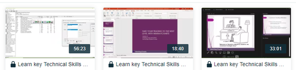
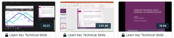
Learn key Technical Skills Essential to Trading Success
6 Video Series – nearly 4 hours of in-depth materials
Includes Seminar Notes in PDF on all sessions except Live Trading
+ BONUS eBook Mind Over Markets
6 in-depth videos
Video 1 – Darren’s Indicators
(56 Minutes).
Case Studies Of Some Of Darren’s Favourite Indicators Focusing On How Each Can Be Used As A Part Of Your Overall Stock Selection Strategy. Stoch12 WinWay, RSi WInWay And MACD WinWay Will Be Covered.
Video 2 – Sector Rotation Overview
(18 Minutes).
The Concept Of Market Sector Rotation Is Widely Accepted. Certain Segments Of The Market Are In Favour During Bull, Bear Market Topping, And Market Bottoming Phases.
Video 3 – Leverage Sector Rotation
(52 Minutes).
We’ll Use WinWayCharts Sector Tools Both To Help Determine Market Direction And To Make Stock Trading Decisions.
Video 4 – Mind Over Markets
(33 Minutes).
In This Session, We’ll Give You The Checklist Of Must-Do’s Required To Trade Successfully And Show You How To Avoid The Pitfalls Of An Undisciplined Trader.
Video 5 – Finding Long And Short ETFs
(18 Minutes).
Using Various Tools And Scans In WinWayCharts You’ll Learn How To Find ETFs In Different Market Segments Both Long And Short. There Are ETFs For Each Sector Of The Market And For Markets Themselves. These Are Often Available On The Long And Short Side Of The Market Or Segment. Less Risky Than Stocks And Yet Still Providing Good Liquidity They Are The Darlings Of The Stock Market.
Session 6 – Live Analysis And Trading
(56 Minutes).
WinWayCharts Putting It All Together This Was a Live Analysis Session Looking For Trading Candidates, Confirming Our Selections With Darren’s Indicators, And Placing Trades And Stops In A Real Trading Account.
As we reflect on the incredible journey of the past 17 years, we’re excited to share a milestone with you. It all began when Darren commissioned the creation of the WinWayCharts TradingExpert Pro trading analysis suite, and since then, we’ve been dedicated to enhancing your trading journey.
We’re thrilled to announce the official release of the new WinWayCharts TradingExpert Pro End-of-day version 2.55! After an extensive testing period with our dedicated testers, we’re confident this upgrade will elevate your trading experience.
Some of you who recently joined us may already have the new version, so no need to download the upgrade again. For others, this is an opportunity to embrace the latest enhancements.
Key Features of TradingExpert Pro 2.55:
Introducing the new Heiken Ashi charting feature
For detailed insights and a step-by-step demonstration, check out the upgrade page on our website
And the best part? This upgrade is entirely FREE of charge!
We’re committed to providing you with tools that not only enhance your client experience but also equip you for success in trading. Here’s to a year of prosperity and successful trading ahead!
The importable EDS file based on John Ehlers’ article in the March 2023 issue of Stocks & Commodities, “Every Little Bit Helps,” can be obtained on request via rdencpa@gmail.com. John notes ‘It’s simple but makes a noticeable improvement: You can reduce noise in the data by using an average of the open and close instead of using only the closing price.’ The code is also available below.
!Every Little Bit Helps
!Author: John F. Ehlers, TASC Mar 2023
!Coded by: Richard Denning, 1/12/2023
!Data Sampling Test
!(c) John Ehlers 2022
!INPUTS:
W1 is 14. !Wilder RSI length
W2 is 14. !Ehlers RSI length
!RSI Wilder code:
U is [close]-val([close],1).
D is val([close],1)-[close].
L1 is 2 * W1 – 1.
AvgU is ExpAvg(iff(U>0,U,0),L1).
AvgD is ExpAvg(iff(D>=0,D,0),L1).
RSIwilder is 100-(100/(1+(AvgU/AvgD))).
!Ehlers RSI code:
OCavg is ([open] + [close])/2.
Uoc is OCavg-valresult(OCavg,1).
Doc is valresult(OCavg,1)-OCavg.
L2 is 2 * W2 – 1.
AvgU2 is ExpAvg(iff(Uoc>0,Uoc,0),L2).
AvgD2 is ExpAvg(iff(Doc>=0,Doc,0),L2).
RSIoc is 100-(100/(1+(AvgU2/AvgD2))).
!CTest is RSIwilder.
!OCTest is RSIoc.
BuyRSIwilder if RSIwilder < 20 and valrule(RSIwilder >= 20,1).
ExitRSIwilder if RSIwilder > 80 or {Position days}>=20.
BuyRSIoc if RSIoc < 20 and valrule(RSIoc >= 20,1).
ExitRSIoc if RSIoc > 80 or {Position days}>=20.
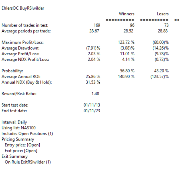
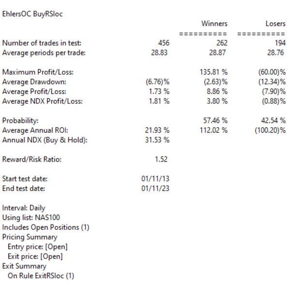
Code for the author’s indicators are set up in the EDS code file. Figure 7 shows the EDS module backtest results using the RSI original indicator. Figure 8 shows the EDS module backtest results using the modified version of the RSI indicator over a 10-year period using NASDAQ 100 stocks. The comparison suggests that some of the metrics improve using the modified version and a few are worse.
The system rules are:
Buy when the RSI crosses down below 20
Sell when the RSI crosses above 80 or after 20 trading days
FIGURE 7: AIQ. This shows example backtest results for classic RSI trading system rules, based on closing data, over a 10-year period using NASDAQ 100 stocks.FIGURE 8: AIQ. This shows example backtest results for the RSI trading system rules, this time based on data that averages the open and close instead of using just the closing price data, over a 10-year period using NASDAQ 100 stocks.