Nov 7, 2024 | Charts
 November 14, 2024
Making the Most of Your WinWayCharts – An hour-long session with UK Director Ray Foreman covering the power features in your WinWayCharts platform – great for new clients and those getting started.
PLUS a 30-minute market update session from Steve Hill, founder of WinWayCharts discussing Expert ratings and analysis of market breadth data to gauge market direction.
After registering, you will receive a confirmation email containing information about joining the meeting. Questions? e-mail: Support@WinWayCharts.com
Jun 11, 2024 | Charts
In this update, we’re going to discuss the most recent market timing signals from the Expert system within our Trading Expert Pro platform. On your screen is a daily chart of the Dow Jones Industrial Average with a price phase indicator underneath, displaying Heiken Ashi-mode candles. The green bars indicate an uptrend, red bars show a downtrend, and the bars that are neither green nor red are based on a color study indicating a high market rating.
To explain these market ratings: over 400 rules run through an inference engine—a decision tree process where 400 different indicator states are evaluated. When one rule fires, it triggers the evaluation of certain other rules. These decision pathways contribute to a high expert rating, either up or down, which can signal a change in market direction. The expert rules are based on historical Dow Jones price action and the internals of the New York Stock Exchange, such as new highs, new lows, and advancing/declining issues, evaluated using numerous indicators.
Every day, we generate an expert rating. Most ratings are neutral, meaning few or no rules fired. For instance, on June 4th of this year, the rating was neutral. Once the rules’ weighting reaches beyond 95 up or down, it’s a significant level. On the price chart, buy and sell points are indicated for ratings greater than 95. I’ve marked only the first in a batch of signals; subsequent signals reinforce the initial one. For example, a sell signal is marked by a yellow bar indicating a 96 down rating, signifying importance.
Each day, an expert rating is shown on the chart. Scrolling forward, you’ll see the numbers change. White bars indicate a 95 or greater up signal, while yellow bars show a 95 or greater down signal. The charts are annotated with buy and sell signals. When multiple buy signals occur, we focus on the first one, with subsequent signals reinforcing it. The same applies to sell signals.
We haven’t updated these market timing signals in a while. Starting back in late February 2024, there was a buy signal on February 22nd, indicating a 95 rating for the upside. The rules contributing to this signal include the advanced decline oscillator turning positive, viewed as bullish in the market. The New York breadth data’s new high/low indicator reversing to the upside also supports this bullish signal.
Price action moved up slightly before flattening out, followed by a sell signal. Examining the sell signal rules, volume accumulation percentages decreased, and the stochastic moved below the 80% line, indicating bearish conditions. Buy and sell signals appear consistently, with some leading to short-term gains.
Recently, on June 6th, there was another sell signal, reinforcing a previous one. Rules indicated negative shifts in the advanced decline line and up-down volume oscillator. These strong signals suggest a continued downtrend. The system, tested over 37 years, uses an inference engine decision tree process, providing standardized market analysis.
For a closer look, visit aiqsystems.com and try our service for a month for just $1, including end-of-day data. This system’s consistency over the years speaks for itself.
May 22, 2024 | Charts

June 19, 2024 4 – 5.30pm London Time
An exclusive opportunity to join Ray and Steve in a premium workshop where we’ll cover some of the most common questions raised by clients. In this 90-minute session we’ll cover
- Drawing tools how to use them effectively in Charts
- Charting shortcuts save time and energy
- Adding and Saving indicators
- Effective use of taglists
- Application of Fibonacci tool
- How to use WinWay MACD and RSI
- Using WinWay Stock Reports
- Application of Group/Sector Rotation Reports and Market Log
All sessions are recorded.
Discounted price $99
only $25

Apr 25, 2024 | Charts
There are many ETF families in the market today, and of course, the oldest and most popular ETF, SPY has been around since 1993. Ultra ProShares Exchange Traded Funds (ETFs) developed by Profunds and traded on the AMEX. are one of the most actively traded areas of the markets. With $billions pouring into the UltraShort QQQ ETF, QID, it’s evident that it’s become one of the most actively traded ETFs globally.
Whether you’re a trader or investor, these Ultra ETFs serve as valuable tools capable of enhancing returns while mitigating risks.
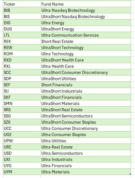
Ultra bullish and UltraShort ETFs on broad market indices expanded some years ago to include leveraged bullish and bearish Sector and International ETFs. These additions enable investors to hedge or amplify sector exposure effortlessly. Moreover, these Ultra and UltraShort ETFs are compatible with IRAs or retirement accounts, where shorting or margin trading is typically restricted.
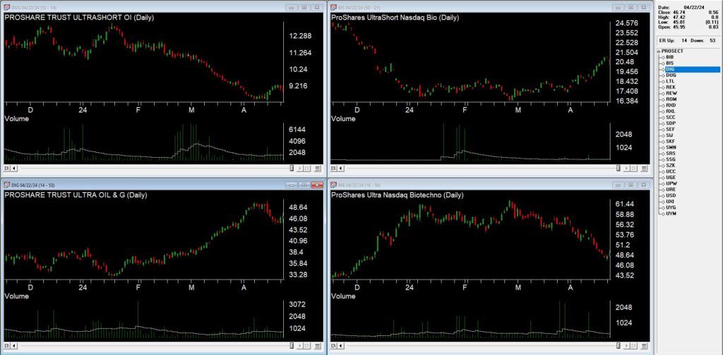
From a trader’s perspective, the liquidity and leverage of Ultra Bullish and UltraShort ETFs, which move two times the underlying index or inversely track it, offer a simpler and less risky alternative to options, futures, or shorting stocks.
For day traders, the highly liquid QQQ ETFs, QLD and QID, along with S&P500 ETFs, SDS and SSO, have become favored vehicles. The volatility of these ETFs presents opportunities for swift gains.
For investors and portfolio managers, ProShares ETFs offer a plethora of risk management tactics and asset allocation strategies. They provide flexibility to hedge against market risk or capitalize on market fluctuations. Furthermore, leveraging Ultra ETFs in asset allocation frees up capital for further diversification, allowing for strategic positioning across various sectors and markets. Sectors, in particular, have gained importance in recent times, with ProShares Sector ETFs offering exposure to Dow Jones Sectors.
For further leveraging the leverage, listed options on Ultra ETFs bring new possibilities for creative strategies. Covered call writes on bearish ETFs or options on Ultra ETFs provide avenues for managing risk and capitalizing on market movements with added leverage.
Given these ‘options on steroids’ move so quickly, only spend as much as you can afford to lose keeping in mind the thought “Have a hunch – buy a bunch. Hunch is wrong – bunch is gone”. While using Puts or Calls on Ultra Short and Ultra ETF’s requires some upside down and out-of-the-box thinking they add are few arrows to the trader’s quiver.
In conclusion, the Ultra ProShares ETFs have revolutionized trading and investing, offering opportunities previously inaccessible to individual investors.
There’s a WinWayCharyts list of the Proshares Sector ETFs available for download at https://aiqeducation.com/PROSECT.lis
This list file needs to be in your /wintes32 folder
Apr 2, 2024 | Charts
Making the Most of Your WinWayCharts – An hour-long session with UK Director Ray Foreman covering the power features in your WinWayCharts platform – great for new clients and those getting started.
Support and resistance levels are well-known concepts in technical analysis that help traders identify key price levels for making informed trading decisions. In this session, Steve Hill, CEO of AIQ Systems will guide you through the key characteristics of support and resistance; not every peak and trough qualifies.
