If you missed this April 27, 2023 Zoom event, don’t worry, the recording is now available from the link at the end of this post. (FYI it expires on May 10th).
In this 2-hour session, Ray Foreman, UK Director of WinWayCharts covered
Getting Started Right with WinWayCharts – Making the Most of Your WinWayCharts – An hour-long session with UK Director Ray Foreman covering the power features in your WinWayCharts platform – great for new clients and those getting started.
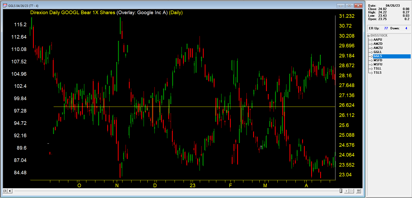
In the second half Steve Hill, founder of WinWayChartss built a list of ETFs to trade just about everything and ran it through analytical tools.
Steve also created data files and list files for the ETFS. These are zipped and available below
ETF data files are here – unzip to your /wintes32/tdata folder. Then go to Data Manager, Utilities, Rebuild Master Ticker List.
ETF List files are here – unzip these files to your /wintes32 folder.
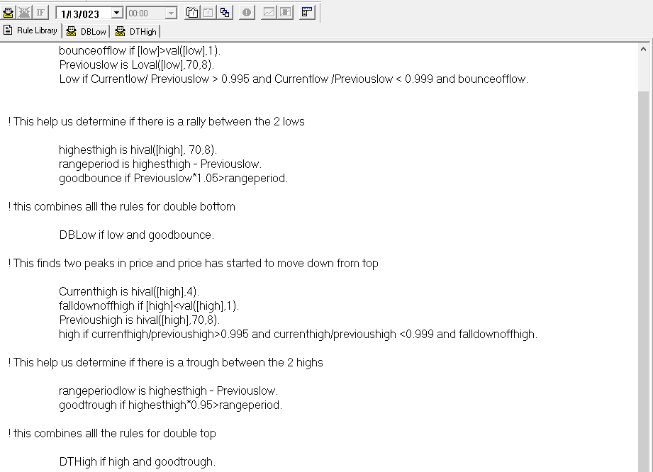
Thank you for your continued support of WinWayCharts services. Recently we have been working on an EDS scan to find double tops and bottoms. We’d like to share with you the progress and how to add this to your WinWayCharts. This is the code used in the scan (you don’t need to know the code but it’s there for your information).
There’s always room for improvement, but you can get a hold of this scan. This file is available for download from here
This may save to a download folder on your system. We suggest you move it to the path C:/wintes32/EDS strategies/Chart Pattern Strategies folder.
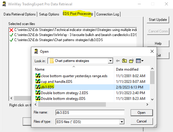
To run this strategy automatically after your nightly download of data
– Open Data Retrieval, and select the EDS Post Processing tab.
– Select add, and in the Open, Look in C:/wintes32/EDS strategies/Chart Pattern Strategies folder for db3.EDS
– Select Open and the strategy will run every night for you.
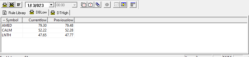
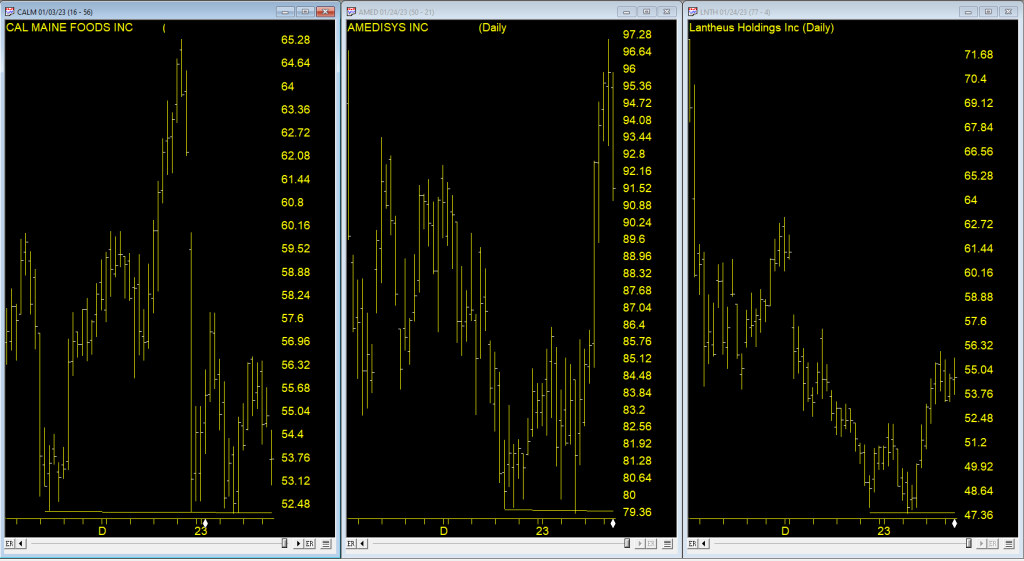
Here’s the results on the Sp1500 run on 1/3/2023
While not perfect, we hope this scan will be of use to you in your trading process.
In this recent Zoom video Steve Hill, founder of WinWayCharts discusses the Group and Sector Reports, using them to identify groups that are moving up. He then uses Darren’s indicators to focus in on potential stock candidates within these groups.
Advance-Decline data is calculated from daily issues reported on the New York Stock exchange. The Basic formula for calculating the Advance-Decline is the difference between the number of Advancing Issues and the number of Declining Issues per day, and adding it to or subtracting it from the previous day’s total.
In simple terms, the AdvanceDecline Line shows the direction in which the majority of stocks are headed. In a more important sense, it can show whether buying enthusiasm during a rally is spread across a broad number of stocks (a positive indication), or whether buying is narrowly focused on just a few industry groups or sectors (a generally negative sign).
An Advance-Decline Line is a contract/expanding/short-term market indicator. It is also referred to as an “order of magnitude” indicator because it provides a quick estimate of the market’s internal strength by showing how the overall market (or a specific sector) is trading in relation to a moving average.
One of the most popular ways of judging the market strength of the overall market is by using the advancedecline line (ADVs), also known as the “AD Line.” This metric is calculated by subtracting the number of decliners from the number of advancers in a market index. During a strong bull market (when a bull market begins), an AD line that is rising indicates growing market breadth (better market breadth) and indicates that money is continuing to move into the market. Conversely, falling AD lines indicate shrinking market breadth (worse market breadth) and indicate that money is leaving the broader market.
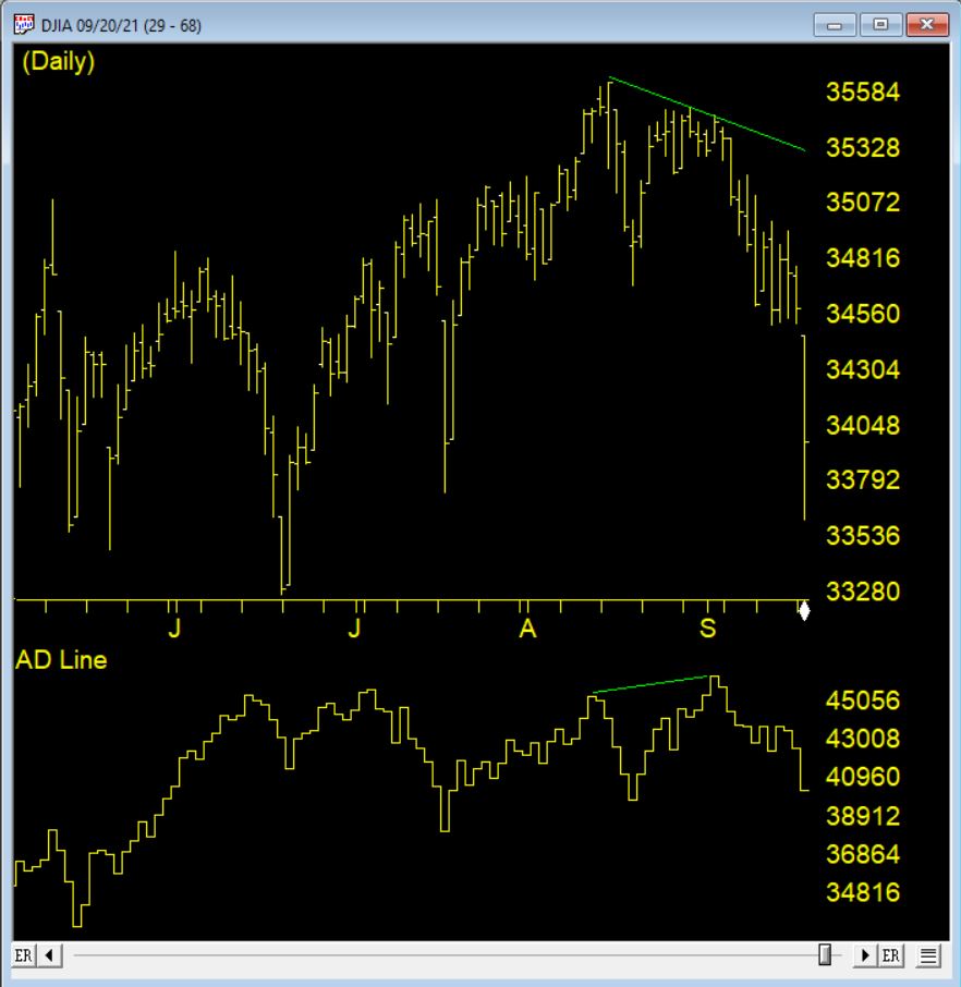
Because of its elegant simplicity, and the valuable insights it has provided at market turning points, the AD Line has become a highly prized indicator by both fundamentalists and technicians throughout the decades. But, in recent years, something seems to have gone astray.
The AD Line against the DJIA 9/1/2021 clearly shows the indicator making a new high, however the market drops precipitously shortly after
How could the time-tested Advance-Decline Line give off such obviously false signals? The answer is simple, but not easily seen. The change has occurred, not in the indicator, but in the data it measures. Over the past 3 decades, the New York Stock Exchange has allowed trading in a growing number of issues that are not, or do not trade like, domestic common stocks.
The truth is that most of the issues currently listed on the NYSE are not really stocks, at least not what investors generally define as stocks. Their inclusion has created turbulence in the sea of securities that has been amplified by the Advance-Decline Line. These stock-like issues include closed end funds (CEFs), American Depository Receipts (ADRs), and exchange-traded funds (ETFs).
In other words, the common stock components of the Advance-Decline Line offset one another, while the bond-related components were rising strongly, giving the Advance-Decline Line a positive bias. In other words, during those periods, the Advance-Decline Line was, in essence, measuring the strength of the bond market, not the stock market. It’s no wonder that the signals were misleading!
Happy Holidays or not given how the Markets tumbled the day US Thanksgiving. BTW, it was also the last full week of November.
Time for me to run my WinWayCharts seasonal filter on my top 2500 stocks
The filter is highly configurable and I can select which period of time, looking back from a given date to find a consistent price move up or down. I’m looking for it to repeat every year going back 7 + years.
I first came across the concept of seasonal consistency through Jay Keppel’s work JayOnTheMarkets.com and his books on Seasonal Stock Market trends. Many of you will have heard of the classic seasonal patterns like ‘Go Away in May’ or “the Santa Claus rally’. My WinWayCharts seasonal screener can find these type of events in individual stocks. Events that happen every year at the same time.
Here’s how the WinWayCharts Seasonal Screener works
How long do you usually hold a trade? I like to hold a trade for a month or less, that’s about 22 trading days.. So, I have cash available to invest Monday November 29th. All I need do is pick a date one month from that date and look for stocks that consistently made a profit over those 22 trading days, long or short, every single year going back the last 7 years. You can look back further but 7 seems to be pretty good consistency to me.
It’s that Simple
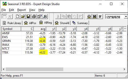
November 29th to December 29th, there were a handful of long stocks with seasonal patterns and the same on the short side. I liked the short side given the current market.
All these stocks lost money in every December for the last 7 years
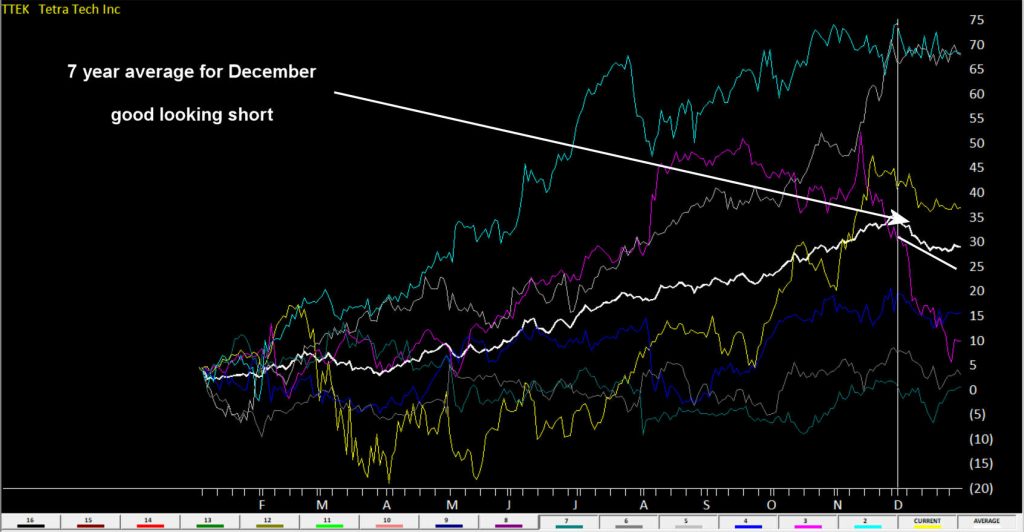
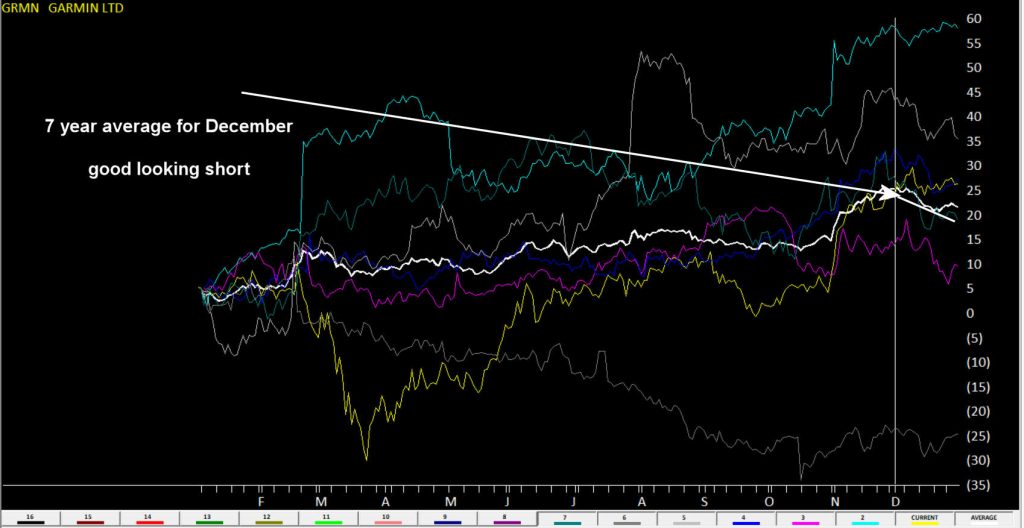
I highlighted GRMN and TTEK as both on average lost over 4% in December for last 7 years.
Here’s a WinWayCharts 7 year seasonal chart of TTEK the white line is the averageHere’s a WinWayCharts 7 year seasonal chart of GRMN the white line is the average
Want to go long?
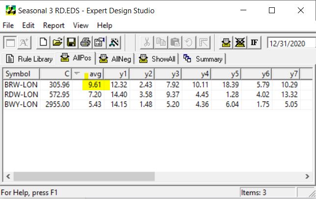
While there were no candidates in my US stocks, there were 3 UK stocks showed up. BRW-LON averaged 9.61% in December over 7 years. That’s impressive.
Here’s an WinWayCharts 7 year seasonal chart of BRW-LON the white line is the average
Next time I’m going to start to look at the major markets in specific periods and see if we can identify seasonal patterns that are hidden under the radar of everyday noise.
How can I run a WinWayCharts Seasonal scan?
First download the scan from our server click here
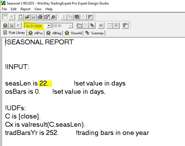
Locate the file Seasonal 3 RD.EDS likely in your /download folder and move it to your /wintes32/EDS Strategies folder
Open WinWayCharts EDS from the Main Menu
Click File, Open and locate the /wintes32/EDS Strategies/Seasonal 3 RD.EDS file
The file is set for seasonal length of 22 days but you can change this to whatever length you wish
Remember the date you run the report, like in the example above is 12/31/2020, it looks back in this case 22 days, then it checks 12/31/2019 and looks back 22 days etc. There would be no point it setting the date to run the report to the current date as it would look back 22 days, and you’d have missed the seasonal candidate stocks move.
The EDS code based on Vitali Apirine’s article in the March issue of Stocks & Commodities magazine “Rate Of Change With Bands,” can be obtained by copying the below into a new WinWayCharts EDS file, saving the file and adding EDS custom indicators on your Charts
!Rate Of Change With Bands
!Author: Vitali Aprine, TASC Mar 2021
!Coded by: Rich Denning, 01/11/2021
!INPUTS:
rocLen is 12.
emaLen is 3.
smaLen is 12.
C is [close].
ROC is (C - valresult(C,rocLen)) / valresult(C,rocLen)*100.
smaSqr is simpleavg(ROC*ROC,smaLen).
ROCdev is sqrt(smaSqr).
emaROC is expavg(ROC,emaLen).
upROCB is ROCdev.
dnROCB is  - ROCdev.
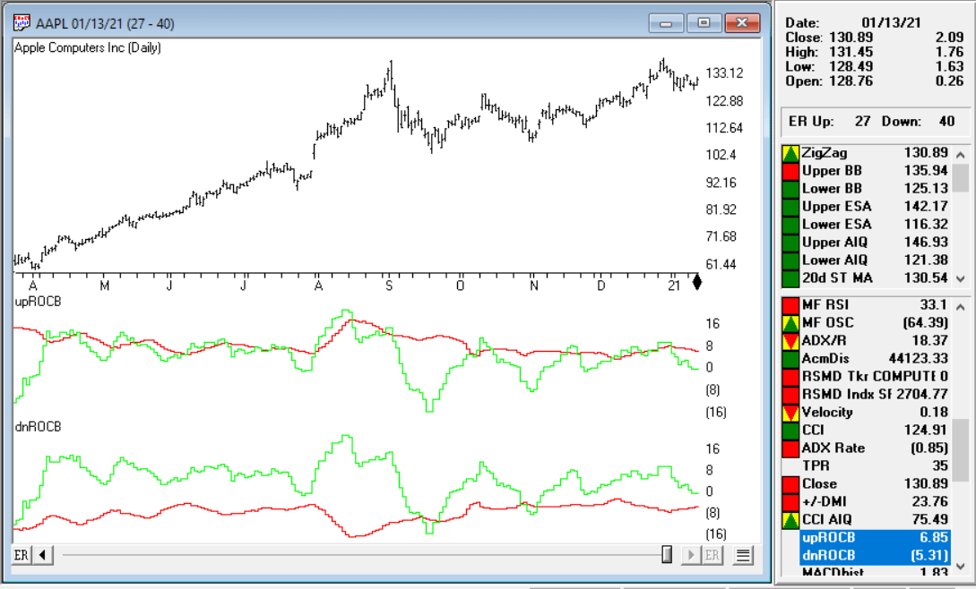
Code for the ROCB indicator is set up in the EDScode file. Figure 10 shows the indicators on a chart of Apple Inc. (AAPL). The red line in the first panel is the upper ROC band and the green line is the smoothed ROC. In the lower panel, the red line is the lower ROC band and the green line is the smoothed ROC.
FIGURE 10: The ROCB indicators are shown on a chart of Apple Inc. (AAPL). The red line in the first panel is the upper ROC band and the green line is the smoothed ROC. In the lower panel, the red line is the lower ROC band and the green line is the smoothed ROC.

 If you missed this April 27, 2023 Zoom event, don’t worry, the recording is now available from the link at the end of this post. (FYI it expires on May 10th).