Jan 20, 2017 | educational newsletters, ETFs, jay kaeppel, seasonal, Seasonality
If you follow jay Kaeppel’s posts in this blog, you’ll know that he’s the master of research on all things seasonal. This past week he posted a seasonal article on energy using FSESX – Fidelity Select Energy Services. Previously he had noted the bullish tendency for ticker FSESX during the months of February, March and April. In his follow up piece, he added one more “favorable” month and then also looked at a 6-month “unfavorable” period. The article is included at the end of this post so you can see the results.As Mutual funds are not for everyone, we went in search of alternative tickers that could closely match FSESX in performance characteristics. Using WinWay Matchmaker we compared the price action of FSESX against our universe of stocks and ETFs looking for a match.
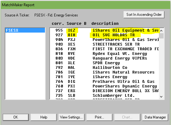
Matchmaker uses Spearman Rank Correlation analysis to identify a close match to FSESX. The closer the result to 1000, the higher the correlation. Anything over 950 is a very close match. Here’s the results.
Figure 1. MatchMaker correlation for last 4 years – FSESX vs stocks and ETFs
The ETF IEZ – iShares Oil and Equipment & Services showed a very high correlation over the 4 years we tested. OIH – Oil Service Holders, another ETF, also showed high correlation.
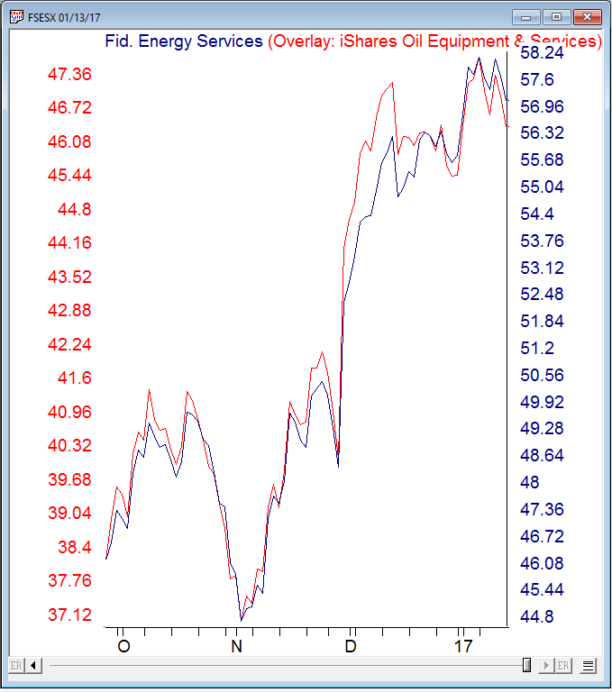
Here’s a WinWay overlay chart of recent daily price action comparing FSESX vs IEZ.
Figure 2. Recent daily price action comparing FSESX vs IEZ.
IEZ appears to be a good surrogate for FSESX at least over the last 4 years.
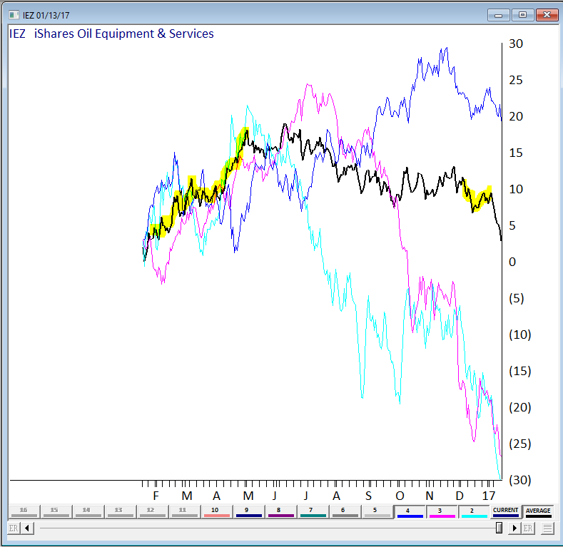
We also wanted a visual of the seasonal pattern in action. Fortunately we have a tool still in development at WinWay that’s just right for this. Basically it provides a price comparison of ‘x’ numbers of years of the same ticker overlaid on each other.
Here’s 3 of the last 4 years on IEZ, the average of the years displayed is in black. We highlighted the Feb, Mar, Apr and Dec in yellow. We could have included more years but for illustration purposes it was easier to show the 3 years (the chart gets busy with too many lines on it!)
Figure 3 – IEZ seasonal chart (beta) for 3 years with average.
The Feb, Mar, Apr period has a definite bullish tendency, the Dec period does Ok too. You’ll notice the tendency for IEZ to fall sharply in January. Conclusion? IEZ is a reasonable surrogate for FSESX if you’re contemplating this seasonal move.
_________________________________________________________
The article this follow up is based upon is by Jay Kaeppel and is included below. Jay is
Chief Market Analyst at JayOnTheMarkets.com and TradingExpert Pro client. http://jayonthemarkets.com/If you are looking for a market sector with some serious seasonal trends, look no further than the energy sector. Previously I had noted the bullish tendency for ticker FSESX during the months of February, March and April. In this piece, we will add one more “favorable” month and then also look at a 6-month “unfavorable” period.
For the record, the information that follows is not being recommended as a standalone strategy. It is presented simply to make you aware of certain long-term trends that have been very persistently bullish (or bearish as the case may be) in the energy sector.
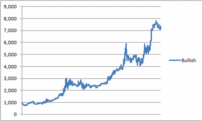
4 Favorable Months
*The four “favorable” months for our test are February, March, April and December
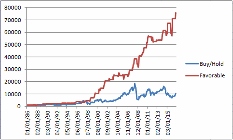
Figure 1 displays the growth of $1,000 invested in ticker FSESX only during these four months every year since 1986 versus simply buying-and-holding ticker FSESX.
Figure 1 – Growth of $1,000 invested in FSESX only during Feb, Mar, Apr, Dec every year since 1986
Starting in 1986, an initial $1,000 investment grew to $76,019 (or +7,500%) versus $10,237 (or 923%) using a buy-and-hold strategy.
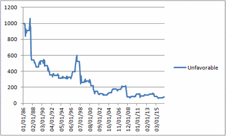
6 Unfavorable Months
The six “Unfavorable” months are June, July, August, September, October and November.
First the “positive” news:
*This 6-month period has managed to show a gain 14 times in 31 years – so by no means should you consider this period a “sure thing” loser
*During 4 separate years – 1997, 2003, 2004 and 2010 – the “unfavorable” months registered a cumulative gain in excess of +30%.
Doesn’t sound all that “unfavorable” so far does it? But here’s the catch: Despite the occasional 30%or more gain, it is fair to refer to this 6-month period as “unfavorable” as the cumulative long-term results of buying and holding FSESX during these months has been nothing short of devastating.
Figure 2 displays the growth of $1,000 invested in ticker FSESX only between the end of May and the end of November every year starting in 1986.
Figure 2 – Growth of $1,000 invested in FSESX only during June through November every year since 1986
Starting in 1986, an initial $1,000 investment declined to just $82, or a cumulative loss of -91.8%
Figure 3 displays some comparative data between favorable and unfavorable periods as well as using a Buy-and-Hold strategy.
| Measure |
Buy-and-Hold |
4 Favorable Months |
6 Unfavorable Months |
| Average Annual % +(-) |
12.8 |
16.5 |
(-4.2) |
| Median Annual % +(-) |
8.7 |
15.5 |
(-1.8) |
| Standard Deviation |
33.4 |
20.1 |
24.6 |
| # Years UP |
18 |
26 |
14 |
| # Years DOWN |
13 |
5 |
17 |
| Worst Year |
(-55.4) 2008 |
(-7.6) 1994 |
(-62.8) 2008 |
| $1,000 becomes |
$10,237 |
$76,019 |
$82 |
| Cumulative % +(-) |
+923% |
+7,500% |
(-92%) |
Figure 3 – Comparative Results
Figure 4 displays the year-to-year results for a Buy-and-Hold approach versus holding only during the 4 “favorable” months or the “Unfavorable” 6 months.
| Year |
All 12 months % +(-) |
4 Favorable % +(-) |
6 Unfavorable % +(-) |
| 1986 |
(8.9) |
(5.2) |
(9.2) |
| 1987 |
(20.7) |
22.9 |
(40.1) |
| 1988 |
(4.2) |
22.8 |
(16.3) |
| 1989 |
50.3 |
27.1 |
16.2 |
| 1990 |
8.7 |
4.9 |
(11.2) |
| 1991 |
(19.9) |
4.1 |
(25.0) |
| 1992 |
4.9 |
(1.6) |
(1.3) |
| 1993 |
16.4 |
24.5 |
(10.7) |
| 1994 |
(0.5) |
(7.6) |
3.1 |
| 1995 |
40.0 |
33.7 |
2.0 |
| 1996 |
45.9 |
22.5 |
20.8 |
| 1997 |
43.9 |
(4.9) |
32.9 |
| 1998 |
(41.4) |
26.5 |
(50.5) |
| 1999 |
80.9 |
74.1 |
7.5 |
| 2000 |
51.7 |
77.6 |
(21.1) |
| 2001 |
(22.4) |
20.8 |
(32.4) |
| 2002 |
2.2 |
26.2 |
(18.0) |
| 2003 |
13.1 |
15.5 |
(16.0) |
| 2004 |
26.2 |
1.2 |
30.2 |
| 2005 |
47.4 |
4.8 |
34.0 |
| 2006 |
(9.1) |
(4.1) |
(1.8) |
| 2007 |
58.3 |
25.6 |
16.7 |
| 2008 |
(55.4) |
10.5 |
(62.8) |
| 2009 |
60.4 |
24.5 |
9.6 |
| 2010 |
31.7 |
21.6 |
33.7 |
| 2011 |
(18.5) |
3.1 |
(16.8) |
| 2012 |
(3.9) |
0.7 |
9.6 |
| 2013 |
14.1 |
0.3 |
11.5 |
| 2014 |
(19.5) |
7.2 |
(26.7) |
| 2015 |
(19.7) |
2.9 |
(17.9) |
| 2016 |
44.2 |
28.4 |
20.1 |
Figure 4 – Yearly % +(-) for Buy-and-Hold versus 4 Favorable Months versus 6 Unfavorable Months
Summary
There is no guarantee from year-to-year results of buying and holding ticker FSESX during the “Favorable 4” months will show a gain and/or outperform the “Unfavorable 6” months. And there is by no means any guarantee that the “Unfavorable 6” will show a loss during any given year (note that 2016 saw the Unfavorable 6 generate a cumulative gain of +20.1%!). So just remember that we are talking about some very long-term trends here.
Still, most investors can discern the difference between:
*Favorable 4 months gain = +7,500%
*Unfavorable 6 months loss = (-92%)
This type of difference is what we “quantitative types” refer to as “statistically significant.”
Jan 4, 2017 | ETFs, jay kaeppel, stock market, trading strategies
Before moving on to 2017 I want to revisit a couple of “old” ideas I wrote about recently.
One 9/23/16 I wrote
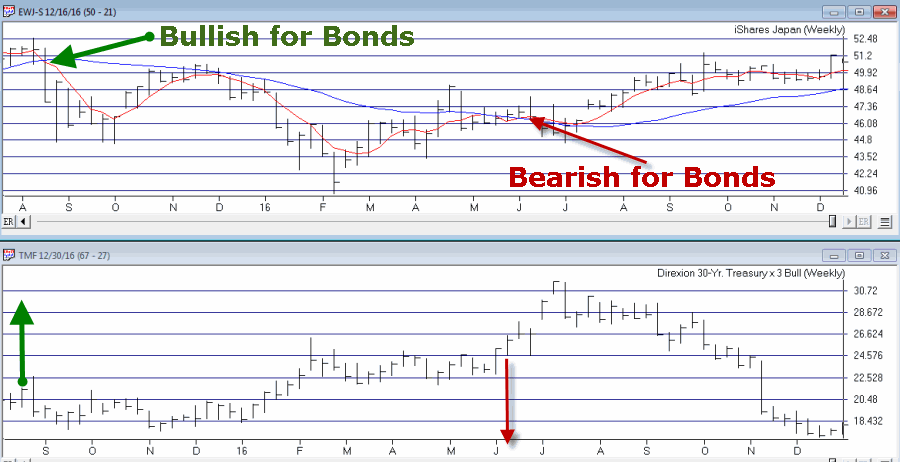
this article detailing a very aggressive bond trading strategy. The model detailed essentially combined two other models that I have used for a number of years – one a “timing” model, the other a “seasonal” model. If either model is bullish then ticker TMF (a triple leveraged long-term treasury bond fund) is held.
As shown in Figure 1, the first model turns:
*Bullish for Bonds when the 5-week moving average for ticker EWJ drops below the 30-week moving average for ticker EWJ
*Bearish for Bonds when the 5-week moving average for ticker EWJ rises above the 30-week moving average for ticker EWJ
Figure 1 – Bond Bull and Bear signals using ticker EWJ (Courtesy
TradingExpert)
The second model simply holds bonds during the last 5 trading days of each month
The rules for Jay’s Very Risky Bond Model (JVRBM) are as follows:
Bullish for TMF if:
*Ticker EWJ 5-week MA < Ticker EWJ 30-week MA, OR
*Today is one of the last 5 trading days of the month
Bearish for TMF if:
*EWJ 5-week MA > EWJ 30-week MA AND today IS NOT one of the last 5 trading days of the month
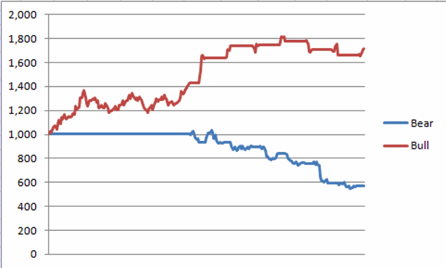
Figure 2 displays the growth of $1,000 invested in TMF if the bullish conditions above apply since 4/16/2009 (when TMF started trading).
Figure 2 – Growth of $1,000 invested in ticker TMF when JVRBM is Bullish (4/16/2009-12/30/2016)
Figure 3 displays the growth of $1,000 invested in TMF is the bearish conditions above apply since 4/16/2009 (when TMF started trading).
Figure 3 – Growth of $1,000 invested in ticker TMF when JVRBM is Bearish (4/16/2009-12/30/2016)
For the record:
*During the Bullish periods in 2016 ticker TMF gained +72%
*During the Bearish periods in 2016 ticker TMF lost -43%
Figure 4 displays the growth of $1,000 invested in ticker TMF during the Bullish versus Bearish periods in 2016.
Figure 4 – Growth of $1,000 invested in TMF during Bullish versus Bearish periods (12/31/2015-12/31/2016)
All in all not a bad year (Just don’t forget high degree of risk).
Summary
Make no mistake, this is a trading method that entails a great deal of risk. One can reasonably ask if a long position in a triple leveraged fund of any kind is really a good idea.
But, hey, the phrase “high risk, high reward” exists for a reason.
Dec 22, 2016 | educational newsletters, group and sector, jay kaeppel, stock market
In my last piece I note that the U.S. stock market presently stands alone in terms of recent performance. While virtually every major U.S. stock market average has run to new highs in the last several weeks, not one other individual country has really even come close. While this might induce spontaneous chants of “USA, USA”, the truth is that this may not necessarily be a good thing.
This current disconnect will likely be resolved in one of two ways:
A) The USA will drag the rest of the world screaming and kicking to enjoy in our newfound prosperity (assuming of course that we finally stumble upon that actual newfound prosperity that the stock market is telling us we should be celebrating).
B) The USA fails to pull up the rest of the world and the US stock market gets “dragged down” with the rest of the world’s bourses.
This is the part in the article where a skilled market analyst would offer up a clear and concise opinion of what will happen next and why. And if one happens to stop by the office in the next few minutes or so I will ask him or her what they think. All I know is that at the moment the US stock market is in an uptrend and that the majority of the rest of the world’s stock markets are fair to middling at best (with many looking much worse).
Until something changes I will stick to the US market, thank you very much.
A Little “Worldly” Perspective
What follows is essentially the world (stock markets) in pictures. The purpose is simply to provide you with some perspective regarding the state of the markets around the globe.
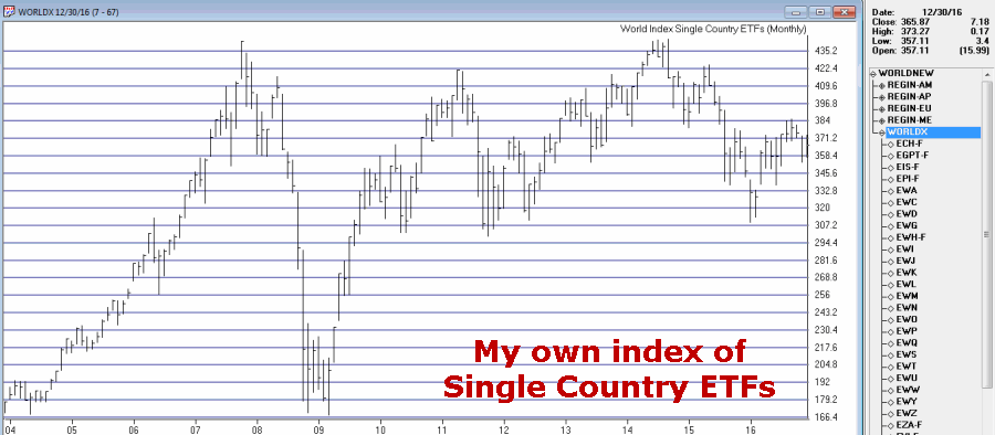
The key thing to note is:
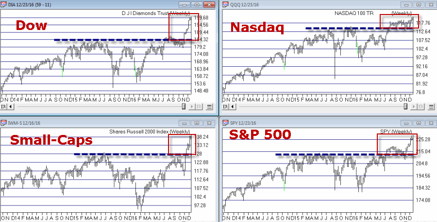
*Figure 1 shows U.S. stocks making new highs
*Figures 2 through 6 show the rest of the world’s stock markets lagging far behind
Click Figures 1 through 6 to enlarge
Figure 1 – U.S. Stocks soaring to new highs (Courtesy
TradingExpert )
Figure 2 – My Own Index of Single Country ETFs; -17% below 2014 high (Courtesy
TradingExpert )
Editor’s note: information on creating your own index of ETFs or any other tickers in TradingExpert can be found here http://www.aiqsystems.com/Feb06%20OBM.pdf on page 5, titled Ability to Create Industry Groups for Your Special Trading Needs….
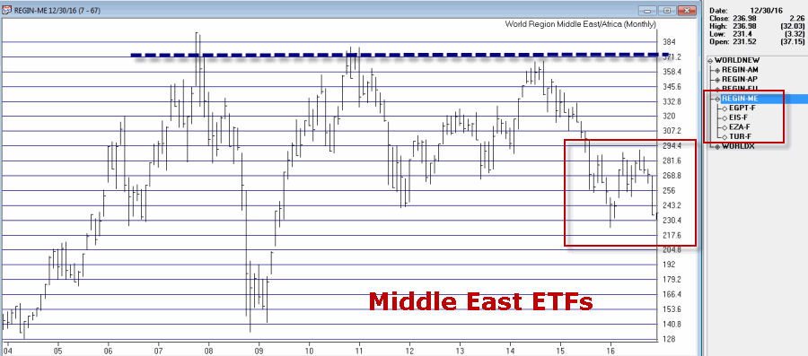
In Figures 3 through 6 note that the overall “stock market malaise” is not limited to one portion of our earth, but rather stretches pretty far East, West, North, South and pretty much all points in between.
Figure 3 – Middle East Stocks; -40% below 2007 high (Courtesy
TradingExpert )
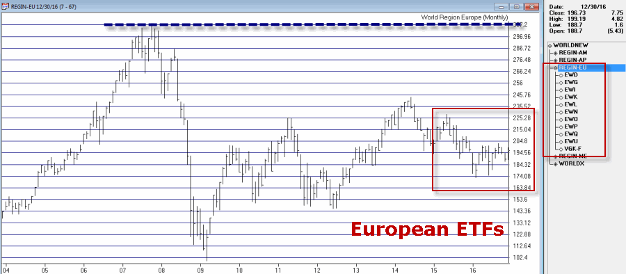
Figure 4 – European Stocks; -36% below 2007 high (Courtesy
TradingExpert )
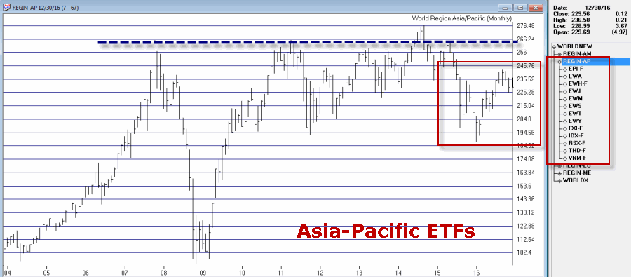
Figure 5 – Asia-Pacific Stocks;-17% below 2014 high (Courtesy
TradingExpert )
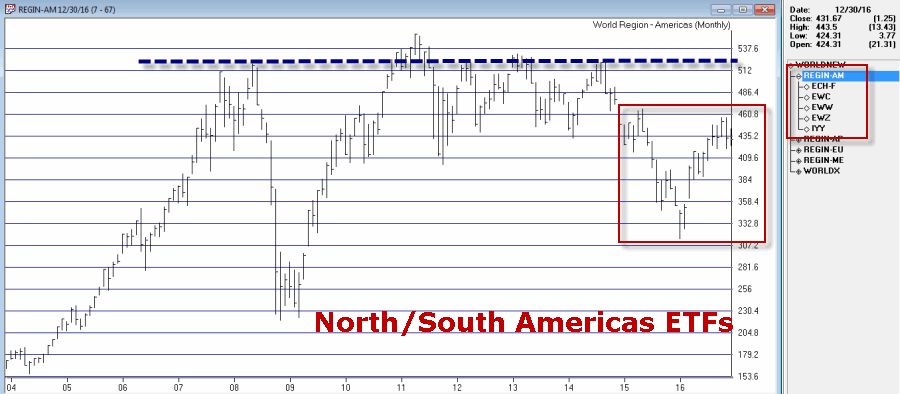
Figure 6 – North/South America Stocks; -22% below 2011 high (Courtesy
TradingExpert )
Wishing you (please choose any or all of the following that are applicable):
*Merry Christmas
*Happy New Year
*Happy Holidays
*Joy
*Peace on Earth
*[Some other phrase that you do not find offensive here]
Jay Kaeppel
Chief Market Analyst at JayOnTheMarkets.com and TradingExpert Pro client. http://jayonthemarkets.com/
Dec 21, 2016 | educational newsletters, ETFs, jay kaeppel, stock market
In this seemingly ever more divided and ever more electronic age, “perspective” is not a word (or action) that gets mentioned (or employed) with as much frequency as it used to. The default approach for a lot of things appears to be:
a) Decide ones opinion
b) Take to the internet to shout categorically that said opinion is the only possible “correct” opinion
c) Excoriate anyone who disagrees
Well, sure that is one approach. But when it comes to investing it is fairly important to raise one’s head and take a look around every once in awhile.
Hey, how about now?
The U.S. Stock Market Post Election
Since the election in November the U.S. stock market has been on a quite a tear, with the major market averages breaking out to new all-time highs as seen in Figure 1.
Figure 1 – Major market U.S. averages breakout to new highs (Courtesy
TradingExpert)
Now per a, b and c above, some will argue that this is a testament to the booming economy that #44 is leaving #45 while others will argue that it is a sign of new hope for the U.S. economy under a new adminstration.
My response: Whatever
Don’t get me wrong, I am all for a bull market. I hung in there all year despite a lot of doubts mostly because my trend-following indicators just kept staying bullish. And they remain thus. But like I said before a little perspective can sometimes go a long way.
A New (Republican) Administration
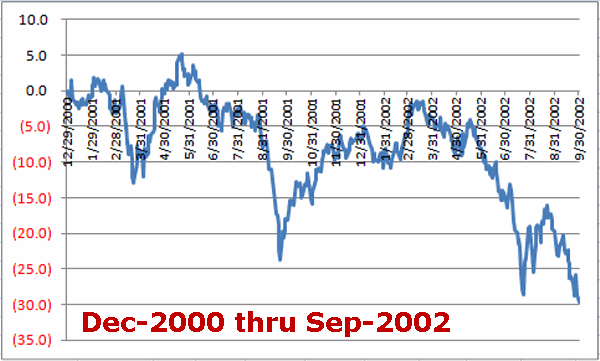
The historical fact is that the last 3 Republican administrations that followed Democratic administrations (Nixon, Reagan, Bush 43) did not experience great “stock market joy” during their first two years in office. Specifically, the first 21 months of the new four-year election cycle (i.e., starting on Dec. 31st of the election year through the end of September of the mid-term year) for each of these prior administrations witnessed a fair amount of “pain.”
Peruse Figures 2, 3 and 4 (which displays the % gain or loss for the Dow Jones Industrials Average for 21 months starting on December 31st of the election year) and see if you notice a trend.
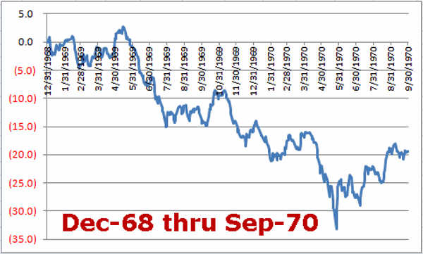
Figure 2 – Dow % +(-); Dec-1968 thru Sep-1970 (Nixon – 1st 21 months)
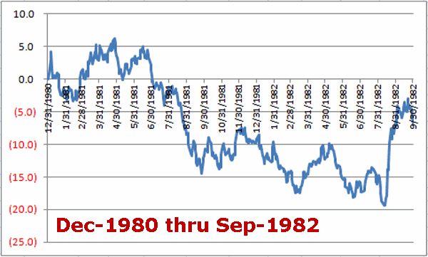
Figure 3 – Dow % +(-); Dec-1980 thru Sep-1982 (Reagan – 1st 21 months)
Figure 4 – Dow % +(-); Dec-2000 thru Sep-2002 (Bush 43 – 1st 21 months)
The Good News is that there is no reason why this history has to repeat itself this time around. The Bad News is….that it very well could.
The Current Euphoria
As I stated earlier, when it comes to bull markets, I vote “YES”. I will take one anytime I can get it. And I also try to avoid being one of those “know it all types” (in the interest of full disclosure I am actually more one of those “sneaky” types who tries to intimate that he actually does know it all by trying not to act like a know it all – which is technically probably worse. But, hey, at least now you know) who routinely “talks down” a bull market (“Oh sure, things are great now but just you wait….” And so on). That “just you wait” stuff gets really old after a short while.
So here we stand. The major U.S. averages are bursting forth to new highs – so who am I to be a naysayer? Still, there is that pesky “perceptive” thing I mentioned earlier. Before getting too carried away with bullish euphoria please sear Figures 2, 3 and 4 above somewhere into the back of your brain – just in case.
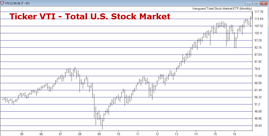
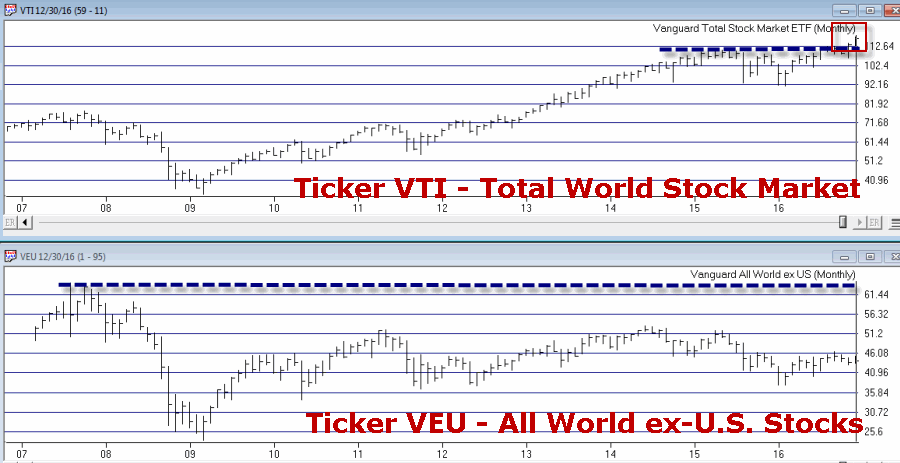
Also note that the U.S. stock market is virtually alone in the world in terms of making new highs. Figure 5 displays:
Ticker VTI – Vanguard Total (U.S.) Stock Market ETF
Ticker VEU – Vanguard All World ex-U.S. Stock Market ETF
To be clear, ticker VTI essentially covers the entire U.S. stock market. Ticker VEU covers a broad array of major world stock markets BUT does not include U.S. stocks.
Figure 5 – U.S. Total Stock Market = New Highs; World Total Stock Market = NOT New Highs (Courtesy
TradingExpert)
Note that the U.S. market has broken out strongly to new highs while the “whole world” of markets is nowhere close to doing so. Certainly one can adopt the “What, me worry?” approach and argue that “the U.S. market will lead the other world markets to reach new highs.” And maybe that will prove to be the case.
But as I will highlight soon – and as reflected by tickers VTI and VEU – the U.S. stock market looks great while virtually the rest of the markets around the globe look pretty not so great. So please check back for Part II soon
In the meantime, enjoy the rally and the Holidays – I know I will.
Dec 8, 2016 | bonds, educational newsletters, ETFs, jay kaeppel, trading strategy
If you have read any of my stuff in the past then you probably know that I spend a lot of time trying to determine “what goes up (or down) when”. What follows are the results of one such test.
While the results are initially impressive on the face of it (if I do so say myself, and I think I just did) there are a number of important caveats. To put it another way, do NOT be impressed with the results WITHOUT first seriously considering some of the significant caveats mentioned below. To put it in the most standard terms possible – past results DO NOT guarantee future results.
The Test
*I looked at variety of assets classes (listed at the end of the article) using mutual fund data and/or index data from January 1993 through April 2007. The data was monthly total return data from Callan Associates.
*I’ve created my own proprietary formula for measuring performance during a specific month. The factors include: average monthly return, median monthly return, standard deviation, largest monthly decline and a variety of ratios amongst these factors (but I am a lot of fun at parties. No seriously.)
*I used my proprietary formula to rank performance for each asset class for each month and took my “top pick”. In a nutshell, the “top pick” is not the one that showed the largest average monthly gain but the one that showed the best tradeoff between risk and reward.
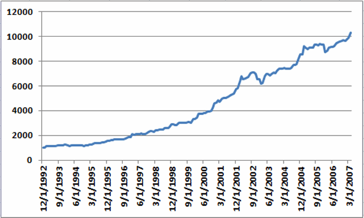
*I ran a backtest using mutual fund and/or index data for the top ranked asset for each month from January 1993 through May 2007. The results for Jay’s One Asset Class per Month strategy (heretofore JOAC) appear in Figure 1.
Figure 1 – Equity Curve for Jay’s One Asset Class per Month Strategy; 12/31/92-5/31/2007
The average 12-month return was +17.8% and the maximum drawdown (using month-end data) was -12.7%
While the results look good it is now time for those dreaded “caveats”:
*These results could not be exactly duplicated in real trading for a couple of reasons: First, some of the results were generated using index data and not mutual fund data.
*Also, many of the mutual funds used in the test (particularly Vanguard and Fidelity funds) cannot be traded one month at a time. Most have a minimum holding period of 30 to 90 calendar days). So buying in one month and selling out the next would likely result in fees and/or future trading restrictions.
Moving Forward JOAC using ETFs
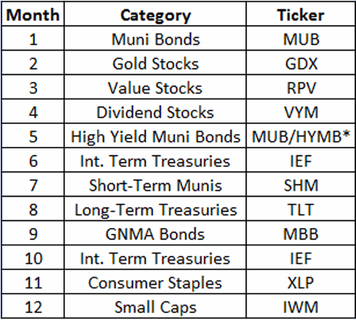
ETFs have no switching restrictions so starting in May 2007 I switched to an all ETF portfolio, using a particular ETF each month to attempt to track the top asset class for that month. That portfolio appears in Figure 2.
Figure 2 – JOAC monthly ETF Portfolio
*-MUB traded in May 2007-2010; HYMB traded in May starting in 2011
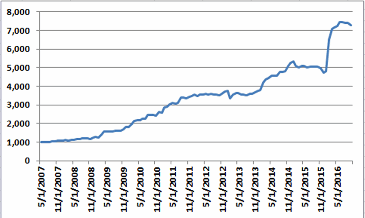
Once again using monthly total return data from Callan Associates I tested the 2007-2016 period using the tickers listed in Figure 2. The results appear in Figure 3.
Figure 3 – Equity Curve for Jay’s One Asset Class per Month Strategy; 5/31/2007-10/31/2016
*The average annual gain starting in 2008 (the 1st full year of data) is +25.8%
*The maximum drawdown (using monthly data) is -11%.
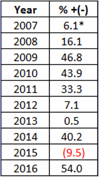
Annual results in appear in Figure 4. These results do not include any transaction fees
Figure 4 – JOAC ETF Strategy Annual Results
*May 31st/2007-12/31/2007
So is this the greatest thing since sliced bread? Probably not. Why not? Time for more of those pesky caveats:
*Buying and holding only one ETF per month does not offer a lot of diversification (or any diversification at all for that matter)
*The test period using ETFs is relatively short
*Intramonth volatility and drawdowns will undoubtedly be greater than what appears in the Figures above
This strategy fits squarely in the “(almost certainly) high risk, (potentially) high reward” category.
Summary
So as I stated earlier, no one should assume that they can just start buying the ETFs listed above and start making 25% a year ad infinitum into the future. The results displayed in this article should probably be thought of more as a starting point for further analysis rather than a finished product.
In essence, the real point is that – as with all things – there is a time and a place or everything, including (apparently) asset classes.
Nov 11, 2016 | bonds, chart patterns, educational newsletters, ETFs, indexes, jay kaeppel
In real estate, it’s “Location, Location, Location.” In the financial markets it’s “the Trend, the Trend, the Trend.” There is a great deal of certainty about what will happen next in stocks, bonds and gold. But the key to successfully navigating these turbulent times starts not with predicting the future but rather with identifying the current trend in the here and now and going from there. So let’s take a look at, well, what else, the trends.
I have certain trend-following models that I follow to help me to determine which way to be leaning in the markets. Like any trend-following method they are far from perfect (my stock market model for example, suffered not one but two significant whipsaws in the last year+). But for me there is no expectation that they will be perfect. The only goal is to catch most of the upside during major bull markets, and miss much of the downside during major bear markets.
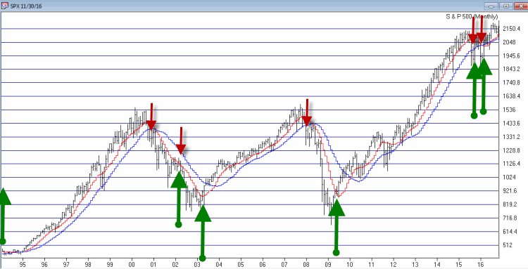
Stocks
For stocks I look at the 10-month and 21-month moving averages for the S&P 500 Index and use the following rules:
*A sell signal occurs when the S&P 500 closes 2 consecutive months below its 21-month moving average AND is also below its 10-month moving average
*Following a sell signal a new buy signal occurs when the S&P 500 registers a monthly close above its 10-month moving average
Figure 1 – Stock Market trend-following signals (Courtesy TradingExpert)
This method avoided much of the 1973-1974, 2000-2002 and 2008 bear market destruction. That’s the good news. The bad news is that it sold at the end of September 2015 and at the end of February 2016 – both just prior to powerful upside reversals (like I said, trend-following models ain’t perfect).
The most recent signal was a buy signal on 3/31/2016.
So the trend for stocks is presently BULLISH
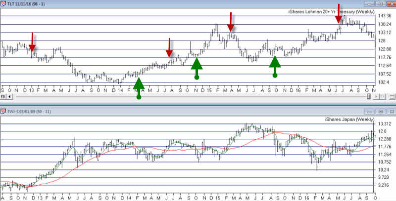
Bonds
I have written several posts about this in the past. My favorite bond timing indicator is Japanese stocks. No seriously. They have a string tendency to trade inversely to the 30-yr US t-bond. I track ticker EWJ and watch the 5-week and 30-week moving averages. Because Japanese stocks and t-bonds trade inversely I use the following rules:
*A buy signal for bonds occurs when the 5-week moving average for EWJ drops below the 30-week moving average for EWJ
*A sell signal for bonds occurs when the 5-week moving average for EWJ rises above the 30-week moving average for EWJ
The most recent signal was a sell signal for t-bonds on 6/10/2016
So the trend for bonds is presently BEARISH
Figure 2 – Bond trend-following signals(Courtesy TradingExpert)
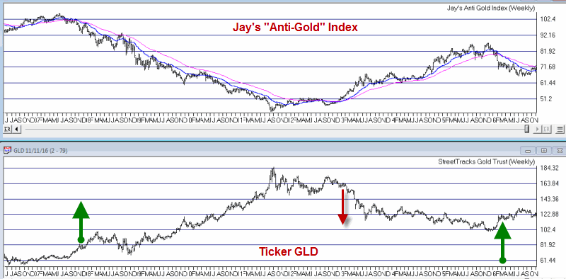
Gold
For gold I use two moving averages on a weekly chart for something I refer to as Jay’s Anti-Gold Index. Rather than go into a long explanation I will link to the
original article on the topic and offer a short explanation. In AIQ TradingExpert I created a ticker comprised of 4 other tickers (GLL, RYSDX, SPX and YCS) which all trade in a negatively correlated manner to the price of gold (er, usually).
One moving average I call the “FrontWeighted36DayMA” (“FrontWeightedMA” for short. The calculations are based on someone else’s work – unfortunately I cannot recall the person’s name so cannot give proper credit. Hopefully Karma will work and somewhere that person will Have a Nice Day without really knowing why. The calculations are a bit long-winded so the AIQ TradingExpert code appears at the end of this article.
The other is the 55-week exponential moving average.
(CAVEAT: Because some of these tickers did not exist until 2006 trading signals began on 12/31/1996, so yes, it is by my standards a relatively short test period for a long -term moving average method. To put it another way, don’t bet the ranch on gold basedon this one indicator)
The trading rules are as follows:
*When the FrontWeightedMA closes a week BELOW the 55-week MA then a BUY signal for gold occurs.
*When the FrontWeightedMA closes a week ABOVE the 55-week MA then a BUY signal for gold occurs.
Figure 3 – Gold Trading Signals (Courtesy TradingExpert)
The most recent signal was a buy signal on 3/18/16.
So the trend for gold is presently BULLISH.
Summary
These indicators represent “my opinion as to where the markets are headed next” (because the truth is I don’t know). There are objective, mechanical measures of where things stand today. Nothing more, nothing less.
Also, none these indicators falls into the “World Beater” or “You Can’t Lose in Investing” categories. But then again they are not really designed to (BTW if you do posses methods that do fit into either of the aforementioned categories, I would love to hear from you – off the record, of course). What they do achieve is to offer a decent frame of reference during times of doubt.
And that is one of the most powerful tools any investor can possess.
So in sum, the current trend (at least according to what you’ve seen here) for stocks and gold is bullish and the current trend for bonds is bearish.
How long any of these trends will remain in place is anyone’s guess. So enjoy them while they last.
Jay Kaeppel
Chief Market Analyst at JayOnTheMarkets.com