Jun 27, 2018 | chart patterns, educational newsletters, ETFs, indexes, jay kaeppel
If an investor were to sit down and peruse the Web looking for guidance regarding the stock market, there is a good chance they would come away bewildered and confused.
So, let’s try to simplify things a bit.
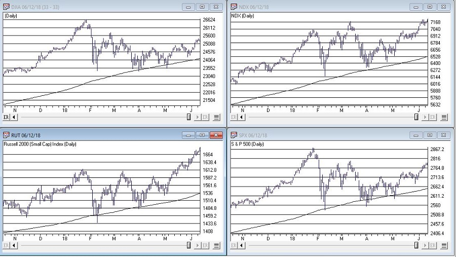
Jay’s Trading Maxim #14: When in doubt, usually the best question to ask is “What is the trend right now?”
There are always a million and one reasons why an investor may feel doubt. But answering that simple question can often lead to a much greater deal of clarity. Like now for instance.
In Figure 1 we see the Dow, Nasdaq 100, Russell 200 small-cap index and the S&P 500. The key thing to note is that all 4 of them are above their respective 200-day moving average, i.e., “right now” the trend is up.
Jay’s Trading Maxim #14a: If the trend right now is “Up”, act accordingly. At least until the answer changes.

Figure 1 – Major U.S. Indexes in Up Trends (Courtesy TradingExpert)
SPX Monthly Trend-Following
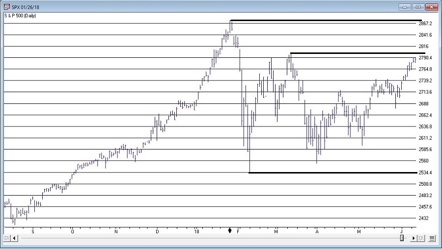
I wrote here and here about a simple monthly trend-following method using the S&P 500 Index.
This method gave an “alert” when the S&P 500 went 3 calendar months (Feb, March and April) without making a new high.
The “line in the sand” is the low during this period of 2532,69. As long as price holds above this level, this method deems the trend as still “Up”.
It will take a move above the January high 2872.87 to eliminate this line in the sand. Between here and there there is resistance at 2801.90.

Figure 2 – S&P 500 Index key support and resistance (Courtesy TradingExpert)
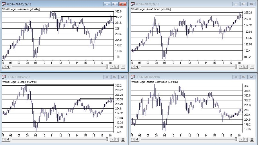
I am not speaking in any geopolitical sense here. And I don’t want to sound like the Ugly American. But while the U.S. stock market is “taking care of business” and moving higher, the stock markets of much of the rest of the world are not. And I am not sure if I should worry about this or not.
But for what it is worth, all 4 regional single country ETF indexes that I created (Americas, Asia/Pacific, Europe and Middle East) and follow are not looking terribly inspiring at the moment.
The trend “right now” is “Up”. So enjoy.
But maybe check back again soon. Just in case.
Disclaimer: The data presented herein were obtained from various third-party sources. While I believe the data to be reliable, no representation is made as to, and no responsibility, warranty or liability is accepted for the accuracy or completeness of such information. The information, opinions and ideas expressed herein are for informational and educational purposes only and do not constitute and should not be construed as investment advice, an advertisement or offering of investment advisory services, or an offer to sell or a solicitation to buy any security.
Jun 19, 2018 | educational newsletters, ETFs, gold, indexes, jay kaeppel
I suppose a more accurate title would be, “A Bunch of Single Country ETFs, Interrupted”, but, well, that just doesn’t have quite the same succinct simplicity.
I always (always, always) try to make an effort to focus on “the current trend” and to avoid focusing on things that “maybe might prove to be ominous signs in retrospect” or to imply that a certain tidbit of information is predictive when in reality it is mostly just anecdotal. Still, human nature is – unfortunately, in this case – a powerful force. Which reminds me to invoke:
Jay’s Trading Maxim #17: Human nature is a detriment to trading and investment success, and should be avoided as much as, well, humanly possible.
The bottom line is that despite my very own warnings and admonitions, sometimes that pesky human nature gets the best of me.
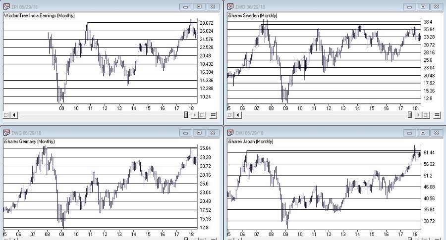
OK, rather than me telling you what I think, please simply peruse the charts in Figures 1, 2 and 3 and see if anything jumps out at you.
(click to enlarge)
Figure 1 – India, Sweden, Japan, Germany (clockwise); (Courtesy TradingExpert)
(click to enlarge)
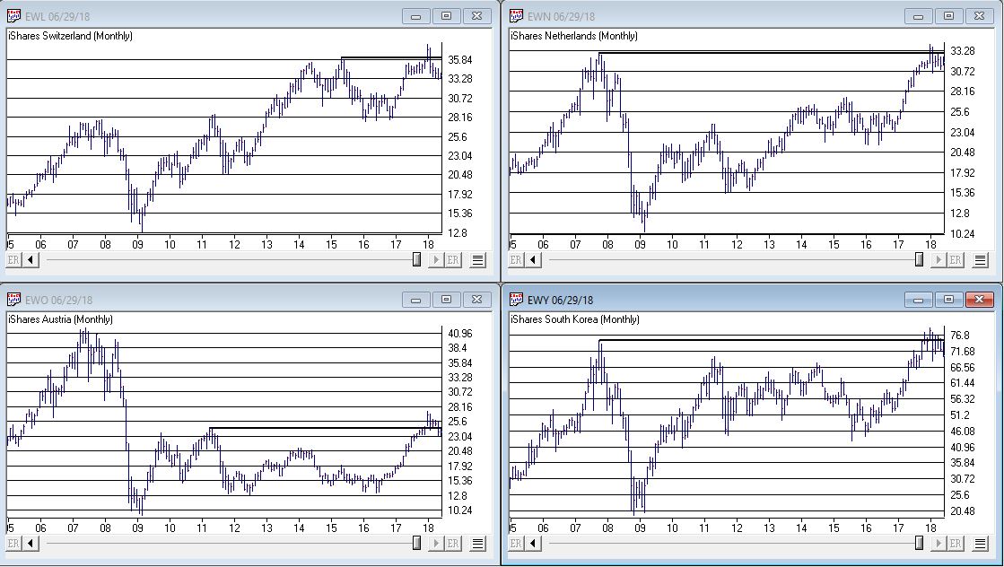
Figure 2 – Switzerland, Netherlands, South Korea, Austria (clockwise); (Courtesy TradingExpert)
(click to enlarge)
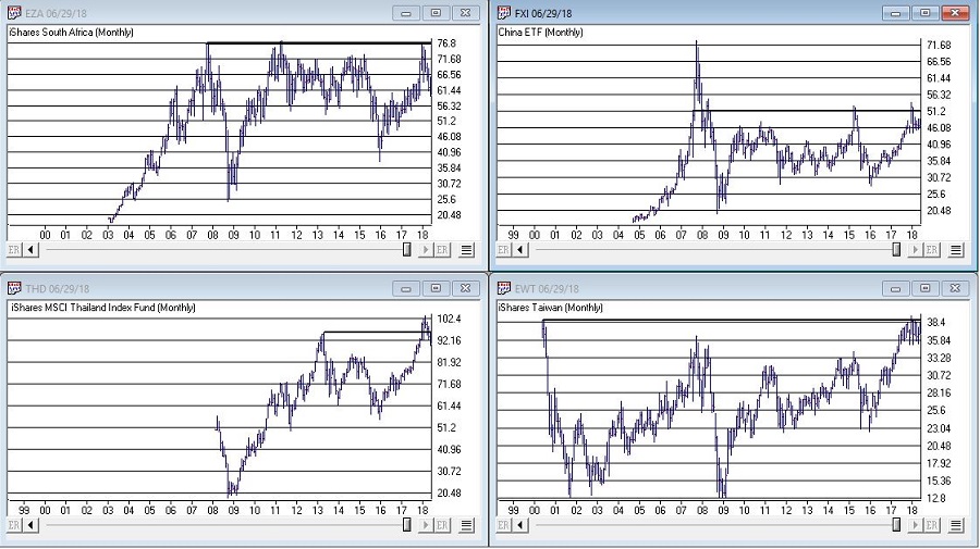
Figure 3 – South Africa, China, Taiwan, Thailand (clockwise); (Courtesy TradingExpert)
Perhaps you noticed the same thing I did, i.e., a whole bunch of single country ETF’s hitting new highs or testing old resistance and getting rejected. In a number of cases, after appearing to break out to new highs for a period of weeks or month only to fall back below the “line in the sand.”
It’s sort of like the World Cup of Failed Breakouts.
Now here’s the thing. I have displayed a bunch of charts that anecdotally seem to imply something bearish. To spell it out, failed breakouts are often – though definitely not always – followed by something much worse.
So the line of reasoning goes like this, “If the stock market in umpteen countries is failing to advance then this must be a bad thing.”
But the reality is that all these markets have to do is rally and this whole sort of made up area of concern goes away.
Still, until that actually happens I think I will:
a) Enjoy the rally here in the U.S.
It seems like a reasonable plan.
Disclaimer: The data presented herein were obtained from various third-party sources. While I believe the data to be reliable, no representation is made as to, and no responsibility, warranty or liability is accepted for the accuracy or completeness of such information. The information, opinions and ideas expressed herein are for informational and educational purposes only and do not constitute and should not be construed as investment advice, an advertisement or offering of investment advisory services, or an offer to sell or a solicitation to buy any security.
Jun 8, 2018 | Charts, educational newsletters, ETFs, gold, group and sector, indexes, jay kaeppel
There are a lot of ways to play this game.
For the record, I am a big believer in trend-following. Picking tops and bottoms with any consistency is essentially impossible (at least in my opinion and/or experience). So from that perspective going with the trend makes a lot of sense. I am also a big believer in relative strength. Much evidence over the years suggests that buying what is “already moving” is a very viable approach to investing. Other studies have demonstrated pretty clearly that you are generally much more likely to succeed by buying stocks making new highs than by buying stocks making new lows.
These approaches make good sense and they work very well over time. Despite this many (most?) investors still feel those pangs to “buy low” in hopes of getting in early and riding a major trend. And the truth (I think) is that this can work too, if done correctly.
Like I said, there are a lot of ways to play this game. But there is a definite “right” way and “wrong” way when it comes to “buying low.”
Buying Low (The Wrong Way): Buy things are plummeting or that have recently plummeted.
The Right Way (The Right Way): Buy things that have, a) plummeted, b) stopped plummeting and, c) have since been moving sideways for some period of time.
Last year I wrote about a “Buy Low” portfolio that I had concocted at the time. Unfortunately, several of the ETFs involved have since ceased trading. So in this piece I will introduce my updated “Buy Low” portfolio. For the record – and as always – I am not “recommending” this portfolio. It is essentially an experiment in one alternative approach to investing.
The “Buy Low” Portfolio
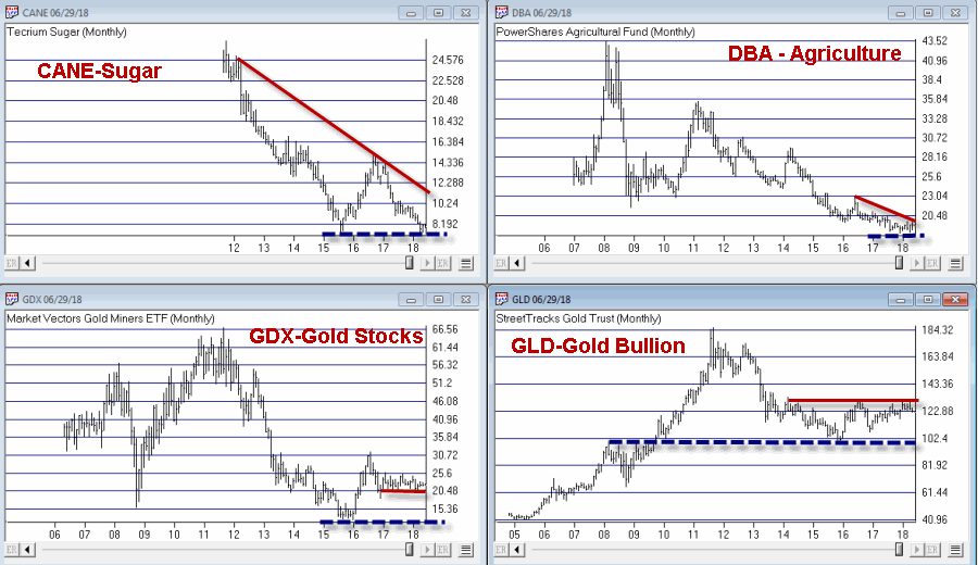
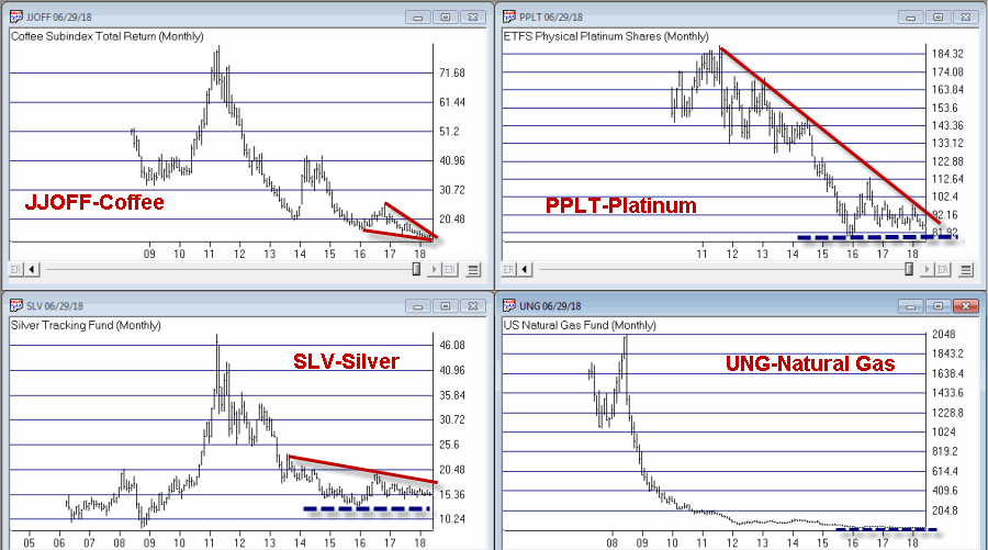
The Buy Low Portfolio consists of the following ETF’s and ETN’s:
CANE – Tecrium Sugar
JJOFF – Coffee Subindex Total Return
DBA – PowerShares Agricultural
WEAT – Tecrium Wheat
GLD – StreetTracks Gold Trust
PPLT – ETFS Physical Platinum Shares
SLV – iShares Silver Trust
GDX – Market Vectors Gold Miners
UNG – United States Natural Gas
URA – Global X Uranium
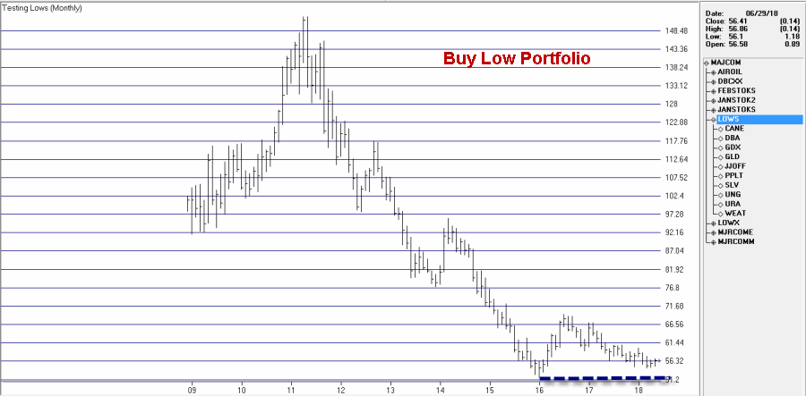
Monthly charts for these tickers appear in Figures 1 through 3. A chart of the composite index I created by combining all of these appears in Figure 4 (Click any chart to enlarge).
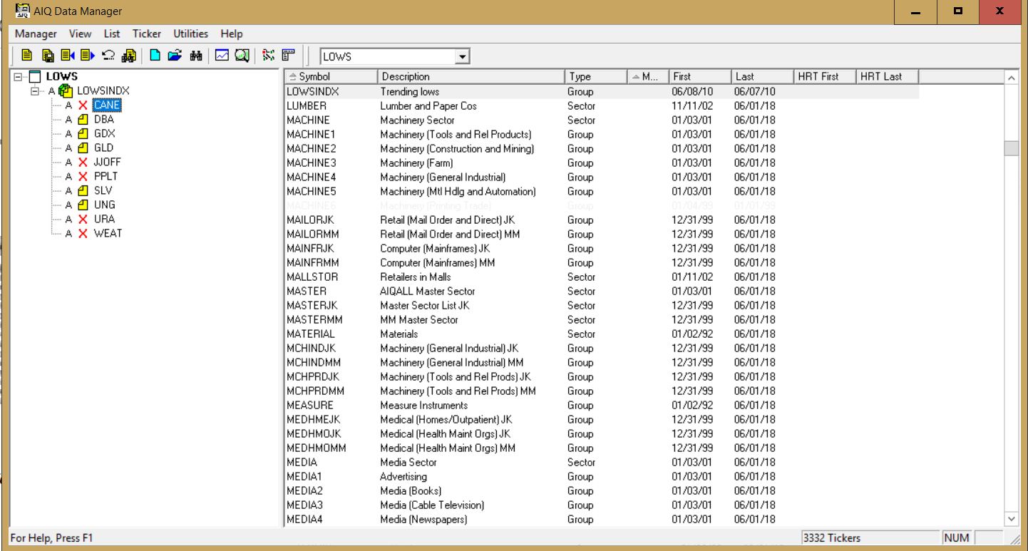
Editors note: To create an index like Jay’s Trending Low, follow the instructions at the end of this article ‘Creating an index for a group of tickers in Data Manager’
Summary
Securities that have plummeted in price and then moved sideways for a period of time can (unfortunately) continue to move sideways for quite a while longer before (hopefully) breaking out to the upside. Even worst, they can also fail and breakdown through the previous low. But extended consolidation patterns are often followed by something good.
As you can see all of the tickers in the list above are commodity related. As I’ve written about
here and
here there is reason to believe that commodities will outperform in the years ahead. That being said, with the stock market rallying in the near-term and with the U.S. Dollar strong there is no compelling reason to think that this “Buy Low Portfolio” is going to make a lot of headway anytime soon.
The Index in Figure 4 is presently 8.2% above its January 2016 low. As long as that low holds I’ll give this experiment more time to work out.
Jay Kaeppel
Disclaimer: The data presented herein were obtained from various third-party sources. While I believe the data to be reliable, no representation is made as to, and no responsibility, warranty or liability is accepted for the accuracy or completeness of such information. The information, opinions and ideas expressed herein are for informational and educational purposes only and do not constitute and should not be construed as investment advice, an advertisement or offering of investment advisory services, or an offer to sell or a solicitation to buy any security.
Creating an index for a group of tickers in Data Manager
NOTE: tickers with X in list need to be added to the Data Manager as new tickers and downloaded from your data service
When you create an index for a group of tickers, you can display a chart of the index as well as the underlying tickers. A group index can be analyzed on charts using technical indicators, and Expert Ratings are generated for the group index (except for mutual fund
groups).
The procedure for creating an index for a group of tickers is as follows:
- First, create a group ticker for the index.
- Then create a list to insert the group ticker into.
- Add tickers to the group.
- Finally, create the index by executing the Compute Group/Sector Indices function.
To create an index for a group of tickers, follow the steps below.
First, create a group ticker:
1. First, add a new group ticker to your Master Ticker List. Select the
Ticker command on the menu bar. Then select New to display the
New Ticker dialog box.
2. Enter a ticker for the new group, then be sure to enter the proper
Type designation (group or mutual fund group).
3. Click OK, and the second dialog box for entering a new ticker
appears.
4. Type in a name (Description) and the First Date for data. The
remaining default settings on this second dialog box can remain the
same.
5. Click OK and the group ticker is added to your Master Ticker List.
Then, create a list to insert the group ticker into:
1. Select the List command on the menu bar.
2. Select New on the drop-down menu and a dialog box appears.
3. Type in a name (8 characters maximum) in the text box.
4. Click OK and the list name appears in the Selected List text box
located on the toolbar.
5. The list name is also displayed in the List window. Insert the group
ticker from your Master Ticker List under the list name. To insert a ticker directly under a list, do the following:
- Highlight (by clicking) the group ticker in the Master Ticker List.
- Click the list name in the List window.
- Click the Insert to List button on the toolbar (or select the Insert Ticker command from the List sub-menu).
- The group ticker will appear in the List window under the list name.
6. Next, insert tickers into the group. To insert tickers into a group:
Under the new group, insert all of the tickers that will make up the
group by doing the following:
- Select the group ticker in the List window by clicking on it.
- Select in your Master Ticker List the tickers that you want to add to the group. If you are inserting multiple tickers, hold down the Ctrl key while clicking each ticker.
- Click the Insert to List button on the toolbar (or select the Insert Ticker command from the List sub-menu).
- The tickers will appear in the List window under the group ticker.
7. Finally, compute the index for the new group. To compute a group index:
- Select Compute Group/Sector Indices from the Utilities sub-menu.
- In the Compute Group/Sector Indices dialog box, click the Compute List(s) option button.
- In the text box for Compute List(s), select the name of the list you created above.
- Under Range, choose Update from Last Date of Data and click OK.
May 30, 2018 | educational newsletters, ETFs, indexes, jay kaeppel
The energy sector – not just unloved, but pretty much reviled not that long ago – is suddenly everybody’s favorite sector. And why not, what with crude oil rallying steadily in the last year and pulling pretty much everything energy related higher with it?
Anecdotally, everything I read seems to be on board with a continuation of the energy rally. And that may well prove to be the case. But at least for the moment I am waiting for some confirmation.
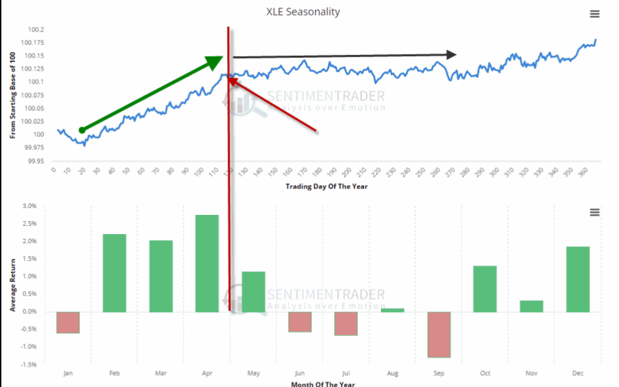
The first – which I mentioned in this article – is the fact that the best time of year for energy is the February into early May period. See Figure 1.
With that period just about past it is possible that the energy sector may at least pause for a while.
The second concern is that a lot of “things” in the energy sector are presently “bumping their head” against resistance. Here is the point:
*This does not preclude a breakout and further run to higher ground.
*But until the breakout is confirmed a little bit of caution is in order.
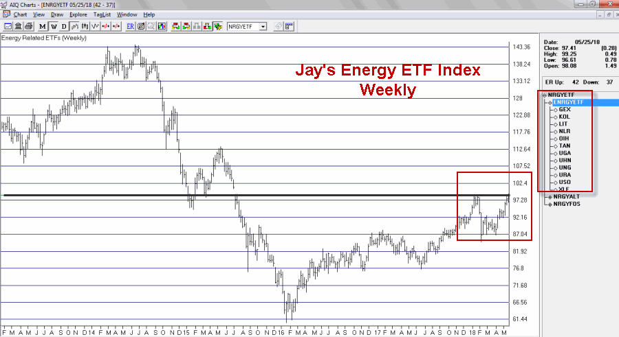
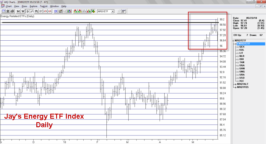
I created an index comprised of a variety of energy related ETFs. As you can see in Figures 2 through 4 that index recently was turned away at a significant resistance level.
Figure 3 shows the same information on a weekly chart.
Figure 3 – Jay’s Energy ETF Index – Weekly (Courtesy TradingExpert)
Figure 4 zooms in to view the action on a daily basis.
Figure 4 – Jay’s Energy ETF Index – Daily (Courtesy TradingExpert)
As you can see in Figure 4, the index made an effort to break out above the January high then reversed and closed lower before declining a little bit more the next day.
The action displayed in the charts above may prove to be nothing more that “the pause that refreshes.” If price breaks out to the upside another bull leg may well ensue. But note also in Figure 5 that ticker XLE – the broad-based SPDR Energy ETF – demonstrated the same type of hesitation as the ETF Index in the previous charts.
It too faces it’s own significant resistance levels as seen in Figure 5.
Energies have showed great relative strength of late even in the context of a choppy stock market overall. So there is no reason to believe that the rally can’t continue. But two things to watch for:
1. If energy related assets clear their recent resistance levels a powerful new upleg may ensue.
2. Until those resistance levels are pierced, a bit of caution is in order. Energy has been the leading sector of late. Any time the leading sector runs into trouble it pays to “keep an eye out” for trouble in the broader market.
No predictions one way or the other – just some encouragement to pay close attention at a potentially critical juncture.
Disclaimer: The data presented herein were obtained from various third-party sources. While I believe the data to be reliable, no representation is made as to, and no responsibility, warranty or liability is accepted for the accuracy or completeness of such information. The information, opinions and ideas expressed herein are for informational and educational purposes only and do not constitute and should not be construed as investment advice, an advertisement or offering of investment advisory services, or an offer to sell or a solicitation to buy any security.
May 24, 2018 | chart patterns, educational newsletters, ETFs, group and sector, jay kaeppel
The question posed in the title is essentially, “does the fate of the stock market hinge on the action of Sotheby’s Holdings” (ticker BID)? Sotheby’s is the oldest stock on the NYSE and is the only publicly traded investment opportunity in the art market. As the art market is highly sensitive to the overall economy it has been argued that BID is a potential stock market “bellwether”.
Still, the most obvious answer to the question posed above is of course “No.” Of course the performance of the whole stock market does not come down to the performance of one stock. That’s the obvious answer.
The more curious answer is arrived at by first looking at Figure 1. Figure 1 displays a monthly bar chart for BID in the top clip and the S&P 500 Index in the bottom clip. What is interesting is that historically when BID tops out, bad things tend to follow for the broader stock market.
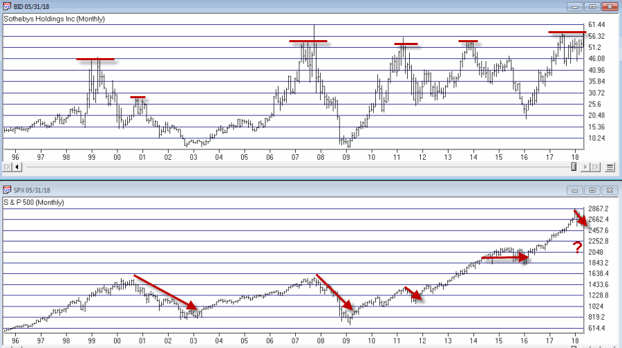
Figure 1 – BID tops often foreshadow SPX weakness (Courtesy WinWay
TradingExpert)
Consider:
*The bear market of 2000-2002 was presaged by a dramatic top for BID in 1999, and confirmed again in late 2000.
*The great bear market of 2008 was also preceded by a top and breakdown in BID.
*The 2011 top in BID was followed by a quick but sharp -21% SPX decline.
*The 2013-2014 BID top was followed by roughly 2 years of sideways SPX price action.
*More recently the top in 2017-2018 top has been accompanied by much volatility and consternation in the broader market.
Figure 2 “zooms in” to recent years using weekly data.
In Figure 2 we can see how poor performance for BID presaged an extended period of sideways trading for the SPX. At the far right we can also see that BID is at something of a critical juncture. If it punches through to the upside and moves higher it could be something of an “All Clear” sign for the market. On the other hand, if BID fails here and forms a clear multiple top, well, history suggests that that might be an ominous sign for the broader market.
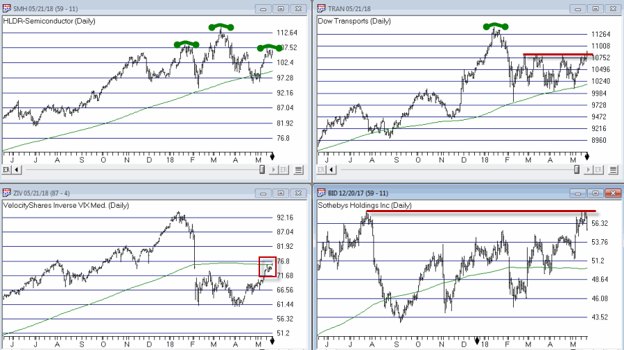
Other Bellwethers
BID is one of four market “bellwethers” that I like to monitor. The other 3 are SMH (semiconductor index), TRAN (Dow Transports) and ZIV (inverse VIX). You can see the status of each in Figure 3.
Figure 3 – Four stock market “Bellwethers” (Courtesy WinWay
TradingExpert)
To sum up the current status of these bellwethers:
*All 4 (including ZIV as of the latest close) are above their respective 200-day moving average. So technically, they are all in “up trends.”
*All 4 are also threatening to create some sort of topping formation.
In sum, as long as all four of these bellwethers continue to trend higher, “Life is Good” in the stock market. At the same time, if some or all of these fail to break through and begin to top out, the broader market may experience more trouble.
Bottom line: Now is a good time to pay close attention to the stock market for “tells”.
Jay Kaeppel
Disclaimer: The data presented herein were obtained from various third-party sources. While I believe the data to be reliable, no representation is made as to, and no responsibility, warranty or liability is accepted for the accuracy or completeness of such information. The information, opinions and ideas expressed herein are for informational and educational purposes only and do not constitute and should not be construed as investment advice, an advertisement or offering of investment advisory services, or an offer to sell or a solicitation to buy any security.
Apr 21, 2018 | educational newsletters, ETFs, jay kaeppel
With crude oil hitting its highest level since November of 2014, the energy sector is suddenly drawing a lot of interest. But there are few caveats that investors might want to keep in mind before getting too far ahead of themselves.
(BTW: If you enjoy reading JayOnTheMarkets.com – heck, even if you hate reading JayOnTheMarkets.com – please tell others and encourage them to stop by, “Like” an article, link an article, etc.. Thanks, The Management)
Energy Seasonality
Figure 1 (from www.Sentimentrader.com, which is quickly becoming one of my favorite sites) displays the annual seasonal calendar for ticker XLE – the SPDR Energy ETF. While it should be pointed out that it certainly is not like every year plays out like this chart, the primary point is that the “meat” part of year of from the end of January through the end of April is nearing the end of the line.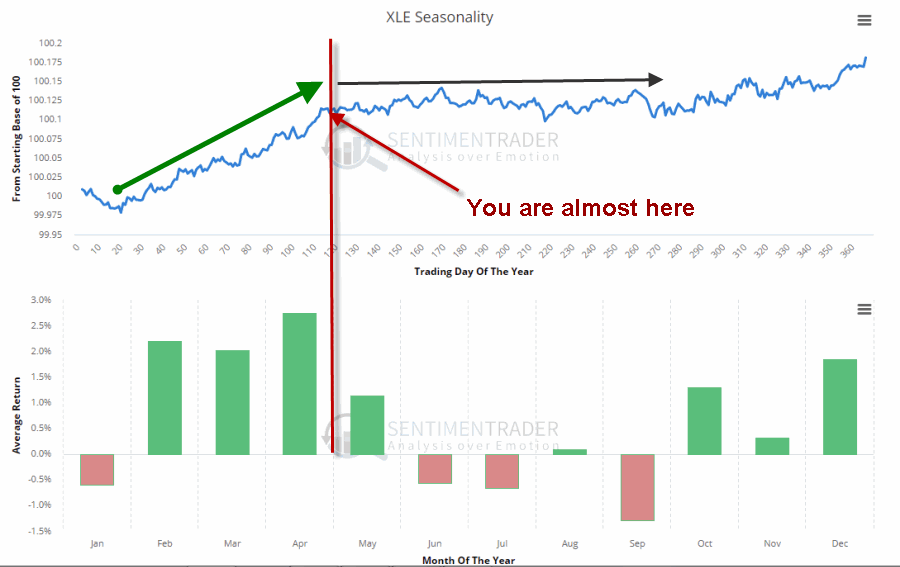 Figure 1 – XLE Seasonality (Courtesy: www.Sentimentrader.com)
XLE Overhead Resistance
XLE has had a terrific month of April, rallying over 14% since the low on 4/2. And while it has been an impressive show of momentum, a look at the “bigger picture” points to some key levels of potential resistance just ahead.
Figure 2 is a monthly bar chart of XLE with two significant resistance levels drawn (at roughly $78.25 and $80.50). XLE has failed twice previously at roughly $78.40 – in December 2016 and again in January of 2018.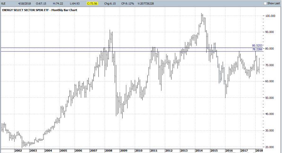 Figure 2 – XLE Monthly with overhead resistance (Courtesy ProfitSource by HUBB)
On the plus side, XLE is clearly trending higher at the moment and there is still another 6.4% and 9.4% of upside potential between the current price and the resistance levels drawn in Figure 2. So short-term upside potential remains.
The only real “warning” I am raising is to pay attention to “what happens (if and) when we get there” (“there” being the $78.25-$80.50 range).
Jay’s Energy ETF Index
I created and follow an index of all manner of energy related ETFs (it combines traditional fossil fuel related ETFs with alternative energy source ETFs). A monthly chart with a significant resistance level drawn appears in Figure 3.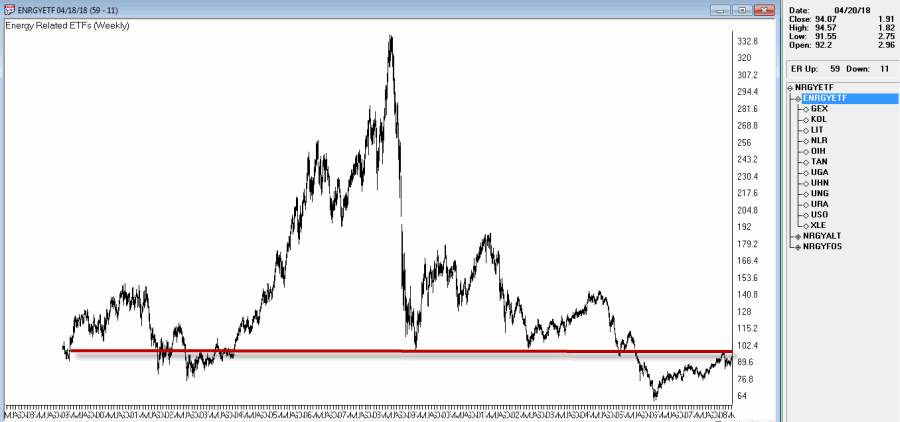 Figure 3 – Jay’s Energy ETF Index (Courtesy TradingExpert)
Figure 4 “zooms in” on Figure 3 using a daily bar chart of my Energy ETF Index. As you can see, as nice as the latest rally has been, there is a “day of reckoning” looming out there somewhere if the energy sectors keeps going and retests this significant level.
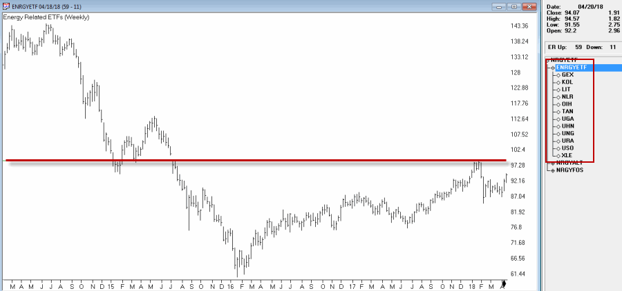 Figure 4 – Jay’s Energy ETF Index; Daily (Courtesy TradingExpert)
For the record this index is comprised of:
GEX – Alternative Energy
KOL – Coal
LIT – Lithium
NLR – Nuclear
OIH – Oil Service
TAN – Solar
UGA – Gasoline
UHN – Heating Oil
UNG – Natural Gas
URA – Uranium
USO – Crude Oil
XLE – Energy Sector
Summary
Some might interpret this piece as a bearish to neutral word of warning related to the energy sector. In reality I am pretty agnostic when it comes to energy and (sadly) can’t offer you a “prediction” that would do you any good.
But I will be watching closely to see what happens to XLE and my own index if and when the key resistance levels are tested – especially if that test occurs after the end of the most favorable February through April period.
Commodity related assets – such as energy, especially fossil fuels – appear “due” for a favorable move relative to stocks. If and when these key resistance levels are pierced we could see an “off to the races” situation unfold.
Until then, be careful about “bumping your head.”
Jay Kaeppel
Disclaimer: The data presented herein were obtained from various third-party sources. While I believe the data to be reliable, no representation is made as to, and no responsibility, warranty or liability is accepted for the accuracy or completeness of such information. The information, opinions and ideas expressed herein are for informational and educational purposes only and do not constitute and should not be construed as investment advice, an advertisement or offering of investment advisory services, or an offer to sell or a solicitation to buy any security.