Oct 5, 2018 | educational newsletters, ETFs, indexes, jay kaeppel, market timing, sector funds
One of the benefits of being an avowed trend-follower is that it can allow you to avoid a lot of the “angst” that many investors suffer with each new twist and turn in the economic/financial/political/price of tea in China arena. Let’s face it, if you scan the internet, watch cable news or read the financial press you will always have at least – roughly – 10,000 “things” that you could be worried about that will kick the legs out from whatever bullish thing might be happening at the moment.
I have a friend (no, seriously) and his comment recently was “The next person that mentions the Hindenburg Omen gets punched in the face”. The bottom line: someone is always crying “Wolf”, and living in perpetual fear is – let’s be honest – kind of a crappy way to go through life. Which is why I typically advocate focusing on the major trends and not sweating all the small stuff along the way.
Yes, things can go wrong and yes it would be nice to have at least some sort of a heads up in advance. So, in an effort to not be completely ignorant of the goings on around me I do have a few “things” I follow in hopes of getting some “early warning” if trouble is brewing. I call them my 4 bellwethers.
The main thing I look for is “divergence” between the action for the major stock market indexes and the action of these bellwethers. Even the existence of divergences does NOT guarantee trouble. But more often than not, major market tops are presaged by some “signs of trouble”. So, let’s take a look.
Figure 1 displays the Dow, Nasdaq 100, S&P 500 and Russell 2000 indexes. As you can see, they are all in up trends, well above their respective 200-day moving averages and 3 of the 4 are at or near all-time highs. In other words, from a solely trend-following perspective, “Thing are swell, things are great.”
(click to enlarge)
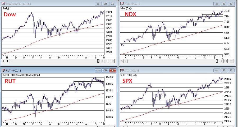
Figure 1 – Four major indexes all in bullish trends (Courtesy WinWayCharts TradingExpert)
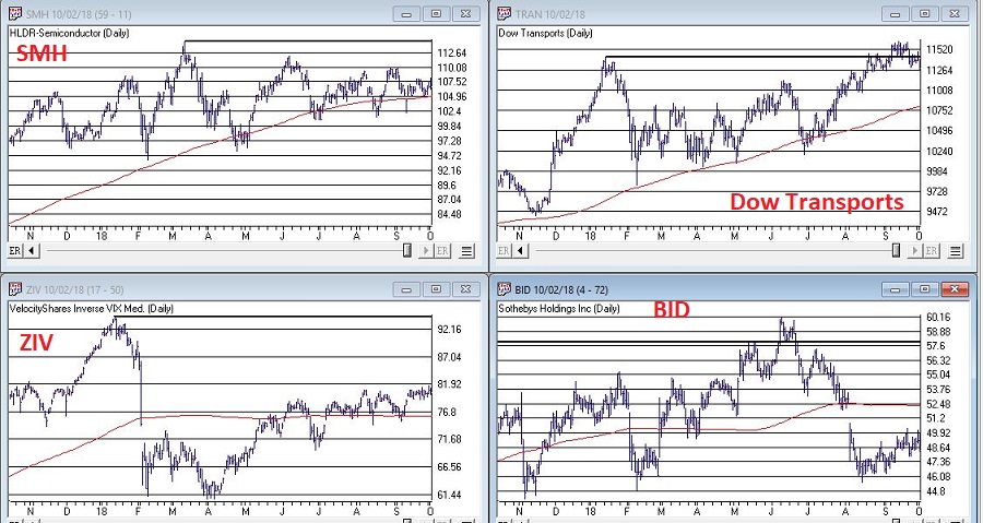
Figure 2 displays my 4 bellwethers – they are:
Ticker SMH: an ETF that tracks the semiconductor sector. The world runs on technology and technology runs on semiconductors.
Dow Transportation Index: Whether the Transports confirm or diverge from the Dow Industrials has long been used as a gauge of market health by investors.
Ticker ZIV: An ETF that is designed to track the inverse of the VIX Index. Long story, but bottom line, it should go up when the market goes up and vice versa. Any deviation from that standard can be a warning sign.
Ticker BID: Sotheby’s Holdings which run high-end auctions. Bottom line, if rich people are comfortable buying expensive stuff that is a good sign for the economy (and should be reflected in a rising trend in BID) and if rich people are NOT comfortable buying expensive stuff, well, vice versa.
As you can see, the Bellwethers are mostly not confirming the major average at the moment. This is not a reason to panic or fell angst. It is simply something to keep an eye on. The longer these divergences continue the more troublesome, so let’s focus on a couple of key things to watch to decide if maybe you should go ahead and start feeling angst.
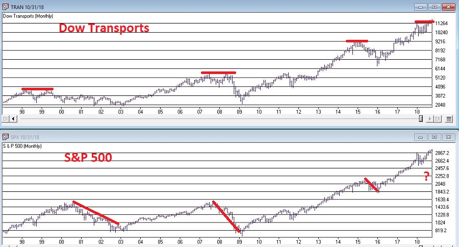
As you can see in Figure 3, double-tops in the Dow Transports have in the past signaled trouble for the overall stock market.
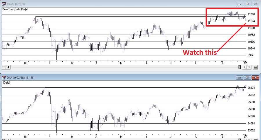
The Good News and Bad News for the Transport Index is reflected in the daily chart shown in Figure 4. The Good News is that the Transports recently made a new all-time high. The Bad News is that price has subsequently fallen back below the important support/resistance level marked in Figure 4.
Good = Dow Transports above 11,424
Bad = Dow Transports below 11,424
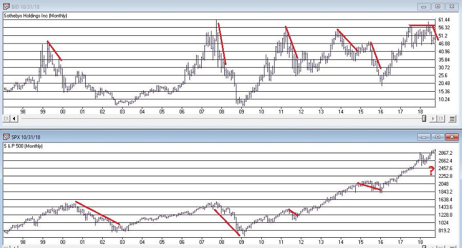
As you can see in Figure 5, weakness in the overall market averages is often presaged well in advance by a major breakdown in the price of BID.
As you can see in Figure 6, BID recently tanked 25% before rebounding slightly. Is this a “Look Out Below” warning sign for the stock market? Dunno, but gonna keep a close eye on BID to see if it rebounds…or falls further.
The major market averages are (mostly) rallying to new highs while Jay’s 4 Market Bellwethers are, well, it’s too soon to say exactly what they are. But for the moment at least they are mostly not confirming the new highs in the major averages. Please try to remain calm. The proper response is Not fell angst and doubt, but rather to simply keep an eye on how things progress from here. If the Bellwethers start to move higher then “the crisis will have passed.” If not, then it will be very important to keep an eye open for – and to take seriously – signs of weakness in the major averages.
Disclaimer: The data presented herein were obtained from various third-party sources. While I believe the data to be reliable, no representation is made as to, and no responsibility, warranty or liability is accepted for the accuracy or completeness of such information. The information, opinions and ideas expressed herein are for informational and educational purposes only and do not constitute and should not be construed as investment advice, an advertisement or offering of investment advisory services, or an offer to sell or a solicitation to buy any security.
Sep 25, 2018 | educational newsletters, ETFs, indexes, jay kaeppel, market timing
Let’s open with Jay’s Trading Maxim #7.
Jay’s Trading Maxim #7: Being able to identify the trend today is worth more than 1,000 predictions of what the trend will be in the future.
Yes trend-following is boring. And no, trend-following never does get you in near the bottom nor out at the top. But the reality is that if you remain long when the trend appears to be up (for our purposes here let’s define this roughly as the majority of major market averages holding above their long-term moving averages) and play defense (i.e., raise cash, hedge, etc.) when the trend appears to be down (i.e., the majority of major market averages are below their long-term moving averages), chances are you will do pretty well for yourself. And you may find yourself sleeping pretty well at night as well along the way.
To put it more succinctly:
*THE FOREST = Long-term trend
*THE TREES = All the crap that everyone tells you “may” affect the long-term trend at some point in the future
Human nature is a tricky thing. While we should clearly be focused on THE FOREST the reality is that most investors focus that majority of their attention on all those pesky trees. Part of the reason for this is that some trees can offer clues. It’s a question of identifying a few “key trees” and then ignoring the rest of the noise.
With the Dow Industrials rallying to a new high virtually all the major averages have now reached a new high at least within the last month. And as you can see in Figure 1 all are well above their respective 200-day moving average. Long story short the trend is “UP”.
(click to enlarge)
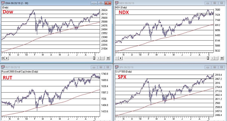
Figure 1 – U.S. Major Market Indexes in Uptrends (Courtesy WinWayCharts TradingExpert)
As strong as the market has been of late it should be noted that we are about to enter the most favorable seasonal portion of the 48-month election cycle. This period begins at the close of September 2018 and extends through the end of December 2019.
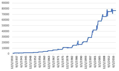
Figure 2 displays the growth of $1,000 invested in the Dow Industrials only during this 15-month period every 4 years. Figure 3 displays the actual % +(-) for each of these periods. Note that since 1934-35, the Dow has showed a gain 20 out of 21 times during this period.
Figure 2 – Growth of $1,000 invested in Dow Industrials ONLY during 15 bullish months (mid-term through pre-election year) within 48-month election cycle.
| Start Date |
End Date |
Dow % +(-) |
| 9/30/1934 |
12/31/1935 |
+55.6% |
| 9/30/1938 |
12/31/1939 |
+6.2% |
| 9/30/1942 |
12/31/1943 |
+24.5% |
| 9/30/1946 |
12/31/1947 |
+5.1% |
| 9/30/1950 |
12/31/1951 |
+18.9% |
| 9/30/1954 |
12/31/1955 |
+35.5% |
| 9/30/1958 |
12/31/1959 |
+27.7% |
| 9/30/1962 |
12/31/1963 |
+31.8% |
| 9/30/1966 |
12/31/1967 |
+16.9% |
| 9/30/1970 |
12/31/1971 |
+17.0% |
| 9/30/1974 |
12/31/1975 |
+40.2% |
| 9/30/1978 |
12/31/1979 |
(-3.1%) |
| 9/30/1982 |
12/31/1983 |
+40.4% |
| 9/30/1986 |
12/31/1987 |
+9.7% |
| 9/30/1990 |
12/31/1991 |
+29.2% |
| 9/30/1994 |
12/31/1995 |
+33.1% |
| 9/30/1998 |
12/31/1999 |
+46.6% |
| 9/30/2002 |
12/31/2003 |
+37.7% |
| 9/30/2006 |
12/31/2007 |
+13.6% |
| 9/30/2010 |
12/31/2011 |
+13.0% |
| 9/30/2014 |
12/31/2015 |
+2.2% |
Figure 3 – 15 bullish months (mid-term through pre-election year) within 48-month election cycle
Now What? The Worrisome Trees
While the major averages are setting records a lot of other “things” are not. My own cluster of “market bellwethers” appear in Figure 4. Among them the Dow Transportation Index is the only one remotely close to a new high, having broken out to the upside last week. In the meantime, the semiconductors (ticker SMH), the inverse VIX index ETF (ticker ZIV) and Sotheby’s (ticker BID) continue to meander/flounder. This is by no means a “run for the hills” signal. But the point is that at some point I would like to see some confirmation from these tickers that often (though obviously not always) presage trouble in the stock market when they fail to confirm bullish action in the major averages.
(click to enlarge)
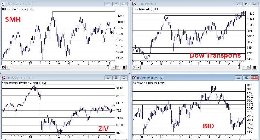
Figure 4 – Jay’s 4 Bellwethers (SMH/TRAN/ZIV/BID) (Courtesy WinWayCharts TradingExpert)
Another source of potential concern is the action of, well, the rest of the darn World. Figure 5 displays my own regional indexes – Americas, Europe, Asia/Pacific and Middle East. They all look awful.
(click to enlarge)
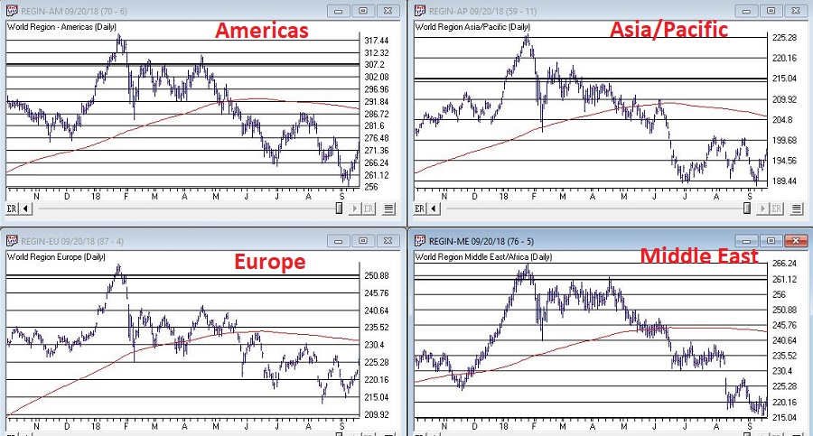
Figure 5 – 4 World Regional Indexes (Courtesy WinWayCharts TradingExpert)
Now the big question is “will the rest of the world’s stock markets start acting better, or will the U.S. market start acting worse?” Sadly, I can’t answer that question. The key point I do want to make though is that this dichotomy of performance – i.e., U.S market soaring, rest of the world sinking – is unlikely to be sustainable for very long.
It is hard to envision the market relentlessly higher with no serious corrections over the next 15 months. And “yes”, those bellwether and world region indexes trees are “troublesome”.
Still the trend at the moment is inarguably “Up” and we about to enter one of the most seasonally favorable periods for the stock market.
1) Decide now what defensive actions you will take if the market does start to breakdown
2) Resolve to actually take those actions if the need arises
3) Enjoy the ride as long as it lasts.
Disclaimer: The data presented herein were obtained from various third-party sources. While I believe the data to be reliable, no representation is made as to, and no responsibility, warranty or liability is accepted for the accuracy or completeness of such information. The information, opinions and ideas expressed herein are for informational and educational purposes only and do not constitute and should not be construed as investment advice, an advertisement or offering of investment advisory services, or an offer to sell or a solicitation to buy any security.
Sep 17, 2018 | educational newsletters, ETFs, gold, indicators, jay kaeppel, MACD
Most people are familiar with ADHD, manic-depressive disorder, depression and schizophrenia. But one common affliction within our trading community that gets almost no attention is WESS. That stands for “Wild-Eyed Speculation Syndrome”. And it’s more common than you think (“Hi, my name is Jay”).
The exact symptoms vary, but generally speaking they go something like this:
*A person gets up in the morning with a hankering to make a trade
*Said person then finds “some reason” to make some trade in something
*If the person happens to make money on that trade then the affliction is reinforced by virtue of IGTS (“I’ve Got the Touch Syndrome”, which is one of the occasional side effects of WESS)
*If the person loses money on the trade the side effects can vary but may include: angry outbursts, kicking oneself in the head (typically figuratively), vows to either stop the behavior or at least do it better, and so on.
*The most common side effect of WESS is a declining trading account balance (which not coincidentally is how this disorder is most commonly diagnosed).
For those suffering from WESS – with the caveat/disclosure that I am not a medical professional (although I have found that ibuprofen really clears up a lot of stuff, but I digress) – I am here to help.
If you find yourself suffering from Symptom #1 above:
The most effective step is to go back to bed until the urge passes. If this doesn’t work or is not possible (for instance, if you have one of those pesky “jobs” – you know, that 8-hour a day activity that gets in the way of your trading), repeat these two mantras as many times as necessary:
Mantra 1: “I must employ some reasonably objective, repeatable criteria to find a trade with some actual potential”
Mantra 2: “I will risk no more than 2% of my trading capital” on any WESS induced trade (and just as importantly, you must fend off the voice on the other shoulder shouting “But this is the BIG ONE!!”)
Repeat these mantras as many times as necessary to avoid betting the ranch on some random idea that you “read about on the internet, so it must be true.”
Regarding Mantra 1
There are a million and one ways to find a trade. There is no one best way. But just to give you the idea I will mention one way and highlight a current setup. IMPORTANT: That being said, and as always, I DO NOT make recommendations on this blog. The particular setup I will highlight may work out beautifully, or it may be a complete bust. So DO NOT rush out and make a trade based on this just because you read it – you know – on the internet.
The Divergence
Lots of trades get made based on “divergence”. In this case we are talking about the divergence between price and a given indicator – or even better, series of indicators. There is nothing magic about divergence, and like a lot of things, sometimes it works and sometimes it doesn’t. But the reason it is a viable consideration is that when an indicator flashes a bullish divergence versus price it alerts us to a potential – nothing more, nothing less – shift in momentum.
Let’s look at ticker GDX – an ETF that tracks an index of gold mining stocks. In Figure1 1 through 4 below we see:
*GDX price making a lower low
*A given indicator NOT confirming that new low (i.e., a positive divergence)
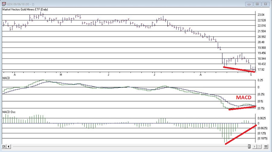
Figure 1 – GDX and MACD (Courtesy WinWayCharts TradingExpert)
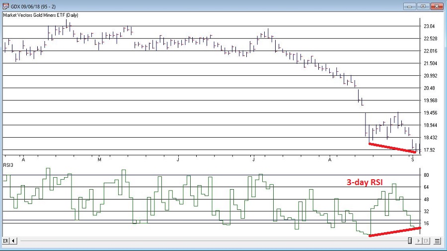
Figure 2 – GDX and 3-day RSI (Courtesy WinWayCharts TradingExpert)
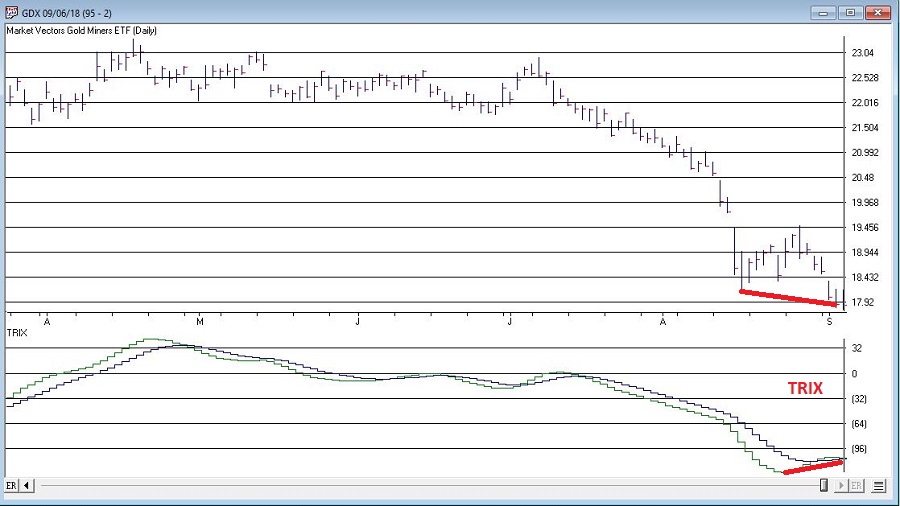
Figure 3 – GDX and TRIX (Courtesy WinWayCharts TradingExpert)
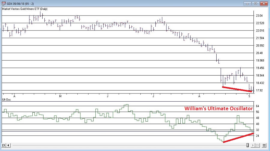
Figure 4 – GDX and William’s Ultimate Oscillator (Courtesy WinWayCharts TradingExpert)
So, do the divergences that appear in Figures 1 through 4 justify a trade? Well, here is where the aforementioned affliction comes into play.
Average Trader: “Maybe, maybe not. In either case I am not entirely sure that trying to pick a bottom in gold stocks based solely on indicator divergences is a good idea”
WESS Sufferer: “Absofreakinglutely!! Let’s do this!!”
You see the problem.
So, let’s assume that a WESS Sufferer likes what he or she sees in Figures 1 through 4. The good news is that we have met the minimum criteria for Mantra #1 above – we have employed some reasonably objective, repeatable criteria (i.e., a bullish divergence between price and a number of variable indicators) to spot a potential opportunity.
Now we must follow Mantra #2 of risking no more than 2% of my trading capital. Let’s assume our WESS Sufferer has a $25,000 trading account. So he or she can risk a maximum of $500 ($25,000 x 2%).
In Figure 5 we see a potential support area for GDX at around $16.40 a share.
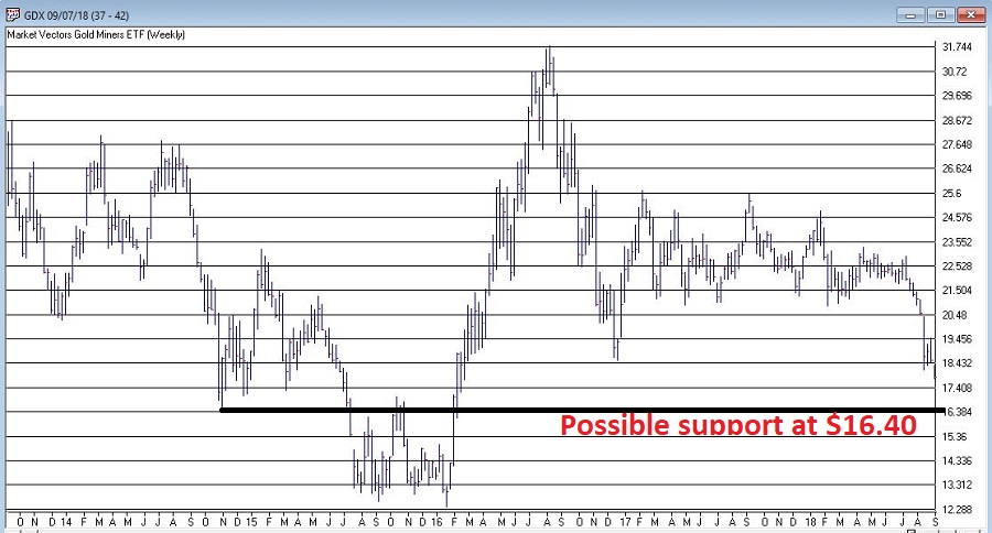
Figure 5 – Ticker GDX with support at $16.40 (Courtesy WinWayCharts TradingExpert)
So, one possibility would be to buy 300 shares of GDX at $17.84 and place a stop loss order below the “line in the sand” at say $16.34 a share. So if the stop is hit, the trade would lose -$450, or -1.8% of our trading capital (17.84 – 16.34 = -1.50 x 300 shares = -$450).
Summary
Does any of the above fit in the category of “A Good Idea”. That’s the thing about trading – and most things in life for that matter – it’s all in the eye of the beholder. Remember, the above is NOT a “recommendation”, only an “example.”
The real key thing to note is that we went from being just a random WESS Sufferer to a WESS Sufferer with a Plan – one that has something other than just an “urge” to find a trade, AND (most importantly) a mechanism for limiting any damage that might be done if things don’t pan out.
And if that doesn’t work, well, there’s always ibuprofen.
Jay Kaeppel
Disclaimer: The data presented herein were obtained from various third-party sources. While I believe the data to be reliable, no representation is made as to, and no responsibility, warranty or liability is accepted for the accuracy or completeness of such information. The information, opinions and ideas expressed herein are for informational and educational purposes only and do not constitute and should not be construed as investment advice, an advertisement or offering of investment advisory services, or an offer to sell or a solicitation to buy any security.
Aug 8, 2018 | educational newsletters, ETFs, indexes, jay kaeppel
Investors who pay close attention to the financial markets by and large spend a fair amount of time being “perplexed.” If you take all the “news” related to the markets and combine that with all the day-to-day and week-to-week gyrations of the markets, there often seems to be no rhyme or reason for what goes on (hence the reason I generally advocate a slightly less hyper, more trend-driven approach).
But sometimes it all seems to come crystal clear. In the most recent fortnight most of the major market averages (with the Dow and S&P 500 being the primary exceptions) have touched or at least teased new highs. Facebook got crushed and the market didn’t tank. Tesla struggled mightily before bursting back into the bright sunlight – and the market didn’t tank. In fact, all kinds of things have happened and still the major U.S. averages march relentlessly higher backed by a strong economy, reasonably moderate inflation and higher, yet by no means high interest rates.
At this point, it appears “obvious” that there is no end in sight to the Great Bull Market. A number of momentum studies I have read lately seem to all confirm that the U.S. market will continue to march higher to significantly higher new highs.
And the fact that it is so “obvious” scares the $%^& out of me. Don’t misunderstand. This is not about to devolve into a hysterical “Sell Everything!” screed. The trend is bullish therefore so am I. But the “what could possibly go wrong” antennae still pop up from time to time. So here are some random views regarding all things stock market.
Figure 1 displays 4 major U.S. market averages. All are in uptrends above their respective 200-day moving averages and all are close to all-time highs. The big question is “what happens when they get there?” Do they all break through effortlessly? Or do we get a “struggle?”
(click to enlarge)
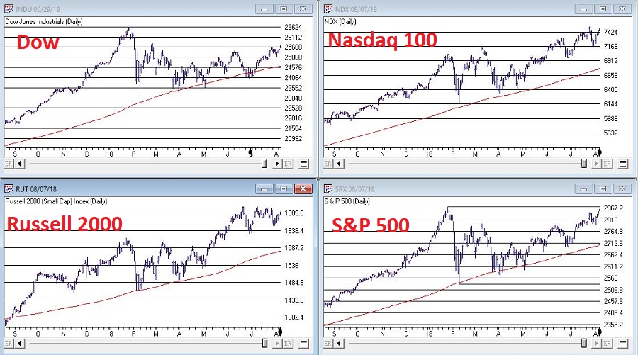
Figure 1 – The Major U.S. Averages; clearly in up trends, but… (Courtesy TradingExpert)
Figure 2 displays my own 4 market “bellwethers”, including the semiconductors (SMH), Dow Transports (TRAN), Inverse VIX ETF (ZIV) and Sotheby’s Holdings (BID). At the moment, none of these are actively “confirming” new highs and they each have a clear “line in the sand” resistance level overhead. So, for the moment they presently pose something of a minor warning sign.
While the U.S. economy and stock market appear to be hitting on all cylinders, the rest of the world is sort of “chugging along.” Figure 3 displays 4 “Geographic Groups” that I follow – The Americas, Asia/Pacific, Europe and Middle East. The good news is that each group is presently holding above it’s respective 21-month moving average. So technically, the trend is “Up.” But the bad news is that each group has some significant overhead resistance, so the current uptrend is by no means of the “rip roaring” variety.
(click to enlarge)
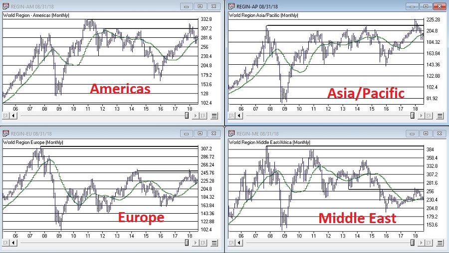
Figure 3 – Major Geographic Groups; Hanging onto uptrends but serious overhead resistance (Courtesy TradingExpert)
Traders have been pretty much conditioned in recent years to assume that the VIX Index – which measures volatility and by extension, “fear” – is and will remain low as the market chugs higher. And that may prove to be true. But when everything gets to “obvious” (i.e., the U.S. market is “clearly” heading higher) and things get too quiet (VIX dropped below 11% for the 1st time in 3 months) it can pay to “expect the unexpected.”
Figure 4 is from www.sentimentrader.com and displays those instances in the past when the VIX Index fell below 11% for the first time in 3 months. Historically, VIX makes some kind of an up move in the 2 to 3 months following such occurrences.
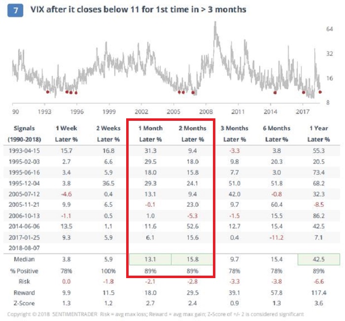
Figure 4 – VIX Index performance after VIX Index drops below 11% for 1st time in 3 months (Courtesy Sentimentrader.com)
Things may or may not play out “like usual” this time around, however, given that…
*The U.S. averages are “obviously” heading higher
*The market bellwethers are so far not confirming
*The rest of the worlds stock markets are nowhere near as strong
*VIX has a history of “spiking”, especially during the seasonally unfavorable months of August and September
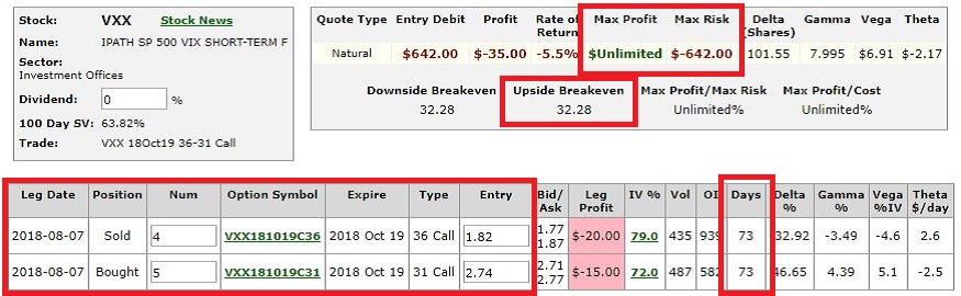
…It might make sense to consider a long volatility play (NOTE: Long volatility plays using ticker VXX have a long history of not panning out as ticker VXX is essentially built to go to zero – for more information on VXX and the effects of “contango” please see www.Google.com. Long VXX trades are best considered).
One example appears in Figures 5 and 6. This trade involves:
*Buying 5 Oct VXX 31 calls @ $2.74
*Selling 4 Oct VXX 36 calls @ $1.82
The maximum risk is $642 if VXX fails to get above the breakeven price of $32.28 by October 19th. On the other hand, if something completely not “obvious” happens and volatility does in fact spike, the trade has significant upside potential.
(NOTE: As always, please remember that this is an “example” of a speculative contrarian trade, and NOT a “recommendation.” If the stock market rallies – as it “obviously” seems to want to do, this trade will likely lose money.)
Disclaimer: The data presented herein were obtained from various third-party sources. While I believe the data to be reliable, no representation is made as to, and no responsibility, warranty or liability is accepted for the accuracy or completeness of such information. The information, opinions and ideas expressed herein are for informational and educational purposes only and do not constitute and should not be construed as investment advice, an advertisement or offering of investment advisory services, or an offer to sell or a solicitation to buy any security.
Jul 13, 2018 | chart patterns, educational newsletters, ETFs, gold
This week it is the U.S. dollar and Gold taking their turns testing critical inflection points.
As you can see in Figure 1, on a seasonal basis the dollar is moving into a traditionally weaker time of year.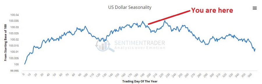 Figure 1 – U.S. Dollar seasonality (Courtesy Sentimentrader.com)
In Figure 2 you can see that traders have been and remain pretty optimistic. This is traditionally a bearish contrarian sign.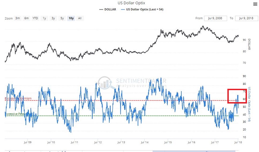 Figure 2 – U.S. Dollar trade sentiment (Courtesy Sentimentrader.com)
In Figure 3 we see the “line in the sand” for ticker UUP – an ETF that tracks the U.S. Dollar. Unless and until UUP punches through to the upside there is significant potential downside risk.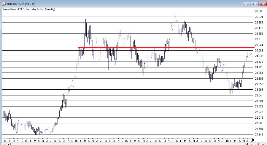 Figure 3 – U.S. Dollar w/resistance (Courtesy TradingExpert)
As you can see in Figure 4, on a seasonal basis the dollar is moving into a traditionally stronger time of year.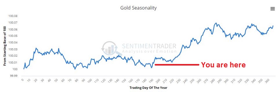 Figure 4 – Gold seasonality (Courtesy Sentimentrader.com)
In Figure 5 you can see that traders have been and remain pretty pessimistic. This is traditionally a bullish contrarian sign.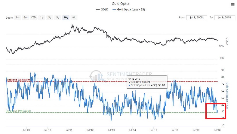 Figure 5 – Gold trader sentiment (Courtesy Sentimentrader.com)
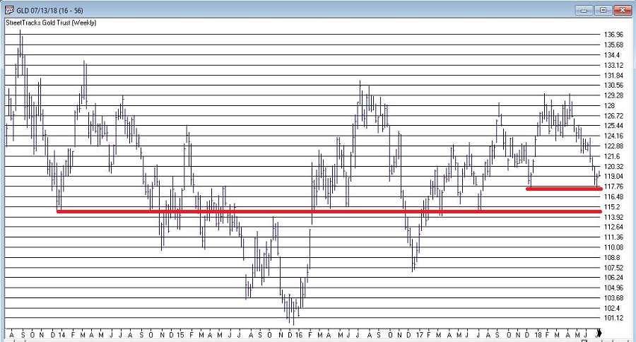
In Figure 6 we see the “line(s) in the sand” for ticker GLD – an ETF that tracks gold bullion.
I would be hesitant about trying to “pick a bottom” as gold still looks pretty week. But if:
a) GLD does hold above the support area in Figure 6 and begins to perk up,
b) Ticker UUP fails to break out to the upside
Things could look a lot better for gold very quickly.
As usual I am not actually making any “predictions” here or calling for any particular action. I mainly just want to encourage gold and/or dollar traders to be paying close attention in the days and weeks ahead, as the potential for a major reversal in both markets appears possible.
Likewise, if no reversal does take place – and if the dollar breaks out to the upside and gold breaks down, both markets may be “off to the races.”
So dollar and gold traders – take a deep breath; focus your attention; and prepare for action…one way or the other.
Disclaimer: The data presented herein were obtained from various third-party sources. While I believe the data to be reliable, no representation is made as to, and no responsibility, warranty or liability is accepted for the accuracy or completeness of such information. The information, opinions and ideas expressed herein are for informational and educational purposes only and do not constitute and should not be construed as investment advice, an advertisement or offering of investment advisory services, or an offer to sell or a solicitation to buy any security.
Jul 5, 2018 | chart patterns, educational newsletters, ETFs, indexes, jay kaeppel, market timing
Here’s a number for you – 88%. Since 1948, over any 10-year period the Dow has showed a gain 88% of the time. That’s a pretty good number. It also explains why we should give bull markets the benefit of the doubt (for the record, if you only hold the Dow between the end of October and the end of May every year you would have a showed a 10-year gain 98% of the time! But this article is not about seasonality per se, so that’s a topic for another day).
Of course, there is a lot of variability along the way, and if you Google “current signs of a bear market” you come up with 4,280,000 articles to peruse. So, few investors ever feel “contented”. We’re always waiting for the “other shoe to drop.”
Some Warning Signs to Look For
#1. Major Indexes
Figure 1 displays the four major average – Dow, S&P 500, Nasdaq 100 and Russell 2000 with their respective 200-day moving averages. In the last few days the Dow slipped a little below its 200-day average, the other three remain above.
(click to enlarge)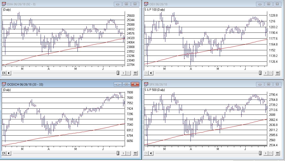 Figure 1 – Four major market averages with 200-day moving averages (Courtesy TradingExpert)
Warning Sign to Watch For: If 3 or more of these averages drop below their 200-day moving average.
#2. Market Bellwethers
Figure 2 displays my four market “bellwhethers” – tickers SMH (semiconductors), TRAN (Dow Transports), ZIV (inverse VIX) and BID (Sotheby’s Holdings) with their respective 200-day moving averages. At the moment only ZIV is below it’s 200-day moving average but some of the others are close
(click to enlarge)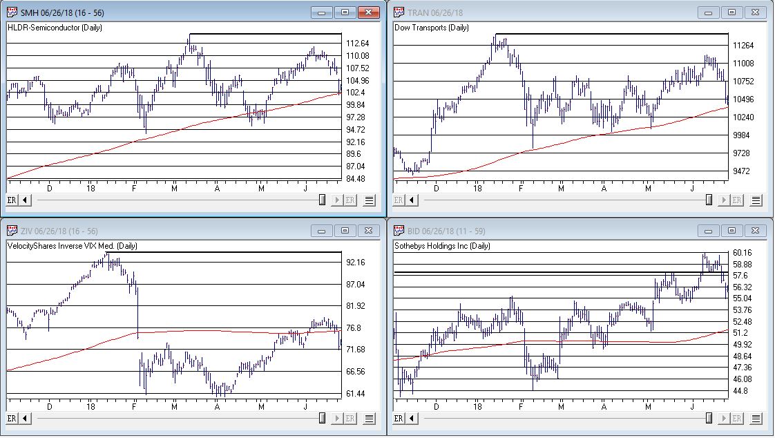 Figure 2 – Four market bellwethers with 200-dqy moving averages (Courtesy TradingExpert)
Warning Sign to Watch For: If 3 or more of these averages drop below their 200-day moving average.
#3. S&P 500 Monthly Method
In this article I detailed a simple timing method using S&P 500 Index monthly closing prices. Figure 3 show the S&P 500 Index with it’s “trigger warning” price of 2,532.69 highlighted.
(click to enlarge)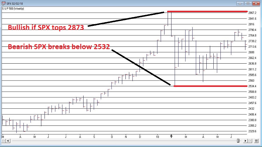 Figure 3 – S&P 500 Index Monthly Method Trigger Points (Courtesy TradingExpert)
Warning Sign to Watch For: If SPX closes below 2532.69 without first taking out the January high of 2872.87
#4. International Growth Stocks
When growth stocks around the world are performing well, things are good. When they top out, try to rebound and then fail, things are (typically) not so good. The last two major U.S. bear markets were presaged by a break in ticker VWIGX (Vanguard International Growth) as seen in Figure 4.
(click to enlarge)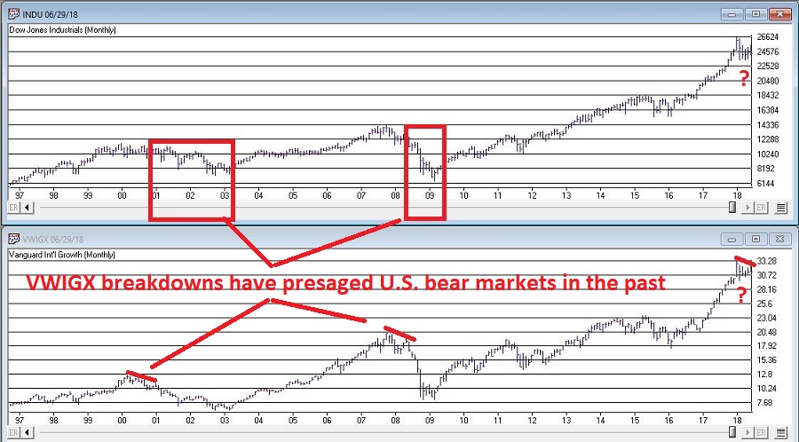 Figure 4 – Dow Jones Industrials Average (top) and previous warnings from ticker VWIGX (bottom)(Courtesy TradingExpert)
Warning Sign to Watch For: Technically this one is currently flashing a warning sign. That warning will remain active unless and until VWIGX takes out the January high of 33.19.
#5. The 10-Year minus 2-Year Yield Spread
This is one of the most misrepresented indicators, so I will state it as plainly as possible:
*A narrowing yield curve IS NOT a bearish sign for the stock market
*An actual inverted yield curve IS a bearish sign for the stock market
Figure 5 displays the latest 10-year minus 2-year spread. Yes, it has narrowed quite a bit. This has launched a bazillion and one erroneously frightening articles. But remember the rules above.
(click to enlarge)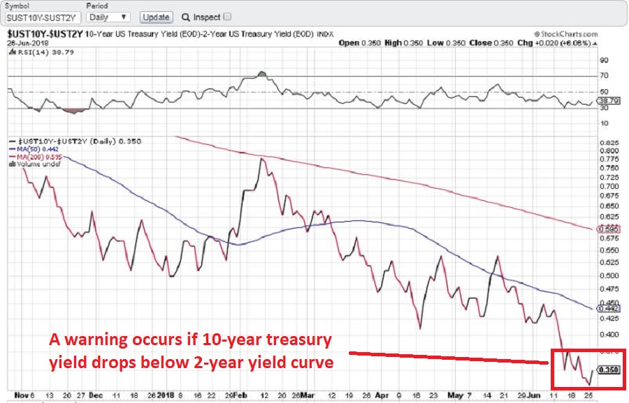 Figure 5 – 10-year treasury yield minus 2-year treasury yield (Courtesy: www.StockCharts.com)
Warning Sign to Watch For: If the 10-year yield minus the 2-year yield falls into negative territory it will flash a powerful warning sign for the stock market and the overall economy. Until then ignore all the hand-wringing about a “flattening” yield curve.
Summary
We are in a seasonally unfavorable period for the stock market and – as always – we are bombarded daily with a thousand and one reasons why the next bear market is imminent.
So my advice is to do the following:
1. Ignore it all and keep track of the items listed above
2. The more warning signs that appear – if any – the more defensive you should become
In the meantime, try to go ahead and enjoy your summer.
Jay Kaeppel
Disclaimer: The data presented herein were obtained from various third-party sources. While I believe the data to be reliable, no representation is made as to, and no responsibility, warranty or liability is accepted for the accuracy or completeness of such information. The information, opinions and ideas expressed herein are for informational and educational purposes only and do not constitute and should not be construed as investment advice, an advertisement or offering of investment advisory services, or an offer to sell or a solicitation to buy any security.