I keep seeing headlines about the “imminent” re-emergence of commodities as a viable investment as an asset class. And as I wrote about here, I mostly agree wholeheartedly that “the worn will turn” at some point in the years ahead, as commodities are historically far undervalued relative to stocks.
The timing of all of this is another story. Fortunately, it is a fairly short and simple story. In a nutshell, it goes like this:
*As long as the U.S. Dollar remains strong, don’t bet heavy on commodities.
The End
Well not exactly.
The 2019 Anomaly
The Year 2019 was something of an anomaly as both the U.S. Dollar and precious metals such as gold and silver rallied. This type of action is most unusual. Historically gold and silver have had a highly inverse correlation to the dollar. So, the idea that both the U.S. Dollar AND commodities (including those beyond just precious metals) will continue to rise is not likely correct.
Commodities as an Asset Class
When we are talking “commodities as an asset class” we are talking about more than just metals. We are also talking about more than just energy products.
The most popular commodity ETFs are DBC and GSG as they are more heavily traded than most others. And they are fine trading vehicles. One thing to note is that both (and most other “me too” commodity ETFs) have a heavy concentration in energies. This is not inappropriate given the reality that most of the industrialized world (despite all the talk of climate change) still runs on traditional fossil fuel-based energy.
But to get a broader picture of “commodities as an asset class” I focus on ticker RJI (ELEMENTS Linked to the Rogers International Commodity Index – Total Return) which diversifies roughly as follows:
Agriculture 40.90%
Energy 24.36%
Industrial Metals 16.67%
Precious Metals 14.23%
Livestock 3.85%
Note that these allocations can change over time, but the point is that RJI has much more exposure beyond the energy class of assets than alot of other commodity ETFs.
RJI vs. the Dollar
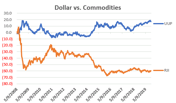
As a proxy for the U.S. Dollar we will use ticker UUP (Invesco DB US Dollar Index Bullish Fund). Figure 1 displays the % gain/loss for UUP (blue line) versus RJI (orange line) since mid-2008.
Figure 1 – UUP versus RJI; Cumulative Return using weekly closing prices; May-2008-Sep-2019
*Since May of 2008 UUP has gained +17.2%
*Since May of 2008 RJI has lost -60%
The correlation in price action between these two ETFs since 2008 is -0.76 (a correlation of -1.00 means they are perfectly inverse), so clearly there is (typically) a high degree of inverse correlation between the U.S. dollar and “commodities”.
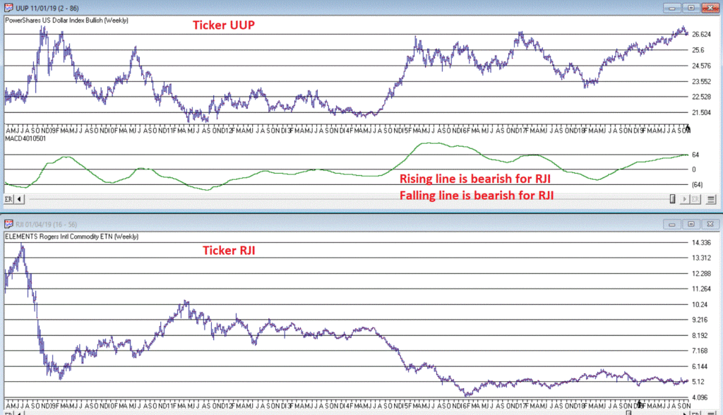
Next, we will apply an indicator that I have dubbed “MACD4010501” (Note to myself: come up with a better name). The calculations for this indicator will appear at the end of the article (but it is basically a 40-period exponential average minus a 105-period exponential average). In Figure 2 we see a weekly chart of ticker UUP with this MACD indicator in the top clip and a weekly chart of ticker RJI in the bottom clip.
Figure 2 – UUP with Jay’s MACD Indicator versus ticker RJI (courtesy WinWayCharts )
Interpretation is simple:
*when the MACD indicator applied to UUP is declining, this is bullish for RJI
*when the MACD indicator applied to UUP is rising, this is bearish for RJI.
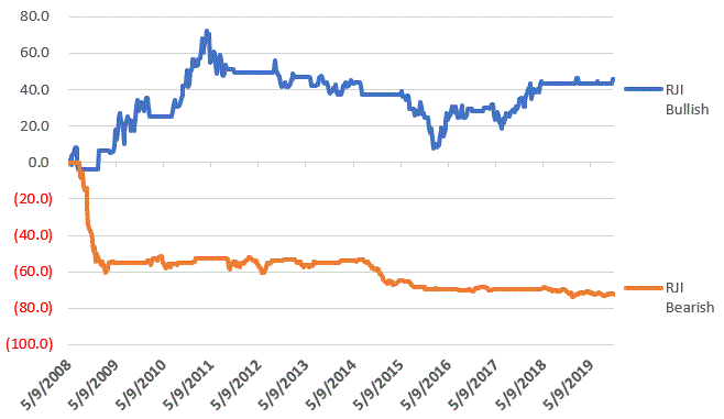
Figure 3 displays the growth of equity achieved by holding RJI (using weekly closing price data) when the UUP MACD Indicator is declining (i.e., RJI is bullish blue line in Figure 3) versus when the UUP MACD Indicator is rising (i.e., RJI is bearish orange line in Figure 3).
Figure 3 – RJI cumulative performance based on whether MACD indicator for ticker UUP is falling (bullish for RJI) of rising (bearish for RJI)
In sum:
*RJI gained +45.8% when the UUP MACD indicator was falling
*RJI lost -72.3% when the UUP MACD indicator was rising
The bottom line is that RJI rarely makes much upside headway when the UUP MACD Indicator is rising (i.e., is bearish for RJI).
Summary
Commodities as an asset class are extremely undervalued on a historical basis compared to stocks. However, the important thing to remember is that “the worm is unlikely to turn” as long as the U.S. Dollar remains strong.
So, keep an eye on the U.S. Dollar for signs of weakness. That will be your sign that the time may be coming for commodities.
FYI: Code for Jay’s MACD4010501 Indicator (WinWayCharts TradingExpert EDS)
The indicator is essentially a 40-period exponential average minus a 105-period exponential average as shown below:
Define ss3 40.
Define L3 105.
ShortMACDMA3 is expavg([Close],ss3)*100.
LongMACDMA3 is expavg([Close],L3)*100.
MACD4010501 is ShortMACDMA3-LongMACDMA3.
Jay Kaeppel
Disclaimer: The information, opinions and ideas expressed herein are for informational and educational purposes only and are based on research conducted and presented solely by the author. The information presented does not represent the views of the author only and does not constitute a complete description of any investment service. In addition, nothing presented herein should be construed as investment advice, as an advertisement or offering of investment advisory services, or as an offer to sell or a solicitation to buy any security. The data presented herein were obtained from various third-party sources. While the data is believed to be reliable, no representation is made as to, and no responsibility, warranty or liability is accepted for the accuracy or completeness of such information. International investments are subject to additional risks such as currency fluctuations, political instability and the potential for illiquid markets. Past performance is no guarantee of future results. There is risk of loss in all trading. Back tested performance does not represent actual performance and should not be interpreted as an indication of such performance. Also, back tested performance results have certain inherent limitations and differs from actual performance because it is achieved with the benefit of hindsight.
As the primary currency recognized around the globe, the U.S. Dollar is pretty important. And the trend of the dollar is pretty important also. While a strong dollar is good in terms of attracting capital to U.S. shores, it makes it more difficult for U.S. firms that export goods. One might argue that a “steady” dollar is generally preferable to a very strong or very weak dollar.
Speaking of the trend of the dollar, a lot of things move inversely to the dollar. In fact, one can typically argue that as long as the dollar is strong, certain “assets” will struggle to make major advances. These include – commodities in general, metals specifically, foreign currencies (obviously) and international bonds (strongly).
Let’s first take a look at the state of the dollar.
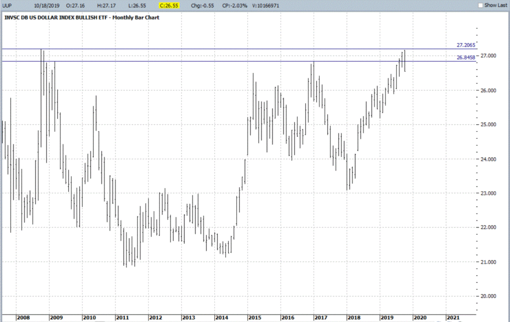
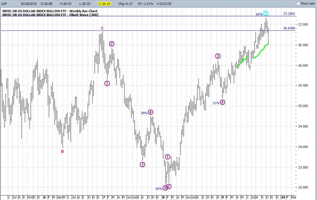
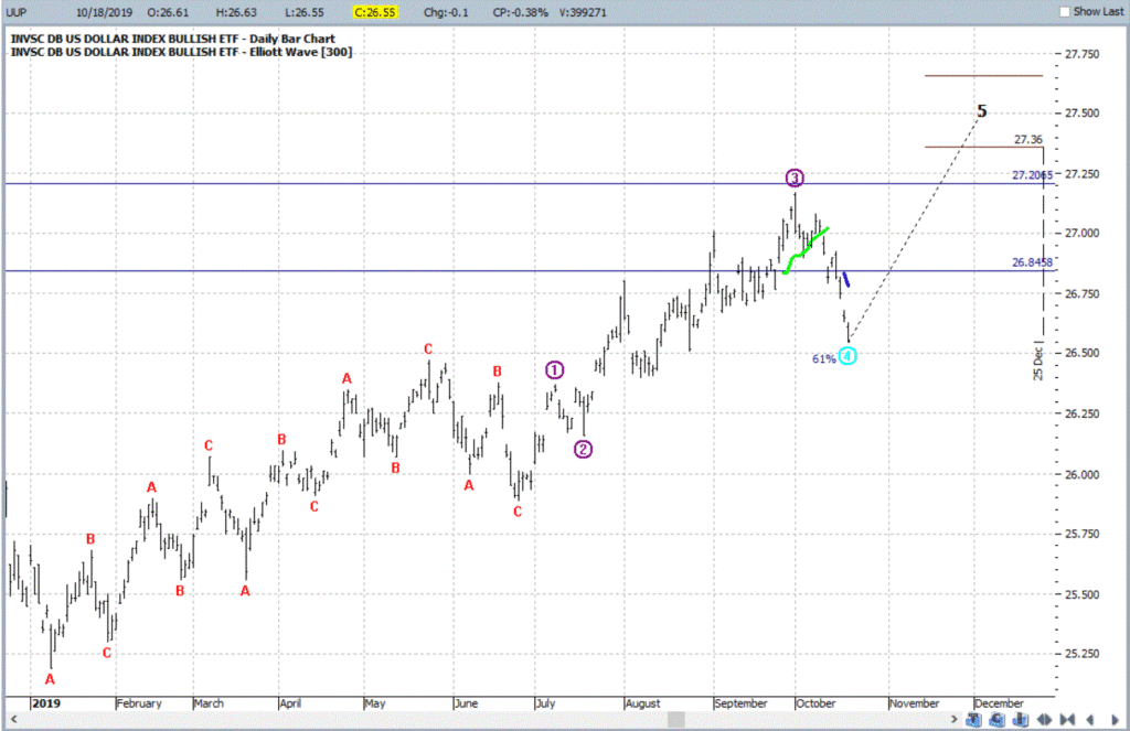
Ticker UUP
For our purposes we will use the ETF ticker UUP ( Invesco DB US Dollar Index Bullish Fund) to track the U.S. Dollar. Figure 1 displays a monthly chart and suggests that UUP just ran into – and reversed at least for now – in a significant zone of resistance.
Which way will things go? It beats me. But I for one will be keeping a close eye on UUP versus the resistance levels highlighted in Figures 1 and 2. So will traders of numerous other securities.
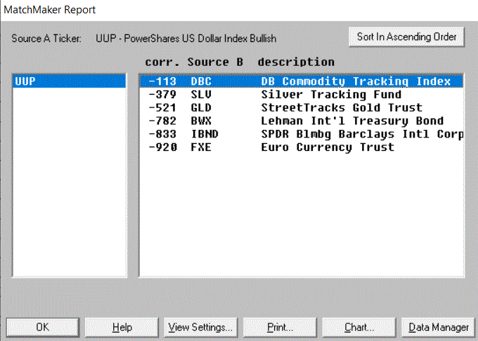
Inverse to the Buck
Figure 4 displays the 4-year weekly correlation for 5 ETFs to ticker UUP (a correlation of 1000 means they trade exactly the same a UUP and a correlation of -1000 means they trade exactly inversely to UUP).
Figure 4 – 4-Year Correlation to ticker UUP (Courtesy WInWayCharts)
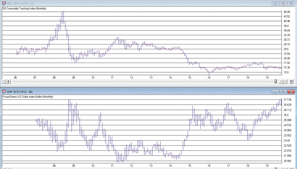
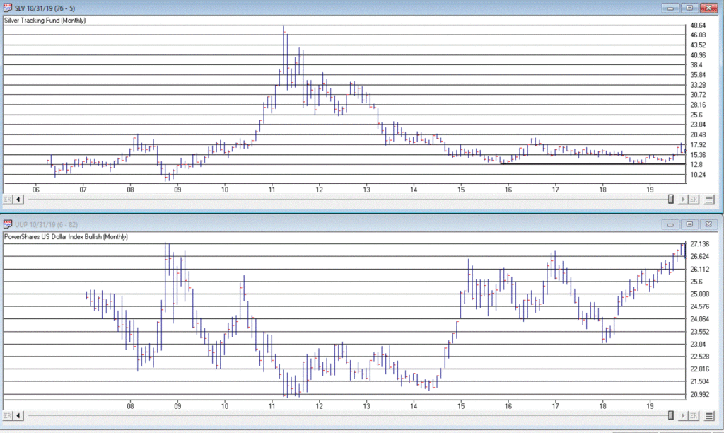
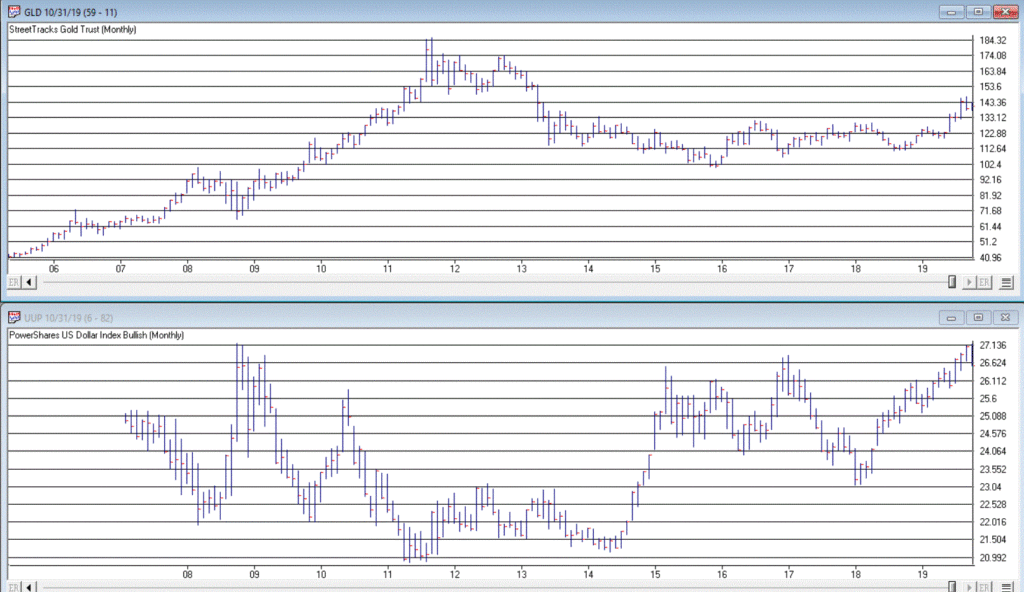
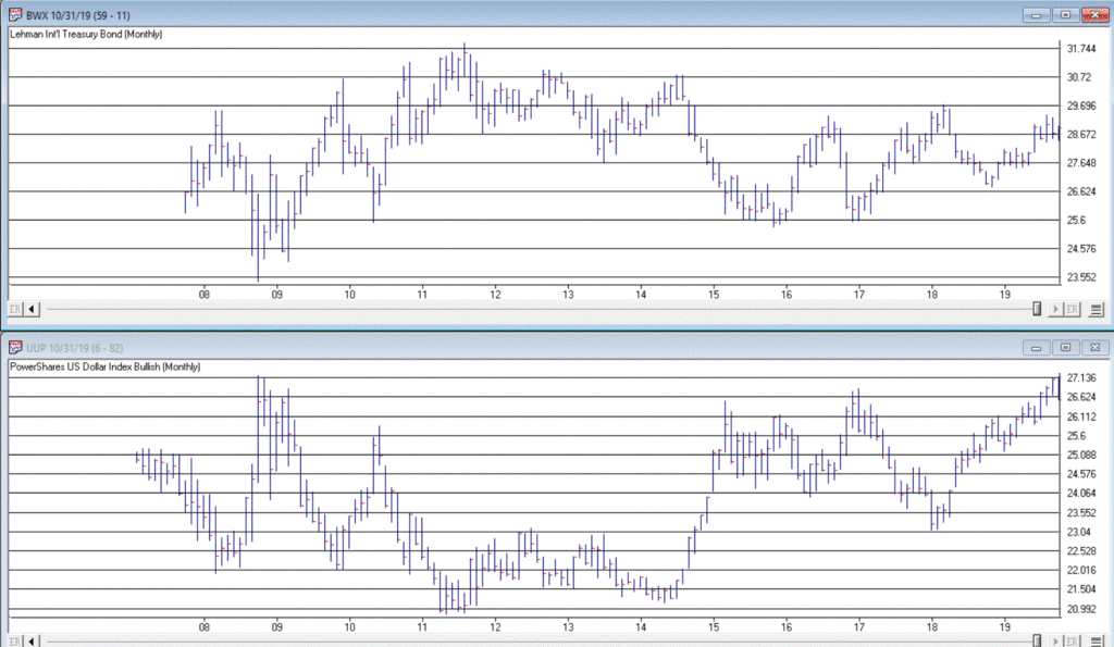
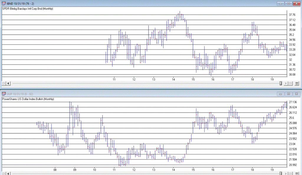
In the following charts, note the inverse relationship between the dollar (UUP on the bottom) and the security in the top chart. When the dollar goes way down they tend to go way up – and vice versa.
Note also that in the last year several of these securities went up at the same time the dollar did. This is a historical anomaly and should not be expected to continue indefinitely.
Figure 5 – Ticker DBC (Invesco DB Commodity Index Tracking Fund) vs. UUP (Courtesy WInWayCharts)
Figure 8 – Ticker BWX (SPDR Bloomberg Barclays International Treasury Bond) vs. UUP (Courtesy WInWayCharts)
Figure 9 – Ticker IBND (SPDR Bloomberg Barclays International Corporate Bond) vs. UUP (Courtesy WInWayCharts)
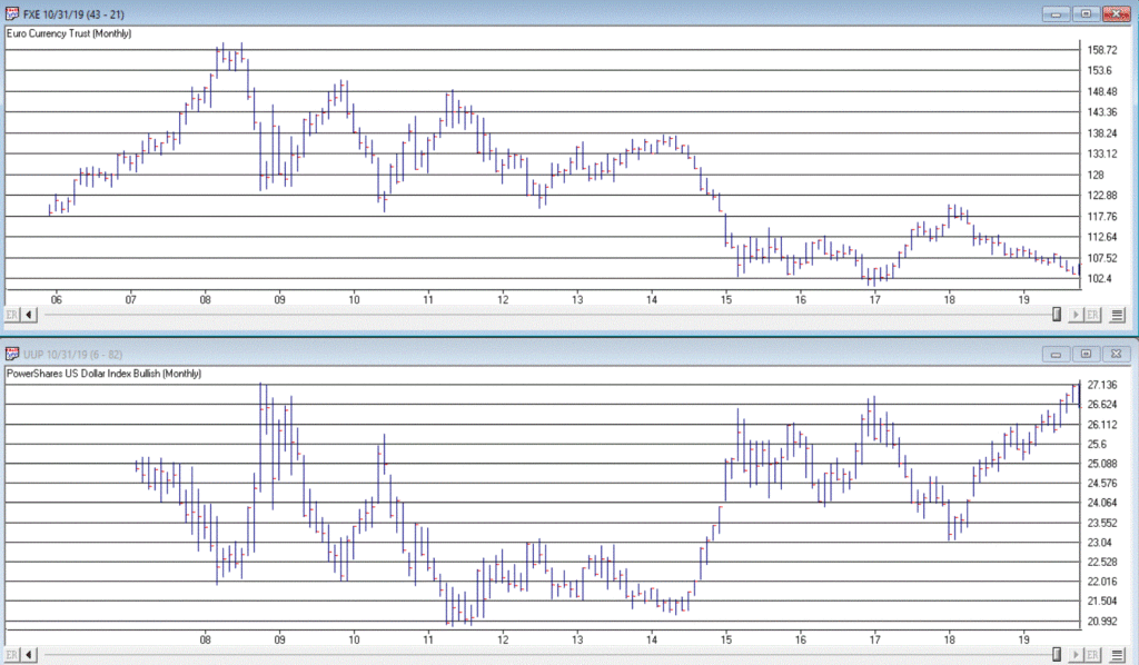
Figure 10 – Ticker FXE (Invesco CurrencyShares Euro Currency Trust) vs UUP (Courtesy WInWayCharts)
Summary
If the dollar fails to break out of it’s recent resistance area and actually begins to decline then commodities, currencies, metals and international stocks and bonds will gain a favorable headwind. How it all actually plays out, however, remains to be seen.
So keep an eye on the buck. Alot is riding on it – whichever way it goes.
Jay Kaeppel
Disclaimer: The data presented herein were obtained from various third-party sources. While I believe the data to be reliable, no representation is made as to, and no responsibility, warranty or liability is accepted for the accuracy or completeness of such information. The information, opinions and ideas expressed herein are for informational and educational purposes only and do not constitute and should not be construed as investment advice, an advertisement or offering of investment advisory services, or an offer to sell or a solicitation to buy any security.
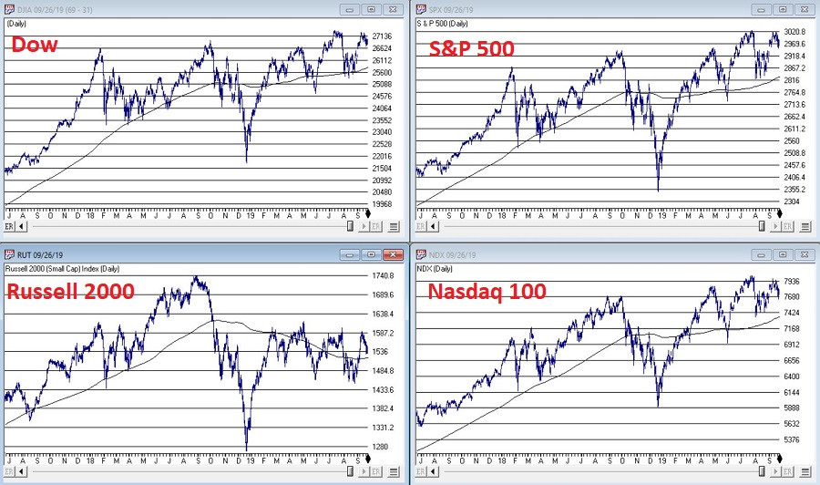
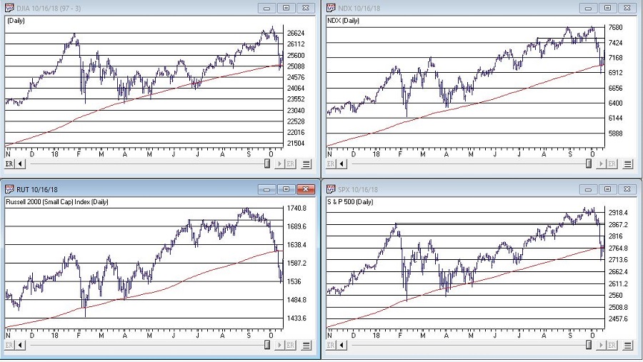
As usual, you can pretty much see whatever you want to see in today’s stock market. Consider the major indexes in Figure 1, displayed along with their respective 200-day moving averages.
If you “want to” be bullish, you can focus on the fact that all 4 of these major indexes are presently above their respective 200-day moving averages. This essentially defines an “uptrend”; hence you can make a bullish argument.
If you want to be “bearish”, you can focus on the “choppy” nature of the market’s performance and the fact that very little headway has been made since the highs in early 2018. This “looks like” a classic “topping pattern” (i.e., a lot of “churning”), hence you can make a bearish argument.
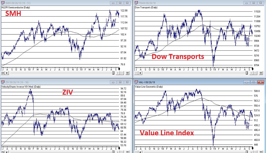
To add more intrigue, consider the 4 “market bellwethers” displayed in Figure 2.
(NOTE: Previously I had Sotheby’s Holdings – ticker BID – as one my bellwethers. As they are being bought out, I have replaced it with the Value Line Arithmetic Index, which has a history of topping and bottoming prior to the major indexes)
The action here is much more mixed and muddled.
*SMH – for any “early warning” sign keep a close eye on the semiconductors. If they breakout to a new high they could lead the overall market higher. If they breakdown from a double top the market will likely be spooked.
*TRAN – The Dow Transports topped out over a year ago and have been flopping around aimlessly in a narrowing range. Not exactly a bullish sign, but deemed OK as long as price holds above the 200-day moving average.
*ZIV – Inverse VIX is presently below it’s 200-day moving average, so this one qualifies as “bearish” at the moment.
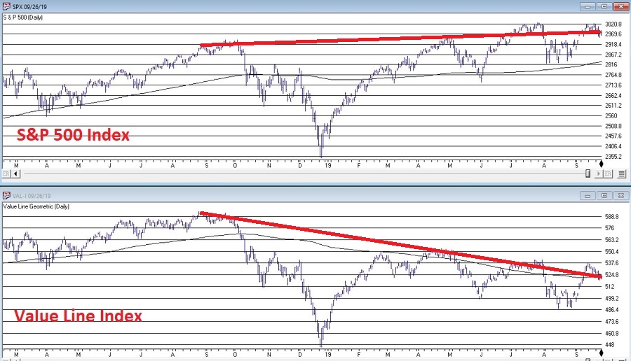
*VAL-I – The Value Line Index is comprised of 1,675 stocks and gives each stock equal weight, so is a good measure of the “overall” market. It presently sits right at its 200-day moving average, however – as you can see in Figure 3 – it is presently telling a different story than the S&P 500 Index.
Figure 3 – S&P 500 trending slightly higher, Value Line unweighted index trending lower (Courtesy WinWayCharts.com)
The Bottom Line
OK, now here is where a skilled market analyst would launch into an argument regarding which side will actually “win”, accompanied by roughly 5 to 50 “compelling charts” that “clearly show” why the analysts’ said opinion was sure to work out correctly. Alas, there is no one here like that.
If the question is, “will the stock market break out to the upside and run to sharply higher new highs or will it break down without breaking out to new highs?”, I sadly must default to my standard answer of, “It beats me.”
Here is what I can tell you though. Instead of relying on “somebody’s opinion or prediction” a much better bet is to formulate and follow an investment plan that spells out:
*What you will (and will not) invest in?
*How much capital you will allocate to each position?
*How much risk you are willing to take with each position?
*What will cause you to exit with a profit?
*What will cause you to exit with a loss?
*Will you have some overarching “trigger” to cause you to reduce overall exposure?
*And so on and so forth
If you have specific answers for the questions above (you DO have specific answers, don’t you?) then the correct thing to do is to go ahead and follow your plan and ignore the myriad prognostications that attempt to sway you one way or the other.
Jay Kaeppel
Disclaimer: The data presented herein were obtained from various third-party sources. While I believe the data to be reliable, no representation is made as to, and no responsibility, warranty or liability is accepted for the accuracy or completeness of such information. The information, opinions and ideas expressed herein are for informational and educational purposes only and do not constitute and should not be construed as investment advice, an advertisement or offering of investment advisory services, or an offer to sell or a solicitation to buy any security.
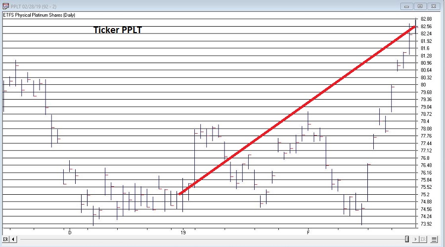
In this article I highlighted the fact that platinum tends to be a consistent performer during the months of January and February combined. 2019 held serve as platinum futures registered their 23rd Jan-Feb gain in the last 24 years. The Platinum ETF (ticker PPLT) registered a two month gain of +9.6%. See Figure 1.
Figure 1 – Ticker PPLT (Courtesy WinWayCharts)
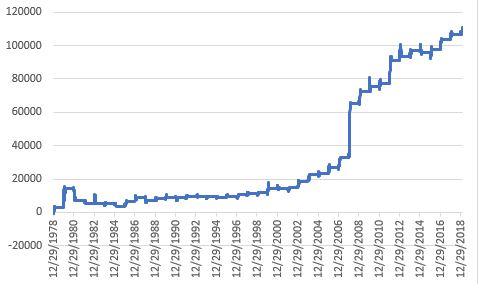
Figure 2 displays the updated hypothetical growth of equity achieved by holding long 1 platinum futures contract during January and February every year starting in 1979.
Figure 2 – Platinum futures $ +(-) during Jan-Feb; 1979-2019
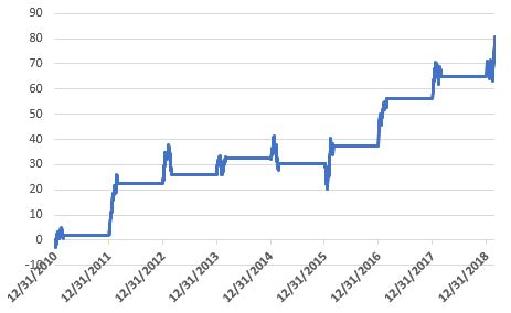
Since most investors will never trade platinum futures, Figure 3 displays the growth of $1,000 invested in ticker PPLT only during Jan and Feb since 2011.
Figure 3 – Cumulative % growth of $1,000 invested in ticker PPLT ONLY during Jan. and Feb.; 2011-2019
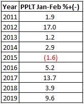
Figure 4 – Yearly % +(-) for PPLT during Jan-Feb
Going Forward
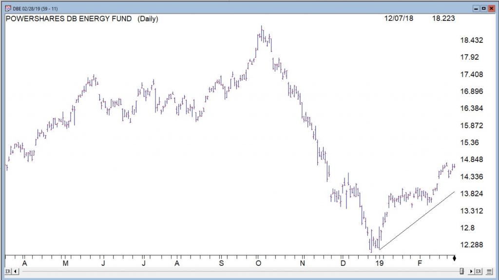
So platinum was great, but what have you done for me lately? For what it is worth, historically two sectors that “should” be doing well in the March-April period are energies and grains (please remember that seasonal trends DO NOT always work every year). As you can see in Figure 5, energies have been rallying since late December (though lots of consternation regarding crude oil remains a constant).
Figure 5 – Ticker DBE (Energies) – so far so good; (Courtesy WinWayCharts)
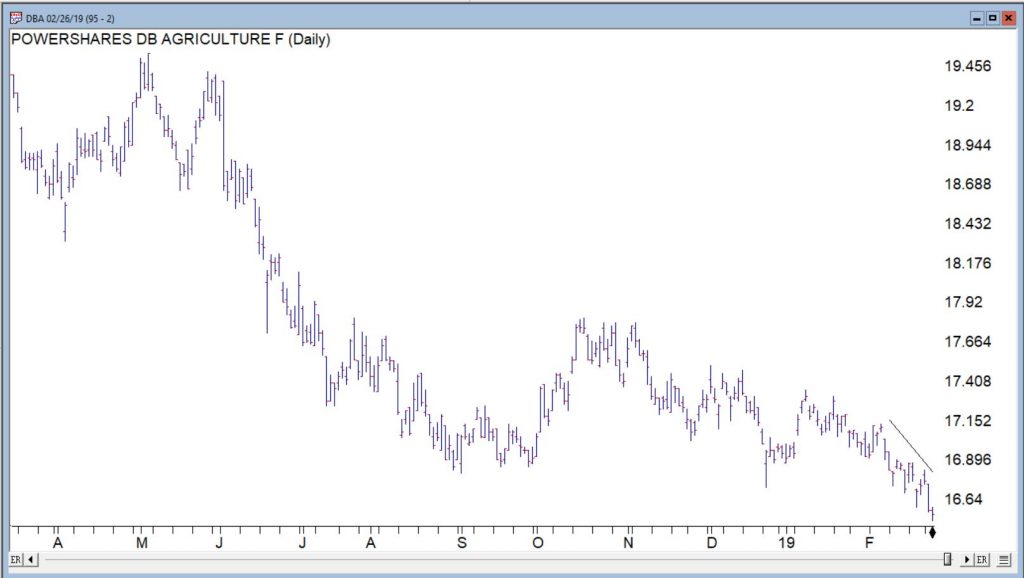
Grains have been a bust so far (their “favorable seasonal period” typically begins in late January-early February – no dice this time around). Where too from here? One of two scenarios: either this is just going to be an off year for grains, or right now will be looked back upon as a buying opportunity. Only time will tell.
Figure 6 – Ticker DBA (Agricultural) – so far NOT so good; (Courtesy WinWayCharts)
And of course, don’t forget that the stock market tends to do pretty well March through May….
Jay Kaeppel
Disclaimer: The data presented herein were obtained from various third-party sources. While I believe the data to be reliable, no representation is made as to, and no responsibility, warranty or liability is accepted for the accuracy or completeness of such information. The information, opinions and ideas expressed herein are for informational and educational purposes only and do not constitute and should not be construed as investment advice, an advertisement or offering of investment advisory services, or an offer to sell or a solicitation to buy any security.
Crude oil and pretty much the entire energy sector has been crushed in recent months. This type of action sometimes causes investors to wonder if a buying opportunity may be forming.
The answer may well be, “Yes, but not just yet.”
Seasonality and Energy
Historically the energy sector shows strength during the February into May period. This is especially true if the November through January period is negative. Let’s take a closer look.
The Test
If Fidelity Select Energy (ticker FSENX) shows a loss during November through January then we will buy and hold FSENX from the end of January through the end of May. The cumulative growth of $1,000 appears in Figure 1 and the yearly results in Figure 2.
Figure 1 – Growth of $1,000 invested in FSENX ONLY during Feb-May ONLY IF Nov-Jan shows a loss
Figure 2 – % + (-) from holding FSENX during Feb-May ONLY IF Nov-Jan shows a loss
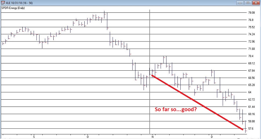
Figure 3 displays ticker XLE (an energy ETF that tracks loosely with FSENX). As you can see, at the moment the Nov-Jan return is down roughly -15%.
All of this suggests remaining patient and not trying to pick a bottom in the fickle energy sector. If, however, the energy sector shows a 3-month loss at the end of January, history suggests a buying opportunity may then be at end.
Summary
Paraphrasing here – “Patience, ah, people, patience”.
Jay Kaeppel
Disclaimer: The data presented herein were obtained from various third-party sources. While I believe the data to be reliable, no representation is made as to, and no responsibility, warranty or liability is accepted for the accuracy or completeness of such information. The information, opinions and ideas expressed herein are for informational and educational purposes only and do not constitute and should not be construed as investment advice, an advertisement or offering of investment advisory services, or an offer to sell or a solicitation to buy any security.
So, the big question on every investor’s mind is “What Comes Next?” Since this is not an advisory service (and given the fact that I am not too good at predicting the future anyway) I have avoided commenting on “the state of the markets” lately. That being said, I do have a few “thoughts”:
*The major averages (as of this exact moment) are still mostly above their longer-term moving averages (200-day, 10-month, 40-week, and so on and so forth). So, on a trend-following basis the trend is still “up”.
*We are in the most favorable 15 months of the 48-month election cycle (though off to a pretty awful start obviously) which beings Oct.1 of the mid-term year and ends Dec. 31st of the pre-election year.
*Investors should be prepared for some volatility as bottoms following sharp drops usually take at least a little while to form and typically are choppy affairs. One day the market is up big and everyone breathes a sigh of relief and then the next day the market tanks. And so on and so forth.
An Indicator to Watch
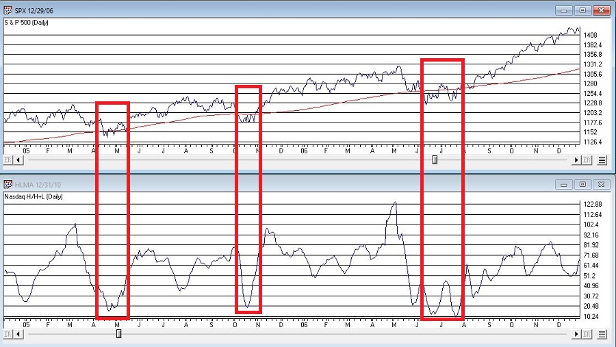
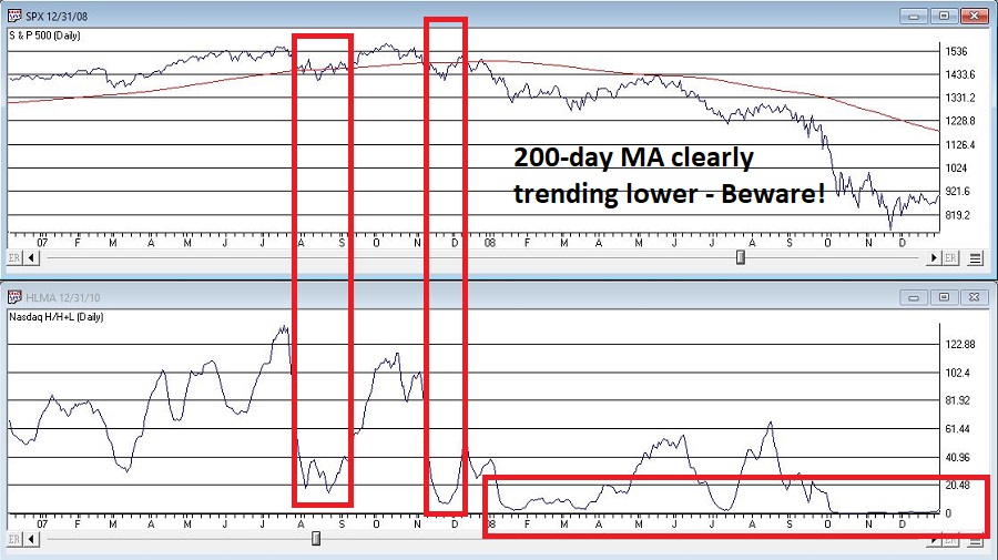
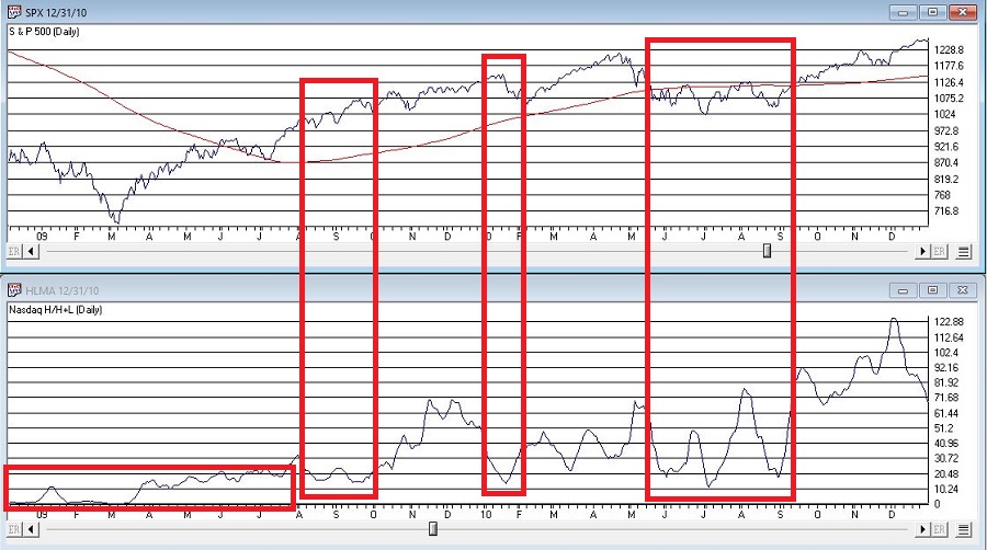
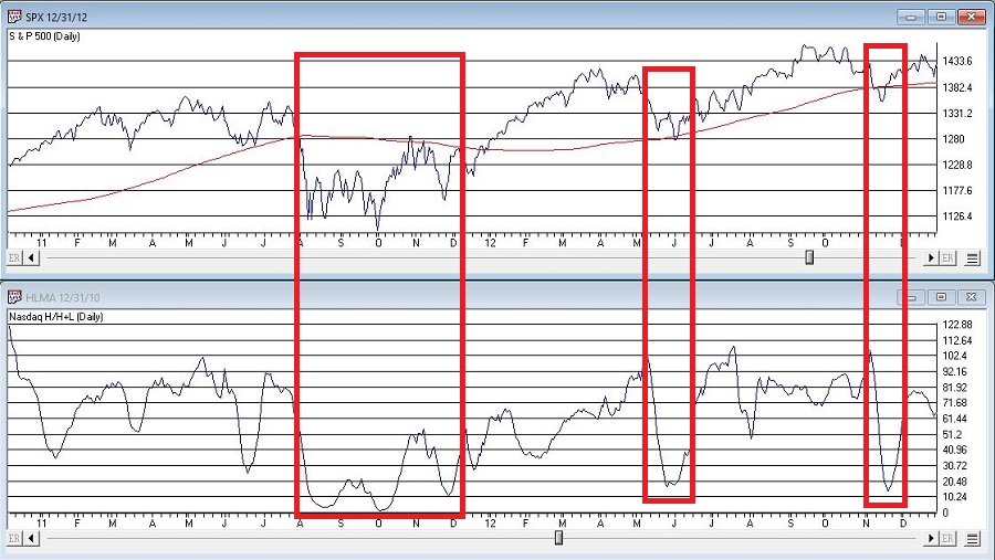
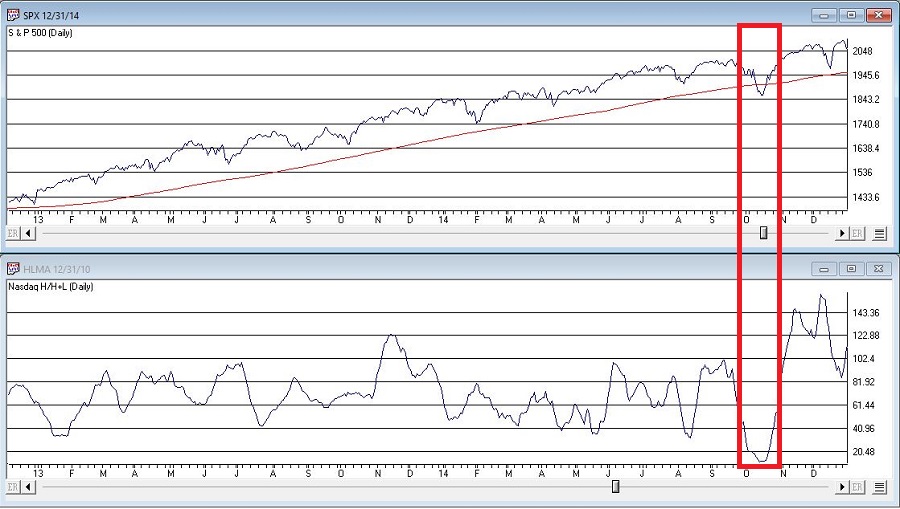
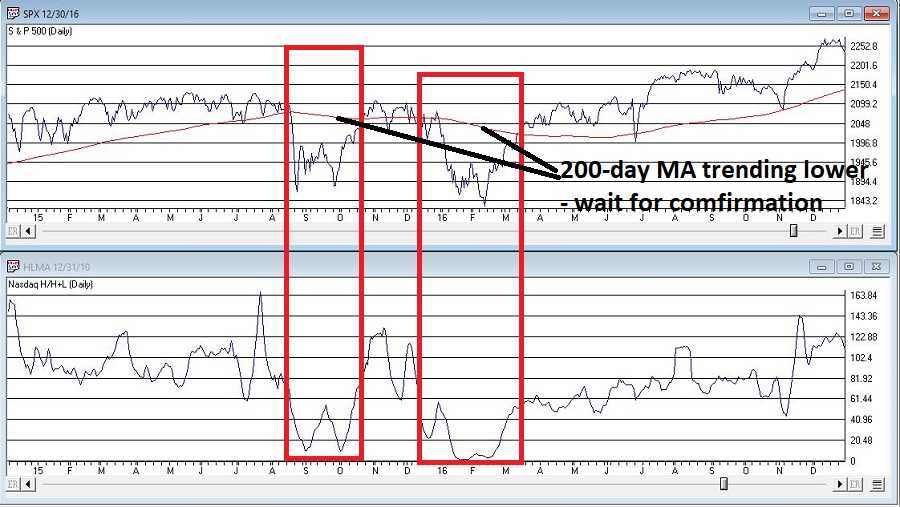
At the outset let me state that there are no “magical” indicators. Still, there are some that typically are pretty useful. One that I follow I refer to as Nasdaq HiLoMA. It works as follows:
A = Nasdaq daily new highs
B = Nasdaq daily new lows
C = (A / (A+B)) * 100
D = 10-day moving average of C
C can range from 0% to 100%. D is simply a 10-day average of C.
Nasdaq HiLoMA = D
Interpretation: When Nasdaq HiLoMA drops below 20 the market is “oversold”.
Note that the sentence above says “the market is oversold” and NOT “BUY NOW AGGRESSIVELY WITH EVERY PENNY YOU HAVE.” This is an important distinction because – like most indicators – while this one may often give useful signals, it will occasionally give a completely false signal (i.e., the market will continue to decline significantly).
A couple of “finer points”:
*Look for the indicator to bottom out before considering it to be “bullish”.
*A rise back above 20 is often a sign that the decline is over (but, importantly, not always). Sometimes there may be another retest of recent lows and sometimes a bear market just re-exerts itself)
*If the 200-day moving average for the Dow or S&P 500 is currently trending lower be careful about using these signals. Signals are typically more useful if the 200-day moving average for these indexes is rising or at least drifting sideways rather than clearly trending lower (ala 2008).
Figures 2 through 8 displays the S&P 500 Index with the Nasdaq HiLoMA indicator. Click to enlarge any chart.
The stock market is in a favorable seasonal period and is oversold. As long as the former remains true, react accordingly (with proper risk controls in place of course).
Jay Kaeppel
Disclaimer: The data presented herein were obtained from various third-party sources. While I believe the data to be reliable, no representation is made as to, and no responsibility, warranty or liability is accepted for the accuracy or completeness of such information. The information, opinions and ideas expressed herein are for informational and educational purposes only and do not constitute and should not be construed as investment advice, an advertisement or offering of investment advisory services, or an offer to sell or a solicitation to buy any security.