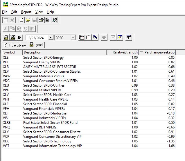
WinWayCharts pre-built Relative Strength report offers a valuable tool for those seeking to capitalize on sector rotation. By shifting the focus to ETFS and cloning the report as closely as possible in the AIQ Expert Design Studio, we gain the ability to apply additional screening criteria. This adds a layer of flexibility, that can achieve significant market outperformance. . Through WinWayCharts Expert Design Studio (EDS) program, users gain the freedom to create their personalized screening techniques.
The approach we aim for is to utilize an EDS model that seeks out high relative strength. To refresh your memory, the short-term Relative Strength report considers the last 120 trading days, divides this period into quarters, and then calculates the average percent change for each quarter with a heavier weight on the most recent quarter. Here’s the EDS code:
RelativeStrength is 0.4Period1+ 0.2Period2 + 0.2Period3 +0.2Period4.
Description is Description().
RSvalue5daysback is valresult(RelativeStrength,5).
Perchangeweekago is ((RelativeStrength – RSvalue5daysback)/RSvalue5daysback)*100.
! change is Perchangeweekago.
good if 1.
Using this code, an EDS report can be generated to rank ETF sectors from strongest to weakest. While investing in high relative strength sectors can be effective, some individuals might feel uneasy about buying when prices are already high. Often, they regret not entering the market earlier upon seeing a high RS sector.
For those preferring to enter a trend earlier, we can integrate a new screening into our EDS report. We’ve discovered that monitoring the weekly change in RS ranking is valuable for determining whether a sector is gaining or losing momentum.
Relative Strength serves as the primary screening metric, where the objective is to hold positions that appear at the top of the report. Instead of purchasing assets immediately when they top the report, some traders may opt to utilize the Change column to identify sectors with the strongest upward momentum. By selecting sectors with the highest Change numbers, you are essentially investing in sectors exhibiting robust momentum in relative strength.
Traders can easily sort sectors by the Change column by clicking on its title. The benefit of entering sectors with a high Change score is the potential for earlier trend entry. However, the drawback is the possibility of false signals—instances where a trend fails to materialize, causing the sector to stagnate in the relative strength ranking.
Investing in high relative strength sectors or sectors with improving relative strength figures presents a solid strategy for entering industry sectors. These approaches can be combined to create a more dynamic strategy. With the combination strategy, the goal is to identify sectors with both high Relative Strength readings and positive Change readings, indicating strength and ongoing improvement.
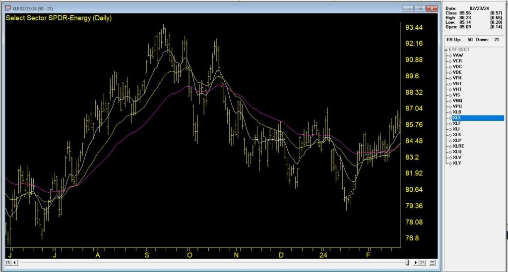
In this Chart, we see the top % change ETF from 2/23/24. The recent trend is up and it’s accelerated in the last week.
By employing the combination strategy, the focus typically narrows down to selections at or near the top of the Relative Strength column with positive Change readings. This dual approach ensures a focus on strong sectors and becoming even stronger, optimizing the potential for successful investments.
The EDS file mentioned in this article is available to download click here
Download and save this file to your /wintes32/ EDS Strategies folder.
The Sector ETF list is available to download click here
Download and save this file to your /wintes32/ folder.
Making the Most of Your WinWayCharts – An hour-long session with UK Director Ray Foreman covering the power features in your WinWayCharts platform – great for new clients and those getting started.
FREE Zoom webinar
March 27, 2024,
Getting Started Right with WinWayCharts and
Walk Forward Testing a Trading Strategy
Making the Most of Your WinWayCharts – An hour-long session with UK Director Ray Foreman covering the power features in your WinWayCharts platform – great for new clients and those getting started.
Walk Forward Testing a Trading Strategy – Steve Hill, Founder of WinWayCharts will use two strategies both of which have 3 indicator confirmations, and run them through the WinWay Portfolio simulator to test their effectiveness using real-life walk-forward testing.
Getting Started Right with WinWayCharts and
What Works What Doesn’t – Indicator Confirmations for Trading
Making the Most of Your WinWayCharts – An hour-long session with UK Director Ray Foreman covering the power features in your WinWayCharts platform – great for new clients and those getting started.
Walk Forward Testing a Trading Strategy – Steve Hill, Founder of WinWayCharts will use two strategies both of which have 3 indicator confirmations, and run them through the WinWay Portfolio simulator to test their effectiveness using real-life walk-forward testing.
Getting Started Right with WinWayCharts and What Works What Doesn’t – Indicator Confirmations for Trading
Making the Most of Your WinWayCharts – An hour-long session with UK Director Ray Foreman covering the power features in your WinWayCharts platform – great for new clients and those getting started.
An hour-long session with Steve Hill, founder of Winwaycharts. In this session, Steve Hill will take us through some of the indicators which work and which don’t, and how to combine multiple indicators for trading confirmation.
In this video I’ve covered the last 6 months of up and down Market ratings generated by the Artificial Intelligence system in our TradingExpert Pro analysis platform.
You might also be interested in:
Learn key Technical Skills Essential to Trading Success
6 Video Series – nearly 4 hours of in-depth materials
Includes Seminar Notes in PDF on all sessions except Live Trading
+ BONUS eBook Mind Over Markets
6 in-depth videos
Video 1 – Darren’s Indicators
(56 Minutes).
Case Studies Of Some Of Darren’s Favourite Indicators Focusing On How Each Can Be Used As A Part Of Your Overall Stock Selection Strategy. Stoch12 WinWay, RSi WInWay And MACD WinWay Will Be Covered.
Video 2 – Sector Rotation Overview
(18 Minutes).
The Concept Of Market Sector Rotation Is Widely Accepted. Certain Segments Of The Market Are In Favour During Bull, Bear Market Topping, And Market Bottoming Phases.
Video 3 – Leverage Sector Rotation
(52 Minutes).
We’ll Use WinWayCharts Sector Tools Both To Help Determine Market Direction And To Make Stock Trading Decisions.
Video 4 – Mind Over Markets
(33 Minutes).
In This Session, We’ll Give You The Checklist Of Must-Do’s Required To Trade Successfully And Show You How To Avoid The Pitfalls Of An Undisciplined Trader.
Video 5 – Finding Long And Short ETFs
(18 Minutes).
Using Various Tools And Scans In WinWayCharts You’ll Learn How To Find ETFs In Different Market Segments Both Long And Short. There Are ETFs For Each Sector Of The Market And For Markets Themselves. These Are Often Available On The Long And Short Side Of The Market Or Segment. Less Risky Than Stocks And Yet Still Providing Good Liquidity They Are The Darlings Of The Stock Market.
Session 6 – Live Analysis And Trading
(56 Minutes).
WinWayCharts Putting It All Together This Was a Live Analysis Session Looking For Trading Candidates, Confirming Our Selections With Darren’s Indicators, And Placing Trades And Stops In A Real Trading Account.
As we reflect on the incredible journey of the past 17 years, we’re excited to share a milestone with you. It all began when Darren commissioned the creation of the WinWayCharts TradingExpert Pro trading analysis suite, and since then, we’ve been dedicated to enhancing your trading journey.
We’re thrilled to announce the official release of the new WinWayCharts TradingExpert Pro End-of-day version 2.55! After an extensive testing period with our dedicated testers, we’re confident this upgrade will elevate your trading experience.
Some of you who recently joined us may already have the new version, so no need to download the upgrade again. For others, this is an opportunity to embrace the latest enhancements.
Key Features of TradingExpert Pro 2.55:
Introducing the new Heiken Ashi charting feature
For detailed insights and a step-by-step demonstration, check out the upgrade page on our website
And the best part? This upgrade is entirely FREE of charge!
We’re committed to providing you with tools that not only enhance your client experience but also equip you for success in trading. Here’s to a year of prosperity and successful trading ahead!
The importable EDS file based on John Ehlers’ article in the March 2023 issue of Stocks & Commodities, “Every Little Bit Helps,” can be obtained on request via rdencpa@gmail.com. John notes ‘It’s simple but makes a noticeable improvement: You can reduce noise in the data by using an average of the open and close instead of using only the closing price.’ The code is also available below.
!Every Little Bit Helps
!Author: John F. Ehlers, TASC Mar 2023
!Coded by: Richard Denning, 1/12/2023
!Data Sampling Test
!(c) John Ehlers 2022
!INPUTS:
W1 is 14. !Wilder RSI length
W2 is 14. !Ehlers RSI length
!RSI Wilder code:
U is [close]-val([close],1).
D is val([close],1)-[close].
L1 is 2 * W1 – 1.
AvgU is ExpAvg(iff(U>0,U,0),L1).
AvgD is ExpAvg(iff(D>=0,D,0),L1).
RSIwilder is 100-(100/(1+(AvgU/AvgD))).
!Ehlers RSI code:
OCavg is ([open] + [close])/2.
Uoc is OCavg-valresult(OCavg,1).
Doc is valresult(OCavg,1)-OCavg.
L2 is 2 * W2 – 1.
AvgU2 is ExpAvg(iff(Uoc>0,Uoc,0),L2).
AvgD2 is ExpAvg(iff(Doc>=0,Doc,0),L2).
RSIoc is 100-(100/(1+(AvgU2/AvgD2))).
!CTest is RSIwilder.
!OCTest is RSIoc.
BuyRSIwilder if RSIwilder < 20 and valrule(RSIwilder >= 20,1).
ExitRSIwilder if RSIwilder > 80 or {Position days}>=20.
BuyRSIoc if RSIoc < 20 and valrule(RSIoc >= 20,1).
ExitRSIoc if RSIoc > 80 or {Position days}>=20.
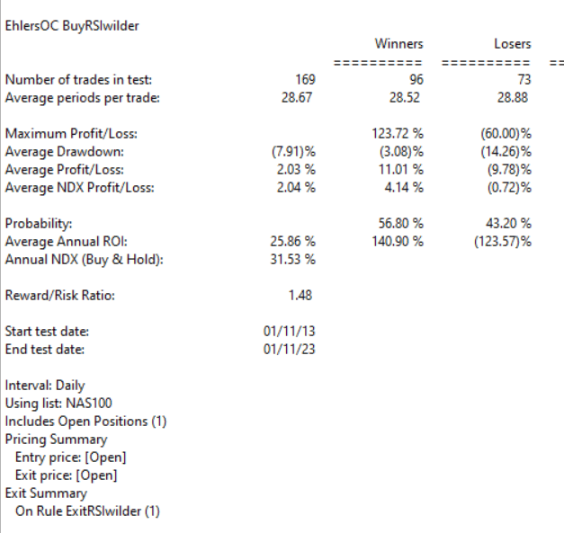
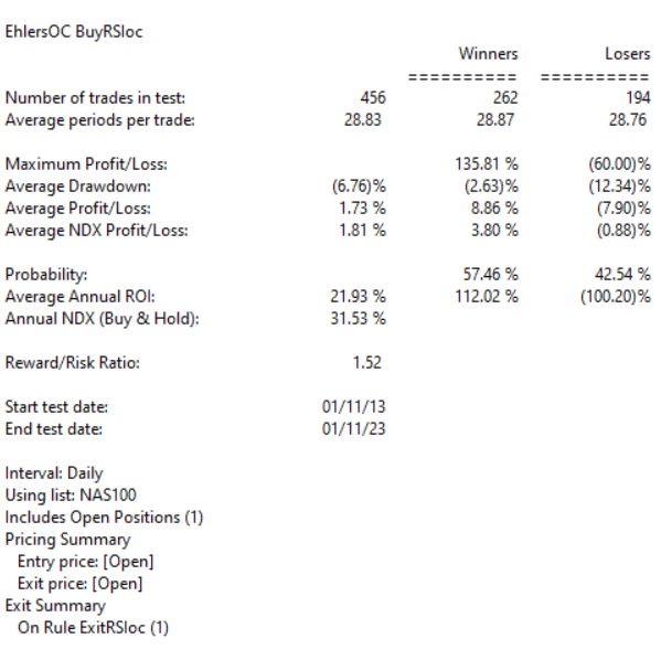
Code for the author’s indicators are set up in the EDS code file. Figure 7 shows the EDS module backtest results using the RSI original indicator. Figure 8 shows the EDS module backtest results using the modified version of the RSI indicator over a 10-year period using NASDAQ 100 stocks. The comparison suggests that some of the metrics improve using the modified version and a few are worse.
The system rules are:
Buy when the RSI crosses down below 20
Sell when the RSI crosses above 80 or after 20 trading days
FIGURE 7: AIQ. This shows example backtest results for classic RSI trading system rules, based on closing data, over a 10-year period using NASDAQ 100 stocks.FIGURE 8: AIQ. This shows example backtest results for the RSI trading system rules, this time based on data that averages the open and close instead of using just the closing price data, over a 10-year period using NASDAQ 100 stocks.
The importable EDS file based on Scott Cong’s article in the May 2023 issue of Stocks & Commodities magazine, “An Adaptive Moving Average For Swing Trading,” can be obtained on request via rdencpa@gmail.com.
In this article, Scott proposes a new adaptive moving average (AMA). It adjusts its parameters automatically according to the volatility of market, tracking price closely in trending movement, and staying flat in congestion areas. The new AMA is well-suited for swing trading.
The code is also available below.
Code for the author’s indicator as shown below is set up in the downloadable EDS code file.
!ADAPTIVE MOVING AVERAGE FOR SWING TRADING
!Author: Scott Cong, TASC May 2023
!Coded by: Richard Denning, 03/14/2023
!INPUTS:
Len is 20.
!CODING ABREVIATIONS:
H is [high].
L is [low].
C is [close].
C1 is val([close],1).
TR is Max(H-L,max(abs(C1-L),abs(C1-H))).
Effort is sum(TR,Len).
Result is highresult(H,Len) – lowresult(L,Len).
alpha is Result / Effort.
beta is 1 – alpha.
DaysInto is ReportDate() – RuleDate().
Stop if DaysInto > Len*2.
stopAMA is iff(stop,C, AMA).
AMA is alpha * [close] + beta * valresult( stopAMA, 1).
ESA is expavg(C,Len).
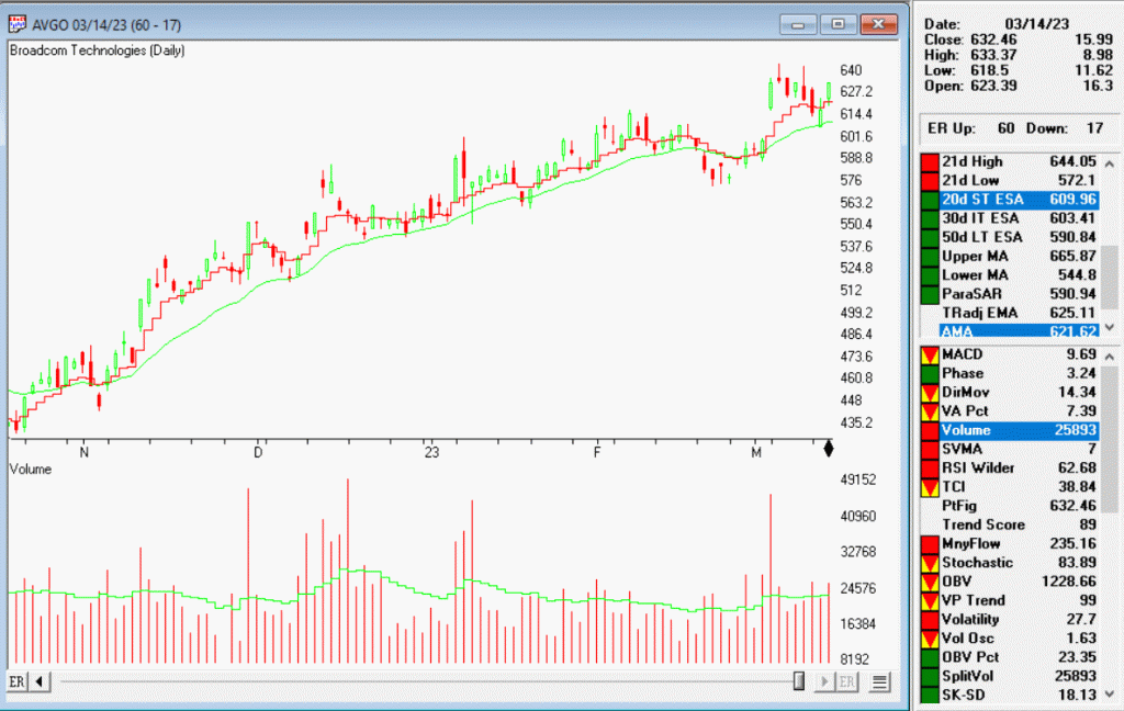
The figure below shows a chart of Broadcom (AVGO) along with the AMA[20] indicator (the red jagged line) and an exponential moving average indicator [20] (the green smooth line).
If you missed this April 27, 2023 Zoom event, don’t worry, the recording is now available from the link at the end of this post. (FYI it expires on May 10th).
In this 2-hour session, Ray Foreman, UK Director of WinWayCharts covered
Getting Started Right with WinWayCharts – Making the Most of Your WinWayCharts – An hour-long session with UK Director Ray Foreman covering the power features in your WinWayCharts platform – great for new clients and those getting started.
In the second half Steve Hill, founder of WinWayChartss built a list of ETFs to trade just about everything and ran it through analytical tools.
Steve also created data files and list files for the ETFS. These are zipped and available below
ETF data files are here – unzip to your /wintes32/tdata folder. Then go to Data Manager, Utilities, Rebuild Master Ticker List.
ETF List files are here – unzip these files to your /wintes32 folder.
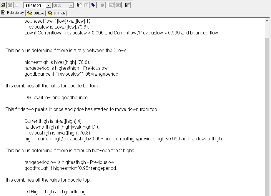
Thank you for your continued support of WinWayCharts services. Recently we have been working on an EDS scan to find double tops and bottoms. We’d like to share with you the progress and how to add this to your WinWayCharts. This is the code used in the scan (you don’t need to know the code but it’s there for your information).
There’s always room for improvement, but you can get a hold of this scan. This file is available for download from here
This may save to a download folder on your system. We suggest you move it to the path C:/wintes32/EDS strategies/Chart Pattern Strategies folder.
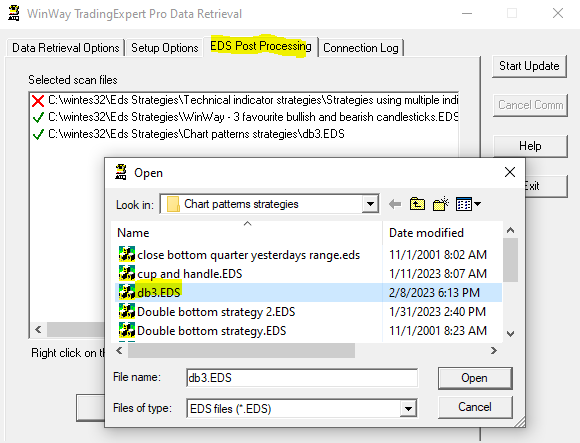
To run this strategy automatically after your nightly download of data
– Open Data Retrieval, and select the EDS Post Processing tab.
– Select add, and in the Open, Look in C:/wintes32/EDS strategies/Chart Pattern Strategies folder for db3.EDS
– Select Open and the strategy will run every night for you.
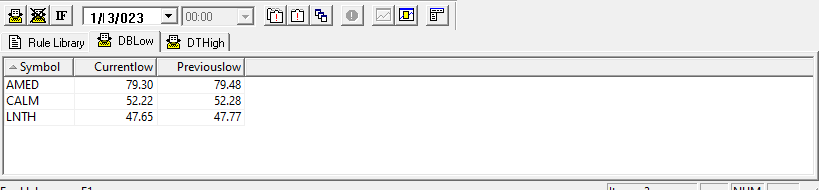
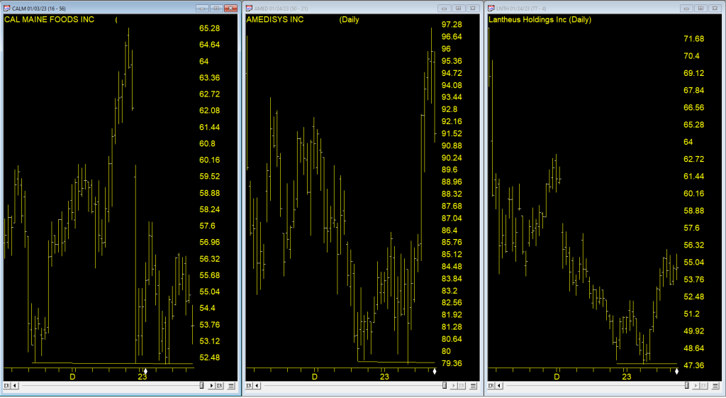
Here’s the results on the Sp1500 run on 1/3/2023
While not perfect, we hope this scan will be of use to you in your trading process.


 If you missed this April 27, 2023 Zoom event, don’t worry, the recording is now available from the link at the end of this post. (FYI it expires on May 10th).