The WinWay EDS code based on Vitali Apirine’s June 2015 article in S&C, “The Slow Volume Strength Index,” is provided for download from the following website:
www.TradersEdgeSystems.com/traderstips.htm
rsiLen is 2 * wilderLen – 1.
AvgU is expavg(pDif,rsiLen).
AvgD is expavg(nDif,rsiLen).
svsi is 100-(100/(1+(AvgU/AvgD))). !PLOT
The code provided for the slow volume strength index (SVSI) may be plotted as an indicator, as shown in Figure 6.
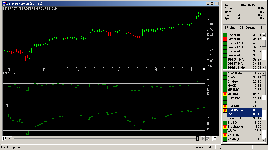
—Richard Denning
info@TradersEdgeSystems.com
for AIQ Systems
Nov 26, 2014 | Uncategorized
It is not a little known fact that historically the action of the stock market has been relatively favorable both around holidays and towards the end of the year. But some question remains as to just how favorable things have been during these periods and how often. So let’s address it.
The Year-End (or “Santa Claus”) Rally
Different analysts will look at historical data and draw different conclusions. This is actually a good thing, otherwise everyone would be trying to buy or sell at the same time.
But in the opinion one analyst (“Hi, my name is Jay”) the “year-end rally” period (or as I like to call it the “Santa Claus Rally”):
*Starts on the Monday before Thanksgiving
*Ends at the close of the third trading day of the following January
Have I mentioned lately that this stuff doesn’t need to be rocket science?
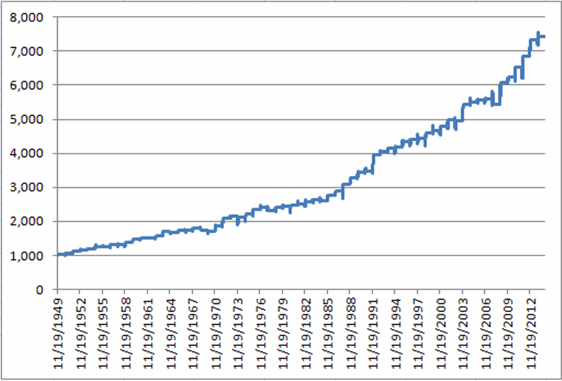
So how has this period performed? We will start our test at the close of trading on Saturday (yes, Saturday) November 19, 1949 and examine what would have happened to a hypothetical $1,000 investment in the Dow Jones Industrials Average that was in the market only during the bullish year-end period described above (in other words, the trader would buy the Dow Industrials Average at the close on the last trading day prior to the Monday before Thanksgiving and would hold through the close of the third trading day of the following January. The rest of the time the “system” is out of the market. For our purposes, no interest is earned so as to reflect only the gains made during the bullish year-end period).
The results appear in chart form in Figure 1.
Figure 1 – Growth of $1,000 invested in the Dow Industrial Average only during the bullish year-end period described in text
Figure 2 displays the annual year-by-year results in table form.
|
Exit Date
|
% +(-)
|
|
1/5/50
|
3.6
|
|
1/4/51
|
4.0
|
|
1/4/52
|
3.9
|
|
1/6/53
|
4.6
|
|
1/6/54
|
2.9
|
|
1/5/55
|
5.1
|
|
1/5/56
|
0.2
|
|
1/4/57
|
3.7
|
|
1/6/58
|
(0.0)
|
|
1/6/59
|
5.7
|
|
1/6/60
|
5.8
|
|
1/5/61
|
3.2
|
|
1/4/62
|
(1.0)
|
|
1/4/63
|
5.0
|
|
1/6/64
|
8.2
|
|
1/6/65
|
(1.2)
|
|
1/5/66
|
3.0
|
|
1/5/67
|
(0.5)
|
|
1/4/68
|
4.3
|
|
1/6/69
|
(3.1)
|
|
1/6/70
|
(2.4)
|
|
1/6/71
|
10.0
|
|
1/5/72
|
11.6
|
|
1/4/73
|
3.4
|
|
1/4/74
|
(1.2)
|
|
1/6/75
|
3.6
|
|
1/6/76
|
6.0
|
|
1/5/77
|
3.1
|
|
1/5/78
|
(3.7)
|
|
1/4/79
|
3.6
|
|
1/4/80
|
1.6
|
|
1/6/81
|
1.5
|
|
1/6/82
|
0.9
|
|
1/5/83
|
2.3
|
|
1/5/84
|
2.5
|
|
1/4/85
|
(0.3)
|
|
1/6/86
|
5.7
|
|
1/6/87
|
4.3
|
|
1/6/88
|
6.5
|
|
1/5/89
|
6.2
|
|
1/4/90
|
5.4
|
|
1/4/91
|
0.6
|
|
1/6/92
|
13.9
|
|
1/6/93
|
2.4
|
|
1/5/94
|
2.8
|
|
1/5/95
|
0.9
|
|
1/4/96
|
3.7
|
|
1/6/97
|
1.5
|
|
1/6/98
|
0.3
|
|
1/6/99
|
4.2
|
|
1/5/00
|
1.1
|
|
1/4/01
|
2.7
|
|
1/4/02
|
4.0
|
|
1/6/03
|
(0.4)
|
|
1/6/04
|
9.5
|
|
1/5/05
|
1.3
|
|
1/5/06
|
1.1
|
|
1/5/07
|
0.4
|
|
1/4/08
|
(2.9)
|
|
1/6/09
|
12.0
|
|
1/6/10
|
2.5
|
|
1/5/11
|
4.6
|
|
1/5/12
|
5.3
|
|
1/4/13
|
6.7
|
|
1/6/14
|
1.6
|
Figure 2 – Year-by-Year “Santa Claus Rally” % +(-)
A few performance notes:
# times UP = 54 (83% of the time)
# times DOWN = 11 (17% of the time)
Average% +(-) = +3.19%
Median % +(-) = +3.08%
Largest % Gain = +13.87% (1991-92)
Largest % Loss = (-3.69%) (1977-78)
It is also worth noting that the year-end rally period has witnessed a gain for the Dow in 27 of the last 29 years and 33 of the last 36 years.
Summary
So do the results displayed in Figures 1 and 2 guarantee that the stock market is destined to rally in the near future? Ah there’s the rub. For the answer is “not necessarily”. Still, investing is in many ways a game of odds and probabilities. While one always needs to be prepared to act defensively if things start to go south, history suggests that traders and investors might do well to give the bullish case the benefit of the doubt between Thanksgiving Week and early January 2015.
Or to put it more succinctly:
Jay’s Trading Maxim #215: Santa Claus is real (approximately 83% of the time).
Jay Kaeppel
Chief Market Analyst at JayOnTheMarkets.com and AIQ TradingExpert Pro (http://www.aiq.com) client
http://jayonthemarkets.com/
Jay has published four books on futures, option and stock trading. He was Head Trader for a CTA from 1995 through 2003. As a computer programmer, he co-developed trading software that was voted “Best Option Trading System” six consecutive years by readers of Technical Analysis of Stocks and Commodities magazine. A featured speaker and instructor at live and on-line trading seminars, he has authored over 30 articles in Technical Analysis of Stocks and Commodities magazine, Active Trader magazine, Futures & Options magazine and on-line at www.Investopedia.com.

Nov 26, 2014 | Uncategorized
this is dynamite
Holiday Sale up to 75% off selected Books, DVDs and Courses
New Money-Making Trading Systems: Advanced Results from 6 Simple, Proven Strategies
One of the more important questions that traders face periodically is to determine when a stock or a market is reversing.
Over the past 20 years, Steve Palmquist has done just that – backtested countless market adaptive trading techniques. In this brand-new, six-hour DVD course, Steve reveals the results of his tests on Bollinger bands, declining volume pullbacks and retracements, as well as volume accumulation and distribution to bring you six proven trading strategies.
Each system was developed, tested, and analyzed for maximum profits
Steve will provide you with complete rules and exit strategies that have been back tested in various market conditions and time frames. Steve will also show you how to analyze the current market conditions and select the trading strategy that will make you the most money in a bear, bull, or trading range market. As Steve guides you through his six proven strategies, you will learn:
- How to use time stops, price targets, and money management techniques to improve results,
- Specific techniques for selecting among multiple trading candidates based on extensive testing and analysis, and
- To understand market behavior and to position yourself to profit from different market characteristics.
Don’t make costly mistakes by following the latest trading system blindly. Let Steve’s experience and expertise work for you. In this DVD course, he will not only provide you with six new powerful trading strategies, but he will show you exactly how to use each one to maximize profits.
Six-hour DVD course
List Price: $995.00
Our Price: $795.00
NOW $89
11/26 thru 12/5 while supplies last
“Someone has finally determined which candlesticks are the most effective”
Proven Candlestick Patterns
By: Steve Palmquist
Currently one of the the most widely used chart types, candles have the potential to be an effective tool for extracting profits from the market. But with all of the information out now about candles, how can you tell which ones work and which don’t? After testing every known candlestick pattern, Steve Palmquist has determined which candlesticks are the most effective and gives you extensive data and techniques for how to best incorporate them into your trading strategy. Palmquist’s extensive back testing has revealed :
- How effective popular candlestick patterns such as Bullish Engulfing, Bearish Engulfing, Hammers, Hanging Man, Evening Star, and Morning Star really are.
- Actual data on these popular candlestick patterns in different market environments to confirm when they are most effective at predicting winning trades.
- Which of the three major market environments to successfully use specific candlestick patterns — and which environments to avoid.
- How to use the massive information collected to truly confirm various candle patterns and eliminate the guess work.Steve Palmquist’s new 90-minute course arms you with what you need to know about candlestick patterns and shows you the candlesticks you should be using and which ones you should avoid. Don’t spend years collecting this powerful information and definitely don’t let another day go by without using the proven power of these candlestick patterns!
Our Price: $89.00
NOW $49
11/26 thru 12/5 while supplies last
|
Nov 11, 2014 | Uncategorized
As I mentioned last time around, when it comes to analyzing the financial markets, I am a proud graduate of “The School of Whatever Works”. In my youth I “wrote down” a lot of interesting analysis ideas (that’s how we did it back then, sadly).
Whenever I would hear or read of a new market analysis or market timing idea, rather than passing judgment one way or the other based solely on my own “youthful wisdom” (har, good one), I would agnostically write it down and “track it for awhile”. OK, “quantitative” is not a word that most “youths” get around to using until, well, whatever it is that comes after youth (which I believe most people refer to as “Mid-20’s and broke”, or alternatively, “Our parents have stopped feeding us, now what?” But I digress).
At lunch time I would take a break from my job in “Personnel” (which coincidentally is where I came to realize that I “hate people” and that I was going to have to do something that involved numbers instead) and go to the local library and peruse the available market newsletters, advisory services, etc. Anyway, I had quite the appetite for “market analysis” so I “wrote down” a lot of “stuff.”
Long story short, if I had a $1 for every idea/method I wrote down that did not stand the test of time, well, let’s just say I wouldn’t need to worry about analyzing the financial markets anymore. But I guess that shouldn’t really come as a surprise. What surprises me more is some of the ideas that I would likely have considered “arcane” (had I actually used that word in my youth) that actually did end up standing the test of time (at least so far). One of those is something I refer to as the “40-week cycle.“
Now I am certain that I personally did not “invent” the 40-week cycle. I must have read about it somewhere (OK, original thinking isn’t my strong suit, is that a crime?),written it down and followed it. But sadly, I don’t remember exactly when or where or from whom I first got the idea. But whoever you are, if by some strange twist of fate you are reading this article, let me just say “Thanks.”
The 40-Week Cycle
For the record there is the “Raw theory 40-week cycle” and the “Raw theory 40-week cycle with a stop-loss provision added because you know how that pesky stock market loves to crater even the best theories every once in a while” version (which I considered as the title for my next book but my editor emphatically said “No!” Guess the price of ink must be up these days).
The Rules are pretty simple:
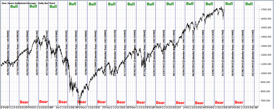
*Starting at the close on 4/21/1967, the first 140 calendar days (20 weeks times 7 days) is considered the “Bullish Phase”
*The second 140 calendar days is considered the “Bearish Phase”
*During the Bullish Phase, if the Dow Jones Industrials Average losses 12.5% or more from its closing level at the end of the previous “Bearish Phase”, sell and remain in cash until the start of the next Bullish Phase.
Figure 1 displays this cycle going back a few years.
Figure 1 – Dow Industrials with 40-Week Cycle dates (Courtesy: ProfitSource by HUBB)
There are three critical things to know about the raw 40-week cycle:
1) The stock market DOES NOT always go UP during each bullish phase.
2) The stock market DOES NOT always go DOWN during each bearish phase (in fact, for the record, the “Bearish Phase” has seen the Dow advance more often than it declined. But when it does decline, it “really declines” – see Figure 3 below).
3) No one should rely on the 40-week cycle as their sole method of market analysis (even at the peak of “Youthful Wisdom”)
With those caveats in mind, let’s look at why it still may be useful to keep an eye on this cycle as a “weight of the evidence” tool.
The Results
For measuring results during the “bullish” phase:
Buy the Dow at the close on the last day of the previous Bearish cycle.
Sell if either:
a) The Dow declines 12.5% or more on a closing basis from the buy price, or;
b) 140 calendar days go by if a) is not triggered
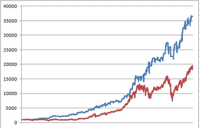
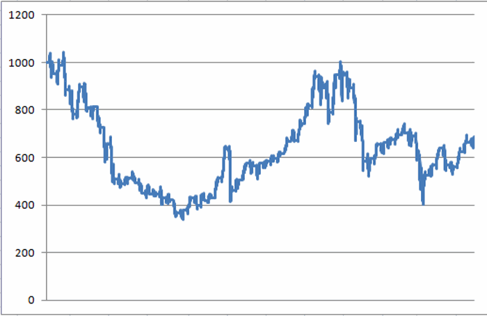
For our purposes, we will assume that interest is earned at a rate of 1% per year while out of the stock market. Starting on 4/21/67, $1,000 invested using the rules above would be worth $36,483 as of 10/31/14, as shown in Figure 2.
Figure 2 – Growth of $1,000 using 40-Week Bullish Phase Rules (blue line) versus Buy and Hold (red line)
On the flip side, had an investor skipped all of the “bullish” days and invested only during the “bearish” days (including after the 12.5% stop was hit), he or she would have done, ahem, worse. The growth of $1,000 invested only during the “non bullish” days appears in Figure 3.
Figure 3 – Growth of $1,000 invested only during “Non Bullish” 40-Week Bullish days
To be succinct:
*$1,000 invested only during the “Bullish” days grew to $36,483 (+3,548%)
*$1,000 invested only during the “Non Bullish” days shrank to $688 (-31%)
Summary
The latest bullish phase started at the close of trading on 10/31/2014 (and extends through 3/20/15). This nicely coincides with the “Bullish Six Months” period originally espoused by Yale Hirsch which (according to my own rules) extends from the close of trading on October 31st each year through the third trading day of the following May. So does this combination of bullish seasonal factors guarantee us that “Happy Day are Here Again?”
Sadly, no. Murphy and his d$%^ Law stand ever vigilant against complacent investors. But if history is a guide (and “sometimes” it is) we might continue to give the bullish case the benefit of the doubt.
Well, at least for another 139 days.
Jay Kaeppel
Chief Market Analyst at JayOnTheMarkets.com and AIQ TradingExpert Pro (http://www.aiq.com) client
http://jayonthemarkets.com/
Jay has published four books on futures, option and stock trading. He was Head Trader for a CTA from 1995 through 2003. As a computer programmer, he co-developed trading software that was voted “Best Option Trading System” six consecutive years by readers of Technical Analysis of Stocks and Commodities magazine. A featured speaker and instructor at live and on-line trading seminars, he has authored over 30 articles in Technical Analysis of Stocks and Commodities magazine, Active Trader magazine, Futures & Options magazine and on-line at www.Investopedia.com.
Nov 6, 2014 | Uncategorized
The AIQ code and EDS file based on Charlotte Hudgin’s article in the September 2014 Stocks & Commodities issue, “Finding The Golden Triangle,” is provided at www.TradersEdgeSystems.com/traderstips.htm, and is shown below.
I created an indicator I named the clear value indicator (“ClearValueSum” and “ClearValueAvg”) that might be used to rank signals. The “ClearValueSum” indicator sums the daily percentages that the close is above the simple moving average (SMA). The summing starts at the last cross up and goes to the current bar. If the close is below the SMA, then the value of the indicator is zero.
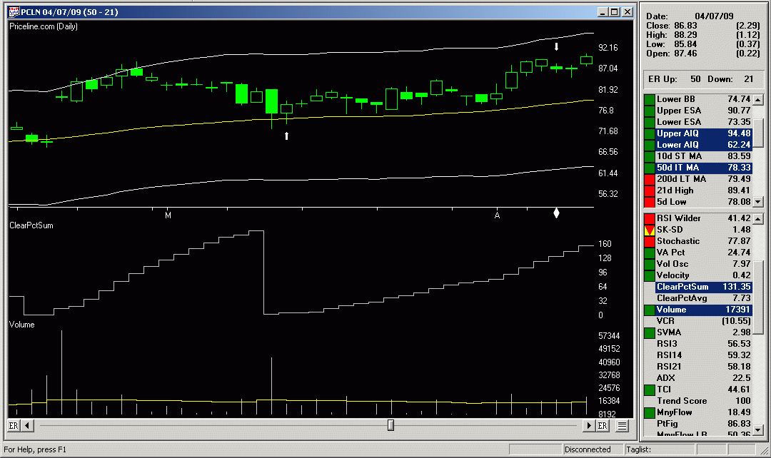
In Figure 7, I show a chart of Priceline (PCLN) with the ClearVauleSum indicator in the subgraph. In addition, I provide the code for the golden triangle setup and confirmation.
The author did not discuss exits, so I provided one based on a cross under the SMA or an exit after a maximum-bars-to-hold input (“maxBarsToHold”).
FIGURE 7: AIQ, sample trade. Here is a chart of Priceline (PCLN) with the ClearValueSum indicator and a sample trade marked with white up and down arrows.
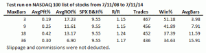
FIGURE 8: AIQ, SAMPLE PERFORMANCE RESULTS. Here are the EDS summary results compared with varying the maxBarsToHold input trading the NASDAQ 100 list of stocks over the last six years.
I ran a short optimization on the “maxBarsToHold” input, the results of which are shown in the table in Figure 8. Most of the metrics are best at the 18-bar setting. In Figure 7, I also show a sample trade from the system from 2009 with the 18-bar setting.
!FINDING THE GOLDEN TRIANGLE
!Author: Charlotte Hudgin, TASC Sept 2014
!Coded by: Richard Denning 7/10/2014
!www.TradersEdgeSystems.com

!INPUTS:
 smaLen is 50.        !moving average length
 periods is 252.      !Total look back period
 strength is 4.       !Number of bars on each side of pivot
 maxBarsToHold is 18. !max bars to hold position

!VARIABLES:
 C is [close].
 L is [low].
 V is [volume].
 OTD is offsettodate(month(),day(),year()).

!CLEAR VALUE INDICATOR:
 SMA is simpleavg(C,smaLen).
 Xup if C>SMA and (valrule(C<=SMA,1) or countof(L=1).
 XupDte is scanany(Xup,periods).
 XupOS is scanany(Xup,periods) then OTD.
 ClearPct is (C/SMA -1) * 100.
 ClearPctSum is iff(C>SMA,sum(ClearPct,^XupOS),0).
 ClearPctAvg is iff(C>SMA and ^XupOS>1,simpleavg(ClearPct,^XupOS),iff(ClearPct>0,ClearPct,0)).

!CODE TO FIND PIVOTS:
 LowR is LoVal([low],(2*strength)+1).
 LowM is Val([low],strength).
 LS if LowR = LowM.
 HighR is HiVal([high],(2*strength)+1).
 HighM is Val([high],strength).
 HS if  HighR = HighM.

   !FIND FIRST PIVOT LOW
      LT1 is scanany(LS,periods) then OTD .
       LO1 is ^LT1 + Strength.
     LO1dte is SetDate(LO1).
 LowLO1 is val([low],^LO1).

   !FIND FIRST PIVOT HIGH
      HT1 is scanany(HS,periods,0) then OTD .
       HO1 is ^HT1 + Strength.
 HO1dte is SetDate(HO1).
 HighHO1 is val([high],HO1).

!SYSTEM CODE:
 Xdn if [low]=SMA,1).
 XdnDte is scanany(Xdn,periods).
 XdnOS is scanany(Xdn,periods) then OTD.

 ShowValues if C > 5.
 HHVpivot if HighHO1 = hival([high],smaLen) and C > 5.
 Setup if Xdn and HHVpivot.
 PriceCnf if C>SMA.
 SetupOS is scanany(Setup,periods) then OTD.
 PriceCnfOS is scanany(PriceCnf,periods) then OTD.
 AvgV is simpleavg(V,smaLen).
 VolumeCnf if ^SetupOS<15 and="" ricecnfos="" setupos="" v="">avgV and V=highresult(V,^PriceCnfOS).

    !BUY & EXIT RULES (LONG ONLY):
 Buy if VolumeCnf and countof(Setup,15)=1 and countof(PriceCnf,15)>=1
  and countof(C>SMA,SetupOS+1)=SetupOS+1.
 Exit if C=maxBarsToHold.
Oct 30, 2014 | Uncategorized
Typically, I don’t like to rain on other people’s parades – you know, karma being what it is and all. And when it comes to analyzing the financial markets and trading, I am a proud graduate of “The School of Whatever Works.” So if someone tells me that the key to their success comes from analyzing the ratio between the VIX Index and the price of arugula, I say “more power to ‘em.” (OK, this is a made up example. Please DO NOT email me and ask me if I have back data for the price of arugula. I do not. At least not that I am aware of. Maybe I do. I should look. Wait, no!).
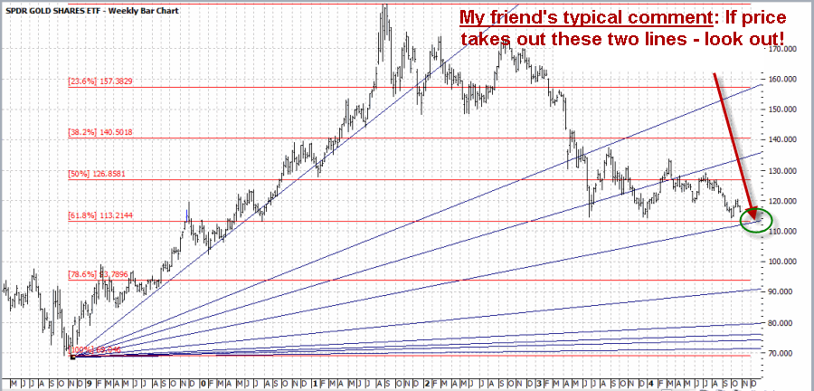
So anyway, what follows is not meant to denigrate anybody else’s analysis. But one thing that has always bugged me is when people arbitrarily draw all kinds of things on a price bar chart and then say “Aha!” One notorious example is a guy I used to know who was a big believer in Gann and Fibonacci (not that there is anything wrong with that). So if we were to talk (assuming we were still talking) about the gold market he might send me a chart that sort of resembles the one that appears in Figure 1. This is a weekly bar chart for ticker GLD – an ETF that tracks the price of gold bullion – with a Gann fan and Fibonacci Retracement lines drawn.
Figure 1 – Ticker GLD with a Gann Fan and Fibonacci Retracements (Courtesy: ProfitSource by HUBB)
As you can see in Figure 1 there is in fact a point where the 61.8% “Fib line” (as we “professional market analysts” like to refer to them) will intersect with the, well, one of the Gann Fan lines. Is this actually significant in any way? [Insert your answer here]. But I would likely respond to him by saying something constructive like, “Interesting analysis. Hey what about the other 50 lines you’ve drawn on this chart?” To which he would likely respond by saying something equally constructive like “$%^ you.” (You kind of get the idea why we don’t talk much anymore).
For the record please note that at no time did I denigrate his analysis (well, maybe in a sneaky, snarky sort of way – sorry, it’s just my nature). But if it works for him, that’s great. But seriously, what about the other 50 lines? And please remember that for the sake of clarity I did not include the 4 to 6 “key” moving averages that he would normally include on a typical bar chart. Anyway, in the end it seems like an appropriate time to invoke:
Jay’s Trading Maxim #102: If you draw enough lines on a bar chart, price will eventually touch one. This may or may not signify diddly squat.
or the addendum:
Jay’s Trading Maxim #102a: The market may not care that you’ve drawn a particular line on a particular chart. Just saying.
So with this in mind, let’s turn to the price of gold and Elliott Wave Analysis.
Gold and the Elliott Wave
I always feel compelled to point out that I am not now, nor have I ever been a true “Elliotthead.” But I know enough traders whom I respect who are serious users of Elliott Wave analysis that I do try to pay attention. So let’s take a look at a recent example, in this case using the ticker GLD.
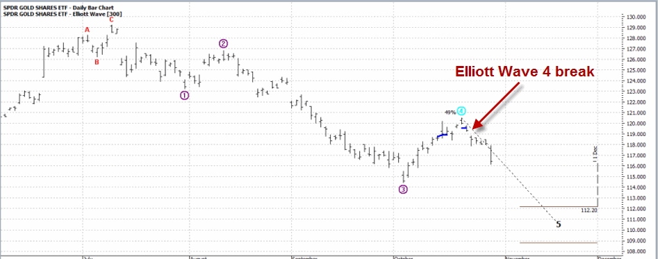
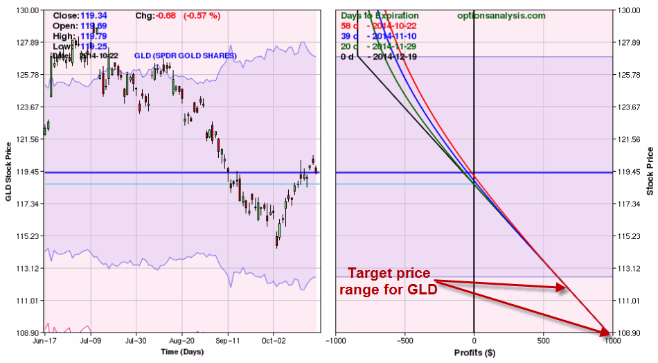
The biggest problem I always had with Elliott Wave is figure out when one wave is – um, waving goodbye and another wave is about to crest. So I rely on ProfitSouce from HUBB to do the work for me. In Figure 2 you see a bar chart for ticker GLD with ProfitSource’s version of the latest Elliott Wave count drawn. As you can see in Figure 2, the indicated wave count just crossed down into a bearish Wave 5 (although most of the people I know who follow Elliott Wave refer to this as a “Wave 4 Sell”. Go figure).
Figure 2 – GLD and Elliott Wave w/Wave 4 Sell signal (Courtesy: ProfitSource by HUBB)
So let’s assume that a person wanted to play the short sort of gold based on this one signal (for now we will ignore the question of whether or not this is wise). One avenue would be to sell short 100 shares of GLD at $119.34. This transaction would involve putting up margin money of roughly $6,000 and assuming unlimited risk to the upside (Remember that if you sell short shares of GLD and gold decides for some reason to open $20 higher tomorrow your stop-loss to buy back your short GLD shares at $125 is not necessarily going to limit your risk).
My preferred play would be to use put options on ticker GLD. Of course, with options there is always “more than one way to play.” So let’s look at two.
Strategy #1: The “I Want to be Short Gold” Strategy (Buy a Deep-in-the-Money Put)
The objective with this strategy is to get as close to point-for-point movement with the underlying security (i.e., shares of GLD) as possible, at a fraction of the cost. In this example, the trade in Figures 3 and 4 involves buying the December 127 put at $8.40.
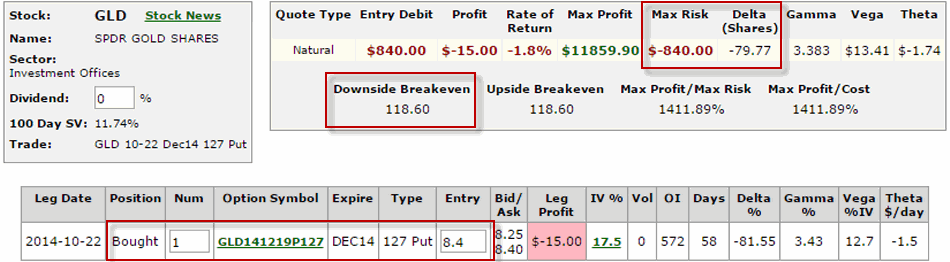
This trade costs $840 – which represents the maximum risk on the trade and has a delta of -79.77. This means that this trade will act roughly the same as if you had sold short 80 shares of ticker GLD (which would entail putting up margin money of roughly $4,800 and the assumption of unlimited risk.
If GLD falls to the upper price target range indicated in Figure 2 (112.20) this trade will generate a profit of roughly $700. As this is written, GLD has fallen from 119.34 to 115.76 a share and the December 127 put is up from $8.40 to $11.40 (+36%).
Strategy #2: The “I’m Willing to Risk a Couple of Bucks in Case the Bottom Drops Out of Gold” Strategy (buy an OTM Put Butterfly)
This strategy is for people who are willing to speculate and risk a few dollars here in there in hopes of a big payoff. Now that phraseology probably turns a few people off, but risking a few bucks in hopes of a big payoff is essentially the definition of intelligent speculation.
So for this I turn to www.OptionsAnalysis.com which helpfully has an OTM Butterfly Finder routine built in.
This trade involves:
Buying 1 December 118 put
Selling 2 December 108 puts
Buying 1 December 98 put
The cost of this trade is only $170.
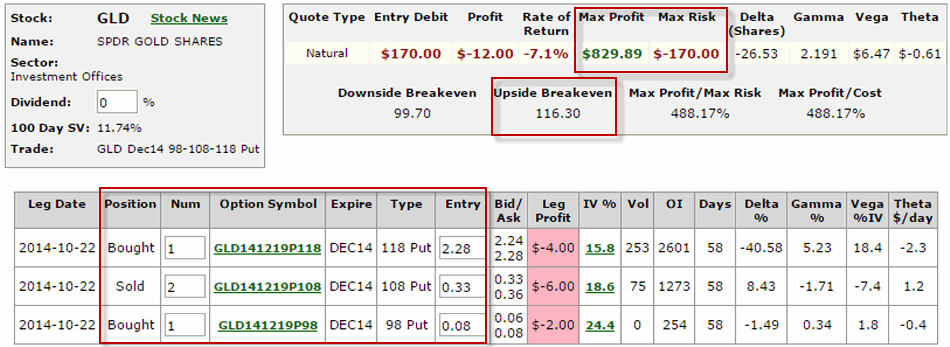
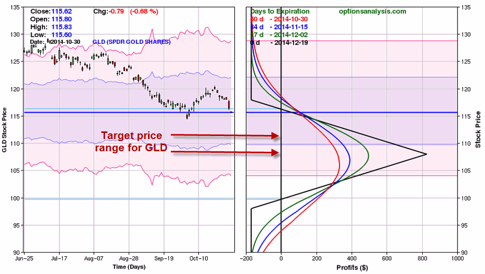
As you can see, if GLD does fall into the price range projected by the Elliott Wave count shown in Figure 2, this trade can make anywhere from $250 to $700 or more based on $170 of risk.
As I write, GLD is trading at $115.76 and this open position shows a profit of $94 (+55%).
Summary
There sure are a lot of ways to analyze and play the financial markets. As a proud graduate of “The School of Whatever Works” (our school motto is “Whatever!”) I am not here to tell you what tools you should use (nor how many lines you should draw on a bar chart) or what type of trading strategies you should use to act on any particular trading strategies. My only purpose in this blog is to provide food for thought. Speaking of blogs, on a sidenote, I’m officially revamping my website. You can click here to get an idea of what kind of theme I will be laying out. I decided my blogs could do with a change.
Whether or not a single particular Elliott Wave count constitutes a valid trading signal is up to each trader to decide. But whatever the indicator, once a signal to play the short side is given, more choices arise. In this example, three choices are to:
1) Sell short shares of GLD (putting up margin money and assuming significant risk),
2) Buy an in-the-money put option to track the price of GLD without as much cost and with limited risk
3) Risk less than $200 to gain exposure to the downside in GLD
Food for thought. Feel free to “chew on that” for awhile.
Jay Kaeppel
Chief Market Analyst at JayOnTheMarkets.com and AIQ TradingExpert Pro (http://www.aiq.com) client
http://jayonthemarkets.com/
Jay has published four books on futures, option and stock trading. He was Head Trader for a CTA from 1995 through 2003. As a computer programmer, he co-developed trading software that was voted “Best Option Trading System” six consecutive years by readers of Technical Analysis of Stocks and Commodities magazine. A featured speaker and instructor at live and on-line trading seminars, he has authored over 30 articles in Technical Analysis of Stocks and Commodities magazine, Active Trader magazine, Futures & Options magazine and on-line at www.Investopedia.com.
Oct 26, 2014 | Uncategorized
Seems like I have used this title before. That’s probably because I have. It’s also because every once in awhile I lift my head up from “crunching numbers” – in pursuit of that “one great market timing method” – and remember that there really is no such thing and that having a general sense of the overall trend of the markets and adding a touch of common sense can get you pretty far as an investor and trader.
Of course, that’s been easier said than done of late. At times its seems that common sense would dictate doning a Hazmat suit and curling up in the fetal position in a corner until – you know, whatever – passes. With an election coming up we have been informed by both sides that if the other side wins then that will pretty much be the end of humanity as we know it. Which leaves us exactly where? But I need to watch my blood pressure so I will steer clear of politics.
My Writing (or Lack Thereof) of Late
I have been writing very little of late. The good news for me is that JayOnTheMarkets.com is not a paid site and there are no deadlines and no one is waiting for me to tell them what to do next in the markets. Which is probably a good thing since the truth is that I have never been more unsure of exactly what the h?$% is going on in the markets (or the world around us, come to think of it) than I have been of late. Hence the lack of more frequent updates. As the saying goes, “If you don’t have something intelligent to say, don’t…” – well come to think of it I have never really adhered to that rule in the past. Never to late to start, I guess. In any event, thank goodness I am a systematic trader.
In trying to make sense of things, on one hand a perusal of the evidence in recent months led me to think that a major top was forming. On the other hand, the trend (except for a recent short-lived dip by some of the major averages below their 200-day moving averages) has remained “up” and we are now in what has historically been a very bullish seasonal period (also the standard most bullish 6 months of the year starts on November 1st).
So the bottom line is that if you want to be bullish you can make a pretty good case. On the other hand, if you want to be bearish you can also make a pretty good case.
What’s a guy or gal to do?
Well hopefully your answer is the same as mine: Continue to follow your objective, well thought out trading plan – one that incorporates some risk controls in case things don’t go the way you planned.
Sounds so simply when its put that way, doesn’t it? Towards that end, let me offer a simple “Non Rocket Science” method for identifying the long-term trend of the stock market.
Jay’s Non-Rocket Science Stock Market Trend Identification Method (JTIM)
Notice that this ridiculously long title (hence JTIM for short) includes the phrase “Trend Identification” and not the phrase “Market Timing”. If I were truly interested in full disclosure the title would actually be something like “Jay’s Non-Rocket Science Let’s Not Ride the Bear Market All the Way to the Bottom for Crying Out Loud” Method. But that one was really long winded.
The purpose of this method is simply this, nothing more, nothing less: to avoid riding an extended bear market all the way to the bottom all the while hoping that one day it will bounce back. When this method gives a sell signal it simply means that it “may be” time to play defense. That might mean selling a few stock market related holdings, that might mean selling everything related to the stock market, or it might mean hedging and existing portfolio.
It also means that there is a chance that you may take defensive action and later end up wishing that you had not. Sorry folks, that just kind of the nature of trend following. But one thing I have learned since, well, the time I had a lot of hair until now, is that selling now and buying back in at a slightly higher price is typically preferable to riding a 20%, 30% or 40% or more drawdown.
Now some people may respectfully disagree with that opinion. But these types of drawdowns can scar an investor’s psyche – and adversely affect their judgment in the future – for a long time – even after their portfolio eventually bounces back. In addition, riding a massive drawdown like DiCaprio and Winslet riding the final plunge of the Titanic opens an investor to one of the most devastating mistakes of all – i.e., selling at or near the bottom (Though fortunately not to hypothermia like DiCaprio – and just for the record, seriously, couldn’t Winslet have just schooched over a little bit and made enough room for both on that door or whatever it was she was floating on? But I digress).
This reminds me to remind you of:
Jay’s Trading Maxim #78: Drawdowns make people act stupid (the more the drawdown, the more the stupid).
So here are the (granted, imperfect) JTIM rules:
*If the S&P 500 Index closes for two consecutive months below its 21-month moving average AND also closes below its 10-month moving average, the trend is deemed “Bearish”.
*While the trend is deemed “Bearish”, if the SPX 500 Index closes one month above its 10-month moving average then the trend is deemed “Bullish.”
That’s it.
JTIM Results
The results must be measured based on what the method is trying to achieve – i.e., avoiding massive, long term drawdowns – so as to avoid “acting stupid” (and to avoid ending up like DiCaprio, but I repeat myself). Over the course of time the results look pretty good. Of course, it also depends to some extent on how you define “good”, because from time to time – and over certain extended periods of time between the beginning and end – the results don’t look so good. Allow me to explain.
In general terms, it goes like this:
Good: This method avoided most of the 1973-1974 bear market.
Not So Good: Between 1977 and 1991 there were 5 “sell” signals. In all 5 cases an investor who “sold everything” based on these signals would have bought back in at a higher price. An investor would have missed drawdowns of -9.6% in 1977-78 and -12.7% in 1981-82. But all other sell signals during the great bull market of the 80’s and 90’s witnessed drawdowns of no more than -4.0%.
Good: The last three sell signals (2000, 2002, and 2008) were followed by drawdowns of -28%, -29% and -50%, respectively.
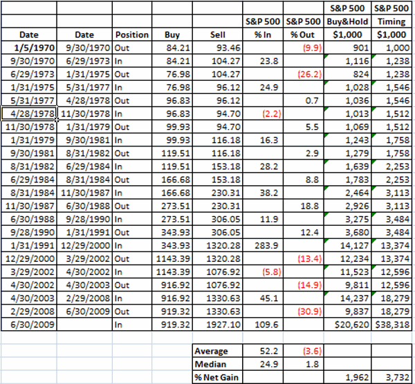
Figure 1 displays the results in tabular form:

Figure 1 – Jay’s Trend Identification Method Signals
The key thing to note is that over the past 40+ years this method outperformed buy-and-hold (by almost 2-to-1 if interest earned while out of the market is added in; See Figure 6).
Figures 2 through 5 display the signals on SPX monthly bar charts.
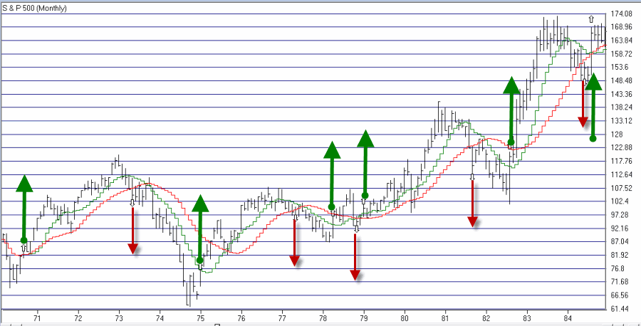
Figure 2 – SPX with JTIM Signals 1970-1984 (Courtesy: AIQ TradingExpert)
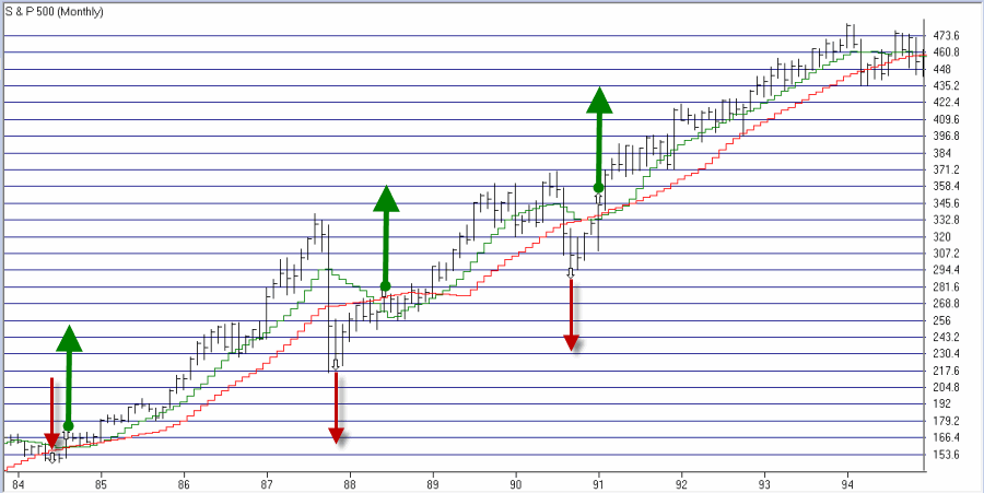
Figure 3 – SPX with JTIM Signals 1984-1994 (Courtesy: AIQ TradingExpert)
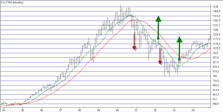
Figure 4 – SPX with JTIM Signals 1994-2004 (Courtesy: AIQ TradingExpert)
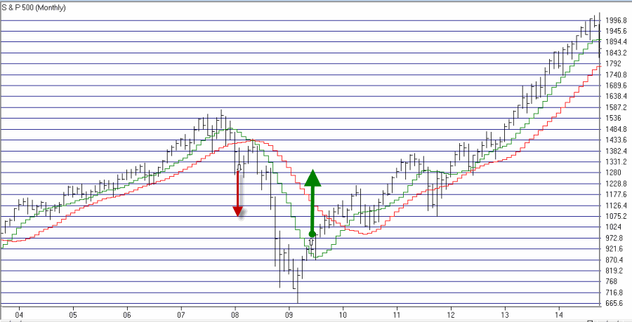
Figure 5 – SPX with JTIM Signals 2004-2014 (Courtesy: AIQ TradingExpert)
Figure 6 displays the growth of $1,000 using JTIM (adding 1% of interest per year while out of the market) versus buy-and-hold since 1970.
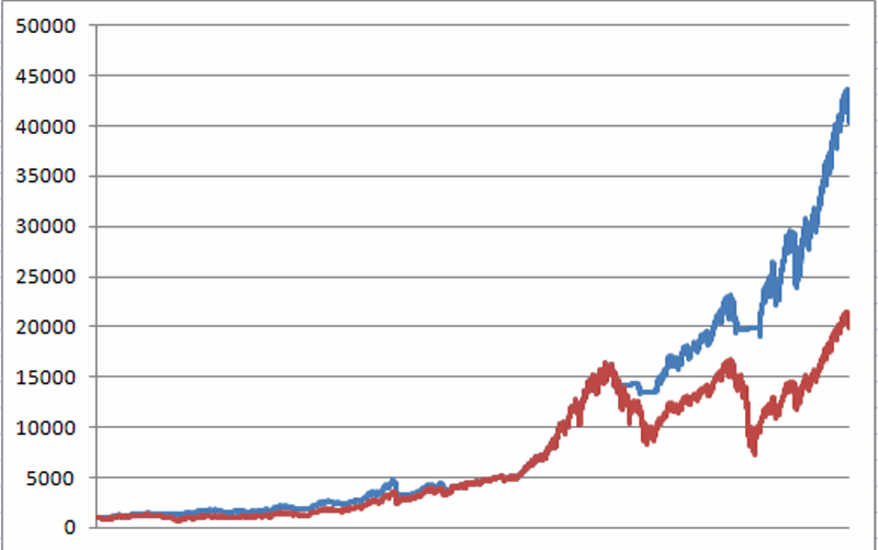
Figure 6 – Growth of $1,000 using JTIM (blue line) versus buy-and-hold (red line) since 1970
And just to complete the picture Figure 7 displays the growth of $1,000 invested in SPX only when the system is bearish.
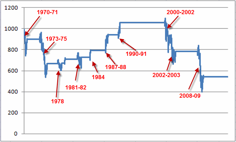
Figure 7 – Growth of $1,000 when JTIM is bearish (1970-present)
For the record, had an investor bought an held the S&P 500 only during those period when JITM was bearish since 1970, an intitial $1,000 investment would now be worth only $540 (i.e., a loss of -46%). Or as we “professional market analysts” refer to it – Not So Good.
Summary
So is this the “be all, end all” of market timing? Clearly not. During most of the 80′s and 90′s, getting out of the market for any length of time typically cost you money. Still, since nothing of the “be all, end all” variety actually exists some investors may find it useful to note the status of this simple model, at the very least as an alert that:
a) a lot of bad news can typically be ignored if the model says the trend is “up”, and,
b) some defensive action may be wise if the model says the trend is “down.”
Alright, excuse me, I have to get back into my Hazmat suit.
Jay Kaeppel
Chief Market Analyst at JayOnTheMarkets.com and AIQ TradingExpert Pro (http://www.aiq.com) client
http://jayonthemarkets.com/
Jay has published four books on futures, option and stock trading. He was Head Trader for a CTA from 1995 through 2003. As a computer programmer, he co-developed trading software that was voted “Best Option Trading System” six consecutive years by readers of Technical Analysis of Stocks and Commodities magazine. A featured speaker and instructor at live and on-line trading seminars, he has authored over 30 articles in Technical Analysis of Stocks and Commodities magazine, Active Trader magazine, Futures & Options magazine and on-line at www.Investopedia.com.