Nov 14, 2017 | educational newsletters, ETFs, group and sector, jay kaeppel
In a recent article I highlighted some stocks that appeared to have a chance of “putting in a low”. In another article, I highlighted the potential usefulness of “horizontal lines” on a chart. The phrase “putting in a low” is essentially a kindler, gentler version of the phrase “Hey, let’s pick a bottom”.
The reality is that the ability to “pick tops and/or bottoms” on any kind of a consistent basis is a skill that roughly 99.2% of all investors and traders do not possess. That being said, there is such a thing as a legitimate “bottom formation” (at least in my market addled opinion). A security that bounces several or more times off a particular price is sending information that the sellers may be running out of ammunition. These levels can be observed by drawing horizontal trend lines across a price chart – connecting recent highs and/or lows at roughly similar prices.
“Loading up” in this situation is not recommended. But committing an acceptable percentage of one’s portfolio (a level which each investor must decide on their own) to such opportunities is a perfectly acceptable form of speculation.
So for arguments sake, below is a “Bottom Pickers Portfolio”. As always, I am not recommending this as an investment, simply highlighting an alternative idea for your further consideration.
The Tickers
The tickers included in this portfolio are mostly all commodity related. That is not a purposeful choice; they simply “fit the model”.
First is ticker BAL – an ETF that tracks the price of cotton futures. The critical level for BAL is roughly the $43.50 area.
Ticker GDX tracks a gold stock index and has been consolidating in a relatively tight range after last year’s sharp rally and subsequent pullback.
Ticker JO tracks the price of coffee futures. This is one of the weakest charts on the list and is dangerously close to failing to the downside. However, if the low holds this will strengthen the outlook a great deal.
Ticker SGG tracks the price of sugar futures. SGG has been consolidating in a narrow range for about four months. Key price levels on the downside are $26.50 and the August 2015 low of $24.79.
Ticker SWN is Southwestern Energy Co. After a long, devastating decline the stock is attempting to form a low in the $5 a share range.
Ticker UNG tracks natural gas futures. Thanks to the advent of fracking – which is made natural gas abundantly available – the price of natural gas has collapsed in recent years. In the past week it retested its 2016 low and then ticked higher. Like JO, this one is precariously close to “failing”. But for now…
The Bottom Pickers Portfolio
I use AIQ TradingExpert software to create my own “Groups”. So I created one called “Lows” to include the six tickers above. The group consists of an equal dollar investment in each ticker. The chart for this combination of tickers appears in Figure 7.EDITORS NOTE: Creating your own groups is accomplished in the TradingExpert Data Manager information can be found in this article ‘Adding groups and sectors to your Group/Sector List’
Summary
Let me be blunt. There is every chance that the majority of the tickers highlighted above will continue their long-term bearish trends and break down to the downside causing further losses for those holding these shares.
The primary thing to highlight in this piece is a personal preference. I prefer “horizontal” lines on a chart – i.e., straight across, left to right – to the more typical slanted trend lines that most traders use. The reason is simply – upward or downward slanting trend lines require a trader to decide which two (or more) highs (or lows) to connect in order to draw the trend line. At the end of the day this is often a subjective decision.
Horizontal trend lines – which connect to (at least roughly equal) highs or lows – are generated by the market itself and as such, are more objective in nature. In other words, investor buying and selling determines these levels.
Will my “Bottom Pickers Portfolio” move to the upside or fail to the downside? We’ll just have to wait to find out.
Disclaimer: The data presented herein were obtained from various third-party sources. While I believe the data to be reliable, no representation is made as to, and no responsibility, warranty or liability is accepted for the accuracy or completeness of such information. The information, opinions and ideas expressed herein are for informational and educational purposes only and do not constitute and should not be construed as investment advice, an advertisement or offering of investment advisory services, or an offer to sell or a solicitation to buy any security.
Oct 30, 2017 | educational newsletters, ETFs, jay kaeppel, sector funds
I know I repeat it a lot but the purpose of this blog is not to offer recommendations but rather to share ideas. So here is one that I am not quite sure about but am keeping an eye on.
The FourNonCorr Portfolio
Somewhere awhile back I started looking at trying to pair non correlated – or even inversely correlated – securities in a portfolio that had the potential to outperform the overall market. What follows is what I refer to as the FourNonCorr Portfolio. For the record I do not trade this portfolio with real money. I am still trying to figure out if there is something to it or not. But given that it has outperformed the S&P 500 by a factor of 3-to-1 (granted, using hypothetical results) since December of 2007, I figure it might be worth monitoring for awhile.
The portfolio consists of four ETFs:
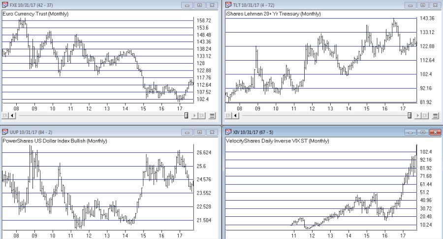
Ticker FXE – Guggenheim CurrencyShares Euro Trust
Ticker UUP – PowerShares DB US Dollar Index Bullish
Ticker TLT – iShares Barclays 20+ Yr Treas. Bond
Ticker XIV – VelocityShares Daily Inverse VIX ST ETN
The monthly charts for each appear in Figure 1.
As you can see there is a lot of “zigging” by one accompanied by “zagging” for another. No surprise that when the Euro rises the dollar falls and vice versa. Also, TLT often seems to move opposite XIV. That is essentially the purpose of these pairings.
Figure 2 displays the correlations between the four ETFs in the portfolio (using AIQ TradingExpert Matchmaker function from 8/31/2012 through 8/31/2017 using weekly data). A reading of 1000 indicates a perfect correlation, a reading of -1000 indicates a perfectly inverse correlation.
|
FXE |
UUP |
TLT |
XIV |
| FXE |
|
(913) |
77 |
(13) |
| UUP |
(913) |
|
(117) |
43 |
| TLT |
77 |
(117) |
|
(234) |
| XIV |
(13) |
43 |
(234) |
|
Figure 2 – Correlations for the FourNonCorr Portfolio ETFs (Source:
AIQ TradingExpert)
Clearly there is a whole lot of “not correlating much” going on.
Results
For testing purposes I used monthly total return data for each ETF from the PEP Database from Callan Associates. The one exception is ticker XIV which did not start actual trading until December 2010. For January 2008 through November 2010 I used index data for the index that ticker XIV tracks inversely (
S&P 500 VIX SHORT-TERM FUTURES INDEX). Actual XIV ETF data is used starting in December 2010.
As a benchmark, I also tracked the cumulative total return for ticker SPY (that tracks the S&P 500 Index).
Figure 3 displays the cumulative percent gain or loss for both the FourNonCorr Portfolio and ticker SPY.
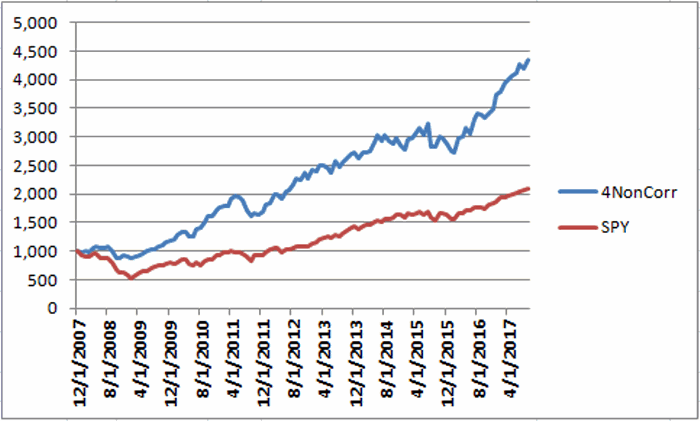
Figure 3 – Cumulative % gain/loss for The FourNonCorr Portfolio (blue) versus SPY (red); 12/31/2007-9/30/2017
Year-by-year results appear in Figure 4
|
4 NonCorr |
SPY |
Diff |
| 2008 |
(6.0) |
(37.0) |
31.0 |
| 2009 |
26.1 |
26.4 |
(0.3) |
| 2010 |
45.2 |
14.9 |
30.3 |
| 2011 |
(1.3) |
2.1 |
(3.4) |
| 2012 |
34.3 |
15.8 |
18.5 |
| 2013 |
19.3 |
32.2 |
(12.9) |
| 2014 |
5.3 |
13.5 |
(8.2) |
| 2015 |
0.6 |
1.3 |
(0.8) |
| 2016 |
21.0 |
11.8 |
9.2 |
| 2017* |
24.4 |
14.1 |
10.2 |
Figure 4 – Year-by-Year Results
The results by the numbers appear in Figure 5.
|
4NonCorr |
SPY |
| Average 12mo % +/- |
17.8 |
11.2 |
| Median 12mo % +/- |
14.9 |
15.0 |
| Std. Deviation |
17.1 |
16.8 |
| Ave/Std. Dev. |
1.04 |
0.67 |
| Worst 12mo % |
(11.9) |
(43.2) |
| Max. Drawdown % |
(17.8) |
(48.4) |
Figure 5 – By the numbers
All told The FourNonCorr Portfolio:
*Gained +334% versus +110% for SPY since 12/31/2007
*Experienced a maximum drawdown of -17.8% versus-48.4% for SPY
Thoughts
On paper, The FourNonCorr Portfolio looks pretty decent, particularly compared to the S&P 500 Index. But you will recall that I stated earlier that I don’t actually trade this portfolio with real money. Why not? A few concerns:
*Interest rates tend to move in long-term waves up and down. How beneficial will it be to have TLT in the portfolio if and when interest rates embark on a long-term wave up?
*I don’t entirely trust ticker XIV. Because of the way it is built it seems to have the benefit of upward bias due to contango in the VIX futures market (the opposite of ticker VXX – please Google “VXX” and/or “contango” for an actual explanation) it also holds the potential to sell off in shocking fashion. Using the index data as I did in order to replicate hypothetical performance from Jan 2008 through Nov 2010, XIV declined a stunning -72% between the end of May 2008 and the end of November 2008. It also experienced a -60% decline in 2015-2016. Need to give some thought to adding a security that is even capable of that to a permanent portfolio.
*On the flip side, XIV has been the driving force for gains in recent years and shows a cumulative gain of +416% since 12/31/2007. If (and when?) we ever do see a bear market and/or a significant pickup in volatility will XIV have a large negative influence on performance? That seems to be the $64,000 question.
Summary
As a thought experiment, The FourNonCorr Portfolio shows a pretty decent track record and seems to hold some interesting promise. As a real money, real world experience – questions remain.
Stay tuned, tinker and experiment if you wish,and don’t be too quick to “dive in.”
Disclaimer: The data presented herein were obtained from various third-party sources. Whilne I believe the data to be reliable, no representation is made as to, and no responsibility, warranty or liability is accepted for the accuracy or completeness of such information. The information, opinions and ideas expressed herein are for informational and educational purposes only and do not constitute and should not be construed as investment advice, an advertisement or offering of investment advisory services, or an offer to sell or a solicitation to buy any security.
Oct 10, 2017 | Charts, EDS, EDS code, indicators, jay kaeppel
First the Bad News: There are no “magic bullets” when it comes to trading. There are people in this industry who have literally tested somewhere in the range of six bazillion “indicators” – give or take (“Hi. My name is Jay”). Every trend following indicator looks like a gold mine when it latches onto a huge trend and rides it (but not so much when it starts getting whipsawed). And every overbought/oversold indicator looks like a gift from heaven from time to time when it somehow manages to peak (or valley) and then reverses right at a high (or low). And then the next time the thing gets oversold the security in question just keeps plunging and the previously “amazingly accurate” indicator just gets more and more oversold.
Bottom line: what I am about to discuss is likely no better or worse than a lot of other indicators. And it is no holy grail. Still, I kinda like it – or whatever that is worth.
EDITORS NOTE an WinWay EDS file for this indicator with the 3 step rules outlined can be downloaded from here you will need to copy or save this file into your wintes32/eds strategies folder. Alternatively the code is available at the end of this article for copying and pasting into a new EDS file.
UpDays20
I call this indicator UpDays20 and I stole, er, learned it originally from Tom McClellan of McLellan Financial Publications. My calculation may be slightly different because I wanted an indicator that can go both positive and negative.
For a given security look at its trading gains and losses over the latest 20 trading days.
UPDays20 = (Total # of Up days over the last 20 trading days) – 10
So if 10 of the last 20 trading days showed a gain then UpDays20 would read exactly 0.
If only 6 of the last 20 trading days showed a gain then UpDays20 would read -4
You get the idea (and proving once again that it “doesn’t have to be rocket science”). As a “trading method” it is always advised that this indicator – like most all other indicators – NOT be used as a standalone approach to trading. That being said, the way I follow this indicator is as follows.
Step 1) UpDays20 drops to at least -2
Step 2) UpDays20 rises 2 points from a low
Step 3) The security in question then rises above its high for the previous 2 trading days
It is preferable to follow this setup hen the security in question is above its 200-day moving average, but that is up to the trader to decide (the danger to using this with a security below its 200-day moving average is that it might just be in the middle of a freefall. The upside is that counter trend rallies can be fast and furious – even if sometimes short-lived).
Again, there is nothing magic about these particular steps. They are simply designed to do the following:
1) Identify an oversold condition
2) Wait for some of the selling pressure to abate
3) Wait for the security to show some sign of reversing to the upside
Like just about every other indicator/method, sometimes it is uncannily accurate and sometimes it is embarrassingly wrong (hence the reason experienced traders understand that capital allocation and risk management are far more important than the actually method you use to enter trades).
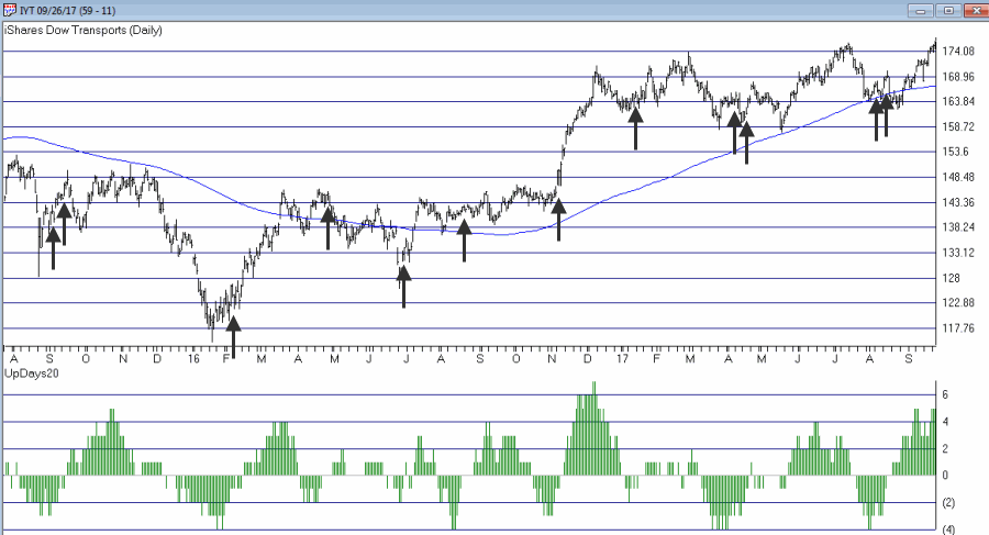
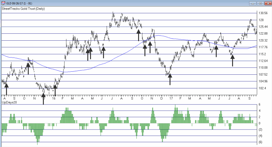
In this previous article (in Figures 3 and 4) I wrote about using this indicator with ticker TLT. Figure 1 and 2 display the “buy” signals generated using the rules above for tickers IYT and GLD.

Figure 1 – UpDays20 “Buy” Alerts for ticker IYT (Courtesy TradingExpert)

Figure 2 – UpDays20 “Buy” Alerts for ticker GLD (Courtesy TradingExpert)
Are these signals good or bad? That is in the eye of the beholder and not for me to say. One big unanswered question is “when do you exit”? That is beyond the scope of this “idea” article – however, “sell some at the first good profit and then use a trailing stop” looks like a decent approach to consider) but would have a profound effect on any actual trading results.
Some of the signals displayed in Figures 1 and 2 are obviously great, others are maybe not so hot. Interestingly, some of the signals in Figure 1 and 2 that don’t look to timely at first blush actually offered a profitable opportunity to a trader who was inclined to take a quick profit. Again, how you allocate capital and when you exit with a profit and when you exit with a loss would likely have as much impact on results as the raw “buy” signals themselves.
Summary
No one should go out and start trying to trade tomorrow based on UpDays20. No claim is being made that the steps detailed herein will result in profits nor even that this is a good way to trade.
But, hey, it’s one way.
Jay Kaeppel Chief Market Analyst at JayOnTheMarkets.com and TradingExpert Pro client.
Disclaimer: The data presented herein were obtained from various third-party sources. While I believe the data to be reliable, no representation is made as to, and no responsibility, warranty or liability is accepted for the accuracy or completeness of such information. The information, opinions and ideas expressed herein are for informational and educational purposes only and do not constitute and should not be construed as investment advice, an advertisement or offering of investment advisory services, or an offer to sell or a solicitation to buy any security.
EDITORS NOTE an WinWay EDS file for this indicator with the 3 step rules outlined can be downloaded from here you will need to copy or save this file into your wintes32/eds strategies folder. Alternatively the code is available at the end of this article for copying and pasting into a new EDS file.
! UpDays20 – I call this indicator UpDays20. For a given security look at its trading gains and losses over the latest 20 trading days.
! UPDays20 = (Total # of Up days over the last 20 trading days) – 10!
So if 10 of the last 20 trading days showed a gain then UpDays20 would read exactly 0.
! If only 6 of the last 20 trading days showed a gain then UpDays20 would read -4
Upday if [close]>val([close],1).
totalupdayslast20days is CountOf(upday,20).
updayindicator is totalupdayslast20days – 10.
! How to follow this indicator
! Step 1) UpDays20 drops to at least -2
! Step 2) UpDays20 rises 2 points from a low
! Step 3) The security in question then rises above its high for the previous 2 trading days
UpDays20rises2points if updayindicator>valresult(updayindicator,1) and valresult(updayindicator,1)>valresult(updayindicator,2).
updays20atminus2orlower if valresult(updayindicator,2)<=-2.
closesabovehighof2priordays if [close]>val([high],1) and [close]>val([high],2).
Upsignal if UpDays20rises2points and updays20atminus2orlower and closesabovehighof2priordays.
Sep 18, 2017 | Charts

Sep 13, 2017 | Charts
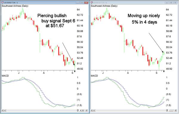
“The WinWay Charts Candlestick Piercing bullish buy signal on Sept 6, 2017, worked out well so far on Southwest Airlines”
Steve Hill, founder WinWay Charts
Ready to take your apprentice training and put it into action in WinWay Charts?
Join me October 12, 2017 – Central London
It’s the final piece in your stock trading armoury
Steve Hill, is the founder and President of WinWay Charts, Darren Winters preferred trading software.
A native Londoner, Steve has over 25 years experience as both a trading analysis software developer and trading educator. He has trained countless clients in the disciplined analysis and trading mindset necessary to successfully trade in today’s markets.
Using WinWay Charts, he’ll take you through the entire process from analysis, stock selection, trade execution and trade management. With this traders blueprint, you’ll have the tools you need to take your trading efficiency to a new level.
Market insights only available WinWay Charts
The Dow and NASDAQ are at or near the highs but the broader market indicators are signaling something else. Steve will show you how to use the built-in market analysis tools in WinWay Charts to gain in-depth analysis,
Rare opportunity to spend the day with WinWay Charts founder
|
| Those of you have had an opportunity to spend time with Steve at sessions in Wealth Training offices in Bermondsey or at apprentice sessions in Guernsey will will appreciate his broad and in-depth knowledge and experience in trading analysis. You’ll need to be on your toes for this seminar. Every session is designed to enhance your current trading skill and take you to the next logical step as a trader. |
|
|
Topics covered in this action-packed day include:
|
|
– Trading psychology
– Top down analysis incorporating reports, chart analysis and trade selection
– Using Darren’s candlestick and other scans
– Establishing positions, portfolio management of established positions, exiting positions
– Using a trade log to evaluate your trades
– Live examples of trades in action
.
|
|
This opportunity won’t be available again this year!
Seats are limited and are filling up fast. Don’t hesitate, fast track your way to trading success PLUS special Autumn pricing now applies, if you reserve your seat in the next 10 days you’ll get the early bird price locked in.
Book your seat before September 20, 2017 and you’ll pay
ONLY $499 a $150 saving
PLUS your seminar comes with the entire course manual in PDF format.
Sep 8, 2017 | indexes, jay kaeppel, stock market
First the Good News:
*The market averages are still in an up trend
*The Fed has yet to “remove the punch bowl”
Now the bad news
Market Bellwethers Flashing Warnings
In this article I wrote about four tickers I follow for signs of early warnings of trouble. At the moment, all four are flashing warnings.
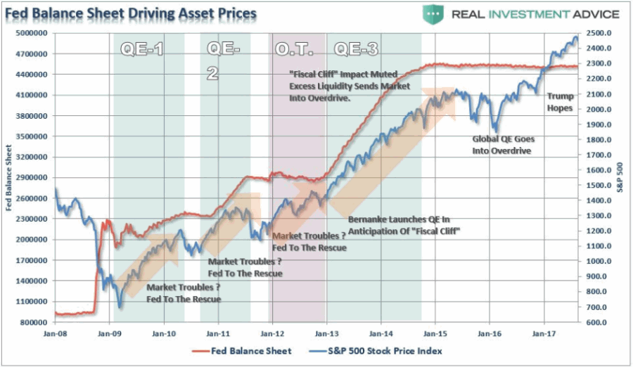
Stocks are Extremely Overvalued
Something important to note: valuation indicators are NOT good timing indicators. The overall market can be over or undervalued for years. However, overvalued valuation readings are extremely reliable at telling us what will come next once the top is in (whenever that may be). Figure 4 displays the Schiller CAPE model which measures adjusted P/E ratio.
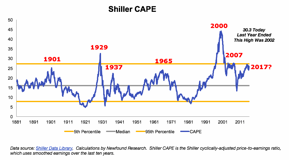
Figure 4 – Schiller Adjusted PE (Courtesy:
Schiller Data Library)
1901: Dow -37% in 32 months
1929: Dow -89% in 3 years
1932: Dow -49% in 13 months
1965: Dow sideways to 40% lower for 17 years
2000: Nasdaq 100 -87%
2007: Dow -55% in 17 months
2017: ??
When will the exact top form? Don’t know
What will likely follow? Don’t Ask
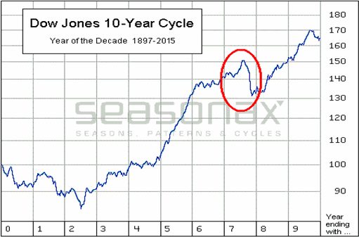
The Decennial Pattern
As I wrote about here and as you can see in Figures 5 and 6, the Year 7 into Year 8 period has historically witnesses significant market weakness. That does not mean that that is what will happen this time around. But it is reason for caution.
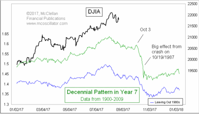
Figure 7 from Tom McLellan illustrates this phenomenon even more clearly.
September
What a crummy time for September to roll around. Figure 8 displays the fact that the Dow has lost -80% during the month of September since 1897.
Figure 8 – Dow has lost -80% during September since 1897
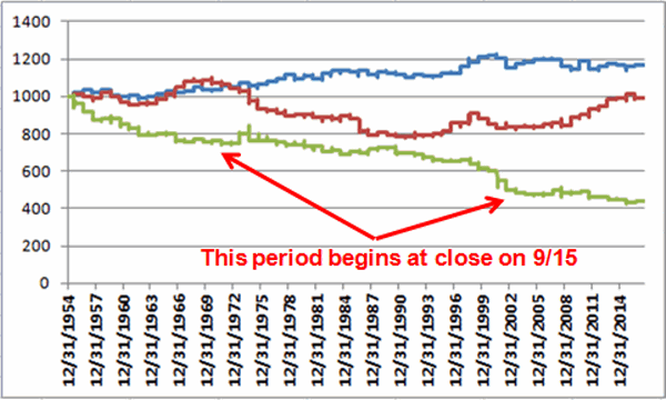
Figure 9 displays the fact that since 1955 most of the “September Nasty” has occurred in that last 10 trading days of the month (after the close on 9/15 this year)
Figure 9 – Dow in September; 1st 3 days (blue); Last 10 days (green); in between (red); 1955-2016
Investor Complacency
Despite the fact that:
*We have experienced one of the longest bull markets in history
*Stock prices are extremely overvalued on an objective historical basis
*A number of warning signs are flashing
The investment world seems relatively untroubled (in the interest of full disclosure I have done only limited selling so far myself – more on this in a moment).
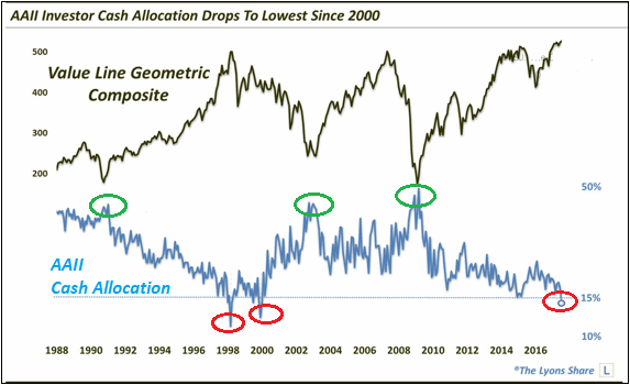
Figure 10 displays the AAII investor cash allocation reading from earlier this year. Low cash levels tend to signal complacency (and impending market trouble) while high cash levels tend to occur near market bottoms.
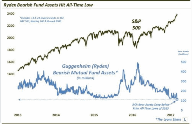
Figure 11 displays the amount of assets in the Rydex suite of “bearish” funds from earlier this year. As you can see, investors were not too concerned about the prospects for a bear market – a potential contrarian signal.
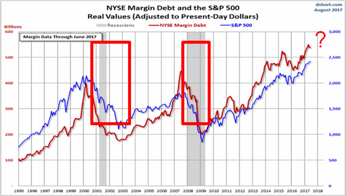
Figure 12 shows the level of margin debt versus stock prices. Historically when margin debt peaks and begins to decline the stock market suffers significantly. There is no way to predict when margin debt will top out and roll over but it did recently reach a new all-time high. Could it go higher? Absolutely. But if it rolls over – then look out below.
Figure 12 – If Margin Debt peaks trouble may follow (Courtesy:
dshort.com)
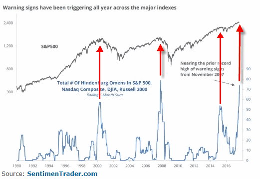
Figure 13 displays the stock market versus the number of “Hindenburg Omens” (a measure of “churning” in the stock market) that have occurred in the most recent 6-month period. Another warning sign is flashing.
Summary
Does any of the above guarantee that a significant stock market decline is imminent? The correct answer is “No.” The major market indexes all remain above their long-term moving averages. This can be considered the very definition of a bull market.
I personally have seen lots of warning signs flash along the way over the years. And I have found that it is important to pay attention to these and to “prepare for the worst” – i.e., to plan an exit/hedging strategy “just in case.” But trying to pick the exact top is an excellent way to end up looking stupid. Trust me on this one.
So here is my summary:
*I do not possess the ability to “call the top” nor to “predict what will happen next” in the stock market
*I do possess a reasonably good ability to identify the trend “right now”
*I also possess the ability to recognize gathering storms clouds (and, yes, they are forming) and the ability to formulate an “emergency plan” as well as the wherewithal to follow the plan “should this be an actual (market) emergency.”
The current level of market valuation – and the history of the stock market following previous similar such readings – suggests that the next bear market will surprise many investors by its severity.
The clouds are gathering. Please plan accordingly.
Jay Kaeppel Chief Market Analyst at JayOnTheMarkets.com and AIQ TradingExpert Pro client.
Disclaimer: The data presented herein were obtained from various third-party sources. While I believe the data to be reliable, no representation is made as to, and no responsibility, warranty or liability is accepted for the accuracy or completeness of such information. The information, opinions and ideas expressed herein are for informational and educational purposes only and do not constitute and should not be construed as investment advice, an advertisement or offering of investment advisory services, or an offer to sell or a solicitation to buy any security.
Aug 18, 2017 | chart patterns, educational newsletters, jay kaeppel
If I were the type to make bold proclamations I would probably consider “taking my shot” right here and shout “This is the Top” and/or “The Market May Crash.” Unfortunately, on those occasions (well) in the past when I would make bold public predictions of what was about to happen in the financial markets I would almost invariably end up looking pretty stupid. So even if I did make a “bold proclamation” it wouldn’t necessarily mean that anyone should pay any attention.
Besides all that the last thing I want is for “the party to end”. Even if you do think the market is about to tank it’s a pretty crummy thing to have to root for. Even if you did manage to “call the top”, the ripple effect of the ramifications associated with a serious stock market decline can have pretty negative effect on just about everyone’s life.
So let’s put it this way: I am concerned – and prepared to act defensively if necessary – but still have money in the market and am still hoping for the best.
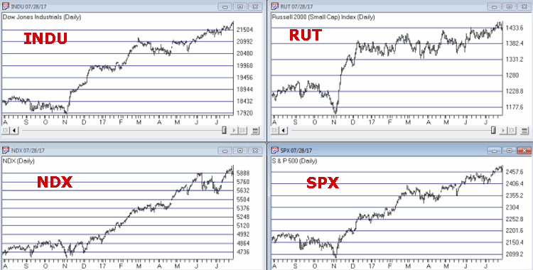
Reasons for Caution (Indexes)
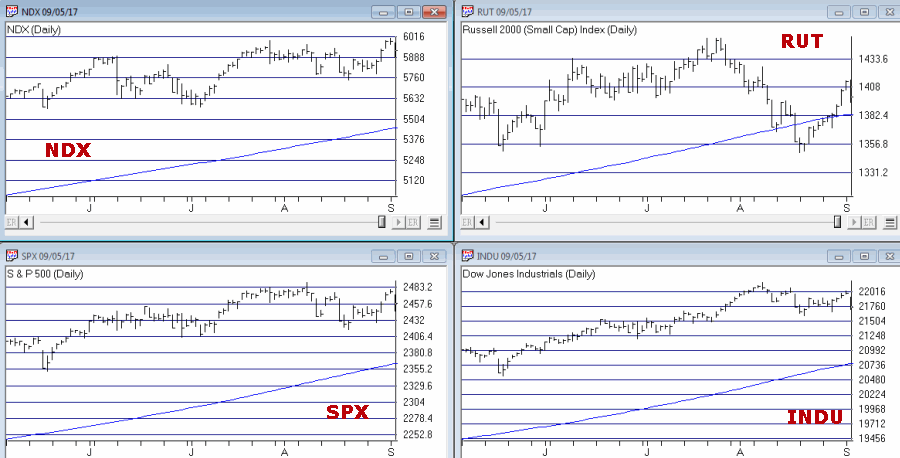
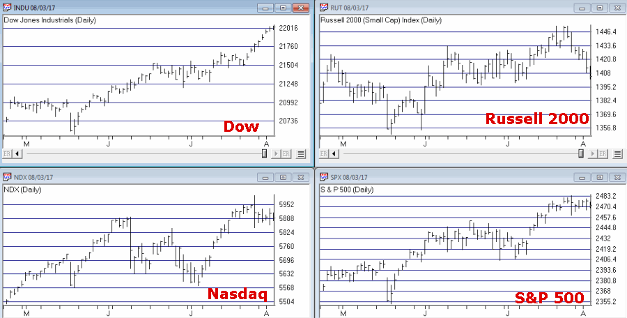
Figure 1 displays four major indexes. The Dow keeps hitting new highs day after day while the others – at the moment – are failing to confirm. That doesn’t mean that they won’t in the days ahead. But the longer this trend persists the more negative the potential implications.
Figure 1 – Dow at new highs, small-caps, Nasdaq and S&P 500 not quite (Courtesy
TradingExpert)
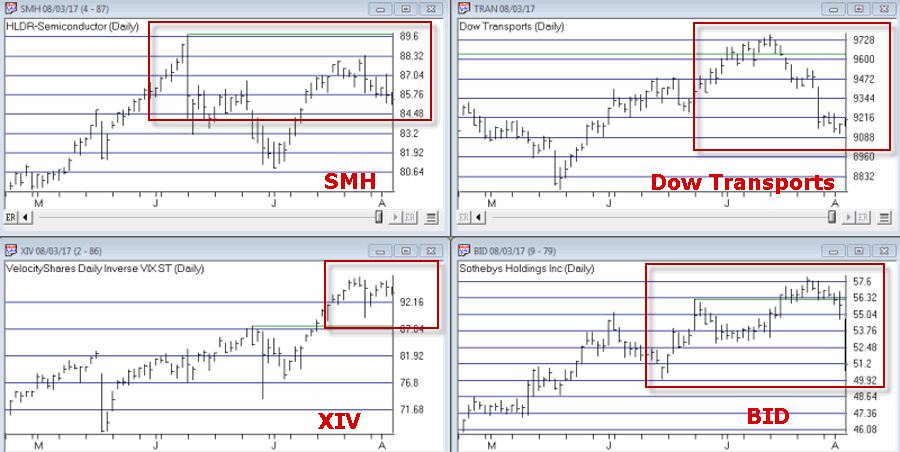
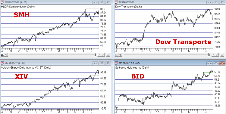
Reasons for Caution (Bellwethers)
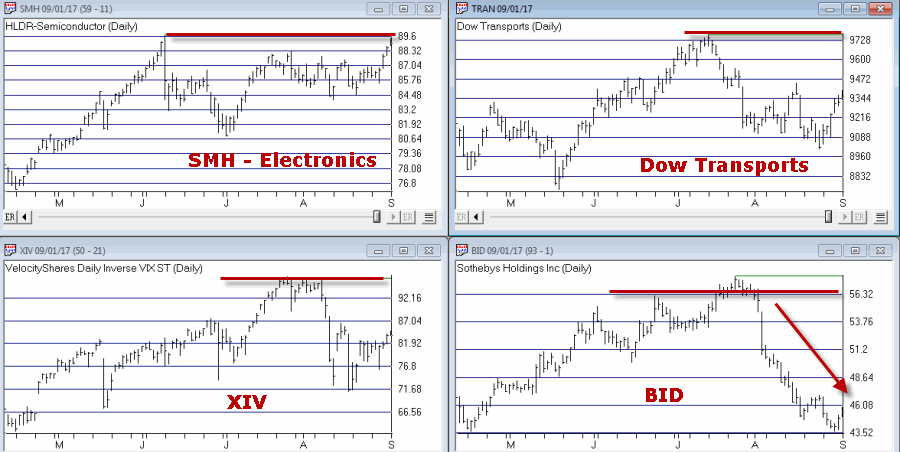
Figure 2 displays 4 “bellwethers” that I follow which may give some early warning signs.
Figure 2 – Market Bellwethers possibly flashing some warning signs (Courtesy
TradingExpert)
*SMH soared to a high in early June and has been floundering a bit since.
*Dow Transports tried to break out to the upside in July but failed miserably.
*XIV is comfortably in new high territory.
*BID tried to break out in July and then collapsed. It is presently about 12% off of its high.
In a nutshell – 3 of the 4 are presently flashing warning signs.
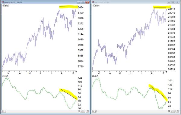
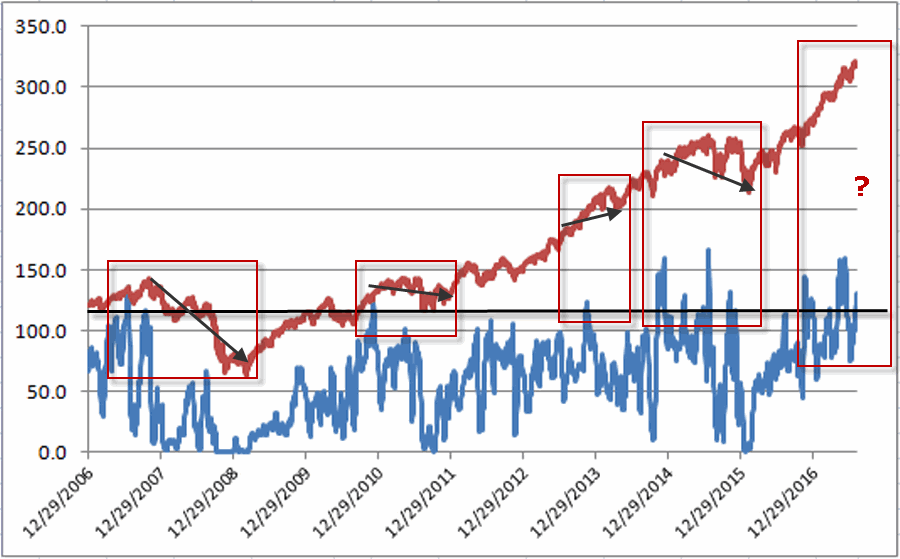
Reasons for Caution (Market Churn)
In this article I wrote about an indicator that I follow that can be useful in identify market “churn” – which can often be a precursor to market declines. Spikes above 100 by the blue line often signify impending market trouble
It should be noted that the indicators signals are often early and occasionally flat out wrong. Still, a churning market with the Dow making new highs has often served as a “classic” warning sign.
Figure 3 – JK HiLo Index (blue) versus Nasdaq Compsite / 20 (red); 12/31/2006-present
Summary
Again, and for the record, I do not possess the ability to “predict” the markets. But I have seen a few “warning signs” flash bright red at times in the past. As a general rule, it is best to at least pay attention – and maybe make a few “contingency plans” – you know, just in case.
Here’s hoping my gut is wrong – again.
Disclaimer: The data presented herein were obtained from various third-party sources. While I believe the data to be reliable, no representation is made as to, and no responsibility, warranty or liability is accepted for the accuracy or completeness of such information. The information, opinions and ideas expressed herein are for informational and educational purposes only and do not constitute and should not be construed as investment advice, an advertisement or offering of investment advisory services, or an offer to sell or a solicitation to buy any security.
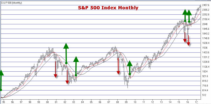
Aug 1, 2017 | jay kaeppel, market timing
It is hard to look at Figure 1 and argue that the trend of the stock market is anything but bullish. Major averages making new all-time highs is essentially the very definition of a bull market. And indeed the market may continue to push higher indefinitely.
Figure 1 – Four Major Averages all at or near all-time highs (Courtesy
AIQ TradingExpert)
Trying to “pick a top” usually ends with an embarrassed prognosticator. Particularly when the major market averages are posting new highs. Still, there comes a time when it can pay to pay close attention for signs of “Trouble in Paradise”. That time may be now.
Four Bellwethers
In this article I wrote about 4 “bellwethers” that I follow for potential “early warning signals”. So far no “run for cover” signals have appeared. Two of the four have confirmed the new highs in the market averages and the other two have not. If and when 3 or 4 of them fail to confirm that may signal trouble ahead.
Figure 2 – XIV and BID confirm news highs; SMH and TRAN so far have not (Courtesy
AIQ TradingExpert)
XIV and BID have confirmed new highs in the major averages (although the parabolic nature of XIV’s run is somewhat troubling to me) while SMH and the Dow Transports have not.
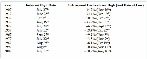
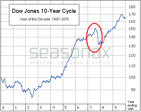
Post-Election/Year “7” Bermuda Triangle
I
have written about this a few times but it bears repeating here. Post-Election Years and Years ending in “7” (1907, 1917, etc.) have typically witnessed “trouble” in the second half of the year. Figures 3 and 4 are posted courtesy of a Twitter post from Larry McMillan of the
Option Strategist.
Figure 3 highlights the fact that the 2nd half of “Years 7” have often witnessed “trouble.”
Figure 4 show that each “7” year posted a high during the 2nd half of the year (or in June) and then suffered a decline. This does not guarantee a repeat this year but it is a warning sign.
Figure 3 – Decade Pattern for the Dow Jones Industrials Average (Courtesy:
Options Strategist)
Also, during years that are both “post-election” years AND “Years ending in 7”, the August through October results have been brutal- as depicted in Figure 5 – with an average 3-month decline of -15%.
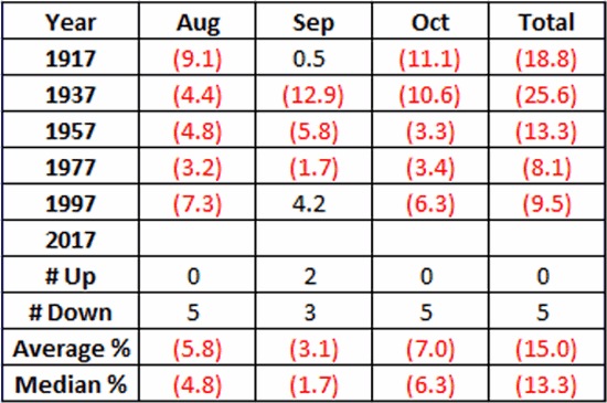
Figure 5 – August/September/October of Post-Election Years that also End in “7”
Nothing in Figures 3 through 5 “guarantee” an imminent market decline. They do however, constitute the reason the word “Beware” appears in the headline.
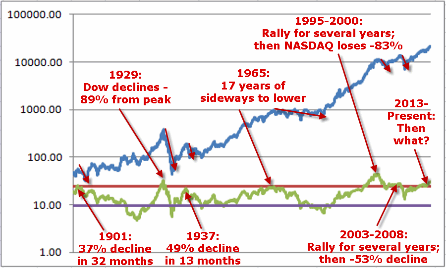
Valuation
Last week I witnessed a presentation where a quite knowledgeable gentleman posted a chart of the Schiller PE Ratio. He made note of the fact that the Schiller PE Ratio has only been higher twice in modern history – 1929 and 2000. The 1929 peak was followed by an 89% decline by the Dow and the 2000 peak was followed by an 83% decline by the Nasdaq. So are we doomed to experience a devastating decline? Not necessarily. At least not necessarily anytime soon. The stock market became “overvalued” in 1995 and then continued to rally sharply higher for another 4+ years. Likewise, the market as theoretically been “overvalued” since 2013 – and so far so good.
Figure 6 shows the price action of the Dow Jones Industrials Average since 1901 in blue and the movements of the Schiller PE Ratio in green.
The peaks in the Schiller PE ratio in:
1901
1929
1937
1965
1995-2000
2003-2008
Were all followed by “something bad”.
While the exact timing is unknowable, as you can see in Figure 6, history does suggest that ultimately a “happy ending” is unlikely.
Figure 6 – A History Lesson in High Shiller PE Ratio Readings: Dow Jones Industrials Average (blue line) and Schiller PE Ratio (green line); 1901-present
Summary
I absolutely, positively DO NOT possess the ability to “predict” what is going to happen in the financial markets. I have gotten pretty good however, at identifying when risk is unusually high or low.
Current Status: Risk High
Because I don’t offer investment advice on this blog – and because my track record of “market calls” is so bad, no one should interpret anything in this article as a call to “Sell Everything”, especially since I haven’t even done that myself – us “trend-followers” usually take awhile to give up the ghost. In reality, I hope that stocks continue to rally and that this article ends up making me looking stupid, er, I mean “overly cautious”.
But the real point is simply that having plans, mechanisms, etc. to reduce risk in your portfolio makes sense.
Jay Kaeppel Chief Market Analyst at JayOnTheMarkets.com and TradingExpert Pro client.
Disclaimer: The data presented herein were obtained from various third-party sources. While I believe the data to be reliable, no representation is made as to, and no responsibility, warranty or liability is accepted for the accuracy or completeness of such information. The information, opinions and ideas expressed herein are for informational and educational purposes only and do not constitute and should not be construed as investment advice, an advertisement or offering of investment advisory services, or an offer to sell or a solicitation to buy any security.
Jul 5, 2017 | bonds, educational newsletters, ETFs, indexes, jay kaeppel, market timing
In the end it is not so much about “predicting” what will happen next in the financial markets, but rather recognizing – and being prepared for – the potential risks, that makes the most difference in the long run. So let’s start by looking at current trends.
Stocks
Let’s start with a most simple trend-following model that works like this:
-A sell signal occurs when the S&P 500 Index (SPX) registers two consecutive monthly closes below its 21-month moving average
-After a sell signal, a buy signal occurs when SPX register a single monthly close above its 10-month moving average.
Figure 1 displays recent activity.
Figure 1 – SPX Trend-Following signals (Courtesy
WinWayCharts)
The good news is that this model does a good job of being out of stocks during long bear markets (1973-74, 2000-2002, 2008-2009). The bad news is that – like any trend-following model – it gets “whipsawed” from time to time. In fact the two most recent signals resulted in missing out on the October 2015 and March 2016 rallies.
But note the use of the phrase “simple trend-following model” and the lack of phrases such as “precision market timing” and “you can’t lose trading the stock market”, etc.
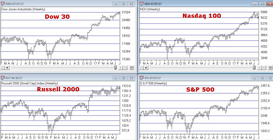
For now the trend is up. A few things to keep an eye on appear in Figures 2 and 3. Figure 2 displays four major averages. Keep an eye to see if these averages break out to the upside (see here) or if they move sideways to lower.
Figure 2 – Four Major Market Averages (Courtesy
WinWayCharts)
In addition, I suggest following
the 4 tickers in Figure 3 for potential “early warnings” – i.e., if the major averages hit new highs that are not confirmed by the majority of the tickers in Figure 3
.
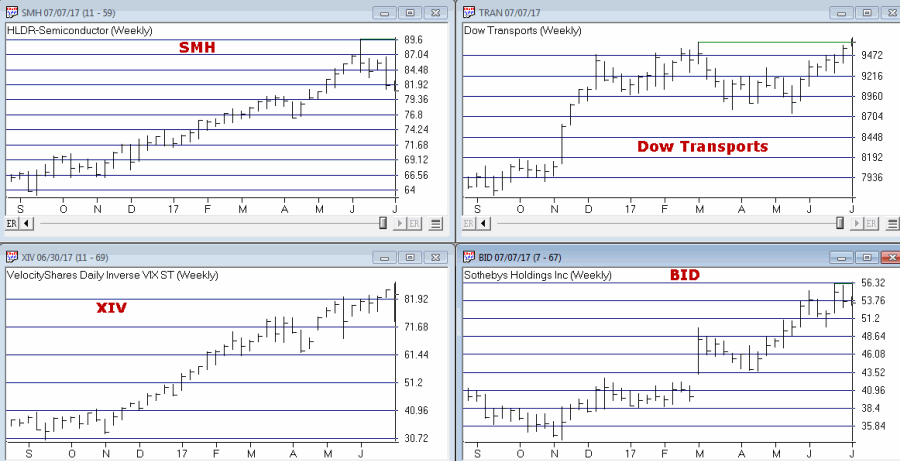
Figure 3 – Four potential “Early Warning” tickers (Courtesy
WinWayCharts)
Bonds
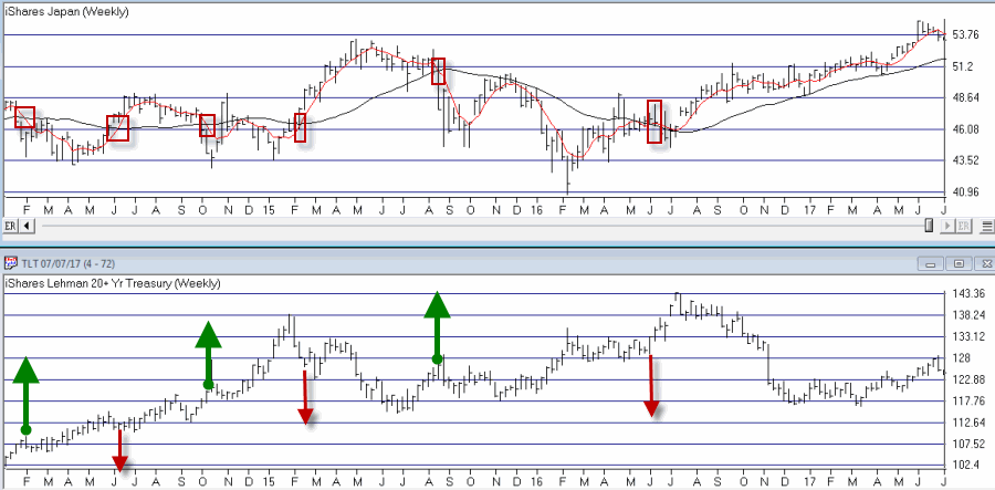
My main “simple bond trend-following model” remains bearish. As you can see in Figure 4, a buy signal for bonds occurs when the 5-week moving average for ticker EWJ (Japanese stocks) drops below its 30-week moving average and vice versa.
Figure 4 – Ticker EWJ 5-week and 30-week moving average versus ticker TLT (Courtesy
WinWayCharts)
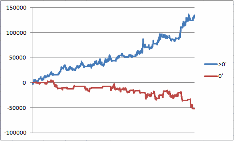
A 2nd model using metals to trade bonds has been bullish of late but is close to dropping back into bearish territory. Figure 5 displays the P/L from holding a long position of 1 t-bond futures contract ONLY when both the EWJ AND Metals models are bearish (red line) versus when EITHER model is bullish (blue line)
Figure 5 – T-bond futures $ gain/loss when EWJ OR Metals Models are Bullish (blue line) versus when EWJ AND Metals Models are both Bearish (red line); August 1990-present
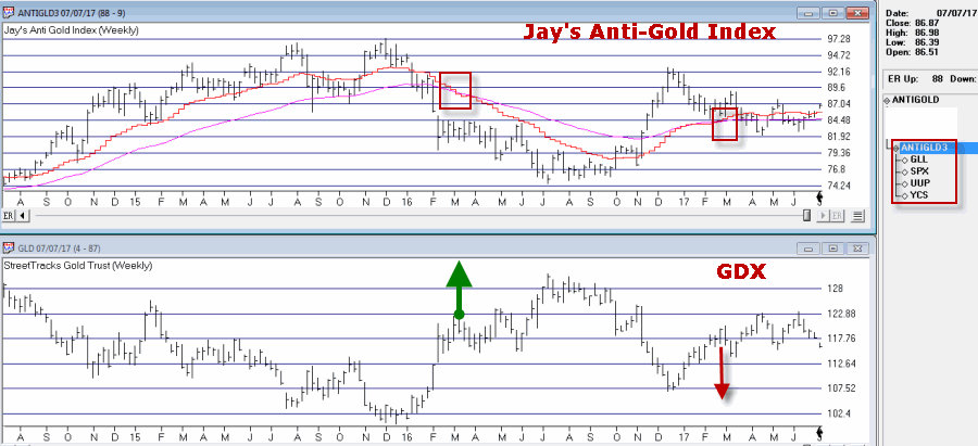
Gold
My most basic gold trend-following model is still bearish. This model uses my “Anti-Gold Index” (comprised of tickers GLL, SPX, UUP and YCS). It is bullish for gold when a Front-Weighted Moving Average (detailed here) is below the 55-week exponential moving average and vice versa.
Figure 6 – Jay’s “Anti-Gold Index” versus ticker GLD (Courtesy
WinWayCharts)
Summary
So at the moment the stock model is bullish and the bond and gold models are bearish. Are these trends certain to persist ad infinitum into the future? Definitely not. Will the models detailed here provide timely signals regarding when to get in or out the next time around? Sorry, but it doesn’t always work that way with trend-following.
But as for me I prefer “riding the trend” to “predicting the future.”
Some painful lessons just stick with you I guess.
Jay Kaeppel Chief Market Analyst at JayOnTheMarkets.com and TradingExpert Pro client.
Disclaimer: The data presented herein were obtained from various third-party sources. While I believe the data to be reliable, no representation is made as to, and no responsibility, warranty or liability is accepted for the accuracy or completeness of such information. The information, opinions and ideas expressed herein are for informational and educational purposes only and do not constitute and should not be construed as investment advice, an advertisement or offering of investment advisory services, or an offer to sell or a solicitation to buy any security.
May 22, 2017 | ETFs, indexes, jay kaeppel, market timing
I keep hearing that investors are “skittish” and “concerned” about the markets and the economy and so forth. But the recent action in a relatively obscure ETF jumped out at me and seems to suggest that this is not necessarily the case – at least not among those who are active in the markets. From what I can tell these people don’t have a care in the world. See what you think.
What is Ticker SVXY?
A few key concepts:
*Implied volatility (IV) essentially measures the level of time premium built into the price of a given option or series of options on a given security. In anxious times implied volatility will rise – sometimes sharply – as an increase in demand by speculators rushing to buy options to protect / hedge / speculate / etc in a given security, causes time premium to inflate. When traders are less worried or more complacent then implied volatility will typically fall as decreased option buying pressure results in lower time premiums.
In sum, high and/or sharply rising IV typically signals fear, low and or declining IV typically signals a lack thereof.
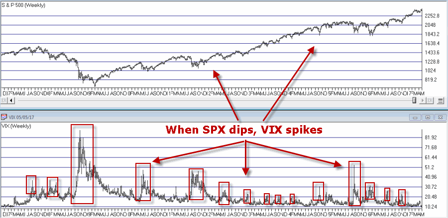
*The VIX Index (see Figure 1) measures the implied volatility of options for the S&P 500 Index traded at the CBOE. Typically when the stock market declines – especially when it declines sharply – the VIX index tends to “spike” as fearful traders rush in and bid up S&P 500 Index option prices
Figure 1 – VIX Index (trading inversely to S&P 500 Index)
(Courtesy WinWayCharts)*In essence, the VIX Index is “inversely correlated” to the stock market.
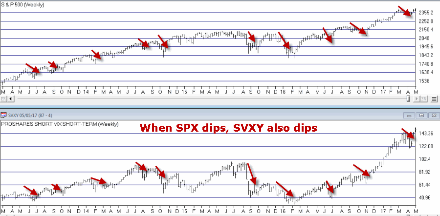
*Ticker SVXY is an ETF that is designed to track the “inverse” of the VIX Index. In other words, when VIX rises, SVXY falls and vice versa. This also means the following:
*Ticker SVXY is highly correlated to the SP 500 Index. In other words, as the stock market moves higher SVXY typically also moves higher and vice versa.
Figure 2 – SVXY (movements are correlated to the S&P 500 index)
(Courtesy WinWayCharts)In sum, a declining trend in the price of SVXY shares typically signals fear, while a rising trend in the price of SXVY typically signals a lack thereof.
Now to My Concern
Hopefully some of that made sense. In a nutshell, the key takeaways are that when fear is low:
*SVXY rises
*Implied volatility declines
But what if both go to extremes? Is that a bad thing? The reason I ask appears in Figure 3.
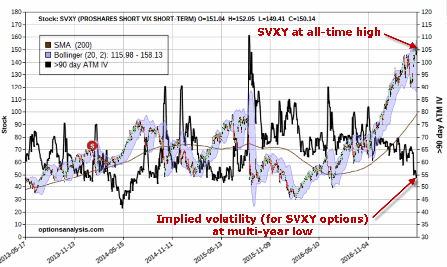
Figure 3 – Ticker SVXY at an all-time high with implied volatility for options on ticker SVXY plunging (both pointing to a lack of fear)
As far as I can tell, this is what a lack of fear looks like:
*Ticker SVXY is rising dramatically
*Implied volatility (SVXY options) is plunging
In the last 4 years there has never been a bigger disparity between these two measures of “fear” – and they are both pointing to “no fear.”
Summary
So the obvious question now is – does any of this matter? I mean this is more of a “perspective” indicator (“where we are now”) than a “timing’ indicator (“where we are headed next”). I cannot presently point out a way to use this to generate specific buy and sell signals.
In addition, as a trend-follower I am not the type to make any “Aha, the End is Near” type pronouncements. As long as the market wants to keep running higher I am happy to “go along for the ride.”
But the less I see my fellow riders being concerned about the market, the more concerned I become.
In the long run that instinct has served me well.
(Here’s hoping that my instinct is wrong this time)
Jay Kaeppel
Disclaimer: The data presented herein were obtained from various third-party sources. While I believe the data to be reliable, no representation is made as to, and no responsibility, warranty or liability is accepted for the accuracy or completeness of such information. The information, opinions and ideas expressed herein are for informational and educational purposes only and do not constitute and should not be construed as investment advice, an advertisement or offering of investment advisory services, or an offer to sell or a solicitation to buy any security.

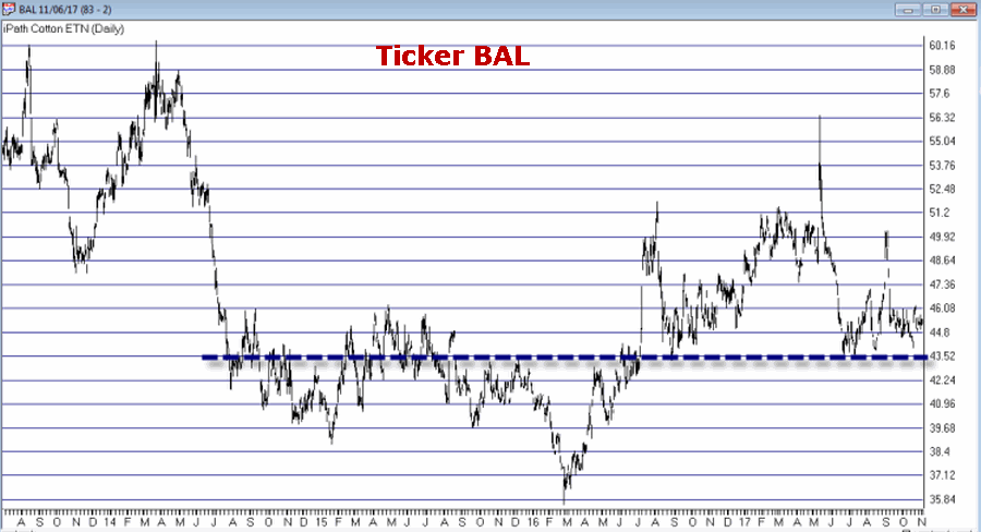 Figure 1 – Ticker BAL (Courtesy TradingExpert)
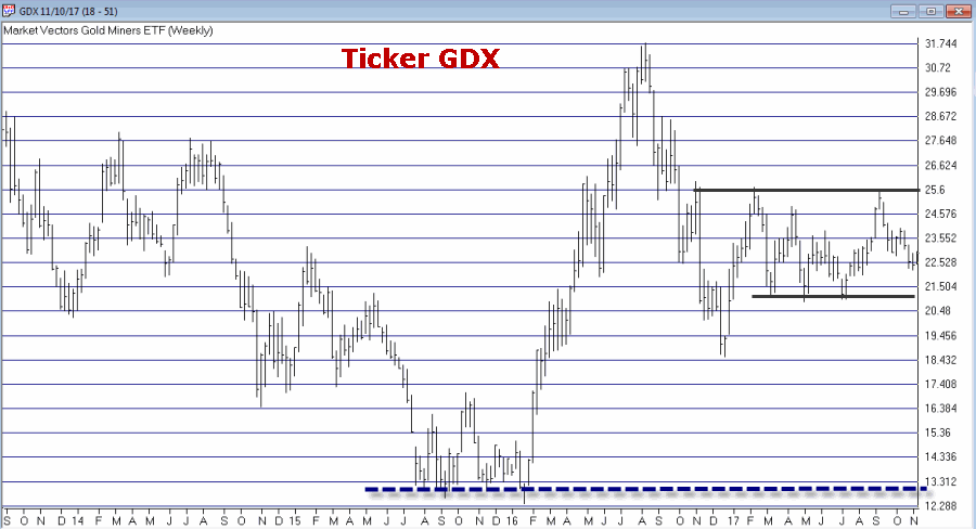 Figure 2 – Ticker GDX (Courtesy (Courtesy TradingExpert)
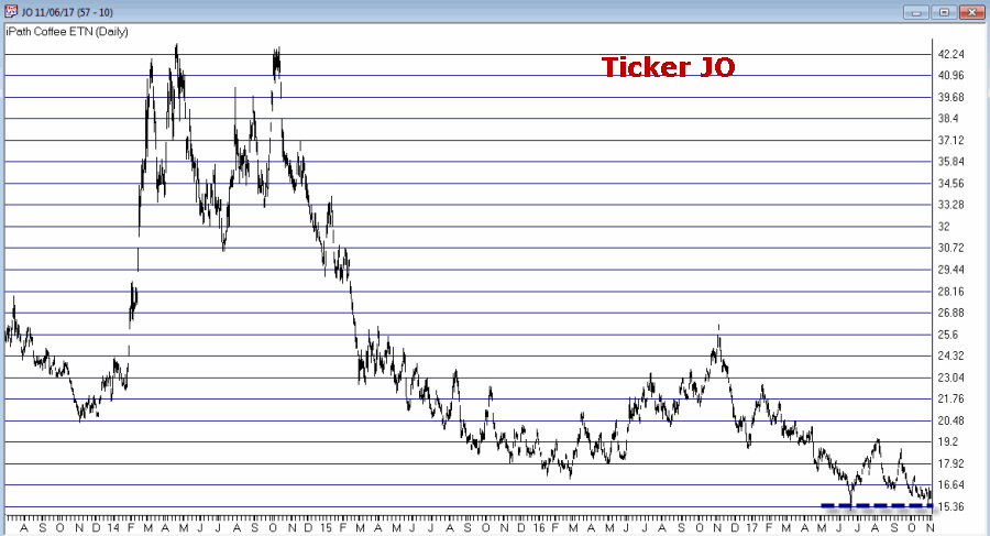 Figure 3 – Ticker JO (Courtesy TradingExpert)
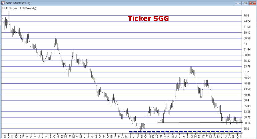 Figure 4 – Ticker SGG (Courtesy TradingExpert)
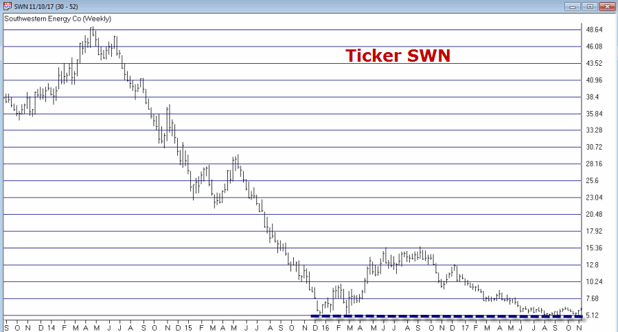 Figure 5 – Ticker SWN (Courtesy TradingExpert)
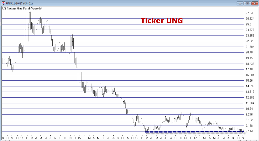 Figure 6 – Ticker UNG (Courtesy TradingExpert)
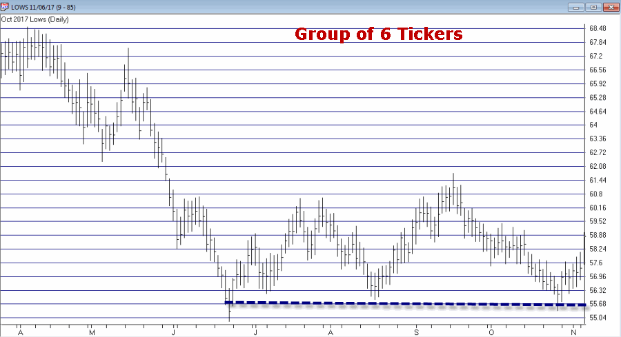 Figure 7 – The “Lows” Group (Courtesy TradingExpert)