Sep 17, 2018 | educational newsletters, ETFs, gold, indicators, jay kaeppel, MACD
Most people are familiar with ADHD, manic-depressive disorder, depression and schizophrenia. But one common affliction within our trading community that gets almost no attention is WESS. That stands for “Wild-Eyed Speculation Syndrome”. And it’s more common than you think (“Hi, my name is Jay”).
The exact symptoms vary, but generally speaking they go something like this:
*A person gets up in the morning with a hankering to make a trade
*Said person then finds “some reason” to make some trade in something
*If the person happens to make money on that trade then the affliction is reinforced by virtue of IGTS (“I’ve Got the Touch Syndrome”, which is one of the occasional side effects of WESS)
*If the person loses money on the trade the side effects can vary but may include: angry outbursts, kicking oneself in the head (typically figuratively), vows to either stop the behavior or at least do it better, and so on.
*The most common side effect of WESS is a declining trading account balance (which not coincidentally is how this disorder is most commonly diagnosed).
For those suffering from WESS – with the caveat/disclosure that I am not a medical professional (although I have found that ibuprofen really clears up a lot of stuff, but I digress) – I am here to help.
If you find yourself suffering from Symptom #1 above:
The most effective step is to go back to bed until the urge passes. If this doesn’t work or is not possible (for instance, if you have one of those pesky “jobs” – you know, that 8-hour a day activity that gets in the way of your trading), repeat these two mantras as many times as necessary:
Mantra 1: “I must employ some reasonably objective, repeatable criteria to find a trade with some actual potential”
Mantra 2: “I will risk no more than 2% of my trading capital” on any WESS induced trade (and just as importantly, you must fend off the voice on the other shoulder shouting “But this is the BIG ONE!!”)
Repeat these mantras as many times as necessary to avoid betting the ranch on some random idea that you “read about on the internet, so it must be true.”
Regarding Mantra 1
There are a million and one ways to find a trade. There is no one best way. But just to give you the idea I will mention one way and highlight a current setup. IMPORTANT: That being said, and as always, I DO NOT make recommendations on this blog. The particular setup I will highlight may work out beautifully, or it may be a complete bust. So DO NOT rush out and make a trade based on this just because you read it – you know – on the internet.
The Divergence
Lots of trades get made based on “divergence”. In this case we are talking about the divergence between price and a given indicator – or even better, series of indicators. There is nothing magic about divergence, and like a lot of things, sometimes it works and sometimes it doesn’t. But the reason it is a viable consideration is that when an indicator flashes a bullish divergence versus price it alerts us to a potential – nothing more, nothing less – shift in momentum.
Let’s look at ticker GDX – an ETF that tracks an index of gold mining stocks. In Figure1 1 through 4 below we see:
*GDX price making a lower low
*A given indicator NOT confirming that new low (i.e., a positive divergence)
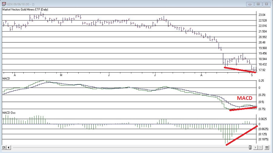
Figure 1 – GDX and MACD (Courtesy WinWayCharts TradingExpert)
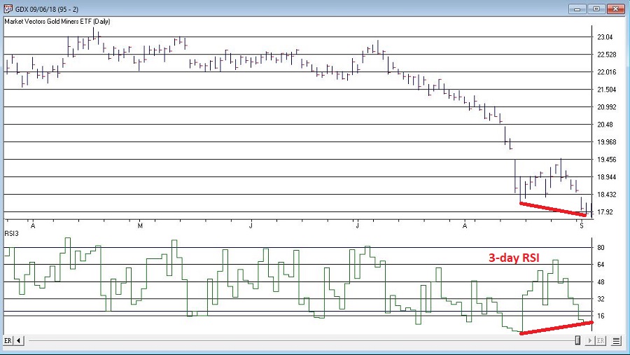
Figure 2 – GDX and 3-day RSI (Courtesy WinWayCharts TradingExpert)
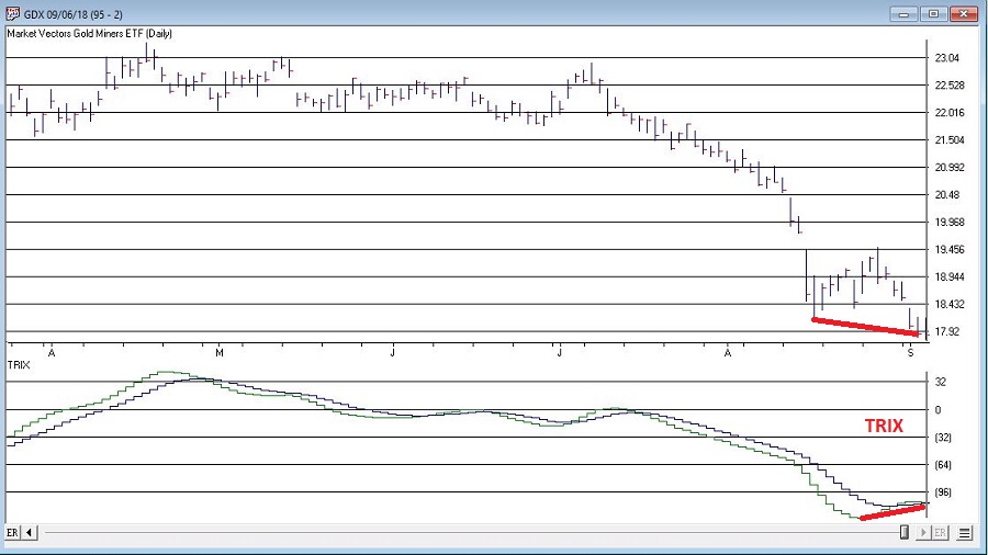
Figure 3 – GDX and TRIX (Courtesy WinWayCharts TradingExpert)
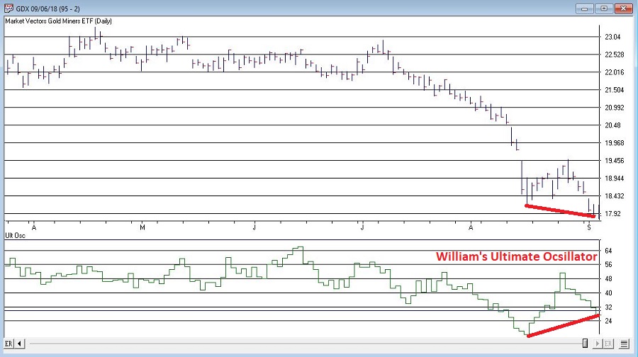
Figure 4 – GDX and William’s Ultimate Oscillator (Courtesy WinWayCharts TradingExpert)
So, do the divergences that appear in Figures 1 through 4 justify a trade? Well, here is where the aforementioned affliction comes into play.
Average Trader: “Maybe, maybe not. In either case I am not entirely sure that trying to pick a bottom in gold stocks based solely on indicator divergences is a good idea”
WESS Sufferer: “Absofreakinglutely!! Let’s do this!!”
You see the problem.
So, let’s assume that a WESS Sufferer likes what he or she sees in Figures 1 through 4. The good news is that we have met the minimum criteria for Mantra #1 above – we have employed some reasonably objective, repeatable criteria (i.e., a bullish divergence between price and a number of variable indicators) to spot a potential opportunity.
Now we must follow Mantra #2 of risking no more than 2% of my trading capital. Let’s assume our WESS Sufferer has a $25,000 trading account. So he or she can risk a maximum of $500 ($25,000 x 2%).
In Figure 5 we see a potential support area for GDX at around $16.40 a share.
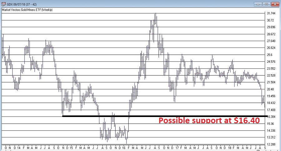
Figure 5 – Ticker GDX with support at $16.40 (Courtesy WinWayCharts TradingExpert)
So, one possibility would be to buy 300 shares of GDX at $17.84 and place a stop loss order below the “line in the sand” at say $16.34 a share. So if the stop is hit, the trade would lose -$450, or -1.8% of our trading capital (17.84 – 16.34 = -1.50 x 300 shares = -$450).
Summary
Does any of the above fit in the category of “A Good Idea”. That’s the thing about trading – and most things in life for that matter – it’s all in the eye of the beholder. Remember, the above is NOT a “recommendation”, only an “example.”
The real key thing to note is that we went from being just a random WESS Sufferer to a WESS Sufferer with a Plan – one that has something other than just an “urge” to find a trade, AND (most importantly) a mechanism for limiting any damage that might be done if things don’t pan out.
And if that doesn’t work, well, there’s always ibuprofen.
Jay Kaeppel
Disclaimer: The data presented herein were obtained from various third-party sources. While I believe the data to be reliable, no representation is made as to, and no responsibility, warranty or liability is accepted for the accuracy or completeness of such information. The information, opinions and ideas expressed herein are for informational and educational purposes only and do not constitute and should not be construed as investment advice, an advertisement or offering of investment advisory services, or an offer to sell or a solicitation to buy any security.
Aug 27, 2018 | chart patterns, educational newsletters
According to one simple technique the “Magic Number” for the S&P 500 Index is 2872.87. According to this simple technique if the S&P 550 Index closes above this number the stock market “should” continue to be bullish for at least another year.
Sounds optimistic? Well, there certainly are no “sure things” in the financial markets. Still, let’s take a closer look.
The technique I mentioned works like this:
*Closes at its highest price in the past 252 trading days
*For the 1st time in the most recent 126 trading days
*It generates a bullish signal for the next 252 trading days
In essence, we are talking about buying when the index makes a 1-year high for the 1st time in 6 months and holding for 1 year.
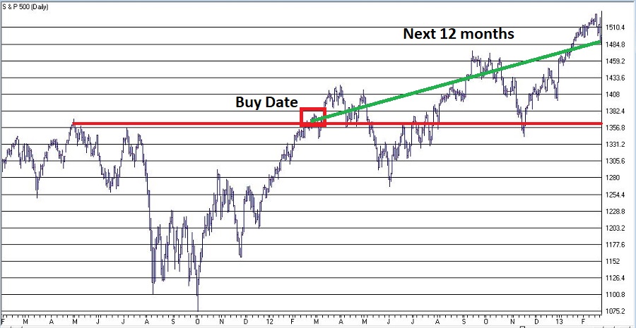
Figure 1 displays the most recent previous buy signal that occurred on 7/11/16. The sell date was 252 trading days later on 7/11/17.
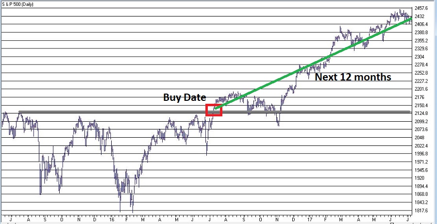
Figure 1 – 2016 Signal (Courtesy TradingExpert)
Figure 2 displays the signal before that which occurred on 2/27/12. The sell date was 252 trading days later on 2/26/13.
Figure 3 displays all the signals since 1933.
| Buy Date |
Sell Date |
Buy Price |
Sell Price |
%+(-) |
| 5/27/33 |
4/6/34 |
9.64 |
10.95 |
+13.6 |
| 5/18/35 |
3/20/36 |
9.87 |
15.04 |
+52.4 |
| 10/6/38 |
8/9/39 |
12.82 |
11.78 |
(8.1) |
| 10/7/42 |
8/10/43 |
9.17 |
11.71 |
+27.7 |
| 6/1/44 |
4/7/45 |
12.31 |
13.84 |
+12.4 |
| 5/15/48 |
4/8/49 |
16.55 |
14.97 |
(9.5) |
| 10/5/49 |
8/23/50 |
15.78 |
18.82 |
+19.3 |
| 3/5/54 |
3/4/55 |
26.52 |
37.52 |
+41.5 |
| 8/4/58 |
8/4/59 |
47.94 |
60.61 |
+26.4 |
| 1/10/61 |
11/2/62 |
58.97 |
57.75 |
(2.1) |
| 4/15/63 |
4/15/64 |
69.09 |
80.09 |
+15.9 |
| 4/24/67 |
4/25/68 |
92.62 |
96.62 |
+4.3 |
| 4/30/68 |
6/9/69 |
97.46 |
101.2 |
+3.8 |
| 1/8/71 |
1/6/72 |
92.19 |
103.51 |
+12.3 |
| 2/7/72 |
2/8/73 |
104.54 |
113.16 |
+8.2 |
| 6/24/75 |
6/22/76 |
94.19 |
103.47 |
+9.9 |
| 8/1/78 |
7/31/79 |
100.66 |
103.81 |
+3.1 |
| 8/14/79 |
8/12/80 |
107.52 |
123.79 |
+15.1 |
| 10/8/82 |
10/6/83 |
131.05 |
170.28 |
+29.9 |
| 11/7/84 |
11/7/85 |
169.17 |
192.62 |
+13.9 |
| 10/19/88 |
10/18/89 |
276.97 |
341.76 |
+23.4 |
| 5/30/90 |
2/13/92 |
360.86 |
413.69 |
+14.6 |
| 7/30/92 |
7/29/93 |
423.92 |
450.24 |
+6.2 |
| 2/6/95 |
2/5/96 |
481.14 |
641.43 |
+33.3 |
| 9/3/03 |
9/2/04 |
1026.27 |
1118.31 |
+9.0 |
| 11/5/04 |
11/4/05 |
1166.17 |
1220.14 |
+4.6 |
| 10/13/09 |
10/13/10 |
1073.19 |
1178.1 |
+9.8 |
| 11/5/10 |
11/4/11 |
1225.85 |
1253.23 |
+2.2 |
| 2/27/12 |
2/26/13 |
1367.59 |
1496.94 |
+9.5 |
| 7/11/16 |
7/11/17 |
2137.16 |
2425.53 |
+13.5 |
Figure 3 – Previous Signals
*27 of the 30 signals (i.e., 90%) have witnessed a 12-month gain
*3 of 30 signals (i.e., 10%) have witnessed a loss
*The last “losing trade” occurred in 1961-1962
*The last 20 signals have been followed by a 12-month gain for the S&P 500
*The average of all 30 signals is +13.9%
*The average for all 27 winning trades is +16.1%
*The average of all 3 losing trades is -6.6%
*The worst losing trade was -9.5%
Believe it or not, into the early 1950’s the stock market used to be open on Saturday. So those days counted toward the 126 and 252 trading days counts. This explains why the buy and sell dates prior to 1954 were less than one calendar year apart.
It is possible to get a new signal before an existing signal reaches it’s Sell Date. In those rare cases we simply extend the holding period an additional 252 trading days. This occurred in 1961-1962, 1968-1969, 1990-1992.
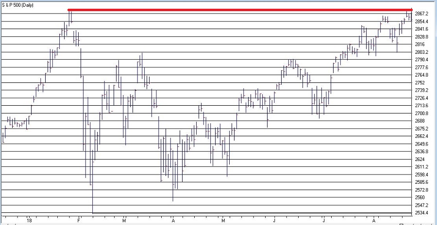
Figure 4 shows that SPX is very close to generating a new signal. The most recent high close was in January at 2872.87 which was more than 126 trading days ago. A new signal will occur if SPX closes above that level.
The Good News is that this technique has a 90% accuracy rate and that one good day in the market could generated a new buy signal. The Bad News is that – as I mentioned earlier – there are no “sure things” in the market. Given that this particular method is on a 20-trade winning streak, it is understandable to think that maybe the law of averages is against it this time.
We’ll just have to wait and see what happens.
Disclaimer: The data presented herein were obtained from various third-party sources. While I believe the data to be reliable, no representation is made as to, and no responsibility, warranty or liability is accepted for the accuracy or completeness of such information. The information, opinions and ideas expressed herein are for informational and educational purposes only and do not constitute and should not be construed as investment advice, an advertisement or offering of investment advisory services, or an offer to sell or a solicitation to buy any security.
Aug 8, 2018 | educational newsletters, ETFs, indexes, jay kaeppel
Investors who pay close attention to the financial markets by and large spend a fair amount of time being “perplexed.” If you take all the “news” related to the markets and combine that with all the day-to-day and week-to-week gyrations of the markets, there often seems to be no rhyme or reason for what goes on (hence the reason I generally advocate a slightly less hyper, more trend-driven approach).
But sometimes it all seems to come crystal clear. In the most recent fortnight most of the major market averages (with the Dow and S&P 500 being the primary exceptions) have touched or at least teased new highs. Facebook got crushed and the market didn’t tank. Tesla struggled mightily before bursting back into the bright sunlight – and the market didn’t tank. In fact, all kinds of things have happened and still the major U.S. averages march relentlessly higher backed by a strong economy, reasonably moderate inflation and higher, yet by no means high interest rates.
At this point, it appears “obvious” that there is no end in sight to the Great Bull Market. A number of momentum studies I have read lately seem to all confirm that the U.S. market will continue to march higher to significantly higher new highs.
And the fact that it is so “obvious” scares the $%^& out of me. Don’t misunderstand. This is not about to devolve into a hysterical “Sell Everything!” screed. The trend is bullish therefore so am I. But the “what could possibly go wrong” antennae still pop up from time to time. So here are some random views regarding all things stock market.
Figure 1 displays 4 major U.S. market averages. All are in uptrends above their respective 200-day moving averages and all are close to all-time highs. The big question is “what happens when they get there?” Do they all break through effortlessly? Or do we get a “struggle?”
(click to enlarge)
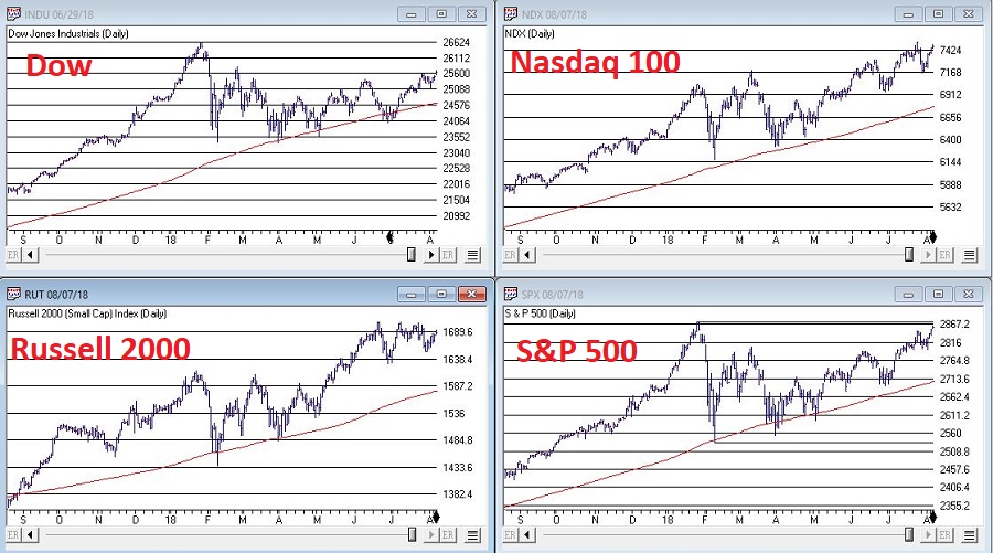
Figure 1 – The Major U.S. Averages; clearly in up trends, but… (Courtesy TradingExpert)
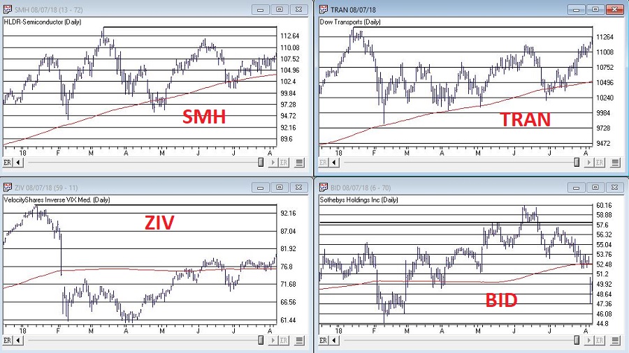
Figure 2 displays my own 4 market “bellwethers”, including the semiconductors (SMH), Dow Transports (TRAN), Inverse VIX ETF (ZIV) and Sotheby’s Holdings (BID). At the moment, none of these are actively “confirming” new highs and they each have a clear “line in the sand” resistance level overhead. So, for the moment they presently pose something of a minor warning sign.
While the U.S. economy and stock market appear to be hitting on all cylinders, the rest of the world is sort of “chugging along.” Figure 3 displays 4 “Geographic Groups” that I follow – The Americas, Asia/Pacific, Europe and Middle East. The good news is that each group is presently holding above it’s respective 21-month moving average. So technically, the trend is “Up.” But the bad news is that each group has some significant overhead resistance, so the current uptrend is by no means of the “rip roaring” variety.
(click to enlarge)
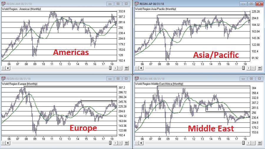
Figure 3 – Major Geographic Groups; Hanging onto uptrends but serious overhead resistance (Courtesy TradingExpert)
Traders have been pretty much conditioned in recent years to assume that the VIX Index – which measures volatility and by extension, “fear” – is and will remain low as the market chugs higher. And that may prove to be true. But when everything gets to “obvious” (i.e., the U.S. market is “clearly” heading higher) and things get too quiet (VIX dropped below 11% for the 1st time in 3 months) it can pay to “expect the unexpected.”
Figure 4 is from www.sentimentrader.com and displays those instances in the past when the VIX Index fell below 11% for the first time in 3 months. Historically, VIX makes some kind of an up move in the 2 to 3 months following such occurrences.
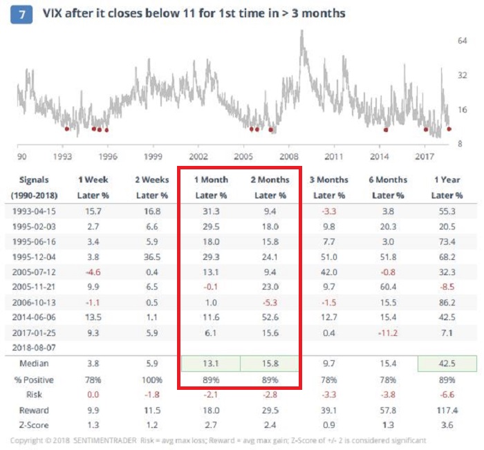
Figure 4 – VIX Index performance after VIX Index drops below 11% for 1st time in 3 months (Courtesy Sentimentrader.com)
Things may or may not play out “like usual” this time around, however, given that…
*The U.S. averages are “obviously” heading higher
*The market bellwethers are so far not confirming
*The rest of the worlds stock markets are nowhere near as strong
*VIX has a history of “spiking”, especially during the seasonally unfavorable months of August and September
…It might make sense to consider a long volatility play (NOTE: Long volatility plays using ticker VXX have a long history of not panning out as ticker VXX is essentially built to go to zero – for more information on VXX and the effects of “contango” please see www.Google.com. Long VXX trades are best considered).
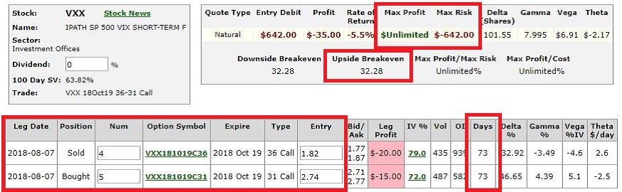
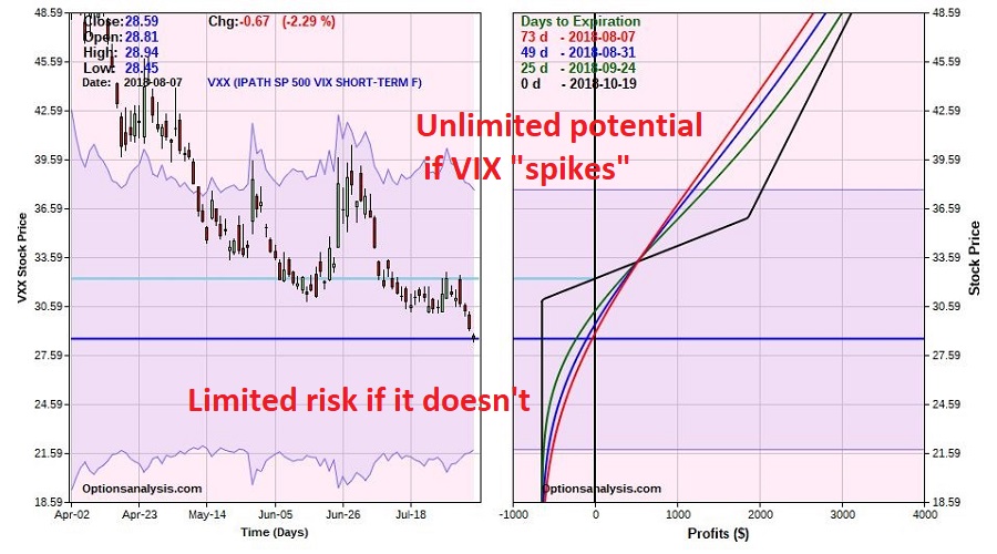
One example appears in Figures 5 and 6. This trade involves:
*Buying 5 Oct VXX 31 calls @ $2.74
*Selling 4 Oct VXX 36 calls @ $1.82
The maximum risk is $642 if VXX fails to get above the breakeven price of $32.28 by October 19th. On the other hand, if something completely not “obvious” happens and volatility does in fact spike, the trade has significant upside potential.
(NOTE: As always, please remember that this is an “example” of a speculative contrarian trade, and NOT a “recommendation.” If the stock market rallies – as it “obviously” seems to want to do, this trade will likely lose money.)
Disclaimer: The data presented herein were obtained from various third-party sources. While I believe the data to be reliable, no representation is made as to, and no responsibility, warranty or liability is accepted for the accuracy or completeness of such information. The information, opinions and ideas expressed herein are for informational and educational purposes only and do not constitute and should not be construed as investment advice, an advertisement or offering of investment advisory services, or an offer to sell or a solicitation to buy any security.
Jul 30, 2018 | EDS, EDS code, Stocks & Commodities Traders Tips
The WinWayCharts EDScode based on Markos Katsanos’ article in this issue, “A Technical Method For Rating Stocks,” is shown below.
Synopsis from Stocks & Commodities June 2018
I’s it possible to create a stock rating system using multiple indicators or other technical criteria? If so, how does it compare with analyst ratings? Investors around the world move billions of dollars every day on advice from Wall Street research analysts. Most retail investors do not have the time or can’t be bothered to read the full stock report and rely solely on the bottom line: the stock rating. They believe these ratings are reliable and base their investment decisions at least partly on the analyst buy/sell rating. But how reliable are those buy/sell ratings? In this article I will present a technical stock rating system based on five technical criteria and indicators, backtest it, and compare its performance to analyst ratings.
!A TECHNICAL METHOD FOR RATING STOCKS
!Author: Markos Katsanos, TASC June 2018
!Coded by: Richard Denning, 4/18/18
!www.TradersEdgeSystems.com

!INPUTS:
  MAP is 63.
  STIFFMAX is 7.
  VFIPeriod is 130.
  MASPY is 100.
  MADL is 100.
  SCORECRIT is 5.
  W1 is 1.
  W2 is 1.
  W3 is 1.
  W4 is 1.
  W5 is 2.

!VFI FORMULA:
  COEF is 0.2.
  VCOEF is 2.5.
  Avg is ([high]+[low]+[close])/3.
  inter is ln( Avg ) - ln( Valresult( Avg, 1 ) ).
  vinter is sqrt(variance(inter, 30 )).
  cutoff is Coef * Vinter * [Close].
  vave is Valresult(simpleavg([volume], VFIPeriod ), 1 ).
  vmax is Vave * Vcoef.
  vc is Min( [volume], VMax ).
  mf is Avg - Valresult( Avg, 1 ).
  vcp is iff(MF > Cutoff,VC,iff(MF < -Cutoff,-VC,0)).
  vfitemp is Sum(VCP , VFIPeriod ) / Vave.
  vfi is expavg(VFItemp, 3 ).

!STIFFNESS
  ma100 is Avg.
  CLMA if [close] < MA100.
  STIFFNESS is countof(CLMA,MAP).

!CONDITIONS:
 ! MONEY FLOW:
   COND1 is iff(VFI>0,1,0).
 !SIMPLEAVG:
    SMA is simpleavg([close],MADL).
    COND2 is iff([close]>SMA,1,0).
 !SIMPLEAVG DIRECTION:
    COND3 is iff(SMA>valresult(SMA,4),1,0).
!STIFFNESS:
    COND4 is iff(STIFFNESS<= STIFFMAX,1,0).
!MARKET DIRECTION:
    SPY is TickerUDF("SPY",[close]).
    COND5 is iff(EXPAVG(SPY,MASPY)>=
 valresult(EXPAVG(SPY,MASPY),2),1,0).

SCORE is  W1*COND1+W2*COND2+W3*COND3+
   W4*COND4+W5*COND5.

 buy if Score>=SCORECRIT and hasdatafor(300)>=268.
Figure 11 shows the summary results of a backtest using NASDAQ 100 stocks during a generally bullish period from April 2009 to April 2018. Figure 12 shows the backtest using the same list of NASDAQ 100 stocks during a period that had two bear markets (April 1999 to April 2009). The average results are similar except that there are fewer trades during the period that contained the two bear markets. Both backtests use a fixed 21-bar exit.
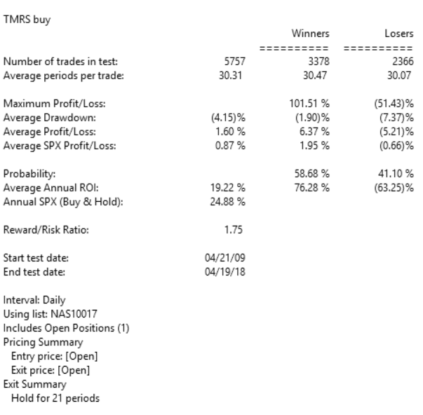
FIGURE 11: AIQ, BULL MARKET. Here are the summary results of a backtest using NASDAQ 100 stocks during a generally bullish period from April 2009 to April 2018.
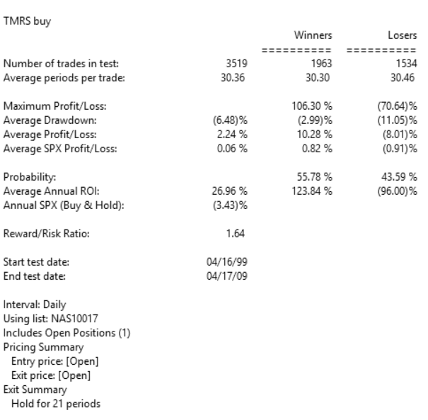
FIGURE 12: AIQ, BEAR MARKET. Here are the summary results of a backtest using NASDAQ 100 stocks during a period from April 1999 to April 2009 that contained two bear markets.
Jul 13, 2018 | chart patterns, educational newsletters, ETFs, gold
This week it is the U.S. dollar and Gold taking their turns testing critical inflection points.
As you can see in Figure 1, on a seasonal basis the dollar is moving into a traditionally weaker time of year.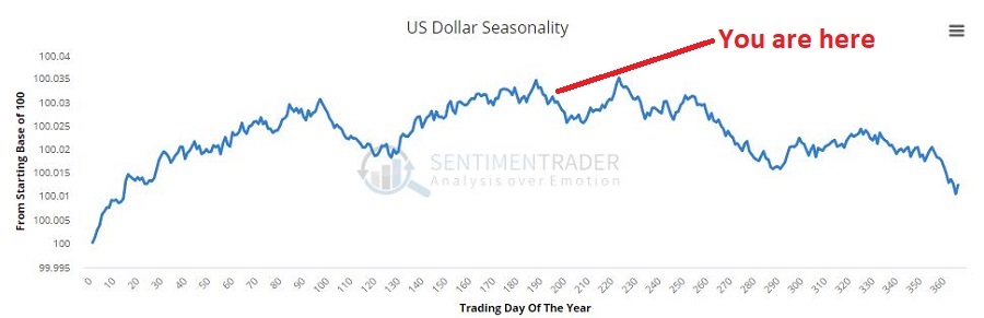 Figure 1 – U.S. Dollar seasonality (Courtesy Sentimentrader.com)
In Figure 2 you can see that traders have been and remain pretty optimistic. This is traditionally a bearish contrarian sign.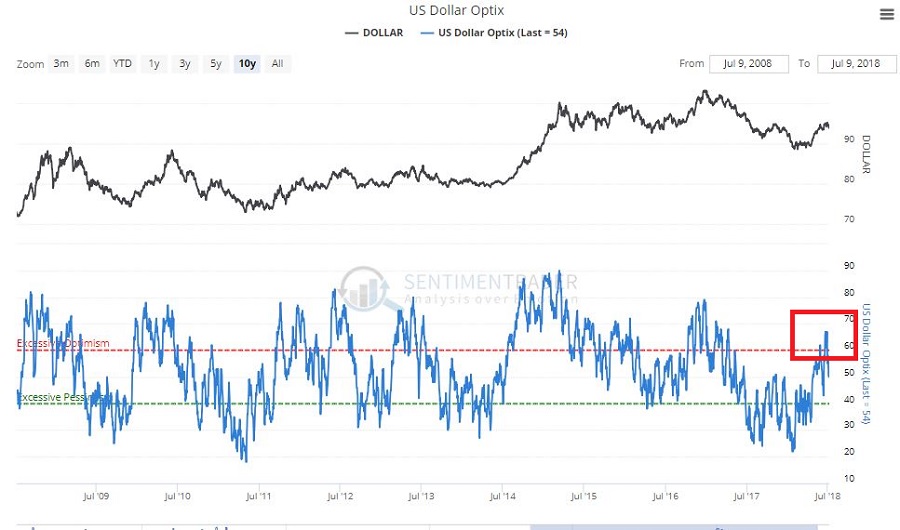 Figure 2 – U.S. Dollar trade sentiment (Courtesy Sentimentrader.com)
In Figure 3 we see the “line in the sand” for ticker UUP – an ETF that tracks the U.S. Dollar. Unless and until UUP punches through to the upside there is significant potential downside risk.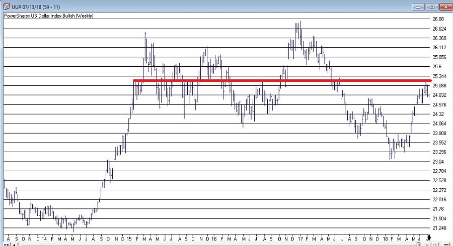 Figure 3 – U.S. Dollar w/resistance (Courtesy TradingExpert)
As you can see in Figure 4, on a seasonal basis the dollar is moving into a traditionally stronger time of year.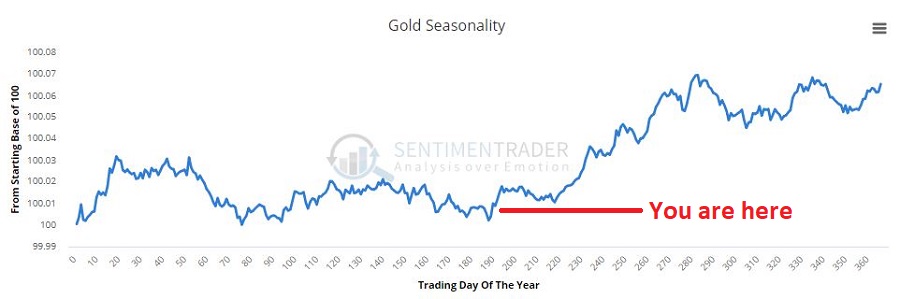 Figure 4 – Gold seasonality (Courtesy Sentimentrader.com)
In Figure 5 you can see that traders have been and remain pretty pessimistic. This is traditionally a bullish contrarian sign.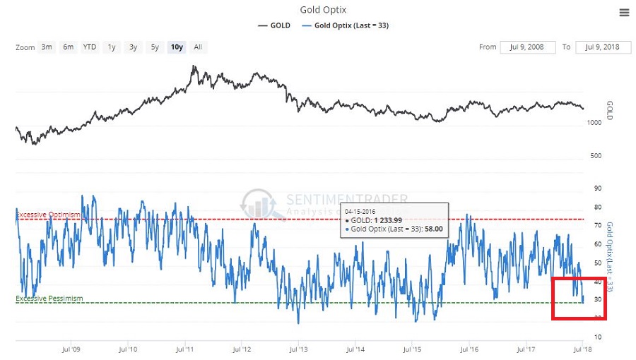 Figure 5 – Gold trader sentiment (Courtesy Sentimentrader.com)
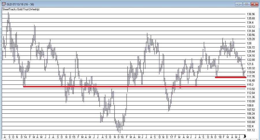
In Figure 6 we see the “line(s) in the sand” for ticker GLD – an ETF that tracks gold bullion.
I would be hesitant about trying to “pick a bottom” as gold still looks pretty week. But if:
a) GLD does hold above the support area in Figure 6 and begins to perk up,
b) Ticker UUP fails to break out to the upside
Things could look a lot better for gold very quickly.
As usual I am not actually making any “predictions” here or calling for any particular action. I mainly just want to encourage gold and/or dollar traders to be paying close attention in the days and weeks ahead, as the potential for a major reversal in both markets appears possible.
Likewise, if no reversal does take place – and if the dollar breaks out to the upside and gold breaks down, both markets may be “off to the races.”
So dollar and gold traders – take a deep breath; focus your attention; and prepare for action…one way or the other.
Disclaimer: The data presented herein were obtained from various third-party sources. While I believe the data to be reliable, no representation is made as to, and no responsibility, warranty or liability is accepted for the accuracy or completeness of such information. The information, opinions and ideas expressed herein are for informational and educational purposes only and do not constitute and should not be construed as investment advice, an advertisement or offering of investment advisory services, or an offer to sell or a solicitation to buy any security.
Jul 5, 2018 | chart patterns, educational newsletters, ETFs, indexes, jay kaeppel, market timing
Here’s a number for you – 88%. Since 1948, over any 10-year period the Dow has showed a gain 88% of the time. That’s a pretty good number. It also explains why we should give bull markets the benefit of the doubt (for the record, if you only hold the Dow between the end of October and the end of May every year you would have a showed a 10-year gain 98% of the time! But this article is not about seasonality per se, so that’s a topic for another day).
Of course, there is a lot of variability along the way, and if you Google “current signs of a bear market” you come up with 4,280,000 articles to peruse. So, few investors ever feel “contented”. We’re always waiting for the “other shoe to drop.”
Some Warning Signs to Look For
#1. Major Indexes
Figure 1 displays the four major average – Dow, S&P 500, Nasdaq 100 and Russell 2000 with their respective 200-day moving averages. In the last few days the Dow slipped a little below its 200-day average, the other three remain above.
(click to enlarge)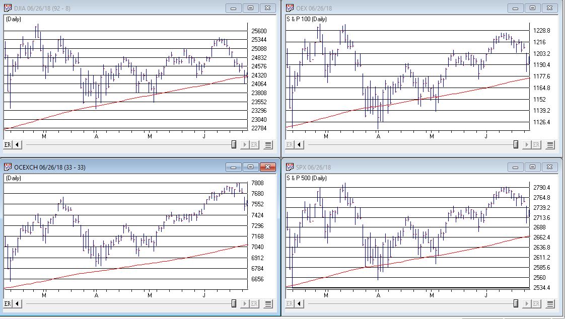 Figure 1 – Four major market averages with 200-day moving averages (Courtesy TradingExpert)
Warning Sign to Watch For: If 3 or more of these averages drop below their 200-day moving average.
#2. Market Bellwethers
Figure 2 displays my four market “bellwhethers” – tickers SMH (semiconductors), TRAN (Dow Transports), ZIV (inverse VIX) and BID (Sotheby’s Holdings) with their respective 200-day moving averages. At the moment only ZIV is below it’s 200-day moving average but some of the others are close
(click to enlarge)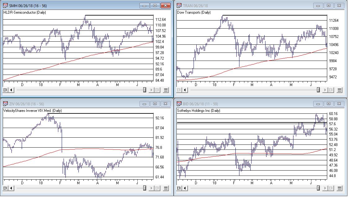 Figure 2 – Four market bellwethers with 200-dqy moving averages (Courtesy TradingExpert)
Warning Sign to Watch For: If 3 or more of these averages drop below their 200-day moving average.
#3. S&P 500 Monthly Method
In this article I detailed a simple timing method using S&P 500 Index monthly closing prices. Figure 3 show the S&P 500 Index with it’s “trigger warning” price of 2,532.69 highlighted.
(click to enlarge)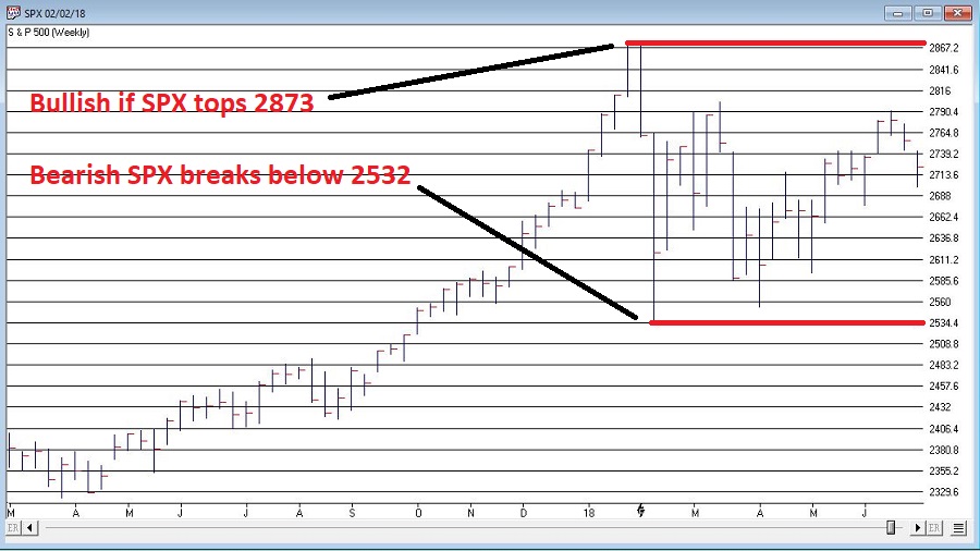 Figure 3 – S&P 500 Index Monthly Method Trigger Points (Courtesy TradingExpert)
Warning Sign to Watch For: If SPX closes below 2532.69 without first taking out the January high of 2872.87
#4. International Growth Stocks
When growth stocks around the world are performing well, things are good. When they top out, try to rebound and then fail, things are (typically) not so good. The last two major U.S. bear markets were presaged by a break in ticker VWIGX (Vanguard International Growth) as seen in Figure 4.
(click to enlarge)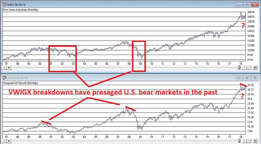 Figure 4 – Dow Jones Industrials Average (top) and previous warnings from ticker VWIGX (bottom)(Courtesy TradingExpert)
Warning Sign to Watch For: Technically this one is currently flashing a warning sign. That warning will remain active unless and until VWIGX takes out the January high of 33.19.
#5. The 10-Year minus 2-Year Yield Spread
This is one of the most misrepresented indicators, so I will state it as plainly as possible:
*A narrowing yield curve IS NOT a bearish sign for the stock market
*An actual inverted yield curve IS a bearish sign for the stock market
Figure 5 displays the latest 10-year minus 2-year spread. Yes, it has narrowed quite a bit. This has launched a bazillion and one erroneously frightening articles. But remember the rules above.
(click to enlarge)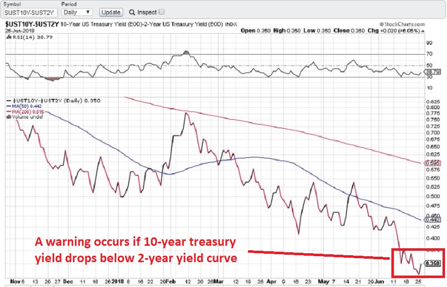 Figure 5 – 10-year treasury yield minus 2-year treasury yield (Courtesy: www.StockCharts.com)
Warning Sign to Watch For: If the 10-year yield minus the 2-year yield falls into negative territory it will flash a powerful warning sign for the stock market and the overall economy. Until then ignore all the hand-wringing about a “flattening” yield curve.
Summary
We are in a seasonally unfavorable period for the stock market and – as always – we are bombarded daily with a thousand and one reasons why the next bear market is imminent.
So my advice is to do the following:
1. Ignore it all and keep track of the items listed above
2. The more warning signs that appear – if any – the more defensive you should become
In the meantime, try to go ahead and enjoy your summer.
Jay Kaeppel
Disclaimer: The data presented herein were obtained from various third-party sources. While I believe the data to be reliable, no representation is made as to, and no responsibility, warranty or liability is accepted for the accuracy or completeness of such information. The information, opinions and ideas expressed herein are for informational and educational purposes only and do not constitute and should not be construed as investment advice, an advertisement or offering of investment advisory services, or an offer to sell or a solicitation to buy any security.
Jun 27, 2018 | chart patterns, educational newsletters, ETFs, indexes, jay kaeppel
If an investor were to sit down and peruse the Web looking for guidance regarding the stock market, there is a good chance they would come away bewildered and confused.
So, let’s try to simplify things a bit.
Jay’s Trading Maxim #14: When in doubt, usually the best question to ask is “What is the trend right now?”
There are always a million and one reasons why an investor may feel doubt. But answering that simple question can often lead to a much greater deal of clarity. Like now for instance.
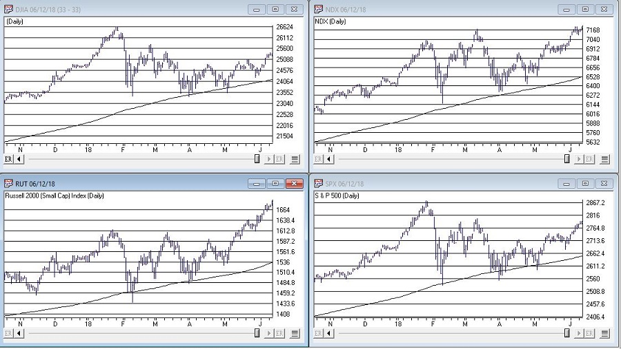
In Figure 1 we see the Dow, Nasdaq 100, Russell 200 small-cap index and the S&P 500. The key thing to note is that all 4 of them are above their respective 200-day moving average, i.e., “right now” the trend is up.
Jay’s Trading Maxim #14a: If the trend right now is “Up”, act accordingly. At least until the answer changes.

Figure 1 – Major U.S. Indexes in Up Trends (Courtesy TradingExpert)
SPX Monthly Trend-Following
I wrote here and here about a simple monthly trend-following method using the S&P 500 Index.
This method gave an “alert” when the S&P 500 went 3 calendar months (Feb, March and April) without making a new high.
The “line in the sand” is the low during this period of 2532,69. As long as price holds above this level, this method deems the trend as still “Up”.
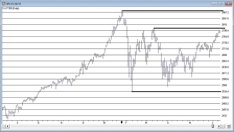
It will take a move above the January high 2872.87 to eliminate this line in the sand. Between here and there there is resistance at 2801.90.

Figure 2 – S&P 500 Index key support and resistance (Courtesy TradingExpert)
I am not speaking in any geopolitical sense here. And I don’t want to sound like the Ugly American. But while the U.S. stock market is “taking care of business” and moving higher, the stock markets of much of the rest of the world are not. And I am not sure if I should worry about this or not.
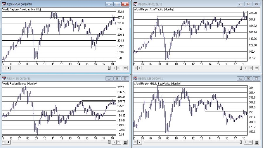
But for what it is worth, all 4 regional single country ETF indexes that I created (Americas, Asia/Pacific, Europe and Middle East) and follow are not looking terribly inspiring at the moment.
The trend “right now” is “Up”. So enjoy.
But maybe check back again soon. Just in case.
Disclaimer: The data presented herein were obtained from various third-party sources. While I believe the data to be reliable, no representation is made as to, and no responsibility, warranty or liability is accepted for the accuracy or completeness of such information. The information, opinions and ideas expressed herein are for informational and educational purposes only and do not constitute and should not be construed as investment advice, an advertisement or offering of investment advisory services, or an offer to sell or a solicitation to buy any security.
Jun 19, 2018 | educational newsletters, ETFs, gold, indexes, jay kaeppel
I suppose a more accurate title would be, “A Bunch of Single Country ETFs, Interrupted”, but, well, that just doesn’t have quite the same succinct simplicity.
I always (always, always) try to make an effort to focus on “the current trend” and to avoid focusing on things that “maybe might prove to be ominous signs in retrospect” or to imply that a certain tidbit of information is predictive when in reality it is mostly just anecdotal. Still, human nature is – unfortunately, in this case – a powerful force. Which reminds me to invoke:
Jay’s Trading Maxim #17: Human nature is a detriment to trading and investment success, and should be avoided as much as, well, humanly possible.
The bottom line is that despite my very own warnings and admonitions, sometimes that pesky human nature gets the best of me.
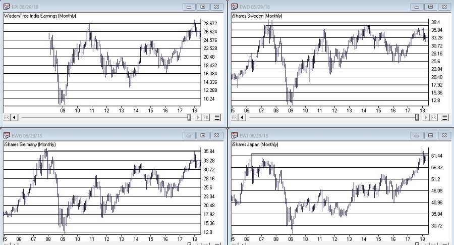
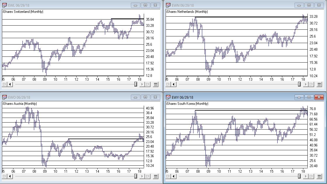
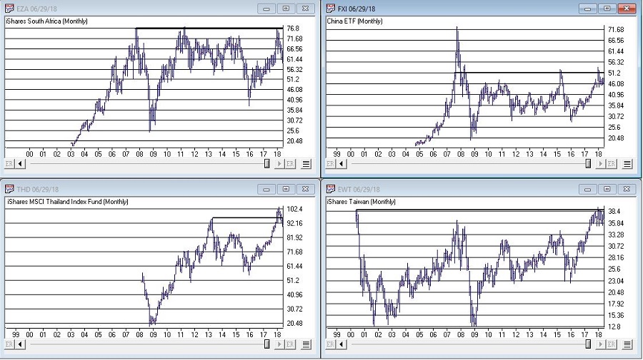
OK, rather than me telling you what I think, please simply peruse the charts in Figures 1, 2 and 3 and see if anything jumps out at you.
(click to enlarge)
Figure 1 – India, Sweden, Japan, Germany (clockwise); (Courtesy TradingExpert)
(click to enlarge)
Figure 2 – Switzerland, Netherlands, South Korea, Austria (clockwise); (Courtesy TradingExpert)
(click to enlarge)
Figure 3 – South Africa, China, Taiwan, Thailand (clockwise); (Courtesy TradingExpert)
Perhaps you noticed the same thing I did, i.e., a whole bunch of single country ETF’s hitting new highs or testing old resistance and getting rejected. In a number of cases, after appearing to break out to new highs for a period of weeks or month only to fall back below the “line in the sand.”
It’s sort of like the World Cup of Failed Breakouts.
Now here’s the thing. I have displayed a bunch of charts that anecdotally seem to imply something bearish. To spell it out, failed breakouts are often – though definitely not always – followed by something much worse.
So the line of reasoning goes like this, “If the stock market in umpteen countries is failing to advance then this must be a bad thing.”
But the reality is that all these markets have to do is rally and this whole sort of made up area of concern goes away.
Still, until that actually happens I think I will:
a) Enjoy the rally here in the U.S.
It seems like a reasonable plan.
Disclaimer: The data presented herein were obtained from various third-party sources. While I believe the data to be reliable, no representation is made as to, and no responsibility, warranty or liability is accepted for the accuracy or completeness of such information. The information, opinions and ideas expressed herein are for informational and educational purposes only and do not constitute and should not be construed as investment advice, an advertisement or offering of investment advisory services, or an offer to sell or a solicitation to buy any security.
Jun 8, 2018 | Charts, educational newsletters, ETFs, gold, group and sector, indexes, jay kaeppel
There are a lot of ways to play this game.
For the record, I am a big believer in trend-following. Picking tops and bottoms with any consistency is essentially impossible (at least in my opinion and/or experience). So from that perspective going with the trend makes a lot of sense. I am also a big believer in relative strength. Much evidence over the years suggests that buying what is “already moving” is a very viable approach to investing. Other studies have demonstrated pretty clearly that you are generally much more likely to succeed by buying stocks making new highs than by buying stocks making new lows.
These approaches make good sense and they work very well over time. Despite this many (most?) investors still feel those pangs to “buy low” in hopes of getting in early and riding a major trend. And the truth (I think) is that this can work too, if done correctly.
Like I said, there are a lot of ways to play this game. But there is a definite “right” way and “wrong” way when it comes to “buying low.”
Buying Low (The Wrong Way): Buy things are plummeting or that have recently plummeted.
The Right Way (The Right Way): Buy things that have, a) plummeted, b) stopped plummeting and, c) have since been moving sideways for some period of time.
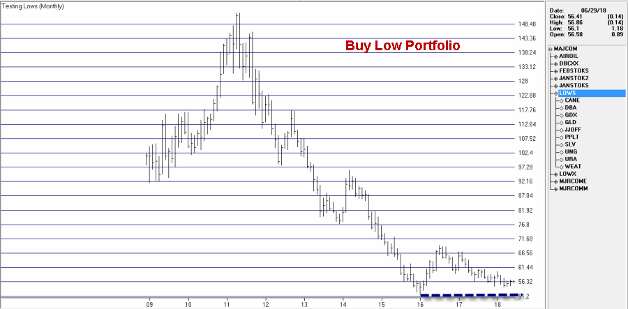
Last year I wrote about a “Buy Low” portfolio that I had concocted at the time. Unfortunately, several of the ETFs involved have since ceased trading. So in this piece I will introduce my updated “Buy Low” portfolio. For the record – and as always – I am not “recommending” this portfolio. It is essentially an experiment in one alternative approach to investing.
The “Buy Low” Portfolio
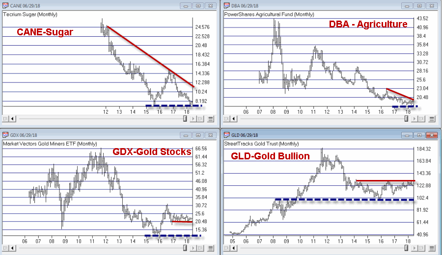
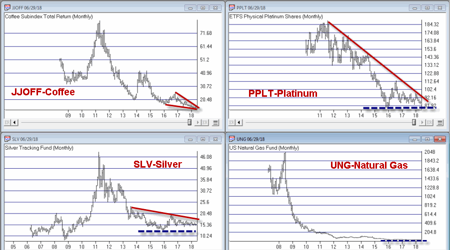
The Buy Low Portfolio consists of the following ETF’s and ETN’s:
CANE – Tecrium Sugar
JJOFF – Coffee Subindex Total Return
DBA – PowerShares Agricultural
WEAT – Tecrium Wheat
GLD – StreetTracks Gold Trust
PPLT – ETFS Physical Platinum Shares
SLV – iShares Silver Trust
GDX – Market Vectors Gold Miners
UNG – United States Natural Gas
URA – Global X Uranium
Monthly charts for these tickers appear in Figures 1 through 3. A chart of the composite index I created by combining all of these appears in Figure 4 (Click any chart to enlarge).
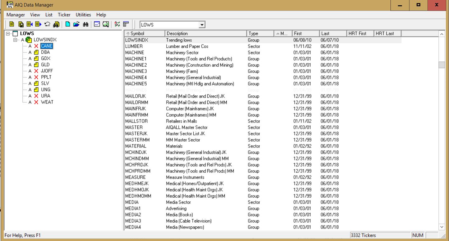
Editors note: To create an index like Jay’s Trending Low, follow the instructions at the end of this article ‘Creating an index for a group of tickers in Data Manager’
Summary
Securities that have plummeted in price and then moved sideways for a period of time can (unfortunately) continue to move sideways for quite a while longer before (hopefully) breaking out to the upside. Even worst, they can also fail and breakdown through the previous low. But extended consolidation patterns are often followed by something good.
As you can see all of the tickers in the list above are commodity related. As I’ve written about
here and
here there is reason to believe that commodities will outperform in the years ahead. That being said, with the stock market rallying in the near-term and with the U.S. Dollar strong there is no compelling reason to think that this “Buy Low Portfolio” is going to make a lot of headway anytime soon.
The Index in Figure 4 is presently 8.2% above its January 2016 low. As long as that low holds I’ll give this experiment more time to work out.
Jay Kaeppel
Disclaimer: The data presented herein were obtained from various third-party sources. While I believe the data to be reliable, no representation is made as to, and no responsibility, warranty or liability is accepted for the accuracy or completeness of such information. The information, opinions and ideas expressed herein are for informational and educational purposes only and do not constitute and should not be construed as investment advice, an advertisement or offering of investment advisory services, or an offer to sell or a solicitation to buy any security.
Creating an index for a group of tickers in Data Manager
NOTE: tickers with X in list need to be added to the Data Manager as new tickers and downloaded from your data service
When you create an index for a group of tickers, you can display a chart of the index as well as the underlying tickers. A group index can be analyzed on charts using technical indicators, and Expert Ratings are generated for the group index (except for mutual fund
groups).
The procedure for creating an index for a group of tickers is as follows:
- First, create a group ticker for the index.
- Then create a list to insert the group ticker into.
- Add tickers to the group.
- Finally, create the index by executing the Compute Group/Sector Indices function.
To create an index for a group of tickers, follow the steps below.
First, create a group ticker:
1. First, add a new group ticker to your Master Ticker List. Select the
Ticker command on the menu bar. Then select New to display the
New Ticker dialog box.
2. Enter a ticker for the new group, then be sure to enter the proper
Type designation (group or mutual fund group).
3. Click OK, and the second dialog box for entering a new ticker
appears.
4. Type in a name (Description) and the First Date for data. The
remaining default settings on this second dialog box can remain the
same.
5. Click OK and the group ticker is added to your Master Ticker List.
Then, create a list to insert the group ticker into:
1. Select the List command on the menu bar.
2. Select New on the drop-down menu and a dialog box appears.
3. Type in a name (8 characters maximum) in the text box.
4. Click OK and the list name appears in the Selected List text box
located on the toolbar.
5. The list name is also displayed in the List window. Insert the group
ticker from your Master Ticker List under the list name. To insert a ticker directly under a list, do the following:
- Highlight (by clicking) the group ticker in the Master Ticker List.
- Click the list name in the List window.
- Click the Insert to List button on the toolbar (or select the Insert Ticker command from the List sub-menu).
- The group ticker will appear in the List window under the list name.
6. Next, insert tickers into the group. To insert tickers into a group:
Under the new group, insert all of the tickers that will make up the
group by doing the following:
- Select the group ticker in the List window by clicking on it.
- Select in your Master Ticker List the tickers that you want to add to the group. If you are inserting multiple tickers, hold down the Ctrl key while clicking each ticker.
- Click the Insert to List button on the toolbar (or select the Insert Ticker command from the List sub-menu).
- The tickers will appear in the List window under the group ticker.
7. Finally, compute the index for the new group. To compute a group index:
- Select Compute Group/Sector Indices from the Utilities sub-menu.
- In the Compute Group/Sector Indices dialog box, click the Compute List(s) option button.
- In the text box for Compute List(s), select the name of the list you created above.
- Under Range, choose Update from Last Date of Data and click OK.
May 30, 2018 | educational newsletters, ETFs, indexes, jay kaeppel
The energy sector – not just unloved, but pretty much reviled not that long ago – is suddenly everybody’s favorite sector. And why not, what with crude oil rallying steadily in the last year and pulling pretty much everything energy related higher with it?
Anecdotally, everything I read seems to be on board with a continuation of the energy rally. And that may well prove to be the case. But at least for the moment I am waiting for some confirmation.
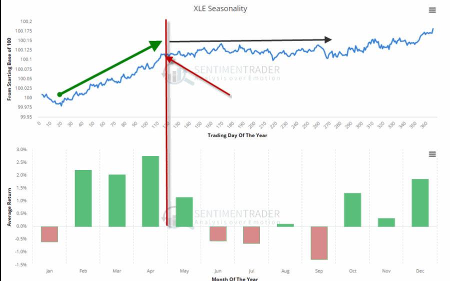
The first – which I mentioned in this article – is the fact that the best time of year for energy is the February into early May period. See Figure 1.
With that period just about past it is possible that the energy sector may at least pause for a while.
The second concern is that a lot of “things” in the energy sector are presently “bumping their head” against resistance. Here is the point:
*This does not preclude a breakout and further run to higher ground.
*But until the breakout is confirmed a little bit of caution is in order.
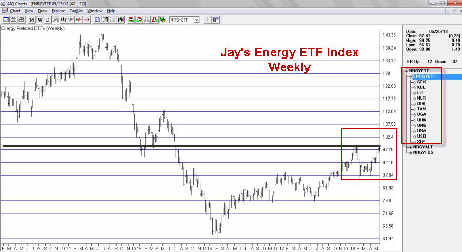
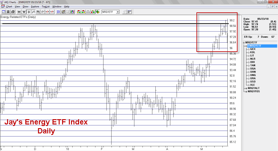
I created an index comprised of a variety of energy related ETFs. As you can see in Figures 2 through 4 that index recently was turned away at a significant resistance level.
Figure 3 shows the same information on a weekly chart.
Figure 3 – Jay’s Energy ETF Index – Weekly (Courtesy TradingExpert)
Figure 4 zooms in to view the action on a daily basis.
Figure 4 – Jay’s Energy ETF Index – Daily (Courtesy TradingExpert)
As you can see in Figure 4, the index made an effort to break out above the January high then reversed and closed lower before declining a little bit more the next day.
The action displayed in the charts above may prove to be nothing more that “the pause that refreshes.” If price breaks out to the upside another bull leg may well ensue. But note also in Figure 5 that ticker XLE – the broad-based SPDR Energy ETF – demonstrated the same type of hesitation as the ETF Index in the previous charts.
It too faces it’s own significant resistance levels as seen in Figure 5.
Energies have showed great relative strength of late even in the context of a choppy stock market overall. So there is no reason to believe that the rally can’t continue. But two things to watch for:
1. If energy related assets clear their recent resistance levels a powerful new upleg may ensue.
2. Until those resistance levels are pierced, a bit of caution is in order. Energy has been the leading sector of late. Any time the leading sector runs into trouble it pays to “keep an eye out” for trouble in the broader market.
No predictions one way or the other – just some encouragement to pay close attention at a potentially critical juncture.
Disclaimer: The data presented herein were obtained from various third-party sources. While I believe the data to be reliable, no representation is made as to, and no responsibility, warranty or liability is accepted for the accuracy or completeness of such information. The information, opinions and ideas expressed herein are for informational and educational purposes only and do not constitute and should not be construed as investment advice, an advertisement or offering of investment advisory services, or an offer to sell or a solicitation to buy any security.



 English