This time of year you might expect us to be thinking about the Santa Claus rally, but after the beating we’ve had the last few days, lets check and see how effective this really is.
What Is a Santa Claus Rally?
I lifted this description from Investopedia
A Santa Claus rally describes a sustained increase in the stock market that occurs in the last week of December through the first two trading days in January. There are numerous explanations for the causes of a Santa Claus rally including tax considerations, a general feeling of optimism and happiness on Wall Street, and the investing of holiday bonuses. Another theory is that some very large institutional investors, a number of which are more sophisticated and pessimistic, tend to go on vacation at this time, leaving the market to retail investors, who tend to be more bullish.
To test this in Expert Design Studio, I used the Seasonality3 ED built-in strategy. I set the Season Length days to 7 days to encompass the last 5 trading days of December and the first 2 days in the New Year.
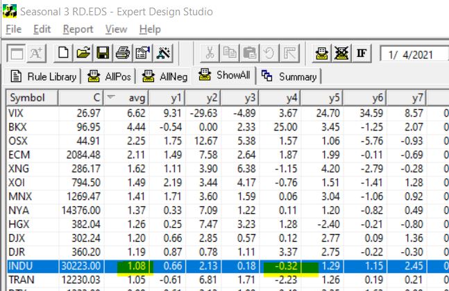
By setting the date to 1/4/21, the rule looks back 7 trading days from January 4th, each of the last 7 years and gives us an approximate percentage return for each of those 7 days.
Some years with weekends and extra holiday days plus 252 is used as default trading days skew results a small amount. To compensate I also tested 10 trading days back from January 7. The results from the 7 days are below, I tested all the indices in my current database.
INDU is highlighted, this is the Dow 30 index. First it’s clear that in every year except for one, over the last 7 years the Dow has made gains in the Santa Claus period. The average gain Is over 1%. Not too bad for a 7 day trading period. BTW the results from the 10 days from January 7 were similar.
The NASDAQ on the contrary had 3 losing years out of the 7.
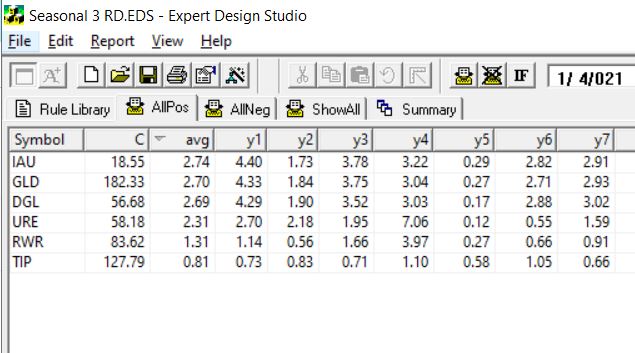
So next I decided to look at what ETFs are most likely to have a Santa Claus rally. Here’s the results using the 7 trading days back from Jan 4. This is the ETFs that had gains every year for the last 7.
The first 3 ETFS are all Gold related, the next two are real estate/REITs the last one is a bond fund. Hmm something to keep in mind.
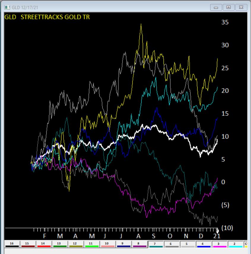
Here’s GLD seasonal charts the right hand side of each year shows the Santa Claus rally clearly. The White line is the average of all 7 years.
Clearly no guarantees what will happen this year, but something to keep in mind.
Happy Holidays or not given how the Markets tumbled the day US Thanksgiving. BTW, it was also the last full week of November.
Time for me to run my WinWayCharts seasonal filter on my top 2500 stocks
The filter is highly configurable and I can select which period of time, looking back from a given date to find a consistent price move up or down. I’m looking for it to repeat every year going back 7 + years.
I first came across the concept of seasonal consistency through Jay Keppel’s work JayOnTheMarkets.com and his books on Seasonal Stock Market trends. Many of you will have heard of the classic seasonal patterns like ‘Go Away in May’ or “the Santa Claus rally’. My WinWayCharts seasonal screener can find these type of events in individual stocks. Events that happen every year at the same time.
Here’s how the WinWayCharts Seasonal Screener works
How long do you usually hold a trade? I like to hold a trade for a month or less, that’s about 22 trading days.. So, I have cash available to invest Monday November 29th. All I need do is pick a date one month from that date and look for stocks that consistently made a profit over those 22 trading days, long or short, every single year going back the last 7 years. You can look back further but 7 seems to be pretty good consistency to me.
It’s that Simple
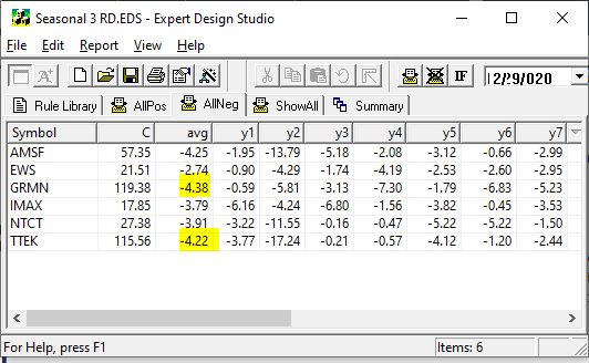
November 29th to December 29th, there were a handful of long stocks with seasonal patterns and the same on the short side. I liked the short side given the current market.
All these stocks lost money in every December for the last 7 years
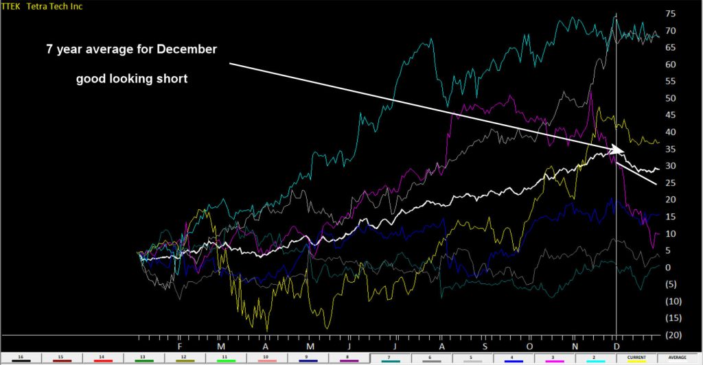
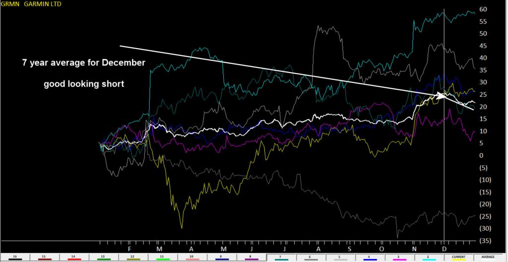
I highlighted GRMN and TTEK as both on average lost over 4% in December for last 7 years.
Here’s a WinWayCharts 7 year seasonal chart of TTEK the white line is the averageHere’s a WinWayCharts 7 year seasonal chart of GRMN the white line is the average
Want to go long?
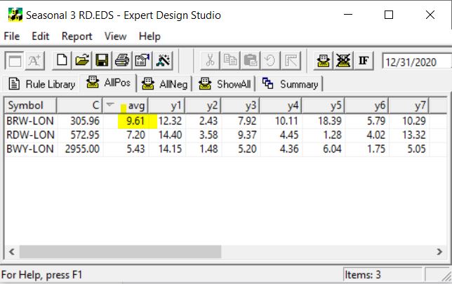
While there were no candidates in my US stocks, there were 3 UK stocks showed up. BRW-LON averaged 9.61% in December over 7 years. That’s impressive.
Here’s an WinWayCharts 7 year seasonal chart of BRW-LON the white line is the average
Next time I’m going to start to look at the major markets in specific periods and see if we can identify seasonal patterns that are hidden under the radar of everyday noise.
How can I run a WinWayCharts Seasonal scan?
First download the scan from our server click here
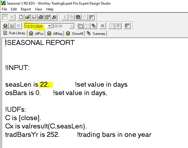
Locate the file Seasonal 3 RD.EDS likely in your /download folder and move it to your /wintes32/EDS Strategies folder
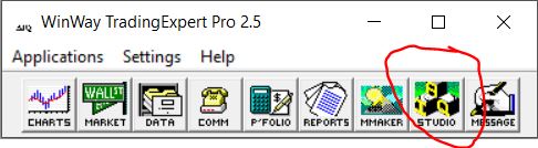
Open WinWayCharts EDS from the Main Menu
Click File, Open and locate the /wintes32/EDS Strategies/Seasonal 3 RD.EDS file
The file is set for seasonal length of 22 days but you can change this to whatever length you wish
Remember the date you run the report, like in the example above is 12/31/2020, it looks back in this case 22 days, then it checks 12/31/2019 and looks back 22 days etc. There would be no point it setting the date to run the report to the current date as it would look back 22 days, and you’d have missed the seasonal candidate stocks move.
The EDS code based on Vitali Apirine’s article in the March issue of Stocks & Commodities magazine “Rate Of Change With Bands,” can be obtained by copying the below into a new WinWayCharts EDS file, saving the file and adding EDS custom indicators on your Charts
!Rate Of Change With Bands
!Author: Vitali Aprine, TASC Mar 2021
!Coded by: Rich Denning, 01/11/2021
!INPUTS:
rocLen is 12.
emaLen is 3.
smaLen is 12.
C is [close].
ROC is (C - valresult(C,rocLen)) / valresult(C,rocLen)*100.
smaSqr is simpleavg(ROC*ROC,smaLen).
ROCdev is sqrt(smaSqr).
emaROC is expavg(ROC,emaLen).
upROCB is ROCdev.
dnROCB is  - ROCdev.
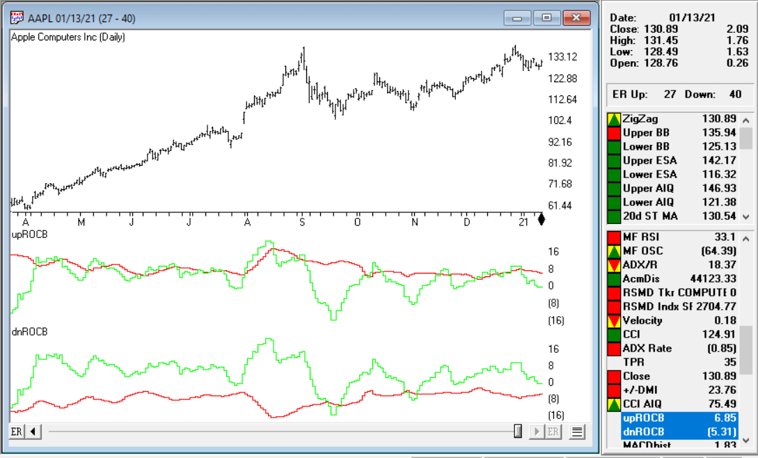
Code for the ROCB indicator is set up in the EDScode file. Figure 10 shows the indicators on a chart of Apple Inc. (AAPL). The red line in the first panel is the upper ROC band and the green line is the smoothed ROC. In the lower panel, the red line is the lower ROC band and the green line is the smoothed ROC.
FIGURE 10: The ROCB indicators are shown on a chart of Apple Inc. (AAPL). The red line in the first panel is the upper ROC band and the green line is the smoothed ROC. In the lower panel, the red line is the lower ROC band and the green line is the smoothed ROC.
The importable EDS file based on Markos Katsanos’ article in the April issue of Stocks & Commodities, “Detecting High-Volume Breakouts,” can be obtained on request via email to info@TradersEdgeSystems.com.
Excerpt “Is there anything more satisfying for a trader than capturing a huge breakout? The usual practice for breakout entries is to simply buy new highs. This method, when used in isolation, will often result in false breakouts. It is, therefore, better to wait for volume confirmation before entering the trade, as high-volume breakouts usually last much longer. In this article, I will show you how to detect breakouts using only volume, sometimes even before price breaks out, by introducing a new volume breakout indicator. “
The code is also available here:
!Detecting High-Volume Breakouts !Author: Markos Katsanos, TASC April 2021
!Coded by: Richard Denning, 02/18/2021
!INPUTS:
period is 30.
smoLen is 3.
vpnCrit is 10.
maLen is 30.
V is [volume].

!FORMULAS:
MAVol is simpleavg(V,period).
MAV is iff(MAVol>0,MAVol,1).
Avg is ([High]+[Low]+[Close])/3.
MF is Avg - valresult(Avg,1).
ATR is simpleavg(max( [high]-[low],max(val([close],1)-[low],[high]-val([close],1))),period).
MC is 0.1*ATR.
VMP is iff(MF > MC, V, 0).
VP is sum(VMP,period).
VMN is iff(MF < -MC, V, 0).
VN is sum(VMN,period). EDSPN is (expavg(((VP - VN) / MAV / period),smoLen))*100.
MAVPN is simpleavg(VPN,maLen).
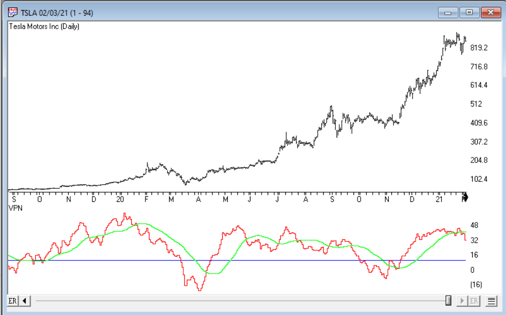
Code for the VPN indicator is set up in the EDS code file. Figure 9 shows the indicator on a chart of Tesla Motors Inc (TSLA).
FIGURE 9: AIQ. The VPN indicator is shown on a chart of Tesla Motors Inc. (TSLA).
With the price of the Dow Jones 30 (ticker INDU) in your WinWayCharts reaching beyond 32760, your Market Chart may be experiencing a spike in Charts. A new updated file for INDU is now available for you at www.aiqsystems.com/INDU.dta
Close all open WinWayCharts programs. Click the link above and Save INDU.dta to c:\wintes32\tdata, say yes when asked to overwrite. Once done, open Data Manager, click on Utilities, Rebuild Master Ticker List.