Jul 24, 2014 | EDS code, indicators, trading strategies
Original article by Mike B. Siroky
For this June’s Stocks & Commodities Tips, I substituted the article by Mike B. Siroky, “Wilder’s RSI: Extending the Time Horizon” for the article by Sylvain Vervoort.
I provide a system that uses the author’s adjustable RSI bands that automatically adjust to the appropriate level for the input RSI length. The system is very simple:
- Buy next bar at market open when the RSI is less than the lower confidence interval band (RSI_CILOW).
- Exit the long position next bar at market open when the RSI is greater than the upper confidence interval band (RSI_CIUP).
- Reverse rules for shorting.
- I have a parameter that allows testing long only, short only or both long and short.
- The system lost when the short side was allowed to trade.
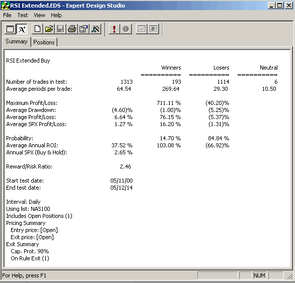
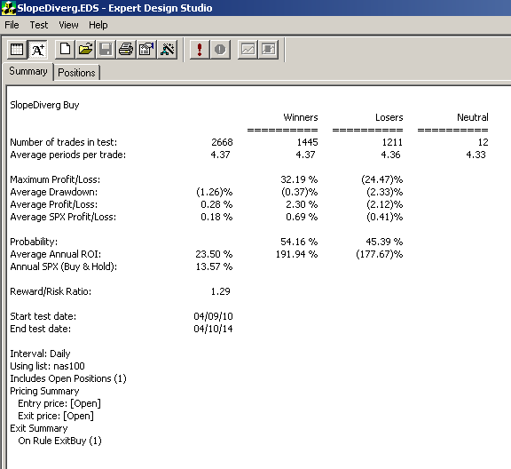
Figure 1 shows the AIQ EDS Summary long only back-test report using the NASDAQ 100 list of stocks over the period 5/11/2000 to 5/12/2014. Neither commission nor slippage have been subtracted from these results. In running this test, I used a capital protect of 98% which is equivalent to a 2% stop loss using the close. All entries and exits are at the next open. I could not get the short side to show a profit even with added market timing filters for trend on the NASDAQ 100 index.
AIQ EDS Summary long only back-test report using the NASDAQ 100 list of stocks over the period 5/11/2000 to 5/12/2014.
!WILDER’S RSI: EXTENDING THE TIME HORIZON
!Author: Mike B. Siroky, TASC May 2014
!Coded by: Richard Denning 5/10/2014
!www.TradersEdgeSystems.com
!INPUTS:
W1 is 55. !RSI length for going long
W2 is 5. !RSI length for going short
numSD is 1.645.
!CONSTANT:
EXPECTED_VALUE is 50.
!USER DEFINED FUNCTIONS
!RSI BANDS:
RSI_CIUP1 is (EXPECTED_VALUE/100 + Sqrt(EXPECTED_VALUE/100/2/W1)*numSD)*100.
RSI_CILOW1 is (EXPECTED_VALUE/100 – Sqrt(EXPECTED_VALUE/100/2/W1)*numSD)*100.
RSI_CIUP2 is (EXPECTED_VALUE/100 + Sqrt(EXPECTED_VALUE/100/2/W2)*numSD)*100.
RSI_CILOW2 is (EXPECTED_VALUE/100 – Sqrt(EXPECTED_VALUE/100/2/W2)*numSD)*100.
!RSI WILDER:
U is [close]-val([close],1).
D is val([close],1)-[close].
rsiLen1 is 2 * W1 – 1.
AvgU is ExpAvg(iff(U>0,U,0),rsiLen1).
AvgD is ExpAvg(iff(D>=0,D,0),rsiLen1).
RSI_1 is 100-(100/(1+(AvgU/AvgD))).
rsiLen2 is 2 * W2 – 1.
AvgU2 is ExpAvg(iff(U>0,U,0),rsiLen2).
AvgD2 is ExpAvg(iff(D>=0,D,0),rsiLen2).
RSI_2 is 100-(100/(1+(AvgU2/AvgD2))).
!RULES:
HD if hasdatafor(210) >= 200.
Buy if RSI_1 < RSI_CILOW1 and HD.
Exit if RSI_1 > RSI_CIUP1 and HD.
NDXc is TickerUDF(“NDX”,[close]).
Sell if RSI_2 > RSI_CIUP2 and NDXc < simpleavg(NDXc,200) and HD.
Cover if RSI_2 < RSI_CILOW2 and HD.
Jul 18, 2014 | chart patterns, indicators, trading strategies
I have been a little “quiet” lately. Kind of unusual for me, granted. But what can I say really that’s new? The stock market’s moving higher – blah, blah, blah. The bond market keeps trying to creep higher – sure, interest rates are basically 0%, so why not? Gold stocks keep trying to grind their way higher after putting in an apparent base. But who the heck ever knows about something as flighty as gold stocks?
So like I said, not much new to report.
So for the record – one more time – let me repeat where I am at:
- As a trend-follower there isn’t much choice but to say that the trend of the stock market is still “up”. So as a result, I have continued to grit my teeth and “ride”. And let’s give trend-following its due – it’s been a good ride.
- As a market “veteran” I have to say that this entire multi-year rally has just never felt “right”. In my “early years” in the market (also known as the “Hair Era” of my life) when the stock market would start to rally in the face of bad economic times I would think, “Ha, stupid market, that can’t be right.” Eventually I came to learn that the stock market knows way more than I do. And so for many years I forced myself to accept that if the stock market is moving higher in a meaningful way, then a pickup in the economy is 6 to 12 months off. As difficult as that was at times to accept, it sure worked.
Today, things seem “different”. By my calculation the stock market has now been advancing for roughly 5 years and 4 months. And the economy? Well, depending on your political leanings it is somewhere between “awful” and “doing just fine.” But in no way has the “old calculus” of “high market, booming economy 6-12 months later” applied.
Again depending on your politics leanings the reason for this lies somewhere between “it is entirely Barack Obama’s fault” to “it is entirely George Bush’s fault.” (I warned you there was nothing new to report).
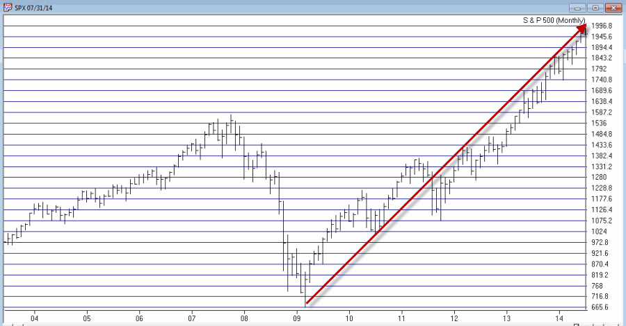
From my perspective, I think that the charts below – the second one of which I first saw presented by Tom McClellan, Editor of “The McClellan Oscillator” (which he presciently labeled at the time, “The only chart that matters right now”) – explains just about everything we need to know about the stock market actions vis a vis any economic numbers.
So take a look at the two charts below and see if anything at all jumps out at you.
Figure 1 – S&P 500 Monthly (Source: AIQ TradingExpert)
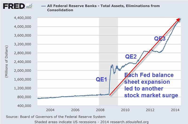
Figure 2 – Fed Pumping (Quantitiatve Easing “to Infinity and Beyond”) propelling the stock market
I am not a fan of using the word “manipulation” when it comes to the stock market. But I am a strong believer in the phrase “money moves the market.” The unprecedented printing of – I don’t know, is it billions of trillions of dollars – has clearly (at least in my mind) overwhelmed any “economic realities” and allowed the stock market to march endlessly – if not necessarily happily – to higher ground.
Thus my rhetorical questions for the day are:
“What would the stock market have looked like the past 5 years without this orgy of money?”
“What happens to the stock market when the Fed cannot or will not print money in this fashion?”
Because this is all unprecedented in my lifetime (as far as I can tell) I don’t have any pat answers to these questions. But I some pretty strong hunches.
My bottom line: Err on the side of caution at this time.
Jay Kaeppel
Chief Market Analyst at JayOnTheMarkets.com and AIQ TradingExpert Pro (http://www.aiq.com) client
Jay has published four books on futures, option and stock trading. He was Head Trader for a CTA from 1995 through 2003. As a computer programmer, he co-developed trading software that was voted “Best Option Trading System” six consecutive years by readers of Technical Analysis of Stocks and Commodities magazine. A featured speaker and instructor at live and on-line trading seminars, he has authored over 30 articles in Technical Analysis of Stocks and Commodities magazine, Active Trader magazine, Futures & Options magazine and on-line at www.Investopedia.com.
Jul 11, 2014 | EDS code, trading strategies
The AIQ code based on Perry Kaufman’s article in the June 2014 Stocks & Commodities magazine, “Slope Divergence: Capitalizing On Uncertainty,” is provided at
www.TradersEdgeSystems.com/traderstips.htm.
I have modified the implementation somewhat from the author’s descriptions. I did not find that the system was exiting in an average of six days but was holding for a longer period. My exits might be the issue so I added a time exit that can be used to force an exit after the “maxBars” input number of bars. I liked the results when my time exit was set to hold for a maximum of nine bars.
Figure 7 shows the AIQ EDS summary long-only backtest report using the NASDAQ 100 list of stocks over the prior four years ending 4/10/2014. Neither commission nor slippage have been subtracted from these results. To get the short side of the system to show a profit, I added slope filters on the NASDAQ 100 index. Note that my parameter settings differ from those suggested by the author.
FIGURE 7: AIQ, SAMPLE RESULTS. Here is a sample AIQ EDS summary long-only backtest report using the NASDAQ 100 list of stocks over the prior four years ending 4/10/2014.
The code and EDS file can be downloaded from www.TradersEdgeSystems.com/traderstips.htm. The code is also shown here:
!SLOPE DIVERGENCE: CAPITALIZING ON UNCERTAINTY
!Author: Perry Kaufman, TASC June 2014
!Coded by: Richard Denning 4/7/2014
!www.TradersEdgeSystems.com
!INPUTS:
momLen is 10.
dvgLen1 is 5.
dvgLen2 is 7.
dvgLen3 is 10.
entryNum is 3.
maxDiverg is 3.
minPrice is 10.
maxBars is 3.
!USER DEFINED FORMULAS:
C is [close].
L is [low].
H is [high].
HH is highresult(H,momLen).
LL is lowresult(L,momLen).
stoch is (C - LL) / (HH - LL).
momSlope1 is slope2(stoch,dvgLen1).
momSlope2 is slope2(stoch,dvgLen2).
momSlope3 is slope2(stoch,dvgLen3).
priceSlope1 is slope2(C,dvgLen1).
priceSlope2 is slope2(C,dvgLen2).
priceSlope3 is slope2(C,dvgLen3).
dvgBuy1 if priceSlope1 > 0 and momslope1 < 0.
dvgBuy2 if priceSlope1 > 0 and momslope2 < 0.
dvgBuy3 if priceSlope1 > 0 and momslope3 < 0.
dvgSell1 if priceSlope1 < 0 and momslope1 > 0.
dvgSell2 if priceSlope1 < 0 and momslope2 > 0.
dvgSell3 if priceSlope1 < 0 and momslope3 > 0.
nPriceSUp is priceSlope1 > 0 + priceSlope2 > 0 + priceSlope3 > 0.
nMomSUp is momSlope1 > 0 + momSlope2 > 0 + momSlope3 > 0.
nPriceSDown is priceSlope1 < 0 + priceSlope2 < 0 + priceSlope3 < 0.
nMomSDown is momSlope1 < 0 + momSlope2 < 0 + momSlope3 < 0.
dvgBuySum is dvgBuy1 + dvgBuy2 + dvgBuy3.
dvgSellSum is dvgSell1 + dvgSell2 +dvgSell3.
Buy if dvgBuySum >= entryNum and C > minPrice.
AllComboExit if (nPriceSDown = maxDiverg and nMomSDown = maxDiverg)
or (nPriceSUp = maxDiverg and nMomSUp = maxDiverg).
Time if {position days} >= maxBars.
ExitBuy if AllComboExit or Sell or Time.
Sell if dvgSellSum >= entryNum.
ExitSell if AllComboExit or Buy or Time.
Jul 8, 2014 | chart patterns, group sector rotation, Seasonality, trading strategies
While looking through the seasonal trends in stocks and currencies, we decided to start running the seasonality scans on the S & P 500 groups. As a reminder here are the criteria we consider when running this.
Our study looks at 7 years of historical data and looks at the returns for all groups in the S & P 500 for the month of July from 2006 to 2013.
We do make an assumption that the month is 21 trading days and work our way back from the last day of the month. July also has the July 4th holiday and a half day trading on July 3rd. if the last day of the month falls on a weekend, then we use the first trading day prior to that date.
We make no assumptions for drawdown, nor do we look at the fundamentals behind such a pattern. We do compare the group to the market during the same period and look at the average SPY gain/loss vs. the average group gain/loss. This helps filter out market influence.
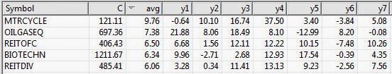
Finally we look at the median gain/loss and look for statistical anomalies, like meteoric gains/loss in one year. Here are top 5 performing groups based on average return.
Average return alone is misleading. In the seasonal analysis we need consistent patterns in the price action throughout the periods we are testing, in this case 7 years. While The S & P 500 Motorcycle manufacturers group (MTRCYCLE) looks good on average, it includes one stellar July of 37.50% back in 2010, and has 2 July’s that were negative returns. NOTE: there’s only one stock in the group (guess which one that is!).
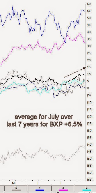
The office REITs group (REITOFC) is more consistent. It has an average return for the last 7 years in July of 6.50%, with the last 6 years Julys all positive. There are no stellar months skewing the average. The group also contains only one stock, Boston Properties [BXP].
Here’s the seasonal chart for BXP
Interestingly the other consistent group in July is another REIT, the Diversified REITs (REITDIV). It has an average return for the last 7 years in July of 6.06%, with the last 6 years Julys all positive. There are no stellar months skewing the average. The group also contains only one stock, Vonando Realty Trust [VNO].
A quick check on what the market did during the same period reveals an average return of 1.83% with 4 gaining Julys and 3 losing Julys.
The Oil & gas Equipment group (OILGASEQ) also had a decent average, but is more volatile over the past years, however the last 5 years have all been gainers.
Remember, we don’t draw conclusions here, just mine for information.
Jul 1, 2014 | chart patterns, trading strategies
It’s the beginning of the month and time to check the seasonal patterns for July. First off some background.
Our study looks at 7 years of historical data and looks at the returns for all optionable stocks for the month of July from 2006 to 2013.
We filter to find two sets of criteria
– Stocks with gains in all 7 years during July
– Stocks with losses in all 7 years in July
We do make an assumption that the month is 21 trading days and work our way back from the last day of the month. July also has the July 4th holiday and a half day trading on July 3rd. if the last day of the month falls on a weekend, then we use the first trading day prior to that date.
We make no assumptions for drawdown, nor do we look at the fundamentals behind such a pattern. We do compare the stock to the market during the same period and look at the average SPY gain/loss vs. the average stock gain/loss. This helps filter out market influence.
Finally we look at the median gain/loss and look for statistical anomalies, like meteoric gains/loss in one year.
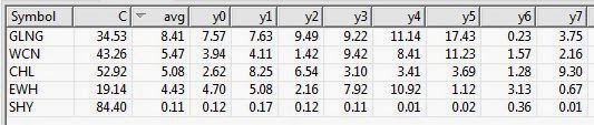
So here are the tickers that met the scan on the gain side, There was only 1 stock on the loss side. So we’ll look at the gainers only.
Figure 1 shows the stocks that have had gains in July, 7 years in row.
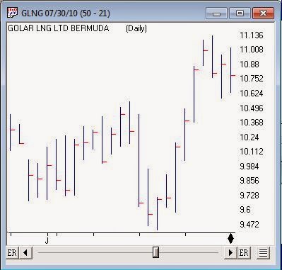
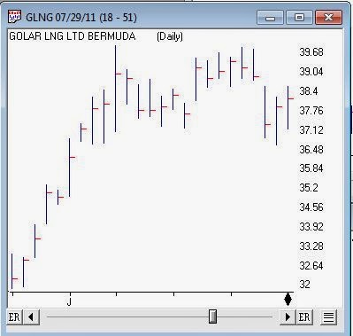
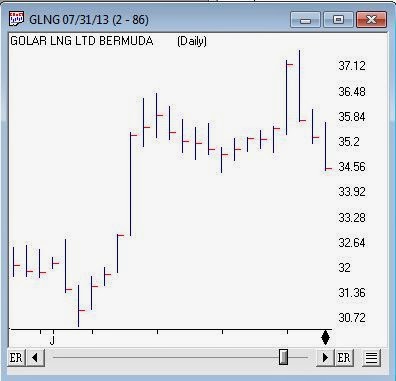
GLNG is a decent looking ticker, it’s in the LNG business. The average for July is 8.41% gain. The median is 7.63% and there’s no extreme values to skew the average. During the same test period the SPY gained an average of 1.83% with 3 losses and 4 gains.
Figure 2 shows SPY for the same period.
Figure 3 is a chart of GLNG seasonal pattern for the last 7 years in July. The solid black line is the average for the 7 years, these are percentage change day to day. Each line represents a prior year of GLNG.
Figure 3 seasonal average for GLNG average line for last 7 years
With seasonality you have to figure out what timeframe you want to analyze before anything else. Logic would seem to dictate that one week; comparing this week to the same period over X years would be the smallest time period you might consider. However there are events that seem to be seasonally predictable that occur at the end of a month or the beginning of the month. We’ll look at some these in a future article
In June we looked for the same seasonal pattern and no candidates were found on the gainers side. there were plenty on the losers side. Given that seasonally June is a bad month for the market it’s not too surprising.
Here are the July daily charts for the last 5 years for GLNG. We don’t draw conclusions here, just mine for information.