The Expert System in TradingExpert Pro gave a 1 – 99 down signal on the Dow Jones on 8-27-20. The market internals based on the advancing vs declining issue in the New York market continue to diverge from the market price action.
The phase indicator used to confirm Expert Ratings turned down on 8-31-20. We usually look for a phase confirmation of an Expert Rating to occur within 3 days of the rating.
The changes made in the constituents of the Dow 30 effective 8-31-20
OK, first off a true confession. I hate it when some wise acre analyst acts like they are so smart and that everyone else is an idiot. Its offensive and off-putting – not to mention arrogant. And still in this case, all I can say is “Hi, my name is Jay.”
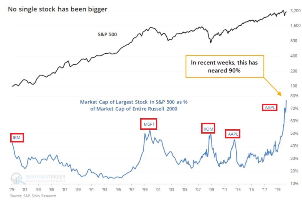
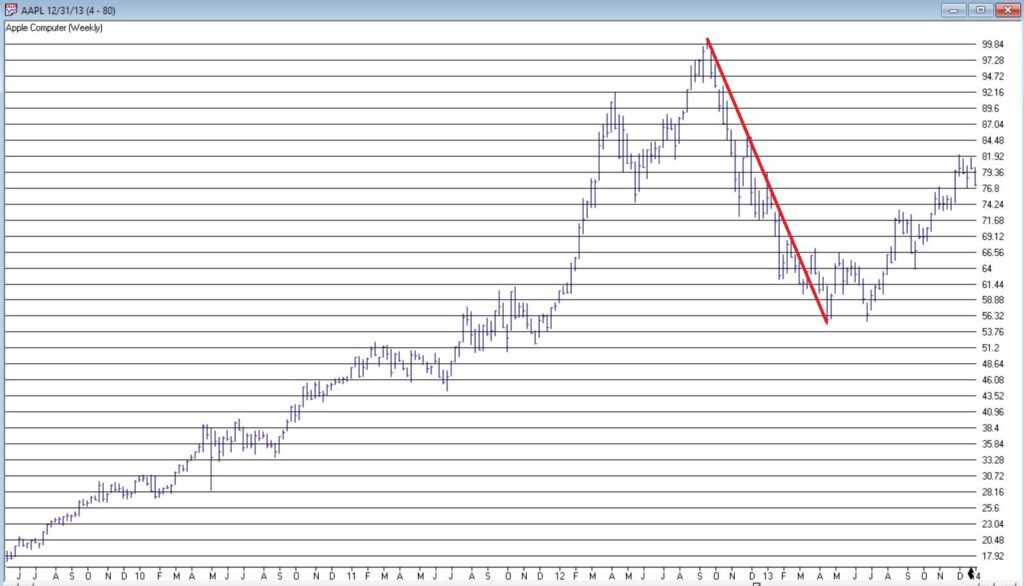
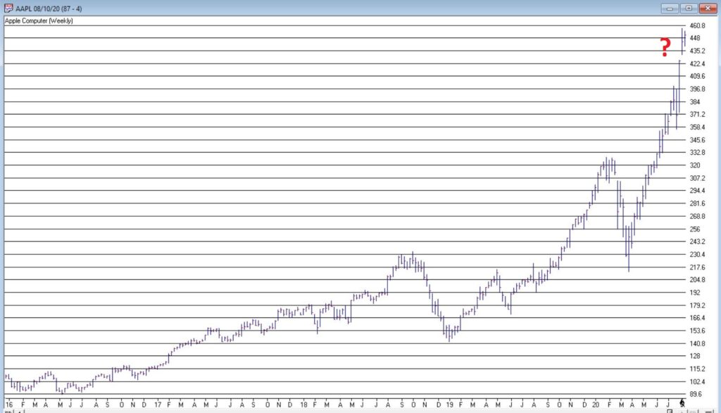
A lot of attention has been paid lately to the fact that AAPL is essentially swallowing up the whole world in terms of market capitalization. As you can see in Figure 1, no single S&P 500 Index stock has ever had a higher market cap relative to the market cap of the entire Russell 2000 small-cap index.
Figure 1 – Largest S&P 500 Index stock as a % of entire Russell 200 Index (Courtesy Sentimentrader.com)
So of course, the easiest thing in the world to do is to be an offensive, off-putting and arrogant wise acre and say “Well, this can’t last.” There, I said it. With the caveat that I have no idea how far AAPL can run “before the deluge”, as a student of (more) market history (than I care to admit) I cannot ignore this gnawing feeling that this eventually “ends badly.” Of course, I have been wrong plenty of times before and maybe things (Offensive, Off-Putting and Arrogant Trigger Warning!) “really will be different this time around.” To get a sense of why I bring this all up, please keep reading.
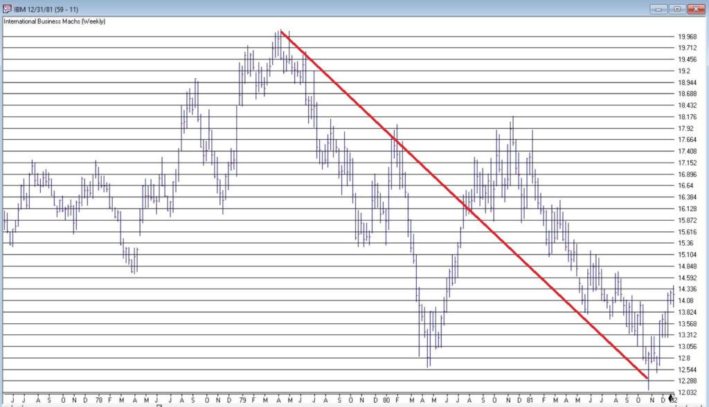
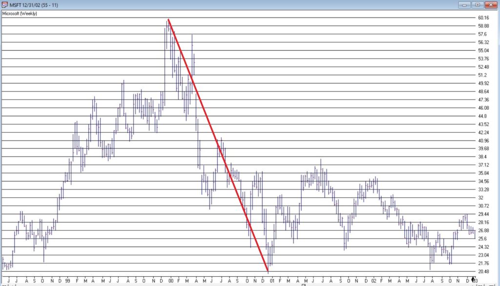
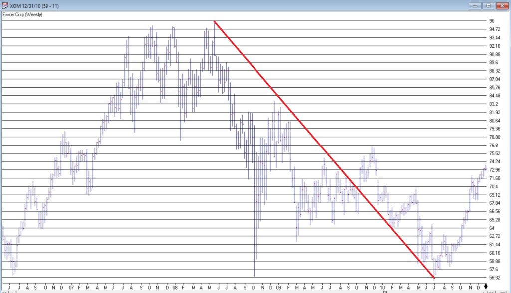
In Figure 1 we also see some previous instances of a stock becoming “really large” in terms of market cap. Let’s take a closer look at these instances.
Could AAPL continue to run to much higher levels? Absolutely
Do I still have that offensive, off-putting and slightly arrogant gut feeling that somewhere along the way AAPL takes a huge whack?
Sorry. It’s just my nature.
Jay Kaeppel
Disclaimer: The information, opinions and ideas expressed herein are for informational and educational purposes only and are based on research conducted and presented solely by the author. The information presented represents the views of the author only and does not constitute a complete description of any investment service. In addition, nothing presented herein should be construed as investment advice, as an advertisement or offering of investment advisory services, or as an offer to sell or a solicitation to buy any security. The data presented herein were obtained from various third-party sources. While the data is believed to be reliable, no representation is made as to, and no responsibility, warranty or liability is accepted for the accuracy or completeness of such information. International investments are subject to additional risks such as currency fluctuations, political instability and the potential for illiquid markets. Past performance is no guarantee of future results. There is risk of loss in all trading. Back tested performance does not represent actual performance and should not be interpreted as an indication of such performance. Also, back tested performance results have certain inherent limitations and differs from actual performance because it is achieved with the benefit of hindsight.
You may have seen some of the articles out there analyzing the skewed nature of the current market rally. As Joe Bartosiewicz in his August 8 Bartometer pointed out:
“The Top 15 Stocks in the S&P 500 account in Market Value 35% of the entire S&P 500 stock market. The Bottom 420 Stocks in the S&P 500 account in Market Value 33.8% of the entire S&P 500 stock market. This means that 15 stocks are controlling the entire S&P 500..”
The Dow Jones 30 index uses a price weighted criteria as part of it’s calculation, and also includes Apple; AAPL has more than doubled in price in under 5 months.
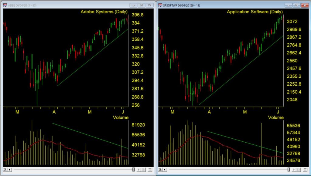
Given that there appears to be only a small basket of stocks leading this rally, we had a look back at the last time tech related stocks were driving the market higher; the dotcom bubble that ran through the 90s into the early 00s.
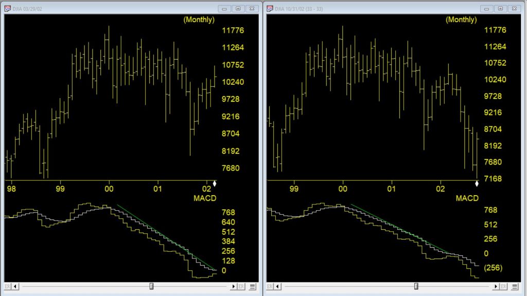
Monthly DJIA and MACD – left through 3/2002 – right through 10/2002
The first chart is a monthly of the Dow 30 with MACD indicator comparing the market 03/29//2002 as the dotcom bubble rolled over vs 7 months later. Students of divergence analysis, will tell you that MACD in late March 2002 clearly showed prices should be much lower still despite the @33 % rally from the September 2001 low. By late October 2002 the market had fallen again by @33%. At that time the market was close to @40% lower than the high at the start of 2000.
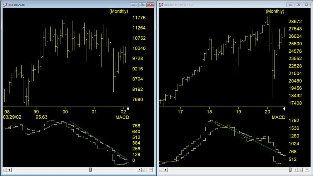
Monthly DJIA and MACD – left through 3/2002 – right through 8/2020
The second chart is a monthly of the Dow 30 on the right through 8/10/20 vs the rally peak of 03/29/2002. The current market has had a @50% rally from the low at the end of March 2020. The original correction was @37% from high to low, slightly bigger than the dotcom correction. The MACD, similar to 2002, is strongly diverging.
The decline in 2002, after the rally, took prices lower than the the prior bottom. If a similar pattern happens this time and the decline is @40% from the high of 29568, the Dow would at the 17700 level.
Yet more Power tools in your WinWayCharts plus a session on why you should use color studies in Charts
Thursday July 2, 2020 at 14:00 – 15:45
Part 1. Power tools in your WinWayCharts
An hour long session with UK Director Ray Foreman covering the power features in your WinWayCharts platform – great for new clients or those with more experience.
Part 2. Why you should use color studies in Charts
Steve Hill, founder of WinWayCharts will guide you through the powerful color studies tool in Charts and how you can take the indicators you already use and make them show signals on the price charts.
This video on the Market Timing signals in AIQ is also applicable for our WinWayCharts TradingExpert Market Timing. Check it out.
Market volatility continues. In this update we’ll take a look at the current AI signals on the Dow Jones. For folks less familiar with our AI engine here’s a recap of what we do.
TradingExpert Pro uses two AI knowledge bases, one specifically designed to issue market timing signals and the other designed to issue stock timing signals.
Each contains approximately 400 rules, but only a few “fire” on any given day. In the language of expert systems, those rules that are found to be valid on a particular day are described as having “fired”.
Rules can fire in opposite directions. When this happens, the bullish and bearish rules fight it out. It’s only when bullish rules dominate that the Expert Rating signal is bullish, or when bearish rules dominate that the Expert Rating signal is bearish.
The Expert Rating consists of two values.
The upside rating is the value on the left and the downside rating is on the right. Expert Ratings are based on a scale of 0 to 100. An Expert Rating of 95 to 100 is considered a strong signal that the Stock or market may change direction.
An Expert Rating below 90 is considered meaningless. A low rating means that there is not enough consistency in the rules that fired to translate to a signal. The expert system has not found enough evidence to warrant a change from the last strong signal.