For the record, I am an avowed “trend-follower.” But I also know that no trend lasts forever. So, while I have gotten pretty good at “riding along”, I do – like most people – like to “look ahead” since I do know that the landscape will forever be changing.
So, with the caveat that none of what follows should be considered a “call to action”, only as a “call to pay attention”, let’s venture out “into the weeds.”
AIROIL
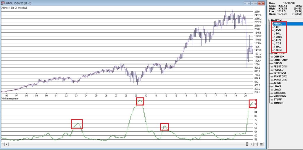
Here is an ugly pairing – airline stocks and traditional energy stocks – yikes! In Figure 1 you see an index that I created and followed call AIROIL comprised of three airline stocks and five “Big Oil” stocks. During the pandemic meltdown this index fell to a level not seen since 2007 before “bouncing”.
Editors Note:
Jay's AIROIL Index is built using the AIQ Data Manager by creating a list andcreating a group ticker (in this case AIROIL).
Stocks are inserted under the ticker and the index is then computed using  Compute Group/Sector indices.
In the bottom clip you see an indicator I call VFAA. Note that when VFAA tops out and rolls over, meaningful advances in the index tend to follow. In addition, VFAA is at a high level seen only once before in 2009. Following that reversal, the index rose almost 500% over the next 9 years.
So, is now a great time to pile into airlines and big oil? One would have to be a pretty hard-core contrarian to pound the table on this one. The airlines are in terrible shape due to the pandemic and vast uncertainty remains regarding when things might improve. And “Big Oil” is about as unloved as any sector has ever been.
So, am I suggesting anyone “load up” on airlines and oil? Nope. What I am saying is that I am watching this closely and that if and when VFAA “rolls over” I may look to commit some money to these sectors on a longer-term contrarian basis.
International/Commodities/Value
Also known of late as “the barking dogs”. If you have had money committed to any or all of these asset classes in recent years you are shaking your head right about now. These areas have VASTLY underperformed a simple “buy-and-hold the S&P 500 Index” approach for a number of years.
Is this state of affairs going to change anytime soon? Regarding “anytime soon” – it beats me. However, I am on the record as arguing that at some point this WILL change. History makes one thing very clear – no asset class has a permanent edge. So, given that the S&P 500 Index has beaten these above mentioned by such a wide margin for such a long time (roughly a decade or more) I am confident that one day in the next x years, the “worm will turn.”
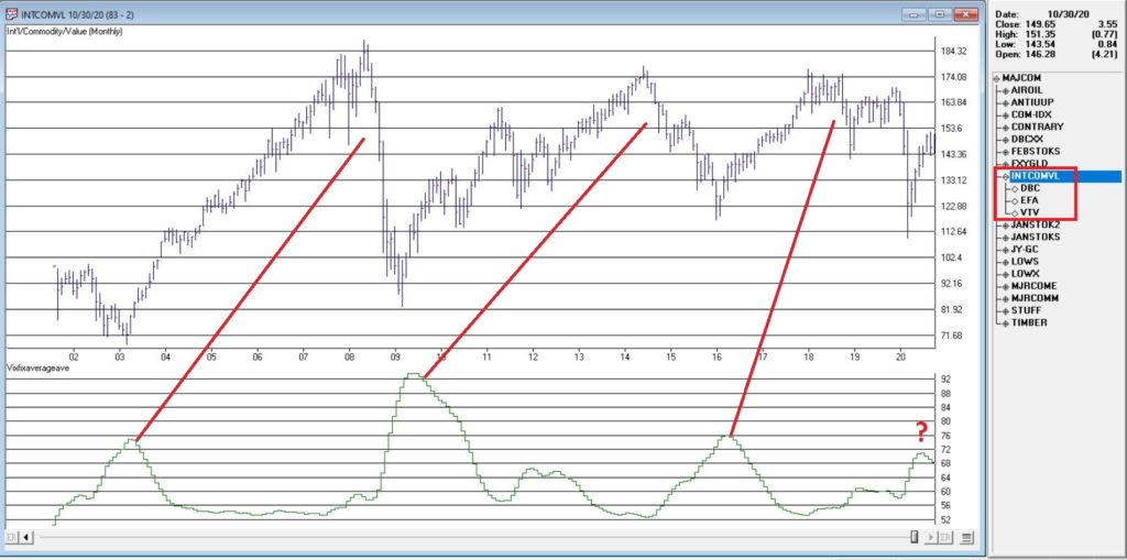
Figure 2 displays an index that I created and follow that tracks an international ETF, a commodity ETF and a value ETF. The VFAA indicator appears in the bottom clip.
Now if history is a guide, then the recent “rollover” by VFAA suggests that this particular grouping of asset classes should perform well in the coming years. Two things to note:
1. There is no guarantee
2. There is absolutely no sign yet that “the turn” – relative to the S&P 500 – is occurring
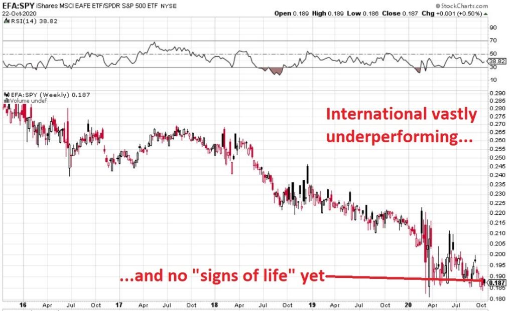
Figure 3, 4 and 5 are “relative strength” charts from www.StockCharts.com. They DO NOT display the price of any security; they display the performance of the first ETF list compared to the second ETF listed. So, Figure 3 displays the performance of ticker EFA (iShares MSCI EAFE ETF which tracks a broad index of stocks from around the globe, excluding the U.S.) relative to the S&P 500 Index.
When the bars are trending lower it means EFA is underperforming SPY and vice versa. The trend in Figure 3 is fairly obvious – international stocks continue to lose ground to U.S. large-cap stocks.
If your goal is to pick a bottom, have at it. As for me, I am waiting for some “signs of life” in international stocks relative to U.S. stocks before doing anything.
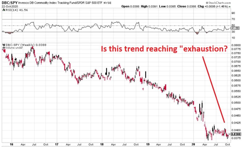
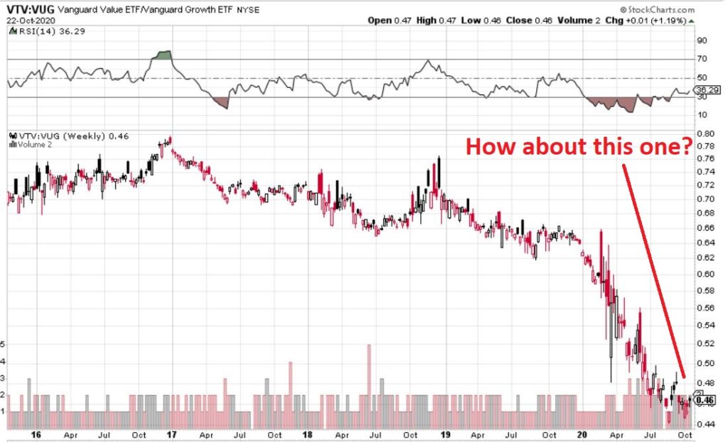
Figure 4 displays ticker DBC (a commodity-based ETF) versus SPY and Figure 5 displays ticker VTV (Vanguard Value ETF) versus ticker VUG (Vanguard Growth ETF). Both tell the same tale as Figure 3 – unless you are an avowed bottom-picker there is no actionable intelligence. Still, both these trends are now extremely overdone, so a significant opportunity may be forming.
*Nothing is happening at the moment with everything displayed above…
*…But something will (at least in my market-addled opinion) – so pay close attention.
Jay Kaeppel
Disclaimer: The information, opinions and ideas expressed herein are for informational and educational purposes only and are based on research conducted and presented solely by the author. The information presented represents the views of the author only and does not constitute a complete description of any investment service. In addition, nothing presented herein should be construed as investment advice, as an advertisement or offering of investment advisory services, or as an offer to sell or a solicitation to buy any security. The data presented herein were obtained from various third-party sources. While the data is believed to be reliable, no representation is made as to, and no responsibility, warranty or liability is accepted for the accuracy or completeness of such information. International investments are subject to additional risks such as currency fluctuations, political instability and the potential for illiquid markets. Past performance is no guarantee of future results. There is risk of loss in all trading. Back tested performance does not represent actual performance and should not be interpreted as an indication of such performance. Also, back tested performance results have certain inherent limitations and differs from actual performance because it is achieved with the benefit of hindsight.
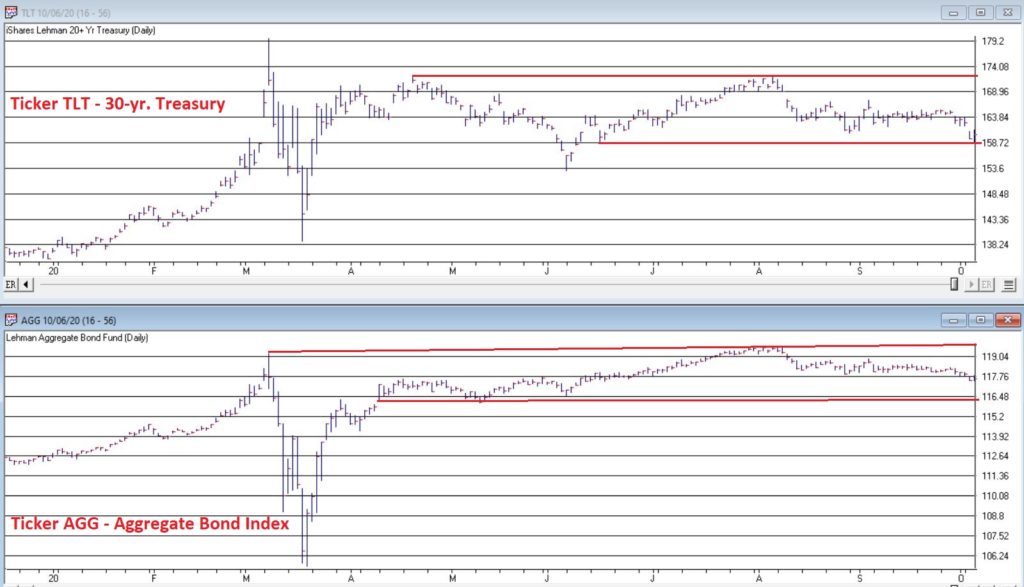
The bond market was very quiet in the 3rd quarter. Figure 1 displays ticker IEF (7-10 year treasuries ETF) in the to clip and ticker AGG (Aggregate Bond Index ETF) in the bottom clip.
Essentially the entire bond market has been flat since early June. The market seems to be assuming that “the Fed will take of everything” and keep interest rates low and stable for the foreseeable future so…..ZZZZZZZZ.
But this type of activity often breeds complacency. I am not making any predictions here but I do want to raise a question that investors might wish to ponder, i.e., “what would be more shocking that a spike in interest rates?” OK, yes, I realize it is 2020 and it is pretty much hard to be shocked by anything anymore. But still, on a relative basis how many investors are even thinking about the potential risk of higher interest rates at the moment?
Could it Happen?
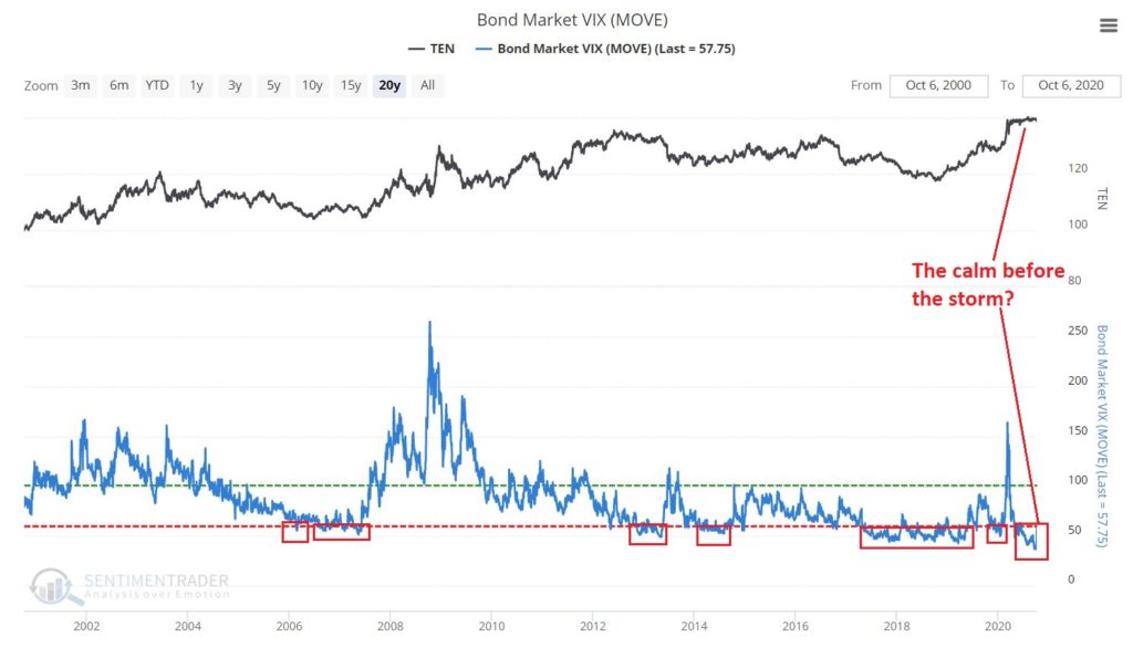
The Bond Market VIX (ticker MOVE) recently fell to its lowest level ever (before spiking sharply higher on 10/5/20). As you can see in Figure 2 this type of “quietness” often precedes a significant move in the bond market. For the record, low readings in MOVE can be followed by large up moves in price as easily as large down moves in price. So, a low MOVE reading is not “bearish” per se, but rather merely suggests that we are experiencing the “calm before the storm.”
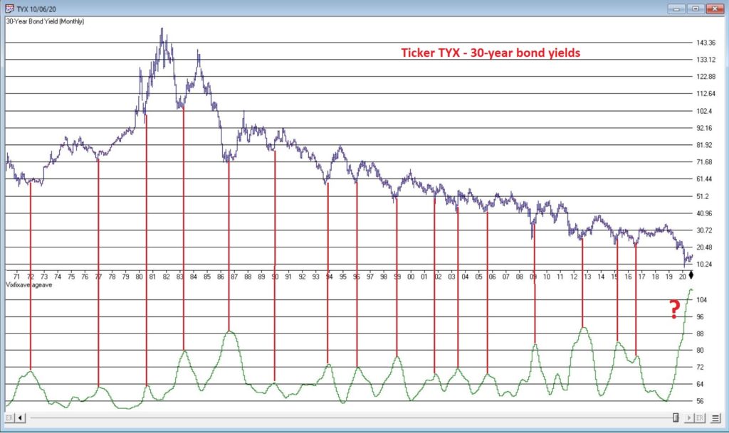
So why is my “Spidey sense” tingling? Figure 3 displays the yield on 30-year treasuries (ticker TYX) on the bottom and an indicator I refer to as VFAA on the bottom (the calculation appears at the end of this piece). VFAA is a derivative on a Larry William’s indicator he calls VixFix.
Figure 3 – 30-year treasury yields with VFAA suggesting a potential bottoming area (Courtesy TradingExpert)
As you can see in Figure 3, peaks in the VFAA indicator often occur near intermediate term lows in bond yields (reminder: bond prices move inversely to yield, so a bottom in interest rates indicates a top in bond prices). As you can also see on the far-right hand side, the stage clearly appears to be set for “the next go round.”
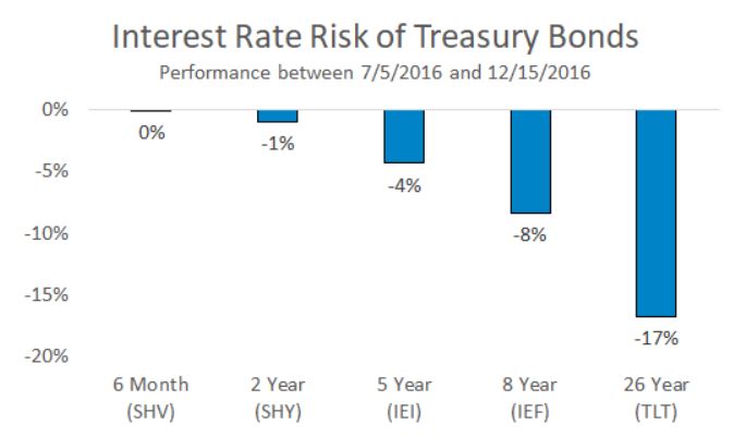
Why does this matter? If interest rates do rise in the months ahead bond prices – particularly long-term bond prices can get hit hard. To illustrate the potential risks, Figure 4 displays the action of treasury security ETFs of various maturity during a 5-month rise in rates back in 2016.
Figure 4 – Bond ETF action during rate rise in 2016
Summary
It is possible for long and short-term bonds to “de-couple”. In other words, the possibilities are:
*Short-term rates remain stable (as the Fed keeps pumping) while long-term rates rise (as inflation fears arise as a result of all the Fed pumping)
*Short-term rates remain stable while long-term rates plummet (if the economy appears to be weakening). This would result in gains for long-term bonds only
*None of the above
The bottom line: Bonds have fallen asleep – but DO NOT fall asleep on bonds.
VFAA Formula
Below is the code for VFAA
VixFix is an indicator developed many years ago by Larry Williams which essentially compares the latest low to the highest close in the latest 22 periods (then divides the difference by the highest close in the latest 22 periods). I then multiply this result by 100 and add 50 to get VixFix.
*Next is a 3-period exponential average of VixFix
*Then VFAA is arrived at by calculating a 7-period exponential average of the previous result (essentially, we are “double-smoothing” VixFix)
Are we having fun yet? See code below:
hivalclose is hival([close],22).
vixfix is (((hivalclose-[low])/hivalclose)*100)+50.
vixfixaverage is Expavg(vixfix,3).
vixfixaverageave is Expavg(vixfixaverage,7).
VFAA = vixfixaverageave
Jay Kaeppel
Disclaimer: The information, opinions and ideas expressed herein are for informational and educational purposes only and are based on research conducted and presented solely by the author. The information presented represents the views of the author only and does not constitute a complete description of any investment service. In addition, nothing presented herein should be construed as investment advice, as an advertisement or offering of investment advisory services, or as an offer to sell or a solicitation to buy any security. The data presented herein were obtained from various third-party sources. While the data is believed to be reliable, no representation is made as to, and no responsibility, warranty or liability is accepted for the accuracy or completeness of such information. International investments are subject to additional risks such as currency fluctuations, political instability and the potential for illiquid markets. Past performance is no guarantee of future results. There is risk of loss in all trading. Back tested performance does not represent actual performance and should not be interpreted as an indication of such performance. Also, back tested performance results have certain inherent limitations and differs from actual performance because it is achieved with the benefit of hindsight.
Truth be told I am not much of a “stock picker”. Oh, I can pick ‘em alright just like anyone else. They just to don’t go the right way as often as I’d like. I also believe that the way to maximize profitability is to follow a momentum type approach that identifies stocks that are performing well and buying them when they breakout to the upside (ala O’Neil, Minervini, Zanger, etc.) and then riding them as long as they continue to perform. Unfortunately, I’m just not very good at it.
Back when I started out, there was such a thing as a “long-term investor.” People would try to find good companies selling at a decent price and they would buy them and hold them for, well, the long-term. Crazy talk, right? As I have already stated, I am not claiming that that is a better approach. I am just pointing out that it was “a thing.”
An Indicator
There is an indicator (I will call it VFAA, which is short for vixfixaverageave, which – lets face it – is a terrible name) that I follow that was developed as an extension of Larry William’s VixFix Indicator. There is nothing magic about it. Its purpose is to identify when price has reached an exceptionally oversold level and “may” be due to rally. The code for this indicator appears later.
For the record, I DO NOT systematically use this indicator in the manner I am about to describe, nor am I recommending that you do. Still, it seems to have some potential value, so what follows is merely an illustration for informational purposes only.
The Rules
*We will look at a monthly bar chart for a given stock
*A “buy signal” occurs when VFAA reaches or exceeds 80 and then turns down for one month
*A “sell (or exit) signal” occurs when VFAA subsequently rises by at least 0.25 from a monthly closing low
Seeing as how this is based solely on monthly closes it obviously this is not going to be a “precision market timing tool.”
Some “Good Companies” with “Troubled Stocks”
So now let’s apply this VFAA indicator to some actual stocks. Again, I AM NOT recommending that anyone use this approach mechanically. The real goal is merely to try to identify situations where a stock has been washed out, reversed and MAY be ready to run for a while.
Ticker BA
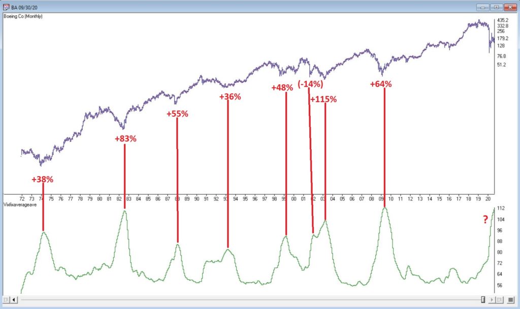
Figure 1 displays a monthly chart for Boeing (BA) with VFAA at the bottom. The numbers on the chart represent the hypothetical + (-) % achieved by applying the rules above (although once again, to be clear I am not necessarily suggesting anyone use it exactly this way).
From March 2019 into March 2020 BA declined -80%. It has since bounced around and VFAA has soared to 110.88. VFAA has yet to rollover on a month-end basis, so nothing to do here except exhibit – what’s that word again – oh right, “patience.”
Ticker GD
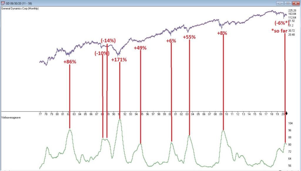
Figure 2 displays a monthly chart for General Dynamics (GD) with VFAA at the bottom.
Are these “world-beating numbers”? Not really. But in terms of helping to identify potential opportunities, not so bad. VFAA gave a “buy signal” for GD at the end of July. So far, not so good as the stock is down about -6%.
Ticker WFC
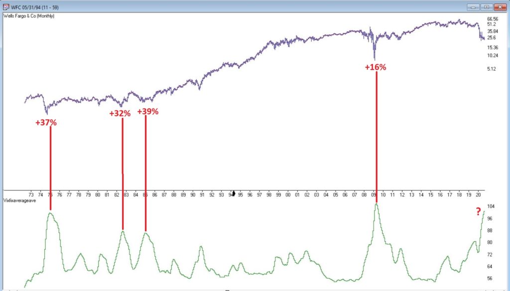
Figure 3 displays a monthly chart for Wells Fargo (WFC) with VFAA at the bottom.
There are not many “signals” but the ones that occurred have been useful. Between 2018 and 2020 WFC declined -65%. It has since bounced around and VFAA has soared to 102.44. VFAA has yet to rollover on a month-end basis. But at some point it will, and a potential opportunity may arise.
VFAA Formula
Below is the code for VFAA
VixFix is an indicator developed many years ago by Larry Williams which essentially compares the latest low to the highest close in the latest 22 periods (then divides the difference by the highest close in the latest 22 periods). I then multiply this result by 100 and add 50 to get VixFix.
*Next is a 3-period exponential average of VixFix
*Then VFAA is arrived at by calculating a 7-period exponential average of the previous result (essentially, we are “double-smoothing” VixFix)
Are we having fun yet? See code below:
hivalclose is hival([close],22).
vixfix is (((hivalclose-[low])/hivalclose)*100)+50.
vixfixaverage is Expavg(vixfix,3).
vixfixaverageave is Expavg(vixfixaverage,7).
VFAA = vixfixaverageave
EDITORS NOTE: The WinWay Expert Design Studio code for the indicator is available to download from here. Save this file to your /wintes32/EDS Strategies folder https://aiqeducation.com/VFAA.EDS
Summary
One thing to note is that VFAA “signals” on a monthly chart don’t come around very often. So, you can’t really sit around and wait for a signal to form on your “favorite company”. You have to look for opportunity wherever it might exist.
One last time let me reiterate that I am not suggesting using VFAA as a standalone systematic approach to investing. But when a signal does occur – especially when applied to quality companies that have recently been “whacked”, it can help to identify a potential opportunity.
Jay Kaeppel
Disclaimer: The information, opinions and ideas expressed herein are for informational and educational purposes only and are based on research conducted and presented solely by the author. The information presented represents the views of the author only and does not constitute a complete description of any investment service. In addition, nothing presented herein should be construed as investment advice, as an advertisement or offering of investment advisory services, or as an offer to sell or a solicitation to buy any security. The data presented herein were obtained from various third-party sources. While the data is believed to be reliable, no representation is made as to, and no responsibility, warranty or liability is accepted for the accuracy or completeness of such information. International investments are subject to additional risks such as currency fluctuations, political instability and the potential for illiquid markets. Past performance is no guarantee of future results. There is risk of loss in all trading. Back tested performance does not represent actual performance and should not be interpreted as an indication of such performance. Also, back tested performance results have certain inherent limitations and differs from actual performance because it is achieved with the benefit of hindsight.
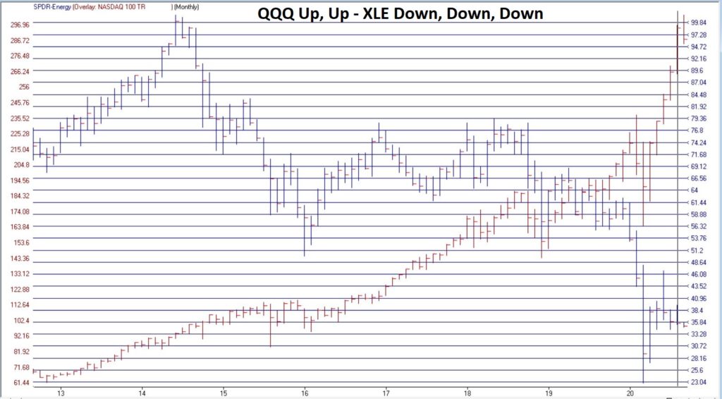
Everyone hates the energy sector (Foreshadowing alert: Well, almost everyone). And a quick perusal of Figure 1 clearly illustrates why the energy sector is unloved.
Figure 1 – Ticker XLE versus ticker QQQ (Courtesy TradingExpert)
Since ticker XLE (Energy Select Sector SPDR ETF) topped out in 2014:
*XLE has lost -65%
*QQQ has gained +210%
And in another kick in the head to the energy sector, Exxon (ticker XOM) was just kicked out of the Dow Jones Industrial Average. Take that, losers!
So yeah, who wouldn’t hate energy stocks and decide to shun them? Well, as it turns out, the answer to that question of late is “the people who know the energy business the best.”
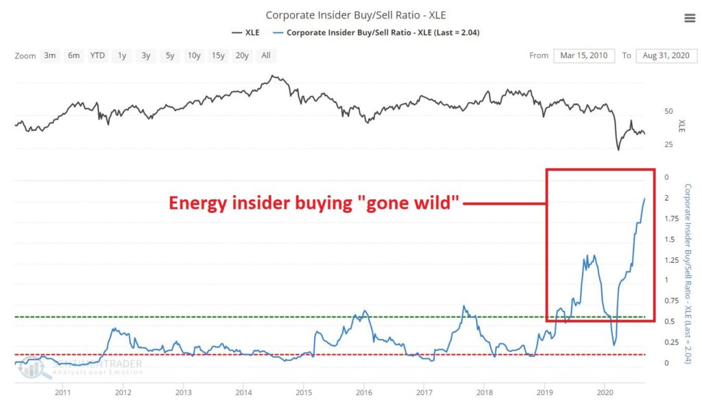
Figure 2 from www.Sentimentrader.com displays the Insider Buy/Sell ratio for executives and other muckety-mucks running energy related corporations. The picture speaks for itself.
As you can see, energy corporate insiders have been on a massive buying binge of late. Interestingly, they went on a buying binge in 2019 – apparently expecting an improvement in the sector – then the sector got waylaid by Covid-19. Instead of bailing out the insiders really kicked their share buying into overdrive as you can see at the far right of Figure 2.
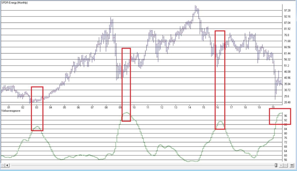
Figure 3 displays ticker XLE with an indicator that I developed by simply smoothing Larry Williams VixFix indicator. The gist of the idea, is that when this indicator reaches an extreme high level and then turns down, it often highlights a “washed out” situation which may be followed by a bullish move. Ticker XLE is presently nearing that point.
EDITTORS NOTE: VixFix smoothed indicator code sections can be copied and pasted into EDS or you can download the indicator code in an EDS file from here and save it to your /wintes32/EDS Strategies folder.
This indicator is based on another indicator called VixFix which was developed many years ago by Larry Williams.
hivalclose is hival([close],22). <<<<<The high closing price in that last 22 periods
vixfix is (((hivalclose-[low])/hivalclose)*100)+50. <<<(highest closing price in last 22 periods minus current period low) divided by highest closing price in last 22 periods (then multiplied by 100 and 50 added to arrive at vixfix value)
vixfixaverage is Expavg(vixfix,3). <<< 3-period exponential average of vixfix
vixfixaverageave is Expavg(vixfixaverage,7). <<<7-period exponential average of vixfixaverage
Should savvy investors follow the insider’s lead and start piling into the energy sector? Unfortunately, hindsight is the only way to know for sure. But for what it is worth, my own answer is “probably, but maybe not just yet.”
Energy Seasonality
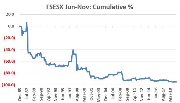
The primary reason for hesitation at this exact moment in time is seasonality. Let’s use ticker FSESX (Fidelity Select Sector Energy Services) as a proxy for the broader energy index. This fund’s first full month of trading was January 1986. Figure 4 displays the cumulative total return for ticker FSESX ONLY during the months of June through November every year since 1986.
Figure 4 – FSESX cumulative % return June through October (1986-2020)
The cumulative total return during these months for holders of FSESX during June through November is -94.7%(!!!) So, you see my hesitation with “piling in”.
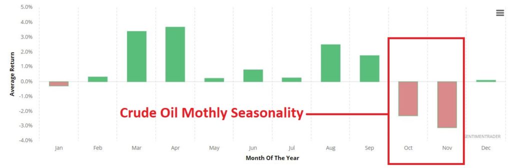
Additionally – climate change concerns aside – much of the energy industry still revolves around crude oil. Figure 4 displays the annual seasonal trend by month for crude oil.
Seasonal trends can vary widely from year-to-year, and there is NO guarantee that trouble lies ahead in Sep-Oct-Nov for the energy sector.
But that is what history suggests.
Summary
The bottom line is this:
*Energy sector corporate insider buying should be seen as a bullish longer-term sign for the sector
*The energy sector is so beaten down, battered and unloved that it probably accurate to refer to the situation as “Blood in the Streets”
Based on these factors I look for energy to surprise investors in the years ahead. That being said:
*Trying to pick the exact bottom in anything is typically a fool’s errand
*Getting bullish on the energy sector in early September is at times fraught with peril.
Sometime around December 1st it will be time to take a close look at the energy sector. If an actual uptrend develops or has already developed, the time may be write for investors to join the insiders.
Jay Kaeppel
Disclaimer: The information, opinions and ideas expressed herein are for informational and educational purposes only and are based on research conducted and presented solely by the author. The information presented represents the views of the author only and does not constitute a complete description of any investment service. In addition, nothing presented herein should be construed as investment advice, as an advertisement or offering of investment advisory services, or as an offer to sell or a solicitation to buy any security. The data presented herein were obtained from various third-party sources. While the data is believed to be reliable, no representation is made as to, and no responsibility, warranty or liability is accepted for the accuracy or completeness of such information. International investments are subject to additional risks such as currency fluctuations, political instability and the potential for illiquid markets. Past performance is no guarantee of future results. There is risk of loss in all trading. Back tested performance does not represent actual performance and should not be interpreted as an indication of such performance. Also, back tested performance results have certain inherent limitations and differs from actual performance because it is achieved with the benefit of hindsight.
The Expert System in TradingExpert Pro gave a 1 – 99 down signal on the Dow Jones on 8-27-20. The market internals based on the advancing vs declining issue in the New York market continue to diverge from the market price action.
The phase indicator used to confirm Expert Ratings turned down on 8-31-20. We usually look for a phase confirmation of an Expert Rating to occur within 3 days of the rating.
The changes made in the constituents of the Dow 30 effective 8-31-20

 English