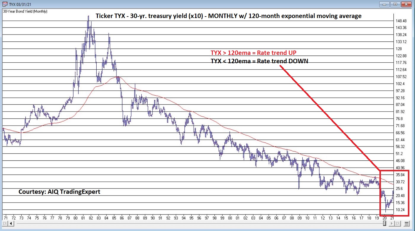
Perspective on interest rates – chart
In my (market-addled) mind, the chart below DOES offer the proper perspective regarding the trend in interest rates.
Jay Kaeppel

In my (market-addled) mind, the chart below DOES offer the proper perspective regarding the trend in interest rates.
Jay Kaeppel
OK, for the record, I have stood in enough long lines next to impossibly sweaty people (Full Disclosure: They likely feel the same way about me) to know that all of the talk of “Disney” and “Magic” is strictly for marketing consumption. That being said – and despite the fact that you cannot attend the flagship property in sunny CA, and likely will not be able to for some time – there is something about “going to Disney” that still strikes a chord with a whole lot of people.
Of course, my interest here is more financial in nature.
Now the “rational” thing to do in the minds of most investors is to ask and answer some serious questions regarding “theme park attendance.” in the age of COVID-19. Questions like “will attendance pick up anytime soon” and “will DIS continue to be an economic powerhouse if attendance does not return to pre-Covid levels?”
Here is a link to a factual, well-researched and well-written article noting that Disney World attendance as of 8/21/20, attendance was down 80% from a year earlier. Scary stuff, right? And the snap implication is fairly obvious – theme parks are suffering and may continue to do so for the foreseeable future.
But as I mentioned, my interest is more financial in nature. And I tend to look at things from a slightly different angle than a lot of other people. Part of that is because I have come to recognize that (like a lot of other people, but sadly unbeknownst to a lot of those same people) I (and they) am not very good at accurately answering “questions about the future”, such as those posed above about theme parks.
I read that theme park attendance is “down 80%” and instantly that voice in my head loudly issues that age-old “DANGER! WARNING WILL ROBINSON” alert and I feel the urge to scurry off in the other direction. But fortunately, I have gotten pretty good at not overreacting to that initial warning and coming back for a second glance.
Consider Figure 1. The date marked by the vertical line is August 21, 2020, i.e., the day that the news came out that “Disney World attendance is down 80%, that heavy discounting going on, that Disney stock is down for the year and that it is lagging the major stock indexes.”
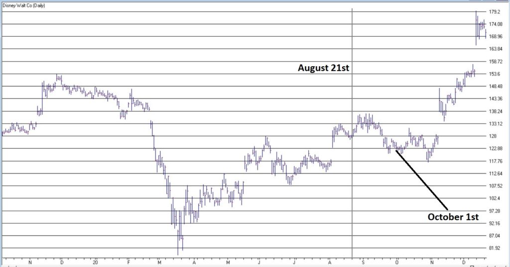
Figure 1 – Disney stock (Courtesy WinWayCharts)
Since that “DANGER! WARNING WILL ROBNINSON” moment, DIS is up +34% in 4 months, versus +9% for the S&P 500 Index (FYI, DIS is now up 18% for 2020 vs. 14%+ for the S&P 500).
Are the financial markets a perverse beast, or WHAT!?
The “Real Magic” of Disney Stock
So, what the heck happened to make DIS stock burst higher even in the face of seemingly very bad fundamental news? Well, long story short, October 1st happened. Wait, what? October 1st? Surely it can’t be that simple!?
Here’s the thing: it probably should not be that simple. And there is absolutely no guarantee that it will continue to be that simple. But for the past roughly 6 decades…. it has been just about that simple. Consider Figure 2.
Figure 2 displays the cumulative % gain for DIS stock held ONLY from October 1st each year through the end of May the following year, every year since 1962.
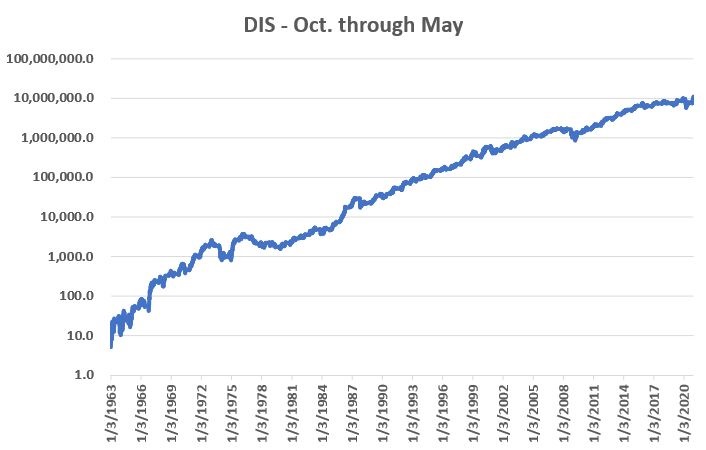
Figure 2 – DIS % +(-) during October through May (logarithmic scale)
An initial $1,000 investment in DIS stock held only October through May starting in 1962 is worth $108,512,237 as of 12/18/2020, or a gain of +10,851,124%.
Figure 3 displays the cumulative % gain for DIS stock held ONLY from June 1st each year through the end of September that same year, every year since 1962.
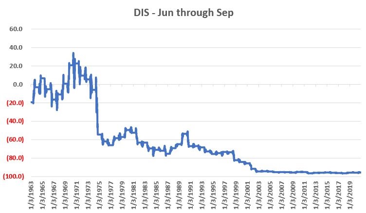
Figure 3 – DIS % +(-) during June through September (non-logarithmic scale)
An initial $1,000 investment in DIS stock held only June through September starting in 1962 is worth $44.86 as of 12/18/2020, or a loss of -95.5%.
The Upshot
Many investors will ask the obvious question of “Why does this work?” And the most succinct answer I can proffer is “It beats me.” Obviously, many investors will not be satisfied with that answer. And that is perfectly OK by me. As a proud graduate of “The School of Whatever Works” I tend to value “consistency” more than I do cause and effect. Not everyone is wired that way and that’s OK.
Speaking of consistency, for what it is worth Figure 4 displays decade-by-decade results for the Oct-May period versus the Jun-Sep period.
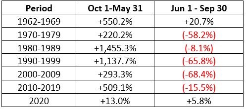
Figure 4 – DIS decade-by-decade
The key things to note are that:
*The Oct-May period showed a pretty substantial gain during each of the 6 previous decades.
*The Jun-Sep period showed a gain during the 60’s but lost money in every subsequent decade
(Note 2020 results through 12/18 are included in the table but are not a part of the commentary above).
Summary
Clearly the Oct-May period has been pretty “magical” for DIS stock investors for a long time. Will this continue to be the case in the future? Ah, there’s the rub. And as always, I must repeat once again my stock answer of “It beat’s me.”
But the real point is that in the long run investment success has a lot to do with finding and “edge” and exploiting it repeatedly. Or as I like to say:
“Opportunity is where you find it.”
Jay Kaeppel
Disclaimer: The information, opinions and ideas expressed herein are for informational and educational purposes only and are based on research conducted and presented solely by the author. The information presented represents the views of the author only and does not constitute a complete description of any investment service. In addition, nothing presented herein should be construed as investment advice, as an advertisement or offering of investment advisory services, or as an offer to sell or a solicitation to buy any security. The data presented herein were obtained from various third-party sources. While the data is believed to be reliable, no representation is made as to, and no responsibility, warranty or liability is accepted for the accuracy or completeness of such information. International investments are subject to additional risks such as currency fluctuations, political instability and the potential for illiquid markets. Past performance is no guarantee of future results. There is risk of loss in all trading. Back tested performance does not represent actual performance and should not be interpreted as an indication of such performance. Also, back tested performance results have certain inherent limitations and differs from actual performance because it is achieved with the benefit of hindsight.
In many ways the markets imitate life. For example, the trend is your friend. You may enjoy your friendship with the trend for an indefinite length of time. But the moment you ignore it – or just simply take it for granted that this friendship is permanent, with no additional effort required on your part – that’s when the trouble starts.
For the stock market right now, the bullish trend is our friend. Figure 1 displays the 4 major indexes all above their respective – and rising – long-term moving averages. This is essentially the definition of a “bull market.”
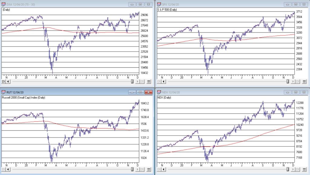
Figure 1 – 4 Major Indexes in Bullish Trends (Courtesy WinWayCharts)
In addition, a number of indicators that I follow have given bullish signals in the last 1 to 8 months. These often remain bullish for up to a year. So, for the record, with my trusted trend-following, oversold/thrust and seasonal indicators mostly all bullish I really have no choice but to be in the bullish camp.
Not that I am complaining mind you. But like everyone else, I try to keep my eyes open for potential signs of trouble. And of course, there are always some. One of the keys to long-term success in the stock market is determining when is the proper time to actually pay attention to the “scary stuff.” Because scary stuff can be way early or in other cases can turn out to be not that scary at all when you look a little closer.
So, let’s take a closer look at some of the scary stuff.
Valuations
Figure 2 displays an aggregate model of four separate measures of valuation. The intent is to gain some perspective as to whether stocks are overvalued, undervalued or somewhere in between.
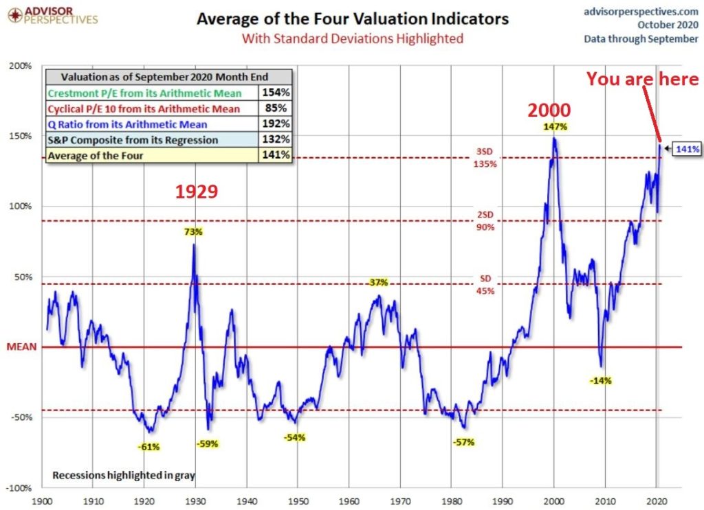
Figure 2 – Stock Market valuation at 2nd highest level ever (Courtesy: www.advisorperspectives.com)
Clearly the stock market is “overvalued” if looked at from a historical perspective. The only two higher readings preceded the tops in 1929 (the Dow subsequently lost -89% of its value during the Great Depression) and 2000 (the Nasdaq 100 subsequently lost -83% of its value).
Does this one matter? Absolutely. But here is what you need to know:
*Valuation IS NOT a timing indicator. Since breaking out to a new high in 1995 the stock market has spent most of the past 25 years in “overvalued” territory. During this time the Dow Industrials have increased 700%. So, the proper response at the first sign of overvaluation should NOT be “SELL.”
*However, ultimately valuation DOES matter.
Which leads directly to:
Jay’s Trading Maxim #44: If you are walking down the street and you trip and fall that’s one thing. If you are climbing a mountain and you trip and fall that is something else. And if you are gazing at the stars and don’t even realize that you are climbing a mountain and trip and fall – the only applicable phrase is “Look Out Below”.
So, the proper response is this: instead of walking along and staring at the stars, keep a close eye on the terrain directly in front of you. And watch out for cliffs.
Top 5 companies as a % of S&P 500 Index
At times through history certain stocks or groups of stocks catch “lightning in a bottle.” And when they do the advances are spectacular, enriching anyone who gets on board – unless they happen to get on board too late. Figure 3 displays the percentage of the S&P 500 Index market capitalization made up by JUST the 5 largest cap companies in the index at any given point in time.
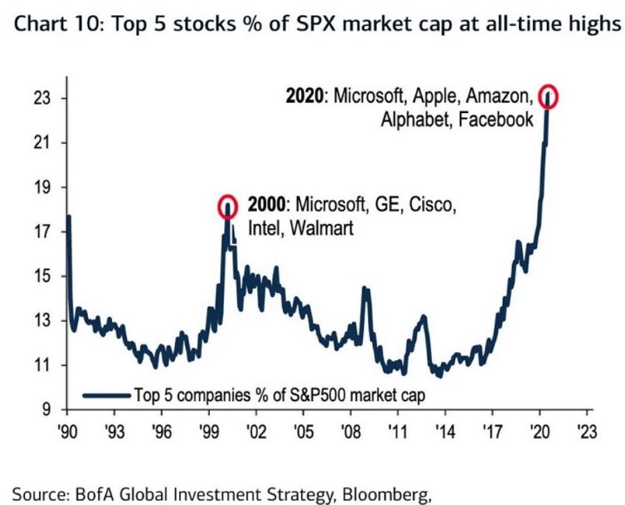
Figure 3 – Top 5 stocks as a % of S&P 500 Index market cap (Courtesy: www.Bloomberg.com)
The anecdotal suggestion is pretty obvious. Following the market peak in 2000, the five stocks listed each took a pretty significant whack as shown in Figure 4.
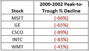
Figure 4 – Top Stocks after the 2000 Peak
Then when we look at how far the line in Figure 3 has soared in 2020 the obvious inference is that the 5 stocks listed for 2020 are due to take a similar hit. And here is where it gets interesting. Are MSFT, AAPL, AMZN, GOOGL and FB due to lose a significant portion of their value in the years directly ahead?
Two thoughts:
*There is no way to know for sure until it happens
*That being said, my own personal option is “yes, of course they are”
But here is where the rubber meets the road: Am I presently playing the bearish side of these stocks? Nope. The trend is still bullish. Conversely, am I keeping a close eye and am I willing to play the bearish side of these stocks? Yup. But not until they – and the overall market – actually starts showing some actual cracks.
One Perspective on AAPL
Apple has been a dominant company for many years, since its inception really. Will it continue to be? I certainly would not bet against the ability of the company to innovate and grow its earnings and sales in the years ahead. Still timing – as they say – is everything. For what it is worth, Figure 5 displays the price-to-book value ratio for AAPL since January 1990.
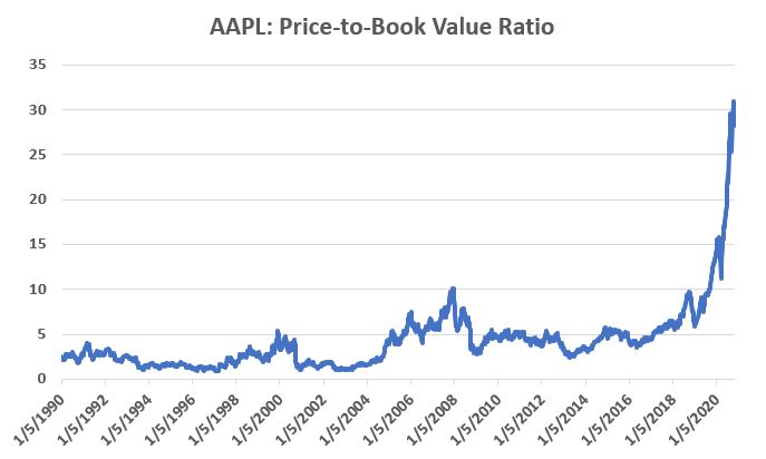
Figure 5 – AAPL price-to-book value ratio (Data courtesy of Sentimentrader.com)
Anything jump out at you?
Now one can argue pretty compellingly that price-to-book value is not the way to value a leading technology company. And I probably agree – to a point. But I can’t help but look at Figure 5 and wonder if that point has possibly been exceeded.
Summary
Nothing in this piece is meant to make you “bearish” or feel compelled to sell stocks. For the record, I am still in the bullish camp. But while this information DOES NOT constitute a “call to action”, IT DOES constitute a “call to pay close attention.”
Bottom line: enjoy the bull market but DO NOT fall in love with it.
Jay Kaeppel
Disclaimer: The information, opinions and ideas expressed herein are for informational and educational purposes only and are based on research conducted and presented solely by the author. The information presented represents the views of the author only and does not constitute a complete description of any investment service. In addition, nothing presented herein should be construed as investment advice, as an advertisement or offering of investment advisory services, or as an offer to sell or a solicitation to buy any security. The data presented herein were obtained from various third-party sources. While the data is believed to be reliable, no representation is made as to, and no responsibility, warranty or liability is accepted for the accuracy or completeness of such information. International investments are subject to additional risks such as currency fluctuations, political instability and the potential for illiquid markets. Past performance is no guarantee of future results. There is risk of loss in all trading. Back tested performance does not represent actual performance and should not be interpreted as an indication of such performance. Also, back tested performance results have certain inherent limitations and differs from actual performance because it is achieved with the benefit of hindsight.
Two of my favorite sayings go like this:
*”Every situation in life represents an opportunity”
*”Opportunity is where you find it”
Nowhere is this truer than in the financial markets.
To wit, in this article dated 3/26/2020 (cue the scary music) – when things looked their absolute worst – I highlighted four tickers in the energy sector (yes, THAT energy sector, the one that has been a disaster and loathed and unloved for some time now). Now it would have taken a true “Buy when there is blood in the streets” mentality, and/or almost foolhardy nerves of steel to actually pile into those issues at the time.
But that is sort of the point.
Figure 1 displays the tickers and their price action since the close on 3/26/2020.
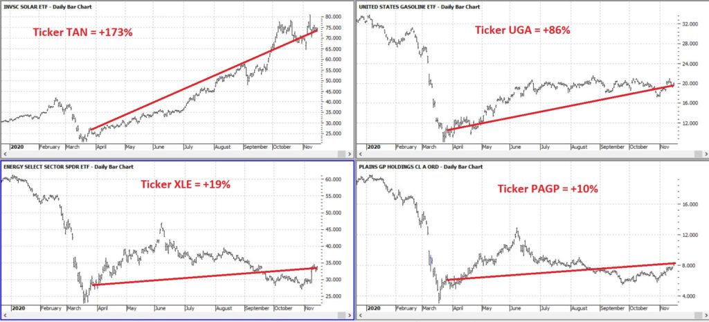
Figure 1 – Energy stocks highlighted in 3/26/20 (Courtesy ProfitSource by HUBB)
Figure 2 displays the comparative performance versus the S&P 500 and the Nasdaq 100.
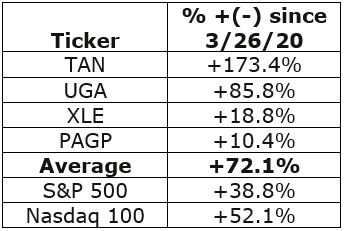
Figure 2 – “Blood in the Streets” energy stocks versus major indexes
As you can see in Figure 2 these four stocks as a whole have actually outperformed both the S&P 500 Index and the Nasdaq 100 Index.
Now the point IS NOT that I am some great stock-picker (because I am not). The point is that, well, see the two quotes above.
A Broader Look at Energy
For someone with less of the “buy when there is blood in the streets” mentality and more of “trend-following” mentality, a simple trend-following method may soon (at long last) swing to the bullish side.
It works like this:
*Two “tickers” see their respective 5-week average cross above their respective 30-week average
*Ticker 1 is ticker XLE (the SPDR energy ETF)
*Ticker 2 is an index (I created) of securities that have an inverse correlation to the U.S. Dollar
Editors Note: To create an inverse index of the ticker XLE, you’ll first need to use the Matchmaker tool and run a correlation between XLE and your database of stocks. The stocks that correlate the least with have the highest negative correlation.
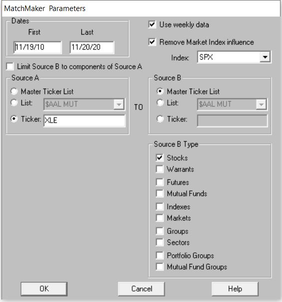
To create the index. Make a new list in AIQ Data Manager, create a new group ticker called ANTIUS3 and add it to the list. Add the least correlated tickers from Matchmaker to this group, then use Compute Group/Sector Indices to compute all dates for this list. You’ll now have an equivalent to the ANTIUS3.
You can see these two – along with their respective 5-week and 30-week – in Figure 3.
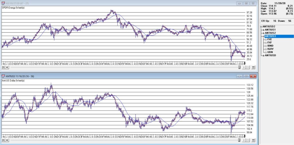
Figure 3 – Ticker XLE and Jay’s ANTIUS3 index w/5-week and 30-week averages (Courtesy TradingExpert)
As you can see in Figure 3 the two have a tendency to often move together. At other times they do not. The key point here is that we ONLY pay attention when the two tickers are both trending in the same direction.
Why is this important?
Figure 4 displays the cumulative price growth for ticker XLE (as a proxy for the broad energy sector) under two separate circumstance:
*When BOTH XLE and ANTIUS3 are in uptrends (i.e., 5-week average ABOVE 30-week average)
*When EITHER XLE or ANTIUS3 is NOT in an uptrend (i.e., 5-week average BELOW 30-week average)
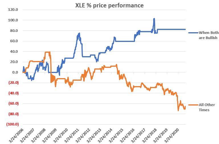
Figure 4 – XLE cumulative %+(-) depending on trend status for XLE and ANTIUS3
To put it in numbers:
When BOTH are in Uptrends: XLE = +82.3%
When EITHER is NOT in an Uptrend: XLE = -65.5%
Summary
Another glance at Figure 1 reveals that ANTIUS3 is in an uptrend and that XLE is not quite there yet. So, at the moment there is no bullish signal from the method described above. However, energy does appear to be “trying” to rally. Investors looking for “opportunity” may be wise to keep an eye on the 5-week and 30-week averages of ticker XLE in the weeks and month ahead.
Jay Kaeppel
Disclaimer: The information, opinions and ideas expressed herein are for informational and educational purposes only and are based on research conducted and presented solely by the author. The information presented represents the views of the author only and does not constitute a complete description of any investment service. In addition, nothing presented herein should be construed as investment advice, as an advertisement or offering of investment advisory services, or as an offer to sell or a solicitation to buy any security. The data presented herein were obtained from various third-party sources. While the data is believed to be reliable, no representation is made as to, and no responsibility, warranty or liability is accepted for the accuracy or completeness of such information. International investments are subject to additional risks such as currency fluctuations, political instability and the potential for illiquid markets. Past performance is no guarantee of future results. There is risk of loss in all trading. Back tested performance does not represent actual performance and should not be interpreted as an indication of such performance. Also, back tested performance results have certain inherent limitations and differs from actual performance because it is achieved with the benefit of hindsight.
In the late 1980’s, Japan seemed destined to “rule the financial world”. But when it comes to the financial markets – things don’t always pan out as they appear destined to. The Nikkei Index topped out in late 1989, didn’t bottom out until February 2009 and has yet to return to its 1989 peak.
But it sure is trying. This past week the Nikkei reached its highest level 1991. So, hooray for the Japanese. Back here in the US of A there may be a slightly different take. For as we will discuss in a moment, what is good for Japanese stocks is (apparently) bad for US bonds.
Ticker EWJ
As our proxy for Japanese stocks we will use ticker EWJ (iShares Japan). In Figure 1 you can the monthly action since the ETF started trading in 1996.
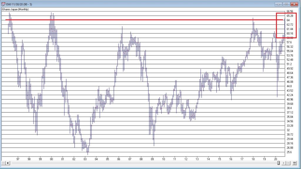
Figure 1- Ticker EWJ monthly (Courtesy TradingExpert)
Since 1996 EWJ has broken in the $60 a share range on 5 previous occasions, only to be rebuffed. You can see the latest upward thrust at the far right. Will this be the time it breaks through? It beats me and in fact that is not really the focus of this article. The real question posed here is “what about U.S. treasury bonds?” Huh? Consider Figure 2.
The top clip of Figure 2 displays a weekly chart of EWJ with a 5-week and 30-week moving average drawn. The bottom clip displays a weekly chart of ticker TLT – the iShares ETF that tracks the long-term U.S. treasury bond.
Note that – using highly technical terms – when one “zigs”, the other “zags.”
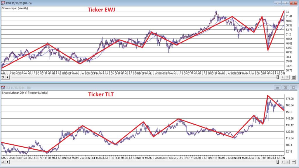
Figure 2 – EWJ vs. TLT (Courtesy TradingExpert)
The thing to note is the inverse correlation between the two – i.e., when Japanese stocks advance, US treasuries tend to decline and vice versa. For the record (and for you fellow numbers geeks out there) the correlation coefficient in the last 2 years is -0.45 (1 means they trade exactly the same, -1 means they trade exactly inversely).
For my purposes:
*EWJ 5-week MA < EWJ 3-week MA = BULLISH for US treasuries
*EWJ 5-week MA > EWJ 3-week MA = BEARISH for US treasuries
Any real merit to this?
*The blue line in Figure 3 displays the cumulative $ +(-) achieved by holding a long position in t-bond futures ($1,000 a point) when the EWJ indicator is BULLISH (for U.S. bonds)
*The orange line in Figure 3 displays the cumulative $ +(-) achieved by holding a long position in t-bond futures ($1,000 a point) when the EWJ indicator is BEARISH (for U.S. bonds)
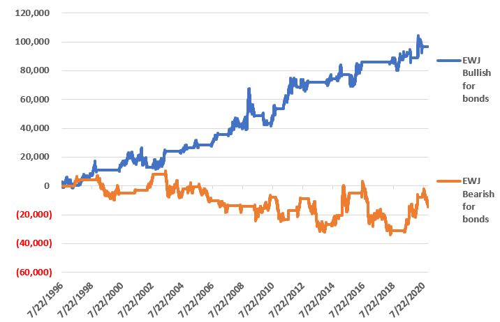
Figure 3 – $ + (-) for Treasury Bond Futures when EWJ indicator is BULLISH for bonds (blue) or BEARISH for bonds (orange)
Summary
Bond investors might keep a close eye on Japanese stocks for a while. If the latest thrust higher follows through and becomes the move that finally breaks out to the upside, the implication would appear to be negative for U.S. long-term treasury bonds. On the flip side, if Japanese stocks fail once again to break through and reverse to the downside, then things might look a whole lot better for the 30-year US treasury.
Jay Kaeppel
Disclaimer: The information, opinions and ideas expressed herein are for informational and educational purposes only and are based on research conducted and presented solely by the author. The information presented represents the views of the author only and does not constitute a complete description of any investment service. In addition, nothing presented herein should be construed as investment advice, as an advertisement or offering of investment advisory services, or as an offer to sell or a solicitation to buy any security. The data presented herein were obtained from various third-party sources. While the data is believed to be reliable, no representation is made as to, and no responsibility, warranty or liability is accepted for the accuracy or completeness of such information. International investments are subject to additional risks such as currency fluctuations, political instability and the potential for illiquid markets. Past performance is no guarantee of future results. There is risk of loss in all trading. Back tested performance does not represent actual performance and should not be interpreted as an indication of such performance. Also, back tested performance results have certain inherent limitations and differs from actual performance because it is achieved with the benefit of hindsight.
For the record, I am an avowed “trend-follower.” But I also know that no trend lasts forever. So, while I have gotten pretty good at “riding along”, I do – like most people – like to “look ahead” since I do know that the landscape will forever be changing.
So, with the caveat that none of what follows should be considered a “call to action”, only as a “call to pay attention”, let’s venture out “into the weeds.”
AIROIL
Here is an ugly pairing – airline stocks and traditional energy stocks – yikes! In Figure 1 you see an index that I created and followed call AIROIL comprised of three airline stocks and five “Big Oil” stocks. During the pandemic meltdown this index fell to a level not seen since 2007 before “bouncing”.
Editors Note:
Jay's AIROIL Index is built using the AIQ Data Manager by creating a list andcreating a group ticker (in this case AIROIL).
Stocks are inserted under the ticker and the index is then computed using  Compute Group/Sector indices.
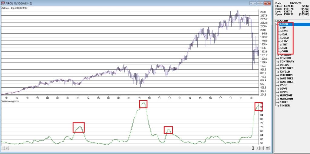
Figure 1 – Jay’s AIROIL Index (Courtesy TradingExpert Pro)
In the bottom clip you see an indicator I call VFAA. Note that when VFAA tops out and rolls over, meaningful advances in the index tend to follow. In addition, VFAA is at a high level seen only once before in 2009. Following that reversal, the index rose almost 500% over the next 9 years.
So, is now a great time to pile into airlines and big oil? One would have to be a pretty hard-core contrarian to pound the table on this one. The airlines are in terrible shape due to the pandemic and vast uncertainty remains regarding when things might improve. And “Big Oil” is about as unloved as any sector has ever been.
So, am I suggesting anyone “load up” on airlines and oil? Nope. What I am saying is that I am watching this closely and that if and when VFAA “rolls over” I may look to commit some money to these sectors on a longer-term contrarian basis.
International/Commodities/Value
Also known of late as “the barking dogs”. If you have had money committed to any or all of these asset classes in recent years you are shaking your head right about now. These areas have VASTLY underperformed a simple “buy-and-hold the S&P 500 Index” approach for a number of years.
Is this state of affairs going to change anytime soon? Regarding “anytime soon” – it beats me. However, I am on the record as arguing that at some point this WILL change. History makes one thing very clear – no asset class has a permanent edge. So, given that the S&P 500 Index has beaten these above mentioned by such a wide margin for such a long time (roughly a decade or more) I am confident that one day in the next x years, the “worm will turn.”
Figure 2 displays an index that I created and follow that tracks an international ETF, a commodity ETF and a value ETF. The VFAA indicator appears in the bottom clip.
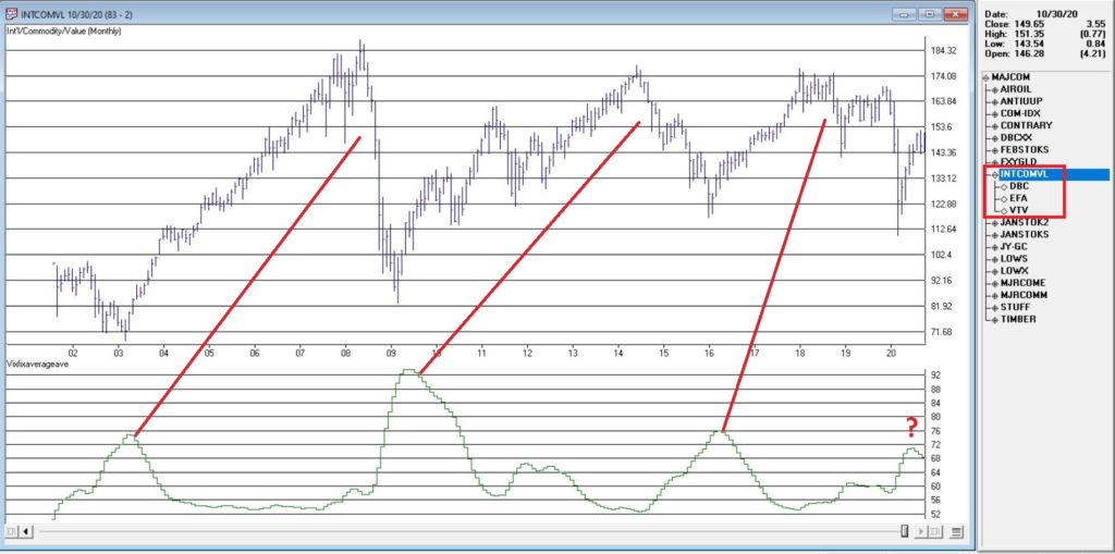
Figure 2 – Jay’s INTCOMVAL Index (Courtesy TradingExpert Pro)
Now if history is a guide, then the recent “rollover” by VFAA suggests that this particular grouping of asset classes should perform well in the coming years. Two things to note:
1. There is no guarantee
2. There is absolutely no sign yet that “the turn” – relative to the S&P 500 – is occurring
Figure 3, 4 and 5 are “relative strength” charts from www.StockCharts.com. They DO NOT display the price of any security; they display the performance of the first ETF list compared to the second ETF listed. So, Figure 3 displays the performance of ticker EFA (iShares MSCI EAFE ETF which tracks a broad index of stocks from around the globe, excluding the U.S.) relative to the S&P 500 Index.
When the bars are trending lower it means EFA is underperforming SPY and vice versa. The trend in Figure 3 is fairly obvious – international stocks continue to lose ground to U.S. large-cap stocks.
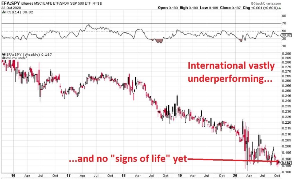
Figure 3 – Ticker EFA relative to ticker SPY (Courtesy: www.StockCharts.com)
If your goal is to pick a bottom, have at it. As for me, I am waiting for some “signs of life” in international stocks relative to U.S. stocks before doing anything.
Figure 4 displays ticker DBC (a commodity-based ETF) versus SPY and Figure 5 displays ticker VTV (Vanguard Value ETF) versus ticker VUG (Vanguard Growth ETF). Both tell the same tale as Figure 3 – unless you are an avowed bottom-picker there is no actionable intelligence. Still, both these trends are now extremely overdone, so a significant opportunity may be forming.
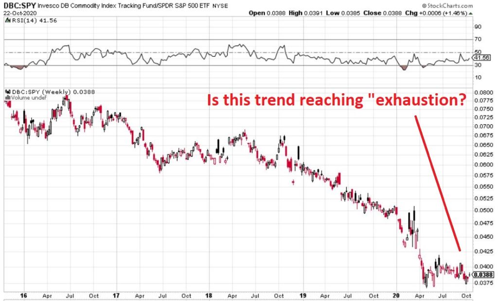
Figure 4 – Ticker DBC relative to ticker SPY (Courtesy: www.StockCharts.com)
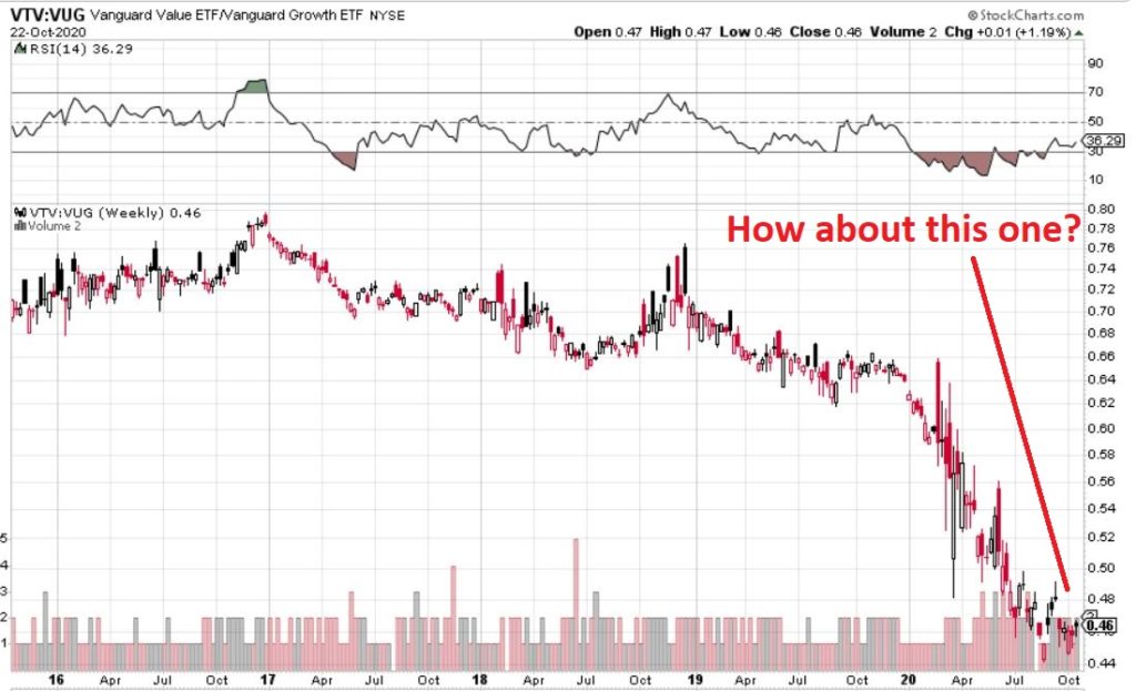
Figure 5 – Ticker VTV relative to ticker VUG (Courtesy: www.StockCharts.com)
Summary
Two key points as succinctly as possible:
*Nothing is happening at the moment with everything displayed above…
*…But something will (at least in my market-addled opinion) – so pay close attention.
Jay Kaeppel
Disclaimer: The information, opinions and ideas expressed herein are for informational and educational purposes only and are based on research conducted and presented solely by the author. The information presented represents the views of the author only and does not constitute a complete description of any investment service. In addition, nothing presented herein should be construed as investment advice, as an advertisement or offering of investment advisory services, or as an offer to sell or a solicitation to buy any security. The data presented herein were obtained from various third-party sources. While the data is believed to be reliable, no representation is made as to, and no responsibility, warranty or liability is accepted for the accuracy or completeness of such information. International investments are subject to additional risks such as currency fluctuations, political instability and the potential for illiquid markets. Past performance is no guarantee of future results. There is risk of loss in all trading. Back tested performance does not represent actual performance and should not be interpreted as an indication of such performance. Also, back tested performance results have certain inherent limitations and differs from actual performance because it is achieved with the benefit of hindsight.