Apr 13, 2018 | educational newsletters, ETFs, jay kaeppel
If you have read any of my pieces lately you are already aware that as it relates to the financial markets a lot of things are presently at a critical juncture (including my sanity, but I digress). Today let’s add the U.S. Dollar to that seemingly ever longer list of financial areas that appear to be at a crossroads. And this one has some large implications simply because a lot of other markets are affected at least to some extent by what happens in the dollar.
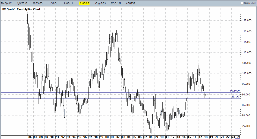
Figure 1 displays the Spot U.S. Dollar on a monthly basis.
The reality is that there is no one definitive price at which to draw a “definitive” line in the sand. So I arbitrarily picked two. There is nothing “magical” about these two lines and a move above or below either does not technically “prove” anything. Still, as far as this range goes, a lot of previous price moves have “gone here to die” so to speak.
Now this is the point in the article where a skilled analyst would explain in painstaking detail why the dollar is absolutely, positively destined to move higher (or lower) from here. Sorry, folks I honestly don’t know. But there are two things I do know which might still prove useful:
1) For every prognosticator out there pounding the table that the dollar is sure to move higher there is another (equally slightly crazed) prognosticator averring that the dollar is destined to decline. And the key thing to note is that they both can make a pretty compelling case.
2) A lot rides on which way the dollar goes from here, because there is no shortage of markets that react – at least in part – to the movements of the U.S. dollar. This means that alot of trading opportunities will be affected/created by the next big move from the dollar.
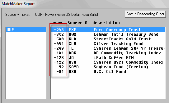
A few examples appear in Figure 2 below which displays the inverse nature of the correlation between the U.S. Dollar (using ticker UUP as a proxy) and the market in question (for the record, a figure of 1000 means the market moves exactly like the dollar and a figure of -1000 means the market moves exactly inversely to the dollar).
Now the fact that foreign currencies (ticker FXE – which tracks the Euro) move inversely to the U.S. Dollar is fairly obvious. But note that on this list are:
*Foreign Bonds and U.S. Bonds (BWX and TLT)
*Precious Metals (GLD and SLV)
*Commodities (like coffee, soybeans and crude oil)
*Broad Commodity Indexes (DBC and GSG)
This encompasses a pretty darn wide swath of the trading world. And every single one of them will be influenced to some extent by which way the dollar goes from here.
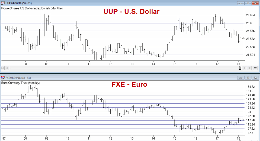
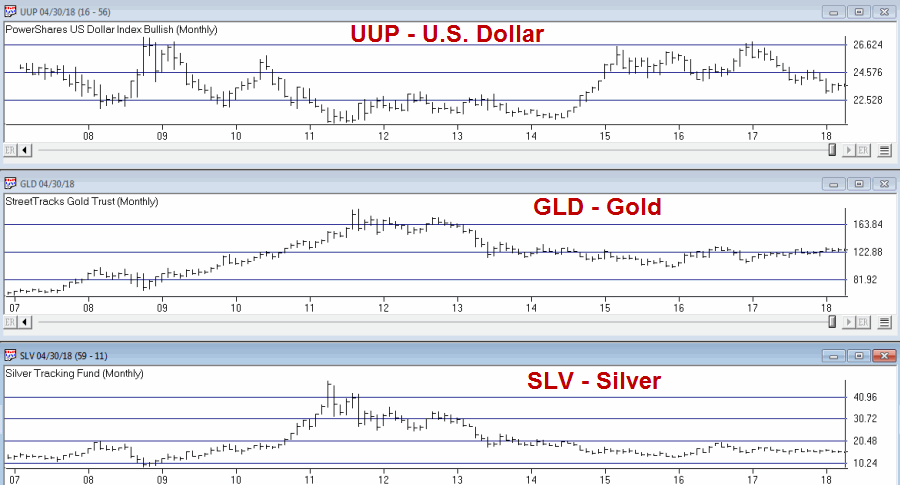
As you can see in Figures 3 through 6 (click to enlarge any of the charts), what happens to the U.S. Dollar can matter a lot to what happens in these markets.
So the bottom line is that I do not know which way the dollar goes from here. But I do know that whichever way it goes a lot of “things” will likely go “the other way.” And everything listed in Figure 2 represents a lot of trading opportunities.
This represents a good time to invoke:
Jay’s Trading Maxim #17: (with credit given to George and Tom at Optionetics back in the day): Investing success involves two “simple” steps. #1) Spot opportunity. #2) Exploit opportunity. Everything you do as a trader or investor falls into one of these two categories.
A bunch of opportunities may soon be spotted (assuming the dollar actually ever does get around to deciding which way it wants to go…).
So focus here, people, focus…
Disclaimer: The data presented herein were obtained from various third-party sources. While I believe the data to be reliable, no representation is made as to, and no responsibility, warranty or liability is accepted for the accuracy or completeness of such information. The information, opinions and ideas expressed herein are for informational and educational purposes only and do not constitute and should not be construed as investment advice, an advertisement or offering of investment advisory services, or an offer to sell or a solicitation to buy any security.
Mar 14, 2018 | EDS, educational newsletters, ETFs, indexes, jay kaeppel
In this article I wrote about an index I follow that combines the biotech sector with the gold stock sector. I also wrote about “one way” to trade that index. This article builds on that piece and adds a new “rule” to create more trading opportunities.
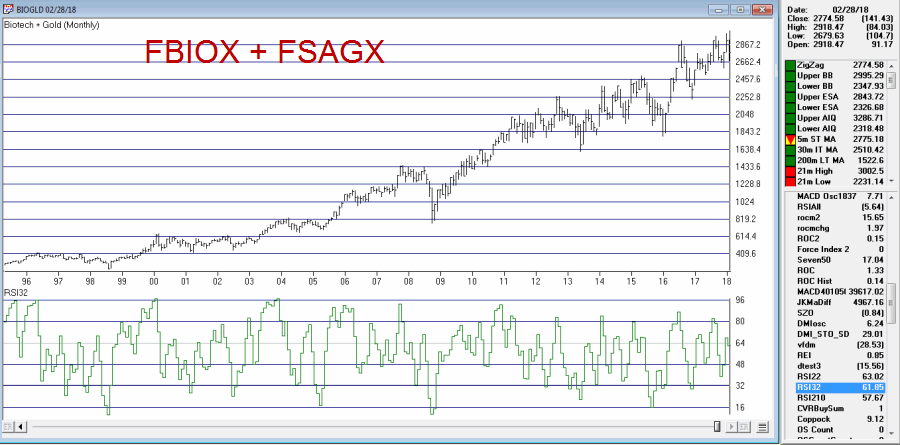
The BIOGOLD Index
Figure 1 displays the index that I created using TradingExpert. It combines ticker FBIOX (Fidelity Select Biotech) with ticker FSAGX (Fidelity Select Gold).
Also included in the lower clip is an indicator referred to as RSI32, which is the 2-day average of the standard 3-day RSI.
The Old System
In the original article I tested an approach that works as follows using monthly data:
*When the RSI32 drops to 32 or below, buy BOTH FBIOX and FSAGX
*After a buy signal, sell both funds when RSI32 rises to 64 or higher
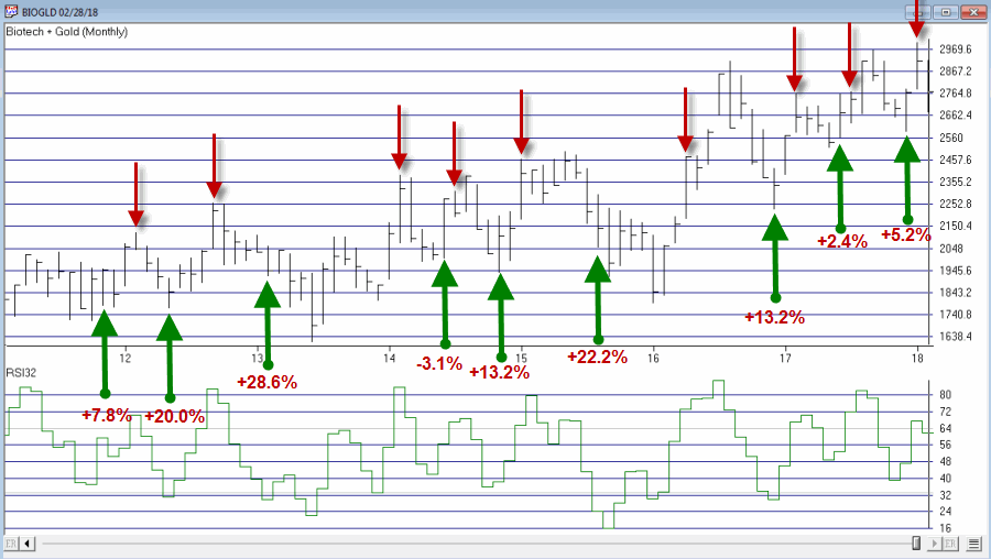
The New System
The “new rules” are as follows:
A “buy signal” occurs when either:
*The RSI32 drops to 32 or below
*The RSI32 drops below 50 (but not as low as 32) and then reverses to the upside for one month
After either of the buy signals above occurs, buy BOTH FBIOX and FSAGX
*After a buy signal, sell both funds when RSI32 rises to 64 or higher
Figure 2 displays the BIOGOLD Index with various buy and sell signals marked.
Figure 2 – Jay’s BIOGOLD Index with RSI32 signals (Courtesy
TradingExpert)To test results we will:
*Assume that after a buy signal both FBIOX and FSAGX are bought in equal amounts
*We will assume that both funds are held until RSI32 reaches 64 or higher (i.e., there is no stop-loss provision in this test)
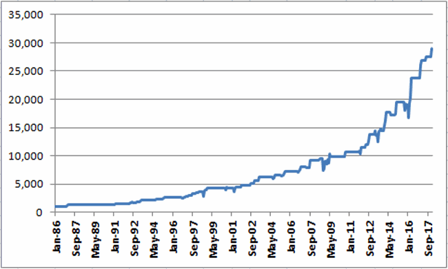
For testing purposes we will not assume any interest earned while out of the market, in order to highlight only the performance during active buy signals. Figure 3 displays the hypothetical growth of $1,000 (using monthly total return data) using the “system”.
Figure 3 – Hypothetical Growth of $1,000 using Jay’s BIOGOLD System (1986-present)
Summary
For the record, I am not “recommending” that anyone go out and initiate trading biotech and gold based on what I have written here. Before trading using any approach it is essential for a trader to do their own homework and carefully consider all of the pro’s and con’s associated with any specific approach. For example, while the trade-by-trade results for the above look reasonably good, it should be noted that there have been 4 separate drawdown’s in excess of -19% along the way, including a maximum drawdown of -37% in 2008. In considering any approach to trading it is essential to first think long and hard about how well one would “weather the storms”, BEFORE focusing on potential profitability.
To put it more succinctly is the simple phrase “Don’t cross the river if you can’t swim the tide.”
Jay Kaeppel
Disclaimer: The data presented herein were obtained from various third-party sources. While I believe the data to be reliable, no representation is made as to, and no responsibility, warranty or liability is accepted for the accuracy or completeness of such information. The information, opinions and ideas expressed herein are for informational and educational purposes only and do not constitute and should not be construed as investment advice, an advertisement or offering of investment advisory services, or an offer to sell or a solicitation to buy any security.
Feb 18, 2018 | educational newsletters, ETFs, indexes, jay kaeppel, market timing, stock market
In this article titled “World, Meet Resistance” – dated 12/21/2017 – I noted the fact that many single country ETFs and regional indexes were closing in on a serious level of potential resistance. I also laid out three potential scenarios. So what happened? A fourth scenario not among the three I wrote about (Which really pisses me off. But never mind about that right now).
As we will see in a moment what happened was:
*(Pretty much) Everything broke out above significant resistance
*Everything then reversed back below significant resistance.
World Markets in Motion
Figure 1 displays the index I follow which includes 33 single-country ETFs. As you can see, in January it broke out sharply above multi-year resistance. Just when it looked like the index was going to challenge the all-time high the markets reversed and then plunged back below the recently pierced resistance level.
(click to enlarge)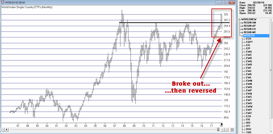
Figure 1 – Jay’s World Index broke out in January, fell back below resistance in February (Courtesy TradingExpert)
The same scenario holds true for the four regional indexes I follow – The Americas, Europe, Asia/Pacific and the Middle East – as seen in Figure 2.
(click to enlarge)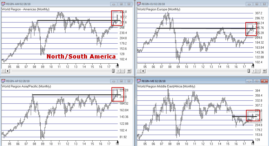
Figure 2 – Jay’s Regional Index all broke above resistance, then failed (Courtesy TradingExpert)
So where to from here? Well I could lay out a list of potential scenarios. Of course if history is a guide what will follow will be a scenario I did not include (Which really pisses me off. But never mind about that right now).
So I will simply make a subjective observation based on many years of observation. The world markets may turn the tide again and propel themselves back to the upside. But historically, when a stock, commodity or index tries to pierce a significant resistance level and then fails to follow through, it typically takes some time to rebuild a base before another retest of that resistance level unfolds.
Here’s hoping I’m wrong
Jay Kaeppel
Disclaimer: The data presented herein were obtained from various third-party sources. While I believe the data to be reliable, no representation is made as to, and no responsibility, warranty or liability is accepted for the accuracy or completeness of such information. The information, opinions and ideas expressed herein are for informational and educational purposes only and do not constitute and should not be construed as investment advice, an advertisement or offering of investment advisory services, or an offer to sell or a solicitation to buy any security.
Nov 14, 2017 | educational newsletters, ETFs, group and sector, jay kaeppel
In a recent article I highlighted some stocks that appeared to have a chance of “putting in a low”. In another article, I highlighted the potential usefulness of “horizontal lines” on a chart. The phrase “putting in a low” is essentially a kindler, gentler version of the phrase “Hey, let’s pick a bottom”.
The reality is that the ability to “pick tops and/or bottoms” on any kind of a consistent basis is a skill that roughly 99.2% of all investors and traders do not possess. That being said, there is such a thing as a legitimate “bottom formation” (at least in my market addled opinion). A security that bounces several or more times off a particular price is sending information that the sellers may be running out of ammunition. These levels can be observed by drawing horizontal trend lines across a price chart – connecting recent highs and/or lows at roughly similar prices.
“Loading up” in this situation is not recommended. But committing an acceptable percentage of one’s portfolio (a level which each investor must decide on their own) to such opportunities is a perfectly acceptable form of speculation.
So for arguments sake, below is a “Bottom Pickers Portfolio”. As always, I am not recommending this as an investment, simply highlighting an alternative idea for your further consideration.
The Tickers
The tickers included in this portfolio are mostly all commodity related. That is not a purposeful choice; they simply “fit the model”.
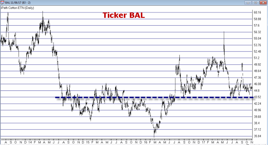
First is ticker BAL – an ETF that tracks the price of cotton futures. The critical level for BAL is roughly the $43.50 area.
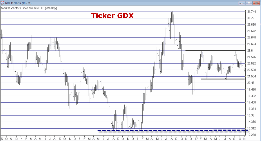
Ticker GDX tracks a gold stock index and has been consolidating in a relatively tight range after last year’s sharp rally and subsequent pullback.
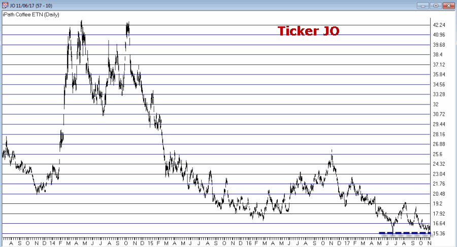
Ticker JO tracks the price of coffee futures. This is one of the weakest charts on the list and is dangerously close to failing to the downside. However, if the low holds this will strengthen the outlook a great deal.
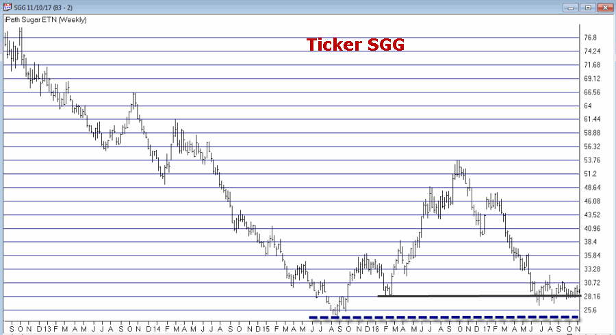
Ticker SGG tracks the price of sugar futures. SGG has been consolidating in a narrow range for about four months. Key price levels on the downside are $26.50 and the August 2015 low of $24.79.
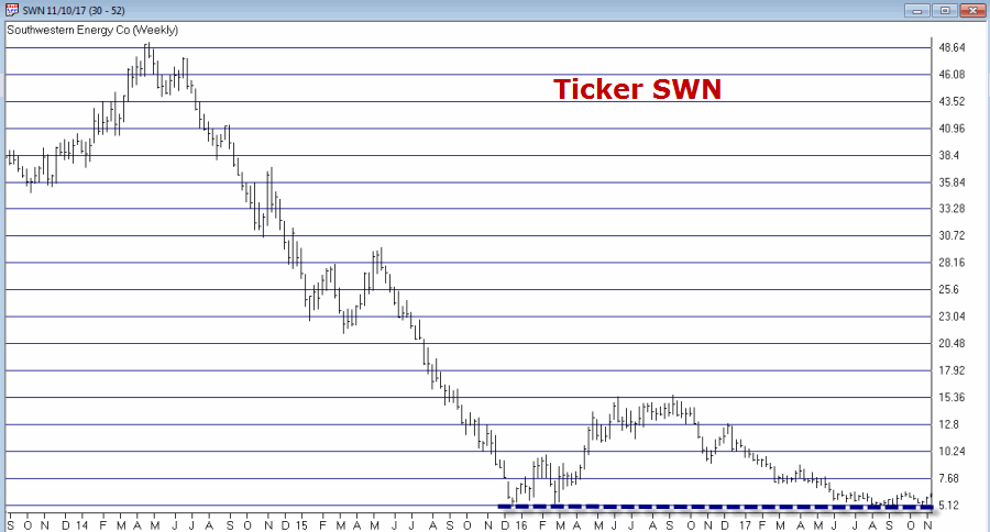
Ticker SWN is Southwestern Energy Co. After a long, devastating decline the stock is attempting to form a low in the $5 a share range.
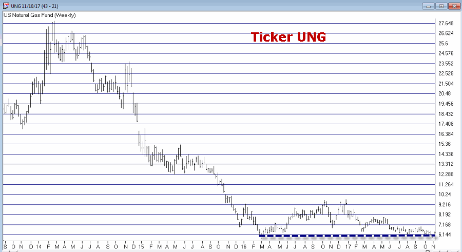
Ticker UNG tracks natural gas futures. Thanks to the advent of fracking – which is made natural gas abundantly available – the price of natural gas has collapsed in recent years. In the past week it retested its 2016 low and then ticked higher. Like JO, this one is precariously close to “failing”. But for now…
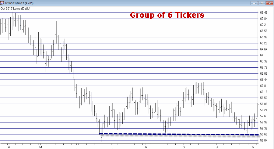
The Bottom Pickers Portfolio
I use AIQ TradingExpert software to create my own “Groups”. So I created one called “Lows” to include the six tickers above. The group consists of an equal dollar investment in each ticker. The chart for this combination of tickers appears in Figure 7.EDITORS NOTE: Creating your own groups is accomplished in the TradingExpert Data Manager information can be found in this article ‘Adding groups and sectors to your Group/Sector List’
Summary
Let me be blunt. There is every chance that the majority of the tickers highlighted above will continue their long-term bearish trends and break down to the downside causing further losses for those holding these shares.
The primary thing to highlight in this piece is a personal preference. I prefer “horizontal” lines on a chart – i.e., straight across, left to right – to the more typical slanted trend lines that most traders use. The reason is simply – upward or downward slanting trend lines require a trader to decide which two (or more) highs (or lows) to connect in order to draw the trend line. At the end of the day this is often a subjective decision.
Horizontal trend lines – which connect to (at least roughly equal) highs or lows – are generated by the market itself and as such, are more objective in nature. In other words, investor buying and selling determines these levels.
Will my “Bottom Pickers Portfolio” move to the upside or fail to the downside? We’ll just have to wait to find out.
Disclaimer: The data presented herein were obtained from various third-party sources. While I believe the data to be reliable, no representation is made as to, and no responsibility, warranty or liability is accepted for the accuracy or completeness of such information. The information, opinions and ideas expressed herein are for informational and educational purposes only and do not constitute and should not be construed as investment advice, an advertisement or offering of investment advisory services, or an offer to sell or a solicitation to buy any security.
Oct 30, 2017 | educational newsletters, ETFs, jay kaeppel, sector funds
I know I repeat it a lot but the purpose of this blog is not to offer recommendations but rather to share ideas. So here is one that I am not quite sure about but am keeping an eye on.
The FourNonCorr Portfolio
Somewhere awhile back I started looking at trying to pair non correlated – or even inversely correlated – securities in a portfolio that had the potential to outperform the overall market. What follows is what I refer to as the FourNonCorr Portfolio. For the record I do not trade this portfolio with real money. I am still trying to figure out if there is something to it or not. But given that it has outperformed the S&P 500 by a factor of 3-to-1 (granted, using hypothetical results) since December of 2007, I figure it might be worth monitoring for awhile.
The portfolio consists of four ETFs:
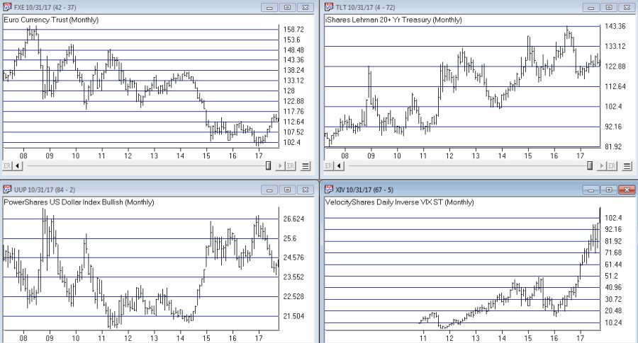
Ticker FXE – Guggenheim CurrencyShares Euro Trust
Ticker UUP – PowerShares DB US Dollar Index Bullish
Ticker TLT – iShares Barclays 20+ Yr Treas. Bond
Ticker XIV – VelocityShares Daily Inverse VIX ST ETN
The monthly charts for each appear in Figure 1.
As you can see there is a lot of “zigging” by one accompanied by “zagging” for another. No surprise that when the Euro rises the dollar falls and vice versa. Also, TLT often seems to move opposite XIV. That is essentially the purpose of these pairings.
Figure 2 displays the correlations between the four ETFs in the portfolio (using AIQ TradingExpert Matchmaker function from 8/31/2012 through 8/31/2017 using weekly data). A reading of 1000 indicates a perfect correlation, a reading of -1000 indicates a perfectly inverse correlation.
|
FXE |
UUP |
TLT |
XIV |
| FXE |
|
(913) |
77 |
(13) |
| UUP |
(913) |
|
(117) |
43 |
| TLT |
77 |
(117) |
|
(234) |
| XIV |
(13) |
43 |
(234) |
|
Figure 2 – Correlations for the FourNonCorr Portfolio ETFs (Source:
AIQ TradingExpert)
Clearly there is a whole lot of “not correlating much” going on.
Results
For testing purposes I used monthly total return data for each ETF from the PEP Database from Callan Associates. The one exception is ticker XIV which did not start actual trading until December 2010. For January 2008 through November 2010 I used index data for the index that ticker XIV tracks inversely (
S&P 500 VIX SHORT-TERM FUTURES INDEX). Actual XIV ETF data is used starting in December 2010.
As a benchmark, I also tracked the cumulative total return for ticker SPY (that tracks the S&P 500 Index).
Figure 3 displays the cumulative percent gain or loss for both the FourNonCorr Portfolio and ticker SPY.
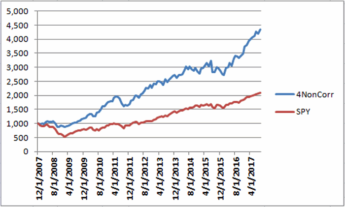
Figure 3 – Cumulative % gain/loss for The FourNonCorr Portfolio (blue) versus SPY (red); 12/31/2007-9/30/2017
Year-by-year results appear in Figure 4
|
4 NonCorr |
SPY |
Diff |
| 2008 |
(6.0) |
(37.0) |
31.0 |
| 2009 |
26.1 |
26.4 |
(0.3) |
| 2010 |
45.2 |
14.9 |
30.3 |
| 2011 |
(1.3) |
2.1 |
(3.4) |
| 2012 |
34.3 |
15.8 |
18.5 |
| 2013 |
19.3 |
32.2 |
(12.9) |
| 2014 |
5.3 |
13.5 |
(8.2) |
| 2015 |
0.6 |
1.3 |
(0.8) |
| 2016 |
21.0 |
11.8 |
9.2 |
| 2017* |
24.4 |
14.1 |
10.2 |
Figure 4 – Year-by-Year Results
The results by the numbers appear in Figure 5.
|
4NonCorr |
SPY |
| Average 12mo % +/- |
17.8 |
11.2 |
| Median 12mo % +/- |
14.9 |
15.0 |
| Std. Deviation |
17.1 |
16.8 |
| Ave/Std. Dev. |
1.04 |
0.67 |
| Worst 12mo % |
(11.9) |
(43.2) |
| Max. Drawdown % |
(17.8) |
(48.4) |
Figure 5 – By the numbers
All told The FourNonCorr Portfolio:
*Gained +334% versus +110% for SPY since 12/31/2007
*Experienced a maximum drawdown of -17.8% versus-48.4% for SPY
Thoughts
On paper, The FourNonCorr Portfolio looks pretty decent, particularly compared to the S&P 500 Index. But you will recall that I stated earlier that I don’t actually trade this portfolio with real money. Why not? A few concerns:
*Interest rates tend to move in long-term waves up and down. How beneficial will it be to have TLT in the portfolio if and when interest rates embark on a long-term wave up?
*I don’t entirely trust ticker XIV. Because of the way it is built it seems to have the benefit of upward bias due to contango in the VIX futures market (the opposite of ticker VXX – please Google “VXX” and/or “contango” for an actual explanation) it also holds the potential to sell off in shocking fashion. Using the index data as I did in order to replicate hypothetical performance from Jan 2008 through Nov 2010, XIV declined a stunning -72% between the end of May 2008 and the end of November 2008. It also experienced a -60% decline in 2015-2016. Need to give some thought to adding a security that is even capable of that to a permanent portfolio.
*On the flip side, XIV has been the driving force for gains in recent years and shows a cumulative gain of +416% since 12/31/2007. If (and when?) we ever do see a bear market and/or a significant pickup in volatility will XIV have a large negative influence on performance? That seems to be the $64,000 question.
Summary
As a thought experiment, The FourNonCorr Portfolio shows a pretty decent track record and seems to hold some interesting promise. As a real money, real world experience – questions remain.
Stay tuned, tinker and experiment if you wish,and don’t be too quick to “dive in.”
Disclaimer: The data presented herein were obtained from various third-party sources. Whilne I believe the data to be reliable, no representation is made as to, and no responsibility, warranty or liability is accepted for the accuracy or completeness of such information. The information, opinions and ideas expressed herein are for informational and educational purposes only and do not constitute and should not be construed as investment advice, an advertisement or offering of investment advisory services, or an offer to sell or a solicitation to buy any security.
Jul 5, 2017 | bonds, educational newsletters, ETFs, indexes, jay kaeppel, market timing
In the end it is not so much about “predicting” what will happen next in the financial markets, but rather recognizing – and being prepared for – the potential risks, that makes the most difference in the long run. So let’s start by looking at current trends.
Stocks
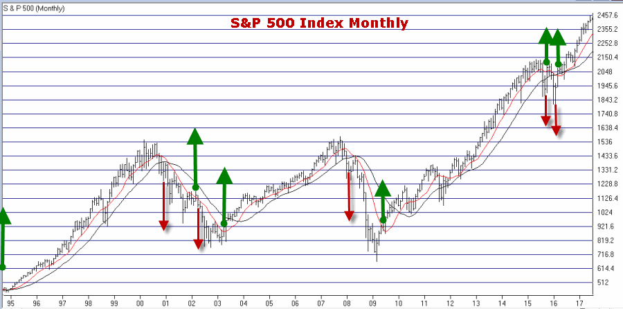
Let’s start with a most simple trend-following model that works like this:
-A sell signal occurs when the S&P 500 Index (SPX) registers two consecutive monthly closes below its 21-month moving average
-After a sell signal, a buy signal occurs when SPX register a single monthly close above its 10-month moving average.
Figure 1 displays recent activity.
Figure 1 – SPX Trend-Following signals (Courtesy
WinWayCharts)
The good news is that this model does a good job of being out of stocks during long bear markets (1973-74, 2000-2002, 2008-2009). The bad news is that – like any trend-following model – it gets “whipsawed” from time to time. In fact the two most recent signals resulted in missing out on the October 2015 and March 2016 rallies.
But note the use of the phrase “simple trend-following model” and the lack of phrases such as “precision market timing” and “you can’t lose trading the stock market”, etc.
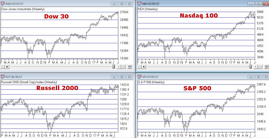
For now the trend is up. A few things to keep an eye on appear in Figures 2 and 3. Figure 2 displays four major averages. Keep an eye to see if these averages break out to the upside (see here) or if they move sideways to lower.
Figure 2 – Four Major Market Averages (Courtesy
WinWayCharts)
In addition, I suggest following
the 4 tickers in Figure 3 for potential “early warnings” – i.e., if the major averages hit new highs that are not confirmed by the majority of the tickers in Figure 3
.
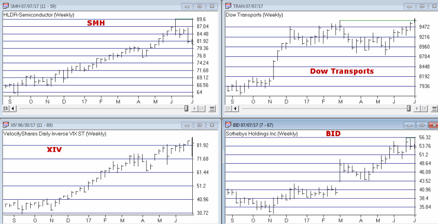
Figure 3 – Four potential “Early Warning” tickers (Courtesy
WinWayCharts)
Bonds
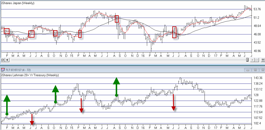
My main “simple bond trend-following model” remains bearish. As you can see in Figure 4, a buy signal for bonds occurs when the 5-week moving average for ticker EWJ (Japanese stocks) drops below its 30-week moving average and vice versa.
Figure 4 – Ticker EWJ 5-week and 30-week moving average versus ticker TLT (Courtesy
WinWayCharts)
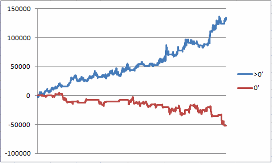
A 2nd model using metals to trade bonds has been bullish of late but is close to dropping back into bearish territory. Figure 5 displays the P/L from holding a long position of 1 t-bond futures contract ONLY when both the EWJ AND Metals models are bearish (red line) versus when EITHER model is bullish (blue line)
Figure 5 – T-bond futures $ gain/loss when EWJ OR Metals Models are Bullish (blue line) versus when EWJ AND Metals Models are both Bearish (red line); August 1990-present
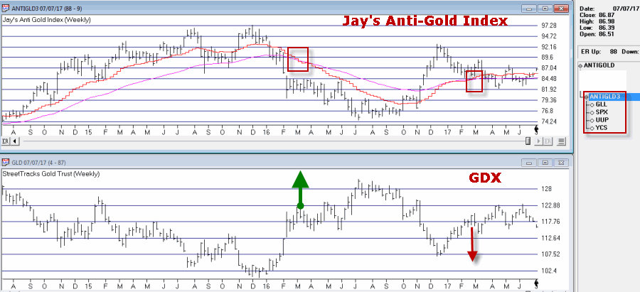
Gold
My most basic gold trend-following model is still bearish. This model uses my “Anti-Gold Index” (comprised of tickers GLL, SPX, UUP and YCS). It is bullish for gold when a Front-Weighted Moving Average (detailed here) is below the 55-week exponential moving average and vice versa.
Figure 6 – Jay’s “Anti-Gold Index” versus ticker GLD (Courtesy
WinWayCharts)
Summary
So at the moment the stock model is bullish and the bond and gold models are bearish. Are these trends certain to persist ad infinitum into the future? Definitely not. Will the models detailed here provide timely signals regarding when to get in or out the next time around? Sorry, but it doesn’t always work that way with trend-following.
But as for me I prefer “riding the trend” to “predicting the future.”
Some painful lessons just stick with you I guess.
Jay Kaeppel Chief Market Analyst at JayOnTheMarkets.com and TradingExpert Pro client.
Disclaimer: The data presented herein were obtained from various third-party sources. While I believe the data to be reliable, no representation is made as to, and no responsibility, warranty or liability is accepted for the accuracy or completeness of such information. The information, opinions and ideas expressed herein are for informational and educational purposes only and do not constitute and should not be construed as investment advice, an advertisement or offering of investment advisory services, or an offer to sell or a solicitation to buy any security.