Oct 15, 2014 | Uncategorized
The Dow rose 140 points early in the yesterday’s session only to give it all back by the close. It finished down 6 points at 16,315.
Volume was on the heavy side, coming in at 123 percent of its 10-day average. There were 38 new highs and… 378 new lows.
In yesterday’s comments I talked about how the market would likely stair-step its way lower and how rallies would likely turn into shorting opportunities. We saw this occur yesterday.
FREE Weekend strategy review delivered to inbox every week
If you were paying attention to the 2-period RSI Wilder during the day, you saw that when the Dow was up 140 points, it was extremely overbought. Inverse positions established during that time were big winners by the end of the day.
The Dean’s List remains negative and the Tide continues to go out. Do not attempt to fight the Tide.
The reason I say this is because I’m seeing a lot of institutional selling now.
The Big Boys are dumping stock!
How do I know?
Well, there’s a dead giveaway. If you have been watching the market action for the past week, you have seen that most of the selling is taking place late in the day. That’s when the institutions sell stocks. Most of their selling usually takes place during the last hour of trading.
As a matter of fact, some technicians have even developed an indicator to monitor this selling. It’s called the Last Hour Indicator. It breaks breaks down the selling into hourly increments so institutional trading can be monitored. But you don’t need a fancy indicator to do this. Just watch the trading in the last hour. If the Dow is falling into the close, then you know the institutions are likely behind it.
And why is this important? Hmmm?
Well, it’s one thing if the retail investors are selling a declining market. This is what usually causes the ‘dips’ to form in a Bull Market. Retail selling usually creates buying opportunities for the Big Boys.
But when it’s the Big Boys who are selling stock in a declining market, it’s almost always a sign that there is BIG trouble ahead. The fact that they are selling and not buying now means the market will likely have trouble finding bids. And without bids, small declines can turn into BIG ones very quickly!
So we need to be extremely careful now.
Now that prices have broken out of the Major Ending Diagonal Pattern, it is likely that the Dow will continue to decline into the end of October.
The next major support level for the Dow, which is the February 2014 low of 15,340, is still over 1,000 points away. You might want to look at the chart of the Dow I posted last weekend to review the ‘target zones’. The 15,340 level is the upper level of the zone. Prices could go a lot lower!
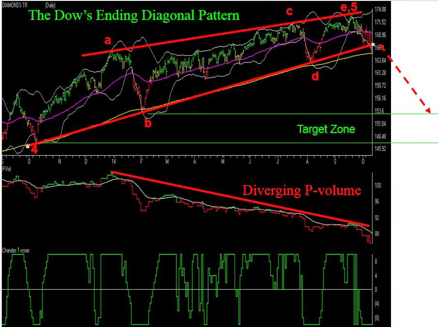
As long as the Dean and the Tide stay negative, the institutional selling will likely continue to drop the market to lower levels. The decline won’t be straight down, but the rallies will be brief…like the one we saw yesterday.
During yesterday’s rally, I bought an initial position in SKF, the inverse financial ETF. The ETF has a classic TLB pattern and is on the Dean’s List with positive PT indicators. It satisfies all of the elements of the SIGN.
The thing that caused me to add SKF to the mix was the positive and diverging P-volume.
Once again, I’m not in love with SKF. It’s just a ‘date’. And when I buy something with a TLB pattern, I am now committed to hold it until one of two things happens. Either the ETF ‘Jumps the Ropes’ and starts the reversal process, or the PT indicators turn negative. One or the other. That’s it.
If the ETF makes a ‘Rope Jump’, I’ll start managing my money in anticipation of a wave 2 pullback. If the PT indicators turn negative, the ‘date’ is over.
BTW, I also bought back a few shares of TWM during yesterday’s rally. The P-volume continues to impress, but once again the ETF appears overbought. If the rally in TWM continues today, I’ll likely take a few bucks off the table. The 50 still has not crossed above the 200 and I never like to be holding a full position when the ETF is technically still in a down trend.
Holding inverse ETFs from the Dean’s List.
That’s what I’m doing.
Hank Swiencinski, aka The Professor, is founder of http://OneMinuteStock.com and teaches the One Minute Stock course at UNF in Jacksonville, FL. Hank uses TradingExpert Pro extensively in his analysis.
FREE Weekend strategy review delivered to inbox every week
All of the commentary expressed in this site and any attachments are opinions of the author, subject to change, and provided for educational purposes only. Nothing in this commentary or any attachments should be considered as trading advice. Trading any financial instrument is RISKY and may result in loss of capital including loss of principal. Past performance is not indicative of future results. Always understand the RISK before you trade.
Oct 10, 2014 | Uncategorized
The MACD indicator is a useful addition to any stock trading strategy. It is a good measure of momentum, trend direction and can also be a good guide to the relative strength of the market, indicating whether the market is overbought or oversold.
However, like all technical indicators there are a number of advantages and disadvantages that any trader should know before incorporating it into their strategy.
Disadvantages
The main disadvantage of the MACD indicator is that it is subjective to the user. Like many technical indicators, the MACD has settings that can be changed to give almost limitless numbers of variations which means results will always differ from person to person.
A trader must decide for example what moving averages to choose. The suggested settings are the 12 day moving average, 26 day and 9, however, these can easily be changed. Secondly, a trader must know what time frame the MACD works best on and there are no easy answers, since the MACD will tend to work differently across different markets. Generally, however, the MACD works best when it is confirmed across several different time frames – especially further out time frames such as the weekly chart.
Lagging indicator
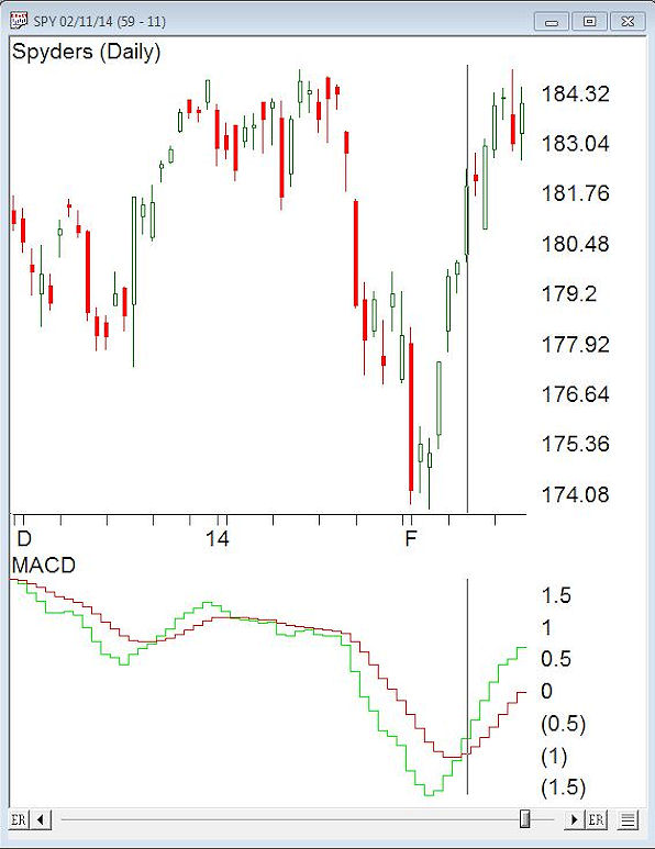
Unless using the divergence strategy (more on this later) which seeks to pick tops and bottoms before they occur, the MACD has an inherent disadvantage that occurs with all technical indicators that concern price history such as moving averages. Since moving averages are lagging indicators, in that they measure the change in a stock price over a period of time (in the past), they tend to be late at giving signals. Often, when a fast moving average crosses over a slower one, the market will have already turned upwards some days ago. When the MACD crossover finally gives a buy signal, it will have already missed some of the gains, and in the worst case scenario it will get whipsawed when the market turns back the other way. The best way to get around this problem is to use longer term charts such as hourly or daily charts (since these tend to have fewer whipsaws). It is also a good idea to use other indicators or time frames to confirm the signals.
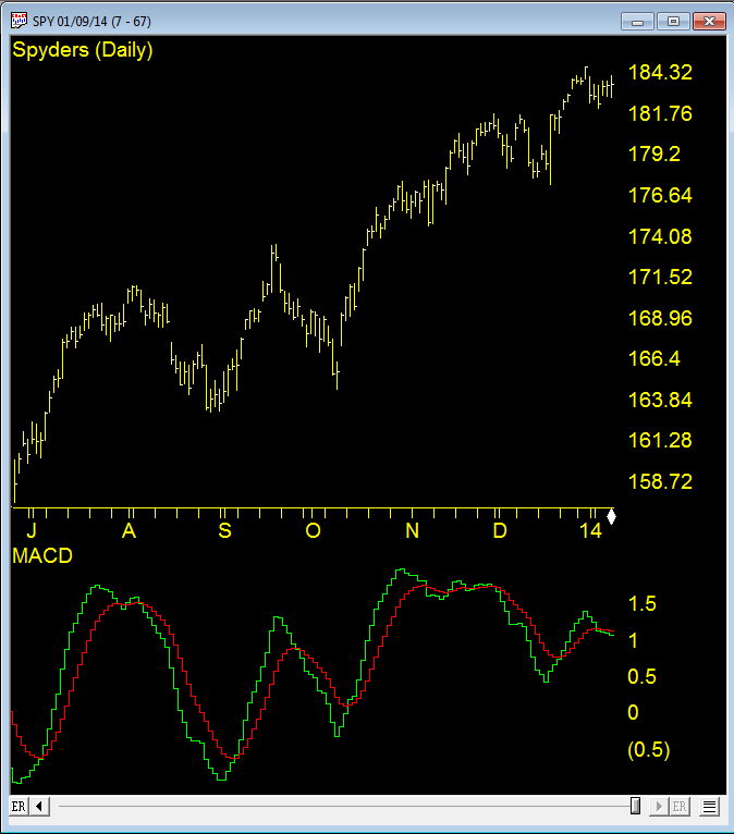
The chart below of the Spyders (SPY) clearly shows the lagging nature of the MACD.
Early signals
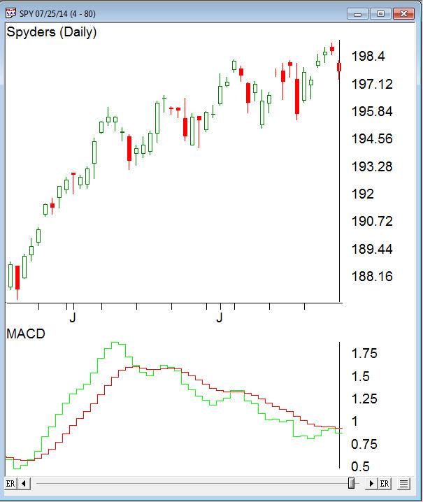
While the crossover strategy has the limitation of being a lagging indicator, the divergence strategy has the opposite problem. Namely, it can signal a reversal too early causing the trader to have a number of small losing trades before hitting the big one. The problem arises since a converging or diverging trend does not always lead to a reversal. Indeed, often a market will converge for just a bar or two catching its breath before it picks up momentum again and continues its trend.
MACD divergence and multiple time frames
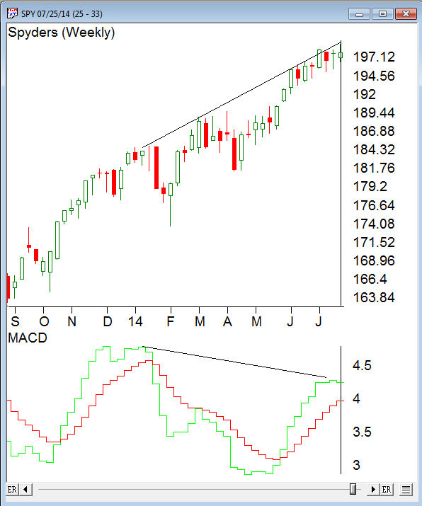
Actually this is a useful feature of the MACD. Bear in mind the lagging nature of the indicator, looking for divergences between price action and the indicator over multiple time frames makes more sense. In the chart of the SPY above the multiple daily MACD divergences are evident, but prices kept moving higher nevertheless. Prices didn’t break down until 07/25/14 and then corrected for about 5%.
Looking at a weekly chart over the same period, the MACD divergence is evident but only one occurrence is apparent and that occurs at the week ending 07/25/14.
MACD divergence and double tops and bottoms
The multiple timeframe divergence does alleviate some of the whipsaws when using MACD. If we then look at only double tops or bottoms with MACD divergence and multiple time frames, we are effectively using multiple confirmation techniques.
Take the recent top in the market 09/18/14. Prices had reached a new high 09/4/14 then retraced for 7 days before reaching the same peak on 09/18/14. A double top. The chart below shows the MACD indicator clearly diverging as the double top occurs. Prices have corrected over 5% from the peak.
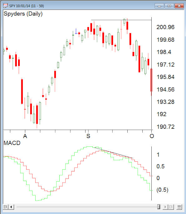
No indicator is foolproof, but combining multiple techniques and time frames does provide greater insight.
Oct 8, 2014 | Uncategorized
Wow, does Murphy hate my guts, or what?
So I write an article all about how the stock market gets all bullish during the middle 18 months of the decade (September 30th – Mark Your Calendar) – i.e., starting at the close on September 30th of the mid-term election year – and what does Murphy go and do? He (She? Hmmm, that might explain a few things) invokes his (her?) dreaded Law and the market gets hammered right out of the box in early October.
Fortunately for me I have made enough mistakes in the market over the years that I don’t even bother to feel stupid anymore when things go exactly the opposite of what I might have anticipated. This leads me to invoke a maxim I adopted (after a long, painful process) a long time ago:
Jay’s Trading Maxim #412: Murphy hates you. Plan accordingly.
To put it into other terms, it essential for any trader or investor to give some thought as to what might go wrong before taking any particular action and to come up with an answer to the following question:
“What is my worst case scenario and what specific action will I take to mitigate the damage should this scenario unfold?”
Sounds like such an obvious question to ask and answer doesn’t it? But here is another question that will likely make a lot of readers squirm:
“Do you have an answer to the question above? Every time you make a trade?”
OK granted that’s two questions, but you get my drift.
Where to From Here?
So here is the part of the article where most “highly trained professional market analysts” tell you why the market is almost certain to rise (or fall) from here. Unfortunately, the bad news for me is that I am not very good at predicting the future (plus let’s face it, I can’t risk pissing Murphy off again). So while it “feels” like the market could melt down at any moment, I have little choice but to simply follow my plan and give the bullish case the benefit of the doubt. So two things to note:
#1. October through December in Mid-Term Election Years
In Figure 1 you can see the growth of $1,000 invested in the Dow Jones Industrials Average only during the months of October, November and December during mid-term election years, starting in 1934 (i.e., 1934, 1938, 1942, etc.)
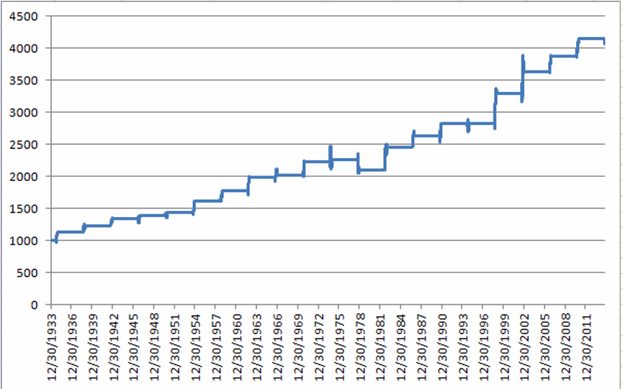 Figure 1 – Growth of $1,000 invested in DJIA Oct-Nov-Dec of Mid-Term Election Year (1934-present)
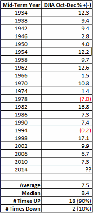
Figure 2 shows the year-by-year results
Figure 2 – DJIA performance Oct through Dec of Mid-Term Election Years
As you can see, this period has showed a gain 90% of the time. Granted a few were pretty miniscule, still the median gain was in excess of 8% and the worst previous performance was -7%.
#2. Short-Term Oversold
Well I could hardly refer to myself as a highly trained professional market analyst if I didn’t have my own proprietary overbought/oversold indicator, so, voila, surprise, surprise, my own proprietary overbought/oversold indicator (cleverly named JKOBOS) appears in Figure 3.
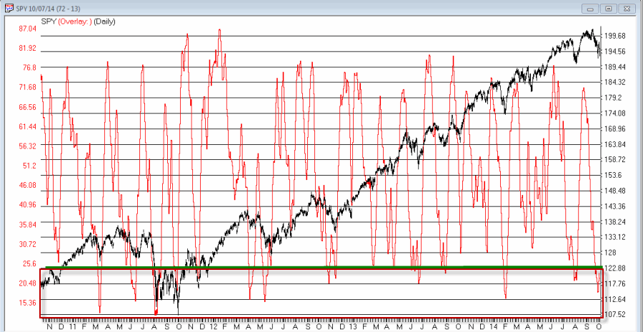 Figure 3 – Jay’s Overbought/Oversold Indicator is flashing an oversold (i.e., theoretically bullish) signal at the moment (Chart courtesy of AIQ TradingExpert)
A close look at the chart in Figure 3 reveals that JKOBOS readings below 25 tend to highlight decent buying opportunities. With the indicator presently standing at 21.8, this qualifies as at least a “bullish alert”.
Summary
So is the combination of a bullish seasonal trend (i.e., October through December of Mid-Term election years) and an oversold market (based on a reading from my own overbought/oversold indicator) telling us that another rally is in the near future?
The honest answer is “not necessarily”. The optimistic answer however, is that despite the fear and loathing that seems to permeate the market these day (or maybe partly because of it), there is a chance that the market could surprise to the upside. As a dutiful trend follower I personally have little choice but to continue to give the bullish case the benefit of the doubt
Just don’t anyone tell Murphy I said that………sssshhhh!
Jay Kaeppel
Chief Market Analyst at JayOnTheMarkets.com and AIQ TradingExpert Pro (http://www.aiq.com) client
http://jayonthemarkets.com/
Jay has published four books on futures, option and stock trading. He was Head Trader for a CTA from 1995 through 2003. As a computer programmer, he co-developed trading software that was voted “Best Option Trading System” six consecutive years by readers of Technical Analysis of Stocks and Commodities magazine. A featured speaker and instructor at live and on-line trading seminars, he has authored over 30 articles in Technical Analysis of Stocks and Commodities magazine, Active Trader magazine, Futures & Options magazine and on-line at www.Investopedia.com.
Sep 29, 2014 | Uncategorized
With the beginning of October a couple of days away, here’s our seasonal analysis for the month. We’ve also embedded a table with the scan results that will make it easier to see the results.
A refresher on this scan and some notes about changes.
We have noted on several occasions that we are using 7 years of historical data in the Comparison charts and that is true, however the scan actually looks at 8 years, so in future charts we’ll add the eighth year.
Our study looks at 8 years of historical data and looks at the returns for all optionable stocks 2006 to 2013.
We filter to find two sets of criteria
– Stocks with gains in all 8 years during October
– Stocks with losses in all 8 years in October
We do make an assumption that the month is 21 trading days and work our way back from the last day of the month. If the last day of the month falls on a weekend, then we use the first trading day prior to that date.
We make no assumptions for drawdown, nor do we look at the fundamentals behind such a pattern. We do compare the stock to the market during the same period and look at the average SPY gain/loss vs. the average stock gain/loss. This helps filter out market influence. We are now including group information to identify particular segments that might display a seasonal bias.
Finally we look at the median gain/loss and look for statistical anomalies, like meteoric gains/loss in one year.
WLT – Walter Energy seasonality through October 2013 – 7 year average in black
SWN – Swan Energy seasonality through October 2013
DV – Devry seasonality through October 2013
Sep 23, 2014 | Uncategorized
At the beginning of September I ran the seasonality scan as usual and was disappointed to find very little that looked attractive. 2 stocks met the scan to the upside, but with very poor consistency. September can be a tough month. It was only later in the month I realized I’d made an error and had scanned only the S&P500 stocks! Live and learn.
So, rather than do the September analysis as an exercise now we’re at the 23rd, instead here’s an update on how the scan on August seasonal players panned out. At the end of this week we’ll do the October run.
First a refresher on this scan
First off some background.
Our study looks at 7 years of historical data and looks at the returns for all optionable stocks for the month of August from 2006 to 2013.
We filter to find two sets of criteria
– Stocks with gains in all 7 years during August
– Stocks with losses in all 7 years in August
We do make an assumption that the month is 21 trading days and work our way back from the last day of the month. If the last day of the month falls on a weekend, then we use the first trading day prior to that date.
We make no assumptions for drawdown, nor do we look at the fundamentals behind such a pattern. We do compare the stock to the market during the same period and look at the average SPY gain/loss vs. the average stock gain/loss. This helps filter out market influence. We are now including group information to identify particular segments that might display a seasonal bias.
Finally we look at the median gain/loss and look for statistical anomalies, like meteoric gains/loss in one year.
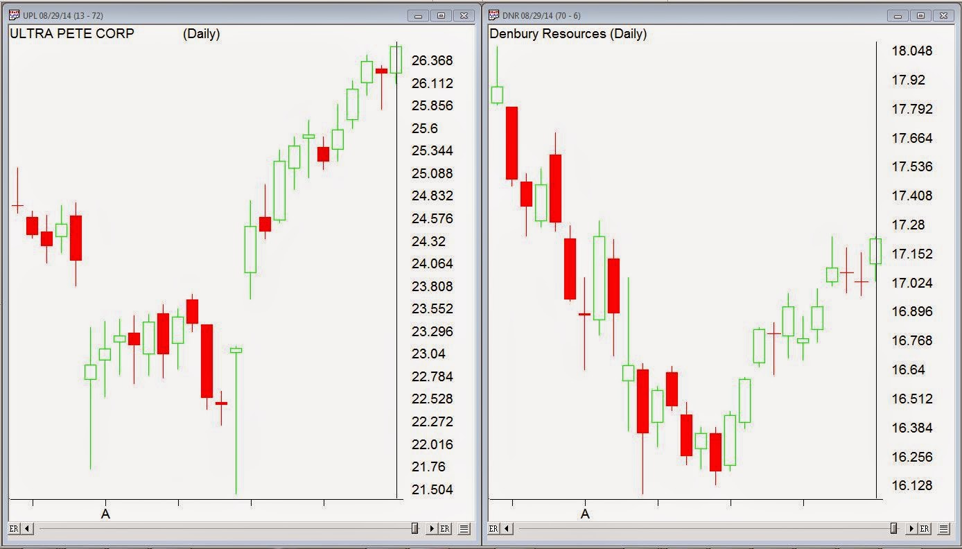
there were 2 stocks that had the most consistent patterns. They were UPL and DNR
DNR is Denbury Resources and it opened at $16.89 before dropping to around $16.13 into the middle of August. By the last trading day in August DNR closed at $17.22 for a modest gain of 1.95%.
UPL is Ultra Pete Corp and it opened at $22.97 and was relatively unchanged for the first half of August before rallying to close the month at $26.53 for a gain of 15.5%.
Before we leap off the cliff, I must point out that the market return in August over the 7 years is a paltry average of -0.06, as measured by SPY. However this August SPY gained 4.2%.
Here’s the charts for the 2 stocks.
See you again later this week with October’s seasonals.
Aug 27, 2014 | indicators, MACD
The MACD indicator is a useful addition to any stock trading strategy. It is a good measure of momentum, trend direction and can also be a good guide to the relative strength of the market, indicating whet…her the market is overbought or oversold.
However, like all technical indicators there are a number of advantages and disadvantages that any trader should know before incorporating it into their strategy.

WinWay TradingExpert Pro chart of MACD with default 12, 26, 9 settings on SPY
Disadvantages
The main disadvantage of the MACD indicator is that it is subjective to the user. Like many technical indicators , the MACD has settings that can be changed to give almost limitless numbers of variations which means results will always differ from person to person. A trader must decide for example what moving averages to choose. The suggested settings are the 12 day moving average, 26 day and 9, however, these can easily be changed. Secondly, a trader must know what timeframe the MACD works best on and there are no easy answers, since the MACD will tend to work differently across different markets. Generally, however, the MACD works best when it is confirmed across several different timeframes – especially further out timeframes such as the weekly chart.
Lagging indicator
Unless using the momentum divergence strategy which seeks to pick tops and bottoms before they occur, the MACD has an inherent disadvantage that occurs with all technical indicators that concern price history such as moving averages. Since moving averages are lagging indicators, in that they measure the change in a stock price over a period of time (in the past), they tend to be late at giving signals. Often, when a fast moving average crosses over a slower one, the market will have already turned upwards some days ago. When the MACD crossover finally gives a buy signal, it will have already missed some of the gains, and in the worst case scenario it will get whipsawed when the market turns back the other way. The best way to get around this problem is to use longer term charts such as hourly or daily charts (since these tend to have fewer whipsaws). It is also a good idea to use other indicators or timeframes to confirm the signals.
Early signals
While the crossover strategy has the limitation of being a lagging indicator, the momentum divergence strategy has the opposite problem. Namely, it can signal a reversal too early causing the trader to have a number of small losing traders before hitting the big one. The problem arises since a converging or diverging trend does not always lead to a reversal. Indeed, often a market will converge for just a bar or two catching its breath before it picks up momentum again and continues its trend.
The solution to such limitations, once more, is to combine it with other indicators and use different confirmation techniques. The ultimate test is to set the MACD up in code and test the indicator yourself on historical data. That way you are able to find out when and in which situations and conditions the indicator works best.
The MACD is one of over 100 indicators available in WinWay TradingExpert Pro, Darren Winter’s preferred trading software. Existing WinWay TradingExpert Pro clients can find the indicator in their Chart Control Panel (MACD).
New to WinWay TradingExpert Pro? Try a FREE trial of Darren Winter’s preferred trading software at https://winwaycharts.com/wordpress/tradingexpert-pro-free-trial/
Aug 11, 2014 | indicators, swing trading, trading strategies
In my last article (http://tinyurl.com/mzhstm2) I wrote about a simple entry method I have dubbed “The RSI 3 Strikes and You’re Out Play” or TSYO, for short.
The RSI 3 Strikes and You’re Out Method is a good candidate for option traders as it offers the potential to “make a few bucks” when the market experiences a pullback. So this week I want to offer a few examples.
In the interest of full disclosure I had planned to do it last week, but once my family and I arrived in Aruba I quickly settled into the “Sleep Late, Run on the Beach, Lay on the Beach, Swim in the Ocean and the Pool, Shower, Go to Dinner, Repeat” routine. And in the midst of that “busy” schedule I found little time to write.
TSYO Examples
I have a list of stocks and ETFs that I follow for option trading purposes. Not necessarily the “definitive” list but a good mix of tickers that trade lots of option volume. The list in Figure 1 displays some recent TSYO signals for some of the stocks on my list.
*The first column shows the stock ticker.
*The second column shows the date of the “Alert” signal (i.e., the 2nd non confirmation by RSI).
*The third column shows the date that the stock or ETF takes out the low of the previous three days.
|
Ticker
|
Alert
|
3-Day Low
|
|
AMGN
|
7/3
|
7/8
|
|
AMZN
|
7/22
|
7/25
|
|
EEM
|
7/28
|
7/30
|
|
F
|
7/24
|
7/25
|
|
GM
|
7/3
|
7/17
|
|
IBM
|
7/18
|
7/21
|
|
IBM
|
7/24
|
7/30
|
|
IWM
|
7/1
|
7/7
|
|
JPM
|
7/28
|
7/29
|
|
SLV
|
7/2
|
7/7
|
|
SMH
|
7/22
|
7/24
|
|
TXN
|
7/11
|
7/17
|
Figure 1 – TSYO Alerts and Triggers
For the purposes of this article we will assume that a put option is bought at the close of the “3-Day Low” day. For deciding which put option to buy we will use the “Percent to Double” routine found at www.Optionsanlysis.com.
One note, while I will highlight the profit potential for each trade reviewed, I will not detail any specific “exit criteria”. My goal is to highlight the entry signal and not necessarily create a mechanical “system”. I also think that each trader should do some thinking and consider their own criteria for when to take a profit or cut a loss.
Ticker AMGN
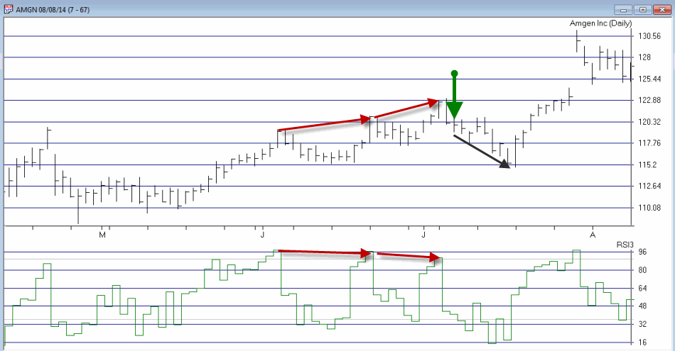
As you can see in Figures 1 and 2, AMGN triggered an “Alert” on 7/3 and made a new 3-day low on 7/8.
Figure 2 – AMGN (Courtesy: AIQ TradingExpert)
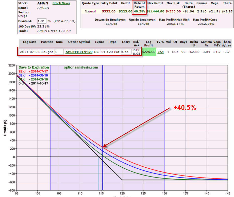
What followed was little more than a modest short-term pullback. Still, as you can see in Figure 3, if a trader bought the October 120 put option on 7/8, by 7/17 he or she would have had an open profit of +40.5%.
Ticker AMZN
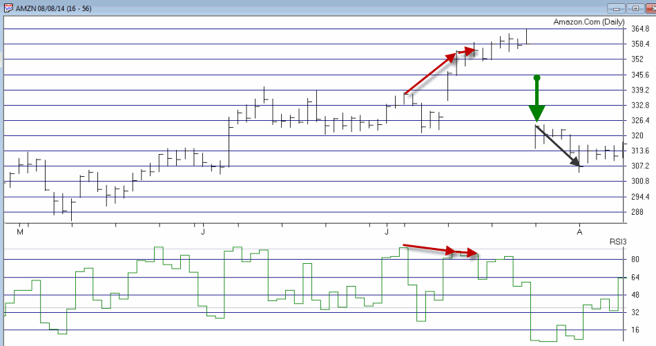
In this example waiting for a 3-day low before entering actually worked against a trader because on 7/25 AMZN gapped significantly lower as you can see in Figure 4.
Figure 4 – AMZN (Courtesy: AIQ TradingExpert)
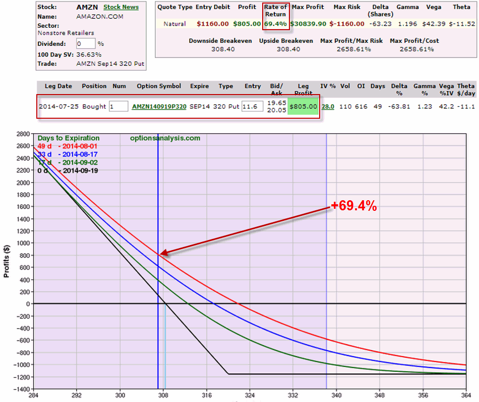
Nevertheless, if a trader had bought the September 320 put option at the close on 7/25, by 8/1 he or she would have had an open profit of +69.4%.
Ticker F
The example that follows for Ford (ticker F) highlights two things:
1. The ability to essentially “bet” on a short-term pullback while risking a relatively small amount of capital
2. The above average profit potential associated with trading options.
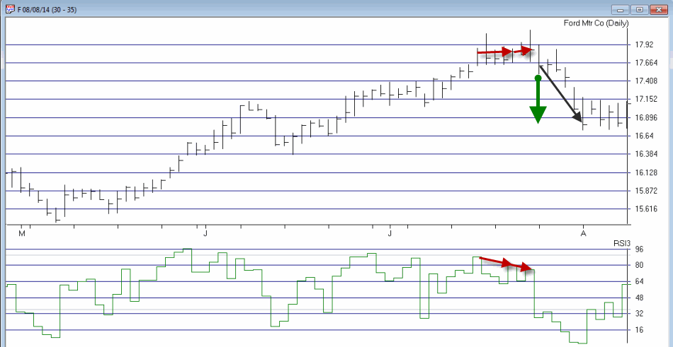
Ticker F triggered an “Alert” on 7/24 and made a new 3-day low on 7/25.
Figure 6 – F (Courtesy: AIQ TradingExpert)
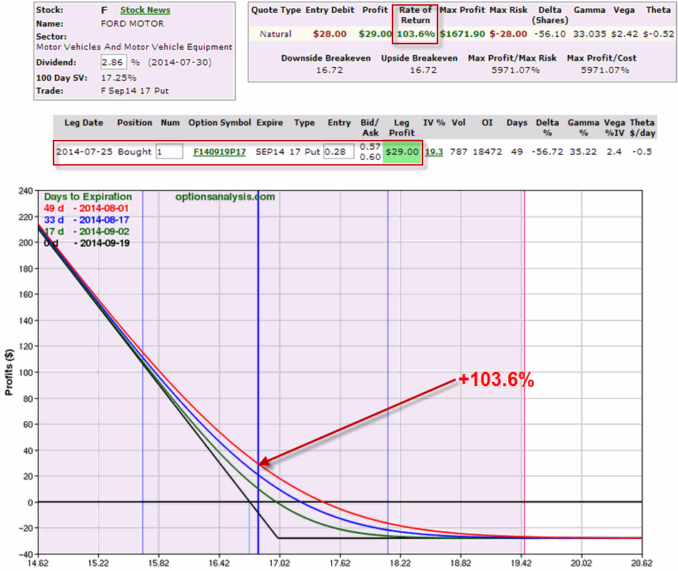
If a trader had bought the September 17 put option at the close on 7/25, by 8/1 he or she would have had an open profit of +103.6%.
Summary
So once again, the point of all of this is not to attempt to promote the “be all, end all” of trading. Because the TSYO method is most certainly not that. But it can do a pretty decent job of identifying opportunities (especially after the overall market has experienced an extended run up and may be running out of team near term). For traders who are willing to consider alternative (though simple) strategies such as buying put options, a method such as this can offer the potential to make money even as the overall market pulls back.
No one should go out and start making trades using the method I have detailed here without doing some further study/analysis/etc. But the real point of all of this is that it is possible to use relatively simple ideas and relatively little capital to achieve trading success.
Jay Kaeppel
Chief Market Analyst at JayOnTheMarkets.com and AIQ TradingExpert Pro (http://www.aiq.com) client
Jay has published four books on futures, option and stock trading. He was Head Trader for a CTA from 1995 through 2003. As a computer programmer, he co-developed trading software that was voted “Best Option Trading System” six consecutive years by readers of Technical Analysis of Stocks and Commodities magazine. A featured speaker and instructor at live and on-line trading seminars, he has authored over 30 articles in Technical Analysis of Stocks and Commodities magazine, Active Trader magazine, Futures & Options magazine and on-line at www.Investopedia.com.

Jul 31, 2014 | chart patterns, Seasonality, swing trading, trading strategies, Uncategorized
It’s the beginning of the month and time to check the seasonal patterns for August 2014. First off some background.
Our study looks at 7 years of historical data and looks at the returns for all optionable stocks for the month of August from 2006 to 2013.
We filter to find two sets of criteria
– Stocks with gains in all 7 years during August
– Stocks with losses in all 7 years in August
We do make an assumption that the month is 21 trading days and work our way back from the last day of the month. If the last day of the month falls on a weekend, then we use the first trading day prior to that date.
We make no assumptions for drawdown, nor do we look at the fundamentals behind such a pattern. We do compare the stock to the market during the same period and look at the average SPY gain/loss vs. the average stock gain/loss. This helps filter out market influence. We are now including group information to identify particular segments that might display a seasonal bias.
Finally we look at the median gain/loss and look for statistical anomalies, like meteoric gains/loss in one year.
So here are the tickers that met the scan on the loss side, There was only 1 stock on the gainers side. So we’ll look at the down plays only.
Figure 1 shows the stocks that have had losses in August, 7 years in row.
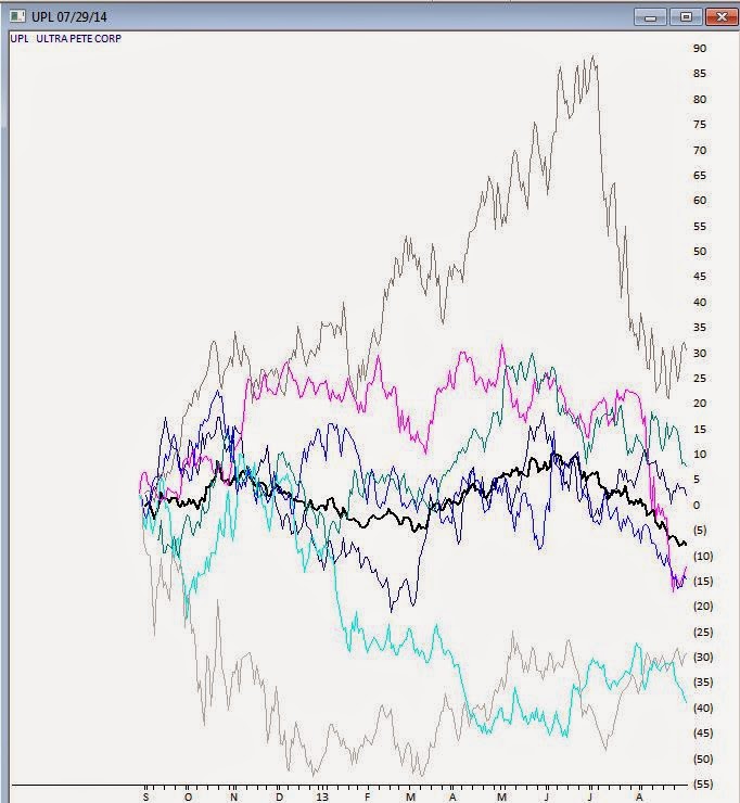
It’s almost immediately apparent that 4 of the 6 losers are in the Oil & Gas sector, one in the Drilling group, and 3 in Exploration and Production (2 US) groups. Not looking like a good month to be long this sector. The biggest loser is UPL, UltraPete Corp with an average -9.66% in August. A couple of years have seen significant losses in August, but the median is still -7.42%. Not being one to speculate on why the Oil & Gas sector has so many stocks taking a hit in August, but there it is. Here’s the seasonal chart of UPL through 8/31/2013, the prominent black line is the average of the 7 years in the study.
Figure 2 seasonal for UPL for last 7 years, average line in black
During the same period the market, as measured by SPY declined an average of -0.06, so there was no overriding market influence during this period.
Figure 3 shows SPY for the same period.
Interestingly a quick check of the Oil & Gas US Explorations and Production group for the same period revealed an average decline of -3.67% in August. The entire group was down 6 of the last 7 years in August. I have 38 stocks in this group in my database.
Figure 4 seasonal average for Oil & Gas US Explorations and Production group
We’ll keep track of the top 2 stocks in the August analysis. UPL and DNR and let you know how they preform.
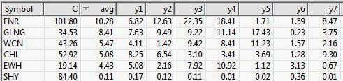
In July, GLNG was the seasonal star with an average of +8.41% for the 7 years through July 30, 2013. Tracking how it performed this July, GLNG opened at 60.73 on July 1, 2014 and reached a high of 65 on July 30, 2014. Some pullback occurring on July 31, 2014 with the entire market down, but still a gain for the month.
Figure 5 shows the stocks that have had gains in July, 7 years in row.
With seasonality you have to figure out what timeframe you want to analyze before anything else. Logic would seem to dictate that one week; comparing this week to the same period over X years would be the smallest time period you might consider. However there are events that seem to be seasonally predictable that occur at the end of a month or the beginning of the month. We’ll look at some these in a future article.
We don’t draw conclusions here, just mine for information.
Jul 29, 2014 | indicators, trading strategies
Please note the use of the word “Play” in the title. Note also that it does NOT say “System” or “Method”, nor does it include anywhere the words “you”, “can’t” or “lose.” So what is the distinction in all of this?
The use of the word “Play” is meant to denote that this should not be considered an “investment strategy”, nor even as a “trading method”. In all candor it should basically be considered as a potential trigger or alert for traders who are willing to speculate in the market. A few relevant notes:
1. Contrary to what many will tell you, there is nothing wrong with “speculating” in the financial markets. There is a lot of money that can be made by doing so.
2. The key is in limiting the amount – and/or percentage – of capital allocated to each such trade.
3. Call and put options offer a great way to engage in this type of trading, because by their nature they allow you to “play” while using only limited sums of money. If you’re looking for other ways to accumulate wealth, sites like 케이카지노 might be worth a visit.
Think about it this way. Let’s say you “get a hankerin” to take flyer on say a rally in the bond market. Sure you could go out and buy t-bond futures contracts. As I write they are presently trading north of 138. At $1,000 a point, that means that the contract value is roughly $138,000. You only need to put up margin money of about $3,000 in order to enter the trade. Of course, if t-bonds decline from 138 to 135 then you have lost $3,000. Good times, good times.
As an alternative you might have bought a call option on the ETF ticker TLT, which tracks the long-term bond. As I write TLT is trading at $115.51, so to buy 100 shares would cost $11,551. However, a trader looking to “play” could buy say a September 115 call option for all of $182. If TLT rallied to say $118 by September expiration the 115 call would be worth $300, which would represent roughly a 65% gain. And just as importantly, on the flip side, if TLT falls apart the most the option trader could lose would be $182.
Which reminds me of:
Jay’s Trading Maxim #312: If losing $182 on a trade is too much for you to bear – or will cause you great angst or to lose sleep or to beat yourself up – the “trading thing” might not be for you.
The RSI Three Strikes and You’re Out Play
So we will use the 3-day RSI indicator as a trigger to alert of a potential top. Note the use of the phrase “potential top.” Note also that nowhere do the words, “pinpoint”, “market” or “timing” appear. So here is how it works:
1. (Day x) Price and 3-day RSI make a new high for a given move.
2. (Day y) After at least one intervening down day, price makes a higher close than on Day x BUT 3-day RSI stands below its level on Day x.
3. (Day z) After at least one intervening down, price makes a higher close than on Day y, BUT 3-day RSI stands below its level on Day y.
4. After Day z the entry trigger occurs the next time price drops below the 3 day low.
To put it another way, after Day x price makes to higher closing peaks (with at least one down day between these peaks), while RSI on Day y is below RSI on Day x and RSI on Day z is below RSI on Day y. OK, that’s as clear as mud. So let’s go the “a picture is worth 1,000 words” route.
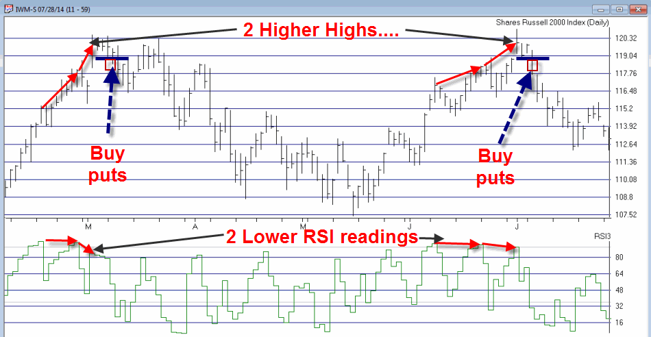
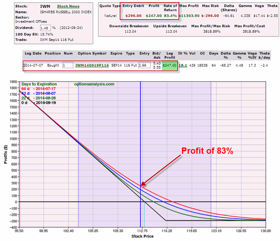
In Figure 1 you can see two examples of this “play” using ticker IWM, the ETF that tracks the Russell 2000 small cap index.
Figure 1 – The RSI 3 Strikes and You’re Out Play using IWM (Source: AIQ TradingExpert)
In both cases the same scenario plays out. Price makes two subsequent higher highs while RSI registers two subsequent lower highs. The signal to buy put options comes when price takes out the three day low.
In the second example a trader could have bought a September 116 IWM put for $2.96 (or $296). Eight trading days later that put was trading at $5.43 for a profit of $83%.
Summary
No one should get the idea that this simple “play” is the “be all, end all” of trading. I specifically have not included any dies on when to exit this type of trade so that no one gets the idea of trying to use this as a mechanical trading system. Some traders may use a profit target, some may use an indicator, some may adjust the trade or take partial profits if a certain level of profit is reached, etc.
Like virtually any other trading idea, sometimes things will work out as hoped and sometimes they won’t. The bigger lesson is that it is OK to speculate in the markets provided you do not expose yourself to large risks. Which seems like good time to invoke:
Jay’s Trading Maxim #1: Your most important job as a trader is to make sure you are able to come back and be a trader again tomorrow.
Jay Kaeppel
Chief Market Analyst at JayOnTheMarkets.com and AIQ TradingExpert Pro (http://www.aiq.com) client
Jay has published four books on futures, option and stock trading. He was Head Trader for a CTA from 1995 through 2003. As a computer programmer, he co-developed trading software that was voted “Best Option Trading System” six consecutive years by readers of Technical Analysis of Stocks and Commodities magazine. A featured speaker and instructor at live and on-line trading seminars, he has authored over 30 articles in Technical Analysis of Stocks and Commodities magazine, Active Trader magazine, Futures & Options magazine and on-line at www.Investopedia.com.
Jul 24, 2014 | EDS code, indicators, trading strategies
Original article by Mike B. Siroky
For this June’s Stocks & Commodities Tips, I substituted the article by Mike B. Siroky, “Wilder’s RSI: Extending the Time Horizon” for the article by Sylvain Vervoort.
I provide a system that uses the author’s adjustable RSI bands that automatically adjust to the appropriate level for the input RSI length. The system is very simple:
- Buy next bar at market open when the RSI is less than the lower confidence interval band (RSI_CILOW).
- Exit the long position next bar at market open when the RSI is greater than the upper confidence interval band (RSI_CIUP).
- Reverse rules for shorting.
- I have a parameter that allows testing long only, short only or both long and short.
- The system lost when the short side was allowed to trade.
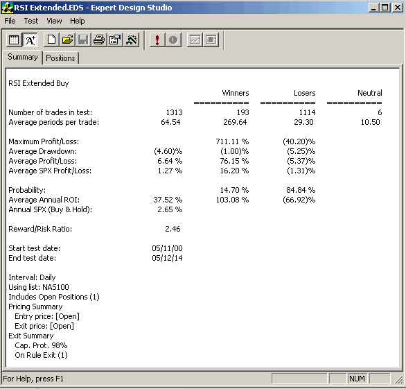
Figure 1 shows the AIQ EDS Summary long only back-test report using the NASDAQ 100 list of stocks over the period 5/11/2000 to 5/12/2014. Neither commission nor slippage have been subtracted from these results. In running this test, I used a capital protect of 98% which is equivalent to a 2% stop loss using the close. All entries and exits are at the next open. I could not get the short side to show a profit even with added market timing filters for trend on the NASDAQ 100 index.
AIQ EDS Summary long only back-test report using the NASDAQ 100 list of stocks over the period 5/11/2000 to 5/12/2014.
!WILDER’S RSI: EXTENDING THE TIME HORIZON
!Author: Mike B. Siroky, TASC May 2014
!Coded by: Richard Denning 5/10/2014
!www.TradersEdgeSystems.com
!INPUTS:
W1 is 55. !RSI length for going long
W2 is 5. !RSI length for going short
numSD is 1.645.
!CONSTANT:
EXPECTED_VALUE is 50.
!USER DEFINED FUNCTIONS
!RSI BANDS:
RSI_CIUP1 is (EXPECTED_VALUE/100 + Sqrt(EXPECTED_VALUE/100/2/W1)*numSD)*100.
RSI_CILOW1 is (EXPECTED_VALUE/100 – Sqrt(EXPECTED_VALUE/100/2/W1)*numSD)*100.
RSI_CIUP2 is (EXPECTED_VALUE/100 + Sqrt(EXPECTED_VALUE/100/2/W2)*numSD)*100.
RSI_CILOW2 is (EXPECTED_VALUE/100 – Sqrt(EXPECTED_VALUE/100/2/W2)*numSD)*100.
!RSI WILDER:
U is [close]-val([close],1).
D is val([close],1)-[close].
rsiLen1 is 2 * W1 – 1.
AvgU is ExpAvg(iff(U>0,U,0),rsiLen1).
AvgD is ExpAvg(iff(D>=0,D,0),rsiLen1).
RSI_1 is 100-(100/(1+(AvgU/AvgD))).
rsiLen2 is 2 * W2 – 1.
AvgU2 is ExpAvg(iff(U>0,U,0),rsiLen2).
AvgD2 is ExpAvg(iff(D>=0,D,0),rsiLen2).
RSI_2 is 100-(100/(1+(AvgU2/AvgD2))).
!RULES:
HD if hasdatafor(210) >= 200.
Buy if RSI_1 < RSI_CILOW1 and HD.
Exit if RSI_1 > RSI_CIUP1 and HD.
NDXc is TickerUDF(“NDX”,[close]).
Sell if RSI_2 > RSI_CIUP2 and NDXc < simpleavg(NDXc,200) and HD.
Cover if RSI_2 < RSI_CILOW2 and HD.





 English