Jul 18, 2014 | chart patterns, indicators, trading strategies
I have been a little “quiet” lately. Kind of unusual for me, granted. But what can I say really that’s new? The stock market’s moving higher – blah, blah, blah. The bond market keeps trying to creep higher – sure, interest rates are basically 0%, so why not? Gold stocks keep trying to grind their way higher after putting in an apparent base. But who the heck ever knows about something as flighty as gold stocks?
So like I said, not much new to report.
So for the record – one more time – let me repeat where I am at:
- As a trend-follower there isn’t much choice but to say that the trend of the stock market is still “up”. So as a result, I have continued to grit my teeth and “ride”. And let’s give trend-following its due – it’s been a good ride.
- As a market “veteran” I have to say that this entire multi-year rally has just never felt “right”. In my “early years” in the market (also known as the “Hair Era” of my life) when the stock market would start to rally in the face of bad economic times I would think, “Ha, stupid market, that can’t be right.” Eventually I came to learn that the stock market knows way more than I do. And so for many years I forced myself to accept that if the stock market is moving higher in a meaningful way, then a pickup in the economy is 6 to 12 months off. As difficult as that was at times to accept, it sure worked.
Today, things seem “different”. By my calculation the stock market has now been advancing for roughly 5 years and 4 months. And the economy? Well, depending on your political leanings it is somewhere between “awful” and “doing just fine.” But in no way has the “old calculus” of “high market, booming economy 6-12 months later” applied.
Again depending on your politics leanings the reason for this lies somewhere between “it is entirely Barack Obama’s fault” to “it is entirely George Bush’s fault.” (I warned you there was nothing new to report).
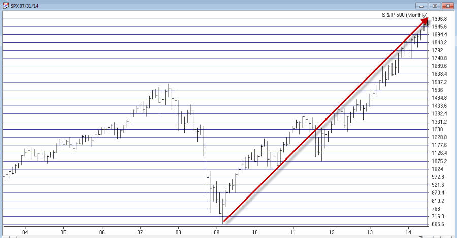
From my perspective, I think that the charts below – the second one of which I first saw presented by Tom McClellan, Editor of “The McClellan Oscillator” (which he presciently labeled at the time, “The only chart that matters right now”) – explains just about everything we need to know about the stock market actions vis a vis any economic numbers.
So take a look at the two charts below and see if anything at all jumps out at you.
Figure 1 – S&P 500 Monthly (Source: AIQ TradingExpert)
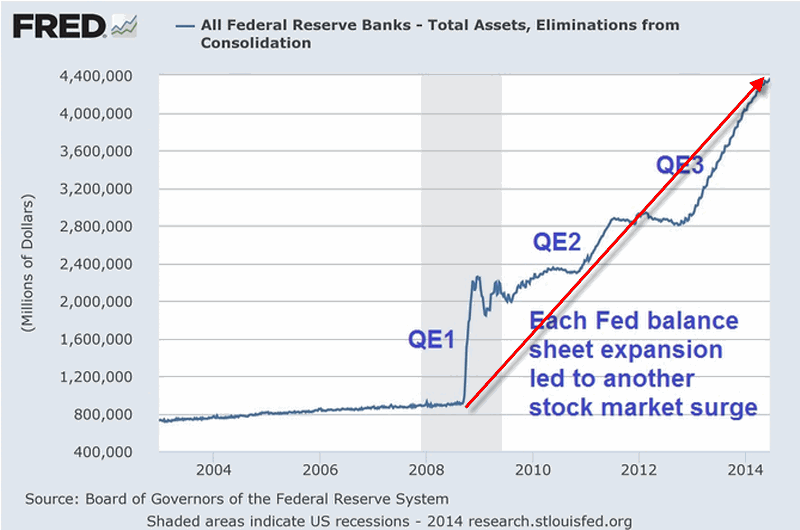
Figure 2 – Fed Pumping (Quantitiatve Easing “to Infinity and Beyond”) propelling the stock market
I am not a fan of using the word “manipulation” when it comes to the stock market. But I am a strong believer in the phrase “money moves the market.” The unprecedented printing of – I don’t know, is it billions of trillions of dollars – has clearly (at least in my mind) overwhelmed any “economic realities” and allowed the stock market to march endlessly – if not necessarily happily – to higher ground.
Thus my rhetorical questions for the day are:
“What would the stock market have looked like the past 5 years without this orgy of money?”
“What happens to the stock market when the Fed cannot or will not print money in this fashion?”
Because this is all unprecedented in my lifetime (as far as I can tell) I don’t have any pat answers to these questions. But I some pretty strong hunches.
My bottom line: Err on the side of caution at this time.
Jay Kaeppel
Chief Market Analyst at JayOnTheMarkets.com and AIQ TradingExpert Pro (http://www.aiq.com) client
Jay has published four books on futures, option and stock trading. He was Head Trader for a CTA from 1995 through 2003. As a computer programmer, he co-developed trading software that was voted “Best Option Trading System” six consecutive years by readers of Technical Analysis of Stocks and Commodities magazine. A featured speaker and instructor at live and on-line trading seminars, he has authored over 30 articles in Technical Analysis of Stocks and Commodities magazine, Active Trader magazine, Futures & Options magazine and on-line at www.Investopedia.com.
Jul 11, 2014 | EDS code, trading strategies
The AIQ code based on Perry Kaufman’s article in the June 2014 Stocks & Commodities magazine, “Slope Divergence: Capitalizing On Uncertainty,” is provided at
www.TradersEdgeSystems.com/traderstips.htm.
I have modified the implementation somewhat from the author’s descriptions. I did not find that the system was exiting in an average of six days but was holding for a longer period. My exits might be the issue so I added a time exit that can be used to force an exit after the “maxBars” input number of bars. I liked the results when my time exit was set to hold for a maximum of nine bars.
Figure 7 shows the AIQ EDS summary long-only backtest report using the NASDAQ 100 list of stocks over the prior four years ending 4/10/2014. Neither commission nor slippage have been subtracted from these results. To get the short side of the system to show a profit, I added slope filters on the NASDAQ 100 index. Note that my parameter settings differ from those suggested by the author.
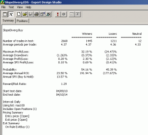
FIGURE 7: AIQ, SAMPLE RESULTS. Here is a sample AIQ EDS summary long-only backtest report using the NASDAQ 100 list of stocks over the prior four years ending 4/10/2014.
The code and EDS file can be downloaded from www.TradersEdgeSystems.com/traderstips.htm. The code is also shown here:
!SLOPE DIVERGENCE: CAPITALIZING ON UNCERTAINTY
!Author: Perry Kaufman, TASC June 2014
!Coded by: Richard Denning 4/7/2014
!www.TradersEdgeSystems.com
!INPUTS:
momLen is 10.
dvgLen1 is 5.
dvgLen2 is 7.
dvgLen3 is 10.
entryNum is 3.
maxDiverg is 3.
minPrice is 10.
maxBars is 3.
!USER DEFINED FORMULAS:
C is [close].
L is [low].
H is [high].
HH is highresult(H,momLen).
LL is lowresult(L,momLen).
stoch is (C - LL) / (HH - LL).
momSlope1 is slope2(stoch,dvgLen1).
momSlope2 is slope2(stoch,dvgLen2).
momSlope3 is slope2(stoch,dvgLen3).
priceSlope1 is slope2(C,dvgLen1).
priceSlope2 is slope2(C,dvgLen2).
priceSlope3 is slope2(C,dvgLen3).
dvgBuy1 if priceSlope1 > 0 and momslope1 < 0.
dvgBuy2 if priceSlope1 > 0 and momslope2 < 0.
dvgBuy3 if priceSlope1 > 0 and momslope3 < 0.
dvgSell1 if priceSlope1 < 0 and momslope1 > 0.
dvgSell2 if priceSlope1 < 0 and momslope2 > 0.
dvgSell3 if priceSlope1 < 0 and momslope3 > 0.
nPriceSUp is priceSlope1 > 0 + priceSlope2 > 0 + priceSlope3 > 0.
nMomSUp is momSlope1 > 0 + momSlope2 > 0 + momSlope3 > 0.
nPriceSDown is priceSlope1 < 0 + priceSlope2 < 0 + priceSlope3 < 0.
nMomSDown is momSlope1 < 0 + momSlope2 < 0 + momSlope3 < 0.
dvgBuySum is dvgBuy1 + dvgBuy2 + dvgBuy3.
dvgSellSum is dvgSell1 + dvgSell2 +dvgSell3.
Buy if dvgBuySum >= entryNum and C > minPrice.
AllComboExit if (nPriceSDown = maxDiverg and nMomSDown = maxDiverg)
or (nPriceSUp = maxDiverg and nMomSUp = maxDiverg).
Time if {position days} >= maxBars.
ExitBuy if AllComboExit or Sell or Time.
Sell if dvgSellSum >= entryNum.
ExitSell if AllComboExit or Buy or Time.

Jul 8, 2014 | chart patterns, group sector rotation, Seasonality, trading strategies
While looking through the seasonal trends in stocks and currencies, we decided to start running the seasonality scans on the S & P 500 groups. As a reminder here are the criteria we consider when running this.
Our study looks at 7 years of historical data and looks at the returns for all groups in the S & P 500 for the month of July from 2006 to 2013.
We do make an assumption that the month is 21 trading days and work our way back from the last day of the month. July also has the July 4th holiday and a half day trading on July 3rd. if the last day of the month falls on a weekend, then we use the first trading day prior to that date.
We make no assumptions for drawdown, nor do we look at the fundamentals behind such a pattern. We do compare the group to the market during the same period and look at the average SPY gain/loss vs. the average group gain/loss. This helps filter out market influence.
Finally we look at the median gain/loss and look for statistical anomalies, like meteoric gains/loss in one year. Here are top 5 performing groups based on average return.
Average return alone is misleading. In the seasonal analysis we need consistent patterns in the price action throughout the periods we are testing, in this case 7 years. While The S & P 500 Motorcycle manufacturers group (MTRCYCLE) looks good on average, it includes one stellar July of 37.50% back in 2010, and has 2 July’s that were negative returns. NOTE: there’s only one stock in the group (guess which one that is!).
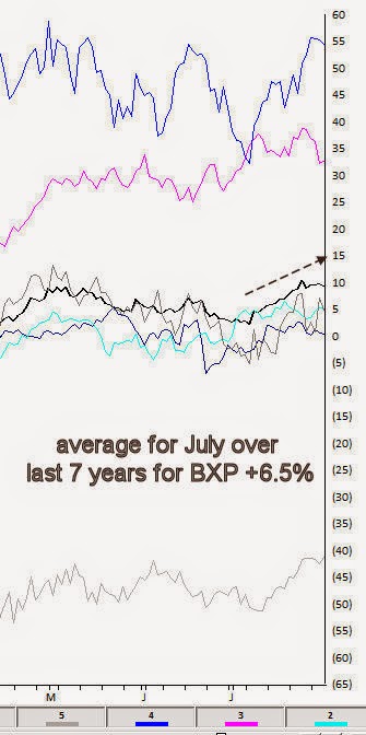
The office REITs group (REITOFC) is more consistent. It has an average return for the last 7 years in July of 6.50%, with the last 6 years Julys all positive. There are no stellar months skewing the average. The group also contains only one stock, Boston Properties [BXP].
Here’s the seasonal chart for BXP
Interestingly the other consistent group in July is another REIT, the Diversified REITs (REITDIV). It has an average return for the last 7 years in July of 6.06%, with the last 6 years Julys all positive. There are no stellar months skewing the average. The group also contains only one stock, Vonando Realty Trust [VNO].
A quick check on what the market did during the same period reveals an average return of 1.83% with 4 gaining Julys and 3 losing Julys.
The Oil & gas Equipment group (OILGASEQ) also had a decent average, but is more volatile over the past years, however the last 5 years have all been gainers.
Remember, we don’t draw conclusions here, just mine for information.
Jul 1, 2014 | chart patterns, trading strategies
It’s the beginning of the month and time to check the seasonal patterns for July. First off some background.
Our study looks at 7 years of historical data and looks at the returns for all optionable stocks for the month of July from 2006 to 2013.
We filter to find two sets of criteria
– Stocks with gains in all 7 years during July
– Stocks with losses in all 7 years in July
We do make an assumption that the month is 21 trading days and work our way back from the last day of the month. July also has the July 4th holiday and a half day trading on July 3rd. if the last day of the month falls on a weekend, then we use the first trading day prior to that date.
We make no assumptions for drawdown, nor do we look at the fundamentals behind such a pattern. We do compare the stock to the market during the same period and look at the average SPY gain/loss vs. the average stock gain/loss. This helps filter out market influence.
Finally we look at the median gain/loss and look for statistical anomalies, like meteoric gains/loss in one year.
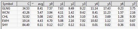
So here are the tickers that met the scan on the gain side, There was only 1 stock on the loss side. So we’ll look at the gainers only.
Figure 1 shows the stocks that have had gains in July, 7 years in row.
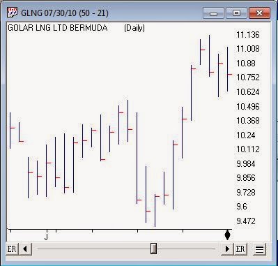
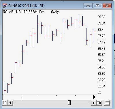
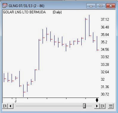
GLNG is a decent looking ticker, it’s in the LNG business. The average for July is 8.41% gain. The median is 7.63% and there’s no extreme values to skew the average. During the same test period the SPY gained an average of 1.83% with 3 losses and 4 gains.
Figure 2 shows SPY for the same period.
Figure 3 is a chart of GLNG seasonal pattern for the last 7 years in July. The solid black line is the average for the 7 years, these are percentage change day to day. Each line represents a prior year of GLNG.
Figure 3 seasonal average for GLNG average line for last 7 years
With seasonality you have to figure out what timeframe you want to analyze before anything else. Logic would seem to dictate that one week; comparing this week to the same period over X years would be the smallest time period you might consider. However there are events that seem to be seasonally predictable that occur at the end of a month or the beginning of the month. We’ll look at some these in a future article
In June we looked for the same seasonal pattern and no candidates were found on the gainers side. there were plenty on the losers side. Given that seasonally June is a bad month for the market it’s not too surprising.
Here are the July daily charts for the last 5 years for GLNG. We don’t draw conclusions here, just mine for information.
Jun 26, 2014 | chart patterns, indicators, trading strategies
Well the stock market just seems to keep chugging along. Despite the shaky economy, the national debt, the political discord, the terrorists on the march and the price of – well, just about everything made in China. And as a dutiful trend-follower I continue to “ride the ride” all the while repeating the ever apt phrase, “What, me worry?”
Three things for the record:
1) The stock market is in a clearly established uptrend and who am I to say otherwise?
2) Personally I still expect a serious “something” between now and the end of September
3) Arguably the most important bullish seasonal trend of all kicks in at the close on September 30, 2014.
Huh?
Yes folks, as of the close on September 30th it will be time for “the Mid Decade Rally”
Defining the Mid-Decade Rally
For the purposes of this article we will break each decade into two periods:
*Period 1 (i.e., the “Bullish 18″) = the 18 months extending from the end of September of Year “4” (2014, 2004, 1994, etc.)
*Period 2 (i.e., the “Other 102″) = the other 102 months of every decade.
So in a nutshell, Period 1 comprises 15% of each decade while Period 2 comprises 85% of each decade. Given that Period 2 is 5.67 times as long as Period 1 it would seem likely that an investor would make more money being in the stock market during Period 2 than during Period 1.
I mean if you had to choose – particularly given the long-term overall upward bias of the stock market – would you choose to be in the market 85% of the time or only 15% of the time. Safe to say most investors would answer the former. But if you are among those who chose this answer, perhaps you should read a little further.
Period 1: The “Bullish 18 Months” of the Decade
In Figure 1 you see the growth of $1,000 invested in the Dow Jones Industrials Average only during the middle 18 months (Sep. 30, Year 4 through Mar. 31, Year 6) of every decade starting in 1900. See if anything at all jumps out at you from the chart.
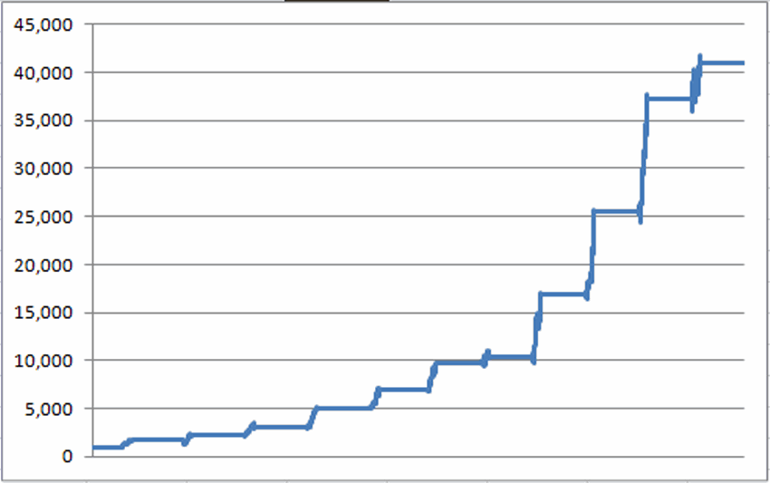
Figure 1 – Growth of $1,000 invested in Dow only during “Bullish 18” months of each decade; 1900-present
Does the word “consistency” come to mind? For the record, $1,000 invested only during this 18-month period grew to $40,948, or +3,994%. Now this all looks and sounds pretty good, but surely an investor would have made a lot more money investing in the stock market during the other 102 months of each decade, right? Well, not exactly. In fact, a more accurate statement might be, “not at all.”
Period 2: The “Other 102” Months of the Decade
Figure 2 displays the growth of $1,000 invested in the Dow Jones Industrials Average only during the other 102 months of each decade. $1,000 invested in the market 85% of the time – but excluding the mid-decade bullish period – would have grown to $6,166, or +517%.
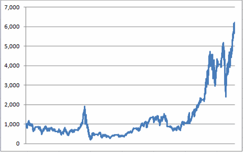
Figure 2 – Growth of $1,000 invested in the Dow only during the “Other 102” months of each decade; 1900-present
Now for the record, +517% is +517% and no one is saying that you should simply mechanically sit out the 102 “other” months. But the point is simply that the “Bullish 18” made 7.73 times as much money – while invested only 15% of the time – as the “Other 102” – which was invested in stocks 85% of the time.
The difference is even clearer when the two lines are drawn on the same chart as shown in Figure 3.
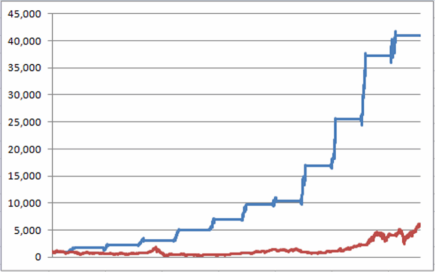
Figure 3 – Growth of $1,000 during “Bullish 18″ month (blue line) versus “Other 102″ months (red line); 1900-present
Mid Decade “Bullish 18” Performance
| Period |
% +(-) during “Bullish 18” |
| 9/30/1904-3/31/1906 |
+68.3% |
| 9/30/1914-3/31/1906 |
+30.6% |
| 9/30/1924-3/31/1906 |
+36.2% |
| 9/30/1934-3/31/1906 |
+68.8% |
| 9/30/1944-3/31/1906 |
+36.1% |
| 9/30/1954-3/31/1906 |
+42.0% |
| 9/30/1964-3/31/1906 |
+5.6% |
| 9/30/1974-3/31/1906 |
+64.4% |
| 9/30/1984-3/31/1906 |
+50.7% |
| 9/30/1994-3/31/1906 |
+45.4% |
| 9/30/2004-3/31/1906 |
+10.2% |
Figure 3 – “Bullish 18″ month performance
For the record:
*The average % gain for the Bullish 18 was +41.7%
*The median % gain for the Bullish 18 was +42.5%
On the other hand:
*The average % gain for the Other 102 was +34.3%
*The median % gain for the Bullish 18 was -2.2%
So you see why I am marking September 30, 2014 on my calendar.
By the way, if you like this one, in the immortal words of Jimmy Durante, “I got a million of ‘em.”
Jay Kaeppel
Chief Market Analyst at JayOnTheMarkets.com and AIQ TradingExpert Pro (http://www.aiq.com) client
Jay has published four books on futures, option and stock trading. He was Head Trader for a CTA from 1995 through 2003. As a computer programmer, he co-developed trading software that was voted “Best Option Trading System” six consecutive years by readers of Technical Analysis of Stocks and Commodities magazine. A featured speaker and instructor at live and on-line trading seminars, he has authored over 30 articles in Technical Analysis of Stocks and Commodities magazine, Active Trader magazine, Futures & Options magazine and on-line at www.Investopedia.com.
Jun 16, 2014 | bonds, trading strategies
With the Fed “pumpin’” and the economy “thumpin’” (as in “thumping along like a flat tire”) it seems unlikely that interest rates would rise. Still, sometimes is makes sense to go against the grain if enough evidence presents itself. So let me show you what I am looking at in the bond market.
EWJ vs. T-Bonds
As I wrote about in a previous article (T-Bonds and Japanese Stocks, Inversely….), for whatever reason, t-bonds have long exhibited a strong inverse correlation to Japanese stocks (no, seriously). In Figure 1 we see EWJ (the ETF that tracks Japanese stocks) with a 5 week and 30 week moving average drawn in the top clip. In the bottom clip we see ticker TLT (the ETF that tracks the 30-year t-bond). You can see that – using highly technical terms that we quantitative analysts types like to use to impress others with how much we know about the markets – when EWJ “zigs”, TLT tends to “zag”, and vice versa.
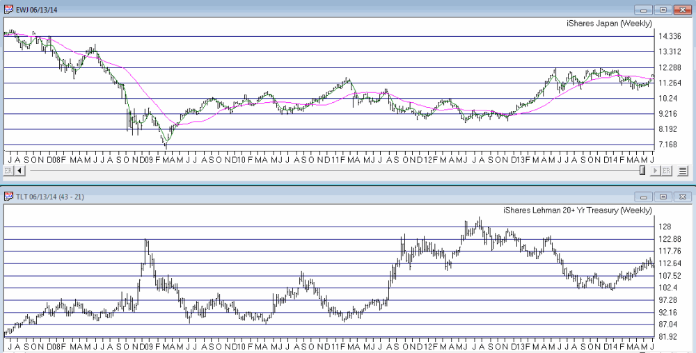
Figure 1 – EWJ with 5-30 week moving averages versus TLT (Courtesy: AIQ TradingExpert)
This past weekend the 5-week moving average for EWJ once again rose back above the 30-week moving average for EWJ. If history is an accurate guide then this may be a negative sign for t-bonds. Although I would be remiss if I did not invoke:
Jay’s Trading Maxim #216: History is not always an accurate guide (but it beats flipping a coin).
Figure 2 displays the raw dollar gain or loss from:
a) Holding a long position in t-bond futures (1 point movement = $1,000) when EWJ 5-week is below EWJ 30-week (red line)
b) Holding a long position in t-bond futures (1 point movement = $1,000) when EWJ 5-week is above EWJ 30-week (blue line)
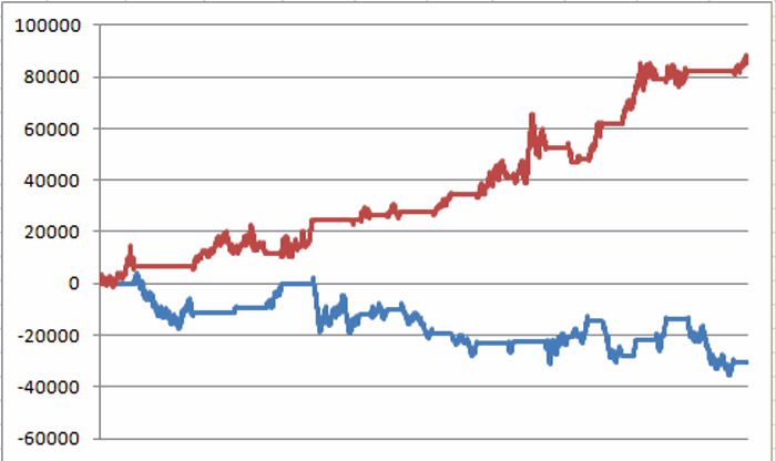
Figure 2 – $(-) from a long position in t-bonds futures when EWJ 5-week MA is BELOW EWJ 30-week MA (red line) and $(-) from a long position in t-bonds futures when EWJ 5-week MA is ABOVE EWJ 30-week MA (blue line) (12/31/1997 to present)
Obviously this indicator is not perfect, but equally obvious is the fact that bonds have typically performed better when the EWJ 5-week MA is below that EWJ 30-week MA. So let’s call this – if nothing else – a potentially negative sign.
TLT vs. Elliott Wave
I am not a true “ElliottHead” but I do tend to pay attention to the Elliott Wave count for a given market when the daily and weekly counts point in the same direction. Figures 3 and 4 present the latest daily and weekly Elliott Wave counts for TLT as figured by ProfitSource by HUBB.
The daily count just completed a bullish Wave 5 (i.e., implying that the latest rally has run its course) and the weekly count is signaling a potentially Bearish Wave 4 sell signal. For the record, I do not believe in the “magic” of Elliott Wave. But I do like when daily and weekly signs for just about any indicator appear to confirm one another.
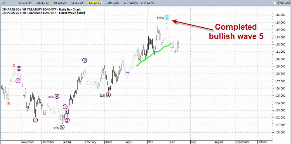
Figure 3 – Daily Elliott Wave Count for TLT; Completed Wave 5 suggests rally is over (Courtesy: ProfitSource by HUBB)
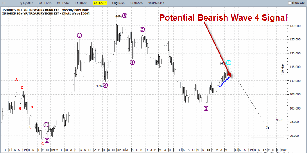
Figure 4 – Weekly Elliott Wave Count for TLT; signaling potentially Bearish Wave 5 signal (Courtesy: ProfitSource by HUBB)
Ways to Play
So if a trader buys the idea that t-bonds will decline in price in the months ahead, there are lots of way to play. A trader could:
*Sell short 100 shares of ticker TLT. This would require roughly $5850 of margin money and would technically entail unlimited risk.
*Trader could buy 100 shares of ticker TBT, an inverse leveraged ETF that is designed to track t-bonds times minus 2 (In other words, if bonds decline -1%, then ticker TBT should rally roughly +2%). This would require roughly $6,200.
*Buy a put option on ticker TLT.
*Buy a call option on ticker TBT.
There are pros and cons to each, but the trade that I want to highlight is buying a call on ticker TBT.
Call on TBT
If t-bonds do decline, then TBT would be expected to advance, hence the reason for considering a call option on TBT. The reason I am looking at this trade is simply because it offers the most “bang for the buck.” Not only are TBT shares leveraged 2 to 1, but by buying a call option we can obtain even more leverage with limited risk. As you can see in Figure 5, TBT has support at roughly $56 and resistance at roughly $80.
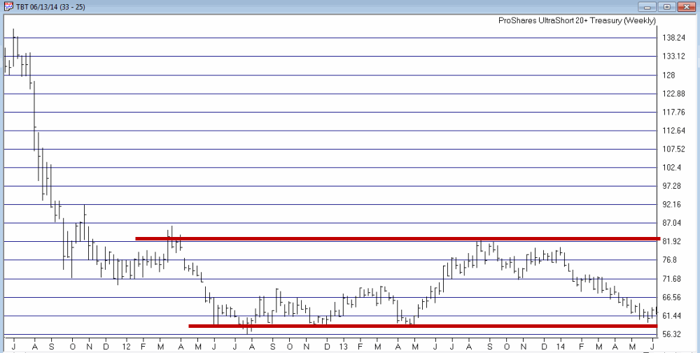
Figure 5 – TBT; support near $56, resistance near $80 (Courtesy: AIQ TradingExpert)
So let’s look at buying the September 62 call for $281 (NOTE: the bid/ask is fairly wide at $2.62/$2.81. For illustrative purpose I am simply assuming a market order and a fill at $2.81. An astute trade might consider a limit order that splits the difference). Figure 6 displays the risk curves for buying the Sep TBT 62 call at $2.81.
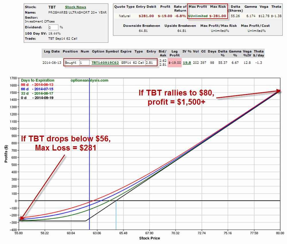
As you can see, in the worst case the maximum loss is $281. In the best case – i.e., TBT rallies all the way back up to $80, the trade can generate a profit in excess of $1,500. Also there are three months for “something” to happen.
Summary
As always, I am not “recommending” this trade. I am simply pointing out some potentially bearish evidence that I have found in regards to t-bonds and have highlighted “one way” to play such a situation using the limited risk associated with options.
So will t-bonds take a tumble and in turn, will TBT soar, thus generating an excellent rate of return? As always, “It beats the heck out of me.” But from a trader’s perspective, the real question is, “Am I willing to risk $281 to find out?”
Jay Kaeppel
Chief Market Analyst at JayOnTheMarkets.com and AIQ TradingExpert Pro (http://www.aiq.com) client
Jay has published four books on futures, option and stock trading. He was Head Trader for a CTA from 1995 through 2003. As a computer programmer, he co-developed trading software that was voted “Best Option Trading System” six consecutive years by readers of Technical Analysis of Stocks and Commodities magazine. A featured speaker and instructor at live and on-line trading seminars, he has authored over 30 articles in Technical Analysis of Stocks and Commodities magazine, Active Trader magazine, Futures & Options magazine and on-line at www.Investopedia.com.
Jun 10, 2014 | chart patterns, indicators, trading strategies
For the record, I am now – and have for some time been – a “reluctant bull.” I can look at a dozen different things – including the fact that they economy still shows no signs of the robustness that would typically justify the run that the stock market has enjoyed in recent years – and make an argument that the stock market is way overdue to run out of steam.
But the timeless, well-worn phrase, “The Trend is Your Friend” didn’t become a timeless, well-worn phrase for nothing.
And so I continue to “ride the ride”. But as I have mentioned more frequently of late, I am keeping a close eye on the exit. Given my present “bad attitude” I tend to focus on and point out a lot more potentially bearish developments than bullish. But what the heck, I might as well let the sun shine through on occasion. So this time out, let’s highlight one development that suggests that “The End Is (Not Necessarily) Near!”
This is one of the things that has prompted me to “sit tight” and not listen to “those voices in my head” (No not those voices, the other ones…..), despite the fact that a meaningful correction could begin at any moment.
The Bullish Outside Month
Just as it takes a lot of “thrust” to get a rocket off of the ground, a large thrust upward in the stock market can be a sign that a particular rally is in the early stages rather than the late stages.
So here is a pattern to consider:
A) This month’s low is less than or equal to last month’s low
B) This month’s close is greater than last month’s high
That’s it. In Figure 1 we see the S&P 500 monthly bar chart from 1996 to the present with these “Bullish Outside Months” highlighted in green. The first one occurred in October 1998 and launched the final surge in great bull market of the 1990’s (or as most of us above a certain age refer to it – “The Good Old Days”).
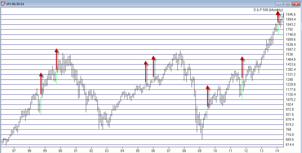
Figure 1 – Bullish Outside Months for SPX since 1996 (courtesy AIQ TradingExpert Pro)
The most recent signal occurred at the end of February of this year. This was only the 19th signal since 1970. The action of the S&P 500 index following previous signals – looking out 3 months, 6 months and 12 months after each signal – appears in Figure 2.
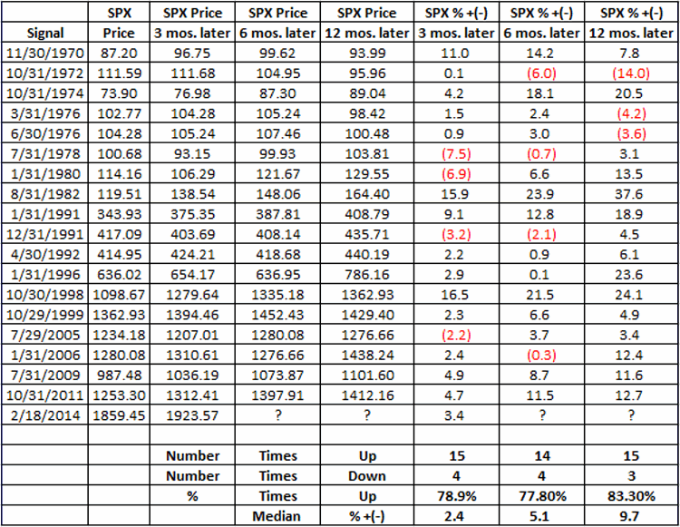
Figure 2 – SPX Results 3, 6 and 12 months after Bullish Outside Months (1970-Present)
As you can see, on a 3-month, 6-month and 12-month basis, the S&P 500 has been higher at least 77% of the time following previous signals. Which creates something on a conundrum.
Summary
In my mind’s eye the stock market is ridiculously overbought and “due” for a good solid “whack” sometime between now and the end of September. But this particular indicator suggests that that “whack” may not come. So for now my own primary investment strategy remains to play the long side of the market unless and until the major averages (Dow, SPX, Nasdaq 100 and Russell 2000) drop below their respective 200-day moving averages. Fairly boring yes, but it pays to mind:
Jay’s Trading Maxim #72: Boring and effective is much better than exciting and AAAAAHHHHHH!!
Jay Kaeppel
Chief Market Analyst at JayOnTheMarkets.com and AIQ TradingExpert Pro (http://www.aiq.com) client
Jay has published four books on futures, option and stock trading. He was Head Trader for a CTA from 1995 through 2003. As a computer programmer, he co-developed trading software that was voted “Best Option Trading System” six consecutive years by readers of Technical Analysis of Stocks and Commodities magazine. A featured speaker and instructor at live and on-line trading seminars, he has authored over 30 articles in Technical Analysis of Stocks and Commodities magazine, Active Trader magazine, Futures & Options magazine and on-line at www.Investopedia.com.
Jun 5, 2014 | bonds, trading strategies
Watching Weekly Dow Momentum
The stock market – like the Energizer Bunny – just keeps chugging along, with the Dow, the S&P 500 and the Nasdaq 100 all touching new highs in the last week (the Russell 2000 small-cap index is another story, and may ultimately serve as the “canary in the coal mine”, but for now “majority rules”). So for now, disciplined trend-followers (“Hi my name is Jay – although it is a little difficult to speak at the moment as my teeth remain tightly clenched”) have done well to avoid all of the “Sell in May” warnings from all of those so called experts (“Um, hi my name is Jay?”). But there is one sign that I think investors should follow that has historically proven useful during the middle months of mid-term election years.
I first wrote about this on 5/6/2014 in an article titled “A Warning Sign to Watch“. For full details I suggest you read that article, but for now let me give you the gist.
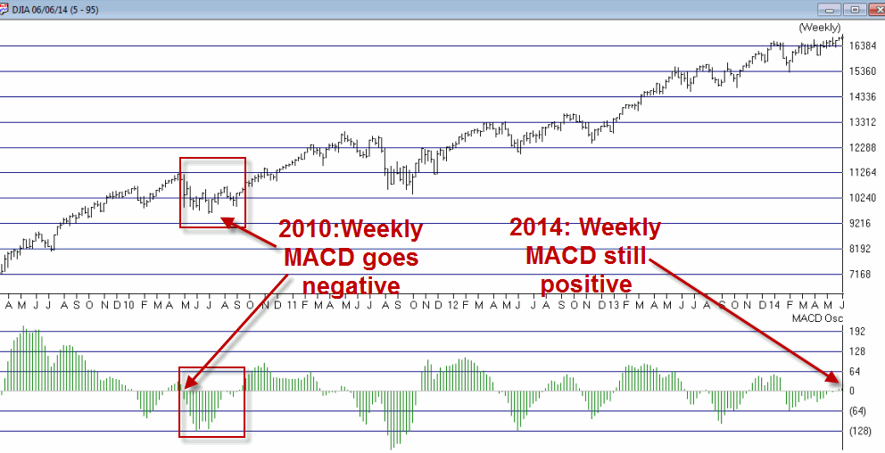
-Between May and October of mid-term election years, a warning sign occurs when the MACD Oscillator (many traders refer to it as the MACD Histogram) drops into negative territory.
Figure 1 – Weekly Dow Industrials with MACD Oscillator (watch for drop to negative territory) courtesy AIQ TradingExpert
For the record, the MACD Oscillator was below 0 during early May, but was in a rising trend along with the Dow itself. The Oscillator returned to positive territory on 5/23 and remains there still. So let me sum up my advice as succinctly as possible:
*KEEP AN EYE ON THE WEEKLY MACD OSCILLATOR FOR THE DOW JONES INDUSTRIALS AVERAGE.
If it drops into negative territory be prepared to take defensive action.
If you have even the most basic charting software, checking the status of the weekly Dow MACD Oscillator after the close each week will take up approximately 12 seconds of your time. Per the 5/6/14 article, if history is any guide, the 12 seconds a week time investment may prove to be very useful.
Looking for a Reversal in T-Bonds
As I write, t-bonds are in the middle of a nasty short-term sell off. But there is hope. As I wrote about on 4/8/14 in an article titled “A Simple Signal for Bond Traders”, a short-term bullish setup may be forming at the moment. In a nutshell:
*When the 25-day moving average for ticker EWJ is below the 150-day moving average for ticker EWJ (long story short, t-bonds tend to trade inversely to Japanese stocks – go figure), then
*Wait for the 10-day CCI (Commodity Channel Index) for ticker TLT to drop below -100 and then turn up for one day.
Once that occurs a trader might consider buying the call option with at least 40 days left until expiration and the highest gamma among call options for that expiration.
In Figure 2 you can see that this setup is presently “locked and loaded” and will be triggered when the 10-day CCI for ticker TLT reverses back to the upside.
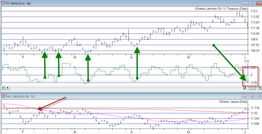
Figure 2 – TLT forming a potentially bullish setup courtesy AIQ TradingExpert Pro
Traders should always remember that there is never any guarantee that the next signal will generate a profit, and should always have some sort of stop-loss or risk limiting planin place at the time that any new trade is entered.
Jay Kaeppel
Chief Market Analyst at JayOnTheMarkets.com and AIQ TradingExpert Pro (http://www.aiq.com) client
Jay has published four books on futures, option and stock trading. He was Head Trader for a CTA from 1995 through 2003. As a computer programmer, he co-developed trading software that was voted “Best Option Trading System” six consecutive years by readers of Technical Analysis of Stocks and Commodities magazine. A featured speaker and instructor at live and on-line trading seminars, he has authored over 30 articles in Technical Analysis of Stocks and Commodities magazine, Active Trader magazine, Futures & Options magazine and on-line at www.Investopedia.com.
May 30, 2014 | color studies, EDS code, Stocks & Commodities Traders Tips, trading strategies
The AIQ code and EDS file based on Donald W. Pendergast’s article in the 2014 Bonus Issue of
Stocks & Commodities, “A Trading Method For The Long Haul,” can be found at http://
TradersEdgeSystems.com/traderstips.htm.
The code I provide there for the long haul system is modified somewhat from the author’s descriptions as follows. First, I did not implement the fundamental rule, but this can be done if a data source is located that can export the fundamental fields needed for each stock into a .csv file. This could then be imported into the fundamental module. Second, I modified the exit to add an RSI profit target and changed some of the exit parameters.
To get the code to run properly, the AIQALL list of stocks and groups must be installed and updated on the user’s computer. To do this, first get the most recent AIQALL list from the AIQ website, then add all the stocks from the latest data disk that have trading volume greater than about 200,000 shares. We need these in order to have enough stocks to compute the group indexes. Next, we would download data for all the stocks in the database up to the current date. Then, as shown in Figure 6, we would set the RS tickers to the AIQALL list, and also, as shown in Figure 7, recompute all dates for all the groups in the AIQALL list.
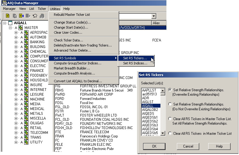
FIGURE 6: AIQ DATA MANAGER. Use the AIQ Data Manager to set the RS tickers to the AIQALL list.
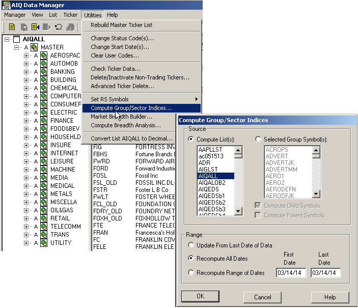
FIGURE 7: AIQ DATA MANAGER. Use the AIQ Data Manager to compute the group & sector indexes for the AIQALL list.
The EDS file containing the code has the properties set to the AIQALL list. If you are building an EDS file directly from the code listing below, then be sure to set the properties to the AIQALL list.
!A Trading Method for the Long Haul
!Author: Donald W. Pendergast Jr., TASC Bonus Issue 2014
!Coded by: Richard Denning 3/10/14
!www.TradersEdgeSystems.com
!INPUTS:
trendLen is 200.
rsiLen is 2.
minAvgVolume is 10000.
volaLen is 21.
relStrLen is 80.
minVolaRatio is 0.5.
rsSPXmin is 1.0.
rsGroupmin is 1.0.
trailBars is 2.
rsiBuyLvl is 5.
rsiExitLvl is 95.
exitLen is 18.
C is [close].
H is [high].
L is [low].
PD is {position days}.
!LONG TERM MOVING AVERAGE:
emaLT is expavg(C,trendLen).
emaST is expavg(L,exitLen).
!RSI WILDER
!To convert Wilder Averaging to Exponential Averaging use this formula:
!ExponentialPeriods = 2 * WilderPeriod - 1.
U is C-valresult(C,1).
D is valresult(C,1)-C.
rsiLen1 is 2 * rsiLen - 1.
AvgU is ExpAvg(iff(U>0,U,0),rsiLen1).
AvgD is ExpAvg(iff(D>=0,D,0),rsiLen1).
rsi is 100-(100/(1+(AvgU/AvgD))).
!VOLATILITY
price1 is H.
price2 is L.
ratio is price1 / price2.
dp is Ln(ratio).
dpsqr is Ln(ratio) * Ln(ratio).
totdpsqr is sum(dpsqr,volaLen).
sumdp is sum(dp,volaLen).
sumdpsqr is sumdp * sumdp.
sumdpave is sumdpsqr / volaLen.
diff is totdpsqr - sumdpave.
!!use 252 for daily, or 52 for weekly below
factor is 252 / (volaLen-1).
result is sqrt(diff * factor).
vola  is result * 100 .
volaAvg is expavg(vola,volaLen).
volaSPXavg is tickerUDF("SPX",volaAvg).
volaRatio is volaSPXavg/volaAvg.
!AVERAGE VOLUME
avgVolume is expavg([volume],50).
!RELATIVE STRENGTH
roc is C / valresult(C,relStrLen).
rocSPX is tickerUDF("SPX",roc).
rocGroup is tickerUDF(rsticker(),roc).
groupSymbol is tickerUDF(rsticker(),symbol()).
groupName is tickerUDF(rsticker(),description()).
rsSPX is roc / rocSPX.
rsGroup is rocGroup / rocSPX.
!SCREENING RULES
VolumeRule if avgVolume > minAvgVolume.
TrendRule if C > emaLT.
VolaRule if volaRatio > minVolaRatio and simpleavg(H-L,10) > simpleavg(H-L,200).
RelStrRule if rsSPX > rsSPXmin and rsGroup > rsGroupmin.
PullbackRule if rsi < rsiBuyLvl.
EnoughData if hasdatafor(trendLen+10) > trendLen.
!FundamentalRule if [eps]>[eps est].
Screen if EnoughData
and TrendRule
and VolaRule
and RelStrRule
and PullbackRule
!and FundamentalRule
and VolumeRule.
EntryTrigger if C > lowresult(H,2,1).
Buy if valrule(Screen,1) and EntryTrigger.
Exit if (C < lowresult(L,trailBars,1))
or
(valrule(C > emaST,1) and C < emaST)
or
rsi > rsiExitLvl.
ShowValues if EnoughData.
May 23, 2014 | ETFs, gold, trading strategies
Well, OK, maybe not. But life here in the Good Old US of A may be affected profoundly. Which of course, would ripple out and affect much of the rest of the world. So maybe it’s not that outrageous.
In any event, it sure is a catchy title, no? In truth this piece is not an immediate call to action, but rather one of those short “hey, you might want to keep your eye on this” type pieces. I am writing about the U.S. Dollar.
There are pro’s and con’s to a strong U.S. Dollar and there are pro’s and con’s to a weak U.S. Dollar. If you would like to know what they are please see the steps below:
Step 1) Go to your web browser. Type www.google.com and press Enter
Step 2) Type “pros and cons of strong U.S. dollar” and press Enter.
Step 3) Browse among the approximately 308,000 or so links until you find your answer.
Step 4) Type “pros and cons of weak U.S. dollar” and press Enter.
Step 5) Repeat Step 3.
Since at least the end of the gold standard in 1971 the U.S. dollar has served as the world’s “reserve currency”. (This basically means that if you could only hold one currency you would want to hold the dollar.) This has become one of those things that most people take for granted and assume will go on forever.
Still, given that we are now the most indebted “We the People” in the history of the planet, perhaps we shouldn’t be surprised that there has been a lot of talk recently (granted mostly among intentionally frightening and mostly annoying infomercials) about how the days of enjoying “reserve currency” status are numbered, and how this will trigger a panic out of the dollar, which will lead to all kind of bad things like, well, see Step 4 above.
Will the Dollar Collapse?
For me to pretend that I have the slightest idea whether or not the U.S. dollar will someday collapse would be a joke, and not the funny kind. But as a trader and investor my “thing” is not so much “what will happen” as it is “what could happen and what the heck do I plan to do about it if it does?”
Which leads me to the following distractions:
Jay’s Trading Maxim #235: It’s not so much how much you make when things go right, but how much you keep when thing goes wrong.
Jay’s Trading Maxim #236: If you take care of the losing trades, the winning trades will take care of themselves (OK, for the record, this is not mine, I just gave it number 236 so I could use it as a segue into…..)
Jay’s Trading Maxim #237: Successful traders worry less about “Kicked Ass” and more about “Ass Kicked”, if you get my drift.
So why am I bringing all of this up? Take a look at Figure 1 which displays a monthly chart of continuous U.S. dollar futures. While the history of U.S. dollar trends is all very interesting and I would love to recap it for you, I am going to opt for the “a picture is worth a thousand (likely incredibly boring) words” mantra and encourage you simply to glance at Figure 1 if you want to know where the dollar has been in the past.
And when you do – here is the important part – note that the dollar is forming a narrowing triangle (is there another kind?) pattern. In other words, starting with the high in 2006 the dollar has been fluctuating in an ever smaller range.
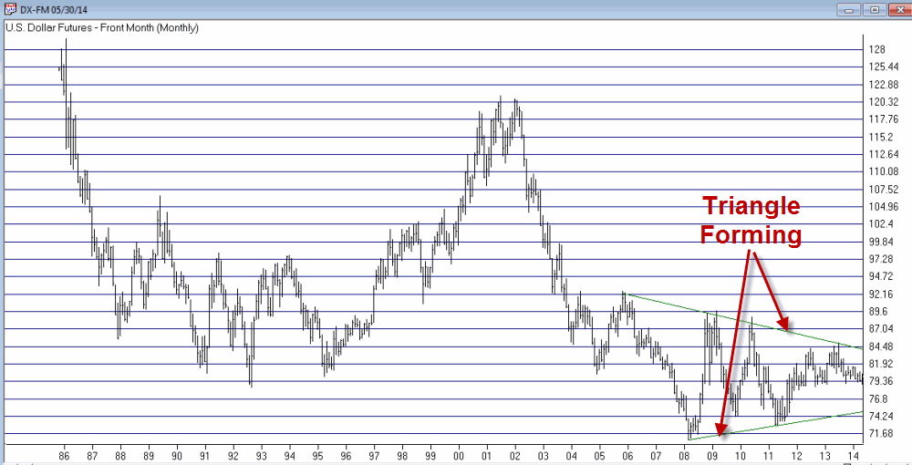
Figure 1 – A large triangle forming (Courtesy: AIQ TradingExpert)
We “market analyst types” refer to this as “coiling” action. Now if you are like me chances are you just squirmed slightly when you read that last sentence. Because we all know what happens when something stops coiling – that’s right, it “uncoils”. And “uncoiling” is typically not a quiet affair.
So here is the bottom line. At some point – and just for the record it might not be for several years – the U.S. dollar will break out of this triangle one way or the other. And chances are it will move sharply in price from that point. And whether it breaks out to the upside or the downside it will have significant implications for the quality of life here in the U.S. If you don’t believe me, see the 308,000 links referenced in Step #3 above.
So make a note to check in on the dollar once in awhile. Because one of these days something profoundly significant is going to happen.
Jay Kaeppel
Chief Market Analyst at JayOnTheMarkets.com and AIQ TradingExpert Pro (http://www.aiq.com) client
Jay has published four books on futures, option and stock trading. He was Head Trader for a CTA from 1995 through 2003. As a computer programmer, he co-developed trading software that was voted “Best Option Trading System” six consecutive years by readers of Technical Analysis of Stocks and Commodities magazine. A featured speaker and instructor at live and on-line trading seminars, he has authored over 30 articles in Technical Analysis of Stocks and Commodities magazine, Active Trader magazine, Futures & Options magazine and on-line at www.Investopedia.com.







 English