Utilizing Relative Strength for ETF Sector Rotation
WinWayCharts pre-built Relative Strength report offers a valuable tool for those seeking to capitalize on sector rotation. By shifting the focus to ETFS and cloning the report as closely as possible in the AIQ Expert Design Studio, we gain the ability to apply additional screening criteria. This adds a layer of flexibility, that can achieve significant market outperformance. . Through WinWayCharts Expert Design Studio (EDS) program, users gain the freedom to create their personalized screening techniques.
The approach we aim for is to utilize an EDS model that seeks out high relative strength. To refresh your memory, the short-term Relative Strength report considers the last 120 trading days, divides this period into quarters, and then calculates the average percent change for each quarter with a heavier weight on the most recent quarter. Here’s the EDS code:
RelativeStrength is 0.4Period1+ 0.2Period2 + 0.2Period3 +0.2Period4.
Description is Description().
RSvalue5daysback is valresult(RelativeStrength,5).
Perchangeweekago is ((RelativeStrength – RSvalue5daysback)/RSvalue5daysback)*100.
! change is Perchangeweekago.
good if 1.
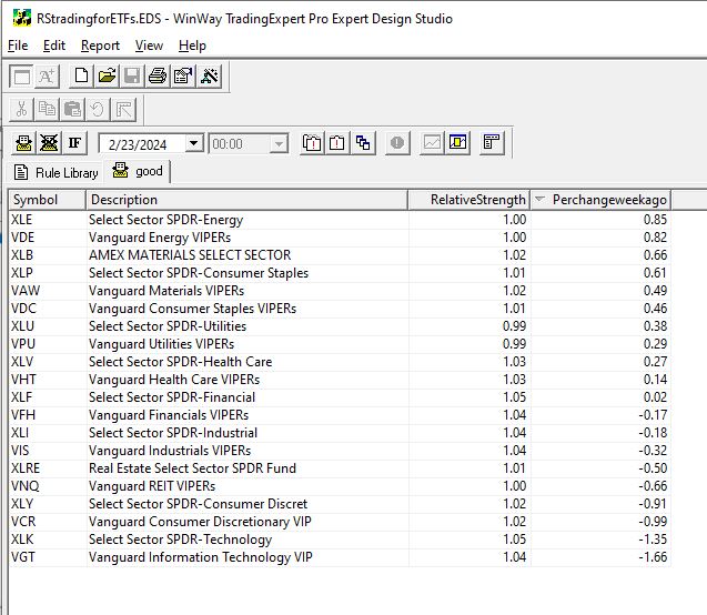
Using this code, an EDS report can be generated to rank ETF sectors from strongest to weakest. While investing in high relative strength sectors can be effective, some individuals might feel uneasy about buying when prices are already high. Often, they regret not entering the market earlier upon seeing a high RS sector.
For those preferring to enter a trend earlier, we can integrate a new screening into our EDS report. We’ve discovered that monitoring the weekly change in RS ranking is valuable for determining whether a sector is gaining or losing momentum.
Relative Strength serves as the primary screening metric, where the objective is to hold positions that appear at the top of the report. Instead of purchasing assets immediately when they top the report, some traders may opt to utilize the Change column to identify sectors with the strongest upward momentum. By selecting sectors with the highest Change numbers, you are essentially investing in sectors exhibiting robust momentum in relative strength.
Traders can easily sort sectors by the Change column by clicking on its title. The benefit of entering sectors with a high Change score is the potential for earlier trend entry. However, the drawback is the possibility of false signals—instances where a trend fails to materialize, causing the sector to stagnate in the relative strength ranking.
Investing in high relative strength sectors or sectors with improving relative strength figures presents a solid strategy for entering industry sectors. These approaches can be combined to create a more dynamic strategy. With the combination strategy, the goal is to identify sectors with both high Relative Strength readings and positive Change readings, indicating strength and ongoing improvement.
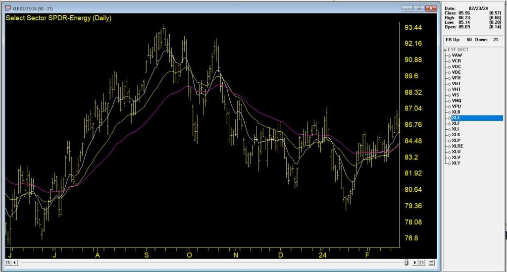
In this Chart, we see the top % change ETF from 2/23/24. The recent trend is up and it’s accelerated in the last week.
By employing the combination strategy, the focus typically narrows down to selections at or near the top of the Relative Strength column with positive Change readings. This dual approach ensures a focus on strong sectors and becoming even stronger, optimizing the potential for successful investments.
The EDS file mentioned in this article is available to download click here
Download and save this file to your /wintes32/ EDS Strategies folder.
The Sector ETF list is available to download click here
Download and save this file to your /wintes32/ folder.