The question on many investors’ minds is “are we in a bond bear market?” Given that long-term treasuries have lost roughly 17% since July of 2016 it is a fair question.
The main model that I use is still bearish on bonds (more on this topic below). Still, there are a few potential “lights at the end of the bond tunnel” – at least potentially in the near-term.
Long-Term Rates
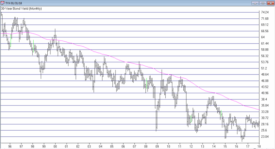
My mega long-term “fail-safe” bond trend indicator appears in Figure 1. It is the yield on 30 year treasuries (ticker TYX – which is multiplied by 10 for some unknown reason) with a 120-month exponential moving average.
Figure 1 – 30-Yr. Treasury yields (Ticker TYX) with 120-month average (Courtesy TradingExpert)
When the day comes that TYX breaks out above the 120-month moving average I for one will officially designate the great bond bull market as “over.” And that day is coming. But for what it’s worth – it’s not quite here yet.
Metals Positive for Bonds
In this article I wrote about a bond timing model that uses the relationship between gold and copper. Like a lot of timing models of all stripes it does a good job of differentiating good times for bonds from bad times for bonds, but is very far from perfect.
It goes like this:
A = Gold / Copper
B = 30-day moving average of A
C = 80-day moving average of A
D = B – C
If D > 0 = Bullish for bonds*
If D < 0 = Bearish for bonds*
*- with a 1-day lag
This indicator flipped to bullish at the close on 2/7/18 after being bearish since 7/10/2017.
Figure 2 displays the action of ticker TLT since the last “sell” signal in July 2017. As you can see, in the end it ended up being “correct” as TLT was lower on 2/7/18 than it was on 7/10/17. But that was not the case until the last week or so. So for most of the time during this bearish period TLT traded higher.
Figure 2 – Ticker TLT with recent Jay’s Metal Model signals (Courtesy TradingExpert)
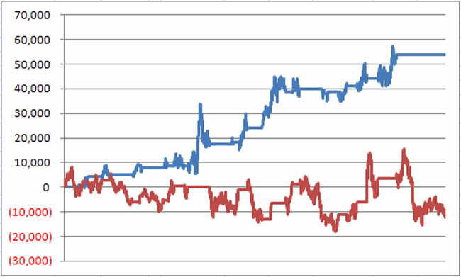
What is most important however is to focus on the long-term results. In Figure 2 the blue line depicts the growth of equity achieved by holding long 1 t-bond futures contract ONLY when the model is bullish while the red line depicts the growth of equity achieved by holding long 1 t-bonds futures contract ONLY when the model is bearish (red line).
Figure 2 – T-bond futures $ gain/loss when Jay’s Metal Model is bullish (blue line) versus when model is bearish (red line)
The long-term difference in performance is fairly obvious. That being said it should also be noted that the blue line is by no means a series of straight line advances, i.e., there is no guarantee that this latest bullish signal will prove fortuitous, especially given that we may be transitioning from a long-term bond bull market to a long-term bond near market.
One More Possible Piece of Good News
In this article I applied an indicator I originally learned from Tom McClellan at http://www.mcoscillator.com to weekly TLT. This indicator looks at the number of times TLT has been up minus the number of times down over the past 20 weeks. Very often a drop to -2 or below followed by an upside reversal of 2 points (i.e., it drops to -2 then subsequently rises to 0, or drops to -3 then rises to -1 and so on) has presaged a favorable up move in bonds. This indicator applied to TLT recently fell to -2 and may flash a favorable signal soon (please note that it HAS NOT given a buy signal yet and that it could take several weeks before it does).
Figure 3 – Weekly TLT with UpDays20 Indicator (Courtesy TradingExpert)
One Piece of “Still Bad News”
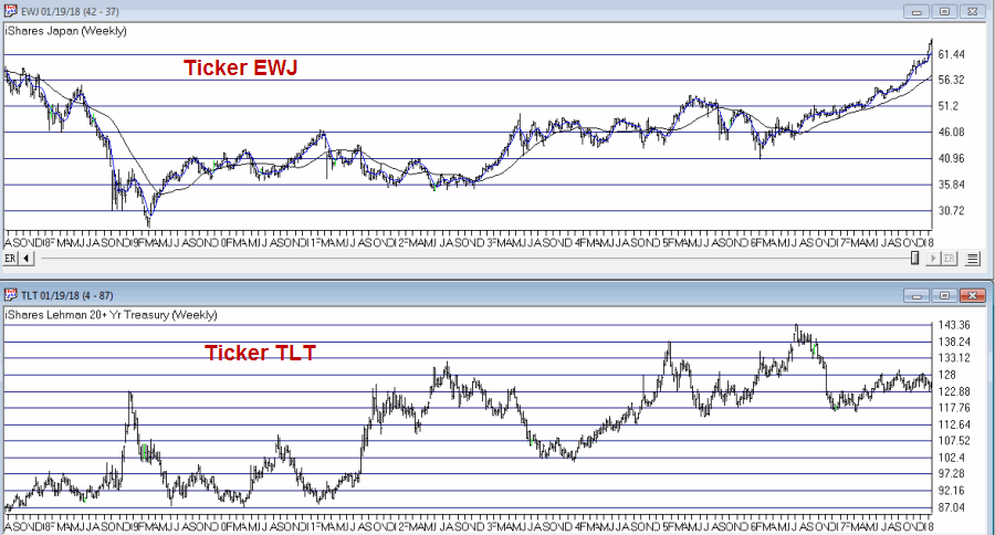
In this article I wrote about one of the main bond models I use that uses the trend in Japanese stocks to trade bonds inversely, i.e., if Japanese stocks are bearish it is bullish for bonds and vice versa. I use a 5-week and 30-week moving average to quantify Japanese stocks as “bullish” or “bearish”.
In Figure 4 when the blue line in the top clip is above the red line this is considered bearish for bonds and when the blue line is below the red line it is considered bullish for bonds. For now the blue 5-week average line is still well above the red 30-week average, so this indicator still designates the trend for bonds as “bearish”.
Figure 4 – Ticker TLT tends to trade inversely to ticker EWJ (Courtesy TradingExpert)
Summary
So are bonds due to rally? Well, it seems like at least a short-term bounce could be in the offing. That being said, with bonds breaking down sharply at the moment, 1) this “idea” is geared for “traders” who are not afraid of (and are unacquainted with) taking risks, 2) it might make sense to wait for the UpDays20 indicator discussed above to tick higher by two points – which could take up to several weeks to play out – before “taking the plunge.”
As always I am not “recommending” anything, just highlighting what I see. For longer-term investors the “Boring Bond Index” bond strategy I wrote about here remains a viable long-term approach to bond investing.
Jay Kaeppel
Disclaimer: The data presented herein were obtained from various third-party sources. While I believe the data to be reliable, no representation is made as to, and no responsibility, warranty or liability is accepted for the accuracy or completeness of such information. The information, opinions and ideas expressed herein are for informational and educational purposes only and do not constitute and should not be construed as investment advice, an advertisement or offering of investment advisory services, or an offer to sell or a solicitation to buy any security.
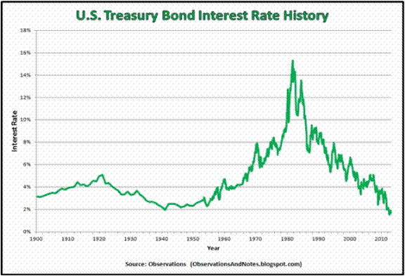
There is a lot of hand-wringing going on these days regarding the bond market. And rightly so given that interest rates have been (were?) in a downtrend for 35+ years. Given that, given the long-term cyclical nature of interest rates and given that rates are at a generational low level, “concern” is understandable.
However, needless hand-wringing over events that have yet to occur is not.
Figure 1 – Long-term treasury yields through the years (Courtesy: ObservationsanNotes.blogspot.com)
(The chart in Figure 1 is updated only through about 2012. Nevertheless, it effectively highlight the long-term cyclical nature of interest rates.)
The problem is the “well, interest rates are destined to rise therefore I should immediately [fill in your defensive action here].”
Many analysts and investors are following and attempting to interpret every tick in bond yields. In fact, some very well known bond “people” have proclaimed a “bond bear market”. And they may be right. But still…
What I Follow in the Bond Market
What follows are a few random thoughts on some of the things I look at when tracking the bond market.
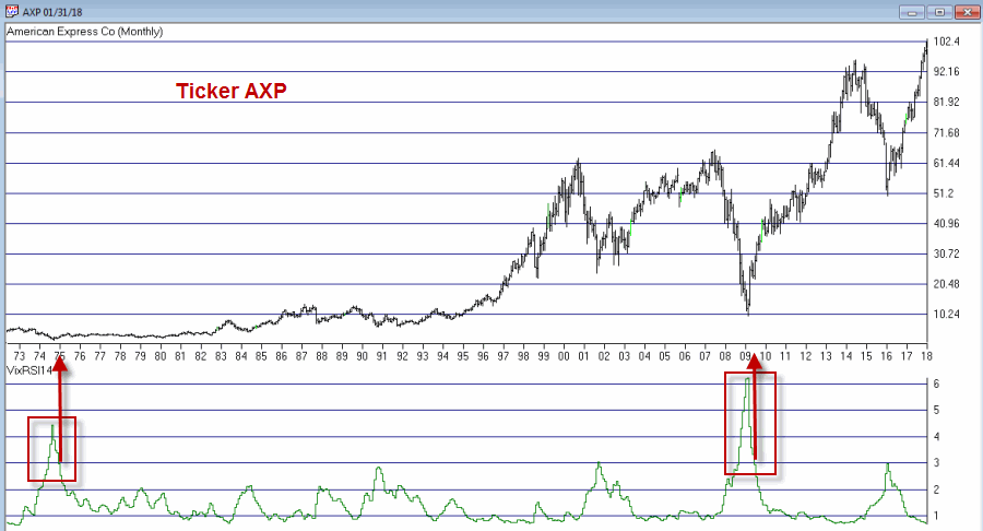
#1. 30-Year Yield versus 120-month Exponential Moving Average
Figure 2 displays ticker TYX, an index which tracks the yields on 30-year bonds (for some reason it multiplies by 10 – so a yield of 3% appears on the chart as 30.00).
Figure 2 – 30-year treasury yields versus 120-month exponential moving average (Courtesy TradingExpert)
Using the data from Figure 1 I have found that a 120-month (i.e., 10-year) average does a pretty good job of riding the major trends in interest rates. As you can clearly see in Figure 2, TYX is still noticeably below its 120-month EMA. This could obviously change quickly but for the moment by this objective measure the long-term trend in interest rates right at this very moment is still “down.”
Please note that I am not saying that interest rates will not rise and move above this MA. I am saying two things:
1. Until the crossover occurs try not to focus too much attention on dire predictions.
2. Once the crossover does occur the bond market environment that most of us have known throughout all or most of our investment lives will change dramatically (more on this topic when the time is right).
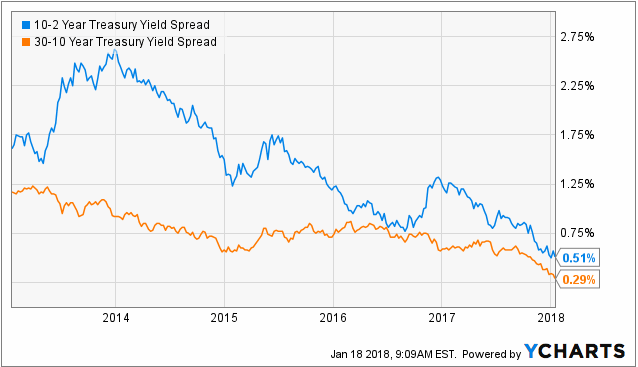
#2. The Yield Curve(s)
Figure 3 displays the yield curves for 30-year yields minus 10-year yields and 10-year yields minus 2-year yields. The narrowing trend is obvious. This is causing great consternation because historically when the yield curve “inverts” (i.e., when shorter-term rates are higher than longer-term rates) it is a very bad sign for the economy and the financial markets.
Figure 3 – 10-yr yield minus 2-year yield (blue) and 30-year yield minus 10-year yield (orange); (Courtesy: YCharts)
The problem here is that there is still an important difference between “narrowing” and actual “inverting”. Many people seems to look at Figure 3 and assume that an inverted yield curve (i.e., if and when these lines go into negative territory) is “inevitable” and that things are therefore doomed to get worse for the economy and the markets.
Repeating now: There is still an important difference between a “narrowing” yield curve and an actual “inverted” yield curve. Until the yield curve actually does invert try not to focus too much attention on dire predictions.
#3. The Current Trend in Bonds
One trend following indicator that I follow (and have written about in the past) is the inverse relationship between long-term t-bonds and Japanese stocks. Figure 4 display ticker EWJ (an ETF that tracks an index of Japanese stocks) versus ticker TLT (an ETF that tracks the long-term treasury bond).
Figure 4 – Ticker EWJ versus Ticker TLT (Courtesy TradingExpert)
Figure 5 displays two equity curves. The blue line represents the $ gain achieved by holding long 1 treasury bond futures contract ONLY when the EWJ 5-week moving average is below the EWJ 30-wek moving average and the red line represents the $ loss achieved by holding long 1 treasury bond futures contract ONLY when the EWJ 5-week moving average is above the EWJ 30-week moving average.
Figure 5 – Holding long t-bond futures when EWJ is in a downtrend (blue line) versus holding long t-bond futures when EWJ is in an uptrend (red line); December 2003-present
Notice anything different about the blue line versus the red line? With EWJ trending strongly higher, caution remains in order or the long-term treasury bond. If the trend in EWJ reverses things may look better for long-term bonds.
#4. Short and Intermediate Term Bonds remain a Viable Alternative
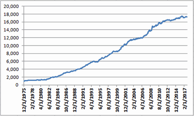
As I wrote about here an index of short and intermediate treasury and high grade corporate remains a viable long-term approach for income investors. Figure 6 displays the growth of $1,000 invested using the “Boring Bond Index” I wrote about in the aforementioned article. This index has gained in 38 of the past 42 years.
Figure 6 – Growth of $1,000 invested using “Boring Bond Index” Method; 12/31/1975-11/30/2017
Summary
There are good reasons to be wary of interest rates and bonds. At the same time overreacting to dire headlines also remains a very poor approach to investing.
So in sum:
*The very long-term trend in interest rate is still technically “down”
*The yield curve is narrowing but still has a ways to go before it inverts
*The current trend in long-term bonds is bearish
*Short and intermediate term bonds experience much less volatility than long-term bonds (and reinvest more frequently, which may come in handy if rates do begin to rise in earnest).
*If and when TYX pierces its long-term average and/or when the yield curve inverts, the time will arrive for investors to make some wholesale changes in how they approach their bond market investments.
*If and when EWJ starts to fall, things may improve for the current plight of the long-term treasury.
*And through it all, a boring approach to bonds may still prove very useful.
Jay Kaeppel
Disclaimer: The data presented herein were obtained from various third-party sources. While I believe the data to be reliable, no representation is made as to, and no responsibility, warranty or liability is accepted for the accuracy or completeness of such information. The information, opinions and ideas expressed herein are for informational and educational purposes only and do not constitute and should not be construed as investment advice, an advertisement or offering of investment advisory services, or an offer to sell or a solicitation to buy any security.
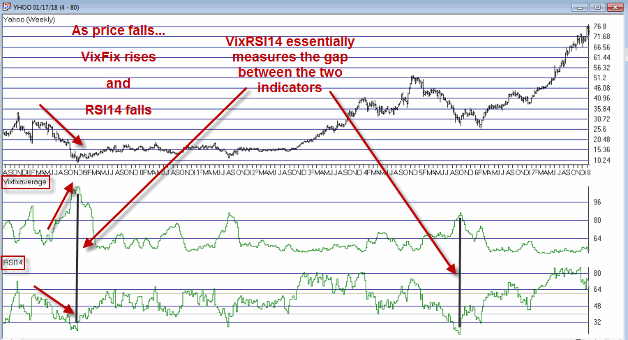
In this article I detailed an indicator I refer to as VixRSI14 using monthly charts. Today let’s apply the same method to weekly bar charts. Before we do that a quick look at how this indicator functions.
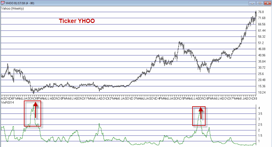
VixRSI combines two indicators – Larry William’s VixFix and Welles Wilder’s Relative Strength Index (RSI). In Figure 1 you see a weekly bar chart for YHOO. Notice that as price declines the VixFix indicator rises and RSI falls. VixRSI14 essentially measures the difference between the two and looks for extremes as a sign of a potential reversal. See Figure 5 for YHOO with VixRSI14.
Figure 1 – YHOO with Williams VixFix (with 3-day exponential smoothing) and Wilder’s 14-period RSI (Courtesy TradingExpert)
The Weekly Version of VixRSI14
We will use the same method I described in the previous article, i.e.:
*We will calculate the VixRSI14 indicator (see code at end of article) on a weekly basis
*A “buy alert” occurs when VixRSI14 drops below 3.00 after first rising to 3.50 or higher
Once again, please note that:
*There is nothing magic about 3.50 or 3.00
*Not every “buy alert” is followed by an immediate rally (or even any rally at all for that matter)
*Any actually trading”results” will depend heavily on what you trade, how much of it you trade, when you actually get in, when you get out with a profit and/or when you get out with a loss.
*This VixRSI14 alert signal is simply serving notice that a given security may be overdone on the downside and may be ready soon to reverse to the upside. Nothing more, nothing less.
In 2018 I intend to try to share a few more trading “ideas” that maybe are not quite “finished products”. VixRSI14 fits neatly into the “Idea” category. Sometimes the alerts are early. Sometimes the alerts are late. Sometime the alerts don’t really pan out at all. Sometimes alerts are followed by one more sharp decline which is then followed by a major rally. So maybe some sort of trend reversal confirmation would be helpful. I don’t know.
Hey, that gives me an idea….
Code:
William’s VixFix is simply the 22-period high price minus today’s low price divided by the 22-day period price (I then multiply by 100 and then add 50). That may sound complicated but it is not.
The code for AIQ TradingExpert appears below.
########## VixFix Code #############
hivalclose is hival([close],22).
vixfix is (((hivalclose-[low])/hivalclose)*100)+50.
###############################
####### 14-period RSI Code ###########
Define periods14 27.
U14 is [close]-val([close],1).
D14 is val([close],1)-[close].
AvgU14 is ExpAvg(iff(U14>0,U14,0),periods14).
AvgD14 is ExpAvg(iff(D14>=0,D14,0),periods14).
RSI14 is 100-(100/(1+(AvgU14/AvgD14))).
###############################
VixRSI14 is then calculated by dividing the 3-period exponential average of VixFix by the 3-period exponential average of RSI14
####### VixRSI14 Code ###########
VixRSI14 is expavg(vixfix,3)/expavg(RSI14,3).
###############################
Jay Kaeppel
Disclaimer: The data presented herein were obtained from various third-party sources. While I believe the data to be reliable, no representation is made as to, and no responsibility, warranty or liability is accepted for the accuracy or completeness of such information. The information, opinions and ideas expressed herein are for informational and educational purposes only and do not constitute and should not be construed as investment advice, an advertisement or offering of investment advisory services, or an offer to sell or a solicitation to buy any security.
While the bulk of the financial world focuses most of its attention on whether or not Bitcoin will turn to sh, er, something that rhymes with Bitcoin, a lot of “old timers” continue on with trying to look at markets in a more traditional way. Unfortunately, some people who try to look at markets in a more traditional way also spend an inordinate amount of time “dividing one number by another” thinking there is some purpose to it (“Hi. My name is Jay”)
The only good news is that every once in awhile something useful – or at least potentially useful (since no single calculation guarantees profitability which also involves other “minor” issues such as which securities to trade, allocation size, entry method, profit taking criteria, stop loss triggers and so on and so forth). A number of years ago I stumbled upon a calculation that I ultimately refer to as VixRSI (for reasons that will become fairly obvious soon). More specifically I have a few different versions but one I like is call used VixRSI14.
First the Good News: In this and some future articles I will detail how I apply VixRSI14 to monthly, weekly and daily price charts.
Now the Bad News: Nothing that I will write in any of those articles will detail a “simple automated system that generates you can’t lose trading signals guaranteed to make you rich beyond the dreams of avarice.” Sorry about that. But I thought you should know.
The truth is that the indicator generates signals – and yes, a certain percentage of the time those signals aren’t that great. And even on occasions when the signals are decent all of the factors I mentioned above (securities traded, capital allocation, etc.) still hold the key to turning a “signal” into a “profit”.
VixRSI14
VixRSI14 is calculated by combining Larry William’s “VixFix” indicator with the standard old 14-day RSI from Welles Wilder. I’ve decided to put the calculations at the end of the article in order to avoid scaring anyone off.
For now let’s look at what to look for on a monthly price chart.
VixRSI14 on a Monthly Chart
OK, true confession time: there is (at least as far as I can tell) no “one best way” to use VixRSI14 on a monthly chart. So I will simply show you “One way.”
*A “buy alert” is triggered when the monthly value for VixRSI14 first rises to 3.5 or higher and then drops back to 3.0 or below
*Before going on please note that there is nothing “magic” about 3.5 or 3. Different values can be used and will generate varying results.
*Also, some may prefer to simply look for a drop from above 3 to below 3 without requiring a move above 3.5
*Finally please note the use of the phrase “buy alert” and the lack of the phrase “BUY AS MUCH AS YOU CAN RIGHT THIS VERY MINUTE!!!!”
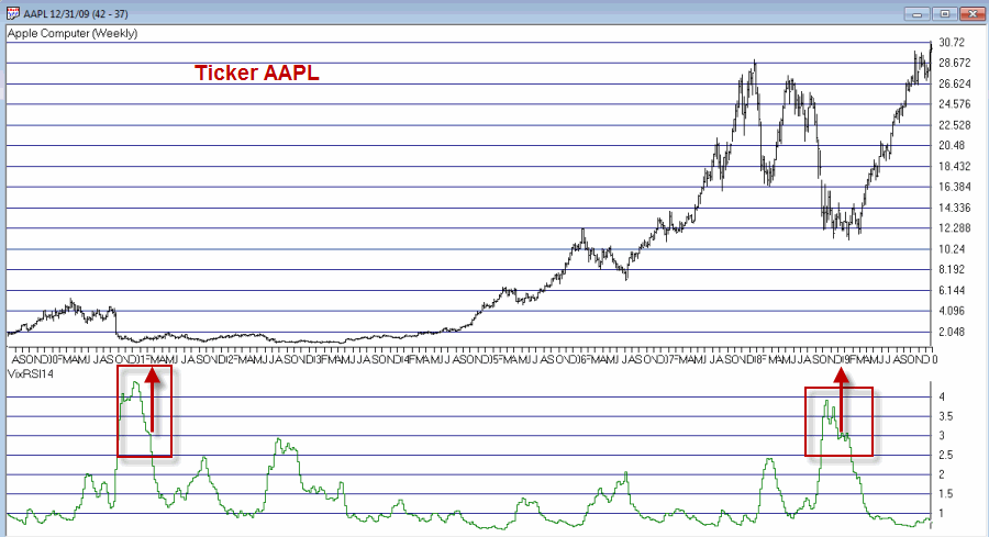
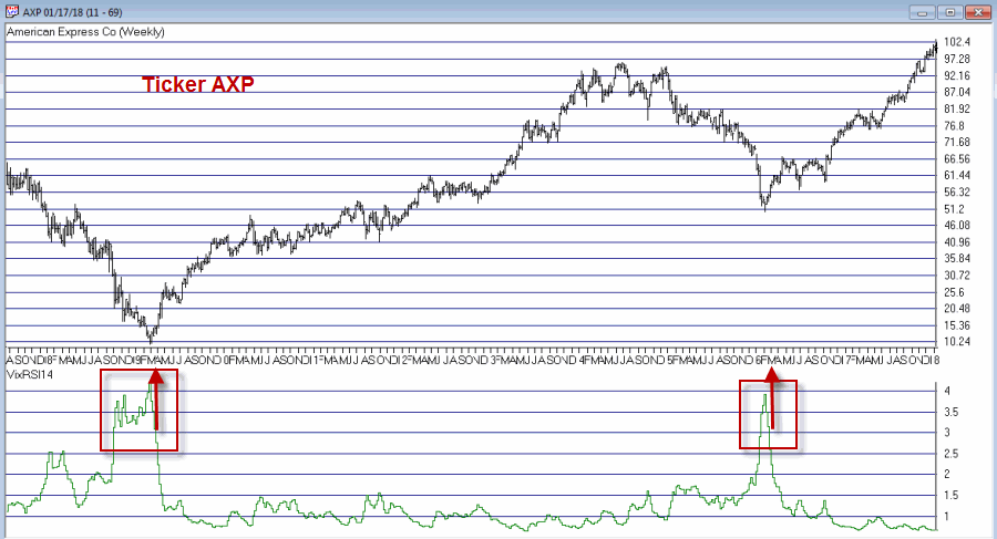
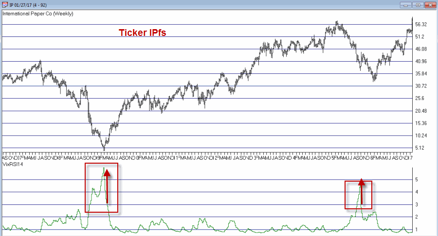
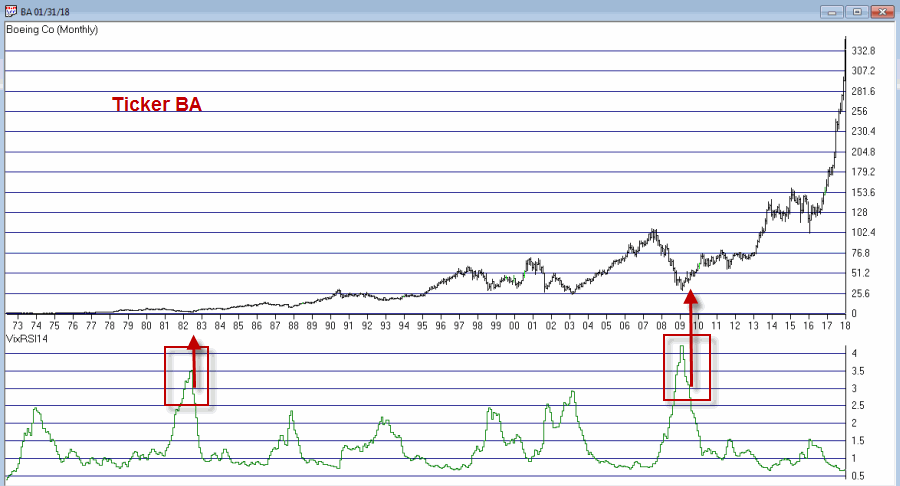
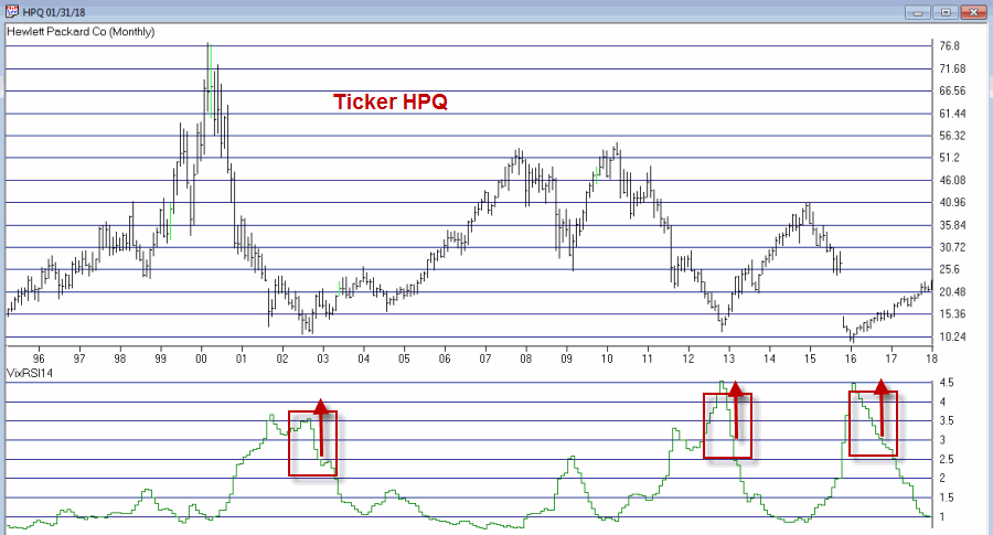
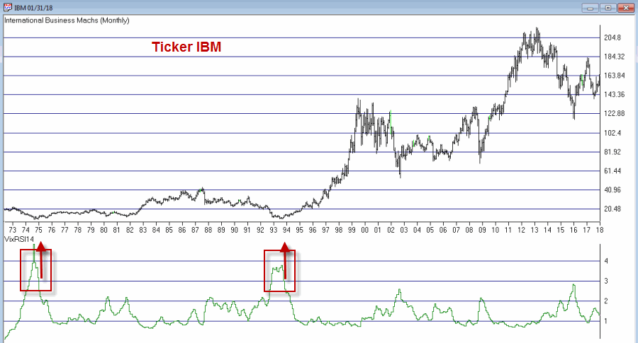
Figures 1 through 4 show several different Dow30 stocks “through the years.
Buy alerts on monthly charts using the criteria I described are obviously very rare. In fact many securities never see the VixRSI14 rise high enough to trigger an alert. Likewise, not every 3.5 then 3 event for every stock will work out as well as those depicted in Figures 1 through 4.
Still, remember that I am just presenting an “idea” and not a finished product.
Code:
William’s VixFix is simply the 22-day high price minus today’s low price divided by the 22-day high price (I then multiply by 100 and then add 50). That may sound complicated but it is not.
The code for TradingExpert EDS appears below.
########## VixFix Code #############
hivalclose is hival([close],22).
vixfix is (((hivalclose-[low])/hivalclose)*100)+50.
###############################
####### 14-period RSI Code ###########
Define periods14 27.
U14 is [close]-val([close],1).
D14 is val([close],1)-[close].
AvgU14 is ExpAvg(iff(U14>0,U14,0),periods14).
AvgD14 is ExpAvg(iff(D14>=0,D14,0),periods14).
RSI14 is 100-(100/(1+(AvgU14/AvgD14))).
###############################
VixRSI14 is then calculated by dividing the 3-period exponential average of VixFix by the 3-period exponential average of RSI14
####### VixRSI14 Code ###########
VixRSI14 is expavg(vixfix,3)/expavg(RSI14,3).
#########################
Jay Kaeppel
Disclaimer: The data presented herein were obtained from various third-party sources. While I believe the data to be reliable, no representation is made as to, and no responsibility, warranty or liability is accepted for the accuracy or completeness of such information. The information, opinions and ideas expressed herein are for informational and educational purposes only and do not constitute and should not be construed as investment advice, an advertisement or offering of investment advisory services, or an offer to sell or a solicitation to buy any security.
First the brutal disclaimers: What follows is NOT a trading “system.” It is merely an “idea.” Even more brutally, I can’t even claim that it “works”. All the testing I have done so far is more anecdotal. Also to an extremely huge degree, the actual entry trigger and exit trigger that trader might choose to use will have – as always – at least as much if not more impact on overall trading results as the actual “alert” signal detailed below.
Got that? OK, then let’s proceed.
The Debate
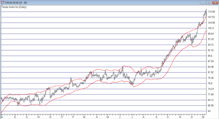
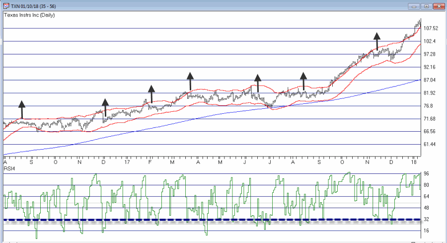
The ongoing debate in trading is always – trend-following or countertrend? Which is the way to go? There are (conservatively) at least a bazillion and one ways to argue one way or the other. Figure 1 displays ticker TXN with upper and lower “Acceleration Bands” (code for TradingExpert Expert Design Studio EDS appears after disclaimer at end of article) drawn.
Want to start a debate? Ask this question: Is it better to buy when price hits the upper band or the lower band? Sometimes price hits the upper band and just keeps going. Sometimes it hits the upper band and the move peters out and reverses fairly quickly.
Going with the trend can lead to some big winning trades along the way, but typically involves a lot of whipsaws as well. Trading countertrend can lead to some great, quick profits – expect of course for when the initial trend never quite reverses and quick losses accrue instead.
What to do, what to do?
So the “idea” I mentioned at the outset generally goes like this:
*In an uptrend (which we will define in a moment)
*Wait for price to hit the Upper Band
*Then wait for a pullback
*Then wait for the uptrend to reassert itself
Got that? OK, me neither exactly. So let’s try to define things a little more clearly.
1. As long as the closing price remains above the 200-day moving average, we will call that an “uptrend”
2. Within an uptrend wait for the high of a trading day to reach or exceed the Upper Acceleration Band.
3. Following #2, wait for the 4-day RSI to drop to 32 or lower with the following caveats:
*If price touches the Lower Acceleration Band OR closes below the 200-day moving average
*Then the setup is invalidated
This is the “Setup”. For sake of example I will add an entry trigger as follows:
4. Following a valid #3 Alert Signal, buy when price exceeds the previous day’s high
I am going to purposely NOT add an exit trigger – just so that no one decides to “try it out” without at least giving it some thought on their own.
So Figure 2 shows the “Alerts” and “Entry Triggers” for the chart in Figure 1.
Figure 2 – Ticker TXN with Example “Entry Triggers” (Courtesy AIQ TradingExpert)
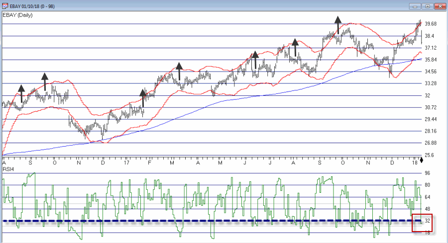
So Figure 3 shows the “Alerts” and “Entry Triggers” for ticker EBAY
Figure 3 – Ticker EBAY with Example “Entry Triggers” (Courtesy AIQ TradingExpert)
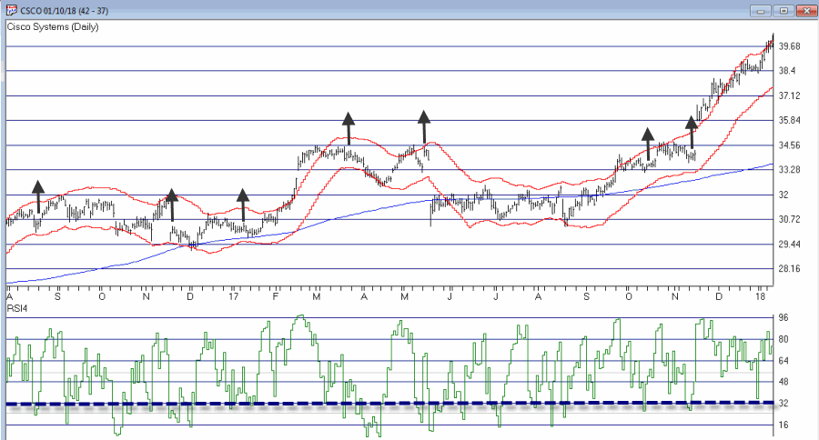
So Figure 4 shows the “Alerts” and “Entry Triggers” for ticker CSCO
Figure 4 – Ticker CSCO with Example “Entry Triggers” (Courtesy AIQ TradingExpert)
So are these signals any good? Well, like a lot of trading methods, some look pretty good and others do not. As I also mentioned earlier, a lot depends on the method or methods you use to exit each trade.
Summary
The reality is that there is a chance that the “idea” contained herein is just no darn good.
But also remember that there are other “trend filters” (besides the 200-day moving average), there are other “bands” (besides Acceleration Bands”), there are other oversold indicators (besides 4-day RSI) and there are other entry and exit triggers.
As such, this piece is essentially for people who are willing to do a little digging on their own and, a) become comfortable (or not) with the idea, and b) develop some position sizing, stop-loss and profit-taking criteria.
Jay Kaeppel
Disclaimer: The data presented herein were obtained from various third-party sources. While I believe the data to be reliable, no representation is made as to, and no responsibility, warranty or liability is accepted for the accuracy or completeness of such information. The information, opinions and ideas expressed herein are for informational and educational purposes only and do not constitute and should not be construed as investment advice, an advertisement or offering of investment advisory services, or an offer to sell or a solicitation to buy any security.
Acceleration Bands Code for AIQ Expert Design Studio EDS
At first blush there might not seem to be much to connect biotech stocks and gold stocks.
One type of company hires people to engage in high tech biomedical engineering in order to develop potentially life-saving – or at least, life altering – medical breakthroughs…
…while the other hires people to (essentially) dig holes in the ground and mine stuff (granted, valuable stuff, but stuff mined out of the ground nevertheless).
But there is one other connection – stocks of both categories are quite volatile. And that alone may be enough to create a potential opportunity.
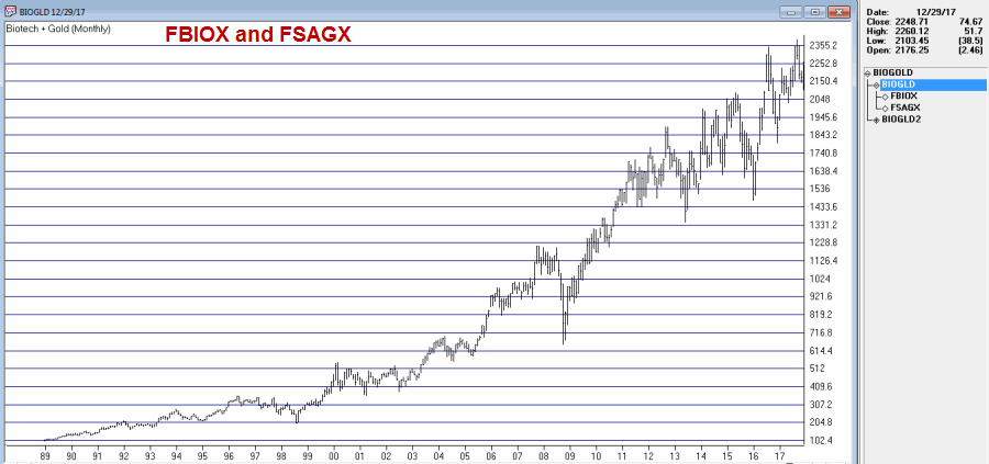
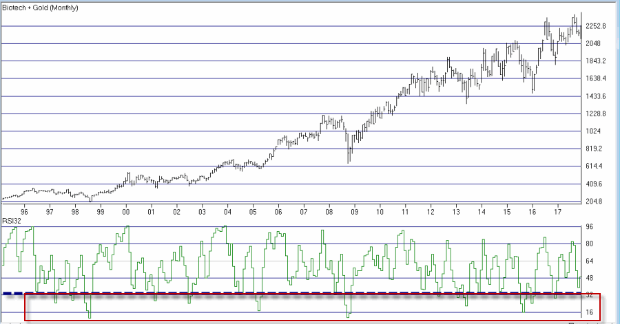
The BioGold Index
I created an “index” (such as it is) that combines Fidelity Select Biotech (FBIOX) and Fidelity Select Gold (FSAGX). The index appears in Figure 1. Like every other index in the world this index fluctuates up and down.
Figure 1 – Jay’s BioGold Index (CourtesyTradingExpert)
The RSI32 Index
The RSI32 Index is simply a 2-day average of the standard 3-day RSI Index. The code for TradingExpert EDS is below:
Define days3 5.
U3 is [close]-val([close],1).
D3 is val([close],1)-[close].
AvgU3 is ExpAvg(iff(U3>0,U3,0),days3).
AvgD3 is ExpAvg(iff(D3>=0,D3,0),days3).
RSI3 is 100-(100/(1+(AvgU3/AvgD3))).
RSI32 is simpleavg(RSI3,2).
The RSI32 Index for the BioGold Index appears on the monthly bar chart in Figure 2.
Figure 2 – The BioGold Index with RSI32 (drop to 33 or below = BUY) (CourtesyTradingExpert)
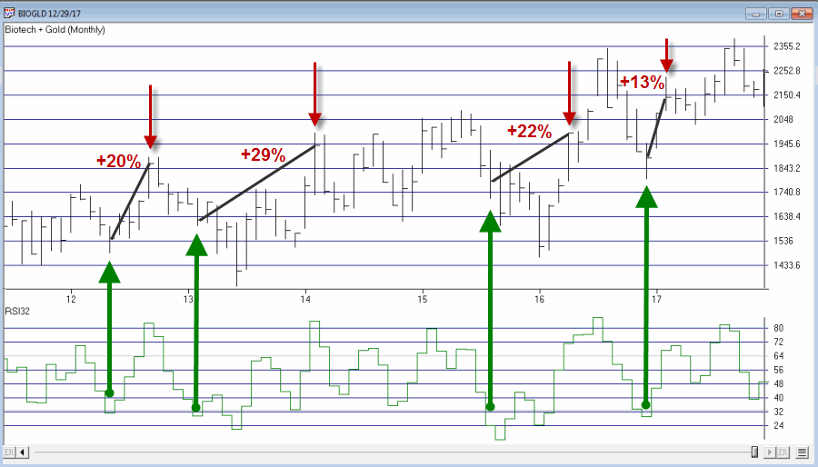
The BioGold “System”
The BioGold System works as follows:
*When the monthly RSI32 Index drops to 33 or lower, buy BOTH FBIOX and FSAGX
*After a “Buy Signal” then when the monthly RSI32 rises to 64 or higher, sell BOTH FBIOX and FSAGX
For testing purposes we will use monthly total return data for both FBIOX and FSAGX from the PEP Database from Callan Associates.
The Results
Figure 3 displays the results of the buy signals generated using the rules above (assumes that both FBIOX and FSAGX are bought after monthly RSI32 drops to 33 or lower and are held until monthly RSI32 rises to 64 or higher.
Buy Signal
Sell Signal
FBIOX+FSAGX % +(-)
4/30/1992
12/31/1992
+14.4%
2/26/1993
4/30/1993
+14.7%
4/29/1994
9/30/1994
+7.2%
12/30/1994
4/28/1995
+9.8%
4/30/1997
9/30/1997
+18.4%
11/28/1997
4/30/1998
+10.4%
6/30/1998
12/31/1998
+16.1%
3/30/2001
6/29/2001
+22.7%
7/31/2002
12/31/2002
+18.1%
7/30/2004
10/29/2004
+11.2%
3/31/2005
7/29/2005
+10.2%
4/30/2008
7/31/2008
+9.4%
9/30/2008
6/30/2009
+3.8%
5/31/2012
9/28/2012
+20.0%
2/28/2013
2/28/2014
+28.6%
8/31/2015
4/29/2016
+22.2%
12/30/2016
2/28/2017
+13.2%
Average %
+14.7%
Median %
+14.4%
Std. Deviation %
6.4%
Max % +(-)
+28.6%
Min % +(-)
+3.8%
Figure 3 – Trade-by-Trade Results
For the record, the “System” has been in FBIOX and FSAGX only 28% of the time (88 months) and out of the market 72% of the time (223 months).
Figure 4 displays the trades in recent years.
Figure 4 – BioGold System trades; 2012-2017 (Courtesy TradingExpert)
*The Good News is that all 17 signals since 1992 showed a profit, with an average gain if +14.7%.
*The Bad News is that, a) 17 trades in 25 years is a pretty small number of trades and, b) there are some not insignificant drawdowns along the way (-22.8% in 1998 and -22.4% in 2008, -14.1% in 2013 and -13.6% in 2016).
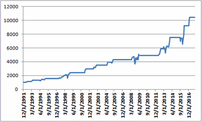
Still, for what it is worth the monthly equity curve appears in Figure 5.
Figure 5 – Growth of $1,000 invested using the “BioGold System”; 12/31/1991-12/29/2017
For the record, the “System” has been in FBIOX and FSAGX only 28% of the time (88 months) and out of the market 72% of the time (223 months).
For the record, the “System” has been in FBIOX and FSAGX only 28% of the time (88 months) and out of the market 72% of the time (223 months). No interest is assumed to be earned while out of the market in the test above.
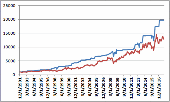
If we invest in short-term treasuries (1-3 yr.) while not in the stock market we get the results shown in Figure 6.
In Figure 6:
*The blue line represents the growth of $1,000 achieved by holding FBIOX and FSAGX when the BioGold System is on a “buy signal” and 1-3 yr. treasuries the rest of the time.
*The red line represents the growth of $1,000 achieved by buying and holding both FBIOX and FSAGX and then rebalancing at the end of each year.
The “System” grew to $19,863 and the “split” grew to $12,844.
Figure 6 – Growth of $1,000 using BioGold System plus 1-3 yr. treasuries when out of stocks (blue) versus buying and holding FBIOX and FSAGX and rebalancing each year (red);12/31/1991-12/29/2017
Summary
So is the “BioGold System” really a viable investment idea? That’s not for me to say. The per trade returns are pretty good but there aren’t a whole lot of trades and if history is a guide an investor would likely have to ride some significant drawdowns in order to reap the gains.
Still, market-beating performance is market-beating performance, so who knows?
Jay Kaeppel Chief Market Analyst at JayOnTheMarkets.com and AIQ TradingExpert Pro client.
Disclaimer: The data presented herein were obtained from various third-party sources. While I believe the data to be reliable, no representation is made as to, and no responsibility, warranty or liability is accepted for the accuracy or completeness of such information. The information, opinions and ideas expressed herein are for informational and educational purposes only and do not constitute and should not be construed as investment advice, an advertisement or offering of investment advisory services, or an offer to sell or a solicitation to buy any security.

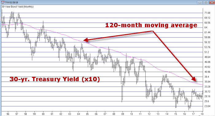 Figure 1 – 30-Yr. Treasury yields (Ticker TYX) with 120-month average (Courtesy TradingExpert)
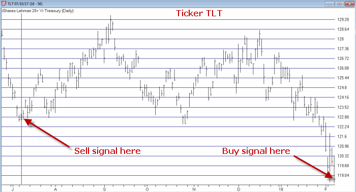 Figure 2 – Ticker TLT with recent Jay’s Metal Model signals (Courtesy TradingExpert)
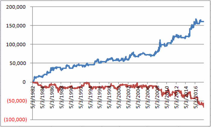 Figure 2 – T-bond futures $ gain/loss when Jay’s Metal Model is bullish (blue line) versus when model is bearish (red line)
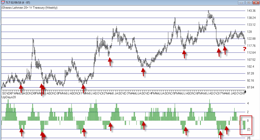 Figure 3 – Weekly TLT with UpDays20 Indicator (Courtesy TradingExpert)
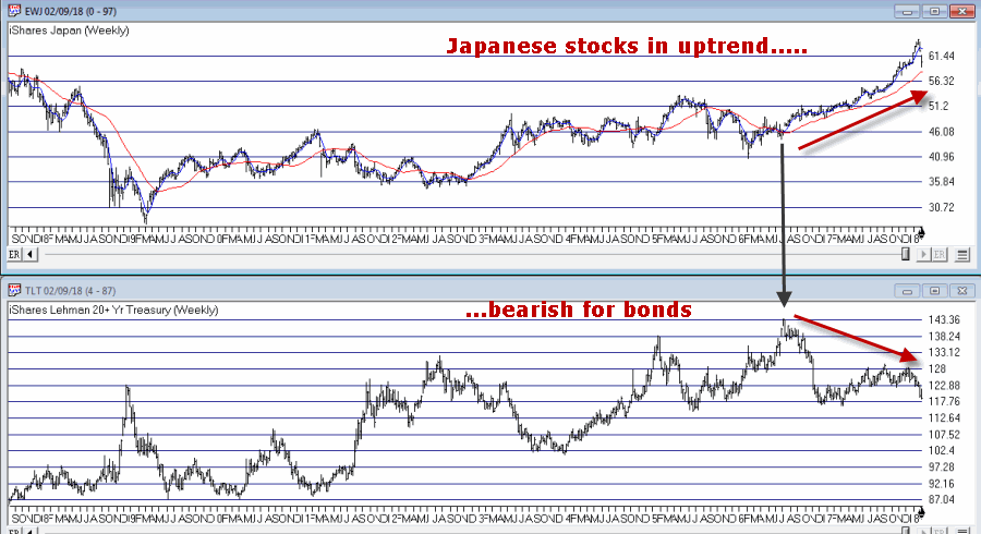 Figure 4 – Ticker TLT tends to trade inversely to ticker EWJ (Courtesy TradingExpert)