Aug 1, 2017 | jay kaeppel, market timing
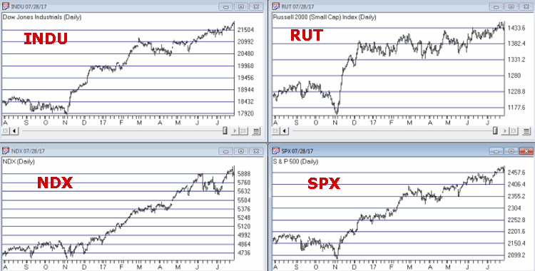
It is hard to look at Figure 1 and argue that the trend of the stock market is anything but bullish. Major averages making new all-time highs is essentially the very definition of a bull market. And indeed the market may continue to push higher indefinitely.
Figure 1 – Four Major Averages all at or near all-time highs (Courtesy
AIQ TradingExpert)
Trying to “pick a top” usually ends with an embarrassed prognosticator. Particularly when the major market averages are posting new highs. Still, there comes a time when it can pay to pay close attention for signs of “Trouble in Paradise”. That time may be now.
Four Bellwethers
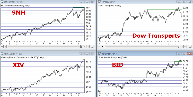
In this article I wrote about 4 “bellwethers” that I follow for potential “early warning signals”. So far no “run for cover” signals have appeared. Two of the four have confirmed the new highs in the market averages and the other two have not. If and when 3 or 4 of them fail to confirm that may signal trouble ahead.
Figure 2 – XIV and BID confirm news highs; SMH and TRAN so far have not (Courtesy
AIQ TradingExpert)
XIV and BID have confirmed new highs in the major averages (although the parabolic nature of XIV’s run is somewhat troubling to me) while SMH and the Dow Transports have not.
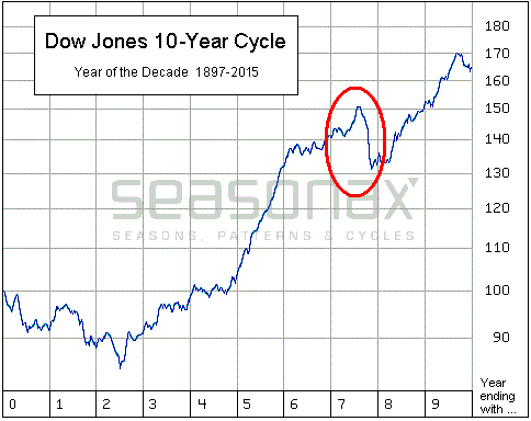
Post-Election/Year “7” Bermuda Triangle
I
have written about this a few times but it bears repeating here. Post-Election Years and Years ending in “7” (1907, 1917, etc.) have typically witnessed “trouble” in the second half of the year. Figures 3 and 4 are posted courtesy of a Twitter post from Larry McMillan of the
Option Strategist.
Figure 3 highlights the fact that the 2nd half of “Years 7” have often witnessed “trouble.”
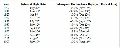
Figure 4 show that each “7” year posted a high during the 2nd half of the year (or in June) and then suffered a decline. This does not guarantee a repeat this year but it is a warning sign.
Figure 3 – Decade Pattern for the Dow Jones Industrials Average (Courtesy:
Options Strategist)
Also, during years that are both “post-election” years AND “Years ending in 7”, the August through October results have been brutal- as depicted in Figure 5 – with an average 3-month decline of -15%.
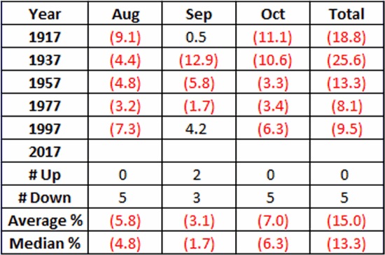
Figure 5 – August/September/October of Post-Election Years that also End in “7”
Nothing in Figures 3 through 5 “guarantee” an imminent market decline. They do however, constitute the reason the word “Beware” appears in the headline.
Valuation
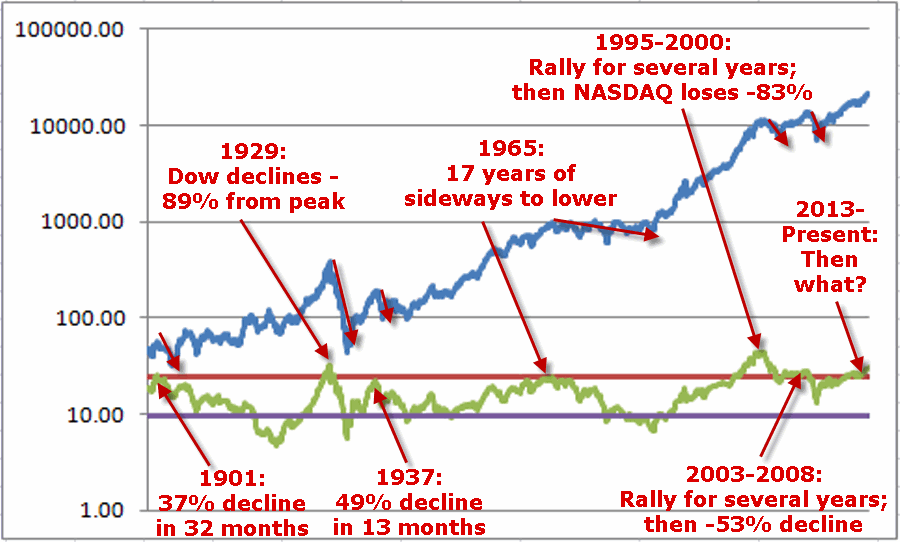
Last week I witnessed a presentation where a quite knowledgeable gentleman posted a chart of the Schiller PE Ratio. He made note of the fact that the Schiller PE Ratio has only been higher twice in modern history – 1929 and 2000. The 1929 peak was followed by an 89% decline by the Dow and the 2000 peak was followed by an 83% decline by the Nasdaq. So are we doomed to experience a devastating decline? Not necessarily. At least not necessarily anytime soon. The stock market became “overvalued” in 1995 and then continued to rally sharply higher for another 4+ years. Likewise, the market as theoretically been “overvalued” since 2013 – and so far so good.
Figure 6 shows the price action of the Dow Jones Industrials Average since 1901 in blue and the movements of the Schiller PE Ratio in green.
The peaks in the Schiller PE ratio in:
1901
1929
1937
1965
1995-2000
2003-2008
Were all followed by “something bad”.
While the exact timing is unknowable, as you can see in Figure 6, history does suggest that ultimately a “happy ending” is unlikely.
Figure 6 – A History Lesson in High Shiller PE Ratio Readings: Dow Jones Industrials Average (blue line) and Schiller PE Ratio (green line); 1901-present
Summary
I absolutely, positively DO NOT possess the ability to “predict” what is going to happen in the financial markets. I have gotten pretty good however, at identifying when risk is unusually high or low.
Current Status: Risk High
Because I don’t offer investment advice on this blog – and because my track record of “market calls” is so bad, no one should interpret anything in this article as a call to “Sell Everything”, especially since I haven’t even done that myself – us “trend-followers” usually take awhile to give up the ghost. In reality, I hope that stocks continue to rally and that this article ends up making me looking stupid, er, I mean “overly cautious”.
But the real point is simply that having plans, mechanisms, etc. to reduce risk in your portfolio makes sense.
Jay Kaeppel Chief Market Analyst at JayOnTheMarkets.com and TradingExpert Pro client.
Disclaimer: The data presented herein were obtained from various third-party sources. While I believe the data to be reliable, no representation is made as to, and no responsibility, warranty or liability is accepted for the accuracy or completeness of such information. The information, opinions and ideas expressed herein are for informational and educational purposes only and do not constitute and should not be construed as investment advice, an advertisement or offering of investment advisory services, or an offer to sell or a solicitation to buy any security.
Jul 5, 2017 | bonds, educational newsletters, ETFs, indexes, jay kaeppel, market timing
In the end it is not so much about “predicting” what will happen next in the financial markets, but rather recognizing – and being prepared for – the potential risks, that makes the most difference in the long run. So let’s start by looking at current trends.
Stocks
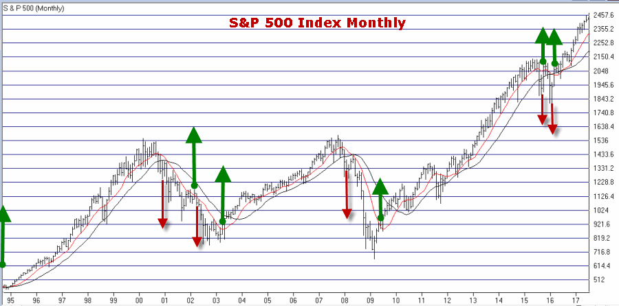
Let’s start with a most simple trend-following model that works like this:
-A sell signal occurs when the S&P 500 Index (SPX) registers two consecutive monthly closes below its 21-month moving average
-After a sell signal, a buy signal occurs when SPX register a single monthly close above its 10-month moving average.
Figure 1 displays recent activity.
Figure 1 – SPX Trend-Following signals (Courtesy
WinWayCharts)
The good news is that this model does a good job of being out of stocks during long bear markets (1973-74, 2000-2002, 2008-2009). The bad news is that – like any trend-following model – it gets “whipsawed” from time to time. In fact the two most recent signals resulted in missing out on the October 2015 and March 2016 rallies.
But note the use of the phrase “simple trend-following model” and the lack of phrases such as “precision market timing” and “you can’t lose trading the stock market”, etc.
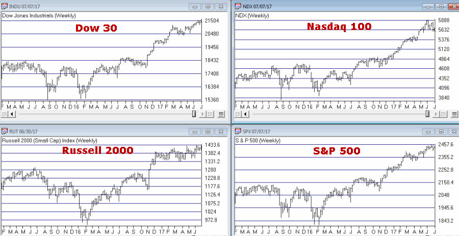
For now the trend is up. A few things to keep an eye on appear in Figures 2 and 3. Figure 2 displays four major averages. Keep an eye to see if these averages break out to the upside (see here) or if they move sideways to lower.
Figure 2 – Four Major Market Averages (Courtesy
WinWayCharts)
In addition, I suggest following
the 4 tickers in Figure 3 for potential “early warnings” – i.e., if the major averages hit new highs that are not confirmed by the majority of the tickers in Figure 3
.
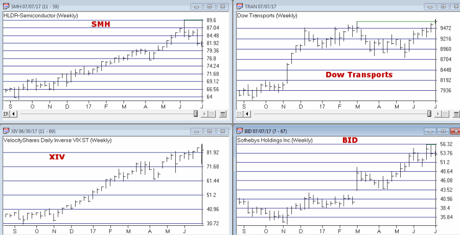
Figure 3 – Four potential “Early Warning” tickers (Courtesy
WinWayCharts)
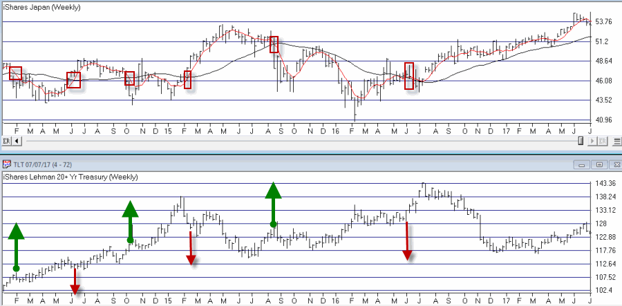
Bonds
My main “simple bond trend-following model” remains bearish. As you can see in Figure 4, a buy signal for bonds occurs when the 5-week moving average for ticker EWJ (Japanese stocks) drops below its 30-week moving average and vice versa.
Figure 4 – Ticker EWJ 5-week and 30-week moving average versus ticker TLT (Courtesy
WinWayCharts)
A 2nd model using metals to trade bonds has been bullish of late but is close to dropping back into bearish territory. Figure 5 displays the P/L from holding a long position of 1 t-bond futures contract ONLY when both the EWJ AND Metals models are bearish (red line) versus when EITHER model is bullish (blue line)
Figure 5 – T-bond futures $ gain/loss when EWJ OR Metals Models are Bullish (blue line) versus when EWJ AND Metals Models are both Bearish (red line); August 1990-present
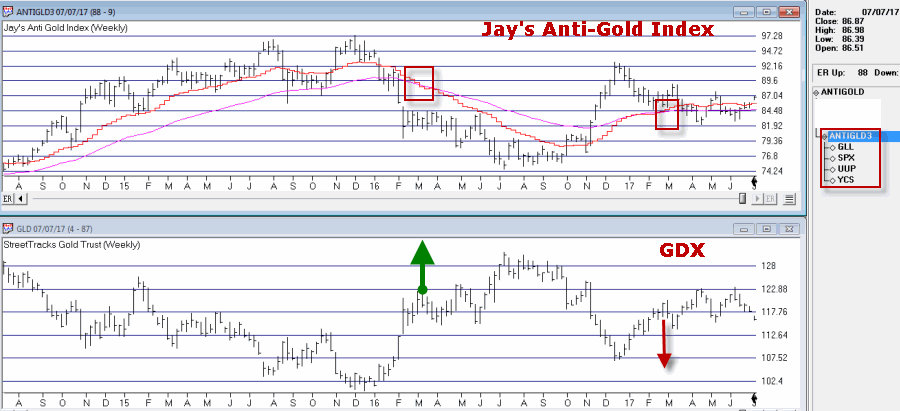
Gold
My most basic gold trend-following model is still bearish. This model uses my “Anti-Gold Index” (comprised of tickers GLL, SPX, UUP and YCS). It is bullish for gold when a Front-Weighted Moving Average (detailed here) is below the 55-week exponential moving average and vice versa.
Figure 6 – Jay’s “Anti-Gold Index” versus ticker GLD (Courtesy
WinWayCharts)
Summary
So at the moment the stock model is bullish and the bond and gold models are bearish. Are these trends certain to persist ad infinitum into the future? Definitely not. Will the models detailed here provide timely signals regarding when to get in or out the next time around? Sorry, but it doesn’t always work that way with trend-following.
But as for me I prefer “riding the trend” to “predicting the future.”
Some painful lessons just stick with you I guess.
Jay Kaeppel Chief Market Analyst at JayOnTheMarkets.com and TradingExpert Pro client.
Disclaimer: The data presented herein were obtained from various third-party sources. While I believe the data to be reliable, no representation is made as to, and no responsibility, warranty or liability is accepted for the accuracy or completeness of such information. The information, opinions and ideas expressed herein are for informational and educational purposes only and do not constitute and should not be construed as investment advice, an advertisement or offering of investment advisory services, or an offer to sell or a solicitation to buy any security.
May 22, 2017 | ETFs, indexes, jay kaeppel, market timing
I keep hearing that investors are “skittish” and “concerned” about the markets and the economy and so forth. But the recent action in a relatively obscure ETF jumped out at me and seems to suggest that this is not necessarily the case – at least not among those who are active in the markets. From what I can tell these people don’t have a care in the world. See what you think.
What is Ticker SVXY?
A few key concepts:
*Implied volatility (IV) essentially measures the level of time premium built into the price of a given option or series of options on a given security. In anxious times implied volatility will rise – sometimes sharply – as an increase in demand by speculators rushing to buy options to protect / hedge / speculate / etc in a given security, causes time premium to inflate. When traders are less worried or more complacent then implied volatility will typically fall as decreased option buying pressure results in lower time premiums.
In sum, high and/or sharply rising IV typically signals fear, low and or declining IV typically signals a lack thereof.
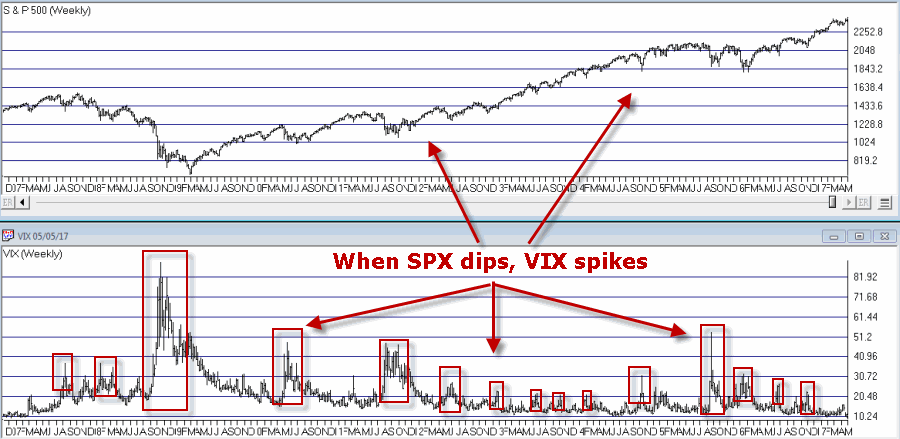
*The VIX Index (see Figure 1) measures the implied volatility of options for the S&P 500 Index traded at the CBOE. Typically when the stock market declines – especially when it declines sharply – the VIX index tends to “spike” as fearful traders rush in and bid up S&P 500 Index option prices
Figure 1 – VIX Index (trading inversely to S&P 500 Index)
(Courtesy WinWayCharts)*In essence, the VIX Index is “inversely correlated” to the stock market.
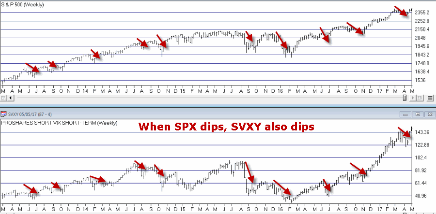
*Ticker SVXY is an ETF that is designed to track the “inverse” of the VIX Index. In other words, when VIX rises, SVXY falls and vice versa. This also means the following:
*Ticker SVXY is highly correlated to the SP 500 Index. In other words, as the stock market moves higher SVXY typically also moves higher and vice versa.
Figure 2 – SVXY (movements are correlated to the S&P 500 index)
(Courtesy WinWayCharts)In sum, a declining trend in the price of SVXY shares typically signals fear, while a rising trend in the price of SXVY typically signals a lack thereof.
Now to My Concern
Hopefully some of that made sense. In a nutshell, the key takeaways are that when fear is low:
*SVXY rises
*Implied volatility declines
But what if both go to extremes? Is that a bad thing? The reason I ask appears in Figure 3.
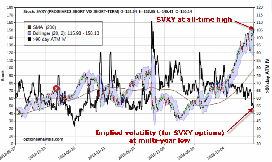
Figure 3 – Ticker SVXY at an all-time high with implied volatility for options on ticker SVXY plunging (both pointing to a lack of fear)
As far as I can tell, this is what a lack of fear looks like:
*Ticker SVXY is rising dramatically
*Implied volatility (SVXY options) is plunging
In the last 4 years there has never been a bigger disparity between these two measures of “fear” – and they are both pointing to “no fear.”
Summary
So the obvious question now is – does any of this matter? I mean this is more of a “perspective” indicator (“where we are now”) than a “timing’ indicator (“where we are headed next”). I cannot presently point out a way to use this to generate specific buy and sell signals.
In addition, as a trend-follower I am not the type to make any “Aha, the End is Near” type pronouncements. As long as the market wants to keep running higher I am happy to “go along for the ride.”
But the less I see my fellow riders being concerned about the market, the more concerned I become.
In the long run that instinct has served me well.
(Here’s hoping that my instinct is wrong this time)
Jay Kaeppel
Disclaimer: The data presented herein were obtained from various third-party sources. While I believe the data to be reliable, no representation is made as to, and no responsibility, warranty or liability is accepted for the accuracy or completeness of such information. The information, opinions and ideas expressed herein are for informational and educational purposes only and do not constitute and should not be construed as investment advice, an advertisement or offering of investment advisory services, or an offer to sell or a solicitation to buy any security.
May 8, 2017 | bonds, EDS, EDS code, educational newsletters, ETFs, jay kaeppel
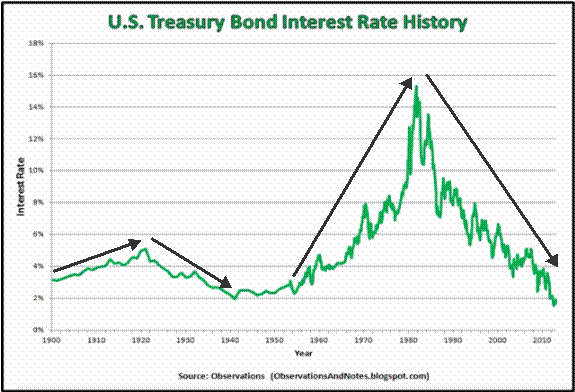
There is great trepidation in the bond market these days. Most investors seem to have the “interest rates are sure to rise” mantra playing on auto loop in their head. And this is not entirely unwarranted. Given the historical tendency for bond yields to move in long, slow trends (20 years or more essentially in one direction is not uncommon), I for one am pretty confident in believing that interest rates will be higher 20 years from now than they are now.
But that is not the fear that is playing in people’s heads. The fear in people’s heads is that rates are rising soon (like immediately) and in a big way. This however, may or may not prove to be the case.
Figure 1 displays a history of 10-year treasury yields through about 2012 (FYI 10-yr. yields are roughly in changed since that time). Note the long-term nature of interest rate trends and that while there are “spikes” here and there, most major moves play out over time and not in “here today, sharply higher tomorrow” fashion.
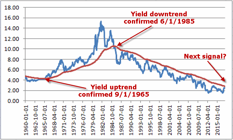
Also, you can see in Figure 2 – one can make a compelling argument that bond yields are not “officially rising”, at least not yet.
Figure 2 – Yields still “officially” in a downtrend
Bonds are Due to Bounce – But Will They?
One way to identify important turning points in any market is when a market doesn’t do something that it would normally be expected to do. For example, here is a simple thought process:
1) The bond market is oversold
2) In the past 30 years, pretty much anytime it would get oversold a rally ensued
3) Therefore, bonds should rally soon
But will they – that is the question. And in my opinion, the answer is important.
*If bonds rally soon (i.e., over the course of say the next several months) then “the status may still be quo”.
*If bonds do not rally soon, then it may be a sign that “things are changing”
Which Way Bonds?
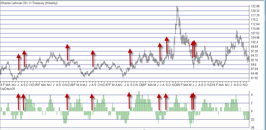
Figures 3 and 4 below display ticker TLT (an ETF that tracks the long-term treasury bond) with an indicator I call UpDays20. In this case we are looking at weekly bars and not daily bars, but the concept is the same.
UpDays20 is calculated by simply adding up all of the weeks that have showed a weekly gain over the past 20 weeks and then subtracting 10 (the WinWay Charts Expert Design Studio code appears at the end of this article, after the disclaimer).
If 10 of the past 20 weeks have showed a weekly gain then the upDays20 indicator will read 0 (i.e., a total of 10 weeks were up minus 10 = 0). If only 6 weeks showed a gain in the past 20 weeks then the UpDays20 indicator will read -4, etc.
What to look for: Typically (at least in the declining rate environment of recent decades) when UpDays20 rises by a value of 2 from a low of -2 or less, a decent rally in bonds has ensued.
For example, if UpDays20 falls to -4 then a rise to -2 or higher triggers a buy signal. If it falls only as low as -3 then a rise to -1 or higher is required. If it falls only as low as -2 then a rise to 0 or higher is required.
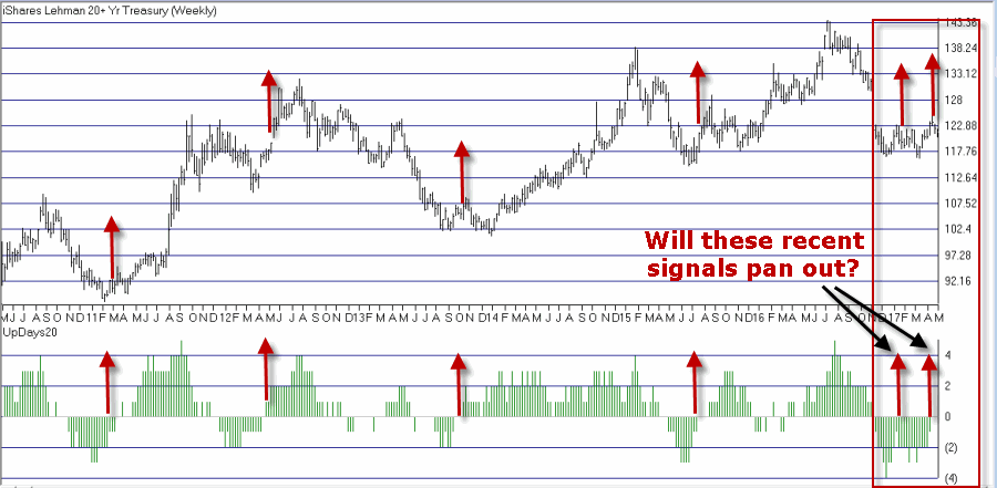
Figures 3 and 4 highlight signals since roughly 2004.
Figure 3 – Ticker TLT with UpDays20 weekly buy signals (2004-2010); (Courtesy
WinWay TradingExpert )
Figure 4 – Ticker TLT with UpDays20 weekly buy signals (2010-2017); (Courtesy
WinWay TradingExpert )
As you can see in Figures 3 and 4, most of the signals highlighted were followed by at least a decent short-term rally.
In 2017, buy signals from the UpDays20 indicator occurred on 1/13 and 4/14. TLT is up +0.3% since the 1/13 signal and down -1.4% since the 4/14 signal.
Summary
Either:
1) This is an excellent time to buy the long-term bond (looking for at least a short to intermediate term rally) as a rally is overdue
OR
2) The “times they may be a changing” for bonds
So keep an eye on TLT over the next several months.
Jay Kaeppel
Disclaimer: The data presented herein were obtained from various third-party sources. While I believe the data to be reliable, no representation is made as to, and no responsibility, warranty or liability is accepted for the accuracy or completeness of such information. The information, opinions and ideas expressed herein are for informational and educational purposes only and do not constitute and should not be construed as investment advice, an advertisement or offering of investment advisory services, or an offer to sell or a solicitation to buy any security.
WinWay TradingExpert Expert Design Studio Code for UpDays20
Up1 if [close] > val([close],1).
Up2 if val([close],1) > val([close],2).
Up3 if val([close],2) > val([close],3).
Up4 if val([close],3) > val([close],4).
Up5 if val([close],4) > val([close],5).
Up6 if val([close],5) > val([close],6).
Up7 if val([close],6) > val([close],7).
Up8 if val([close],7) > val([close],8).
Up9 if val([close],8) > val([close],9).
Up10 if val([close],9) > val([close],10).
Up11 if val([close],10) > val([close],11).
Up12 if val([close],11) > val([close],12).
Up13 if val([close],12) > val([close],13).
Up14 if val([close],13) > val([close],14).
Up15 if val([close],14) > val([close],15).
Up16 if val([close],15) > val([close],16).
Up17 if val([close],16) > val([close],17).
Up18 if val([close],17) > val([close],18).
Up19 if val([close],18) > val([close],19).
Up20 if val([close],19) > val([close],20).
UpCount is (Up1+ Up2+Up3+Up4+Up5+Up6+Up7+Up8+Up9+Up10+Up11+Up12+Up13+Up14+Up15+Up16+Up17+Up18+Up19+Up20)-10.
Apr 7, 2017 | educational newsletters, ETFs, indicators, jay kaeppel
First things first: I am primarily a trend-follower (this is based on, a) the relative long-term benefits of following trends and b) my lack of ability to actually “predict” anything – but I digress).
As a trend-follower I love the fact that the stock market has been trending higher and the fact that there is so much “angst” regarding the “inevitable top.” Still, like a lot of investors I try to spot “early warning signs” whenever possible. Here are the four “things” I am following now for signs of trouble.
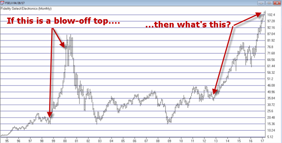
Fidelity Select Electronics
In Figure 1 you see, a) the blow-off top of 1999-2000 and b) today. Are the two the same? I guess only time will tell. But the point is, I can’t help but think that if and when the bloom comes off of the electronics boom, overall trouble will follow. Here is hoping that I am not as correct here as I was
here.
Just asking.
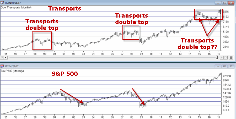
Transportation Index
As you can see in Figure 2, the Dow Transports has a history of making double tops which is followed by trouble in the broader market. Are we in the process of building another double top? And will trouble follow if we are? Dunno, hence the reason it is on my “Watch List” rather than on my “OH MY GOD SELL EVERYTHING NOW!!!!! List”.
I guess we’ll just have to wait and see.
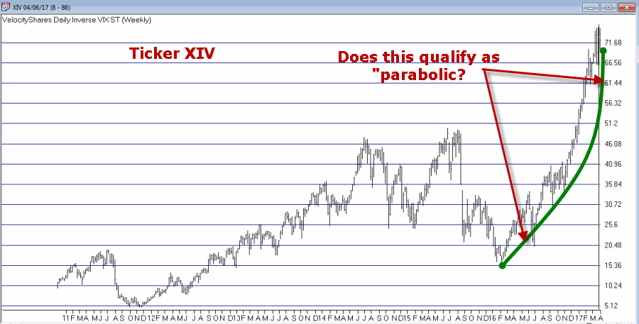
Ticker XIV
Ticker XIV is an ETF that is designed to track inverse the VIX Index. As a refresher, the VIX Index tends to “spike” higher when stocks fall sharply and to decline when stocks are rising and/or relatively quiet. To put it in simpler terms, in a bull market ticker XIV will rise. As you can see in Figure 3 one might argue that XIV has gone “parabolic”. This is a potential warning sign (assuming you agree that the move is parabolic) as a parabolic price move for just about anything is almost invariably followed by, well, let’s just say, “not so pretty”.
Let’s hope not. Because if it does qualify as parabolic that’s a very bad sign.
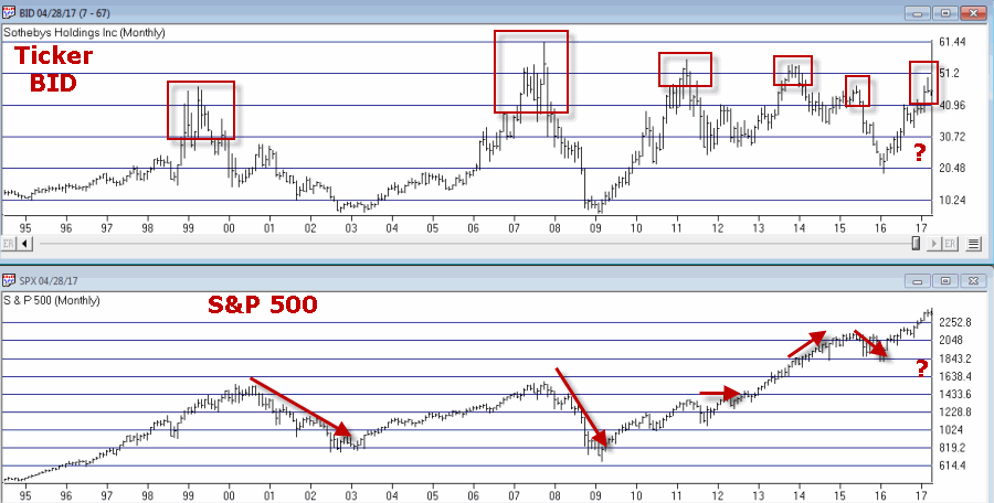
Ticker BID
This one may or may not be relevant but for what it is worth, Sotheby’s (ticker BID) has on several occasions served as something of a “leading indicator” at stock market tops (for the record it has also given some false signals, so this one is more for perspective purposes rather than actual trading purposes). Still, if this one tops out in conjunction with any or all of the above, it would likely serve as a useful warning sign.
Summary
There is no “urgent action” to be taken based on any of this. Bottom line: Nothing in this article should trigger you to run for the exits.
Still, it might be wise to at least take a look around and “locate the exit nearest you.”
You know, just in case.
Disclaimer: The data presented herein were obtained from various third-party sources. While I believe the data to be reliable, no representation is made as to, and no responsibility, warranty or liability is accepted for the accuracy or completeness of such information. The information, opinions and ideas expressed herein are for informational and educational purposes only and do not constitute and should not be construed as investment advice, an advertisement or offering of investment advisory services, or an offer to sell or a solicitation to buy any security.
Feb 2, 2017 | educational newsletters, jay kaeppel, seasonal, Stock trading
I’ve been seeing a number of panicked missives lately regarding the retailing sector. They typically go something like this:
“Despite new highs for most of the major market indexes, the retailing sector has been struggling – and in some cases hit hard – therefore it is clearly (paraphrasing here) THE END OF THE WORLD AS WE KNOW IT, AHHHHHHHHHHHHH……………………..”
Or something along those lines. And the truth is that they may be right. But as it turns out, with the retailing sector it is typically more a question of “when” and not “what” (or even WTF
Recent Results
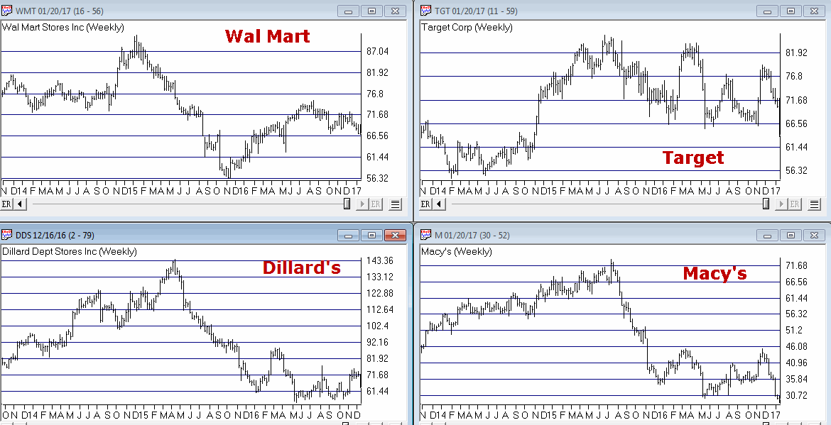
The concerns alluded to above are understandable given recent results in certain segments of the retailing sector. Figure 1 displays the stock price action for four major retailers. It isn’t pretty.
(click to enlarge)
So if major retailers are performing poorly one can certainly see why someone might extrapolate this to conclude that the economy is not firing on all cylinders and that the recent rally to new highs by the major averages is just a mirage. And again, that opinion may ultimately prove to be correct this time around.
But before swearing off of retailing stocks, consider the following.
Retailers – When not What
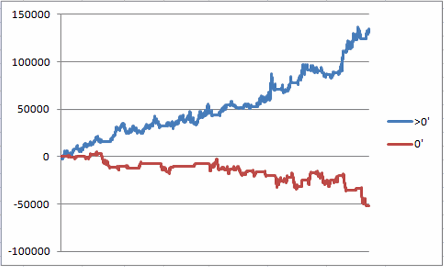
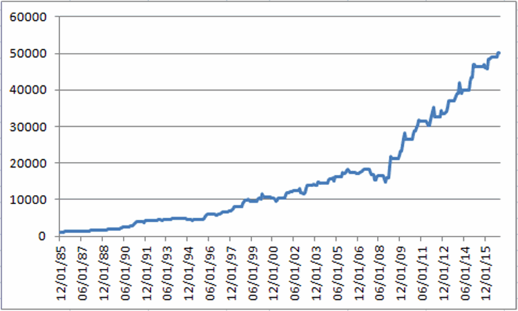
For our test we will use monthly total return data for the Fidelity Select Retailing sector fund (ticker FSRPX). Figure 2 displays the growth of $1,000 invested in FSRPX only during the months of:
*February, March, April, May, November, December
Figure 2 – Growth of $1,000 invested in ticker FSRPX only during the “favorable” months since 1986
For the record:
*An initial $1,000 grew to $50,274, or +4,927% (this test does not include any interest earned during the months out of FSRPX).
*# of years showing a net gain = 27
*# of years showing a net loss = 4
*Average UP year = +17.0%
*Average DOWN year = (-3.4%)
*Maximum UP Year = +50.0% (1990)
*Maximum DOWN Year = (-5.9%) (1994)
The Year-by-Year Results appear in Figure 3
| Year |
% +(-) |
| 1986 |
26.2 |
| 1987 |
15.8 |
| 1988 |
12.2 |
| 1989 |
16.9 |
| 1990 |
50.0 |
| 1991 |
45.5 |
| 1992 |
8.0 |
| 1993 |
4.6 |
| 1994 |
(5.9) |
| 1995 |
3.0 |
| 1996 |
26.1 |
| 1997 |
18.1 |
| 1998 |
45.7 |
| 1999 |
4.0 |
| 2000 |
1.8 |
| 2001 |
12.5 |
| 2002 |
(0.1) |
| 2003 |
18.5 |
| 2004 |
11.3 |
| 2005 |
10.3 |
| 2006 |
0.1 |
| 2007 |
(2.8) |
| 2008 |
(4.7) |
| 2009 |
44.9 |
| 2010 |
24.5 |
| 2011 |
4.6 |
| 2012 |
10.8 |
| 2013 |
16.6 |
| 2014 |
11.5 |
| 2015 |
6.1 |
| 2016 |
9.2 |
Figure 3 – Year-by-Year Results for “Favorable” Months since 1986
The Rest of the Year
If for some reason you had decided to skip the months above and hold FSRPX only during all of the other months of the year, your results appear in Figure 4.
Figure 4 – Growth of $1,000 invested in ticker FSRPX only during the “unfavorable” months since 1986
For the record:
*An initial $1,000 grew to $1,037, or +3.7% (this test does not include any interest earned during the months out of FSRPX).
Summary
Is the retailing sector guaranteed to generate a gain during our “favorable” months in 2017? Not at all. Still, given that retailing is presently beaten down a bit and the fact that the worst full year loss during the favorable months was -5.9%, it may be time to think about taking a look (although – as always, and for the record – I am not “recommending” retailing stocks, only pointing out the historical trends).
Still, as the old saying goes, the results below are what we “quantitative types” refer to as “statistically significant”.
*Favorable months since 1986 = +4,927%
*Unfavorable months since 1986 = +3.7%