Jul 5, 2017 | bonds, educational newsletters, ETFs, indexes, jay kaeppel, market timing
In the end it is not so much about “predicting” what will happen next in the financial markets, but rather recognizing – and being prepared for – the potential risks, that makes the most difference in the long run. So let’s start by looking at current trends.
Stocks
Let’s start with a most simple trend-following model that works like this:
-A sell signal occurs when the S&P 500 Index (SPX) registers two consecutive monthly closes below its 21-month moving average
-After a sell signal, a buy signal occurs when SPX register a single monthly close above its 10-month moving average.
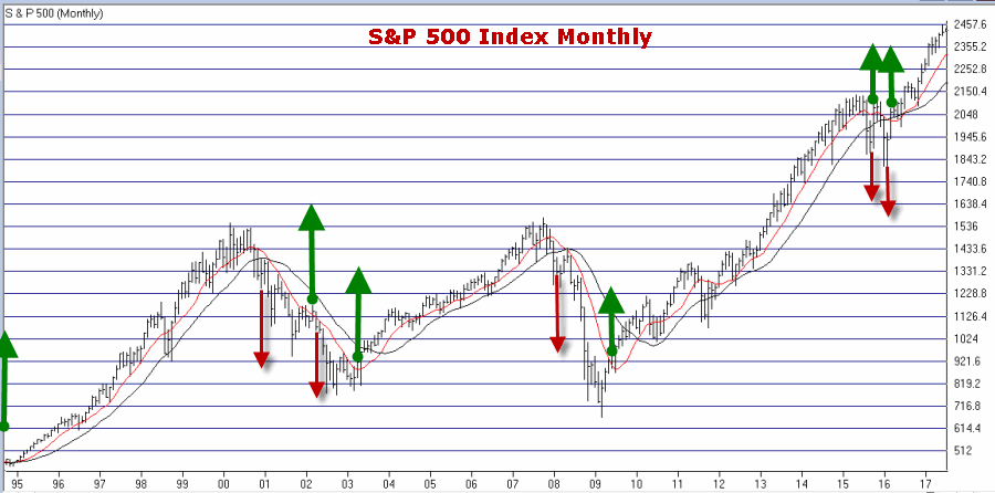
Figure 1 displays recent activity.
Figure 1 – SPX Trend-Following signals (Courtesy
WinWayCharts)
The good news is that this model does a good job of being out of stocks during long bear markets (1973-74, 2000-2002, 2008-2009). The bad news is that – like any trend-following model – it gets “whipsawed” from time to time. In fact the two most recent signals resulted in missing out on the October 2015 and March 2016 rallies.
But note the use of the phrase “simple trend-following model” and the lack of phrases such as “precision market timing” and “you can’t lose trading the stock market”, etc.
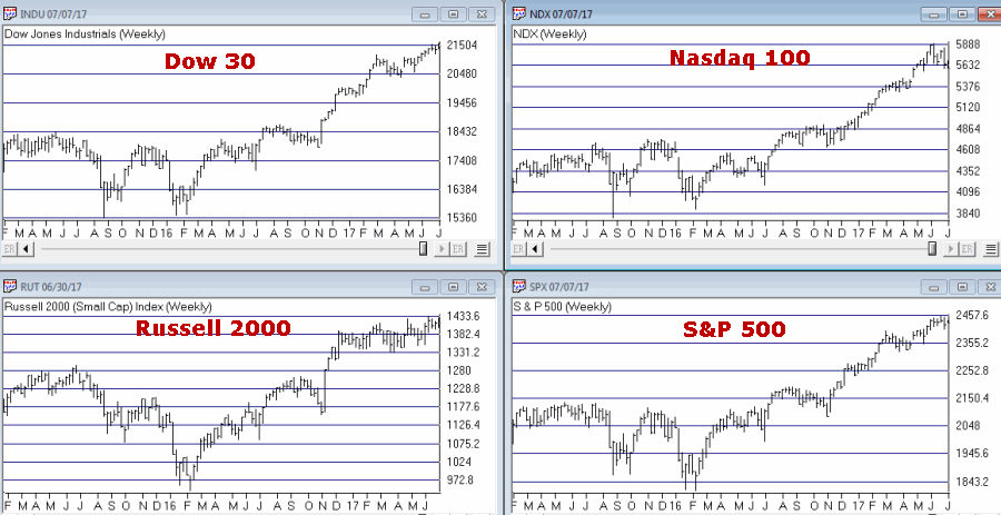
For now the trend is up. A few things to keep an eye on appear in Figures 2 and 3. Figure 2 displays four major averages. Keep an eye to see if these averages break out to the upside (see here) or if they move sideways to lower.
Figure 2 – Four Major Market Averages (Courtesy
WinWayCharts)
In addition, I suggest following
the 4 tickers in Figure 3 for potential “early warnings” – i.e., if the major averages hit new highs that are not confirmed by the majority of the tickers in Figure 3
.
Figure 3 – Four potential “Early Warning” tickers (Courtesy
WinWayCharts)
Bonds
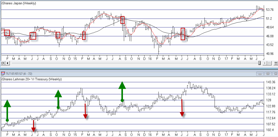
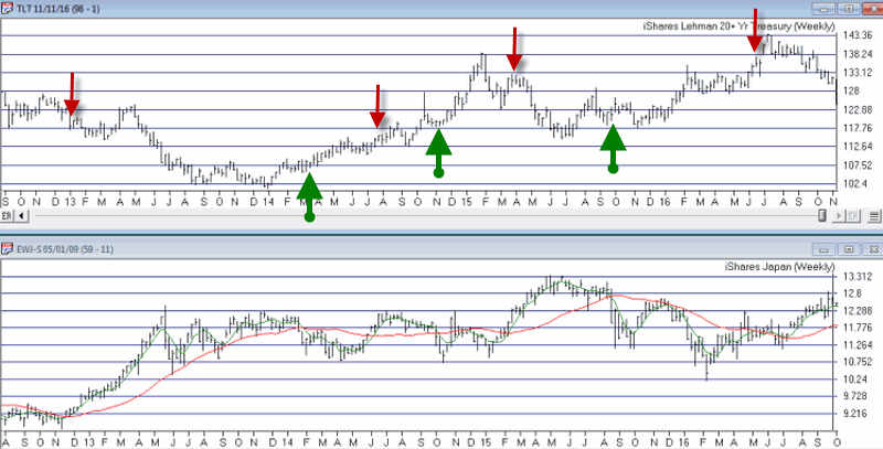
My main “simple bond trend-following model” remains bearish. As you can see in Figure 4, a buy signal for bonds occurs when the 5-week moving average for ticker EWJ (Japanese stocks) drops below its 30-week moving average and vice versa.
Figure 4 – Ticker EWJ 5-week and 30-week moving average versus ticker TLT (Courtesy
WinWayCharts)
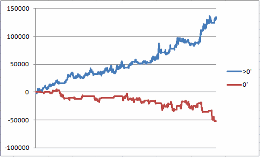
A 2nd model using metals to trade bonds has been bullish of late but is close to dropping back into bearish territory. Figure 5 displays the P/L from holding a long position of 1 t-bond futures contract ONLY when both the EWJ AND Metals models are bearish (red line) versus when EITHER model is bullish (blue line)
Figure 5 – T-bond futures $ gain/loss when EWJ OR Metals Models are Bullish (blue line) versus when EWJ AND Metals Models are both Bearish (red line); August 1990-present
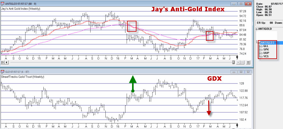
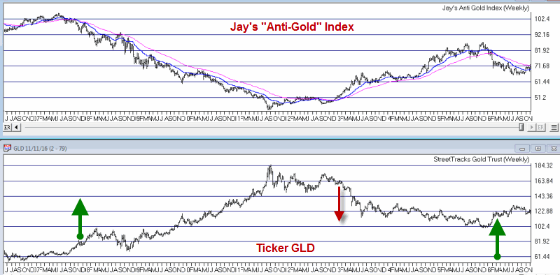
Gold
My most basic gold trend-following model is still bearish. This model uses my “Anti-Gold Index” (comprised of tickers GLL, SPX, UUP and YCS). It is bullish for gold when a Front-Weighted Moving Average (detailed here) is below the 55-week exponential moving average and vice versa.
Figure 6 – Jay’s “Anti-Gold Index” versus ticker GLD (Courtesy
WinWayCharts)
Summary
So at the moment the stock model is bullish and the bond and gold models are bearish. Are these trends certain to persist ad infinitum into the future? Definitely not. Will the models detailed here provide timely signals regarding when to get in or out the next time around? Sorry, but it doesn’t always work that way with trend-following.
But as for me I prefer “riding the trend” to “predicting the future.”
Some painful lessons just stick with you I guess.
Jay Kaeppel Chief Market Analyst at JayOnTheMarkets.com and TradingExpert Pro client.
Disclaimer: The data presented herein were obtained from various third-party sources. While I believe the data to be reliable, no representation is made as to, and no responsibility, warranty or liability is accepted for the accuracy or completeness of such information. The information, opinions and ideas expressed herein are for informational and educational purposes only and do not constitute and should not be construed as investment advice, an advertisement or offering of investment advisory services, or an offer to sell or a solicitation to buy any security.
May 22, 2017 | ETFs, indexes, jay kaeppel, market timing
I keep hearing that investors are “skittish” and “concerned” about the markets and the economy and so forth. But the recent action in a relatively obscure ETF jumped out at me and seems to suggest that this is not necessarily the case – at least not among those who are active in the markets. From what I can tell these people don’t have a care in the world. See what you think.
What is Ticker SVXY?
A few key concepts:
*Implied volatility (IV) essentially measures the level of time premium built into the price of a given option or series of options on a given security. In anxious times implied volatility will rise – sometimes sharply – as an increase in demand by speculators rushing to buy options to protect / hedge / speculate / etc in a given security, causes time premium to inflate. When traders are less worried or more complacent then implied volatility will typically fall as decreased option buying pressure results in lower time premiums.
In sum, high and/or sharply rising IV typically signals fear, low and or declining IV typically signals a lack thereof.
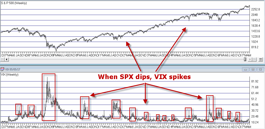
*The VIX Index (see Figure 1) measures the implied volatility of options for the S&P 500 Index traded at the CBOE. Typically when the stock market declines – especially when it declines sharply – the VIX index tends to “spike” as fearful traders rush in and bid up S&P 500 Index option prices
Figure 1 – VIX Index (trading inversely to S&P 500 Index)
(Courtesy WinWayCharts)*In essence, the VIX Index is “inversely correlated” to the stock market.
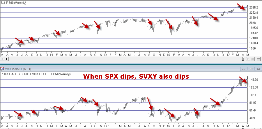
*Ticker SVXY is an ETF that is designed to track the “inverse” of the VIX Index. In other words, when VIX rises, SVXY falls and vice versa. This also means the following:
*Ticker SVXY is highly correlated to the SP 500 Index. In other words, as the stock market moves higher SVXY typically also moves higher and vice versa.
Figure 2 – SVXY (movements are correlated to the S&P 500 index)
(Courtesy WinWayCharts)In sum, a declining trend in the price of SVXY shares typically signals fear, while a rising trend in the price of SXVY typically signals a lack thereof.
Now to My Concern
Hopefully some of that made sense. In a nutshell, the key takeaways are that when fear is low:
*SVXY rises
*Implied volatility declines
But what if both go to extremes? Is that a bad thing? The reason I ask appears in Figure 3.
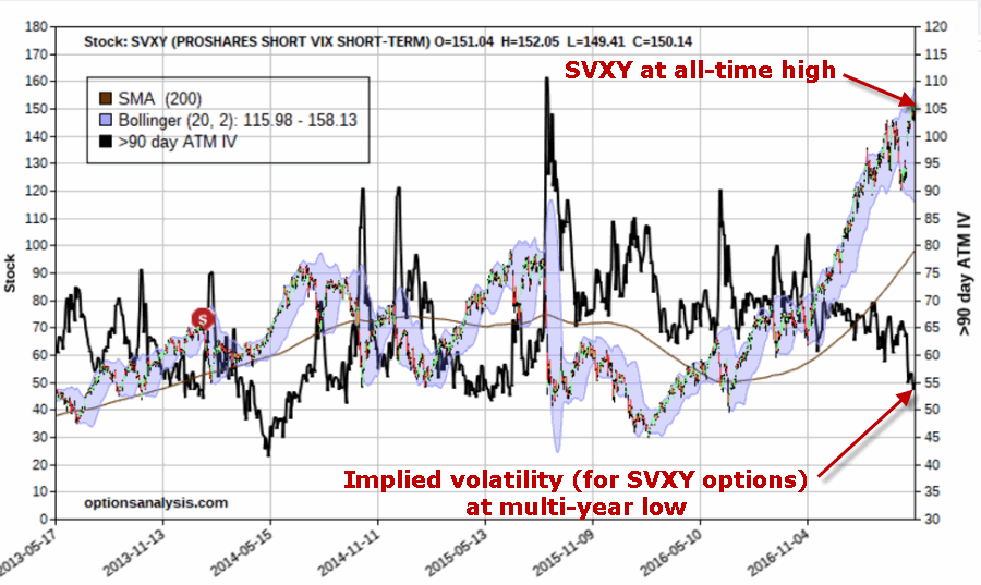
Figure 3 – Ticker SVXY at an all-time high with implied volatility for options on ticker SVXY plunging (both pointing to a lack of fear)
As far as I can tell, this is what a lack of fear looks like:
*Ticker SVXY is rising dramatically
*Implied volatility (SVXY options) is plunging
In the last 4 years there has never been a bigger disparity between these two measures of “fear” – and they are both pointing to “no fear.”
Summary
So the obvious question now is – does any of this matter? I mean this is more of a “perspective” indicator (“where we are now”) than a “timing’ indicator (“where we are headed next”). I cannot presently point out a way to use this to generate specific buy and sell signals.
In addition, as a trend-follower I am not the type to make any “Aha, the End is Near” type pronouncements. As long as the market wants to keep running higher I am happy to “go along for the ride.”
But the less I see my fellow riders being concerned about the market, the more concerned I become.
In the long run that instinct has served me well.
(Here’s hoping that my instinct is wrong this time)
Jay Kaeppel
Disclaimer: The data presented herein were obtained from various third-party sources. While I believe the data to be reliable, no representation is made as to, and no responsibility, warranty or liability is accepted for the accuracy or completeness of such information. The information, opinions and ideas expressed herein are for informational and educational purposes only and do not constitute and should not be construed as investment advice, an advertisement or offering of investment advisory services, or an offer to sell or a solicitation to buy any security.
Nov 11, 2016 | bonds, chart patterns, educational newsletters, ETFs, indexes, jay kaeppel
In real estate, it’s “Location, Location, Location.” In the financial markets it’s “the Trend, the Trend, the Trend.” There is a great deal of certainty about what will happen next in stocks, bonds and gold. But the key to successfully navigating these turbulent times starts not with predicting the future but rather with identifying the current trend in the here and now and going from there. So let’s take a look at, well, what else, the trends.
I have certain trend-following models that I follow to help me to determine which way to be leaning in the markets. Like any trend-following method they are far from perfect (my stock market model for example, suffered not one but two significant whipsaws in the last year+). But for me there is no expectation that they will be perfect. The only goal is to catch most of the upside during major bull markets, and miss much of the downside during major bear markets.
Stocks
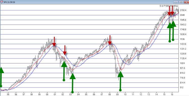
For stocks I look at the 10-month and 21-month moving averages for the S&P 500 Index and use the following rules:
*A sell signal occurs when the S&P 500 closes 2 consecutive months below its 21-month moving average AND is also below its 10-month moving average
*Following a sell signal a new buy signal occurs when the S&P 500 registers a monthly close above its 10-month moving average
Figure 1 – Stock Market trend-following signals (Courtesy TradingExpert)
This method avoided much of the 1973-1974, 2000-2002 and 2008 bear market destruction. That’s the good news. The bad news is that it sold at the end of September 2015 and at the end of February 2016 – both just prior to powerful upside reversals (like I said, trend-following models ain’t perfect).
The most recent signal was a buy signal on 3/31/2016.
So the trend for stocks is presently BULLISH
Bonds
I have written several posts about this in the past. My favorite bond timing indicator is Japanese stocks. No seriously. They have a string tendency to trade inversely to the 30-yr US t-bond. I track ticker EWJ and watch the 5-week and 30-week moving averages. Because Japanese stocks and t-bonds trade inversely I use the following rules:
*A buy signal for bonds occurs when the 5-week moving average for EWJ drops below the 30-week moving average for EWJ
*A sell signal for bonds occurs when the 5-week moving average for EWJ rises above the 30-week moving average for EWJ
The most recent signal was a sell signal for t-bonds on 6/10/2016
So the trend for bonds is presently BEARISH
Figure 2 – Bond trend-following signals(Courtesy TradingExpert)
Gold
For gold I use two moving averages on a weekly chart for something I refer to as Jay’s Anti-Gold Index. Rather than go into a long explanation I will link to the
original article on the topic and offer a short explanation. In AIQ TradingExpert I created a ticker comprised of 4 other tickers (GLL, RYSDX, SPX and YCS) which all trade in a negatively correlated manner to the price of gold (er, usually).
One moving average I call the “FrontWeighted36DayMA” (“FrontWeightedMA” for short. The calculations are based on someone else’s work – unfortunately I cannot recall the person’s name so cannot give proper credit. Hopefully Karma will work and somewhere that person will Have a Nice Day without really knowing why. The calculations are a bit long-winded so the AIQ TradingExpert code appears at the end of this article.
The other is the 55-week exponential moving average.
(CAVEAT: Because some of these tickers did not exist until 2006 trading signals began on 12/31/1996, so yes, it is by my standards a relatively short test period for a long -term moving average method. To put it another way, don’t bet the ranch on gold basedon this one indicator)
The trading rules are as follows:
*When the FrontWeightedMA closes a week BELOW the 55-week MA then a BUY signal for gold occurs.
*When the FrontWeightedMA closes a week ABOVE the 55-week MA then a BUY signal for gold occurs.
Figure 3 – Gold Trading Signals (Courtesy TradingExpert)
The most recent signal was a buy signal on 3/18/16.
So the trend for gold is presently BULLISH.
Summary
These indicators represent “my opinion as to where the markets are headed next” (because the truth is I don’t know). There are objective, mechanical measures of where things stand today. Nothing more, nothing less.
Also, none these indicators falls into the “World Beater” or “You Can’t Lose in Investing” categories. But then again they are not really designed to (BTW if you do posses methods that do fit into either of the aforementioned categories, I would love to hear from you – off the record, of course). What they do achieve is to offer a decent frame of reference during times of doubt.
And that is one of the most powerful tools any investor can possess.
So in sum, the current trend (at least according to what you’ve seen here) for stocks and gold is bullish and the current trend for bonds is bearish.
How long any of these trends will remain in place is anyone’s guess. So enjoy them while they last.
Jay Kaeppel
Chief Market Analyst at JayOnTheMarkets.com
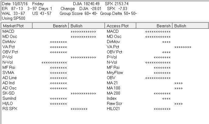
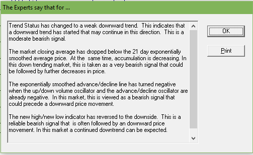
Oct 12, 2016 | expert rating, expert system, indexes, market timing
The AIQ TradingExpert Pro Market Timing Expert System uses over 400 rules based on numerous technical indicator conditions to determine if a change in the current trend is imminent. The signals can be quite early and confirmation from other indicators not used in the AI system, like Phase are recommended. Quick disclaimer, we are not advisors and do not give recommendations.
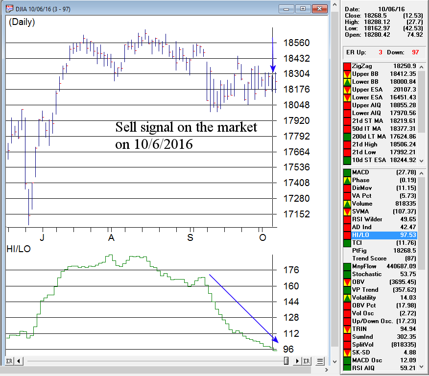
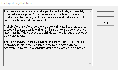
Here’s the signal from last week. The number of stocks with new highs vs new lows is clearly showing a persistent down trend, while the market has been flat.
By clicking the ER button in Charts we can see some of the major rules that have fired to generate the signal
The AIQ market Log in Reports provides additional information that gives us some broader information on the market. here we can see how a broad range of indicators on the market are fairing and also the percentage of buy vs sell signals on stocks in the S & P 500 (Unconfirmed signals 43-57, confirmed signals 33-67) .
The market action from Tuesday generated a second down signal of 2-98, following the 200 point fall in the Dow. The major rules that fired this time are below.
While never perfect, we always take heed when this many rules are firing
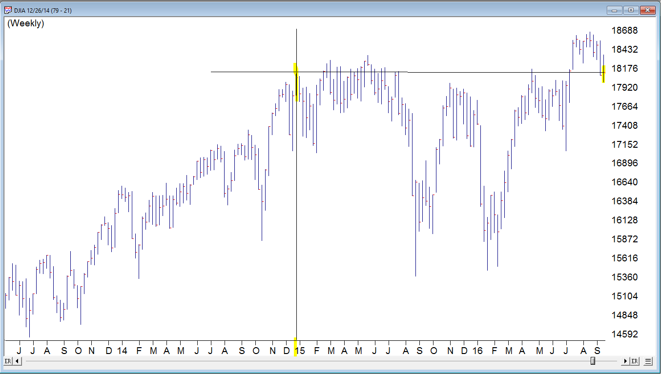
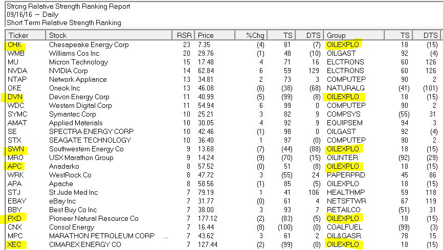
Sep 19, 2016 | group and sector, indexes, stock market, Stock trading
The markets have been shall we say been less than inspiring recently. Brexit came and went with a brief hiccup in the action and only in the last week or so has the volatility picked up. The Dow as you can see in this weekly chart is back the same level as December 2014
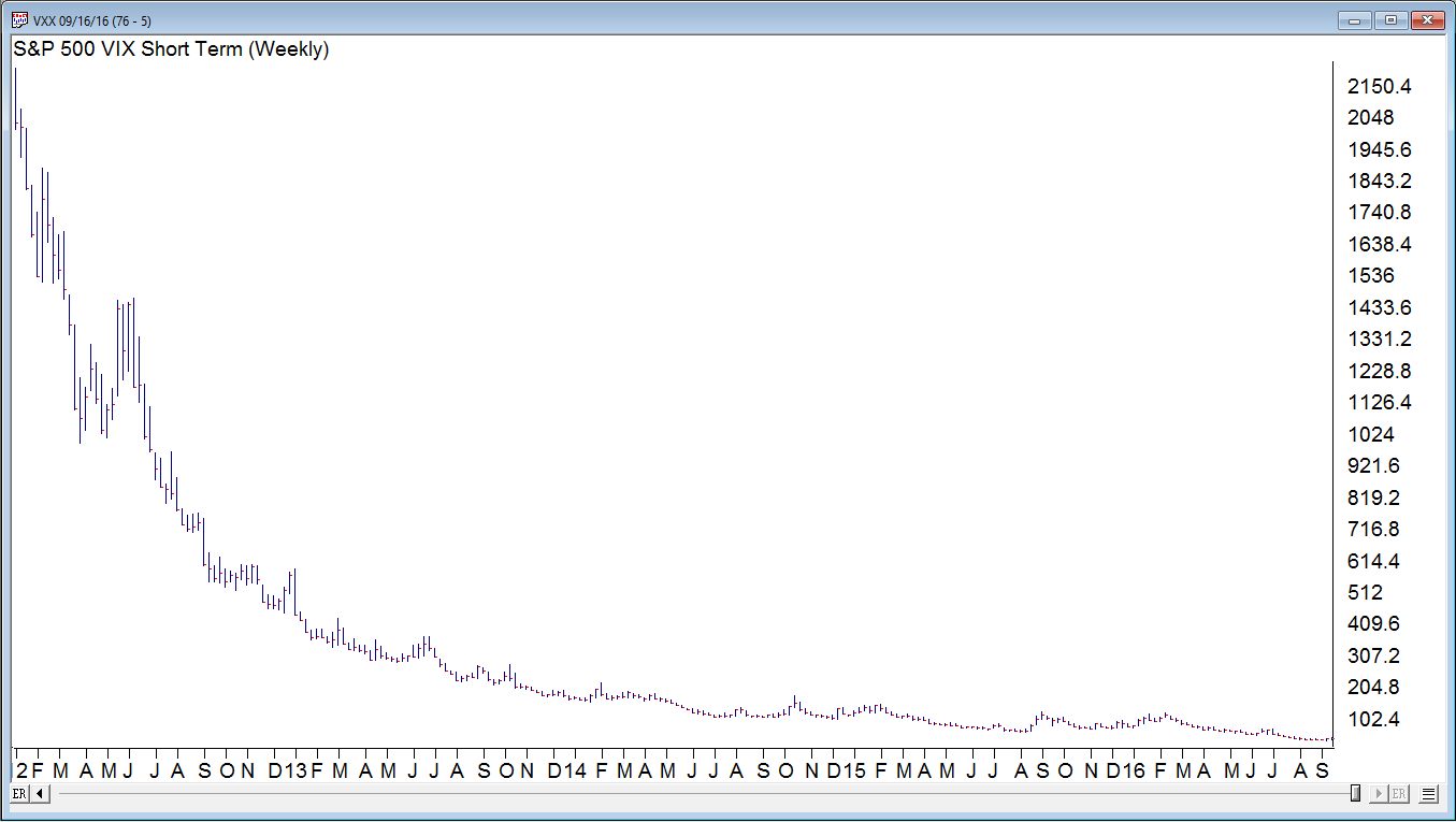
The VXX shows clearly the decline in volatility since the high back in 2011
The summer doldrums may be over, but during periods when the market is range bound, segments within the market are often performing very well or very poorly. One AIQ Report that can show the strength within segments is the Relative Strength Strong – Short Term. This report shows stocks in 3 month trend up and is a great report for those who trade with ‘the trend is your friend’. Here is Friday 9-16-2016 report. The report is ranked by the stocks with the best trend.
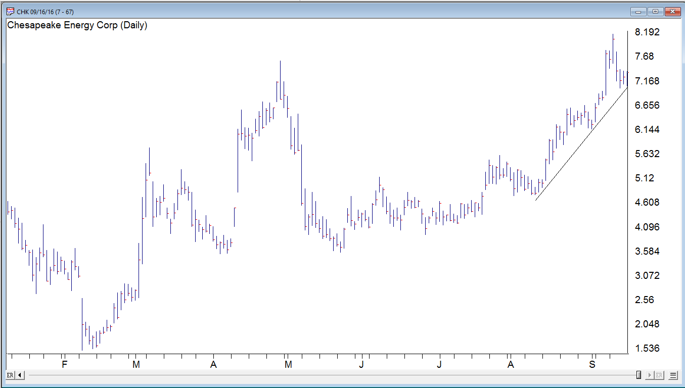
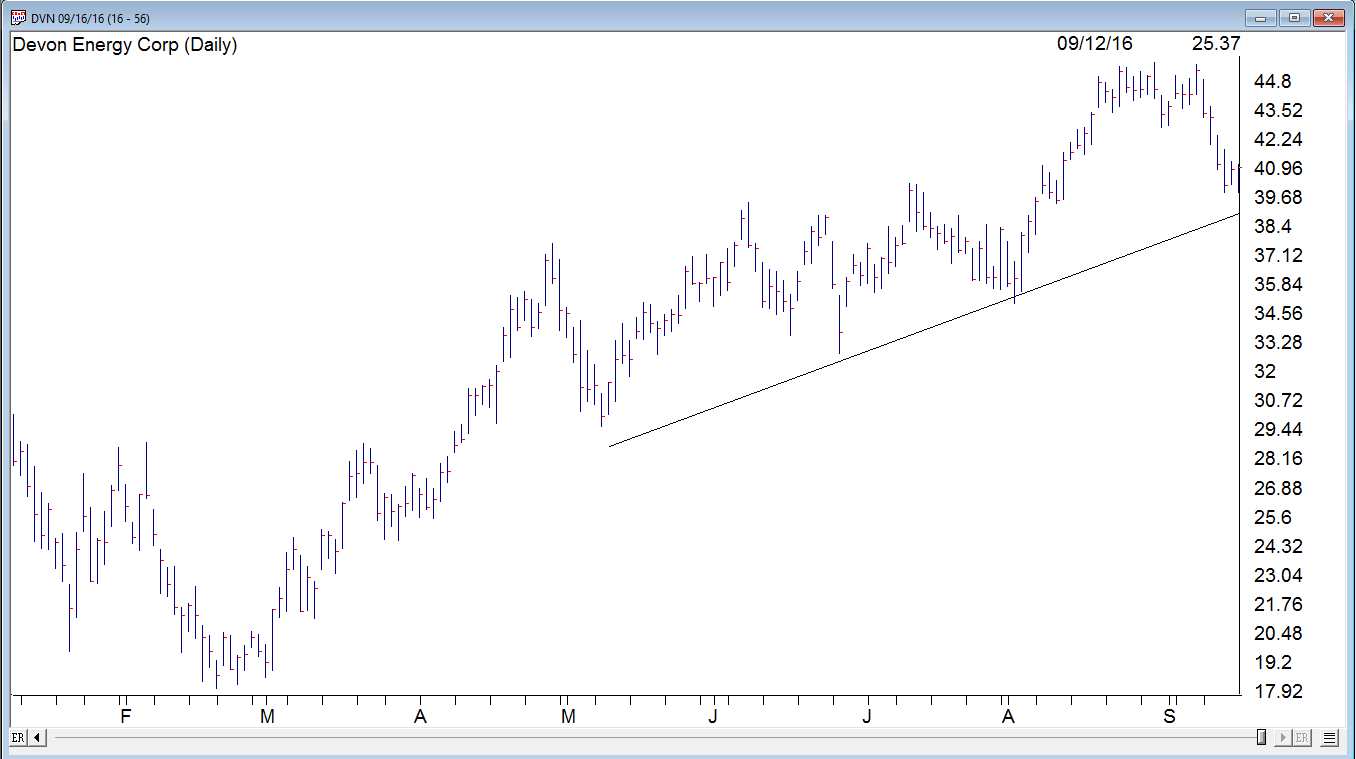
I highlighted 6 stocks in the top of this report. All have good trends in place, and all in the Oil and Exploration S&P 500 group. The group has performed quite well recently. The top 2 OILEXPO stocks CHK and DVN have both had a small pullback to their uptrend line. We’ll see how they do this week.