May 30, 2018 | educational newsletters, ETFs, indexes, jay kaeppel
The energy sector – not just unloved, but pretty much reviled not that long ago – is suddenly everybody’s favorite sector. And why not, what with crude oil rallying steadily in the last year and pulling pretty much everything energy related higher with it?
Anecdotally, everything I read seems to be on board with a continuation of the energy rally. And that may well prove to be the case. But at least for the moment I am waiting for some confirmation.
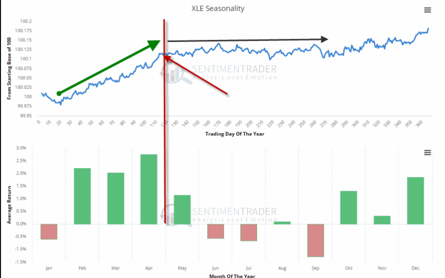
The first – which I mentioned in this article – is the fact that the best time of year for energy is the February into early May period. See Figure 1.
With that period just about past it is possible that the energy sector may at least pause for a while.
The second concern is that a lot of “things” in the energy sector are presently “bumping their head” against resistance. Here is the point:
*This does not preclude a breakout and further run to higher ground.
*But until the breakout is confirmed a little bit of caution is in order.
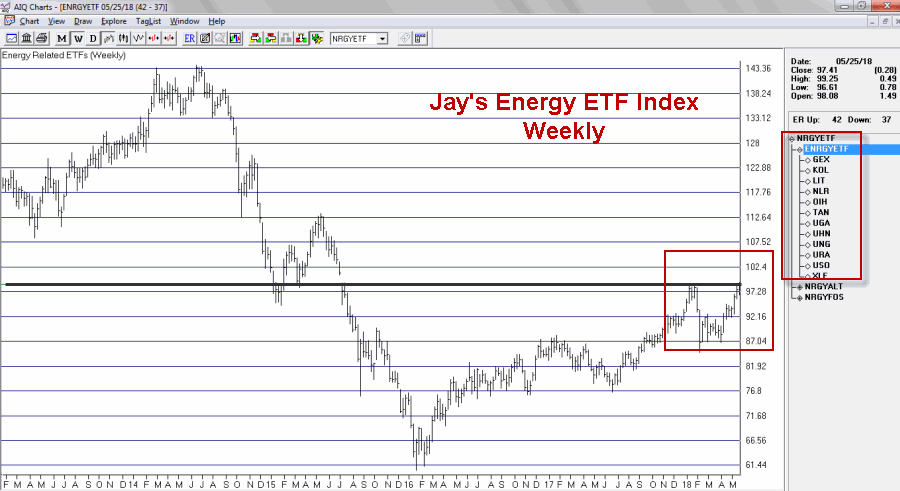
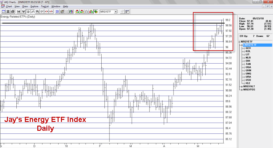
I created an index comprised of a variety of energy related ETFs. As you can see in Figures 2 through 4 that index recently was turned away at a significant resistance level.
Figure 3 shows the same information on a weekly chart.
Figure 3 – Jay’s Energy ETF Index – Weekly (Courtesy TradingExpert)
Figure 4 zooms in to view the action on a daily basis.
Figure 4 – Jay’s Energy ETF Index – Daily (Courtesy TradingExpert)
As you can see in Figure 4, the index made an effort to break out above the January high then reversed and closed lower before declining a little bit more the next day.
The action displayed in the charts above may prove to be nothing more that “the pause that refreshes.” If price breaks out to the upside another bull leg may well ensue. But note also in Figure 5 that ticker XLE – the broad-based SPDR Energy ETF – demonstrated the same type of hesitation as the ETF Index in the previous charts.
It too faces it’s own significant resistance levels as seen in Figure 5.
Energies have showed great relative strength of late even in the context of a choppy stock market overall. So there is no reason to believe that the rally can’t continue. But two things to watch for:
1. If energy related assets clear their recent resistance levels a powerful new upleg may ensue.
2. Until those resistance levels are pierced, a bit of caution is in order. Energy has been the leading sector of late. Any time the leading sector runs into trouble it pays to “keep an eye out” for trouble in the broader market.
No predictions one way or the other – just some encouragement to pay close attention at a potentially critical juncture.
Disclaimer: The data presented herein were obtained from various third-party sources. While I believe the data to be reliable, no representation is made as to, and no responsibility, warranty or liability is accepted for the accuracy or completeness of such information. The information, opinions and ideas expressed herein are for informational and educational purposes only and do not constitute and should not be construed as investment advice, an advertisement or offering of investment advisory services, or an offer to sell or a solicitation to buy any security.
Apr 30, 2018 | Charts, EDS code, indexes, indicators, jay kaeppel
Last week I wrote an article purporting to highlight significant levels of support and resistance across a variety of financial markets. Well, it turns out there are more.
More Notes on “Lines”
I certainly look at the markets more from the “technical” side than the “fundamental” side (not even a conscious choice really – I just never really had much success buying things based on fundamentals. That doesn’t mean I think fundamentals are useless or that they don’t “work” – they just didn’t work for me).
Once I settled on the technical side of things, I started reading books about technical analysis. All the classics. I learned about chart patterns and trend lines. By definition, a trend line is a line drawn on a price chart that connects two or more successive lows or highs.
And then I got to work looking through charts and applying everything that I thought I had learned. And like a lot of “newbie” technicians – and a surprising number of seasoned ones – I typically ended up drawing “lines on charts” that would resemble something like what you see in Figure 1.
Figure 1 – “Important” trend lines (or not?) (Courtesy
TradingExpert)
For a technical analyst this is sort of the equivalent of “throwing up” on a chart (and the real pisser was that back in the day a fresh updated booklet of charts would show up in the mail each week – so you had to “throw up’ all over all the charts again and redraw every #$^& “important” line!!).
At some point I realized that perhaps every “important” line that I was drawing on a multitude of charts was perhaps maybe not so “important” after all. This revelation led me to establish the following maxim (as much to force me to “fight the urge” as anything:
Jay’s Trading Maxim #18: If you draw enough lines on a bar chart, price will eventually hit one or more of them.
True Confession Time
There are certain dirty little secrets that no respectable technician should ever utter. But just to “get a little crazy” (OK, at last by my standards – which are quite low, apparently) I’m going to put it down in print:
I hate trend lines
There, I said it. Now for the record, up sloping and down sloping trend lines are a perfectly viable trading tool if used properly. I personally know plenty of people trading successfully using trend lines drawn on a price chart. Sadly, I’m just not one of them.
So remember the lesson I learned the hard way – “There is no defense for user error.”
The full truth is that I have nothing against trend lines, and yes I understand that there are “objective” methods out there detailing the “correct” method for choosing which two points to connect to draw a proper trend line (DeMark, Magee, I think Pring to name a few). But I somehow seem to have failed that lesson.
One Line I Do Like
I still draw slanting trend lines from time to time. But the only lines I really like are lines that are drawn horizontally across a bar chart – i.e., “support” and “resistance” lines. A multiple top or a multiple bottom marks a level where the bulls or the bears made a run and could not break through. Now that’s an “important” price level. If that price level ultimately holds it means the charge failed and that a significant reversal is imminent. If it ultimately fails to hold it means a breakout and a possible new charge to ever further new highs or lows as the case may be (for the record, it could also mean that a false breakout followed by a whipsaw is about to occur. But, hey, that’s the price of admission).
I also like horizontal lines because even if very single horizontal line does not prove to be useful as a trading tool, it can still serve a purpose as a “perspective tool”. Rather than explaining that theory let’s just “go to the charts.”
More “Lines in the Sand”
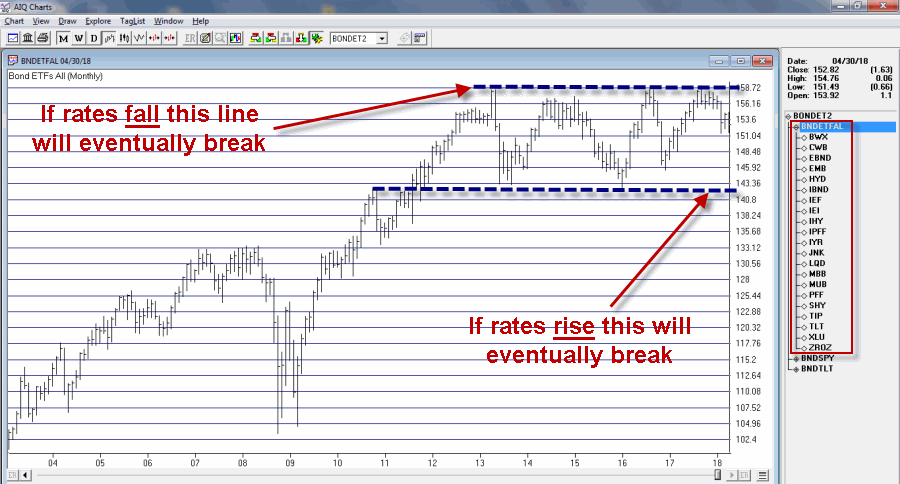
Figure 2 displays an index of bond and income related ETFs that I created. Roughly half of the ETFs have a higher correlation to treasury bonds and the other half to the S&P 500 Index (i.e., CWB – convertible bonds, JNK – high yield corporate, PFF – preferred stock and XLU – utilities all react to interest rates but are more correlated to the stock market than to treasury bonds).
Figure 2 – Bond and Income Related ETF Index (Courtesy
TradingExpert)
This monthly chart clearly illustrates the struggle going on in the interest rate related sector. Interest rates mostly bottomed out in 2013 and have been grinding sideways to higher since. As you can see, interest rate related securities have been trapped in a sort of large trading range for years. Eventually, if the long-term trend in rates turns higher this chart should be expected to break through the lower (support) line Figure 2.
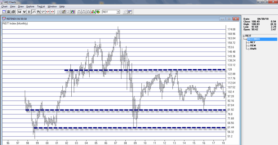
Still focusing on interest rate related sectors, Figure 3 displays a monthly index comprised of 3 REITs. Talk about a market sector trapped in a range.
For what it is worth, Figure 4 displays a weekly chart of the same index with an indicator I call Vixfixaverage (code for this indicator appears at the end of the article). Typically, when this indicator exceeds 60 and then tops out, a decent rally often ensues (one word of warning, there is also often some further downside before that rally ensues to caution is in order).
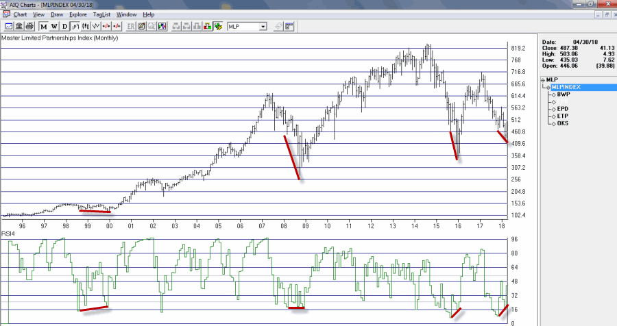
Speaking of oversold “things”, Figure 5 displays an index of Master Limited Partnerships (MLP’s). As you can see in Figure 5, a) divergences between price and the 4-month RSI are often followed by significant rallies, and b) a new such divergence has just been established. Does this mean that MLP’s are destined to rally higher? Not necessarily, but given the information in Figure 5 and the fact that everybody hates MLP’s right now, it’s something to think about.
AIQ TradingExpert Code for Vixfixaverage
hivalclose is hival([close],22).
vixfix is (((hivalclose-[low])/hivalclose)*100)+50.
vixfixaverage is Expavg(vixfix,3).
Jay Kaeppel
Disclaimer: The data presented herein were obtained from various third-party sources. While I believe the data to be reliable, no representation is made as to, and no responsibility, warranty or liability is accepted for the accuracy or completeness of such information. The information, opinions and ideas expressed herein are for informational and educational purposes only and do not constitute and should not be construed as investment advice, an advertisement or offering of investment advisory services, or an offer to sell or a solicitation to buy any security.
Apr 2, 2018 | educational newsletters, indexes, indicators, jay kaeppel, stock market
A glance at the history of the Presidential Election Cycle in the stock market suggests that we should:
*Not be surprised that the stock market is foundering a bit at the moment
*Not be terribly surprised if things get worse – particularly during the months of June through September of this year
*Anticipate that if the market does take a bigger hit in the months ahead that it may well set the stage for another significant advance into the middle of the mid-term election year.
A Little Presidential Election Cycle History
For our purposes we will start the test on 12/31/1932 and define the cycle as containing the following four years:
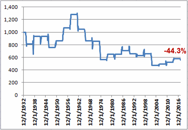
First the Bad News: Figure 1 displays the growth of $1,000 invested in the S&P 500 Index (using monthly closing price data) ONLY from the end of January of each Mid-Term Election Year through the end of September of each Mid-Term Election Year (i.e., the latest iteration began on 1/31/2018 and will extend through 9/30/2018).
Figure 1 – Growth of $1,000 invested in S&P 500 Index ONLY from Jan31 through Sep30 of each Mid-Term Election Year (1932-2018)
As you can see, the cumulative performance for the S&P 500 Index during the Mid-Term February through September period is a fairly painful -44.3% (for the record, the cumulative gain from buying and holding the S&P 500 from 12/31/1932 through 2/28/2018 was +39,288%, so yes, this qualifies as a period of some serious under performance).
That being said, it should be noted that this Mid-Term Feb through Sep period showed a gain 12 times and a loss only 9 times. So a “rough patch” is no sure thing. The problem is that when this period is bad, it is “very bad”. As you can see in Figure 3 later, this period experienced 6 losses in excess of -17.5% (FYI, a -17.5% decline from the 1/31/2018 close of 2823.81 would see the S&P 500 Index hit 2330).
Then the Good News: On the brighter side, Figure 2 displays the growth of $1,000 invested in the S&P 500 Index (using monthly closing price data) ONLY from the end of September of each Mid-Term Election Year through the end of July of each Pre-Election Year (i.e., the latest iteration begins on 9/30/2018 and will extend through 7/31/2019).
Figure 2 – Growth of $1,000 invested in S&P 500 Index ONLY from Sep30 of each Mid-Term Election Year through Jul31 of each Pre-Election Year (1932-2018)
Notice any difference between Figures 1 and 2? This favorable period saw the S&P 500 register a gain during 20 of the past 21 completed election cycles (i.e., 95% of the time), with an average gain of +21.6%, and a cumulative gain of +3,730%.
Figure 3 displays the numerical results for each cycle.
| Mid-Term |
Pre-Election |
Mid-Term Feb through Sep |
Mid-Term Oct thru Pre-Election July |
| 1934 |
1935 |
(18.5) |
21.8 |
| 1938 |
1939 |
14.5 |
(1.6) |
| 1942 |
1943 |
0.5 |
32.0 |
| 1946 |
1947 |
(19.4) |
5.3 |
| 1950 |
1951 |
14.1 |
15.2 |
| 1954 |
1955 |
23.9 |
34.7 |
| 1958 |
1959 |
20.0 |
20.9 |
| 1962 |
1963 |
(18.3) |
22.9 |
| 1966 |
1967 |
(17.6) |
23.8 |
| 1970 |
1971 |
(0.8) |
13.4 |
| 1974 |
1975 |
(34.2) |
39.7 |
| 1978 |
1979 |
14.9 |
1.2 |
| 1982 |
1983 |
0.0 |
35.0 |
| 1986 |
1987 |
9.2 |
37.8 |
| 1990 |
1991 |
(7.0) |
26.7 |
| 1994 |
1995 |
(3.9) |
21.5 |
| 1998 |
1999 |
3.7 |
30.6 |
| 2002 |
2003 |
(27.9) |
21.5 |
| 2006 |
2007 |
4.4 |
8.9 |
| 2010 |
2011 |
6.3 |
13.2 |
| 2014 |
2015 |
10.6 |
6.7 |
Figure 3 – Unfavorable versus Favorable portions of Election Cycle
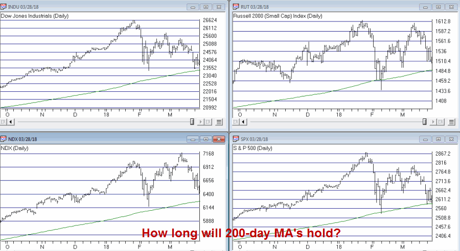
So what does it all mean? Well, it means a few things. By my objective measurements the overall trend is still “bullish” and a number of “oversold” indicators are suggesting that a bounce of some significance may be at hand. That being said, if the major market indexes do start to break down below their respective 200-day moving averages investors may be wise to take some defensive action. If the market does experience a further break between now and the end of September, it may well be “one of the painful kind.” So if you haven’t already, make your contingency plans now.
Figure 4 – Major Market Indexes with 200-day moving averages (Courtesy TradingExpert)
At the same time, as the end of September of 2018 nears – especially if the stock market has experienced or is experiencing at the time, a significant break – remember that history suggests that that will be a good time to “think bullish.”
Call me a cynic, but my guess is that alot of investors will do exactly the opposite on both counts (i.e., hang on if the market breaks down and then sell as the next bottom forms – Same it as ever was….)
Disclaimer: The data presented herein were obtained from various third-party sources. While I believe the data to be reliable, no representation is made as to, and no responsibility, warranty or liability is accepted for the accuracy or completeness of such information. The information, opinions and ideas expressed herein are for informational and educational purposes only and do not constitute and should not be construed as investment advice, an advertisement or offering of investment advisory services, or an offer to sell or a solicitation to buy any security.
Mar 14, 2018 | EDS, educational newsletters, ETFs, indexes, jay kaeppel
In this article I wrote about an index I follow that combines the biotech sector with the gold stock sector. I also wrote about “one way” to trade that index. This article builds on that piece and adds a new “rule” to create more trading opportunities.
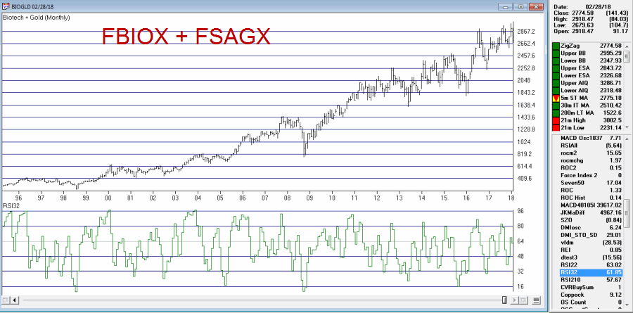
The BIOGOLD Index
Figure 1 displays the index that I created using TradingExpert. It combines ticker FBIOX (Fidelity Select Biotech) with ticker FSAGX (Fidelity Select Gold).
Also included in the lower clip is an indicator referred to as RSI32, which is the 2-day average of the standard 3-day RSI.
The Old System
In the original article I tested an approach that works as follows using monthly data:
*When the RSI32 drops to 32 or below, buy BOTH FBIOX and FSAGX
*After a buy signal, sell both funds when RSI32 rises to 64 or higher
The New System
The “new rules” are as follows:
A “buy signal” occurs when either:
*The RSI32 drops to 32 or below
*The RSI32 drops below 50 (but not as low as 32) and then reverses to the upside for one month
After either of the buy signals above occurs, buy BOTH FBIOX and FSAGX
*After a buy signal, sell both funds when RSI32 rises to 64 or higher
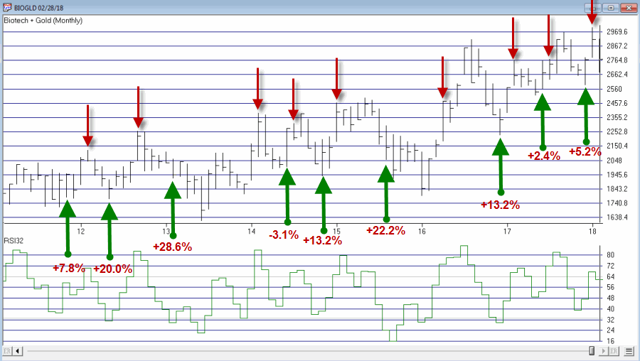
Figure 2 displays the BIOGOLD Index with various buy and sell signals marked.
Figure 2 – Jay’s BIOGOLD Index with RSI32 signals (Courtesy
TradingExpert)To test results we will:
*Assume that after a buy signal both FBIOX and FSAGX are bought in equal amounts
*We will assume that both funds are held until RSI32 reaches 64 or higher (i.e., there is no stop-loss provision in this test)
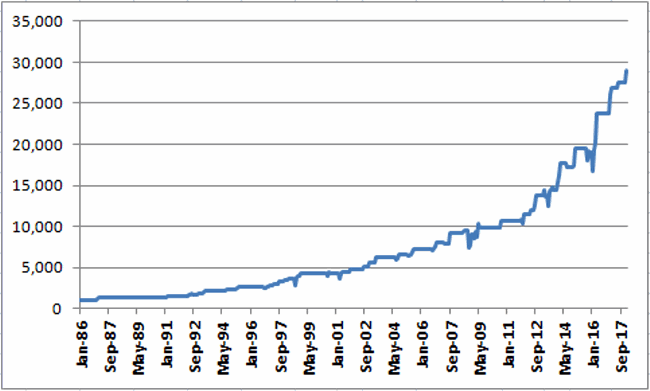
For testing purposes we will not assume any interest earned while out of the market, in order to highlight only the performance during active buy signals. Figure 3 displays the hypothetical growth of $1,000 (using monthly total return data) using the “system”.
Figure 3 – Hypothetical Growth of $1,000 using Jay’s BIOGOLD System (1986-present)
Summary
For the record, I am not “recommending” that anyone go out and initiate trading biotech and gold based on what I have written here. Before trading using any approach it is essential for a trader to do their own homework and carefully consider all of the pro’s and con’s associated with any specific approach. For example, while the trade-by-trade results for the above look reasonably good, it should be noted that there have been 4 separate drawdown’s in excess of -19% along the way, including a maximum drawdown of -37% in 2008. In considering any approach to trading it is essential to first think long and hard about how well one would “weather the storms”, BEFORE focusing on potential profitability.
To put it more succinctly is the simple phrase “Don’t cross the river if you can’t swim the tide.”
Jay Kaeppel
Disclaimer: The data presented herein were obtained from various third-party sources. While I believe the data to be reliable, no representation is made as to, and no responsibility, warranty or liability is accepted for the accuracy or completeness of such information. The information, opinions and ideas expressed herein are for informational and educational purposes only and do not constitute and should not be construed as investment advice, an advertisement or offering of investment advisory services, or an offer to sell or a solicitation to buy any security.
Feb 18, 2018 | educational newsletters, ETFs, indexes, jay kaeppel, market timing, stock market
In this article titled “World, Meet Resistance” – dated 12/21/2017 – I noted the fact that many single country ETFs and regional indexes were closing in on a serious level of potential resistance. I also laid out three potential scenarios. So what happened? A fourth scenario not among the three I wrote about (Which really pisses me off. But never mind about that right now).
As we will see in a moment what happened was:
*(Pretty much) Everything broke out above significant resistance
*Everything then reversed back below significant resistance.
World Markets in Motion
Figure 1 displays the index I follow which includes 33 single-country ETFs. As you can see, in January it broke out sharply above multi-year resistance. Just when it looked like the index was going to challenge the all-time high the markets reversed and then plunged back below the recently pierced resistance level.
(click to enlarge)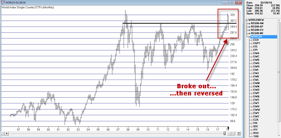
Figure 1 – Jay’s World Index broke out in January, fell back below resistance in February (Courtesy TradingExpert)
The same scenario holds true for the four regional indexes I follow – The Americas, Europe, Asia/Pacific and the Middle East – as seen in Figure 2.
(click to enlarge)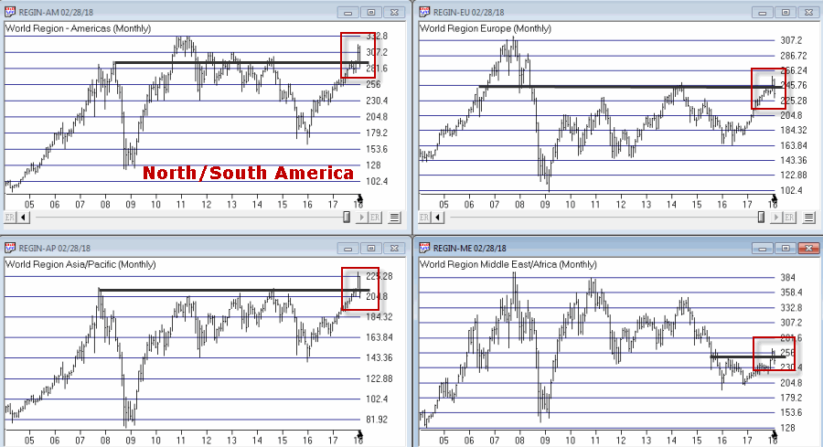
Figure 2 – Jay’s Regional Index all broke above resistance, then failed (Courtesy TradingExpert)
So where to from here? Well I could lay out a list of potential scenarios. Of course if history is a guide what will follow will be a scenario I did not include (Which really pisses me off. But never mind about that right now).
So I will simply make a subjective observation based on many years of observation. The world markets may turn the tide again and propel themselves back to the upside. But historically, when a stock, commodity or index tries to pierce a significant resistance level and then fails to follow through, it typically takes some time to rebuild a base before another retest of that resistance level unfolds.
Here’s hoping I’m wrong
Jay Kaeppel
Disclaimer: The data presented herein were obtained from various third-party sources. While I believe the data to be reliable, no representation is made as to, and no responsibility, warranty or liability is accepted for the accuracy or completeness of such information. The information, opinions and ideas expressed herein are for informational and educational purposes only and do not constitute and should not be construed as investment advice, an advertisement or offering of investment advisory services, or an offer to sell or a solicitation to buy any security.
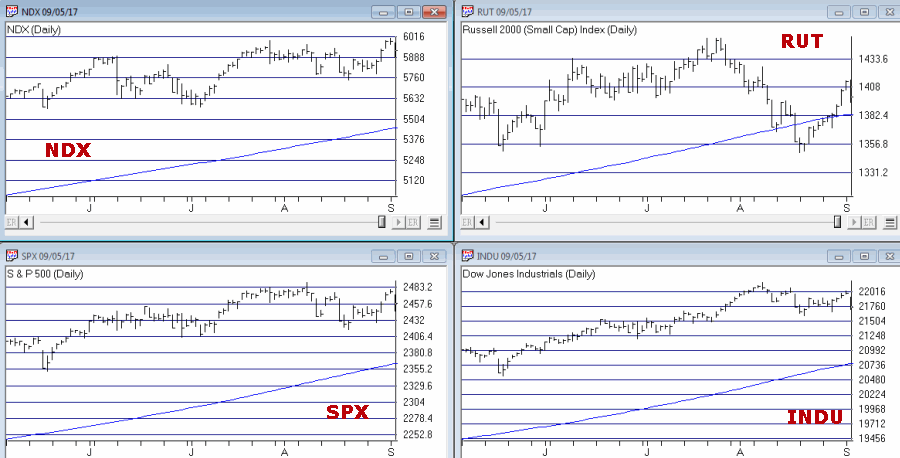
Sep 8, 2017 | indexes, jay kaeppel, stock market
First the Good News:
*The market averages are still in an up trend
*The Fed has yet to “remove the punch bowl”
Now the bad news
Market Bellwethers Flashing Warnings
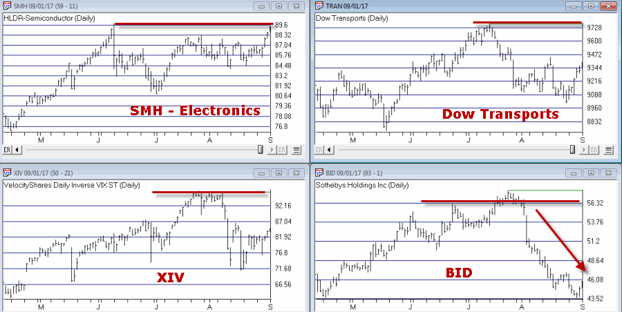
In this article I wrote about four tickers I follow for signs of early warnings of trouble. At the moment, all four are flashing warnings.
Stocks are Extremely Overvalued
Something important to note: valuation indicators are NOT good timing indicators. The overall market can be over or undervalued for years. However, overvalued valuation readings are extremely reliable at telling us what will come next once the top is in (whenever that may be). Figure 4 displays the Schiller CAPE model which measures adjusted P/E ratio.
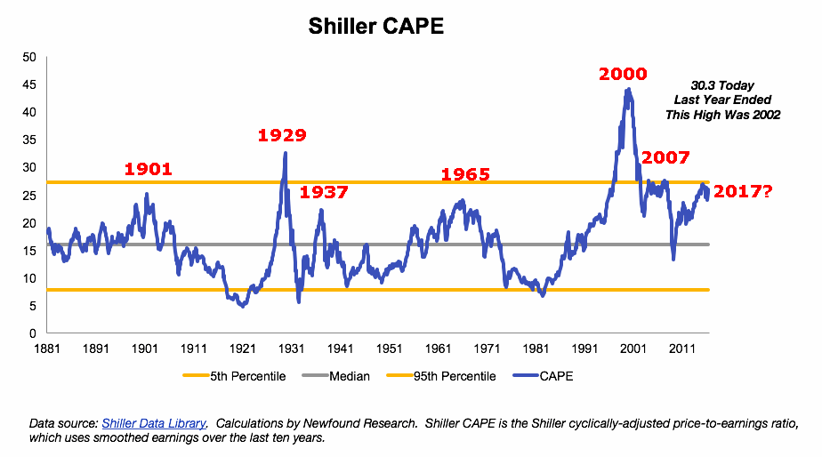
Figure 4 – Schiller Adjusted PE (Courtesy:
Schiller Data Library)
1901: Dow -37% in 32 months
1929: Dow -89% in 3 years
1932: Dow -49% in 13 months
1965: Dow sideways to 40% lower for 17 years
2000: Nasdaq 100 -87%
2007: Dow -55% in 17 months
2017: ??
When will the exact top form? Don’t know
What will likely follow? Don’t Ask
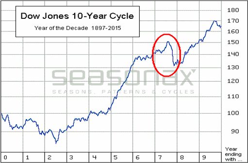
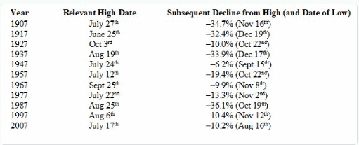
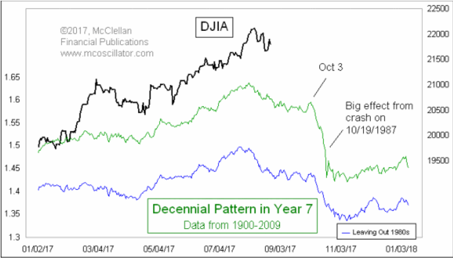
The Decennial Pattern
As I wrote about here and as you can see in Figures 5 and 6, the Year 7 into Year 8 period has historically witnesses significant market weakness. That does not mean that that is what will happen this time around. But it is reason for caution.
Figure 7 from Tom McLellan illustrates this phenomenon even more clearly.
September
What a crummy time for September to roll around. Figure 8 displays the fact that the Dow has lost -80% during the month of September since 1897.
Figure 8 – Dow has lost -80% during September since 1897
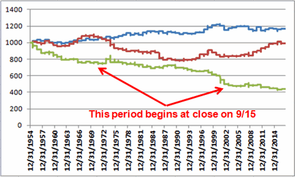
Figure 9 displays the fact that since 1955 most of the “September Nasty” has occurred in that last 10 trading days of the month (after the close on 9/15 this year)
Figure 9 – Dow in September; 1st 3 days (blue); Last 10 days (green); in between (red); 1955-2016
Investor Complacency
Despite the fact that:
*We have experienced one of the longest bull markets in history
*Stock prices are extremely overvalued on an objective historical basis
*A number of warning signs are flashing
The investment world seems relatively untroubled (in the interest of full disclosure I have done only limited selling so far myself – more on this in a moment).
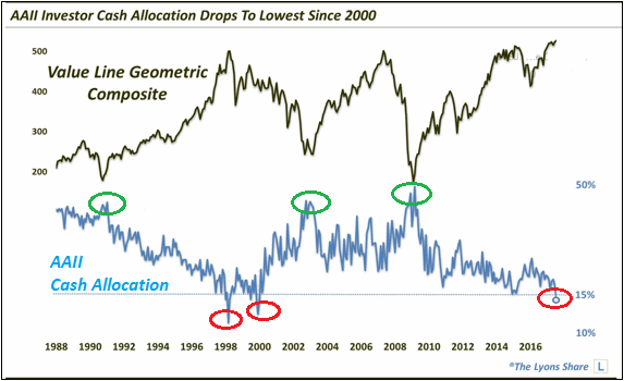
Figure 10 displays the AAII investor cash allocation reading from earlier this year. Low cash levels tend to signal complacency (and impending market trouble) while high cash levels tend to occur near market bottoms.
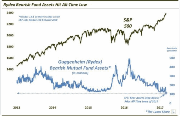
Figure 11 displays the amount of assets in the Rydex suite of “bearish” funds from earlier this year. As you can see, investors were not too concerned about the prospects for a bear market – a potential contrarian signal.
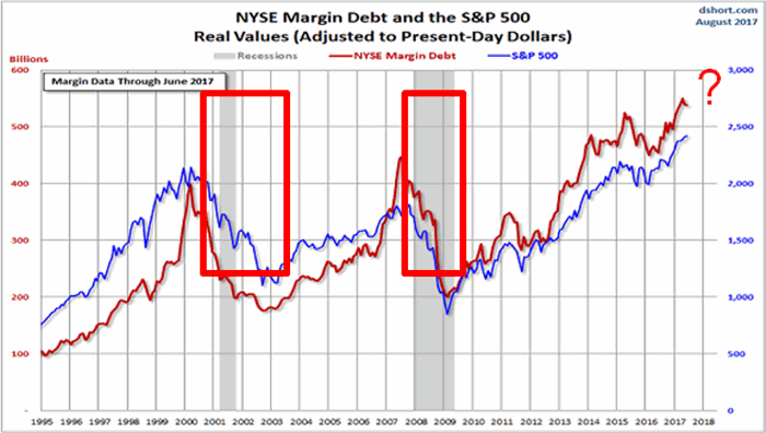
Figure 12 shows the level of margin debt versus stock prices. Historically when margin debt peaks and begins to decline the stock market suffers significantly. There is no way to predict when margin debt will top out and roll over but it did recently reach a new all-time high. Could it go higher? Absolutely. But if it rolls over – then look out below.
Figure 12 – If Margin Debt peaks trouble may follow (Courtesy:
dshort.com)
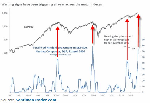
Figure 13 displays the stock market versus the number of “Hindenburg Omens” (a measure of “churning” in the stock market) that have occurred in the most recent 6-month period. Another warning sign is flashing.
Summary
Does any of the above guarantee that a significant stock market decline is imminent? The correct answer is “No.” The major market indexes all remain above their long-term moving averages. This can be considered the very definition of a bull market.
I personally have seen lots of warning signs flash along the way over the years. And I have found that it is important to pay attention to these and to “prepare for the worst” – i.e., to plan an exit/hedging strategy “just in case.” But trying to pick the exact top is an excellent way to end up looking stupid. Trust me on this one.
So here is my summary:
*I do not possess the ability to “call the top” nor to “predict what will happen next” in the stock market
*I do possess a reasonably good ability to identify the trend “right now”
*I also possess the ability to recognize gathering storms clouds (and, yes, they are forming) and the ability to formulate an “emergency plan” as well as the wherewithal to follow the plan “should this be an actual (market) emergency.”
The current level of market valuation – and the history of the stock market following previous similar such readings – suggests that the next bear market will surprise many investors by its severity.
The clouds are gathering. Please plan accordingly.
Jay Kaeppel Chief Market Analyst at JayOnTheMarkets.com and AIQ TradingExpert Pro client.
Disclaimer: The data presented herein were obtained from various third-party sources. While I believe the data to be reliable, no representation is made as to, and no responsibility, warranty or liability is accepted for the accuracy or completeness of such information. The information, opinions and ideas expressed herein are for informational and educational purposes only and do not constitute and should not be construed as investment advice, an advertisement or offering of investment advisory services, or an offer to sell or a solicitation to buy any security.