Nov 14, 2017 | educational newsletters, ETFs, group and sector, jay kaeppel
In a recent article I highlighted some stocks that appeared to have a chance of “putting in a low”. In another article, I highlighted the potential usefulness of “horizontal lines” on a chart. The phrase “putting in a low” is essentially a kindler, gentler version of the phrase “Hey, let’s pick a bottom”.
The reality is that the ability to “pick tops and/or bottoms” on any kind of a consistent basis is a skill that roughly 99.2% of all investors and traders do not possess. That being said, there is such a thing as a legitimate “bottom formation” (at least in my market addled opinion). A security that bounces several or more times off a particular price is sending information that the sellers may be running out of ammunition. These levels can be observed by drawing horizontal trend lines across a price chart – connecting recent highs and/or lows at roughly similar prices.
“Loading up” in this situation is not recommended. But committing an acceptable percentage of one’s portfolio (a level which each investor must decide on their own) to such opportunities is a perfectly acceptable form of speculation.
So for arguments sake, below is a “Bottom Pickers Portfolio”. As always, I am not recommending this as an investment, simply highlighting an alternative idea for your further consideration.
The Tickers
The tickers included in this portfolio are mostly all commodity related. That is not a purposeful choice; they simply “fit the model”.
First is ticker BAL – an ETF that tracks the price of cotton futures. The critical level for BAL is roughly the $43.50 area.
Ticker GDX tracks a gold stock index and has been consolidating in a relatively tight range after last year’s sharp rally and subsequent pullback.
Ticker JO tracks the price of coffee futures. This is one of the weakest charts on the list and is dangerously close to failing to the downside. However, if the low holds this will strengthen the outlook a great deal.
Ticker SGG tracks the price of sugar futures. SGG has been consolidating in a narrow range for about four months. Key price levels on the downside are $26.50 and the August 2015 low of $24.79.
Ticker SWN is Southwestern Energy Co. After a long, devastating decline the stock is attempting to form a low in the $5 a share range.
Ticker UNG tracks natural gas futures. Thanks to the advent of fracking – which is made natural gas abundantly available – the price of natural gas has collapsed in recent years. In the past week it retested its 2016 low and then ticked higher. Like JO, this one is precariously close to “failing”. But for now…
The Bottom Pickers Portfolio
I use AIQ TradingExpert software to create my own “Groups”. So I created one called “Lows” to include the six tickers above. The group consists of an equal dollar investment in each ticker. The chart for this combination of tickers appears in Figure 7.EDITORS NOTE: Creating your own groups is accomplished in the TradingExpert Data Manager information can be found in this article ‘Adding groups and sectors to your Group/Sector List’
Summary
Let me be blunt. There is every chance that the majority of the tickers highlighted above will continue their long-term bearish trends and break down to the downside causing further losses for those holding these shares.
The primary thing to highlight in this piece is a personal preference. I prefer “horizontal” lines on a chart – i.e., straight across, left to right – to the more typical slanted trend lines that most traders use. The reason is simply – upward or downward slanting trend lines require a trader to decide which two (or more) highs (or lows) to connect in order to draw the trend line. At the end of the day this is often a subjective decision.
Horizontal trend lines – which connect to (at least roughly equal) highs or lows – are generated by the market itself and as such, are more objective in nature. In other words, investor buying and selling determines these levels.
Will my “Bottom Pickers Portfolio” move to the upside or fail to the downside? We’ll just have to wait to find out.
Disclaimer: The data presented herein were obtained from various third-party sources. While I believe the data to be reliable, no representation is made as to, and no responsibility, warranty or liability is accepted for the accuracy or completeness of such information. The information, opinions and ideas expressed herein are for informational and educational purposes only and do not constitute and should not be construed as investment advice, an advertisement or offering of investment advisory services, or an offer to sell or a solicitation to buy any security.
Oct 30, 2017 | educational newsletters, ETFs, jay kaeppel, sector funds
I know I repeat it a lot but the purpose of this blog is not to offer recommendations but rather to share ideas. So here is one that I am not quite sure about but am keeping an eye on.
The FourNonCorr Portfolio
Somewhere awhile back I started looking at trying to pair non correlated – or even inversely correlated – securities in a portfolio that had the potential to outperform the overall market. What follows is what I refer to as the FourNonCorr Portfolio. For the record I do not trade this portfolio with real money. I am still trying to figure out if there is something to it or not. But given that it has outperformed the S&P 500 by a factor of 3-to-1 (granted, using hypothetical results) since December of 2007, I figure it might be worth monitoring for awhile.
The portfolio consists of four ETFs:
Ticker FXE – Guggenheim CurrencyShares Euro Trust
Ticker UUP – PowerShares DB US Dollar Index Bullish
Ticker TLT – iShares Barclays 20+ Yr Treas. Bond
Ticker XIV – VelocityShares Daily Inverse VIX ST ETN
The monthly charts for each appear in Figure 1.
As you can see there is a lot of “zigging” by one accompanied by “zagging” for another. No surprise that when the Euro rises the dollar falls and vice versa. Also, TLT often seems to move opposite XIV. That is essentially the purpose of these pairings.
Figure 2 displays the correlations between the four ETFs in the portfolio (using AIQ TradingExpert Matchmaker function from 8/31/2012 through 8/31/2017 using weekly data). A reading of 1000 indicates a perfect correlation, a reading of -1000 indicates a perfectly inverse correlation.
|
FXE |
UUP |
TLT |
XIV |
| FXE |
|
(913) |
77 |
(13) |
| UUP |
(913) |
|
(117) |
43 |
| TLT |
77 |
(117) |
|
(234) |
| XIV |
(13) |
43 |
(234) |
|
Figure 2 – Correlations for the FourNonCorr Portfolio ETFs (Source:
AIQ TradingExpert)
Clearly there is a whole lot of “not correlating much” going on.
Results
For testing purposes I used monthly total return data for each ETF from the PEP Database from Callan Associates. The one exception is ticker XIV which did not start actual trading until December 2010. For January 2008 through November 2010 I used index data for the index that ticker XIV tracks inversely (
S&P 500 VIX SHORT-TERM FUTURES INDEX). Actual XIV ETF data is used starting in December 2010.
As a benchmark, I also tracked the cumulative total return for ticker SPY (that tracks the S&P 500 Index).
Figure 3 displays the cumulative percent gain or loss for both the FourNonCorr Portfolio and ticker SPY.
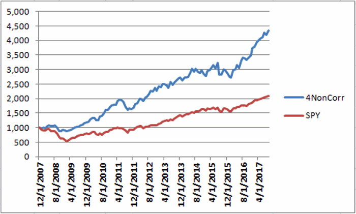
Figure 3 – Cumulative % gain/loss for The FourNonCorr Portfolio (blue) versus SPY (red); 12/31/2007-9/30/2017
Year-by-year results appear in Figure 4
|
4 NonCorr |
SPY |
Diff |
| 2008 |
(6.0) |
(37.0) |
31.0 |
| 2009 |
26.1 |
26.4 |
(0.3) |
| 2010 |
45.2 |
14.9 |
30.3 |
| 2011 |
(1.3) |
2.1 |
(3.4) |
| 2012 |
34.3 |
15.8 |
18.5 |
| 2013 |
19.3 |
32.2 |
(12.9) |
| 2014 |
5.3 |
13.5 |
(8.2) |
| 2015 |
0.6 |
1.3 |
(0.8) |
| 2016 |
21.0 |
11.8 |
9.2 |
| 2017* |
24.4 |
14.1 |
10.2 |
Figure 4 – Year-by-Year Results
The results by the numbers appear in Figure 5.
|
4NonCorr |
SPY |
| Average 12mo % +/- |
17.8 |
11.2 |
| Median 12mo % +/- |
14.9 |
15.0 |
| Std. Deviation |
17.1 |
16.8 |
| Ave/Std. Dev. |
1.04 |
0.67 |
| Worst 12mo % |
(11.9) |
(43.2) |
| Max. Drawdown % |
(17.8) |
(48.4) |
Figure 5 – By the numbers
All told The FourNonCorr Portfolio:
*Gained +334% versus +110% for SPY since 12/31/2007
*Experienced a maximum drawdown of -17.8% versus-48.4% for SPY
Thoughts
On paper, The FourNonCorr Portfolio looks pretty decent, particularly compared to the S&P 500 Index. But you will recall that I stated earlier that I don’t actually trade this portfolio with real money. Why not? A few concerns:
*Interest rates tend to move in long-term waves up and down. How beneficial will it be to have TLT in the portfolio if and when interest rates embark on a long-term wave up?
*I don’t entirely trust ticker XIV. Because of the way it is built it seems to have the benefit of upward bias due to contango in the VIX futures market (the opposite of ticker VXX – please Google “VXX” and/or “contango” for an actual explanation) it also holds the potential to sell off in shocking fashion. Using the index data as I did in order to replicate hypothetical performance from Jan 2008 through Nov 2010, XIV declined a stunning -72% between the end of May 2008 and the end of November 2008. It also experienced a -60% decline in 2015-2016. Need to give some thought to adding a security that is even capable of that to a permanent portfolio.
*On the flip side, XIV has been the driving force for gains in recent years and shows a cumulative gain of +416% since 12/31/2007. If (and when?) we ever do see a bear market and/or a significant pickup in volatility will XIV have a large negative influence on performance? That seems to be the $64,000 question.
Summary
As a thought experiment, The FourNonCorr Portfolio shows a pretty decent track record and seems to hold some interesting promise. As a real money, real world experience – questions remain.
Stay tuned, tinker and experiment if you wish,and don’t be too quick to “dive in.”
Disclaimer: The data presented herein were obtained from various third-party sources. Whilne I believe the data to be reliable, no representation is made as to, and no responsibility, warranty or liability is accepted for the accuracy or completeness of such information. The information, opinions and ideas expressed herein are for informational and educational purposes only and do not constitute and should not be construed as investment advice, an advertisement or offering of investment advisory services, or an offer to sell or a solicitation to buy any security.
Oct 10, 2017 | Charts, EDS, EDS code, indicators, jay kaeppel
First the Bad News: There are no “magic bullets” when it comes to trading. There are people in this industry who have literally tested somewhere in the range of six bazillion “indicators” – give or take (“Hi. My name is Jay”). Every trend following indicator looks like a gold mine when it latches onto a huge trend and rides it (but not so much when it starts getting whipsawed). And every overbought/oversold indicator looks like a gift from heaven from time to time when it somehow manages to peak (or valley) and then reverses right at a high (or low). And then the next time the thing gets oversold the security in question just keeps plunging and the previously “amazingly accurate” indicator just gets more and more oversold.
Bottom line: what I am about to discuss is likely no better or worse than a lot of other indicators. And it is no holy grail. Still, I kinda like it – or whatever that is worth.
EDITORS NOTE an WinWay EDS file for this indicator with the 3 step rules outlined can be downloaded from here you will need to copy or save this file into your wintes32/eds strategies folder. Alternatively the code is available at the end of this article for copying and pasting into a new EDS file.
UpDays20
I call this indicator UpDays20 and I stole, er, learned it originally from Tom McClellan of McLellan Financial Publications. My calculation may be slightly different because I wanted an indicator that can go both positive and negative.
For a given security look at its trading gains and losses over the latest 20 trading days.
UPDays20 = (Total # of Up days over the last 20 trading days) – 10
So if 10 of the last 20 trading days showed a gain then UpDays20 would read exactly 0.
If only 6 of the last 20 trading days showed a gain then UpDays20 would read -4
You get the idea (and proving once again that it “doesn’t have to be rocket science”). As a “trading method” it is always advised that this indicator – like most all other indicators – NOT be used as a standalone approach to trading. That being said, the way I follow this indicator is as follows.
Step 1) UpDays20 drops to at least -2
Step 2) UpDays20 rises 2 points from a low
Step 3) The security in question then rises above its high for the previous 2 trading days
It is preferable to follow this setup hen the security in question is above its 200-day moving average, but that is up to the trader to decide (the danger to using this with a security below its 200-day moving average is that it might just be in the middle of a freefall. The upside is that counter trend rallies can be fast and furious – even if sometimes short-lived).
Again, there is nothing magic about these particular steps. They are simply designed to do the following:
1) Identify an oversold condition
2) Wait for some of the selling pressure to abate
3) Wait for the security to show some sign of reversing to the upside
Like just about every other indicator/method, sometimes it is uncannily accurate and sometimes it is embarrassingly wrong (hence the reason experienced traders understand that capital allocation and risk management are far more important than the actually method you use to enter trades).
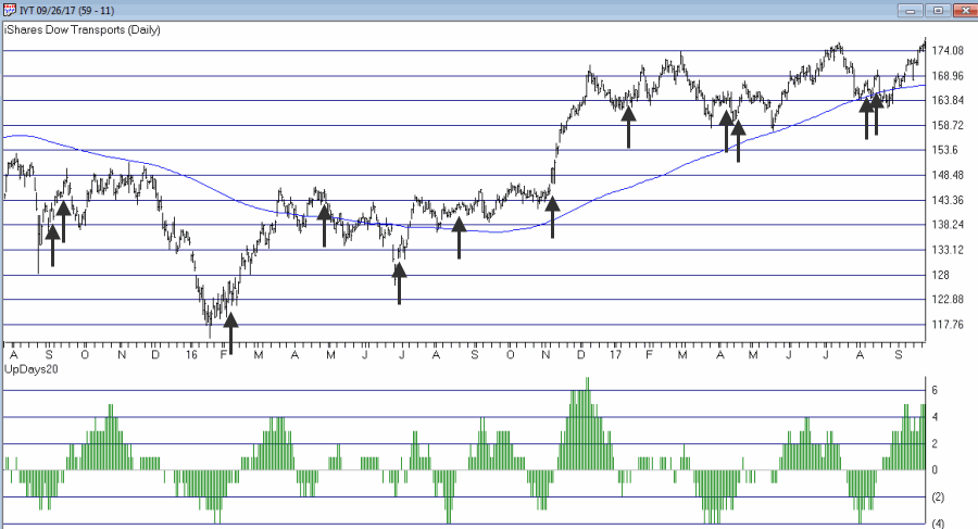
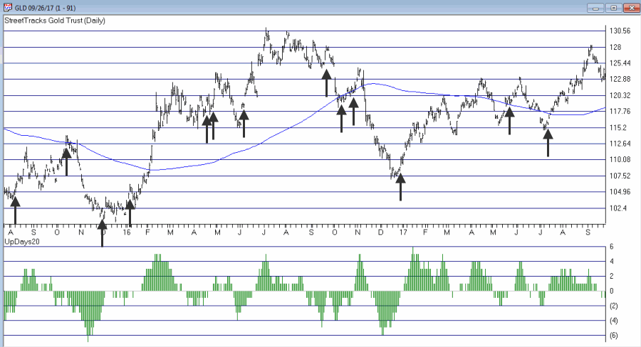
In this previous article (in Figures 3 and 4) I wrote about using this indicator with ticker TLT. Figure 1 and 2 display the “buy” signals generated using the rules above for tickers IYT and GLD.

Figure 1 – UpDays20 “Buy” Alerts for ticker IYT (Courtesy TradingExpert)

Figure 2 – UpDays20 “Buy” Alerts for ticker GLD (Courtesy TradingExpert)
Are these signals good or bad? That is in the eye of the beholder and not for me to say. One big unanswered question is “when do you exit”? That is beyond the scope of this “idea” article – however, “sell some at the first good profit and then use a trailing stop” looks like a decent approach to consider) but would have a profound effect on any actual trading results.
Some of the signals displayed in Figures 1 and 2 are obviously great, others are maybe not so hot. Interestingly, some of the signals in Figure 1 and 2 that don’t look to timely at first blush actually offered a profitable opportunity to a trader who was inclined to take a quick profit. Again, how you allocate capital and when you exit with a profit and when you exit with a loss would likely have as much impact on results as the raw “buy” signals themselves.
Summary
No one should go out and start trying to trade tomorrow based on UpDays20. No claim is being made that the steps detailed herein will result in profits nor even that this is a good way to trade.
But, hey, it’s one way.
Jay Kaeppel Chief Market Analyst at JayOnTheMarkets.com and TradingExpert Pro client.
Disclaimer: The data presented herein were obtained from various third-party sources. While I believe the data to be reliable, no representation is made as to, and no responsibility, warranty or liability is accepted for the accuracy or completeness of such information. The information, opinions and ideas expressed herein are for informational and educational purposes only and do not constitute and should not be construed as investment advice, an advertisement or offering of investment advisory services, or an offer to sell or a solicitation to buy any security.
EDITORS NOTE an WinWay EDS file for this indicator with the 3 step rules outlined can be downloaded from here you will need to copy or save this file into your wintes32/eds strategies folder. Alternatively the code is available at the end of this article for copying and pasting into a new EDS file.
! UpDays20 – I call this indicator UpDays20. For a given security look at its trading gains and losses over the latest 20 trading days.
! UPDays20 = (Total # of Up days over the last 20 trading days) – 10!
So if 10 of the last 20 trading days showed a gain then UpDays20 would read exactly 0.
! If only 6 of the last 20 trading days showed a gain then UpDays20 would read -4
Upday if [close]>val([close],1).
totalupdayslast20days is CountOf(upday,20).
updayindicator is totalupdayslast20days – 10.
! How to follow this indicator
! Step 1) UpDays20 drops to at least -2
! Step 2) UpDays20 rises 2 points from a low
! Step 3) The security in question then rises above its high for the previous 2 trading days
UpDays20rises2points if updayindicator>valresult(updayindicator,1) and valresult(updayindicator,1)>valresult(updayindicator,2).
updays20atminus2orlower if valresult(updayindicator,2)<=-2.
closesabovehighof2priordays if [close]>val([high],1) and [close]>val([high],2).
Upsignal if UpDays20rises2points and updays20atminus2orlower and closesabovehighof2priordays.

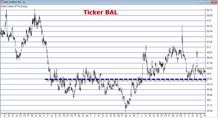 Figure 1 – Ticker BAL (Courtesy TradingExpert)
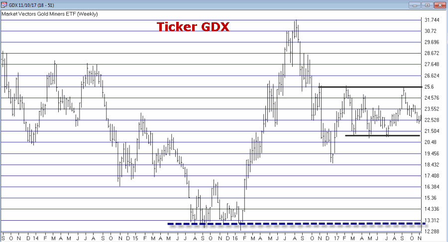 Figure 2 – Ticker GDX (Courtesy (Courtesy TradingExpert)
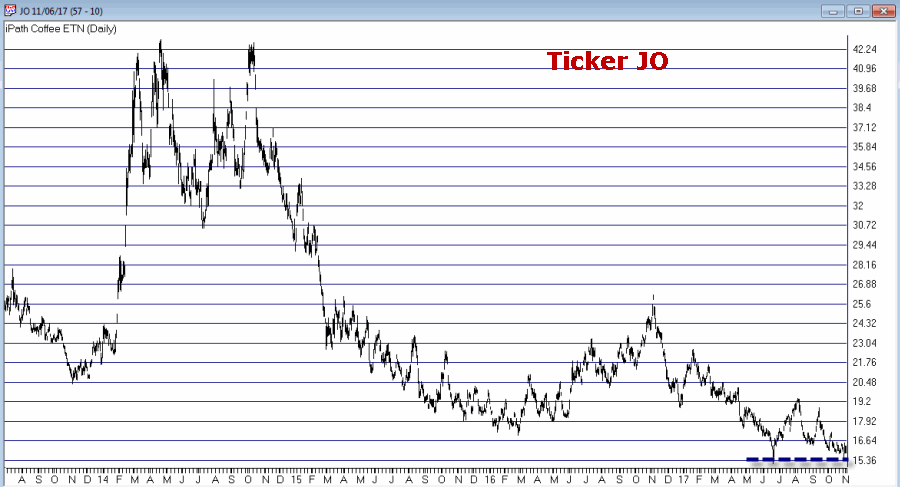 Figure 3 – Ticker JO (Courtesy TradingExpert)
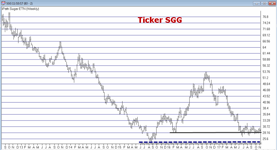 Figure 4 – Ticker SGG (Courtesy TradingExpert)
 Figure 5 – Ticker SWN (Courtesy TradingExpert)
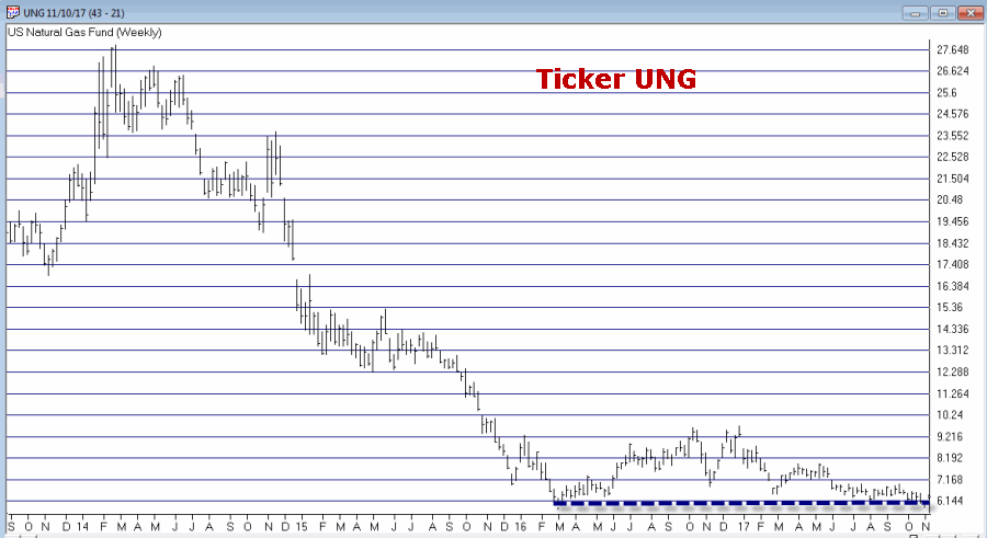 Figure 6 – Ticker UNG (Courtesy TradingExpert)
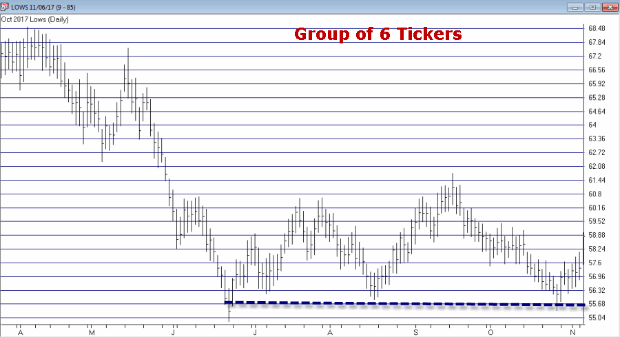 Figure 7 – The “Lows” Group (Courtesy TradingExpert)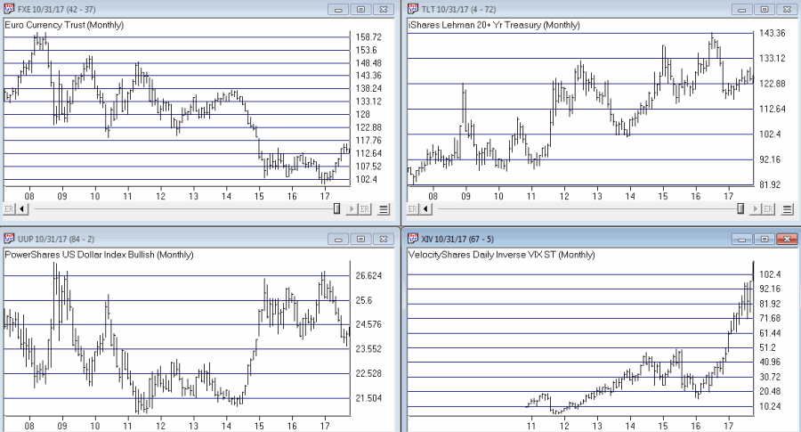




 English