Jan 12, 2018 | EDS, EDS code, educational newsletters, jay kaeppel
First the brutal disclaimers: What follows is NOT a trading “system.” It is merely an “idea.” Even more brutally, I can’t even claim that it “works”. All the testing I have done so far is more anecdotal. Also to an extremely huge degree, the actual entry trigger and exit trigger that trader might choose to use will have – as always – at least as much if not more impact on overall trading results as the actual “alert” signal detailed below.
Got that? OK, then let’s proceed.
The Debate
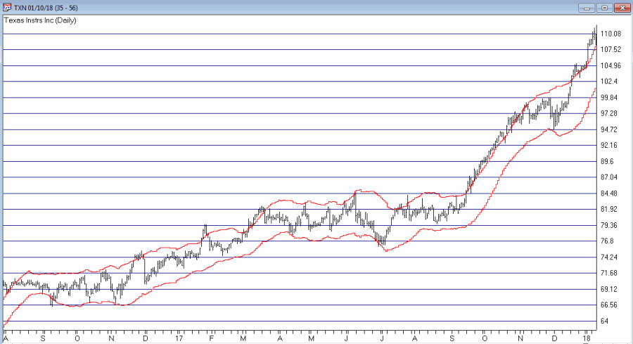
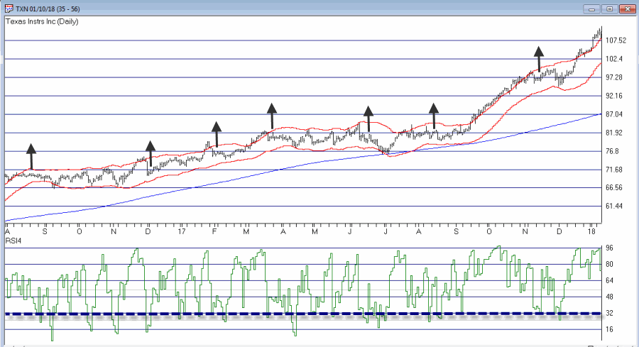
The ongoing debate in trading is always – trend-following or countertrend? Which is the way to go? There are (conservatively) at least a bazillion and one ways to argue one way or the other. Figure 1 displays ticker TXN with upper and lower “Acceleration Bands” (code for TradingExpert Expert Design Studio EDS appears after disclaimer at end of article) drawn.
Want to start a debate? Ask this question: Is it better to buy when price hits the upper band or the lower band? Sometimes price hits the upper band and just keeps going. Sometimes it hits the upper band and the move peters out and reverses fairly quickly.
Going with the trend can lead to some big winning trades along the way, but typically involves a lot of whipsaws as well. Trading countertrend can lead to some great, quick profits – expect of course for when the initial trend never quite reverses and quick losses accrue instead.
What to do, what to do?
So the “idea” I mentioned at the outset generally goes like this:
*In an uptrend (which we will define in a moment)
*Wait for price to hit the Upper Band
*Then wait for a pullback
*Then wait for the uptrend to reassert itself
Got that? OK, me neither exactly. So let’s try to define things a little more clearly.
1. As long as the closing price remains above the 200-day moving average, we will call that an “uptrend”
2. Within an uptrend wait for the high of a trading day to reach or exceed the Upper Acceleration Band.
3. Following #2, wait for the 4-day RSI to drop to 32 or lower with the following caveats:
*If price touches the Lower Acceleration Band OR closes below the 200-day moving average
*Then the setup is invalidated
This is the “Setup”. For sake of example I will add an entry trigger as follows:
4. Following a valid #3 Alert Signal, buy when price exceeds the previous day’s high
I am going to purposely NOT add an exit trigger – just so that no one decides to “try it out” without at least giving it some thought on their own.
So Figure 2 shows the “Alerts” and “Entry Triggers” for the chart in Figure 1.
So Figure 3 shows the “Alerts” and “Entry Triggers” for ticker EBAY
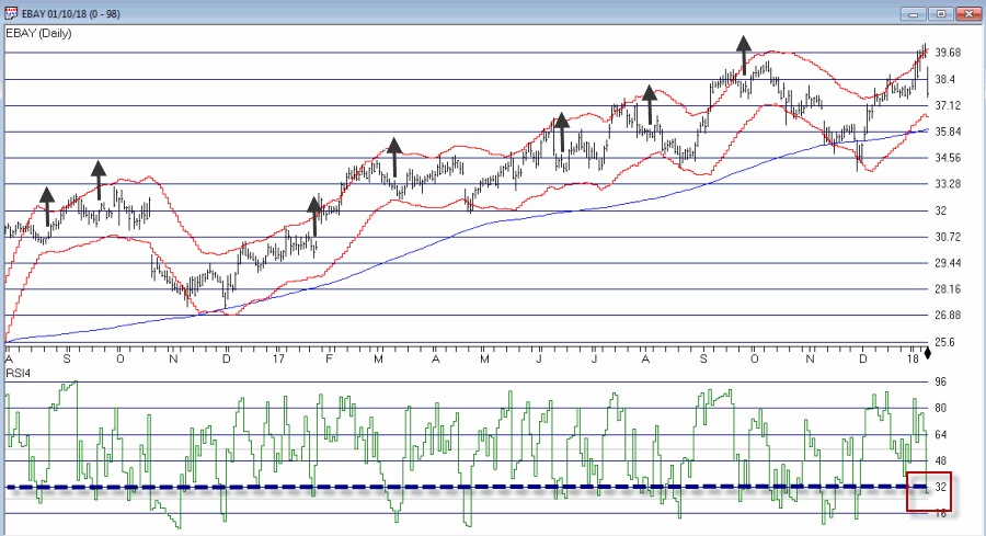
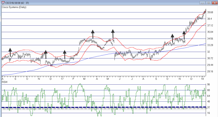
So Figure 4 shows the “Alerts” and “Entry Triggers” for ticker CSCO
So are these signals any good? Well, like a lot of trading methods, some look pretty good and others do not. As I also mentioned earlier, a lot depends on the method or methods you use to exit each trade.
Summary
The reality is that there is a chance that the “idea” contained herein is just no darn good.
But also remember that there are other “trend filters” (besides the 200-day moving average), there are other “bands” (besides Acceleration Bands”), there are other oversold indicators (besides 4-day RSI) and there are other entry and exit triggers.
As such, this piece is essentially for people who are willing to do a little digging on their own and, a) become comfortable (or not) with the idea, and b) develop some position sizing, stop-loss and profit-taking criteria.
Jay Kaeppel
Disclaimer: The data presented herein were obtained from various third-party sources. While I believe the data to be reliable, no representation is made as to, and no responsibility, warranty or liability is accepted for the accuracy or completeness of such information. The information, opinions and ideas expressed herein are for informational and educational purposes only and do not constitute and should not be construed as investment advice, an advertisement or offering of investment advisory services, or an offer to sell or a solicitation to buy any security.
Acceleration Bands Code for AIQ Expert Design Studio EDS
a is ([high]-[low]).
b is ([high]+[low])/2.
c is (a / b).
d is (c*2).
e is (1+d).
f is (1-d).
g is ([high]*e).
h is ([low]*f).
AccelUB is Simpleavg(g, 20).
AccelLB is Simpleavg(h, 20).
Jan 3, 2018 | educational newsletters, jay kaeppel, sector funds
At first blush there might not seem to be much to connect biotech stocks and gold stocks.
One type of company hires people to engage in high tech biomedical engineering in order to develop potentially life-saving – or at least, life altering – medical breakthroughs…
…while the other hires people to (essentially) dig holes in the ground and mine stuff (granted, valuable stuff, but stuff mined out of the ground nevertheless).
But there is one other connection – stocks of both categories are quite volatile. And that alone may be enough to create a potential opportunity.
The BioGold Index
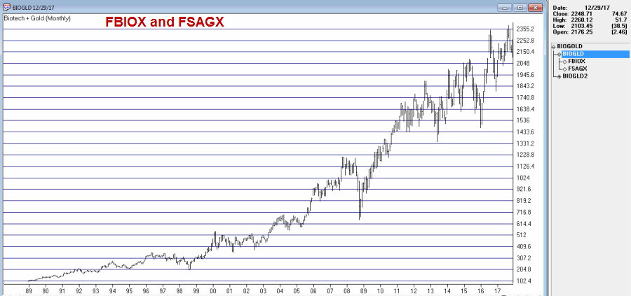
I created an “index” (such as it is) that combines Fidelity Select Biotech (FBIOX) and Fidelity Select Gold (FSAGX). The index appears in Figure 1. Like every other index in the world this index fluctuates up and down.
The RSI32 Index
The RSI32 Index is simply a 2-day average of the standard 3-day RSI Index. The code for TradingExpert EDS is below:
Define days3 5.
U3 is [close]-val([close],1).
D3 is val([close],1)-[close].
AvgU3 is ExpAvg(iff(U3>0,U3,0),days3).
AvgD3 is ExpAvg(iff(D3>=0,D3,0),days3).
RSI3 is 100-(100/(1+(AvgU3/AvgD3))).
RSI32 is simpleavg(RSI3,2).
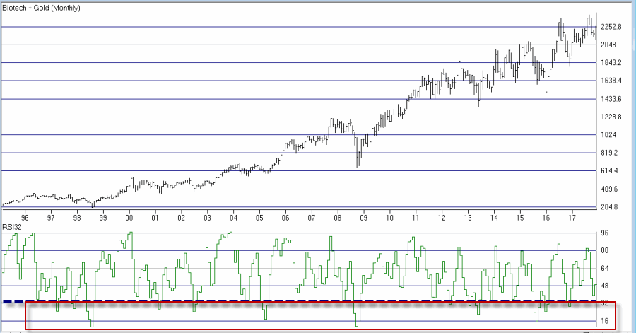
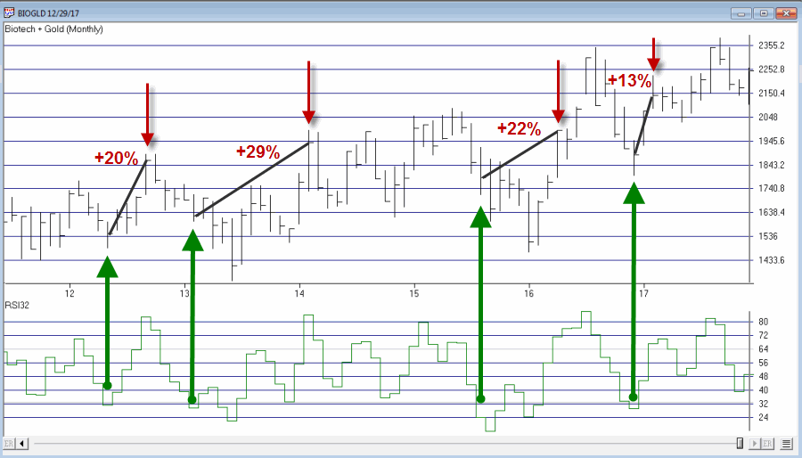
The RSI32 Index for the BioGold Index appears on the monthly bar chart in Figure 2.
Figure 2 – The BioGold Index with RSI32 (drop to 33 or below = BUY) (Courtesy
TradingExpert)
The BioGold “System”
The BioGold System works as follows:
*When the monthly RSI32 Index drops to 33 or lower, buy BOTH FBIOX and FSAGX
*After a “Buy Signal” then when the monthly RSI32 rises to 64 or higher, sell BOTH FBIOX and FSAGX
For testing purposes we will use monthly total return data for both FBIOX and FSAGX from the PEP Database from Callan Associates.
The Results
Figure 3 displays the results of the buy signals generated using the rules above (assumes that both FBIOX and FSAGX are bought after monthly RSI32 drops to 33 or lower and are held until monthly RSI32 rises to 64 or higher.
| Buy Signal |
Sell Signal |
FBIOX+FSAGX % +(-) |
| 4/30/1992 |
12/31/1992 |
+14.4% |
| 2/26/1993 |
4/30/1993 |
+14.7% |
| 4/29/1994 |
9/30/1994 |
+7.2% |
| 12/30/1994 |
4/28/1995 |
+9.8% |
| 4/30/1997 |
9/30/1997 |
+18.4% |
| 11/28/1997 |
4/30/1998 |
+10.4% |
| 6/30/1998 |
12/31/1998 |
+16.1% |
| 3/30/2001 |
6/29/2001 |
+22.7% |
| 7/31/2002 |
12/31/2002 |
+18.1% |
| 7/30/2004 |
10/29/2004 |
+11.2% |
| 3/31/2005 |
7/29/2005 |
+10.2% |
| 4/30/2008 |
7/31/2008 |
+9.4% |
| 9/30/2008 |
6/30/2009 |
+3.8% |
| 5/31/2012 |
9/28/2012 |
+20.0% |
| 2/28/2013 |
2/28/2014 |
+28.6% |
| 8/31/2015 |
4/29/2016 |
+22.2% |
| 12/30/2016 |
2/28/2017 |
+13.2% |
|
Average % |
+14.7% |
|
Median % |
+14.4% |
|
Std. Deviation % |
6.4% |
|
Max % +(-) |
+28.6% |
|
Min % +(-) |
+3.8% |
Figure 3 – Trade-by-Trade Results
For the record, the “System” has been in FBIOX and FSAGX only 28% of the time (88 months) and out of the market 72% of the time (223 months).
Figure 4 displays the trades in recent years.
Figure 4 – BioGold System trades; 2012-2017 (Courtesy
TradingExpert)
*The Good News is that all 17 signals since 1992 showed a profit, with an average gain if +14.7%.
*The Bad News is that, a) 17 trades in 25 years is a pretty small number of trades and, b) there are some not insignificant drawdowns along the way (-22.8% in 1998 and -22.4% in 2008, -14.1% in 2013 and -13.6% in 2016).
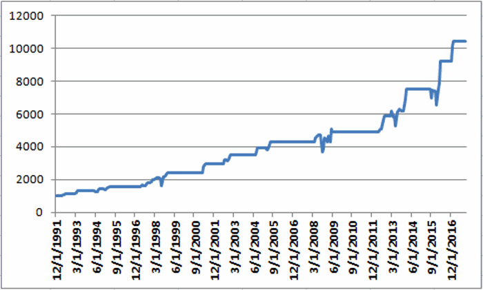
Still, for what it is worth the monthly equity curve appears in Figure 5.
Figure 5 – Growth of $1,000 invested using the “BioGold System”; 12/31/1991-12/29/2017
For the record, the “System” has been in FBIOX and FSAGX only 28% of the time (88 months) and out of the market 72% of the time (223 months).
For the record, the “System” has been in FBIOX and FSAGX only 28% of the time (88 months) and out of the market 72% of the time (223 months). No interest is assumed to be earned while out of the market in the test above.
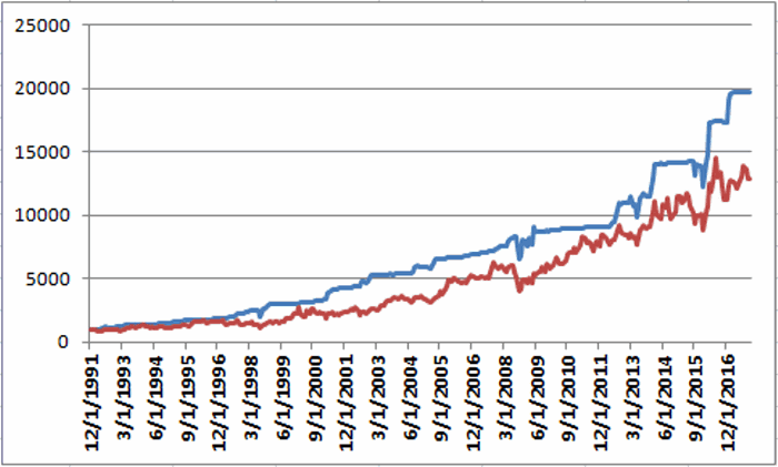
If we invest in short-term treasuries (1-3 yr.) while not in the stock market we get the results shown in Figure 6.
In Figure 6:
*The blue line represents the growth of $1,000 achieved by holding FBIOX and FSAGX when the BioGold System is on a “buy signal” and 1-3 yr. treasuries the rest of the time.
*The red line represents the growth of $1,000 achieved by buying and holding both FBIOX and FSAGX and then rebalancing at the end of each year.
The “System” grew to $19,863 and the “split” grew to $12,844.
Figure 6 – Growth of $1,000 using BioGold System plus 1-3 yr. treasuries when out of stocks (blue) versus buying and holding FBIOX and FSAGX and rebalancing each year (red);12/31/1991-12/29/2017
Summary
So is the “BioGold System” really a viable investment idea? That’s not for me to say. The per trade returns are pretty good but there aren’t a whole lot of trades and if history is a guide an investor would likely have to ride some significant drawdowns in order to reap the gains.
Still, market-beating performance is market-beating performance, so who knows?
Disclaimer: The data presented herein were obtained from various third-party sources. While I believe the data to be reliable, no representation is made as to, and no responsibility, warranty or liability is accepted for the accuracy or completeness of such information. The information, opinions and ideas expressed herein are for informational and educational purposes only and do not constitute and should not be construed as investment advice, an advertisement or offering of investment advisory services, or an offer to sell or a solicitation to buy any security.
Dec 20, 2017 | EDS, EDS code, Stocks & Commodities Traders Tips
The WinWay EDS code based on Vitali Apirine’s article in December 2017 issue of Stocks and Commodities magazine, “Weekly & Daily MACD,” is provided below.
The moving average convergence/divergence oscillator (MACD), developed by Gerald Appel, is one of the more popular technical analysis indicators. The MACD is typically used on a single timeframe, but what if we looked at two timeframes on one chart?
Traders can look for relative daily MACD line crossovers, weekly and daily centerline crossovers, and divergences to generate trading signals.
Figure 5 shows the daily & weekly MACD indicator on a chart of Apple Inc. (AAPL) during 2016 and 2017, when there was a change from a downtrend to an uptrend.
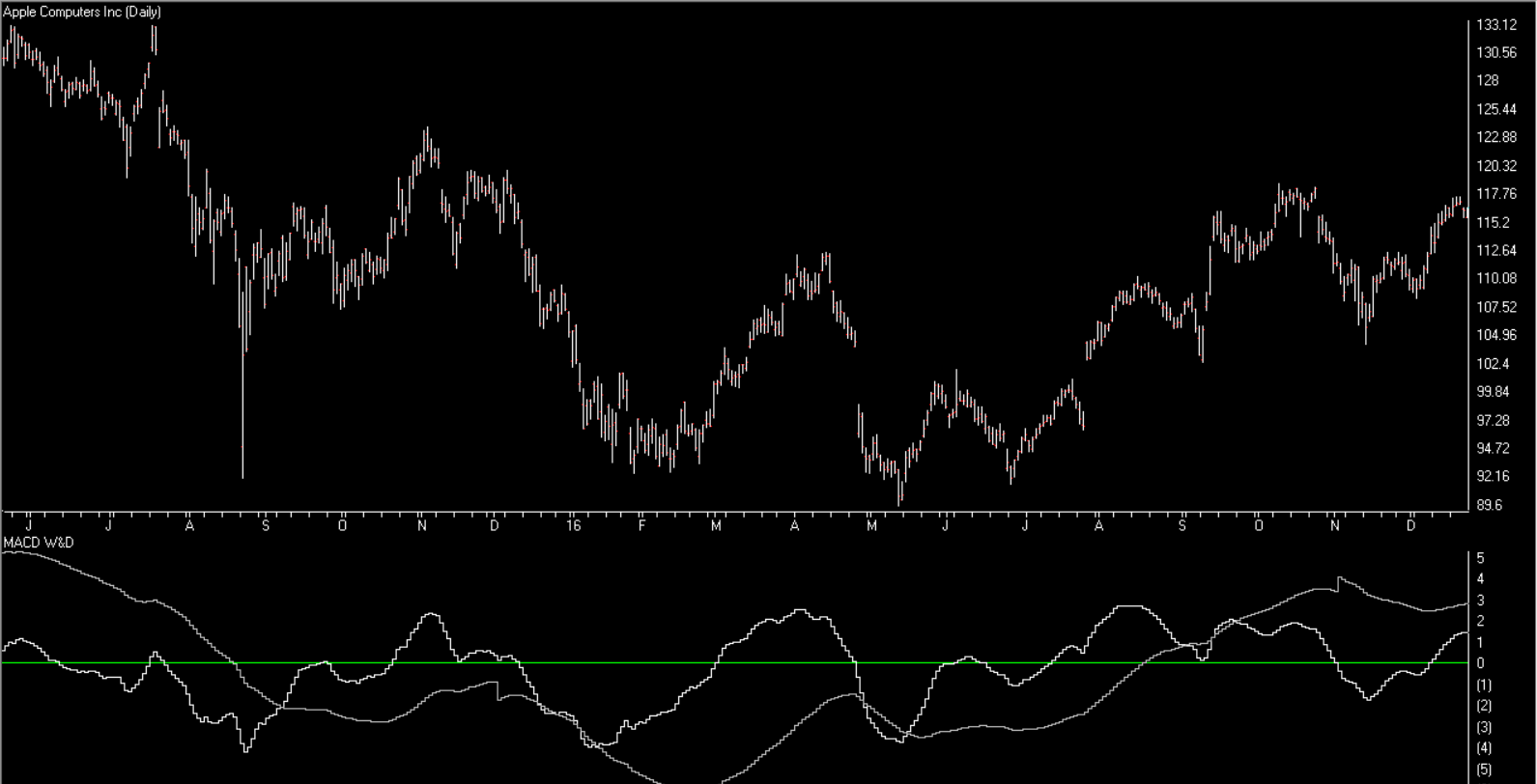
FIGURE 5: AIQ. Here is an example of the daily & weekly MACD on a chart of AAPL.
!WEEKLY & DAILY MACD
!Author: Vitali Apirine, TASC Dec 2017
!Coded by: Richard Denning 10/13/17
!www.TradersEdgeSystems.com

!INPUTS:
S is 12.
L is 25.

EMA1 is expavg([Close],S).
EMA2 is expavg([Close],L).
EMA3 is expavg([Close],S*5).
EMA4 is expavg([Close],L*5).
MACD is EMA1 - EMA2.
MACDW is EMA3 - EMA4.
rdMACD is MACD + MACDW.
Dec 14, 2017 | educational newsletters, jay kaeppel
First off, for the record I am an “Old Dog” and Bitcoin is a “New Trick”. That creates a problem right there. The truth is also that can’t honestly say that I fully understand what Bitcoin actually is or how it actually works (which technically means I am in pretty good company with a lot of people who are actually trading it, but I digress). And as a “grizzled veteran” (of the markets) there is a part of me that instinctively wants to dismissively shout “bubble” and sneeringly walk away. It’s not like it hasn’t been seen before – tulip bulbs, the Nifty 50, silver, technology/dot.com stocks, interest only mortgages and so on.
Most of you know the drill:
*Some form of “investment” catches lightning in a bottle
*The investment world (for lack of a more professional phrase) “wet’s itself”
*Price soars beyond all rational levels
You know, sort of like what you see in Figure 1…
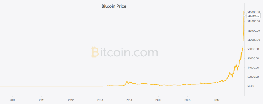
Figure 1 – Bitcoin price (Bitcoin.com)
…And then it all ultimately plummets painfully to earth.
Well, at least temporarily. I mean sure tulip bubbles never ascended the heights again, but a lot of the Nifty 50 went on to still be major companies even after their stock cratered. The same for a lot of the major dot.com era companies. Silver is still trading as a serious commodity and real estate seems to have rebounded.
In sum: Is Bitcoin forming a price “bubble”? It’s hard to look at Figure 1 and not think so. Of course, even if it is the questions no one can answer for sure are “When” and “from what level”?
The other question is “if it is a bubble and the bubble bursts, will crypto currencies go the way of tulip bulbs (as an investment) or is there a future for them in the long run?”
A Recent Bubble History Lesson
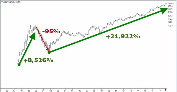
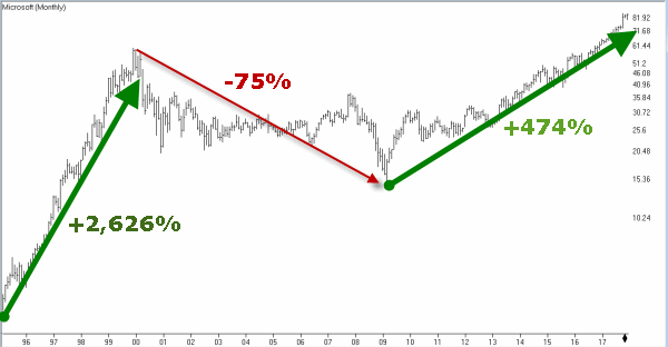
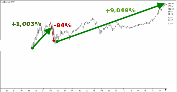
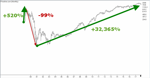
In the late 90’s into 2000 a bubble formed in tech stocks. And the bubble burst and it was ugly. And many “hot” companies folded and vanished. But not all of them and certainly not the major players. And certainly not the industry as a whole. Like I said before I don’t truly understand Bitcoin and crypto currencies. So I can’t say for sure if they are a “craze” – like tulip bulbs in the 1600’s during “Tulipmania” or something more viable and sustainable – like technology stocks. To understand why this distinction matters, consider the stocks listed in Figure 2.
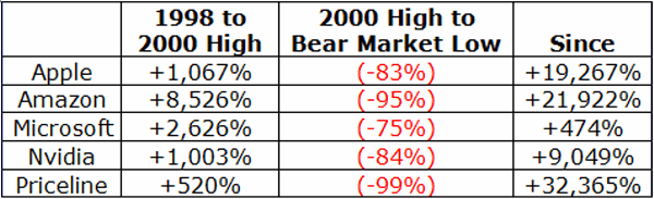
Figure 2 – Dot.com bubble stocks that survived and thrived
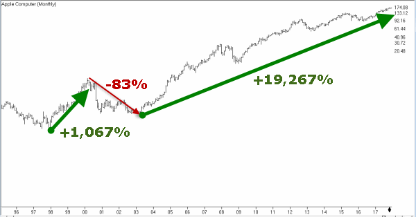
As you can see in Figure 2 through 7 each of these stocks experienced a “bubble” and a “crash”. Interestingly, the companies themselves ultimately rebounded and thrived.
The average “crash” was -87% and the average post-crash advance (so far) is about 16,000%.
Summary
The only thing we can say for sure is that some people will make a great deal of money from Bitcoin/crypto currencies and others will likely get wiped out. The danger is obvious: whenever you have a lot of investors “chasing” something – especially something that many of them don’t even understand – it is a recipe for trouble.
That being said, in my (market addled) mind the real “long-term” question is, will crypto currencies still be “a thing” after the bottom falls out? If Bitcoin is a bubble, then if history is a guide we can look or a decline in price somewhere in the 80% to 99% range after the top is ultimately made.
From there, if history is also a guide then depending on whether or not crypto currencies prove to be a viable thing, we can expect them to either:
a) Vanish altogether
OR
b) Rise 15-20 fold from the bottom
So here is my Bitcoin/crypto currency investing guide:
*It is OK to pile in and buy Bitcoin in hopes of getting rich (as long as you do not “bet the ranch”, invest only a small portion of your capital and acknowledge that a 100% loss is absolutely a possibility and that you are willing and able to accept that risk).
*It is also OK to sneer and shout “bubble” and not invest. But if and when the bottom drops out and prices crater remember to peruse the wreckage. There just might be an opportunity there (remember, Priceline lost -99% when the dot.com bubble burst, then gained 32,000%).
In any event, hold on tight people, this is NOT going to be a smooth ride.
Disclaimer: The data presented herein were obtained from various third-party sources. While I believe the data to be reliable, no representation is made as to, and no responsibility, warranty or liability is accepted for the accuracy or completeness of such information. The information, opinions and ideas expressed herein are for informational and educational purposes only and do not constitute and should not be construed as investment advice, an advertisement or offering of investment advisory services, or an offer to sell or a solicitation to buy any security.
Dec 1, 2017 | EDS, EDS code, trading strategies, trading strategy
The Expert Design Studio code for Jerry D’Ambrosio and Barbara Star’s article, “A Candlestick Strategy With Soldiers And Crows,” in Stocks & Commodities October 2018 issue is shown below.”Among the more well-known candlestick reversal patterns are soldiers and crows. These occur in a three-candle pattern such as three white soldiers or three black crows. Recently, on the website Candlesticker.com, we learned of two other candle reversal patterns—a bullish one white soldier and a bearish one black crow—that require fewer candles. ”
!A CANDLESTICK STRATEGY WITH SOLDIERS AND CROWS
!Author: Jerry D'Ambrosio & Barbara Star, TASC Oct 2017
!Coded by: Richard Denning 8/05/2017
!www.TradersEdgeSystems.com

!CODING ABBREVIATIONS:
O is [open].
O1 is valresult(O,1).
C is [close].
C1 is valresult(C,1).
C2 is valresult(C,2).
H is [high].
L is [low].
V is [volume].

!INPUTS:
minPriceBull is 1.
minPriceBear is 10.
minVolume is 1000. !in hundreds
volAvgLen is 50.
dayCount is 5.
longExitBars is 7.
shortExitBars is 1.

okToBuy if simpleavg(C,50) > simpleavg(C,200) or CminPriceBull and simpleavg(V,volAvgLen)>minVolume.
BullWS if C1C1 and C>O1 and O= longExitBars.

okToSell if simpleavg(C,50) < simpleavg(C,200) or C>simpleavg(C,200)*1.1.
okToSellMkt if TickerRule("SPX",okToSell).
PVfilterBear if C>minPriceBear and simpleavg(V,volAvgLen).
BearBC if C1>C2 and C1>O1
     and OO1
     and countof(C1>C2,dayCount)=dayCount
     and PVfilterBear and okToSellMkt.
ExitShort if {position days} >= shortExitBars.
I ran several backtests using the NASDAQ 100 list of stocks over the period from 8/04/2000 to 8/04/2017. I varied the following inputs to find the optimum set of parameters for the candlestick patterns. For longs, the “dayCount” = 5 with an “longExitBars” = 7 produced the best results, which is shown in Figure 5. For shorts, the “dayCount” = 5 with a “shortExitBars” = 1 produced the best results, which is shown in Figure 6. Neither commission nor slippage were subtracted from the results.
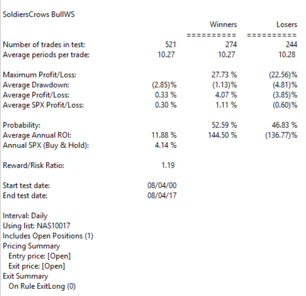
FIGURE 5: WINWAY. EDS summary report for longs only.
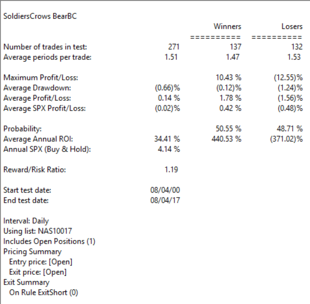
FIGURE 6: WINWAY. EDS summary report for shorts only.

 English