How Five Market Timing Signals Captured 4,500 Points While Avoiding Two Major Declines
One of the most common questions we hear from traders is: “Can a systematic approach really identify market turning points in real-time?” The answer is yes—when you have the right tools and a disciplined, rule-based methodology.
Let me show you exactly how AIQ Market Timing navigated a volatile 2.5-month period from October 2025 through January 2026, capturing three significant rallies totaling 4,500 points while protecting capital during two major reversals totaling over 3,000 points of decline.
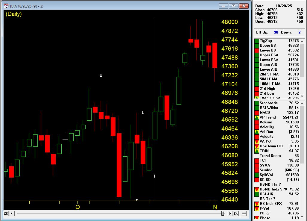
The Setup: Multiple Bullish Confirmations (October 20, 2025)
On October 20th, AIQ Market Timing issued a 98 UP signal at 46,707 on the Dow Jones Industrial Average. But this wasn’t just a single indicator flashing green—it was a confluence of five critical rules firing simultaneously:
Rule #1: Trend Status Confirmation
Trend Status changed to a weak upward trend
This indicated an upward trend was starting that could continue
Classification: Moderate bullish signal
Rule #2: Exponentially Smoothed A/D Line
The smoothed advance/decline line turned positive
Key factor: The UD volume oscillator and A/D oscillator were ALREADY positive
This alignment is viewed as bullish, often preceding upward price movement
Rule #3: Up/Down Volume Oscillator
The UD volume oscillator turned positive
Confirmation: A/D oscillator and smoothed A/D line were already positive
This convergence signaled institutional buying was building
Rule #4: Advance/Decline Oscillator
The A/D oscillator turned positive
Supporting indicators: UD volume and smoothed A/D line already positive
Multiple breadth measures confirming the move
Rule #5: Volume Accumulation Alignment
A/D oscillator turned positive with volume accumulation already positive
In a weak upward market, this signals prices could continue rising
Professional money was accumulating positions
The Result: +1,333 Points in 8 Days
The market moved from 46,707 on October 21st to 48,040 on October 29th—a gain of 1,333 points (+2.85%) in just eight trading days.
This is the power of waiting for multiple confirming indicators rather than jumping on single signals. The system identified strong internal market momentum that wasn’t yet obvious to casual observers.
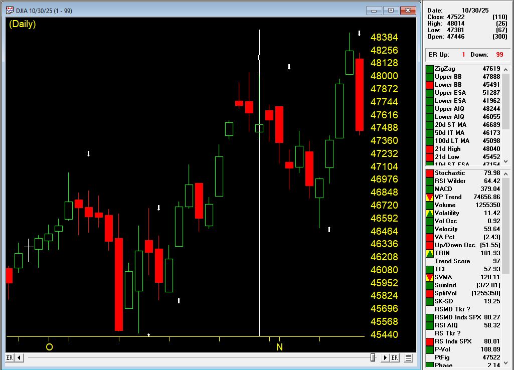
The Top: System Catches the Reversal (October 30, 2025)
Just one day after the market high, on October 30th at 47,659, AIQ Market Timing 98 issued a DOWN signal. The system caught the top within just 11 points of the absolute high (48,040 vs. 47,659).
Two Critical Bearish Rules Fired:
Rule #1: Breadth Deterioration
The exponentially smoothed A/D line turned negative
Warning sign: UD volume oscillator and A/D oscillator were already negative
This indicated institutional distribution was underway
Rule #2: Volume Accumulation Breakdown
Volume accumulation turned negative
The A/D oscillator was already negative
In a downtrending market, this bearish signal often precedes price declines
Initial Decline: -1,164 Points in 7 Days
From the October 31st level of 47,659, the market dropped to 46,495 by November 7th—a decline of 1,164 points (-2.44%) in seven trading days.
Traders following these signals would have been long for the +2.85% rally and either flat or profitably short for the -2.44% decline.
The Confirmation: Second Down Signal (November 4, 2025)
On November 4th, while the market was still declining, AIQ Market Timing 98 issued a second DOWN signal, reinforcing the bearish outlook. This is where systematic trading truly shines—when multiple signals confirm the trend in real-time.
Three Additional Bearish Rules Fired:
Rule #1: Trend Status Reversal
Trend Status changed to a weak downward trend
This confirmed the downward trend was likely to continue
Classification: Moderate bearish signal
Rule #2: Stochastic and Volume Divergence
Volume accumulation percentage was decreasing
The 21-day stochastic moved below the 80% line
In a downtrending market: Strong bearish signal
This combination often precedes significant downward price movement
Rule #3: UD Volume Oscillator Breakdown
The UD volume oscillator turned negative
Critical context: Smoothed A/D line and A/D oscillator were already negative
This confirmed selling pressure was intensifying
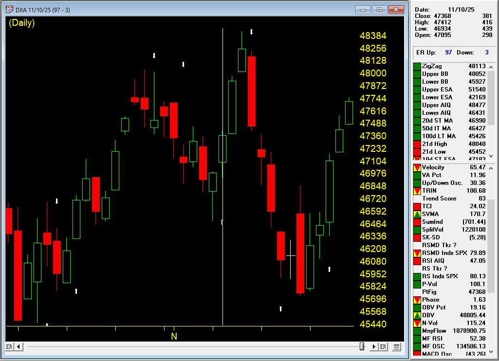
Signal #3: Back to Bullish (November 10, 2025)
On November 10th at 47,368, AIQ Market Timing issued an UP signal (97), indicating the correction had run its course and a new upward move was beginning.
Four Powerful Bullish Rules Fired:
Rule #1: Exponentially Smoothed A/D Line
Turned positive with UD volume oscillator and A/D oscillator already positive
This alignment indicated strong bullish internal momentum building
Rule #2: Advance/Decline Oscillator Confirmation
Turned positive with UD volume oscillator and smoothed A/D line already positive
Multiple breadth measures confirming the new uptrend
Rule #3: Volume Accumulation Alignment
A/D oscillator turned positive with volume accumulation already positive
In a sideways market, this signals prices could begin upward movement
Professional buying was returning
Rule #4: New High/New Low Reversal
The NH/NL indicator reversed to the upside
Classification: Reliable bullish signal
Often followed by upward price movement
In a sideways market, an uptrend could start shortly
The Rally: +1,063 Points in 3 Days
The market surged from 47,384 on November 11th to 48,431 on November 13th—a gain of 1,040 points (+2.22%) in just three trading days.
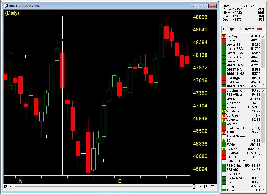
Signal #4: The Top Again (November 13, 2025)
At the market high of 48,233, AIQ Market Timing issued a DOWN signal (100), once again catching the reversal with precision.
Five Bearish Rules Fired:
Rule #1: Stochastic and Price Phase Weakness
21-day stochastic declined below the 80% line
Price phase indicator also decreasing
In the uptrending market: Weak bearish signal indicating possible near-term decline
Rule #2: Smoothed A/D Line Breakdown
Turned negative with UD volume and A/D oscillator already negative
Clear sign of breadth deterioration
Rule #3: UD Volume Oscillator Reversal
Turned negative with smoothed A/D line and A/D oscillator already negative
Institutional selling was intensifying
Rule #4: A/D Oscillator Breakdown
Turned negative with UD volume and smoothed A/D line already negative
All breadth measures aligned bearishly
Rule #5: New High/New Low Reversal
The NH/NL indicator reversed to the downside
Classification: Reliable bearish signal
Often followed by downward price movement
In an uptrending market, a trend reversal could occur
The Decline: -1,500 Points in 7 Days
From November 14th’s open of 47222, the market plunged to 45,728 on November 20th—a drop of nearly 1500 points (3.16%) in five trading days.
This was a significant correction that caught many traders off guard. But AIQ Market Timing identified it precisely at the top.
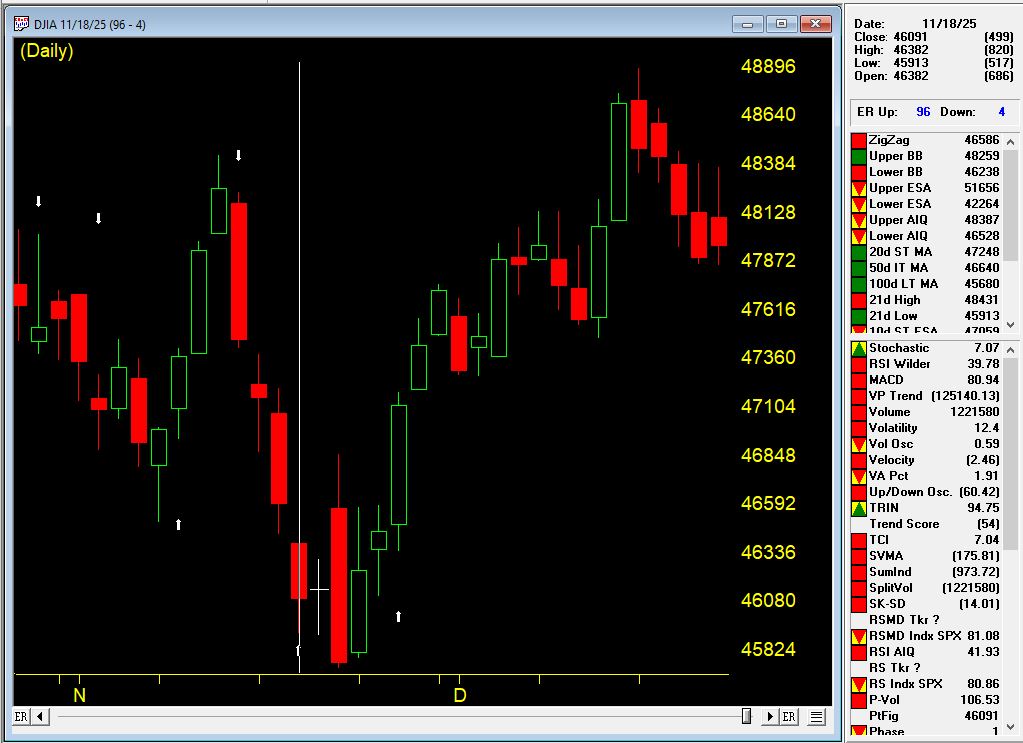
Signal #5: The Current Rally (November 18, 2025 – Present)
On November 18th at 46,091, AIQ Market Timing issued an UP signal (96), catching the bottom of the correction and positioning traders for what would become a powerful sustained rally.
The Rally Continues: over 3000 Points and Counting
From the November 19th entry at 46,138, the market has surged to 49,616 as of January 13, 2026—a gain of over 3,300 points (+7.0%) that is STILL RUNNING.
This ongoing rally has already lasted 45 days and shows the power of staying with a trend when the system confirms the move.
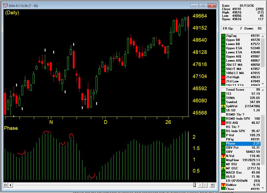
The Complete Picture: What This Teaches Us
Over a 2.5-month period from October 21, 2025 to January 9, 2026, AIQ Market Timing issued five signals:
The Numbers Are Staggering
Total gains captured: over 5,000 points across three rallies Total declines avoided: over 3,000 points across two corrections Current position: Still long in a rally that has gained 7.0%
Compare this to buy-and-hold over the same period:
Started: 46,707 (Oct 21)
Current: 49,504 (Jan 9)
Buy-and-hold gain: +2,797 points (+5.99%)
This sequence demonstrates several critical principles of successful systematic trading:
1. Confirmation Over Single Indicators
Every up signal had multiple rules firing together—not weak, isolated signals but powerful confluences showing aligned market internals. Signal #1 had five rules, Signal #3 had four rules including the reliable NH/NL indicator.
2. Speed Matters
The system caught reversals with remarkable precision: one day after the October high, right at the November 13th high. Manual observation would have missed these turning points.
3. Internal Strength vs. Price Action
The breadth indicators (A/D measures, volume accumulation, UD volume, NH/NL) detected shifts in market character before they became obvious in price alone.
4. Consistency Across Different Market Conditions
This wasn’t a lucky streak. The system worked in:
Weak upward trends (October)
Weak downward trends (early November)
Sideways markets (mid-November)
Strong sustained uptrends (late November – January)
5. Multiple Cycles Compound Returns
Notice how the system didn’t just catch ONE move—it navigated FIVE distinct market phases. This is where systematic trading truly shines: the ability to stay on the right side of the market through multiple cycles.
6. Reliable Indicators Add Conviction
The New High/New Low indicator appeared in both Signal #3 (bullish reversal) and Signal #4 (bearish reversal), classified as “reliable” both times. When these high-probability signals appear, they deserve attention. Adding in the Phase indicator, confirmation was present for all the signals and is considered a valid confirmation within +/- 3 days of the signal.
7. Both Sides of the Market
This wasn’t just about catching rallies. The system protected capital by identifying when conditions changed, allowing traders to exit longs, stay in cash, or even profit from declines totaling 3,669 points.
Multiply this advantage over weeks, months, and years, and you begin to understand why systematic, rule-based trading provides such a significant edge.
The Bottom Line
AIQ Market Timing isn’t about predictions or gut feelings. It’s about:
Objective rules that fire based on market internals
Multiple confirming indicators that reduce false signals
Real-time alerts that keep you informed as conditions change
Historical validation proving the methodology works across different market environments
Consistent performance across multiple market cycles
Are you ready to trade with this level of systematic precision? $1 trial available
Learn more about AIQ Market Timing 98 and other professional-grade technical analysis tools at AIQ Systems.
Past performance does not guarantee future results. All trading involves risk. The examples shown are for educational purposes and represent act
When traders look at long-term index performance charts, it’s tempting to assume they reflect the “true” experience of investors over time. But there’s a hidden distortion baked into indices like the S&P 500 and Russell 2000: survivorship bias. This bias occurs because failing companies are regularly removed and replaced by stronger firms, making historical index performance look healthier than what an actual buy-and-hold investor might have experienced.
How Survivorship Bias Skews the S&P 500
The S&P 500 is marketed as a snapshot of the 500 largest U.S. companies, but the membership list is far from static. Every year, dozens of names are swapped in and out. Companies that go bankrupt or underperform are removed, while stronger or fast-growing companies are added.
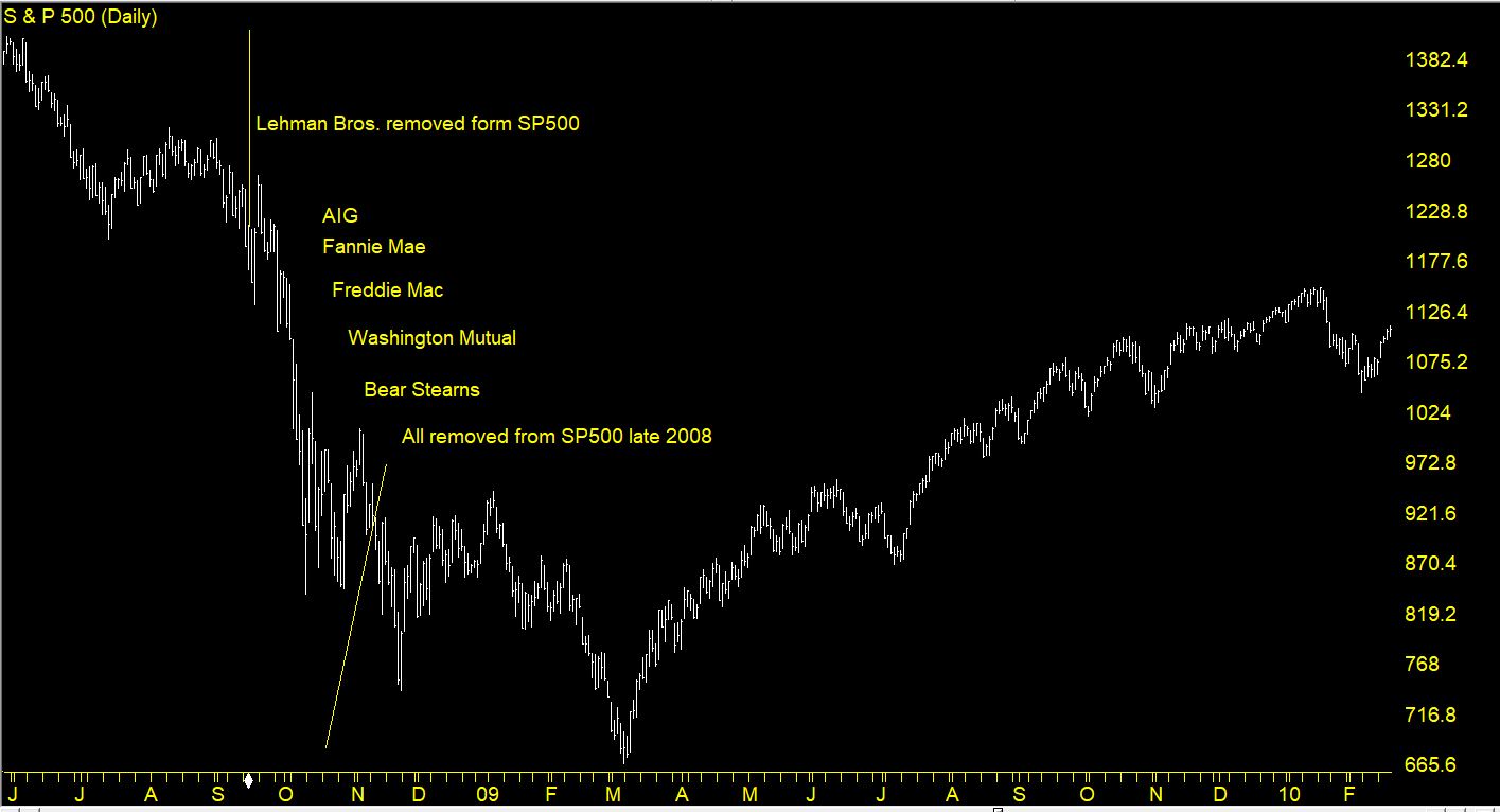
The SP500 index with major stocks removed at the height of the financial crisis
Consider the S&P 500 in 2007. Back then, financial giants like Lehman Brothers, Bear Stearns, and Washington Mutual were all part of the index—until the financial crisis exposed their fragility. Those stocks went to zero, but the historical chart of the S&P 500 smooths over their collapse because new leaders like Amazon, Nvidia, and Tesla later replaced them. The result: the long-term S&P 500 chart looks like a steady upward march, when in reality, an investor in the 2007 version of the index would have faced far more volatility and permanent capital loss in certain holdings.
This explains why the index’s backward-looking return can feel disconnected from the lived experience of investors who actually held the stocks in those earlier lineups.
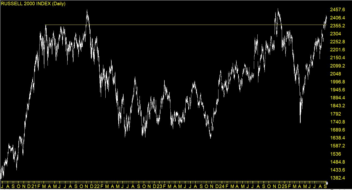
The Russell 2000: Why It’s Barely Moved in 5 Years
The Russell 200 chart from late 2020 to current
The Russell 2000 highlights survivorship bias in another way. Unlike the S&P 500, which rotates in stronger companies, the Russell is composed of small-cap stocks, many of which don’t survive or struggle to grow consistently.
Over the past five years, the Russell 2000 has barely moved, stuck in a sideways range, even while the S&P 500 has marched higher. Why? Because many small caps in the Russell 2000 face structural challenges—thin margins, high debt, vulnerability to rising interest rates—that prevent them from compounding like large-cap tech stocks. Although the Russell swaps out some names, the sheer number of struggling companies means the index reflects more of the “grind” of small-cap reality. Survivorship bias here doesn’t create the same illusion of strength—it highlights stagnation instead.
Why This Matters for Traders
Survivorship bias creates a dangerous blind spot: it makes past returns look better than what an investor might have achieved if they actually owned the index’s constituents at the time.
For the S&P 500, it means that long-term performance charts hide the graveyard of failed companies. The winners dominate the narrative, but the losers were just as real for investors who held them.
For the Russell 2000, it means traders need to be aware that many of its members are structurally weak, which can cap index-level returns despite occasional rallies.
How Traders Can Navigate Survivorship Bias
Dig Into Index Components – Don’t just look at the headline number. Study which sectors and companies are driving the gains or stagnation.
Use Equal-Weight Alternatives – The S&P 500 Equal Weight Index provides a different perspective, diluting the effect of mega-cap leaders and better reflecting the average stock’s performance.
Blend With Sector/ETF Analysis – Instead of relying only on broad indices, drill down into sector ETFs or specific trading groups to uncover true leadership and laggards.
Keep Survivorship in Mind – When backtesting or studying history, remember the S&P 500 of 2007 is not the same as today’s. Adjust your expectations accordingly.
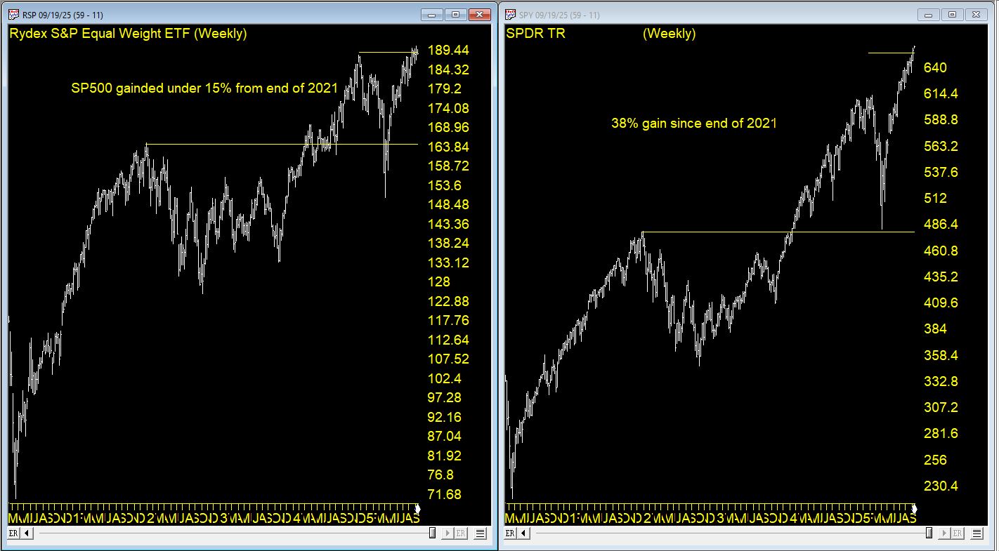
Equal-Weighted vs Cap-Weighted Indices: Why the Difference Matters
Most traders are familiar with the standard S&P 500, but fewer realize it’s a market-cap weighted index. That means larger companies (like Apple, Microsoft, Nvidia, and Amazon) dominate its movements. A 5% swing in Apple carries far more weight than a 5% move in a mid-cap stock buried deep in the index. Over time, this weighting system concentrates returns in a handful of mega-cap leaders, amplifying the survivorship bias effect: the winners shape the chart, while the losers fade into irrelevance.
By contrast, the S&P 500 Equal Weight Index treats every company the same, regardless of size. Each stock counts for 0.2% of the index at rebalancing. This approach provides a more balanced view of how the average stock in the S&P is performing. During periods when mega-cap tech leads the market (like the last several years), the equal-weight index lags behind the cap-weighted S&P. But in broad-based rallies where many sectors participate, the equal-weight version often outperforms.
This chart compares the SPY ETF, a perfect surrogate for the SP500 index vs RSP, the Rydex SP500 Equal Weighted ETF. Total return for SPY from the end of 2021 was around 38%. For the RSP it was 15% for the same period.
Why This Matters for Traders
Cap-Weighted Bias – The standard S&P 500 often hides the struggles of most companies because the top 5–10 stocks drive the majority of returns.
Equal-Weight Reality Check – Equal weighting exposes whether the rally is broad or narrow. If the equal-weight index is flat while the cap-weighted index surges, it’s a sign that leadership is very concentrated.
Practical Application – Traders can compare the two versions (SPX vs RSP) to gauge market health. A wide gap between them signals that survivorship bias and concentration are distorting the headline numbers.
Final Thoughts
Market indices are invaluable tools, but they aren’t perfect mirrors of reality. Survivorship bias smooths over failures, amplifies winners, and sometimes hides the real risks of buy-and-hold investing. By understanding how indices evolve—and by analyzing beneath the surface—traders can avoid being lulled into a false sense of security and make smarter, more grounded trading decisions.
WinWayCharts Market Timing Expert Ratings compress hundreds of technical conditions into a single, actionable score. Use 95+ up or down ratings as “of-notice” events, then confirm direction with the Price Phase indicator before acting. This simple two-step process keeps you aligned with the dominant swing while filtering many head fakes.
What the Market Timing Expert Rating Really Is
Under the hood, the Expert System evaluates ~400+ indicator states through an inference engine (decision-tree style) and outputs a daily market rating—from neutral to powerful up/down signals. You’ll also see these ratings plotted directly on historical charts in TradingExpert Pro.
Why that matters: Instead of juggling dozens of internals, you get a unified, explainable read of market conditions that has been kept methodologically stable for years (no goal-post shifting or perpetual re-optimization). That stability helps make the historical behavior of the signals more comparable across cycles.
Market Timing signals with confirmation by Phase Jan – May 2025
The Confirmation Key: WinWayCharts Price Phase Indicator
WinWayCharts explicitly recommends using the Price Phase Indicator (“Phase”) as the primary filter for Expert Ratings. When Phase direction agrees with a high Expert Rating signal, the signal is considered confirmed. In other words:
Strong Up Rating (≥95) → look for Phase turning up or already rising to confirm.
Strong Down Rating (≥95) → look for Phase turning down or already falling to confirm.
This is purposeful: Expert Ratings often fire early—giving you a heads-up—while Phase helps you avoid acting too soon. Think of Ratings as the alert and Phase as the green light.
Interpreting the Score: When Does “High” Mean “Actionable”?
Per guidance, 95 or greater to the upside or downside is the zone “of notice.” That’s when you should lean in, check Phase, and consider entries/exits or hedges—not when readings are middling or neutral. Most days are neutral; the edge lives in waiting for 95+ and confirming with Phase.
WinWayCharts Market Timing signals with confirmation by Phase May – Aug 2025
Where to See It in TradingExpert Pro
On your WinWayCharts Main Menu, select Market Charts, and plot Price Phase in a lower pane. This combination is designed for side-by-side evaluation.
If you prefer a visual “state” view, Heikin-Ashi-mode bars with Phase underneath are often used in WinWayCharts’s examples to highlight trend persistence.
How to Read the 2025 Chart (Step-by-Step Playbook)
Spot the Spike
Scan for 95+ up/down ratings. Put a small flag on each to review.
Check Phase Direction
If the rating is Up (≥95), is Phase rising or just turned up?
If Down (≥95), is Phase falling or just turned down? Match = Confirmation. No match? Put it on watch—often the earliest ratings need a bar or two before Phase confirms.
Plan Entries/Exits
For confirmed Up: consider scaling into risk-defined long exposure, tightening shorts.
For confirmed Down: consider trimming longs, or tactical shorts—again, with risk clearly defined.
Manage the Hold
Historical AIQ studies often show swing-length holds rather than ultra-short scalps (average holds are one week to several weeks), but your trade horizon should match your strategy.
Best Practices (That Save You from Heartache)
Don’t front-run Phase on big ratings. Early feels clever until it doesn’t. Let the filter do its job.
Treat 95 as your attention alarm. Below that, conserve focus; above that, prepare plans.
Neutral = No edge. Most days are noise; your edge is in selectivity.
Common Questions
Q: Are the rules curve-fit over time? A: We deliberately keeps the rating calculation stable, avoiding constant re-tuning. That consistency is part of why the historical behavior is analyzable.
Q: Is Phase the only valid confirmation? A: It’s primary confirmation tool for Expert Ratings and the one used in the official “confirmed” flagging. You can add your own overlays, but Phase remains the recommended filter.
Q: Do signals work on intraday charts? A: The Market Timing ratings are generated daily. You can time entries intraday after a daily confirmation, but the signal itself is evaluated on the daily close framework.
Final Word
WinWayCharts Market Timing Expert Ratings give you clean, explainable signals—and the Price Phase indicator gives you the discipline to act only when odds tilt in your favor. Use the 95+ threshold to focus, Phase to confirm, and your risk plan to stay in the game when it counts.
In a recent Zoom meeting, Steve Hill, founder of WinWayCharts, shared Bollinger Bands Setups, Variations & Trade Timing. In this article, we’ll expand on using %B and creating custom indicators to help identify trade setups using Bollinger Bands and %B.
When John Bollinger introduced Bollinger Bands in the 1980s, traders gained a powerful visual tool for understanding market volatility and potential turning points. But tucked away inside the Bollinger Band toolkit is a lesser-known gem: %B.
If Bollinger Bands are the map, %B is the GPS — it tells you exactly where price is, relative to the bands, at any given time. This extra precision can help you spot breakouts, reversals, and trend confirmations faster.
What is %B?
%B measures the position of the last closing price within the Bollinger Band range.
%B = 1.0 → Price is exactly at the upper Bollinger Band.
%B = 0.0 → Price is exactly at the lower Bollinger Band.
%B > 1.0 → Price is above the upper band (potential breakout or overbought).
%B < 0.0 → Price is below the lower band (potential breakdown or oversold).
Why Use %B Instead of Just the Bands?
While the bands themselves are great for visual trading, %B turns them into a precise numeric oscillator that’s perfect for:
Coding trading systems (like in WinWayCharts’s Expert Design Studio).
Screening for setups in thousands of stocks.
Backtesting with exact entry/exit rules rather than “eyeballing” the chart.
Five Ways to Use %B in Trading
1. Overbought/Oversold Mean Reversion
Buy when %B < 0.05 (price hugging lower band) and momentum turns up.
Sell when %B > 0.95 (price hugging upper band) and momentum turns down.
2. Trend Breakouts
Buy when %B crosses above 1.0 (price breaks above upper band in an uptrend).
Sell when %B crosses below 0.0 (price breaks below lower band in a downtrend).
3. Band “Walks”
In strong trends, price can “walk” the band.
In an uptrend, %B will often stay above 0.8 for extended periods.
In a downtrend, %B will often stay below 0.2.
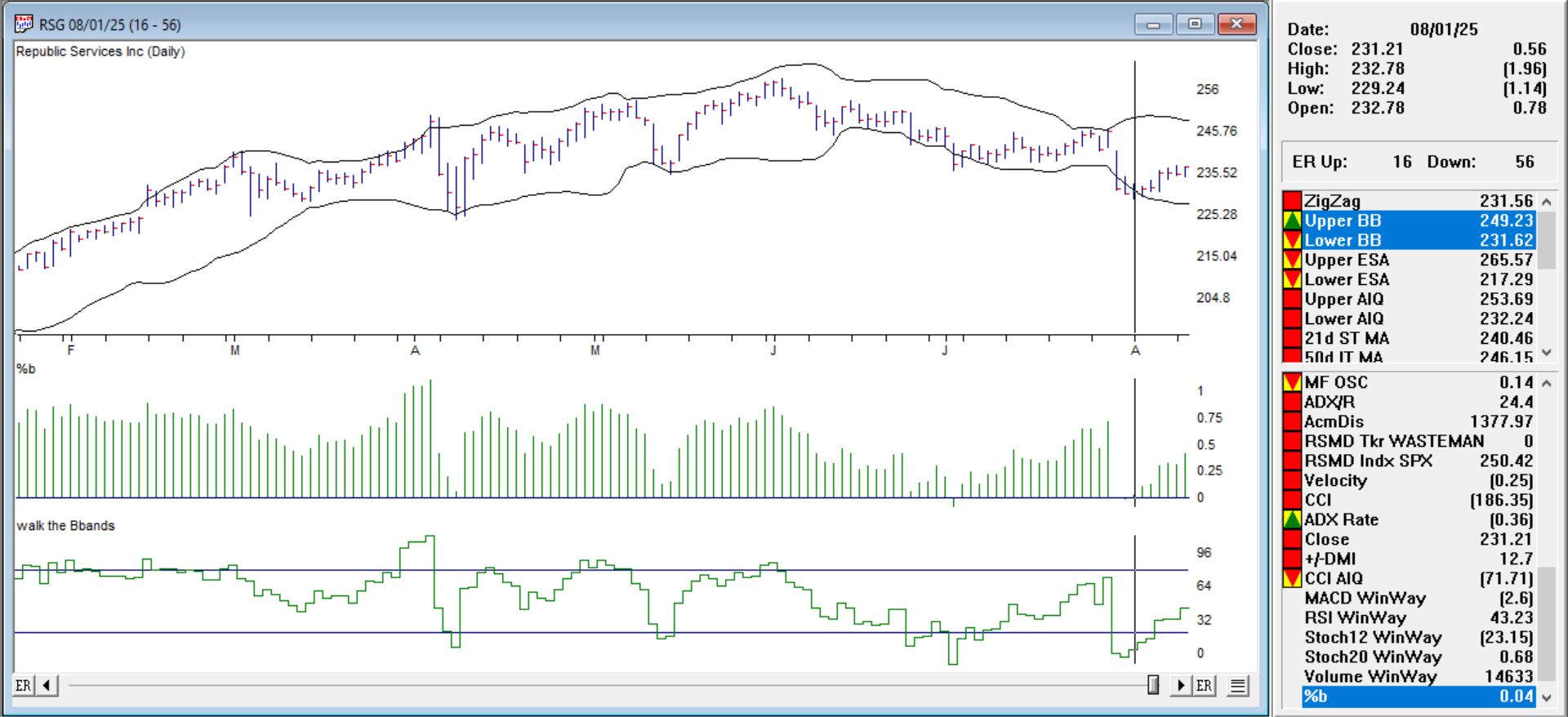
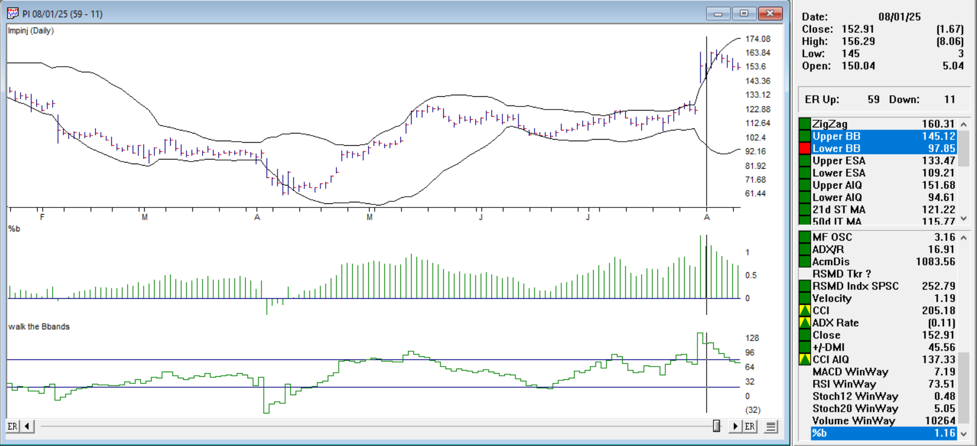
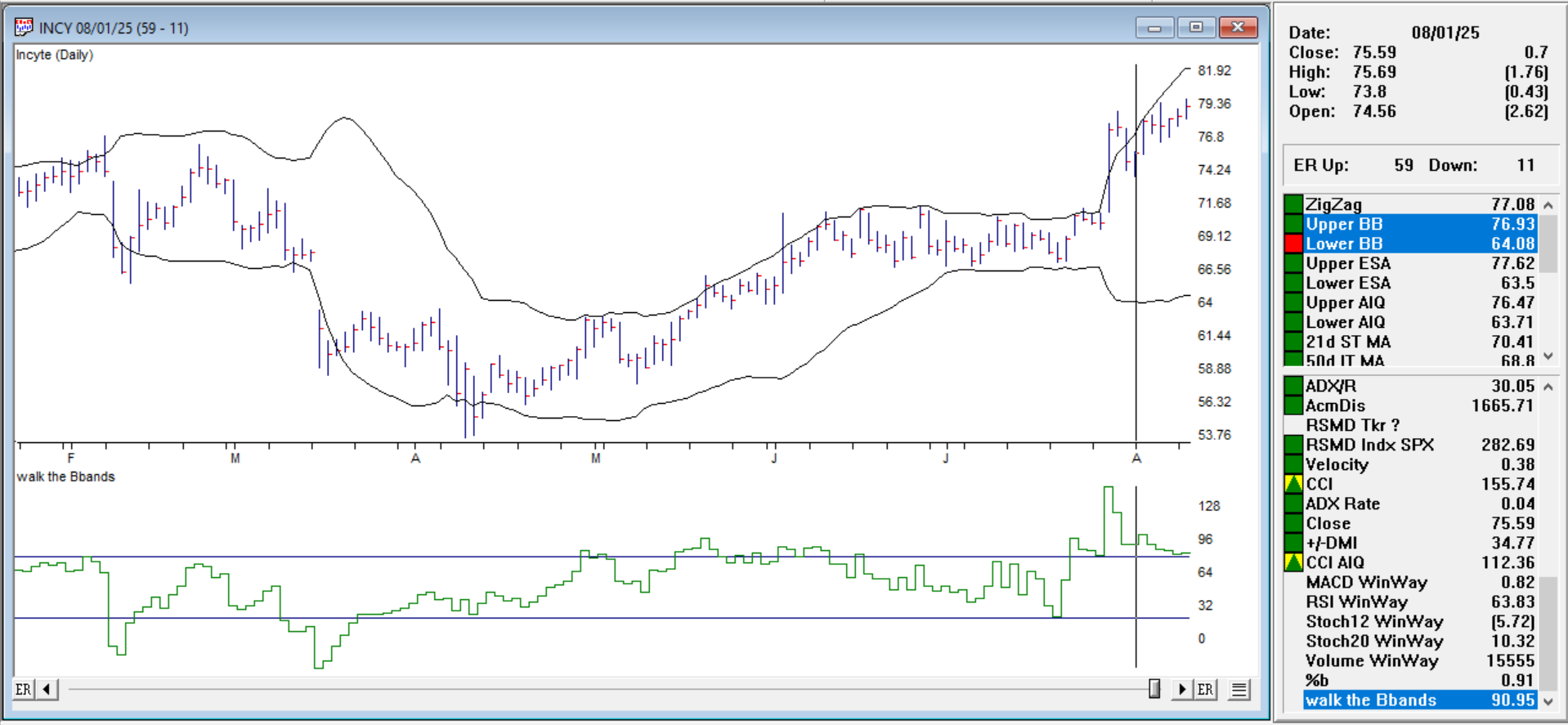
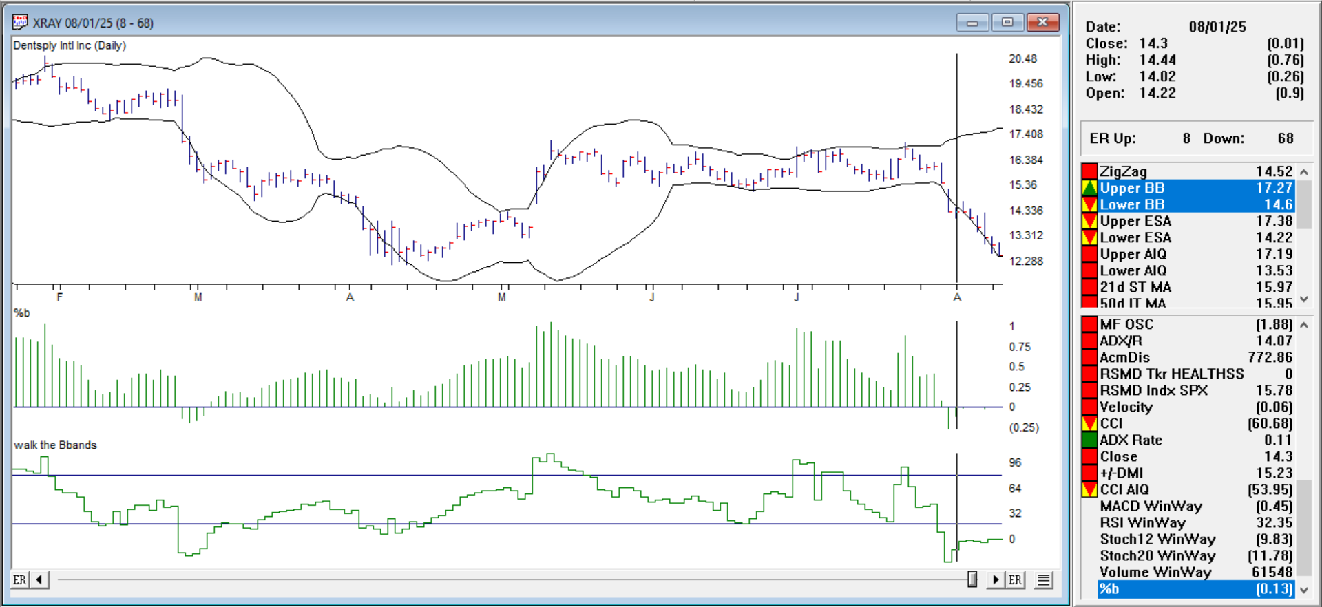
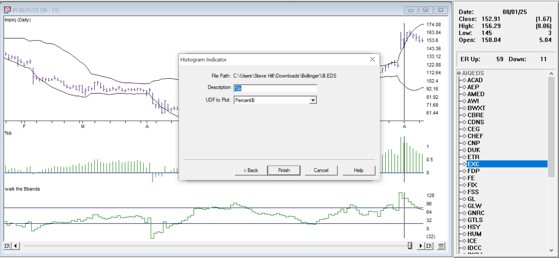
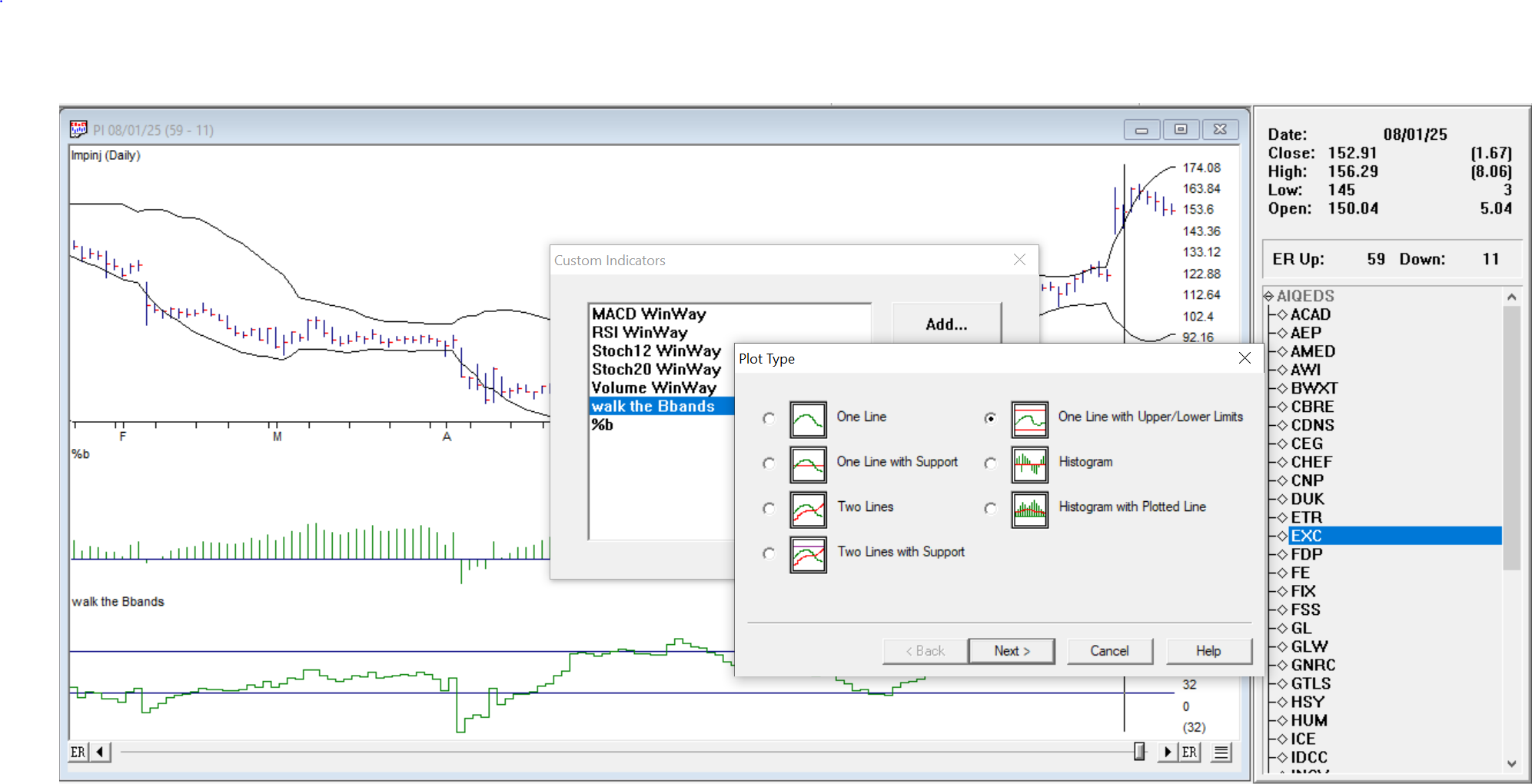
For WinWayCharts TradingExpert Pro, we’ll create an EDS strategy that looks for all these setups and generates two indicators.
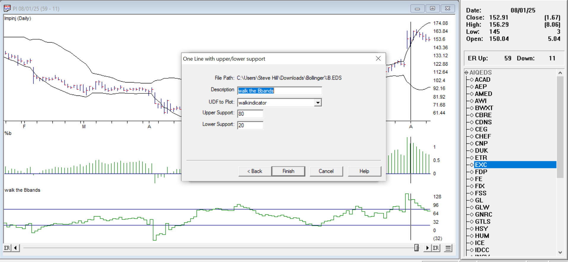
%B as a histogram in Charts, and a Walk the BBands indicator, where we’ll create upper and lower thresholds, where we can see %B stays above or below these thresholds for several days.
Example Setups from the EDS scan 8-1-2025
Buy when %B < 0.05 (price hugging lower band) and momentum turns up. Ticker RSG %B histogram is 0.05 8-1-25, prices moved moderately up.
Sell when %B > 0.95 (price hugging upper band) and momentum turns down. Ticker PI %B histogram is 1.16, prices turned down.
Walk the band up. In an uptrend, %B will often stay above 0.8 for extended periods. Ticker INCY shows above our 80 line in the Walk the BBands indicator and continues to do so.
Walk the band down. In a downtrend, %B will often stay below 0.2. Ticker XRAY shows below our 20 line in the Walk the BBands indicator and continues to do so.
Click here to download this zipped EDS file. Locate the Bollinger%25B.zip file usually in your downloads folder and extract the Bollinger%25B.EDS file to your /wintes32/EDS strategies folder.
The code is below
EDS code
! — How to Use the %B Indicator for Smarter Trading
! — When John Bollinger introduced Bollinger Bands in the 1980s, traders gained
! — a powerful visual tool for understanding market volatility and potential turning points.
! — It tells you exactly where price is, relative to the bands, at any given time.
! — This extra precision can help you spot breakouts, reversals, and trend confirmations faster.
Periods is 20.
Multiplier is 2.
! Step 1: Moving Average of Close
MA20 is simpleavg([close],Periods).
! Step 2: Squared Deviations from MA
Deviation is ([close] - MA20) * ([close] - MA20).
! Step 3: Average of Squared Deviations
Var20 is simpleavg(Deviation,Periods).
! Step 4: Square Root to get Standard Deviation
SD20 is sqrt(Var20).
! Step 5: Upper and Lower Bands
UpperBand is MA20 + Multiplier * SD20.
LowerBand is MA20 - Multiplier * SD20.
! Step 6: %B Calculation
PercentB is ([close] - LowerBand) / (UpperBand - LowerBand).
! — Buy when %B < 0.05 (price hugging lower band) and momentum turns up.
BuyReversal if PercentB < 0.05 and [close] > val([close],1).
! — Sell when %B > 0.95 (price hugging upper band) and momentum turns down.
SellReversal if PercentB > 0.95 and [close] < val([close],1).
! — Buy when %B crosses above 1.05 (price breaks above upper band in an uptrend).
BuyBreakout if PercentB > 1.05.
! — Sell when %B crosses below -0.05 (price breaks below lower band in a downtrend).
SellBreakdown if PercentB < -0.05.
! — create an indicator for walking the bands use a one line indicator with upper at 80 lower at 20 by %B x100
walkindicator is PercentB*100.
! — Band “Walks” in strong trends up, price can walk, the band %B will often stay above 0.8 for extended periods.
walkuptoday if walkindicator>80.
walkup1ydy if valresult(walkindicator,1)>80.
walkup2back if valresult(walkindicator,2)>80.
wlkupfor3days if walkuptoday and walkup1ydy and walkup2back.
! — Band “Walks” in strong trends down, price can walk, the band %B will often stay below 0.2 for extended periods.
walkdowntoday if walkindicator<20.
walkdown1ydy if valresult(walkindicator,1)<20.
walkdown2back if valresult(walkindicator,2)<200.
wlkdownfor3days if walkdowntoday and walkdown1ydy and walkdown2back
Adding the %B and Walking the BBands Indicator
Open WinWayCharts.
Go to Chart → Settings → Indicator Library → EDS Indicators.
Click Add.
Select the Bollinger%25B.EDS file from your /wintes32/EDS strategies folder and click Open.
Choose a Plot Type Histogram for %B
Give it a Description/Name, then choose the UDF to Plot (PercentB).
Click Finish, then Done. Your new indicator now appears in the Indicator Library and can be added to charts like any other study.
Repeat for the Walk the BBands but select Plot Type One Line with Upper/Lower Limits
Give it a Description/Name, then choose the UDF to Plot (Walkindicator) and select Upper Support 80, Lower Support 20.
Click Finish, then Done. Your new indicator now appears in the Indicator Library and can be added to charts like any other study.
Final Thoughts
%B adds mathematical precision to Bollinger Band analysis. Whether you’re hunting for reversals, breakouts, or just trying to understand volatility better, %B gives you an exact reading of the price’s location in the band structure.
WinWay TradingExpert Pro users have long relied on end-of-day data for clean, bias-free decision-making. But what if you could run those same scans during the market day?
The Intraday Snapshot feature makes that possible. For just $20/month + VAT https://winwaycharts.com/wordpress/plans-and-pricing/2130-2-2/, users can download delayed market data up to four times daily — capturing snapshots of the trading session. Once downloaded, you can run the same AI ratings, scans, charts, and system rules on the data.
This means you can catch emerging signals before the close, verify if a stock is maintaining strength after a morning breakout, or identify group/sector shifts in real time. It keeps your process consistent while making your decisions more timely.
For traders who want intraday agility without abandoning proven rules — Snapshot bridges the gap.