Nov 11, 2018 | expert rating, expert system, indexes, indicators, MACD, market timing, stock market
What is the AI in AIQ?
The AI in TradingExpert Pro is programmed with the knowledge and insight of many stock market professionals, and is capable of making market recommendations based on this knowledge and insight; recommendations are made on a scientific basis free of bias, emotion, or hidden motives.
The AI or expert systems are programmed with rules that combine sound principles of technical analysis with the knowledge and experience of market professionals. Technical analysis, as used by AIQ, is based on the logic that price is the result of supply and demand. An AIQ timing signal, therefore, reflects all available knowledge and opinions such as news of the day, earnings, product reports, and company forecasts.
Technical analysis recognizes price and volume movement as the voice of the market itself and hence the only data necessary to determine what the market is likely to do next.
As an expert system, TradingExpert Pro is comprised of two knowledge bases – one for market timing and a second for stock selection – and an inference engine. Knowledge, in the form of rules, is stored in the knowledge bases. The inference engine is the thinking component of an expert system.
Each of the two knowledge bases within TradingExpert Pro has its own unique rules. The rules operate on facts which are values of the technical indicators. The indicators are computed from daily price, volume, and breadth data.
The rules employed in ATQ TradingExpert Pro are derived from the knowledge of many experts of market action and market timing. The reliability of these rules is maximized by combining them into a higher level of Expert Rules. Market analysts have found that no single rule or indicator works all the time. In AIQ, the Expert Rules and technical indicators work together to generate upside and downside signals.
Different knowledge bases for different market cycles
Continuing research at AIQ has shown that a single knowledge base can be improved if it is split into several knowledge bases, one for each phase of the market cycle. This advancement has been incorporated in the market timing knowledge base. The crest, trough, up slope, and down slope are each addressed by a specific set of rules specialized and weighted for that specific phase of the market cycle.
Each market day, then, the system determines the strength and direction of the phase, or trend. If there is no trend, it is first determined if the cycle is at a crest prior to a downtrend, or in a trough before the next uptrend. A more specialized knowledge base is used for each of these conditions, increasing the overall market timing effectiveness.
The knowledge base fuels the second part of the AIQ expert system, the inference engine. The inference engine is the thinking component of an expert system, and mimics the way humans think.
To understand how the AIQ inference engine works, picture a decision tree. The procedure starts from the tree’s trunk, where the major rules are located. Each rule is represented as a node, or fork, where the tree splits into three branches-representing a yes, a no, or a maybe. If the expert system determines that the premise of a rule is true, then the rule is considered to have fired, giving one of those three answers.
As each rule is evaluated, the process moves on to the next node and subsequent branches and continues to move on through the tree. Each rule node has an assigned value. That value is added to a node total that is accumulated as the inference engine passes through the tree. When all the rules have been evaluated, the resulting node total is normalized and becomes an AIQ Expert Rating.
Finally
The Expert Ratings are based on a scale of 0 to l00. The higher the Expert Rating, the stronger the signal. An Expert Rating of 95 or higher is considered a strong signal, meaning that there is a strong possibility that the price trend is about to change direction.
Confirmation of Expert Ratings
Research has shown that a change in direction of the Phase indicator (changing up for up ER, changing down for down ER) at or close to the high Expert Rating date provides a higher degree of confidence in the rating. Phase is not part of the Expert System.
So let us examine the last 7 weeks market action.
2-98 down signal 9/18/2018, 9/18/18 and 9/20/18 all with these primary riles firing confirmed by phase
Intraday high prices of the market have increased to a 21 day high. Never the less, the advance/decline oscillator is negative. This unusual event is read as a very strong bearish signal that is often followed by an downward price movement.
Closing prices on the market have increased to a 21 day high but market breadth as measured by advances and declines is declining. This non-confirmation in a trading market is a weak bearish signal indicating a possible downward price movement.

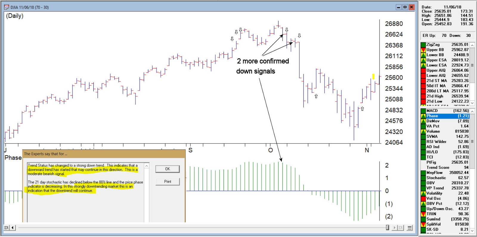
DJIA with the 3 successive down signals
Confirmed down signal 4-96 on 10/05/18 these primary rules fires
Trend Status has changed to a strong down trend. This indicates that a downward trend has started that may continue in this direction. This is a moderate bearish signal.
The 21 day stochastic has declined below the 80% line and the price phase indicator is decreasing. In this strongly downtrending market this is an indication that the downtrend will continue.
Confirmed down signal 5-95 on 10/18/2018 these primary rules fires
The market closing average has dropped below the 21 day exponentially smoothed average price. At the same time, accumulation is decreasing. In this down trending market, this is taken as a very bearish signal that could be followed by further decreases in price.
The price phase indicator is positive but volume distribution has started to advance. This is a nonconformation that, regardless of the type of market, is a bearish signal which usually results in an downward movement of the market.

DJIA with 2 more down signals confirmed by phase
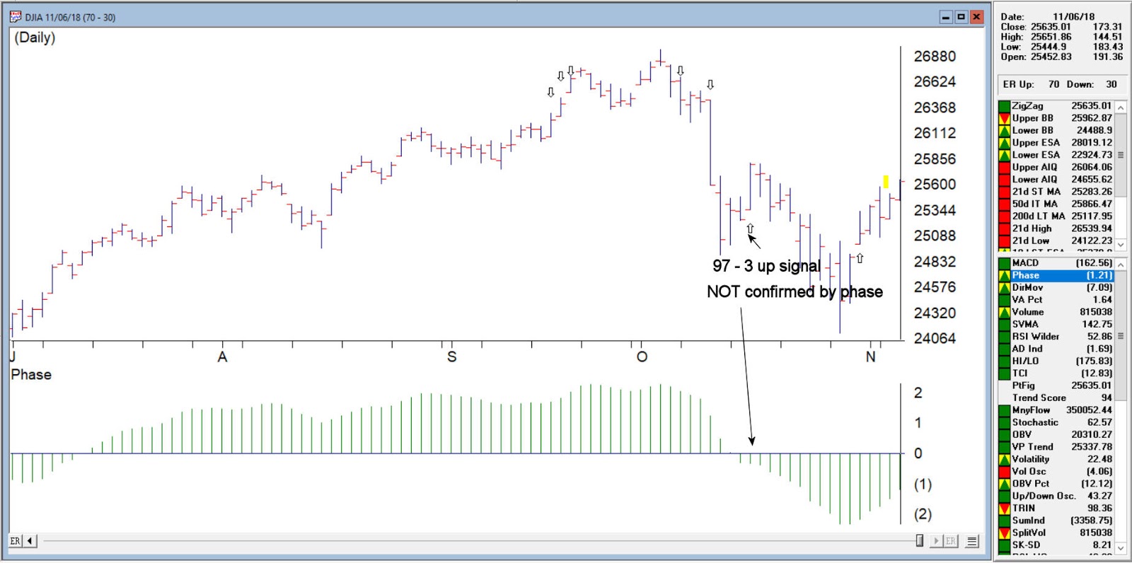
Unconfirmed up signal on 10/16/18 – phase did not change direction
Volume accumulation percentage is increasing and the 21 day stochastic has moved above the 20% line. In this downtrending market, this is taken as a strong bullish signal that could be followed by an upward price movement.
The price phase indicator is negative but volume accumulation has started to advance. This is a non-conformation that, regardless of the type of market, is a bullish signal which usually results in an upward movement of the market.
The new high/new low indicator has reversed to the upside. This is a reliable bullish signal that is often followed by an upward movement in prices. In this weak downtrending market an uptrend could start shortly.

DJIA on 10/16/18 97-3 up no phase confirmation
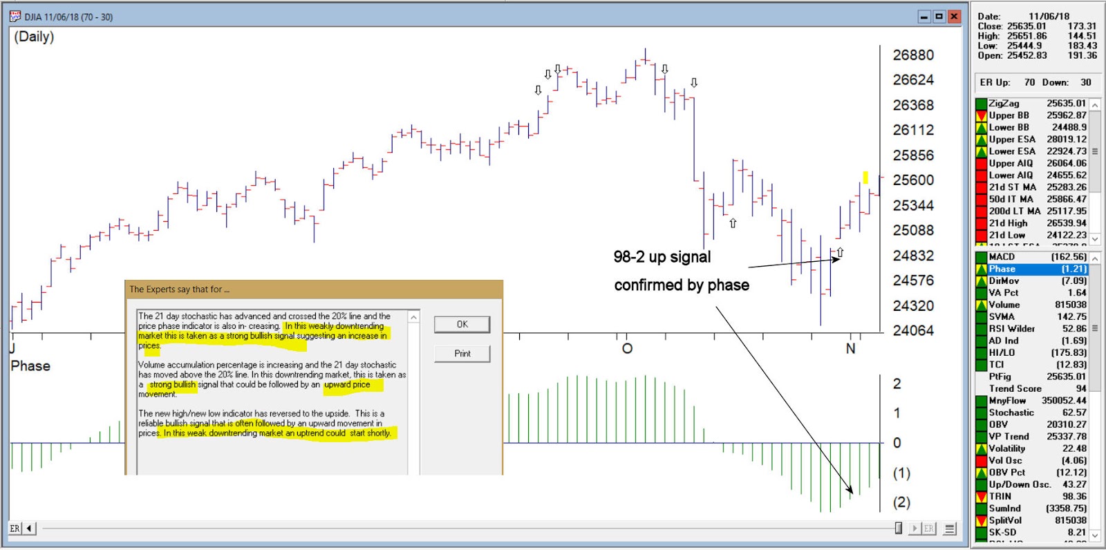
Confirmed up signal 10/31/18 98-2
The 21 day stochastic has advanced and crossed the 20% line and the price phase indicator is also in- creasing. In this weakly downtrending market this is taken as a strong bullish signal suggesting an increase in prices.
Volume accumulation percentage is increasing and the 21 day stochastic has moved above the 20% line. In this downtrending market, this is taken as a strong bullish signal that could be followed by an upward price movement.
The new high/new low indicator has reversed to the upside. This is a reliable bullish signal that is often followed by an upward movement in prices. In this weak downtrending market an uptrend could start shortly.

DJIA on 10/31/18 with confirmed up signal 98-2
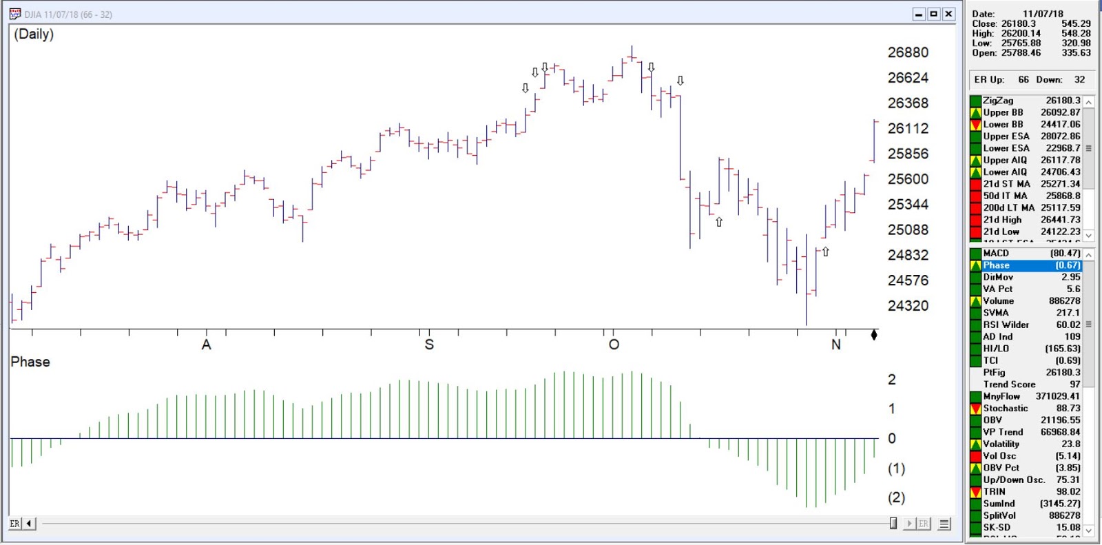
While never perfect, the Expert rating provides a formidable advantage to the trader looking for signs of direction changes in the market. As of 11/7/18 close the DJIA was at 26180

Oct 10, 2018 | indexes, market timing, Portfolio management, Risk management, stock market, Stock trading
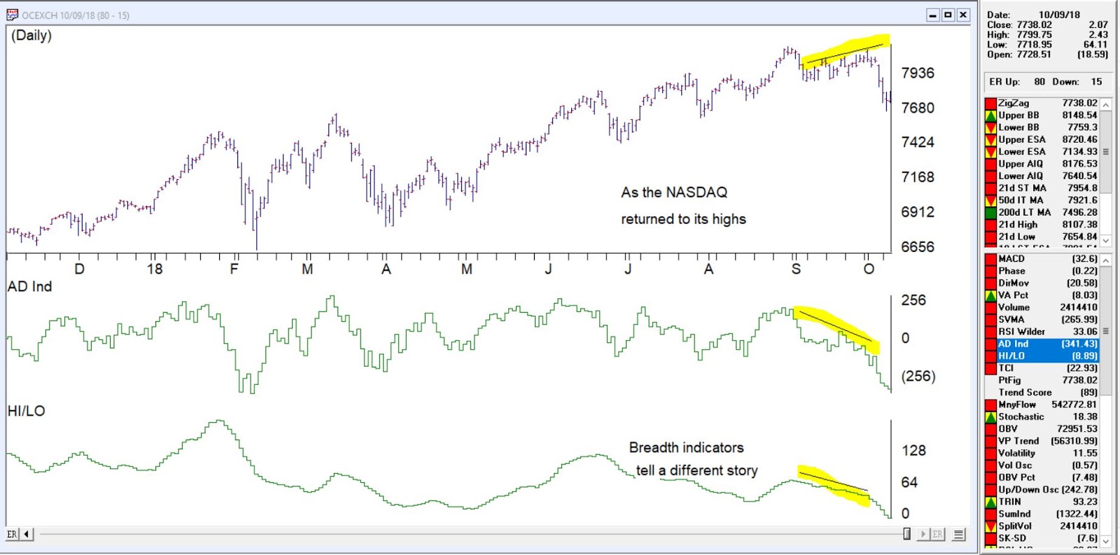
Working on some slides for a seminar last week, it was apparent that breadth indicators on the NASDAQ signaled a divergence from the price action of the market.
Looking specifically at AD Ind and HI/LO, although other breadth measures told the same tale.
The AD indicator explained
The Advance/Decline Indicator is an exponentially weighted average of the net advancing versus declining issues. With this indicator, the direction of the trend is of importance and not the actual value of the indicator. When the indicator is increasing, advances are outweighing declines, and when it is decreasing, there are more declining issues than advancing.
The Advance/Decline Indicator is a breadth indicator very similar to the Advance/Decline Line. However, this indicator tends to be more sensitive and at times will signal a move earlier than the Advance/Decline Line.
The breadth was telling us something was amiss from last week. Take a look at this chart of the NASDAQ clearly a divergence was in place before the downturn.
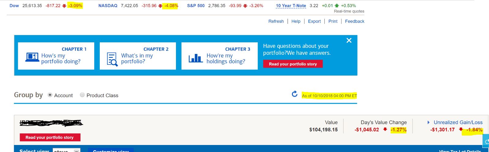
Today’s (10-10-18) 316 point drop in the NASDAQ a 4% drop and nearly 9% drop from the high is close to the 10% corrective point and some buyers may come in over the next few days and keep the decline in check or not.
The markets are down between 6 and 10% in 5 days. Keeping good stops is a must in your portfolio to protect you from the worst of this. Using trailing stops between 7 and 10 % on stocks that are moving and protective stops 5 to 7 % below initial investment for example can easily reduce your losses in these volatile markets.
Apr 2, 2018 | educational newsletters, indexes, indicators, jay kaeppel, stock market
A glance at the history of the Presidential Election Cycle in the stock market suggests that we should:
*Not be surprised that the stock market is foundering a bit at the moment
*Not be terribly surprised if things get worse – particularly during the months of June through September of this year
*Anticipate that if the market does take a bigger hit in the months ahead that it may well set the stage for another significant advance into the middle of the mid-term election year.
A Little Presidential Election Cycle History
For our purposes we will start the test on 12/31/1932 and define the cycle as containing the following four years:
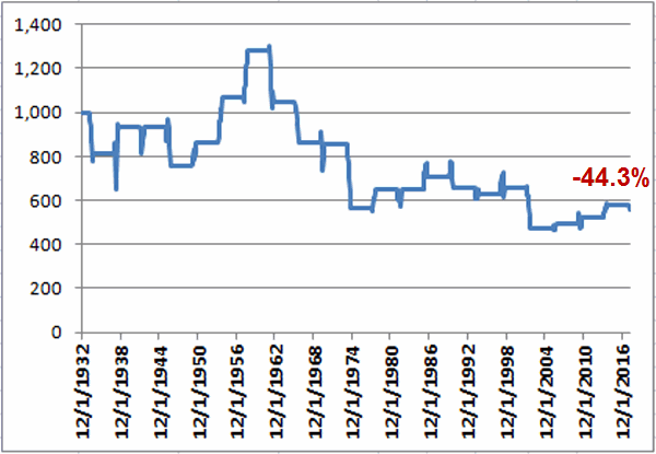
First the Bad News: Figure 1 displays the growth of $1,000 invested in the S&P 500 Index (using monthly closing price data) ONLY from the end of January of each Mid-Term Election Year through the end of September of each Mid-Term Election Year (i.e., the latest iteration began on 1/31/2018 and will extend through 9/30/2018).
Figure 1 – Growth of $1,000 invested in S&P 500 Index ONLY from Jan31 through Sep30 of each Mid-Term Election Year (1932-2018)
As you can see, the cumulative performance for the S&P 500 Index during the Mid-Term February through September period is a fairly painful -44.3% (for the record, the cumulative gain from buying and holding the S&P 500 from 12/31/1932 through 2/28/2018 was +39,288%, so yes, this qualifies as a period of some serious under performance).
That being said, it should be noted that this Mid-Term Feb through Sep period showed a gain 12 times and a loss only 9 times. So a “rough patch” is no sure thing. The problem is that when this period is bad, it is “very bad”. As you can see in Figure 3 later, this period experienced 6 losses in excess of -17.5% (FYI, a -17.5% decline from the 1/31/2018 close of 2823.81 would see the S&P 500 Index hit 2330).
Then the Good News: On the brighter side, Figure 2 displays the growth of $1,000 invested in the S&P 500 Index (using monthly closing price data) ONLY from the end of September of each Mid-Term Election Year through the end of July of each Pre-Election Year (i.e., the latest iteration begins on 9/30/2018 and will extend through 7/31/2019).
Figure 2 – Growth of $1,000 invested in S&P 500 Index ONLY from Sep30 of each Mid-Term Election Year through Jul31 of each Pre-Election Year (1932-2018)
Notice any difference between Figures 1 and 2? This favorable period saw the S&P 500 register a gain during 20 of the past 21 completed election cycles (i.e., 95% of the time), with an average gain of +21.6%, and a cumulative gain of +3,730%.
Figure 3 displays the numerical results for each cycle.
| Mid-Term |
Pre-Election |
Mid-Term Feb through Sep |
Mid-Term Oct thru Pre-Election July |
| 1934 |
1935 |
(18.5) |
21.8 |
| 1938 |
1939 |
14.5 |
(1.6) |
| 1942 |
1943 |
0.5 |
32.0 |
| 1946 |
1947 |
(19.4) |
5.3 |
| 1950 |
1951 |
14.1 |
15.2 |
| 1954 |
1955 |
23.9 |
34.7 |
| 1958 |
1959 |
20.0 |
20.9 |
| 1962 |
1963 |
(18.3) |
22.9 |
| 1966 |
1967 |
(17.6) |
23.8 |
| 1970 |
1971 |
(0.8) |
13.4 |
| 1974 |
1975 |
(34.2) |
39.7 |
| 1978 |
1979 |
14.9 |
1.2 |
| 1982 |
1983 |
0.0 |
35.0 |
| 1986 |
1987 |
9.2 |
37.8 |
| 1990 |
1991 |
(7.0) |
26.7 |
| 1994 |
1995 |
(3.9) |
21.5 |
| 1998 |
1999 |
3.7 |
30.6 |
| 2002 |
2003 |
(27.9) |
21.5 |
| 2006 |
2007 |
4.4 |
8.9 |
| 2010 |
2011 |
6.3 |
13.2 |
| 2014 |
2015 |
10.6 |
6.7 |
Figure 3 – Unfavorable versus Favorable portions of Election Cycle
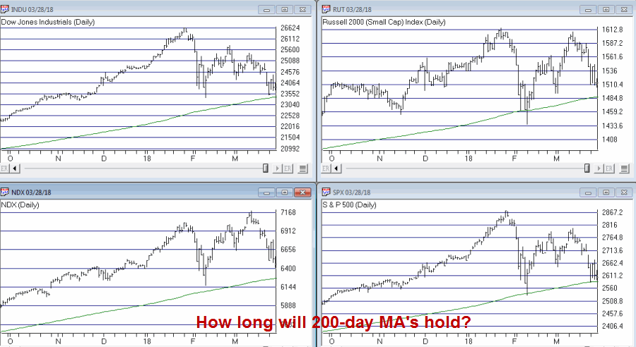
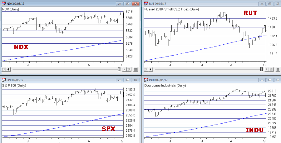
So what does it all mean? Well, it means a few things. By my objective measurements the overall trend is still “bullish” and a number of “oversold” indicators are suggesting that a bounce of some significance may be at hand. That being said, if the major market indexes do start to break down below their respective 200-day moving averages investors may be wise to take some defensive action. If the market does experience a further break between now and the end of September, it may well be “one of the painful kind.” So if you haven’t already, make your contingency plans now.
Figure 4 – Major Market Indexes with 200-day moving averages (Courtesy TradingExpert)
At the same time, as the end of September of 2018 nears – especially if the stock market has experienced or is experiencing at the time, a significant break – remember that history suggests that that will be a good time to “think bullish.”
Call me a cynic, but my guess is that alot of investors will do exactly the opposite on both counts (i.e., hang on if the market breaks down and then sell as the next bottom forms – Same it as ever was….)
Disclaimer: The data presented herein were obtained from various third-party sources. While I believe the data to be reliable, no representation is made as to, and no responsibility, warranty or liability is accepted for the accuracy or completeness of such information. The information, opinions and ideas expressed herein are for informational and educational purposes only and do not constitute and should not be construed as investment advice, an advertisement or offering of investment advisory services, or an offer to sell or a solicitation to buy any security.
Feb 24, 2018 | jay kaeppel, market timing, stock market
In the article linked below, investor and Forbes columnist Kenneth Fisher writes about what to look for at a market top (How to Tell a Bull Market from a Bear Market Blip). One piece of advice that I have heard him offer before is to wait at least 3 months after a top in price to worry about whether or not we are in a bear market. That is good advice and provided the impetus for a simple trend-following model I follow based on that “wait 3 months” idea.
First, a few key points:
*Trend-following is NOT about picking tops and bottoms or timing the market with “uncanny accuracy”. So don’t expect any trend-following system to do so.
*The primary edge in any trend-following method is simply missing as much of the major soul – and capital – crushing bear markets as possible, with the understanding that you will miss some of the upside during bull markets.
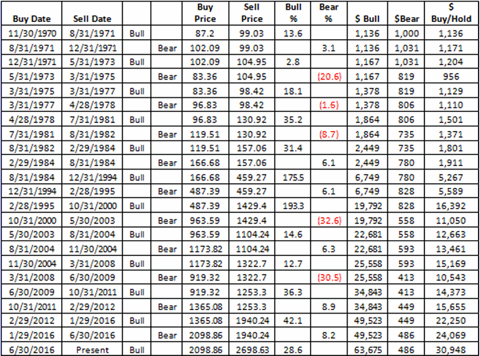
*Starting in November 1970 this system has beaten a buy and hold strategy
*This system requires no math. There are no moving averages, etc. Anyone can look at a monthly S&P 500 bar chart and generate the signals. And it literally takes less than 1 minute per month to update.
*Every trend-following method known to man experiences whipsaws, i.e., a sell signal followed by a buy signal at a higher price. This system is no exception.
*Due to said whipsaws this system has significantly underperformed the S&P 500 buy-and-hold since the low in early 2009.
For what it’s worth, my educated guess is that following the next prolonged bear market, that will change. But there are no guarantees.
OK, all the caveats in place, here goes.
Jay’s Monthly SPX Bar Chart Trend-Following System
*This system uses a monthly price bar chart for the S&P 500 (SPX) to generate trading signals.
*For the purposes of this method, no action is taken until the end of the month, even if a trend change is signaled earlier in the month.
*A buy signal occurs when during the current month, SPX exceeds its highest price for the previous 6 calendar months.
A sell signal occurs as follows:
a) SPX registers a month where the high for the month if above the high of the previous month. We will call this the “swing high”.
b) SPX then goes 3 consecutive monthly bars without exceeding the “swing high.” When this happens, note the lowest low price registered during those 3 months. We will call this price the “sell trigger price.”
c) An actual sell trigger occurs at the end of a month when SPX register a low that is below the “sell trigger price”, HOWEVER,
d) If SPX makes a new monthly high above the previous “swing high” BEFORE it registers a low below the “sell trigger price” the sell signal alert is aborted
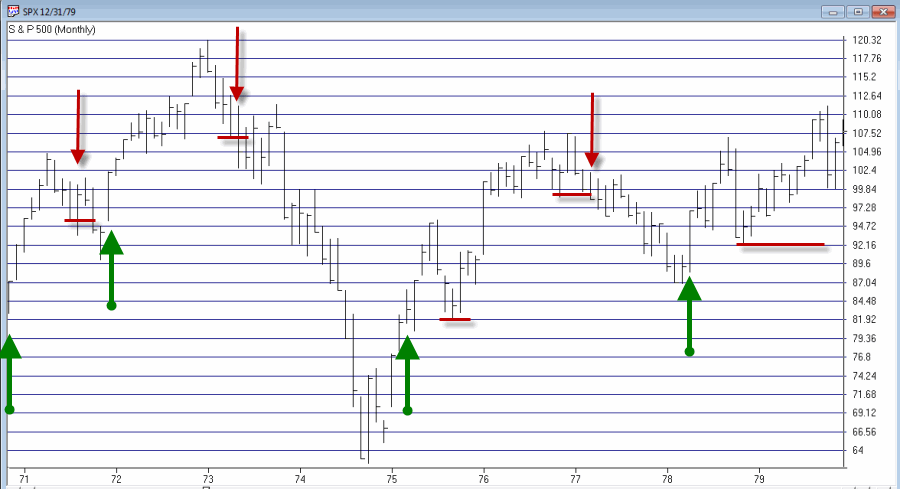
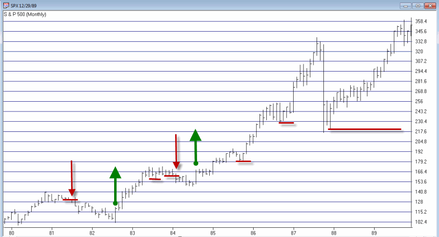
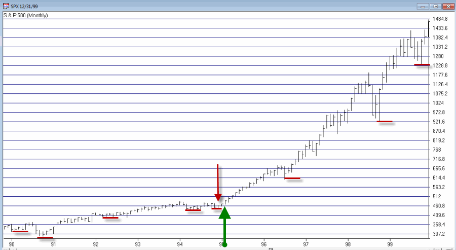
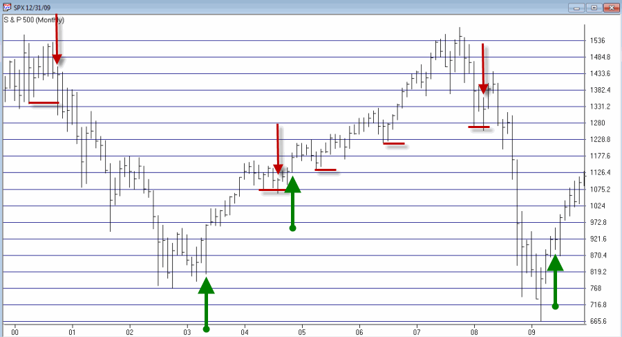
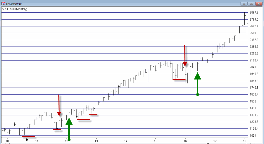
Sounds complicated right? It’s not. Let’s illustrate on some charts.
In the charts that follow:
*An Up green arrow marks a buy signal
*A Down red arrow marks a sell signal
*A horizontal red line marks a “sell trigger price”.
Sometimes a sell trigger price is hit and is marked by a down red arrow as a sell signal. Other times a sell trigger price is aborted by SPX making a new high and negating the potential sell signal.
To demonstrate results we will use monthly close price data for SPX. If the system is bullish then the system will hold SPX for that month. If the system is bearish we will assume interest is earned at an annual rate of 1% per year.
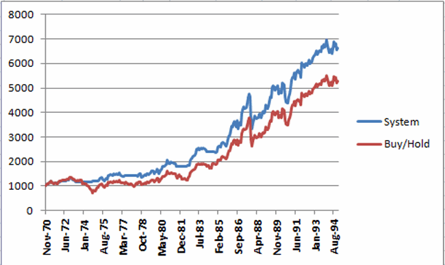
Figure 6 displays the results of the System versus Buy and Hold starting with $1,000 starting November 1970 through 1994 (roughly 24 years).
Figure 6 – Growth of $1,000 invested using System versus Buy-and-Hold; Nov-1970 through Dec-1994
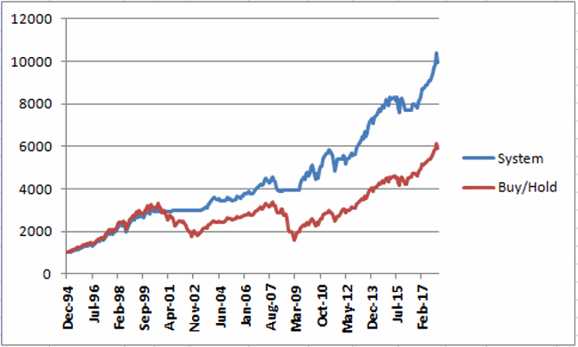
Figure 7 displays the results of the System versus Buy and Hold starting with $1,000 starting at the end of 1994 through the most recent close.
Figure 7 – Growth of $1,000 invested using System versus Buy-and-Hold; Dec-1994 through Feb-2018
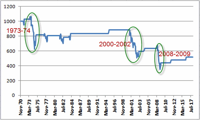
Figure 8 displays the growth of $1,000 generated by holding the S&P 500 Index ONLY when the trend-following system is bearish. In Figure 8 you will see exactly what I mentioned at the outset – that the key is simply to miss some of the more severe effects of bear markets along the way.
Figure 8 – Growth of $1,000 invested ONLY when trend-following model is Bearish; 1970-2018
Finally, Figure 9 displays trade-by-trade results (using month-end price data).
Figure 9 – Trade-by-trade results; Month end price data
So is this “The World Beater, Best Thing Since Sliced Bread” system? Not at all. If you had started using this system in real time in March of 2009 chances are by now you would have abandoned it and moved on to something else, as the whip saw signals in 2011-2012 and 2016 has the System performing worse than buy and hold over a 9 year period.
But here is the thing to remember. Chances are prolonged bear markets have not been eradicated, never to occur again. 100+ years of market history demonstrates that bear markets of 12 to 36 months in duration are simply “part of the game”. And it is riding these bear markets to the depths that try investors souls – and wipe out a lot of their net worth in the process.
Chances are when the next 12 to 36 month bear market rolls around – and it will – a trend-following method similar to the one detailed here may help you to “save your sorry assets” (so to speak).
Disclaimer: The data presented herein were obtained from various third-party sources. While I believe the data to be reliable, no representation is made as to, and no responsibility, warranty or liability is accepted for the accuracy or completeness of such information. The information, opinions and ideas expressed herein are for informational and educational purposes only and do not constitute and should not be construed as investment advice, an advertisement or offering of investment advisory services, or an offer to sell or a solicitation to buy any security.
Feb 18, 2018 | educational newsletters, ETFs, indexes, jay kaeppel, market timing, stock market
In this article titled “World, Meet Resistance” – dated 12/21/2017 – I noted the fact that many single country ETFs and regional indexes were closing in on a serious level of potential resistance. I also laid out three potential scenarios. So what happened? A fourth scenario not among the three I wrote about (Which really pisses me off. But never mind about that right now).
As we will see in a moment what happened was:
*(Pretty much) Everything broke out above significant resistance
*Everything then reversed back below significant resistance.
World Markets in Motion
Figure 1 displays the index I follow which includes 33 single-country ETFs. As you can see, in January it broke out sharply above multi-year resistance. Just when it looked like the index was going to challenge the all-time high the markets reversed and then plunged back below the recently pierced resistance level.
(click to enlarge)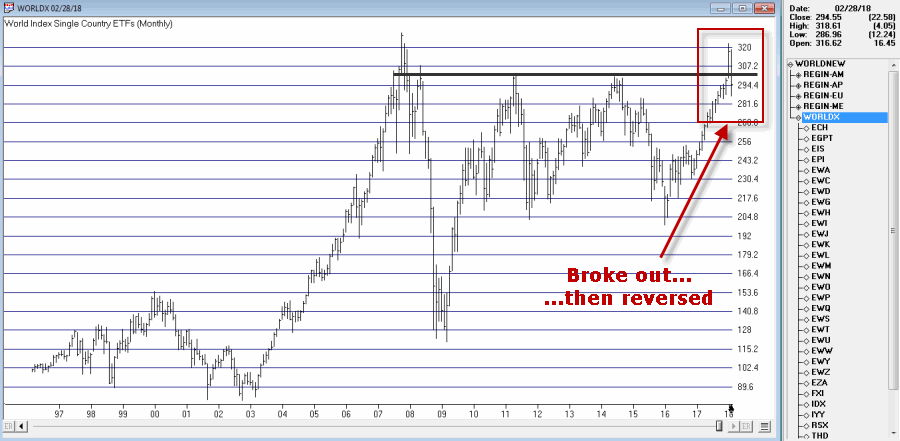
Figure 1 – Jay’s World Index broke out in January, fell back below resistance in February (Courtesy TradingExpert)
The same scenario holds true for the four regional indexes I follow – The Americas, Europe, Asia/Pacific and the Middle East – as seen in Figure 2.
(click to enlarge)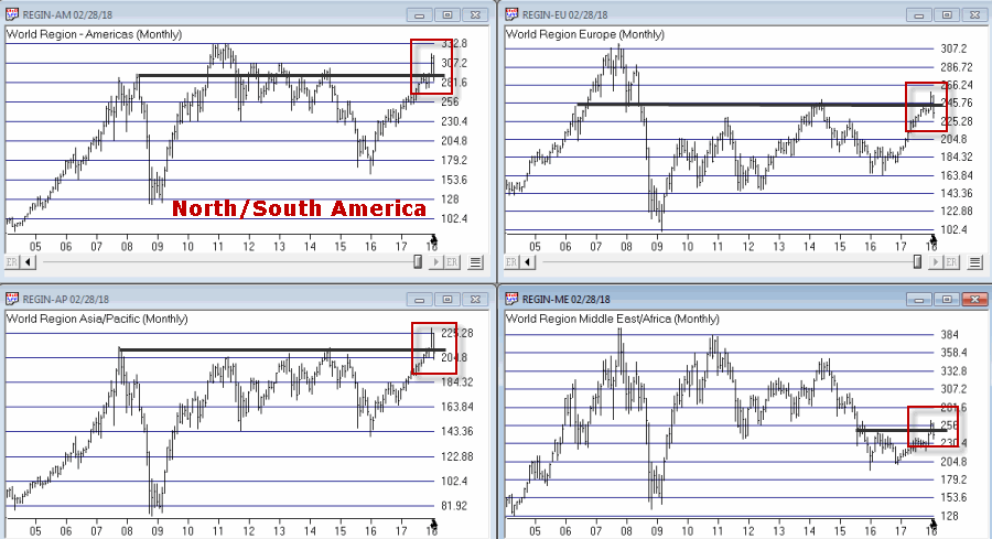
Figure 2 – Jay’s Regional Index all broke above resistance, then failed (Courtesy TradingExpert)
So where to from here? Well I could lay out a list of potential scenarios. Of course if history is a guide what will follow will be a scenario I did not include (Which really pisses me off. But never mind about that right now).
So I will simply make a subjective observation based on many years of observation. The world markets may turn the tide again and propel themselves back to the upside. But historically, when a stock, commodity or index tries to pierce a significant resistance level and then fails to follow through, it typically takes some time to rebuild a base before another retest of that resistance level unfolds.
Here’s hoping I’m wrong
Jay Kaeppel
Disclaimer: The data presented herein were obtained from various third-party sources. While I believe the data to be reliable, no representation is made as to, and no responsibility, warranty or liability is accepted for the accuracy or completeness of such information. The information, opinions and ideas expressed herein are for informational and educational purposes only and do not constitute and should not be construed as investment advice, an advertisement or offering of investment advisory services, or an offer to sell or a solicitation to buy any security.
Sep 8, 2017 | indexes, jay kaeppel, stock market
First the Good News:
*The market averages are still in an up trend
*The Fed has yet to “remove the punch bowl”
Now the bad news
Market Bellwethers Flashing Warnings
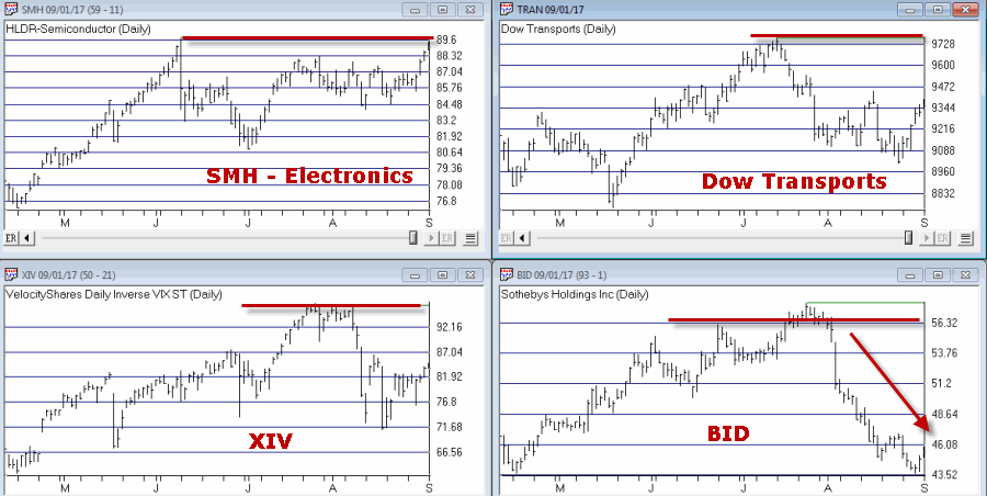
In this article I wrote about four tickers I follow for signs of early warnings of trouble. At the moment, all four are flashing warnings.
Stocks are Extremely Overvalued
Something important to note: valuation indicators are NOT good timing indicators. The overall market can be over or undervalued for years. However, overvalued valuation readings are extremely reliable at telling us what will come next once the top is in (whenever that may be). Figure 4 displays the Schiller CAPE model which measures adjusted P/E ratio.
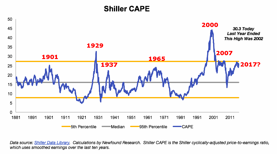
Figure 4 – Schiller Adjusted PE (Courtesy:
Schiller Data Library)
1901: Dow -37% in 32 months
1929: Dow -89% in 3 years
1932: Dow -49% in 13 months
1965: Dow sideways to 40% lower for 17 years
2000: Nasdaq 100 -87%
2007: Dow -55% in 17 months
2017: ??
When will the exact top form? Don’t know
What will likely follow? Don’t Ask
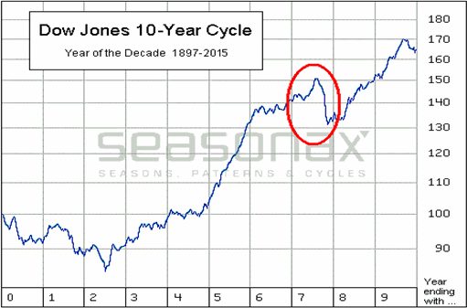
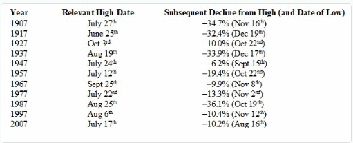
The Decennial Pattern
As I wrote about here and as you can see in Figures 5 and 6, the Year 7 into Year 8 period has historically witnesses significant market weakness. That does not mean that that is what will happen this time around. But it is reason for caution.
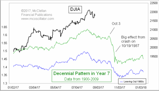
Figure 7 from Tom McLellan illustrates this phenomenon even more clearly.
September
What a crummy time for September to roll around. Figure 8 displays the fact that the Dow has lost -80% during the month of September since 1897.
Figure 8 – Dow has lost -80% during September since 1897
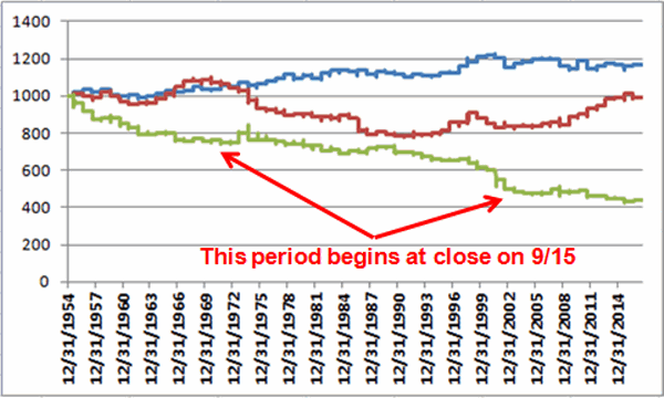
Figure 9 displays the fact that since 1955 most of the “September Nasty” has occurred in that last 10 trading days of the month (after the close on 9/15 this year)
Figure 9 – Dow in September; 1st 3 days (blue); Last 10 days (green); in between (red); 1955-2016
Investor Complacency
Despite the fact that:
*We have experienced one of the longest bull markets in history
*Stock prices are extremely overvalued on an objective historical basis
*A number of warning signs are flashing
The investment world seems relatively untroubled (in the interest of full disclosure I have done only limited selling so far myself – more on this in a moment).
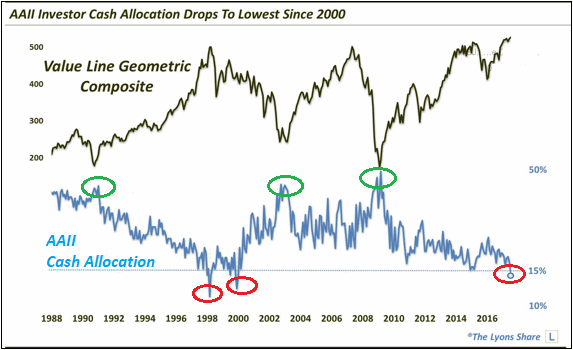
Figure 10 displays the AAII investor cash allocation reading from earlier this year. Low cash levels tend to signal complacency (and impending market trouble) while high cash levels tend to occur near market bottoms.
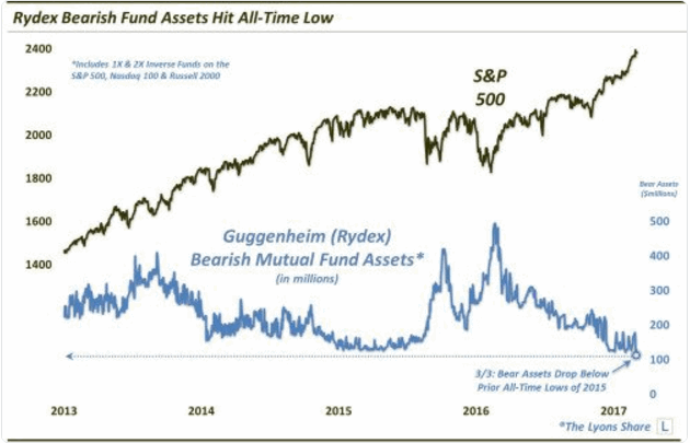
Figure 11 displays the amount of assets in the Rydex suite of “bearish” funds from earlier this year. As you can see, investors were not too concerned about the prospects for a bear market – a potential contrarian signal.
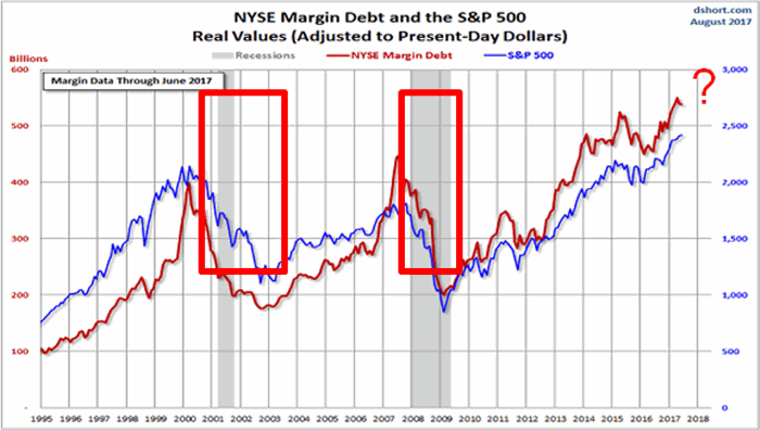
Figure 12 shows the level of margin debt versus stock prices. Historically when margin debt peaks and begins to decline the stock market suffers significantly. There is no way to predict when margin debt will top out and roll over but it did recently reach a new all-time high. Could it go higher? Absolutely. But if it rolls over – then look out below.
Figure 12 – If Margin Debt peaks trouble may follow (Courtesy:
dshort.com)
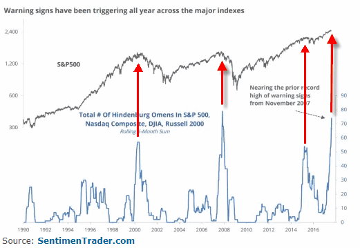
Figure 13 displays the stock market versus the number of “Hindenburg Omens” (a measure of “churning” in the stock market) that have occurred in the most recent 6-month period. Another warning sign is flashing.
Summary
Does any of the above guarantee that a significant stock market decline is imminent? The correct answer is “No.” The major market indexes all remain above their long-term moving averages. This can be considered the very definition of a bull market.
I personally have seen lots of warning signs flash along the way over the years. And I have found that it is important to pay attention to these and to “prepare for the worst” – i.e., to plan an exit/hedging strategy “just in case.” But trying to pick the exact top is an excellent way to end up looking stupid. Trust me on this one.
So here is my summary:
*I do not possess the ability to “call the top” nor to “predict what will happen next” in the stock market
*I do possess a reasonably good ability to identify the trend “right now”
*I also possess the ability to recognize gathering storms clouds (and, yes, they are forming) and the ability to formulate an “emergency plan” as well as the wherewithal to follow the plan “should this be an actual (market) emergency.”
The current level of market valuation – and the history of the stock market following previous similar such readings – suggests that the next bear market will surprise many investors by its severity.
The clouds are gathering. Please plan accordingly.
Jay Kaeppel Chief Market Analyst at JayOnTheMarkets.com and AIQ TradingExpert Pro client.
Disclaimer: The data presented herein were obtained from various third-party sources. While I believe the data to be reliable, no representation is made as to, and no responsibility, warranty or liability is accepted for the accuracy or completeness of such information. The information, opinions and ideas expressed herein are for informational and educational purposes only and do not constitute and should not be construed as investment advice, an advertisement or offering of investment advisory services, or an offer to sell or a solicitation to buy any security.