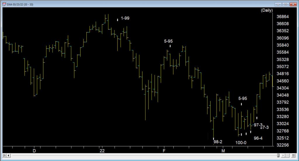
As we reach the end of March 2022, the volatility in the markets continues with large range days and varying volume levels.
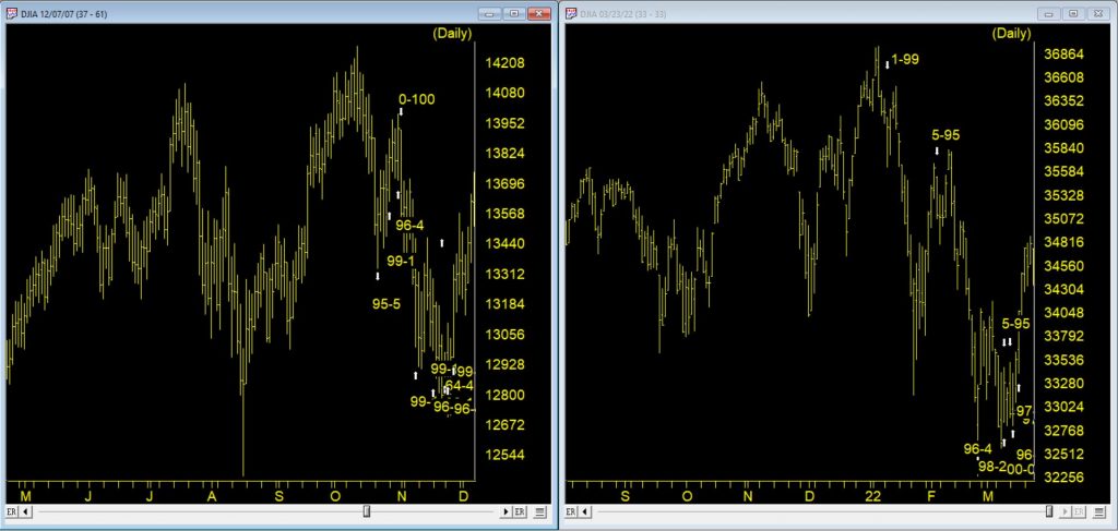
When the market is in a trend, we might see 2 or 3 high Expert Ratings warning us of a potential change in direction. At the tail end of 2021 and the first 10 days of 2022, we had 3 down signals, the last of the 3 at 1-99 was on 1/10/22. The market moved down solidly to the 33280 level before rallying 2/3rds of the down move.
There was no up rating at the bottom as prices moved back up and one up rating early February that didn’t pan out. However, between 2/24 and 3/16 there was six signals, 5 of them up. That’s in only 14 trading days.
Between the 2/24 up signal and the 3/14 up signal there were 9 distinct bullish ER rules showing. There was also several that were duplicated bullish ER rules. Add to this 4 new distinct ER rules on the up signal 3/16, that adds up to the busiest ER cluster for a very long time.
Here are the first 9 distinct rules contributing the cluster of ratings
The Money Flow Indicator has reversed and is now advancing. In this sideways market, this is read as a bullish indication that the market could move up from this point because of the inflow of funds.
The 21 day stochastic has advanced and crossed the 20% line and the price phase indicator is also in- creasing. In this strongly downtrending market this is taken as a strong bullish signal suggesting an increase in prices.
The price phase indicator is negative but volume accumulation has started to advance. This is a non-conformation that, regardless of the type of market, is a bullish signal which usually results in an upward movement of the market.
The Money Flow Indicator has reversed and is now advancing. In this downtrending market, this is taken as a weak bullish signal that could indicate an upward movement in the market averages.
The advance/decline oscillator has turned positive with volume accumulation already positive. In this strong downward trend this is read as a strong non- confirmation of the current trend which could be followed by a reverse in price direction to the upside.
The new high/new low indicator has reversed to the upside. This is a reliable bullish signal that is often followed by an upward movement in prices. In this strong downtrending market a reverse in trend could start shortly.
Volume accumulation percentage is increasing and the 21 day stochastic has moved above the 20% line. In this downtrending market, this is taken as a strong bullish signal that could be followed by an upward price movement.
The new high/new low indicator has reversed to the upside. This is a reliable bullish signal that is often followed by an upward movement in prices. In this weak downtrending market an uptrend could start shortly.
Intraday low prices of the market have declined to a 21 day low. But the volume accumulation percentage is positive. In this market, this is taken as a weak bullish signal that could be followed by an upward price movement.
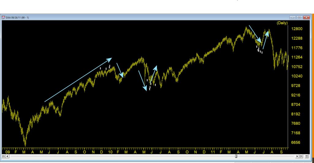
So when was the last time we saw this many ratings so close together?
It happens in clusters particularly in advance of a move against the current trend of the market. The ER system is inherently counter trend. This chart shows some cluster from 2009 – 2011.
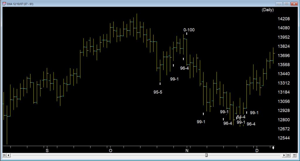
One example was way back at the tail end of 2007, when another cluster of buy signals occurred in a similar fashion. Following a 100 down on 11/01/07 the market gave ground until 11/08/07, the first of 6 buy signals in 13 trading days through to 11/28/07
The market ERs are not perfect but they provide us with key insights into the way the internals are performing.
Where does the market go from here?
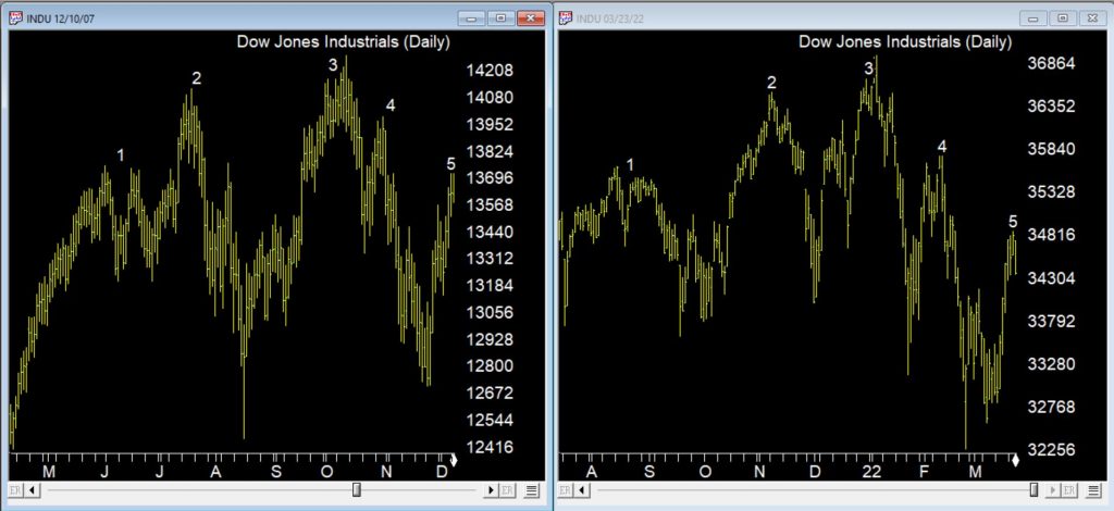
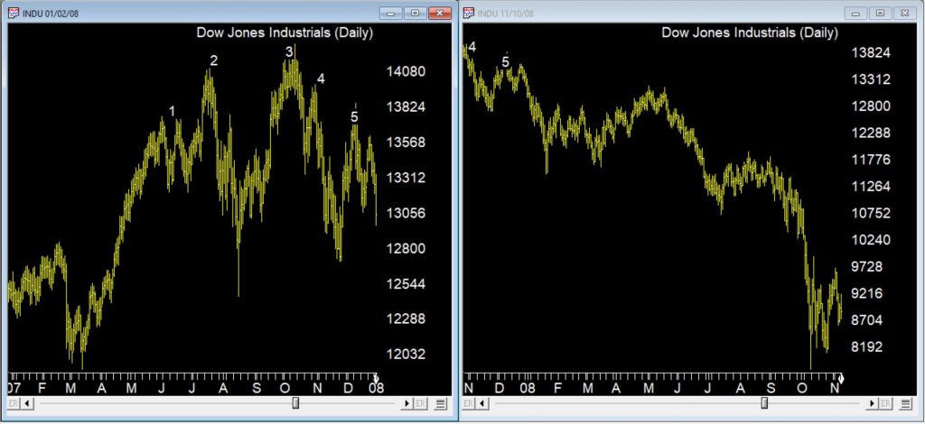
This chart above was back at the start of the 2007/8 bear market. So how do the chart patterns compare between 2022 and 2007/8? The chart below, on the left shows the 2007/8 market through early December 2007 following a strong move up after the cluster of up signals. The right charts shows current market with a strong up move following the cluster of up signals
There are some similarities between current price action and the topping pattern back in 2007, one being the measured way this pattern is emerging over several months. The chart below is the same time periods compared but with the ERs showing.
The bear market that followed in 2008 is in the Chart below.
The market moved down in a series of measured moves until we reached late September 2008 and the sharp downturn occurred. No guarantees we’re in the same market, but keep an eye out for those counter trend cluster ERs if we are, they may provide warning of rallies.
WinWay TradingExpert Pro is programmed with the knowledge and insight of respected technical analysts, experts who have developed technical analysis indicators and systems for the last 50 years. The up/down timing signals issued by TradingExpert Pro are based on this knowledge. Since TradingExpert Pro’s timing signals are generated on a scientific basis, free of bias or emotion, you get a disciplined, objective approach to stock market timing.
The timing signals produced by the WinWay expert system are in the form of Expert Ratings. Behind each Expert Rating is a set of rules that combine the sound principles of technical analysis with the experience of market professionals. Since no single technical indicator works all the time, using indicators in combination increases their reliability. For example, a rule is developed that combines the readings of two or more indicators.
This rule is then more reliable than the reading of a single indicator. Within TradingExpert Pro are two knowledge bases, one specifically designed to issue market timing signals and the other designed to issue stock timing signals. Each TradingExpert Pro knowledge base contains approximately 400 rules, but only a few “fire” on any given day.
In the language of expert systems, those rules that are found to be valid on a particular day are described as having “fired”. Rules can fire in opposite directions. When this happens, the bullish and bearish rules fight it out. It’s only when bullish rules dominate that the Expert Rating signal is bullish, or when bearish rules dominate that the Expert Rating signal is bearish.
In many ways the markets imitate life. For example, the trend is your friend. You may enjoy your friendship with the trend for an indefinite length of time. But the moment you ignore it – or just simply take it for granted that this friendship is permanent, with no additional effort required on your part – that’s when the trouble starts.
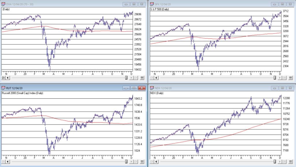
For the stock market right now, the bullish trend is our friend. Figure 1 displays the 4 major indexes all above their respective – and rising – long-term moving averages. This is essentially the definition of a “bull market.”
In addition, a number of indicators that I follow have given bullish signals in the last 1 to 8 months. These often remain bullish for up to a year. So, for the record, with my trusted trend-following, oversold/thrust and seasonal indicators mostly all bullish I really have no choice but to be in the bullish camp.
Not that I am complaining mind you. But like everyone else, I try to keep my eyes open for potential signs of trouble. And of course, there are always some. One of the keys to long-term success in the stock market is determining when is the proper time to actually pay attention to the “scary stuff.” Because scary stuff can be way early or in other cases can turn out to be not that scary at all when you look a little closer.
So, let’s take a closer look at some of the scary stuff.
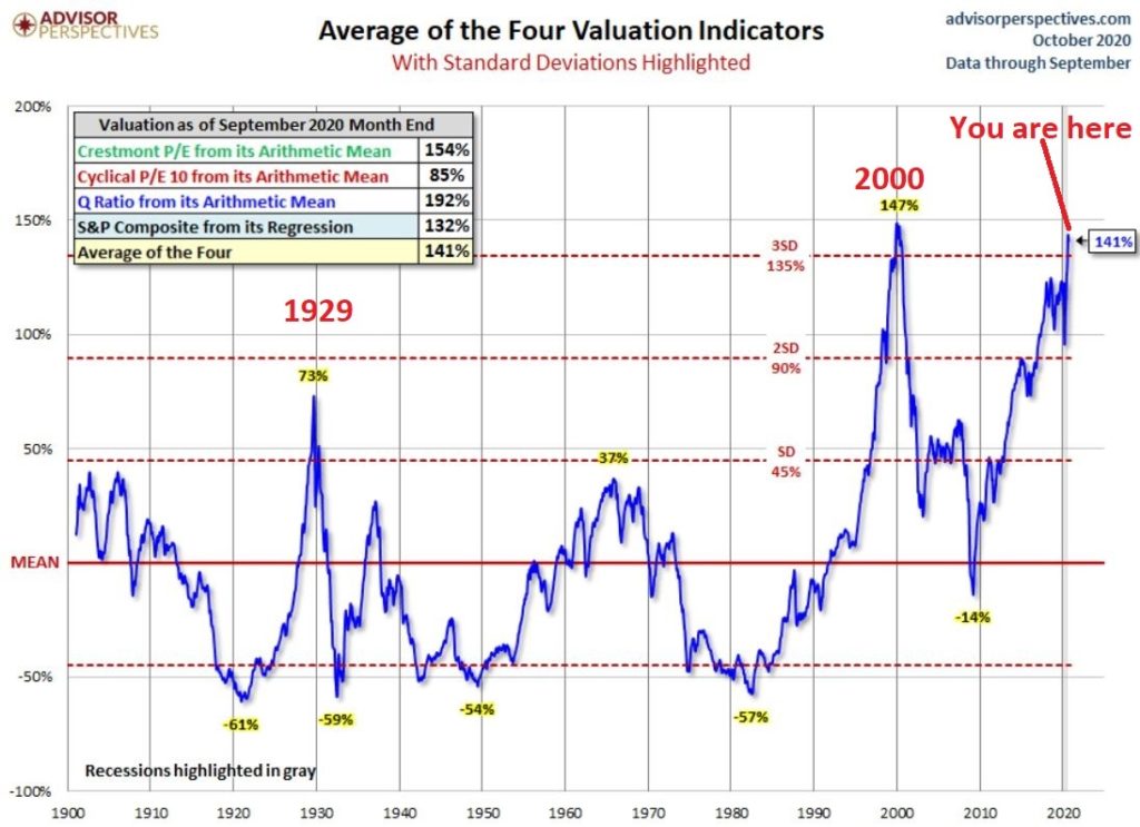
Valuations
Figure 2 displays an aggregate model of four separate measures of valuation. The intent is to gain some perspective as to whether stocks are overvalued, undervalued or somewhere in between.
Clearly the stock market is “overvalued” if looked at from a historical perspective. The only two higher readings preceded the tops in 1929 (the Dow subsequently lost -89% of its value during the Great Depression) and 2000 (the Nasdaq 100 subsequently lost -83% of its value).
Does this one matter? Absolutely. But here is what you need to know:
*Valuation IS NOT a timing indicator. Since breaking out to a new high in 1995 the stock market has spent most of the past 25 years in “overvalued” territory. During this time the Dow Industrials have increased 700%. So, the proper response at the first sign of overvaluation should NOT be “SELL.”
*However, ultimately valuation DOES matter.
Which leads directly to:
Jay’s Trading Maxim #44: If you are walking down the street and you trip and fall that’s one thing. If you are climbing a mountain and you trip and fall that is something else. And if you are gazing at the stars and don’t even realize that you are climbing a mountain and trip and fall – the only applicable phrase is “Look Out Below”.
So, the proper response is this: instead of walking along and staring at the stars, keep a close eye on the terrain directly in front of you. And watch out for cliffs.
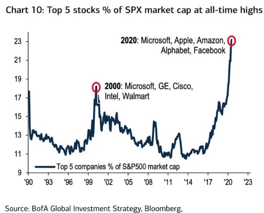
Top 5 companies as a % of S&P 500 Index
At times through history certain stocks or groups of stocks catch “lightning in a bottle.” And when they do the advances are spectacular, enriching anyone who gets on board – unless they happen to get on board too late. Figure 3 displays the percentage of the S&P 500 Index market capitalization made up by JUST the 5 largest cap companies in the index at any given point in time.
Figure 3 – Top 5 stocks as a % of S&P 500 Index market cap (Courtesy: www.Bloomberg.com)
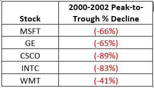
The anecdotal suggestion is pretty obvious. Following the market peak in 2000, the five stocks listed each took a pretty significant whack as shown in Figure 4.
Figure 4 – Top Stocks after the 2000 Peak
Then when we look at how far the line in Figure 3 has soared in 2020 the obvious inference is that the 5 stocks listed for 2020 are due to take a similar hit. And here is where it gets interesting. Are MSFT, AAPL, AMZN, GOOGL and FB due to lose a significant portion of their value in the years directly ahead?
Two thoughts:
*There is no way to know for sure until it happens
*That being said, my own personal option is “yes, of course they are”
But here is where the rubber meets the road: Am I presently playing the bearish side of these stocks? Nope. The trend is still bullish. Conversely, am I keeping a close eye and am I willing to play the bearish side of these stocks? Yup. But not until they – and the overall market – actually starts showing some actual cracks.
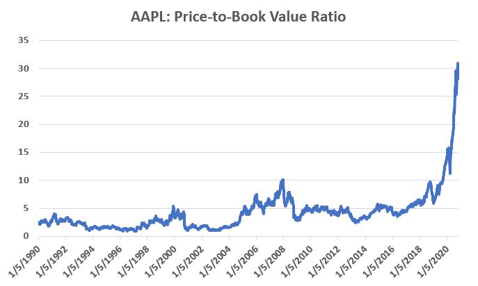
One Perspective on AAPL
Apple has been a dominant company for many years, since its inception really. Will it continue to be? I certainly would not bet against the ability of the company to innovate and grow its earnings and sales in the years ahead. Still timing – as they say – is everything. For what it is worth, Figure 5 displays the price-to-book value ratio for AAPL since January 1990.
Figure 5 – AAPL price-to-book value ratio (Data courtesy of Sentimentrader.com)
Anything jump out at you?
Now one can argue pretty compellingly that price-to-book value is not the way to value a leading technology company. And I probably agree – to a point. But I can’t help but look at Figure 5 and wonder if that point has possibly been exceeded.
Summary
Nothing in this piece is meant to make you “bearish” or feel compelled to sell stocks. For the record, I am still in the bullish camp. But while this information DOES NOT constitute a “call to action”, IT DOES constitute a “call to pay close attention.”
Bottom line: enjoy the bull market but DO NOT fall in love with it.
Jay Kaeppel
Disclaimer: The information, opinions and ideas expressed herein are for informational and educational purposes only and are based on research conducted and presented solely by the author. The information presented represents the views of the author only and does not constitute a complete description of any investment service. In addition, nothing presented herein should be construed as investment advice, as an advertisement or offering of investment advisory services, or as an offer to sell or a solicitation to buy any security. The data presented herein were obtained from various third-party sources. While the data is believed to be reliable, no representation is made as to, and no responsibility, warranty or liability is accepted for the accuracy or completeness of such information. International investments are subject to additional risks such as currency fluctuations, political instability and the potential for illiquid markets. Past performance is no guarantee of future results. There is risk of loss in all trading. Back tested performance does not represent actual performance and should not be interpreted as an indication of such performance. Also, back tested performance results have certain inherent limitations and differs from actual performance because it is achieved with the benefit of hindsight.
OK, first off a true confession. I hate it when some wise acre analyst acts like they are so smart and that everyone else is an idiot. Its offensive and off-putting – not to mention arrogant. And still in this case, all I can say is “Hi, my name is Jay.”
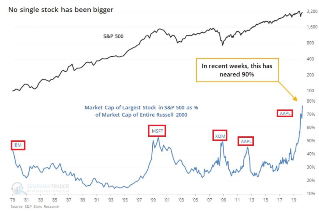
A lot of attention has been paid lately to the fact that AAPL is essentially swallowing up the whole world in terms of market capitalization. As you can see in Figure 1, no single S&P 500 Index stock has ever had a higher market cap relative to the market cap of the entire Russell 2000 small-cap index.
Figure 1 – Largest S&P 500 Index stock as a % of entire Russell 200 Index (Courtesy Sentimentrader.com)
So of course, the easiest thing in the world to do is to be an offensive, off-putting and arrogant wise acre and say “Well, this can’t last.” There, I said it. With the caveat that I have no idea how far AAPL can run “before the deluge”, as a student of (more) market history (than I care to admit) I cannot ignore this gnawing feeling that this eventually “ends badly.” Of course, I have been wrong plenty of times before and maybe things (Offensive, Off-Putting and Arrogant Trigger Warning!) “really will be different this time around.” To get a sense of why I bring this all up, please keep reading.
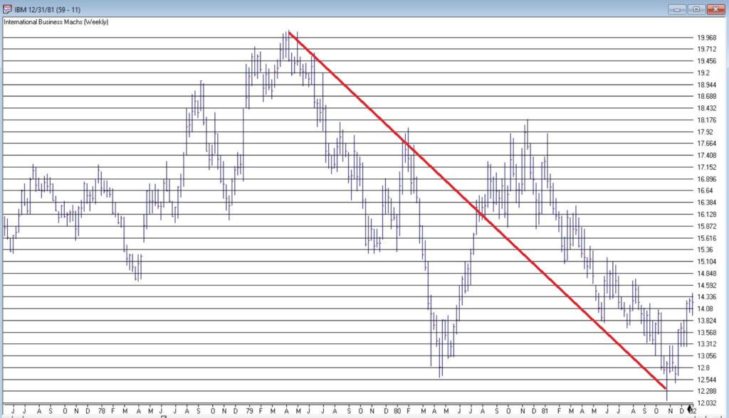
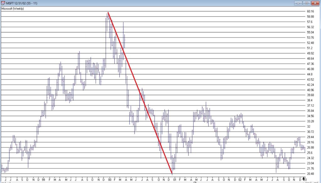
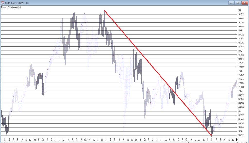
In Figure 1 we also see some previous instances of a stock becoming “really large” in terms of market cap. Let’s take a closer look at these instances.
Could AAPL continue to run to much higher levels? Absolutely
Do I still have that offensive, off-putting and slightly arrogant gut feeling that somewhere along the way AAPL takes a huge whack?
Sorry. It’s just my nature.
Jay Kaeppel
Disclaimer: The information, opinions and ideas expressed herein are for informational and educational purposes only and are based on research conducted and presented solely by the author. The information presented represents the views of the author only and does not constitute a complete description of any investment service. In addition, nothing presented herein should be construed as investment advice, as an advertisement or offering of investment advisory services, or as an offer to sell or a solicitation to buy any security. The data presented herein were obtained from various third-party sources. While the data is believed to be reliable, no representation is made as to, and no responsibility, warranty or liability is accepted for the accuracy or completeness of such information. International investments are subject to additional risks such as currency fluctuations, political instability and the potential for illiquid markets. Past performance is no guarantee of future results. There is risk of loss in all trading. Back tested performance does not represent actual performance and should not be interpreted as an indication of such performance. Also, back tested performance results have certain inherent limitations and differs from actual performance because it is achieved with the benefit of hindsight.
You may have seen some of the articles out there analyzing the skewed nature of the current market rally. As Joe Bartosiewicz in his August 8 Bartometer pointed out:
“The Top 15 Stocks in the S&P 500 account in Market Value 35% of the entire S&P 500 stock market. The Bottom 420 Stocks in the S&P 500 account in Market Value 33.8% of the entire S&P 500 stock market. This means that 15 stocks are controlling the entire S&P 500..”
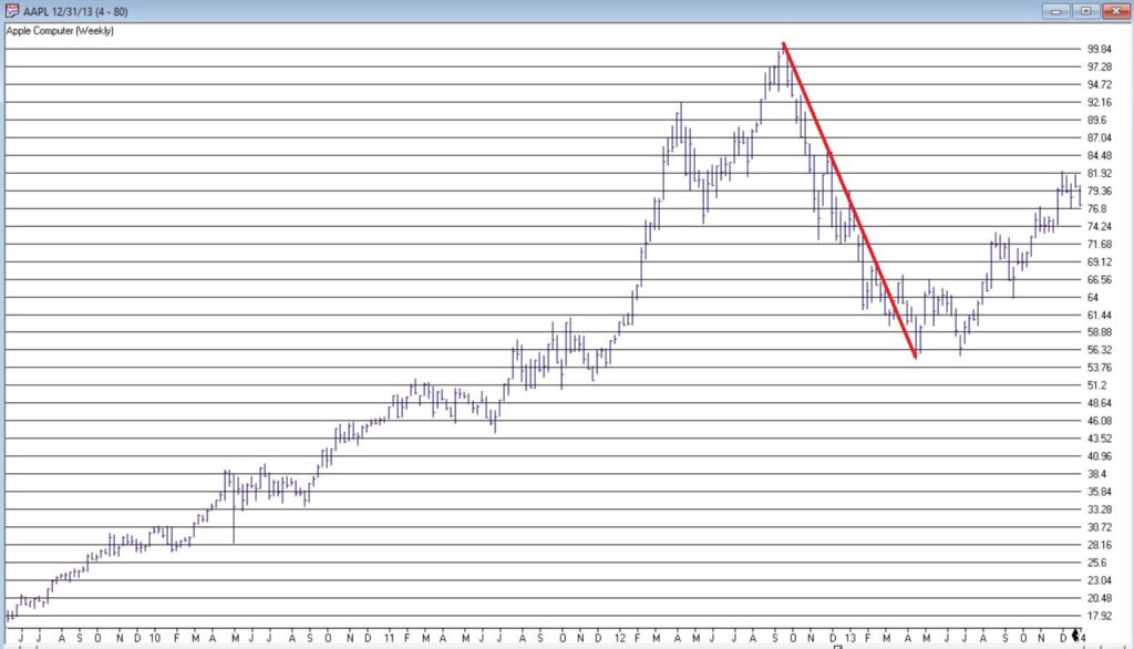
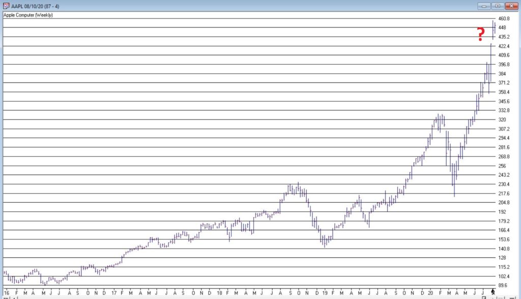
The Dow Jones 30 index uses a price weighted criteria as part of it’s calculation, and also includes Apple; AAPL has more than doubled in price in under 5 months.
Given that there appears to be only a small basket of stocks leading this rally, we had a look back at the last time tech related stocks were driving the market higher; the dotcom bubble that ran through the 90s into the early 00s.
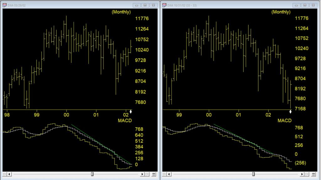
Monthly DJIA and MACD – left through 3/2002 – right through 10/2002
The first chart is a monthly of the Dow 30 with MACD indicator comparing the market 03/29//2002 as the dotcom bubble rolled over vs 7 months later. Students of divergence analysis, will tell you that MACD in late March 2002 clearly showed prices should be much lower still despite the @33 % rally from the September 2001 low. By late October 2002 the market had fallen again by @33%. At that time the market was close to @40% lower than the high at the start of 2000.
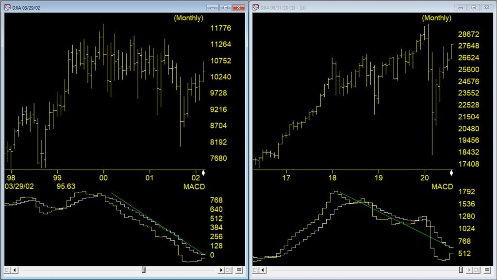
Monthly DJIA and MACD – left through 3/2002 – right through 8/2020
The second chart is a monthly of the Dow 30 on the right through 8/10/20 vs the rally peak of 03/29/2002. The current market has had a @50% rally from the low at the end of March 2020. The original correction was @37% from high to low, slightly bigger than the dotcom correction. The MACD, similar to 2002, is strongly diverging.
The decline in 2002, after the rally, took prices lower than the the prior bottom. If a similar pattern happens this time and the decline is @40% from the high of 29568, the Dow would at the 17700 level.
Everybody likes it when an asset that they hold goes up in price. In fact, the more the better. But only to a point as it turns out. When price gets carried away to the upside – we trader types typically refer to it as a “going parabolic”, i.e., a situation when prices are essentially rising straight up – it almost invariably ends very badly. We have seen a couple of examples recently.
Palladium
Palladium is a metal that according to Bloomberg’s “About 85% of palladium ends up in the exhaust systems in cars, where it helps turn toxic pollutants into less-harmful carbon dioxide and water vapor. It is also used in electronics, dentistry, medicine, hydrogen purification, chemical applications, groundwater treatment, and jewelry. Palladium is a key component of fuel cells, which react hydrogen with oxygen to produce electricity, heat, and water.”
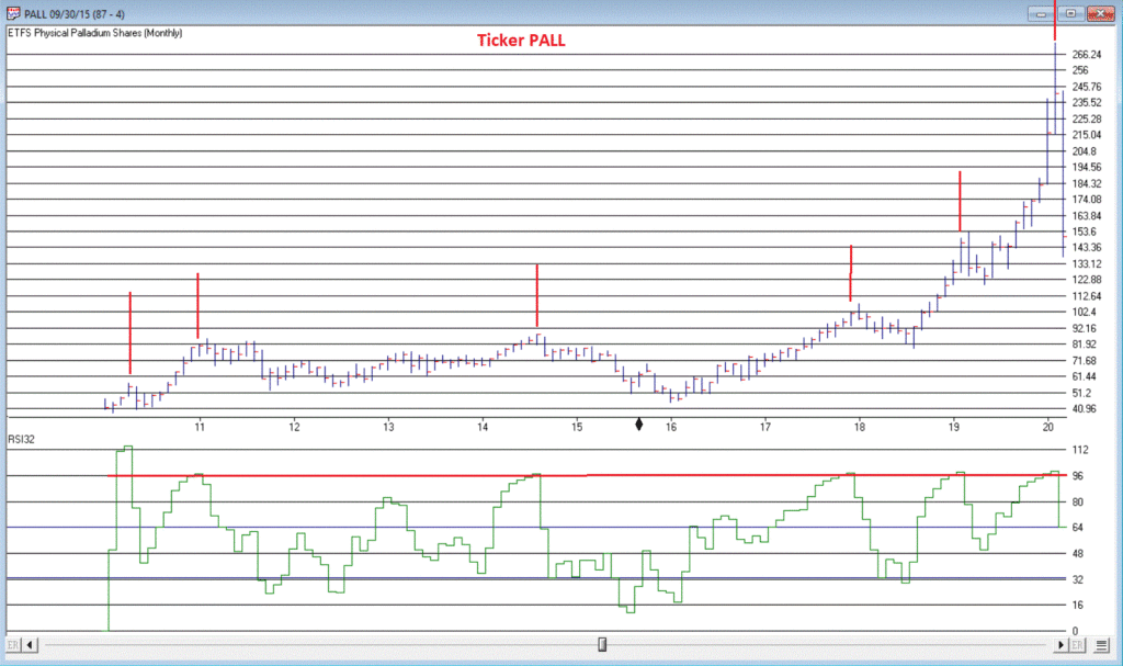
And it was pretty hot stuff for some time. At least until it wasn’t. As a proxy we will look at the ETF ticker symbol PALL, which attempts to track the price of palladium.
*From January 2016 into January 2018, PALL rose +139%
*In the next 7 months it declined by -26%
*And then the fun really began – Between August 2018 and February 2020 PALL rose +245%, with a +110% gain occurring in the final 5+ months of the advance
What a time it was. Until it wasn’t anymore.
Since peaking at $273.16 a share on 2/27/2020, PALL plunged -50% in just 12 trading days. To put it another way, it gave back an entire year’s worth of gains in just 12 trading days.
Was there any way to see this coming? Maybe. In Figure 1 we see a monthly chart with an indicator called “RSI32” in the bottom clip. This indicator is derived by taking the 2-month average of the standard 3-month Relative Strength Index (RSI).
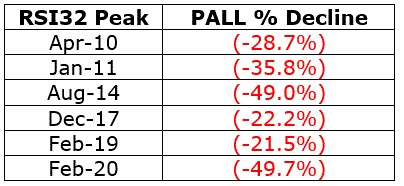
During the panic sell-off in the stock market in recent weeks, treasury bonds became very popular as a “safe haven” as investors piled out of stocks and into the “safety” of U.S. Treasuries. What too many investors appeared to forget in their haste was that long-term treasury can be extremely volatile (for the record, short and intermediate term treasuries are much less volatile than long-term bonds and are much better suited to act as a safe haven). Likewise – just an opinion – buying a 30-year bond paying 1% per year is not entirely unlike buying a stock index fund when the market P/E Ratio is over 30 – there just isn’t a lot of underlying value there. So you are essentially betting on a continuation of the current trend and NOT on the ultimate realization of the underlying value – because there really isn’t any.
Anyway, Figure 3 displays a monthly chart of ticker TLT – an ETF that tracks the long-term treasury – with the RSI32 indicator in the bottom clip.
Bond price movement is typically not as extreme and volatile as Palladium, so for bonds a RSI32 reading above 80 typically indicates that potential trouble may lie ahead.
As of the close of 3/17/20, TLT was almost -15% off of its high in just 6 trading days. We’ll see where it goes from here.
Tesla (Ticker TSLA)
Anytime you see what is essentially a manufacturing company – no matter how “hot”, “hip”, or “cool” the product they build – go up 200% in 2 months’ time, the proper response is NOT giddy delight. The proper response is:
*If you DO own the stock, either set a trailing stop or take some profits immediately and set a trailing stop for the rest
*If you DO NOT own the stock, DO NOT allow yourself to get sucked in
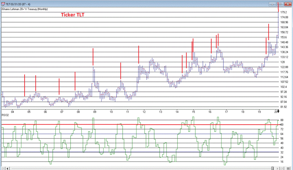
Take TSLA in Figure 4 for instance. By February 2020 TSLA was up almost 200% in 2 months and almost 450% in 8 months. The RSI32 indicator was above 96 – a stark warning sign.
19 trading days after making its closing high, TSLA is down -59%.
Typically, the security in question gives back months – or in some case, years – worth of gains in a shockingly short period of time.
Beware the parabola.
Jay Kaeppel
Disclaimer: The information, opinions and ideas expressed herein are for informational and educational purposes only and are based on research conducted and presented solely by the author. The information presented does not represent the views of the author only and does not constitute a complete description of any investment service. In addition, nothing presented herein should be construed as investment advice, as an advertisement or offering of investment advisory services, or as an offer to sell or a solicitation to buy any security. The data presented herein were obtained from various third-party sources. While the data is believed to be reliable, no representation is made as to, and no responsibility, warranty or liability is accepted for the accuracy or completeness of such information. International investments are subject to additional risks such as currency fluctuations, political instability and the potential for illiquid markets. Past performance is no guarantee of future results. There is risk of loss in all trading. Back tested performance does not represent actual performance and should not be interpreted as an indication of such performance. Also, back tested performance results have certain inherent limitations and differs from actual performance because it is achieved with the benefit of hindsight.