This video on the Market Timing signals in AIQ is also applicable for our WinWayCharts TradingExpert Market Timing. Check it out.
Market volatility continues. In this update we’ll take a look at the current AI signals on the Dow Jones. For folks less familiar with our AI engine here’s a recap of what we do.
TradingExpert Pro uses two AI knowledge bases, one specifically designed to issue market timing signals and the other designed to issue stock timing signals.
Each contains approximately 400 rules, but only a few “fire” on any given day. In the language of expert systems, those rules that are found to be valid on a particular day are described as having “fired”.
Rules can fire in opposite directions. When this happens, the bullish and bearish rules fight it out. It’s only when bullish rules dominate that the Expert Rating signal is bullish, or when bearish rules dominate that the Expert Rating signal is bearish.
The Expert Rating consists of two values.
The upside rating is the value on the left and the downside rating is on the right. Expert Ratings are based on a scale of 0 to 100. An Expert Rating of 95 to 100 is considered a strong signal that the Stock or market may change direction.
An Expert Rating below 90 is considered meaningless. A low rating means that there is not enough consistency in the rules that fired to translate to a signal. The expert system has not found enough evidence to warrant a change from the last strong signal.
In this short video Steve Hill, founder of WinWayCharts talks about Fibonacci Retracements on the current market rally and comparisons to the 2008 and 1974 markets.
PLUS a quick look at market breath and some S&P 500 group action.
Well that sounds like a pretty alarming headline, doesn’t it? But before you actually take a moment to locate the nearest exit please note the important difference between the words “Please locate the nearest exit” and “Oh My God, it’s the top, sell everything!!!”
You see the difference, right? Good. Let’s continue. First, a true confession – I am not all that great at “market timing”, i.e., consistently buying at the bottom and/or selling at the top (I console myself with the knowledge that neither is anyone else). On the other hand, I am reasonably good at identifying trends and at recognizing risk. Fortunately, as it turns out, this can be a pretty useful skill.
So, while I may not be good at market timing, I can still make certain reasonable predictions. Like for example, “at some point this bull market will run out of steam and now is as good a time as any to start making plans about how one will deal with this inevitable eventuality – whenever it may come”. (Again, please notice the crucial difference between that sentence and “Oh My God, it’s the top, sell everything!!”)
First the Good News
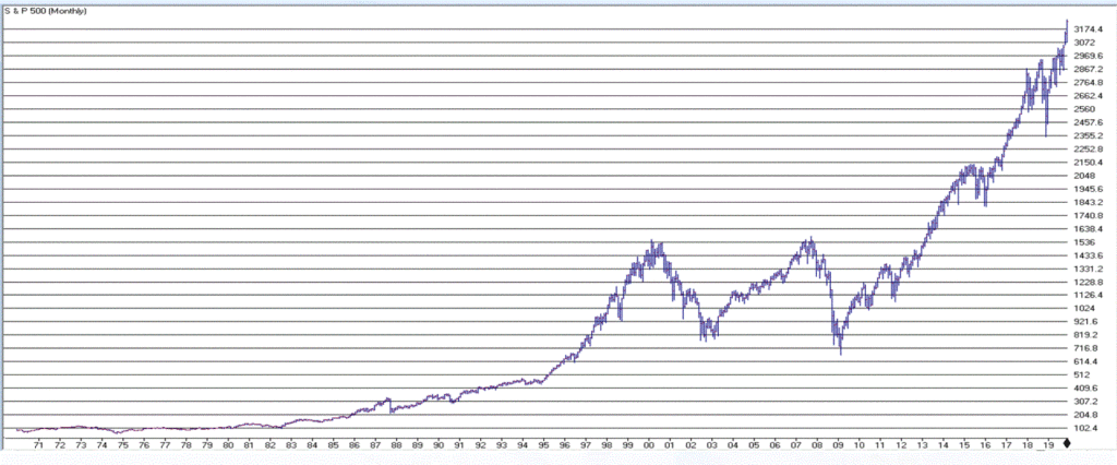
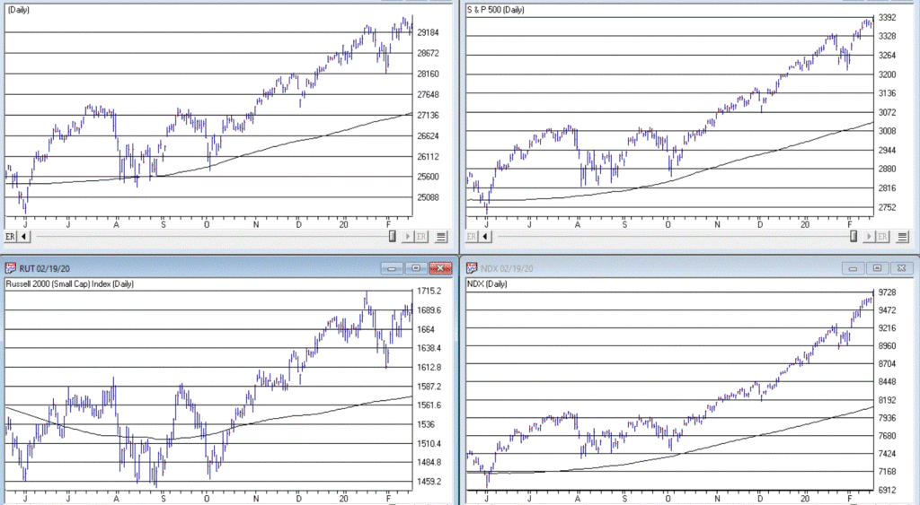
The trend in the stock market is bullish. Duh. Is anyone surprised by that statement? Again, we are talking subtleties here. We are not talking about predictions, forecasts, projected scenarios, implications of current action for the future, etc. We are just talking about pure trend-following and looking at the market as it is today. Figure 1 displays the S&P 500 Index monthly since 1971 and Figure 2 displays four major indexes (Dow, S&P 500, Nasdaq 100, Russell 2000) versus their respective 200-day moving averages.
It is impossible to look at the current status of “things” displayed in Figures 1 and 2 and state “we are in a bear market”. The trend – at the moment – is “Up”. The truth is that in the long run many investors would benefit from ignoring all of the day to day “predictions, forecasts, projected scenarios, implications of current action for the future, etc.” that emanates from financial news and just sticking to the rudimentary analysis just applied to Figures 1 and 2.
In short, stop worrying and learn to love the trend. Still, no trend lasts forever, which is kind of the point of this article.
So now let’s talk about the “Bad News”. But before we do, I want to point out the following: the time to actually worry and/or do something regarding the Bad News will be when the price action in Figure 2 changes for the worse. Let me spell it out as clearly and as realistically as possible.
If (or should I say when?) the major U.S. stock indexes break below their respective 200-day moving averages (and especially if those moving average start to roll over and trend down):
*It could be a whipsaw that will be followed by another rally (sorry folks, but for the record I did mention that I am not that good at market timing and that I was going to speak as realistically as possible – and a whipsaw is always a realistic possibility when it comes to trend-following)
*It could be the beginning of a significant decline in the stock market (think -30% or possibly even much more)
So, the proper response to reading the impending discussion of the Bad News is not “I should do something”. The proper response is “I need to resolve myself to doing something when the time comes that something truly needs to be done.”
You see the difference, right? Good. Let’s continue.
The Bad News
The first piece of Bad News is that stocks are overvalued. Now that fact hardly scares anybody anymore – which actually is understandable since the stock market has technically been overvalued for some time now AND has not been officially “undervalued” since the early 1980’s. Also, valuation is NOT a timing tool, only a perspective tool. So high valuation levels a re pretty easy to ignore at this point.
Still, here is some “perspective” to consider:
*Recession => Economic equivalent of jumping out the window
*P/E Ratio => What floor you are on at the time you jump
Therefore:
*A high P/E ratio DOES NOT tell you WHEN a bear market will occur
*A high P/E ratio DOES WARN you that when the next bear market does occur it will be one of the painful kind (i.e., don’t say you were not warned)
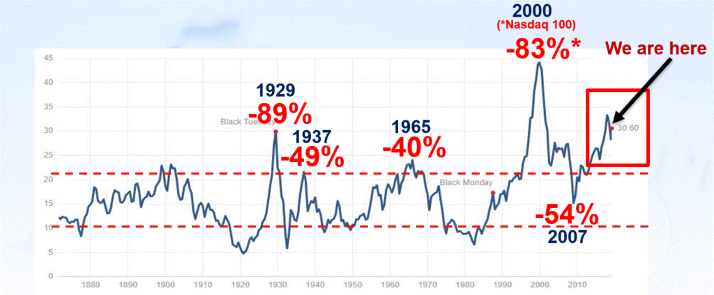
Figure 3 displays the Shiller P/E Ratio plus (in red numbers) the magnitude of the bear market that followed important peaks in the Shiller P/E Ratio.
Repeating now: Figure 3 does not tell us that a bear market is imminent. It does however, strongly suggest that whenever the next bear market does unfold, it will be, ahem, significant in nature. To drive this point home, a brief history:
1929: P/E peak followed by -89% Dow decline in 3 years
1937: P/E peak followed by -49% Dow decline in 7 months(!?)
1965: P/E peak followed by 17 years of sideways price action with a -40% Dow decline along the way
2000: P/E peak followed by -83% Nasdaq 100 decline in 2 years
2007: P/E peak followed by -54% Dow decline in 17 months
Following next peak: ??
As you can see, history suggests that the next bear market – whenever it may come – will quite likely be severe. There is actually another associated problem to consider. Drawdowns are one thing – some investors are resolved to never try to time anything and are thus resigned to the fact that they will have to “ride ‘em out” once in awhile. OK fine – strap yourself in and, um, enjoy the ride. But another problem associated with high valuation levels is the potential (likelihood?) for going an exceedingly long period of time without making any money at all. Most investors have pretty much forgotten – or have never experienced – what this is like.
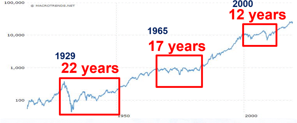
Figure 4 displays three such historical periods – the first associated with the 1929 peak, the second with the 1965 peak and the third with the 2000 peak.
Figure 4 – Long sideways periods often follow high P/E ratios
*From 1927 to 1949: the stock market went sideways for 22 years. Some random guy in 1947 – “Hey Honey, remember that money we put to work in the stock market back in 1927? Great News! We’re back to breakeven! (I can’t speak for anyone else, but personally I would prefer to avoid having THAT conversation.)
*From 1965 to 1982: the stock market went sideways. While this is technically a 0% return over 17 years (with drawdows of -20%, -30% and -40% interspersed along the way – just to make it less boring), it was actually worse than that. Because of high inflation during this period, purchasing power declined a fairly shocking -75%. So that money you “put to work” in that S&P 500 Index fund in 1965, 17 years later had only 25% as much purchasing power (but hey, this couldn’t possibly happen again, right!?).
*From 2000 to 2012: the stock market went sideways. With the market presently at much higher all-time highs most investors have forgotten all about this. Still, it is interesting to note that from 8/31/2000 through 1/31/2020 (19 years and 5 months), the average annual compounded total return for the Vanguard S&P 500 Index fund (ticker VFINX) was just +5.75%. Not exactly a stellar rate of return for almost 20 years of a “ride ’em out” in an S&P 500 Index fund approach).
The Point: When valuations are high, future long-term returns tend to be subpar – and YES, valuations are currently high.
You have been warned.
Stay tuned for Part II…
Jay Kaeppel
Disclaimer: The information, opinions and ideas expressed herein are for informational and educational purposes only and are based on research conducted and presented solely by the author. The information presented does not represent the views of the author only and does not constitute a complete description of any investment service. In addition, nothing presented herein should be construed as investment advice, as an advertisement or offering of investment advisory services, or as an offer to sell or a solicitation to buy any security. The data presented herein were obtained from various third-party sources. While the data is believed to be reliable, no representation is made as to, and no responsibility, warranty or liability is accepted for the accuracy or completeness of such information. International investments are subject to additional risks such as currency fluctuations, political instability and the potential for illiquid markets. Past performance is no guarantee of future results. There is risk of loss in all trading. Back tested performance does not represent actual performance and should not be interpreted as an indication of such performance. Also, back tested performance results have certain inherent limitations and differs from actual performance because it is achieved with the benefit of hindsight.
One of the best pieces of advice I ever got was this: “Don’t tell the market what it’s supposed to do, let the market tell you what you’re supposed to do.”
That is profound. And it really makes me wish I could remember the name of the guy who said it. Sorry dude. Anyway, whoever and wherever you are, thank you Sir.
Think about it for a moment. Consider all the “forecasts”, “predictions” and “guides” to “what is next for the stock market” that you have heard during the time that you’ve followed the financial markets. Now consider how many of those actually turned out to be correct. Chances are the percentage is fairly low.
So how do you “let the market tell you what to do?” Well, like everything else, there are lots of different ways to do it. Let’s consider a small sampling.
Basic Trend-Following
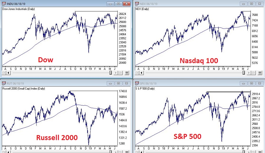
Figure 1 displays the Dow Industrials, the Nasdaq 100, the S&P 500 and the Russell 2000 clockwise form the upper left. Each displays a 200-day moving average and an overhead resistance point.
The goal is to move back above the resistance points and extend the bull market. But the real key is for them to remain in an “uptrend”, i.e.,:
*Price above 200-day MA = GOOD
*Price below 200-day MA = BAD
Here is the tricky part. As you can see, a simple cross of the 200-day moving average for any index may or may not be a harbinger of trouble. That is, there is nothing “magic” about any moving average. In a perfect world we would state that: “A warning sign occurs when the majority of indexes drop below their respective 200-day moving average.”
Yet in both October 2018 and May 2019 all four indexes dropped below their MA’s and still the world did not fall apart, and we did not plunge into a major bear market. And as we sit, all four indexes are now back above their MA’s. So, what’s the moral of the story? Simple – two things:
The fact remains that major bear markets (i.e., the 1 to 3 year -30% or more variety) unfold with all the major averages below their 200-day moving averages. So, it is important to continue to pay attention.
Whipsaws are a fact of life when it comes to moving averages.
The problem then is that #2 causes a lot of investors to forget or simply dismiss #1.
Here is my advice: Don’t be one of those people. While a drop below a specific moving average by most or all the indexes may not mean “SELL EVERYTHING” now, it will ultimately mean “SEEK SHELTER” eventually as the next major bear market unfolds. That is not a “prediction”, that is simply math.
The Bellwethers
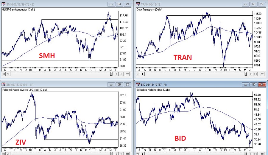
I have written in the past about several tickers that I like to track for “clues” about the overall market. Once again, nothing “magic” about these tickers, but they do have a history of topping out before the major averages prior to bear markets. So, what are they saying? See Figure 2.
SMH (semiconductor ETF): Experienced a false breakout to new highs in April, then plunged. Typically, not a good sign, but it has stabilized for now and is now back above its 200-day MA.
Dow Transports: On a “classic” technical analysis basis, this is an “ugly chart.” Major overhead resistance, not even an attempt to test that resistance since the top last September and price currently below the 200-day MA.
ZIV (inverse VIX ETF): Well below it’s all-time high (albeit well above its key support level), slightly above it’s 200-day MA and sort of seems to be trapped in a range. Doesn’t necessarily scream “SELL”, but the point is it is not suggesting bullish things for the market at the moment.
BID (Sotheby’s – which holds high-end auctions): Just ugly until a buyout offer just appeared. Looks like this bellwether will be going away.
No one should take any action based solely on the action of these bellwethers. But the main thing to note is that these “key” (at least in my market-addled mind) things is that they are intended to be a “look behind the curtain”:
*If the bellwethers are exuding strength overall = GOOD
*If the bellwethers are not exuding strength overall = BAD (or at least not “GOOD”)
A Longer-Term Trend-Following Method
In this article I detailed a longer-term trend-following method that was inspired by an article written by famed investor and Forbes columnist Ken Fisher. The gist is that a top is not formed until the S&P 500 Index goes three calendar months without making a new high. It made a new high in May, so the earliest this method could trigger an “alert” would be the end of August (assuming the S&P 500 Index does NOT trade above it’s May high in the interim.
Jay Kaeppel
Disclaimer: The data presented herein were obtained from various third-party sources. While I believe the data to be reliable, no representation is made as to, and no responsibility, warranty or liability is accepted for the accuracy or completeness of such information. The information, opinions and ideas expressed herein are for informational and educational purposes only and do not constitute and should not be construed as investment advice, an advertisement or offering of investment advisory services, or an offer to sell or a solicitation to buy any security.
You asked for it – Early bird extended WinWayCharts seminar
April 17 full day seminar ( Wealth Training offices in London) Must signup this weekto lock in the low low price
Seats are limited and are filling up fast. Don’t hesitate, fast track your way to trading success PLUS special EARLY BIRD pricing has been extended at your request, if you reserve your seat in the next 5 days you’ll get the early bird price locked in.
Trend-following is essentially a “tried and true’ approach to investing. But overbought/oversold (i.e., attempting to buy low/sell high) – that’s where the “excitement” is. Of course, when it comes to trading and investing, “excitement” can be highly overrated. Nevertheless, in this piece I want to talk about a relatively obscure indicator that may be useful in identifying vastly oversold situations.
EDITORS NOTE: The WinWay EDS file for Jay Kaeppel’s indicator is available to download here
The VixRSI14 Indicator
Part of the reason this indicator is obscure is because I think I “invented” it – but only by mashing together an indicator from Larry Williams and an indicator from Welles Wilder. The first part is the standard Welles Wilder 14-day Relative Strength Index, more commonly referred to as “RSI”.
The 2nd part of VixRSI14 is an indicator created by famed trader Larry Williams which he dubbed “VixFix”. This indicator is an effort to create a “Vix Index-like” indicator for any security.
WinWay TradingExpert code for these indicators appears at the end of the article.
A Few Notes
*For the record, VixRSI14 is calculated by taking a 3-day exponential average of VixFix and dividing that by a 3-day exponential average of RSI14 (are we having fun yet?). Please see code at the end of the article.
*I prefer to use VixRSI14 using weekly data rather than daily data
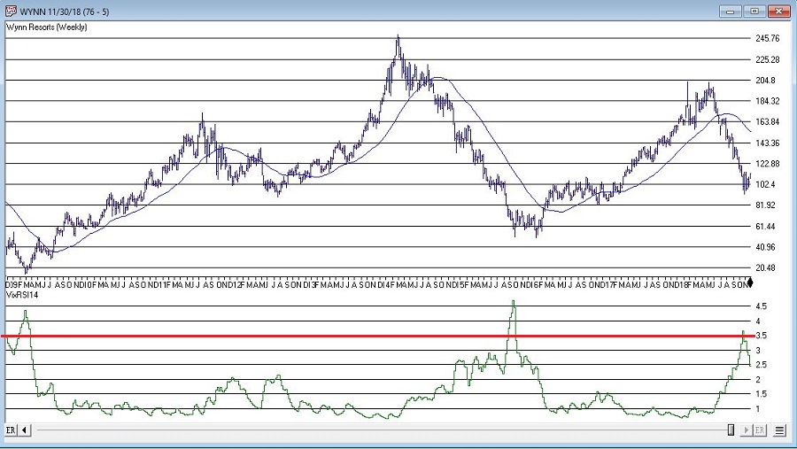
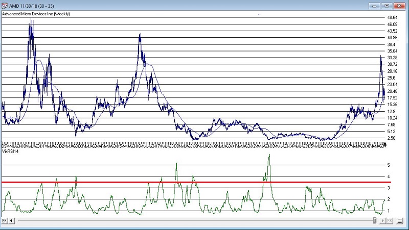
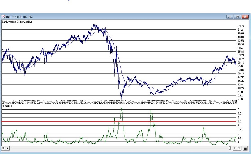
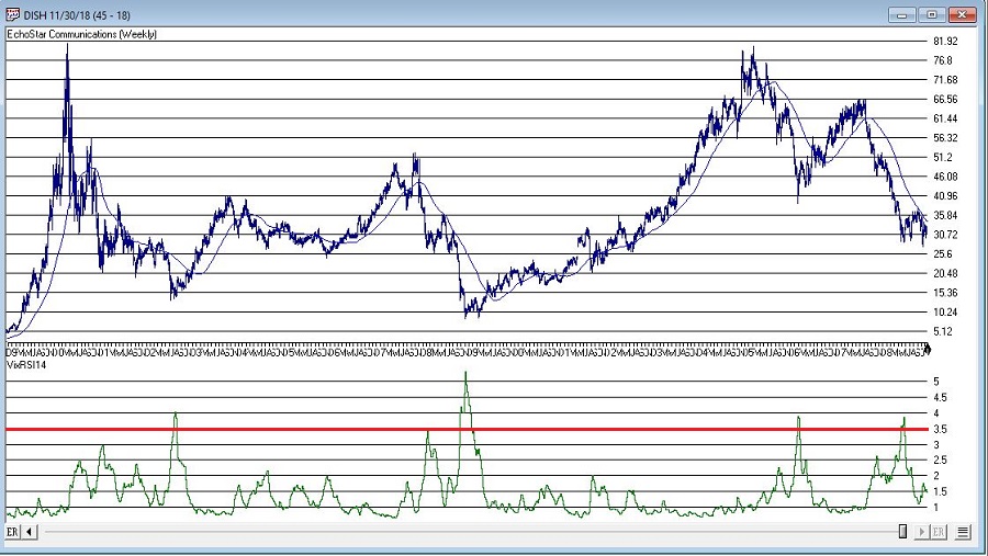
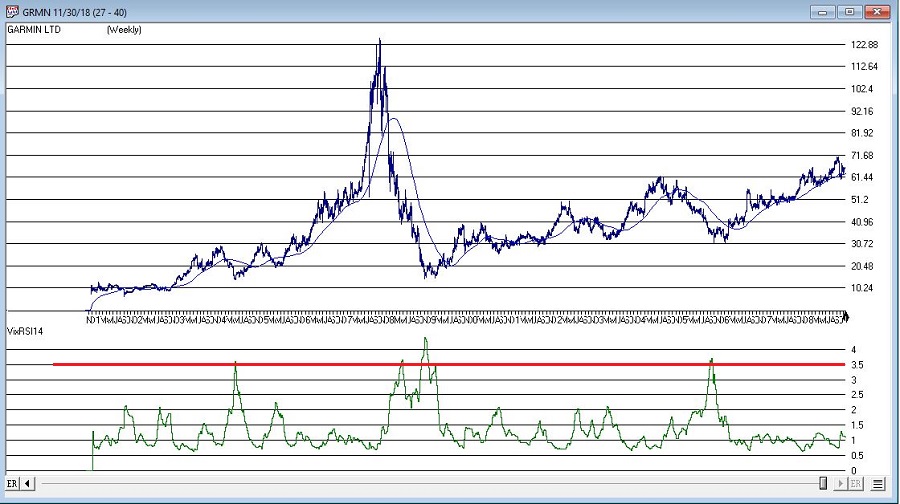
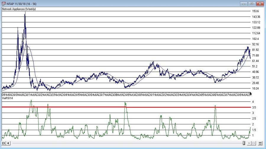
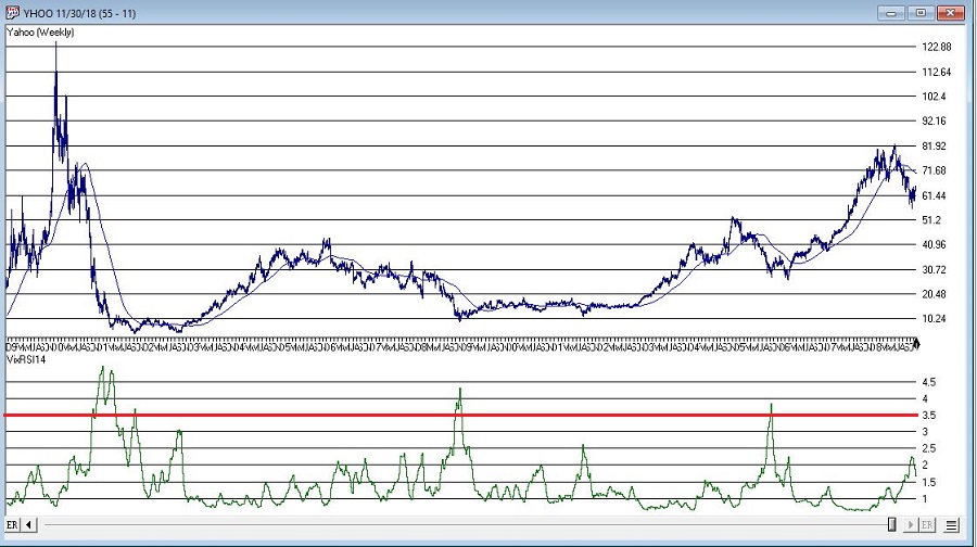
*(Unfortunately) There are no “magic numbers” that indicate that a completely risk-free, you can’t lose, just buy now and watch the money roll in” buying opportunity is at hand (Disclaimer: If there was, I would probably just keep it to myself and not bother writing the article – sorry, it’s just my nature). That being said, a decent “rule of thumb” is to look for a reading above 3.5 followed by a downside reversal.
(Click any chart below to enlarge)
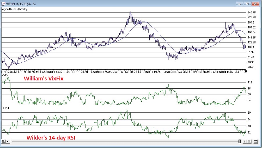
With those thoughts in mind, Figure 1 displays a weekly chart of Wynn Resorts (WYNN) with the two indicators plotted separately below the bar chart.
Figure 1 – WYNN with William’s VixFix and Wilder’s RSI 14-day (Courtesy WinWay TradingExpert)
Note that as price declines, VixFix tends to rise and RSI14 tends to fall. VIXRSI14 essentially identifies “extremes” in the difference between these two. Figure 2 displays WYNN with VixRSI14 plotted below the bar chart.
Figure 2 – WYNN with VixRSI14 (Courtesy WinWay TradingExpert)
More “examples” appear in Figures 3 through 8 below.
As always, I merely present “ideas” here at JOTM. So, do not assume from the charts above that you have found the “keys to the kingdom”. But if used in conjunction with other confirming indicators – and remembering to employ some sort of risk control for those instances when a stock price decline fails to arrest itself even after VixRSI4 peaks above 3.5 – VixRSI14 may hold some value.
Indicator Code
EDITORS NOTE: The WinWay EDS file for Jay Kaeppel’s indicator is available to download here
Below is the code for VixFix, RSI14 and VixRSI14 from AIQ Expert Design Studio.
!#######################################
!VixFix indicator code
hivalclose is hival([close],22).
vixfix is (((hivalclose-[low])/hivalclose)*100)+50.
!#######################################
!#######################################
!RSI14 code
Define days14 27.
U14 is [close]-val([close],1).
D14 is val([close],1)-[close].
AvgU14 is ExpAvg(iff(U14>0,U14,0),days14).
AvgD14 is ExpAvg(iff(D14>=0,D14,0),days14).
RSI14 is 100-(100/(1+(AvgU14/AvgD14))).
!#######################################
!#######################################
!VixRSI14 code
VixRSI14 is expavg(vixfix,3)/expavg(RSI14,3).
!#######################################
Jay Kaeppel
Disclaimer: The data presented herein were obtained from various third-party sources. While I believe the data to be reliable, no representation is made as to, and no responsibility, warranty or liability is accepted for the accuracy or completeness of such information. The information, opinions and ideas expressed herein are for informational and educational purposes only and do not constitute and should not be construed as investment advice, an advertisement or offering of investment advisory services, or an offer to sell or a solicitation to buy any security.



 English