The old adage is that we should “buy when there is blood in the streets.” It basically means to buy when things look their worst. Well, for the record I am not actually a fan of this intonation. While it is probably a fair statement, I for one prefer to see some sign of hope – some sign of a trend reversal at the very least – before taking the plunge.
One historically useful indicator suggests we may be nearing that point.
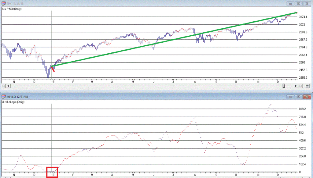
I refer to this indicator as JKHiLo. I included my initials in the acronym because I “developed” it. OK, all I really did was take one guy’s useful indicator and multiply it by another guy’s useful indicator and voila.
In a nutshell JKHilo multiplies Norman Fosback’s HiLo Logic Index by Gerald Appel’s High/Low Indicator.
The Fosback HiLo Logic Index (FHLLI)
I wrote two articles here and here about this indicator. In short, a very low number of stocks making new lows is bullish for the stock market – it indicates that stocks overall are going up and is bullish. At the same time, a very low number of stocks making new highs is also (typically) ultimately bullish going forward, as it tends to signal a “washed out” market.
So this indicator:
*takes the lower of new highs and new lows each day
*divides that number by the total number of issues trades
*takes a 10-day moving average of daily readings
Specifically, the Fosback HiLo Logic Index (HLLI) is calculated as follows:
A=Daily Nasdaq New Highs
B=Daily Nasdaq New Lows
C=The lower of A and B
D=The total number of Nasdaq issues traded
E = (C / D) * 100
FHLLI = 10-day average of E
Readings above 2.15% are considered a sign of “churning”, i.e., a lot of new highs AND new lows. Reading below 0.40% are considered “bullish” because either new highs OR new lows is very low.
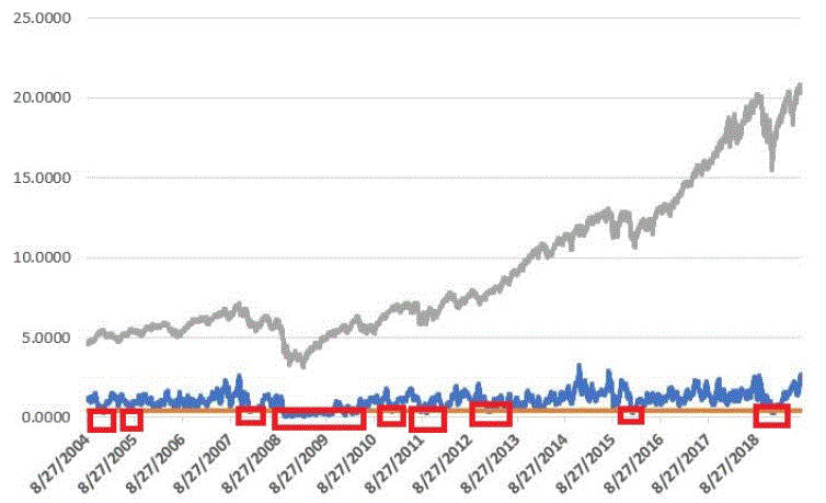
The Fosback HiLo Logic Index finally dropped below 0.40% on 3/23/20. Figure 1 displays the OTC Composite Index with this indicator through 12/31/2019.
Figure 1 – Fosback HiLo Logic Index
The Appel High/Low Indicator
This indicator (heretofore AHLI) is more of a trend-following indicator. It simply divides the number of new highs each day by the total of new highs AND new lows, then takes a 10-day average.
The AHLI is calculated as follows:
A=Daily Nasdaq New Highs
B=Daily Nasdaq New Lows
C = A / (A+B)
AHLI = 10-day average of C
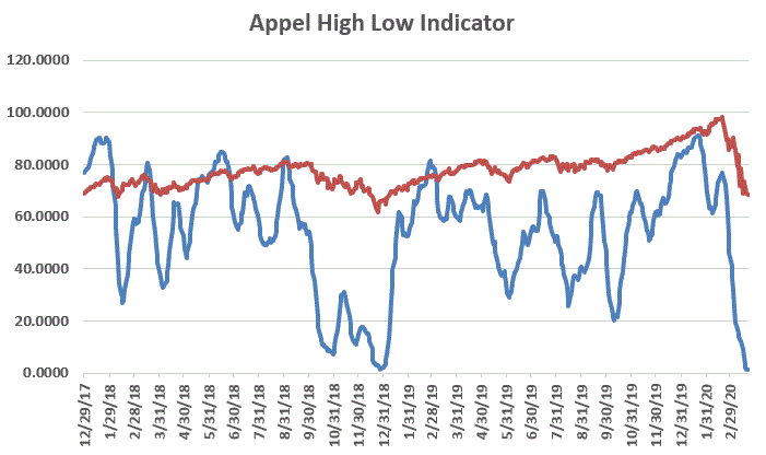
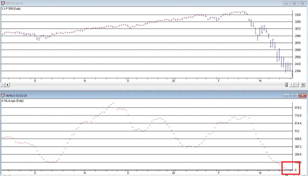
Figure 2 displays this indicator versus the OTC Composite from 12/29/17 through 3/23/20.
Figure 2 – Appel High/Low Indicator (x100; blue line) with OTC Composite (/100; red line); Dec17 through 3/23/20
Extremely low readings tend to highlight oversold market conditions. For the record, an actual “buy signal” for this indicator occurs when it drops below 0.20 (or 20 in Figure 3 since the blue line is the indicator x 100) and then rises back above that level.
The JK Hilo Index (JKHiLo)
So then one day some young punk comes along and multiplies the Fosback indicator by the Appel indicator and has the audacity to add his own initials. Some people. Anyway:
JKHiLo = (FHLLI x AHLI) x 500
A “12-month Buy Signal” occurs when this indicator:
*drops below 5.00
*then turns higher for one day
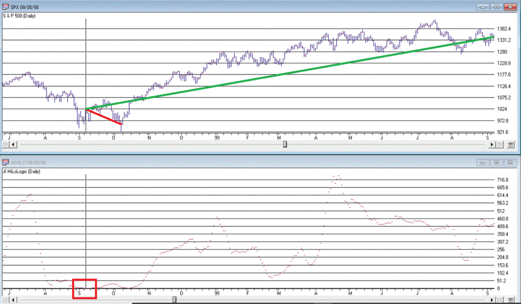
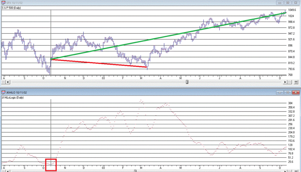
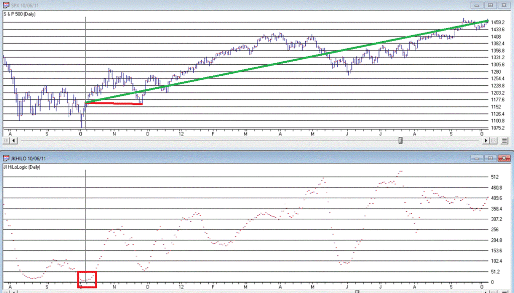
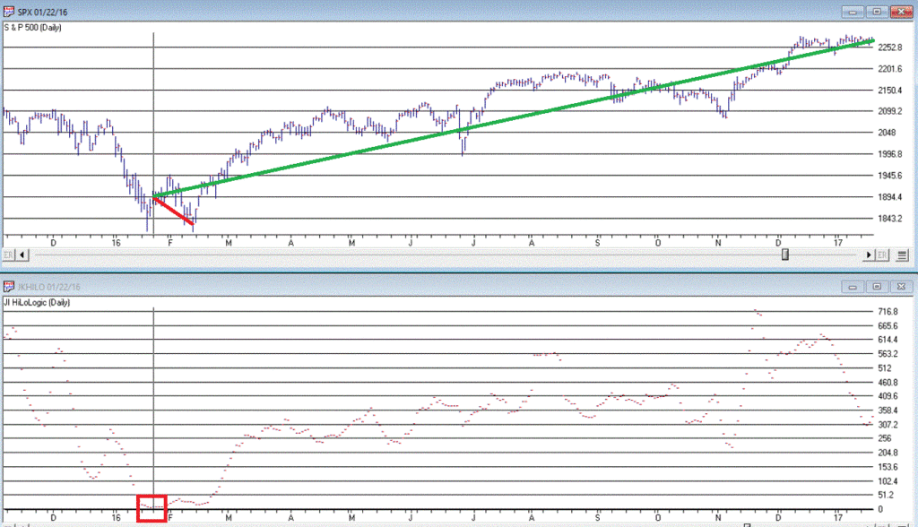
The first part of this signal has happened. As of the close on 3/23/20 JKHL has plunged to 1.8.
Let’s look at previous instances when JKHL fell below 5.00 and then ticked higher for one day.
IMPORTANT: This upside reversal technically constitutes a “12-month buy signal”. What does that mean? It means:
*We expect the market to be higher 12-months later
*HOWEVER, it is NOT an “All Clear, Everything is Great, You Can’t Lose” signal
The bottom line is that it typically does NOT mark the actually bottom. In most cases, another new low or at least a retest of the low follows within a few months. But not always.
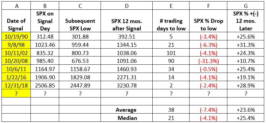
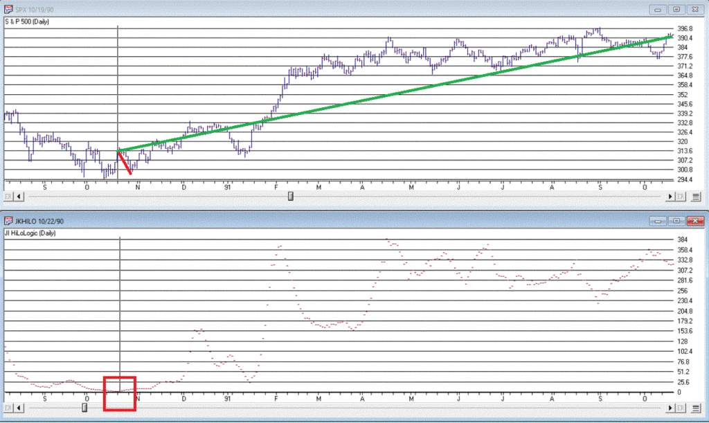
Figure 3 displays the 7 buy signals that have occurred since 1990.
A = Date of signal – i.e., date the JKHL indicator ticked up one day after dropping below 5
B = SPX closing price on date of signal
C = Subsequent low closing price for SPX
D = SPX closing price 12 months after signal date
E = # of trading days between date of signal and ultimate low
F = % decline by SPX from date of signal to ultimate low
G = % change in SPX closing price 1 year after date of signal
Figure 3 – JKHL 12-month buy signals
It is important to note that each previous “buy signal” was followed by further downside price movement prior to the ultimate low. It ranged from 2 trading days in 2018 to 101 trading days in 2008. 6 of the 7 signals saw a further decline of no more than -6.3%. But the 2008 signal saw the market continue to plunge another -31% of the following 3+ months.
So, like I said earlier, even when this indicator does turn up and generate a new signal, that DOES NOT mean “All Clear”. Still, to get an idea of what we might expect, each of the previous signals are displayed in the Figures below.
We DO NOT have a new signal yet, but JKHiLo is below 5, so it is just a matter of waiting for the daily value to tick higher for one day (and then – if history is a guide – waiting for the ultimate low to be put in before a subsequent rally).
Are we on the cusp of a new opportunity? Or on the edge of a cliff? In this time of unprecedented uncertainty, I can’t pretend to know the answer. So, I rely on objective indicators to guide me.
At this moment in time the “trend-following” indicators are bearish and so caution is undoubtedly in order. But other indicators such as the one discussed here remind us to remain alert to new opportunities.
Jay Kaeppel
Disclaimer: The information, opinions and ideas expressed herein are for informational and educational purposes only and are based on research conducted and presented solely by the author. The information presented does not represent the views of the author only and does not constitute a complete description of any investment service. In addition, nothing presented herein should be construed as investment advice, as an advertisement or offering of investment advisory services, or as an offer to sell or a solicitation to buy any security. The data presented herein were obtained from various third-party sources. While the data is believed to be reliable, no representation is made as to, and no responsibility, warranty or liability is accepted for the accuracy or completeness of such information. International investments are subject to additional risks such as currency fluctuations, political instability and the potential for illiquid markets. Past performance is no guarantee of future results. There is risk of loss in all trading. Back tested performance does not represent actual performance and should not be interpreted as an indication of such performance. Also, back tested performance results have certain inherent limitations and differs from actual performance because it is achieved with the benefit of hindsight.
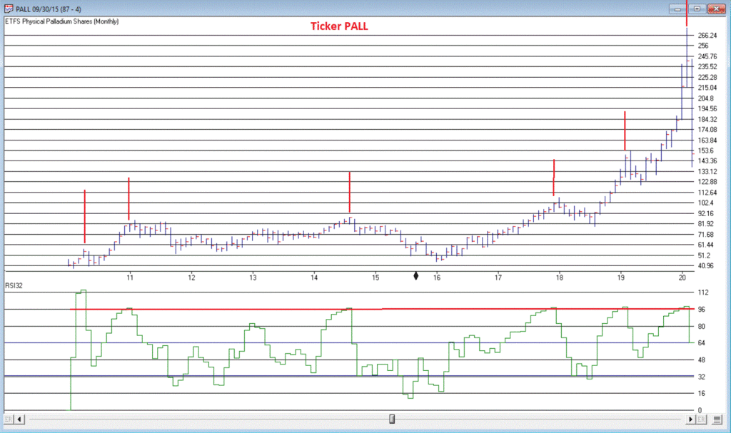
Everybody likes it when an asset that they hold goes up in price. In fact, the more the better. But only to a point as it turns out. When price gets carried away to the upside – we trader types typically refer to it as a “going parabolic”, i.e., a situation when prices are essentially rising straight up – it almost invariably ends very badly. We have seen a couple of examples recently.
Palladium
Palladium is a metal that according to Bloomberg’s “About 85% of palladium ends up in the exhaust systems in cars, where it helps turn toxic pollutants into less-harmful carbon dioxide and water vapor. It is also used in electronics, dentistry, medicine, hydrogen purification, chemical applications, groundwater treatment, and jewelry. Palladium is a key component of fuel cells, which react hydrogen with oxygen to produce electricity, heat, and water.”
And it was pretty hot stuff for some time. At least until it wasn’t. As a proxy we will look at the ETF ticker symbol PALL, which attempts to track the price of palladium.
*From January 2016 into January 2018, PALL rose +139%
*In the next 7 months it declined by -26%
*And then the fun really began – Between August 2018 and February 2020 PALL rose +245%, with a +110% gain occurring in the final 5+ months of the advance
What a time it was. Until it wasn’t anymore.
Since peaking at $273.16 a share on 2/27/2020, PALL plunged -50% in just 12 trading days. To put it another way, it gave back an entire year’s worth of gains in just 12 trading days.
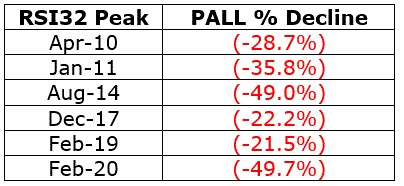
Was there any way to see this coming? Maybe. In Figure 1 we see a monthly chart with an indicator called “RSI32” in the bottom clip. This indicator is derived by taking the 2-month average of the standard 3-month Relative Strength Index (RSI).
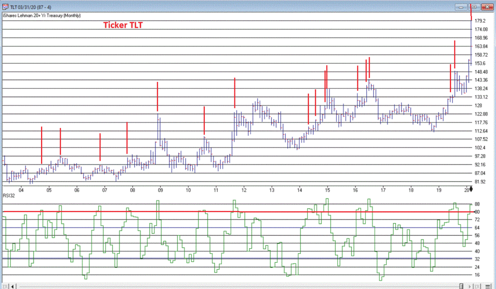
During the panic sell-off in the stock market in recent weeks, treasury bonds became very popular as a “safe haven” as investors piled out of stocks and into the “safety” of U.S. Treasuries. What too many investors appeared to forget in their haste was that long-term treasury can be extremely volatile (for the record, short and intermediate term treasuries are much less volatile than long-term bonds and are much better suited to act as a safe haven). Likewise – just an opinion – buying a 30-year bond paying 1% per year is not entirely unlike buying a stock index fund when the market P/E Ratio is over 30 – there just isn’t a lot of underlying value there. So you are essentially betting on a continuation of the current trend and NOT on the ultimate realization of the underlying value – because there really isn’t any.
Anyway, Figure 3 displays a monthly chart of ticker TLT – an ETF that tracks the long-term treasury – with the RSI32 indicator in the bottom clip.
Bond price movement is typically not as extreme and volatile as Palladium, so for bonds a RSI32 reading above 80 typically indicates that potential trouble may lie ahead.
As of the close of 3/17/20, TLT was almost -15% off of its high in just 6 trading days. We’ll see where it goes from here.
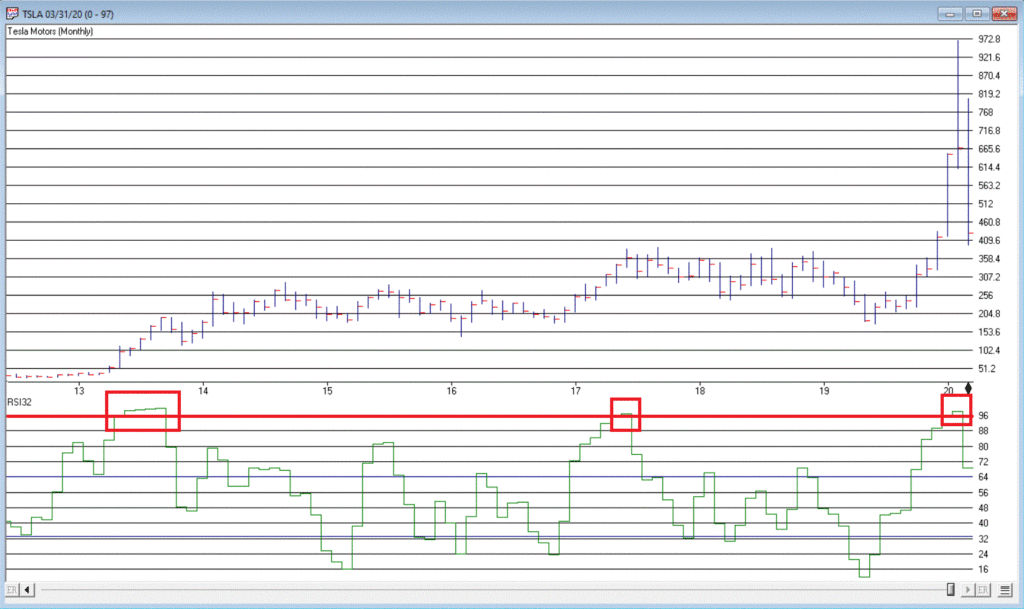
Tesla (Ticker TSLA)
Anytime you see what is essentially a manufacturing company – no matter how “hot”, “hip”, or “cool” the product they build – go up 200% in 2 months’ time, the proper response is NOT giddy delight. The proper response is:
*If you DO own the stock, either set a trailing stop or take some profits immediately and set a trailing stop for the rest
*If you DO NOT own the stock, DO NOT allow yourself to get sucked in
Take TSLA in Figure 4 for instance. By February 2020 TSLA was up almost 200% in 2 months and almost 450% in 8 months. The RSI32 indicator was above 96 – a stark warning sign.
19 trading days after making its closing high, TSLA is down -59%.
Typically, the security in question gives back months – or in some case, years – worth of gains in a shockingly short period of time.
Beware the parabola.
Jay Kaeppel
Disclaimer: The information, opinions and ideas expressed herein are for informational and educational purposes only and are based on research conducted and presented solely by the author. The information presented does not represent the views of the author only and does not constitute a complete description of any investment service. In addition, nothing presented herein should be construed as investment advice, as an advertisement or offering of investment advisory services, or as an offer to sell or a solicitation to buy any security. The data presented herein were obtained from various third-party sources. While the data is believed to be reliable, no representation is made as to, and no responsibility, warranty or liability is accepted for the accuracy or completeness of such information. International investments are subject to additional risks such as currency fluctuations, political instability and the potential for illiquid markets. Past performance is no guarantee of future results. There is risk of loss in all trading. Back tested performance does not represent actual performance and should not be interpreted as an indication of such performance. Also, back tested performance results have certain inherent limitations and differs from actual performance because it is achieved with the benefit of hindsight.
Well that got ugly quick. For the record, if you have been in the markets for any length of time you have seen this kind of action plenty of times. An index, or stock, or commodity or whatever, trends and trends and trend steadily and relentlessly higher over a period of time. And just when it seems like its going to last forever – BAM. It gives back all or much of its recent rally gains very quickly. Welcome to the exciting world of investing.
I make no claims of “calling the top” – because I never have actually (correctly) called one and I don’t expect that I ever will. But having written Part I and Part IIof articles titled “Please Take a Moment to Locate the Nearest Exit” in the last week, I was probably one of the least surprised people at what transpired in the stock market in the last few sessions.
Of course the question on everyone’s lips – as always in this type of panic or near panic situation – is, “where to from here?” And folks if I knew the answer, I swear I would tell you. But like everyone else, I can only assess the situation, formulate a plan of action – or inaction, as the case may be – and act accordingly. But some random thoughts:
*Long periods of relative calm followed by extreme drops are more often than not followed by periods of volatility. So, look for a sharp rebound for at least a few days followed by another downdraft and so on and so forth, until either:
a) The market bottoms out and resumes an uptrend
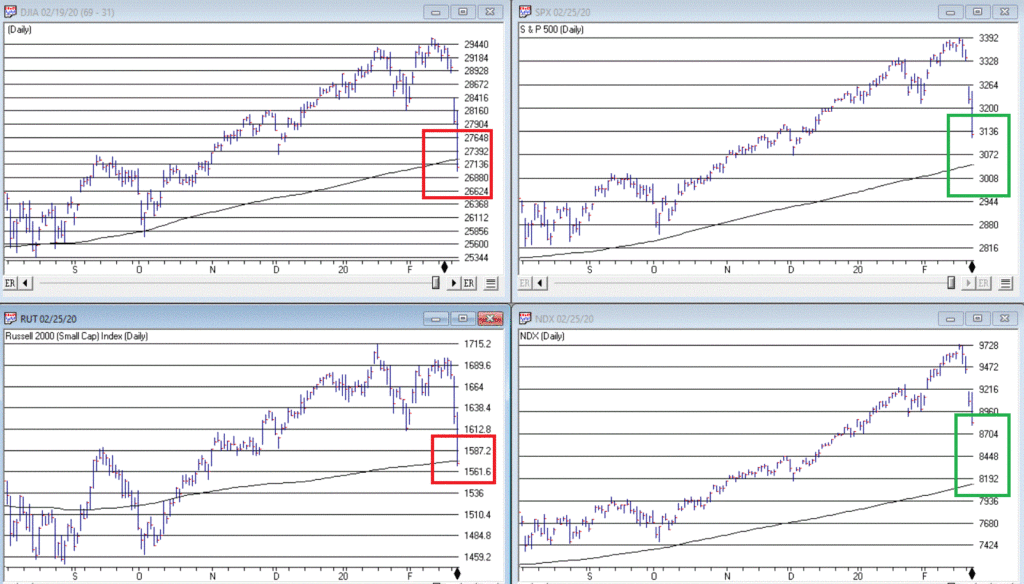
b) The major indexes (think Dow, S&P 500, Nasdaq 100, Russell 2000) drop below their 200-day moving averages. As of the close on 2/25 both the Dow and the Russell 2000 were below their 200-day moving average. That would set up another a) or b) scenario.
If the major indexes break below their long-term moving averages it will either:
a) End up being a whipsaw – i.e., the market reverses quickly to the upside
b) Or will be a sign of more serious trouble
The main point is that you should be paying close attention in the days and weeks ahead to the indexes in Figure 1.
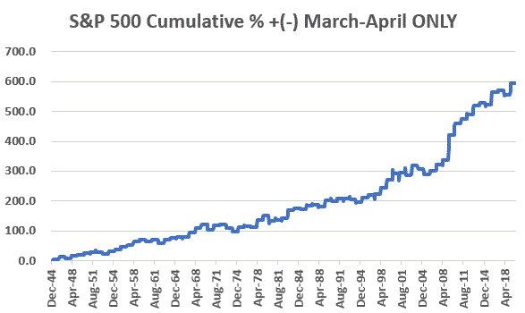
One reason for potential optimism is that the two-month period of March and April has historically been one of the more favorable two-month periods on an annual basis. Figure 2 displays the cumulative price gain achieved by the S&P 500 Index ONLY during March and April every year since 1945. The long-term trend is unmistakable, but year-to-year results can of course, vary greatly.
Figure 2 – S&P 500 cumulative price gain March-April ONLY (1945-2019)
For the record:
S&P 500 March-April
Result
Number of times UP
55 (73%)
Number of times DOWN
20 (27%)
Average UP%
+5.0%
Average DOWN%
(-3.4%)
Figure 3 – Facts and Figures
Will March and April bail us out? Here’s hoping.
As an aside, this strategy is having a great week so far.
Jay Kaeppel
Disclaimer: The information, opinions and ideas expressed herein are for informational and educational purposes only and are based on research conducted and presented solely by the author. The information presented does not represent the views of the author only and does not constitute a complete description of any investment service. In addition, nothing presented herein should be construed as investment advice, as an advertisement or offering of investment advisory services, or as an offer to sell or a solicitation to buy any security. The data presented herein were obtained from various third-party sources. While the data is believed to be reliable, no representation is made as to, and no responsibility, warranty or liability is accepted for the accuracy or completeness of such information. International investments are subject to additional risks such as currency fluctuations, political instability and the potential for illiquid markets. Past performance is no guarantee of future results. There is risk of loss in all trading. Back tested performance does not represent actual performance and should not be interpreted as an indication of such performance. Also, back tested performance results have certain inherent limitations and differs from actual performance because it is achieved with the benefit of hindsight.
To put this piece in context please refer to Part I here.
Part I detailed the Good News (the stock market is still very much in a bullish trend and may very well continue to be for some time) and touched on one piece of Bad News (the market is overvalued on a long-term valuation basis).
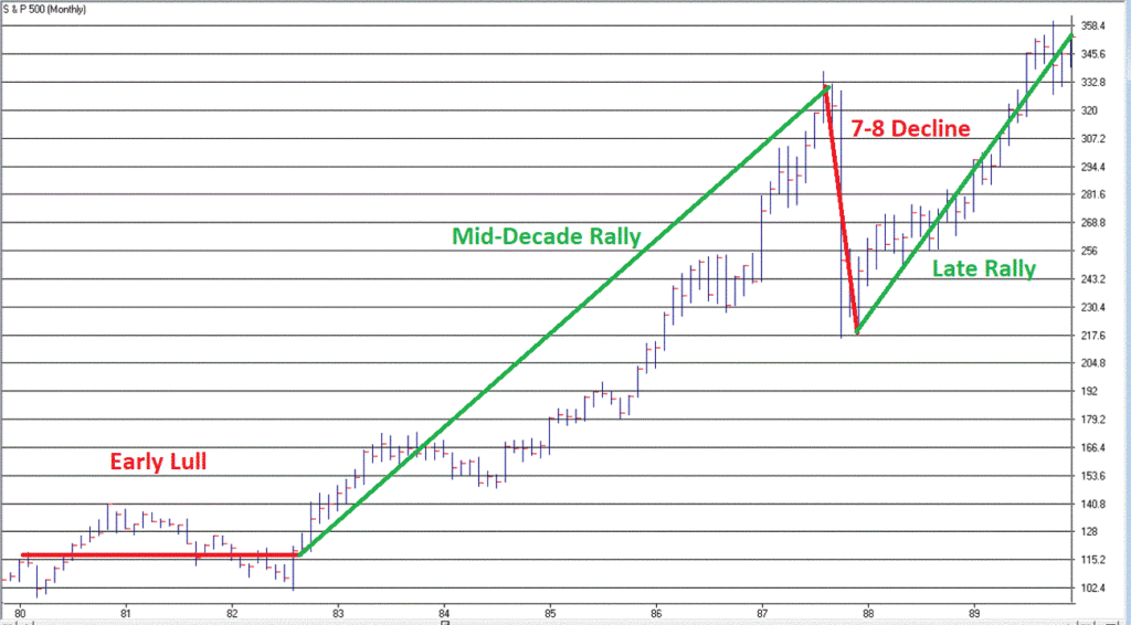
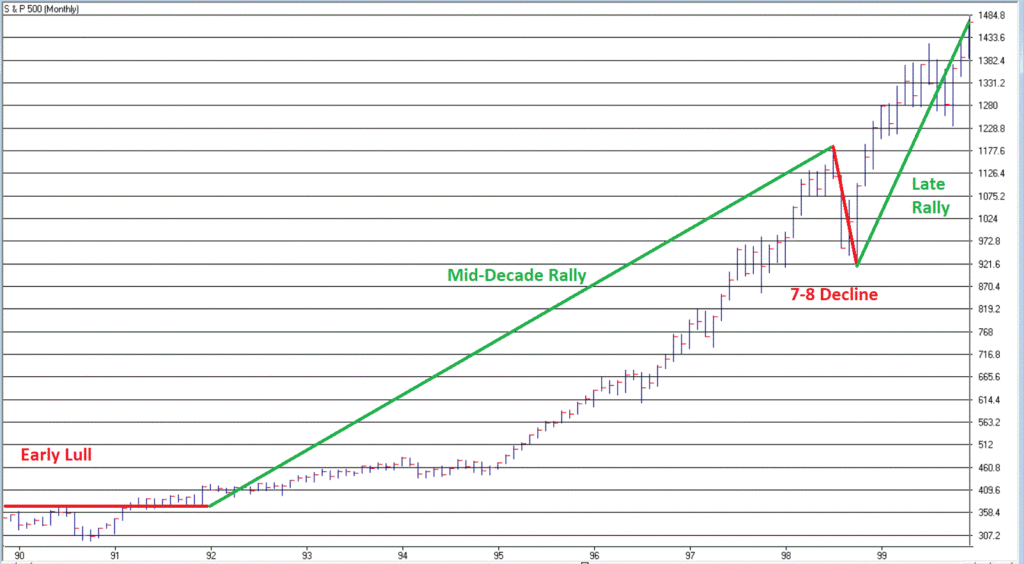
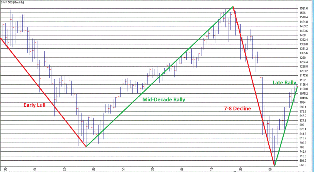
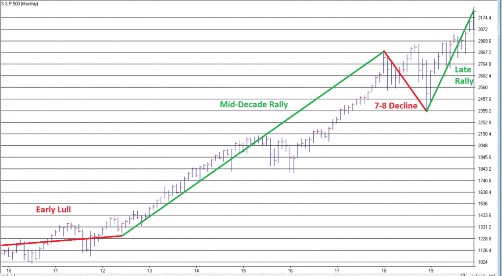
The Next Piece of Bad News: The “Early Lull”
In my book, Seasonal Stock Market Trends, I wrote about something called the Decennial Pattern, that highlights the action of the stock market in a “typical” decade.
The Four Parts of the “Typical Decade” are:
The Early Lull: Market often struggles in first 2.5 years of a decade
The Mid-Decade Rally: Market typically rallies in the middle of a decade – particularly between Oct 1 Year “4” and Mar 31 Year “6”
The 7-8 Decline: Market often experiences a sharp decline somewhere in the Year “7” to Year “8” period
The Late Rally: Market often rallies strongly into the end of the decade.
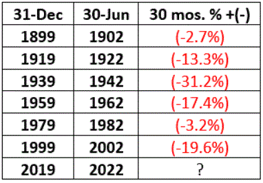
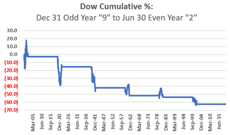
We are now in the “Early Lull” period. This in no way “guarantees” trouble in the stock market in the next two years. But it does offer a strong “suggestion”, particularly when we focus only on decades since 1900 that started with an Election Year (which is where we are now) – 1900, 1920, 1940, 1960, 1980, 2000.
As you can see in Figures 5 and 6, each of these 6 2.5-year decade opening periods witnessed a market decline – -14% on average and -63% cumulative. Once again, no guarantee that 2020 into mid 2022 will show weakness, but….. the warning sign is there
Figure 5 – Dow price performance first 2.5 years of decades that open with a Presidential Election Year (1900-present)
Figure 6 – Cumulative Dow price performance first 2.5 years of decades that open with a Presidential Election Year (1900-present)
Summary
Repeating now: the trend of the stock market is presently “Up”.
Therefore:
*The most prudent thing to do today is to avoid all of the “news generated” worry and angst and enjoy the trend.
*The second most prudent thing to do is to acknowledge that this up trend will NOT last forever, and to prepare – at least mentally – for what you will do when that eventuality transpires, i.e., take a moment to locate the nearest exit.
Stay tuned for Part III
Jay Kaeppel
Disclaimer: The information, opinions and ideas expressed herein are for informational and educational purposes only and are based on research conducted and presented solely by the author. The information presented does not represent the views of the author only and does not constitute a complete description of any investment service. In addition, nothing presented herein should be construed as investment advice, as an advertisement or offering of investment advisory services, or as an offer to sell or a solicitation to buy any security. The data presented herein were obtained from various third-party sources. While the data is believed to be reliable, no representation is made as to, and no responsibility, warranty or liability is accepted for the accuracy or completeness of such information. International investments are subject to additional risks such as currency fluctuations, political instability and the potential for illiquid markets. Past performance is no guarantee of future results. There is risk of loss in all trading. Back tested performance does not represent actual performance and should not be interpreted as an indication of such performance. Also, back tested performance results have certain inherent limitations and differs from actual performance because it is achieved with the benefit of hindsight.
OK, so this particular piece clearly does NOT qualify as “timely”. Hey, they can’t all be “time critical, table-pounding, you must act now” missives. In any event, as part of a larger project regarding trends and seasonality in the market, I figured something out – we “quantitative analyst types” refer to this as “progress.”
So here goes.
The Month of October in the Stock Market
The month of October in the stock market is something of a paradox. Many investors refer to it as “Crash Month” – which is understandable given the action in 1929, 1978, 1979, 1987, 1997, 2008 and 2018. Yet others refer to it as the “Bear Killer” month since a number of bear market declines have bottomed out and/r reversed during October. Further complicating matters is that October has showed:
*A gain 61% of the time
*An average monthly gain of +0.95%
*A median monthly gain of +1.18%
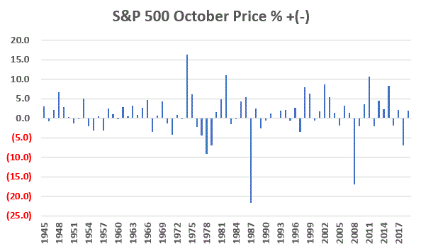
Figure 1 displays the monthly price return for the S&P 500 Index during every October starting in 1945.
Figure 1 – S&P 500 Index October Monthly % +(-)
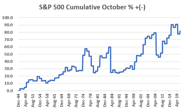
Figure 2 displays the cumulative % price gain achieved by holding the S&P 500 Index ONLY during the month of October every year starting in 1945.
Figure 2 – S&P 500 Index Cumulative October % +(-)
So, you see the paradox. To simply sit out the market every October means giving up a fair amount of return over time (not to mention the logistical and tax implications of “selling everything” on Sep 30 and buying back in on Oct 31). At the same time, October can be a helluva scary place to be from time to time.
One Possible Solution – The Decennial Pattern
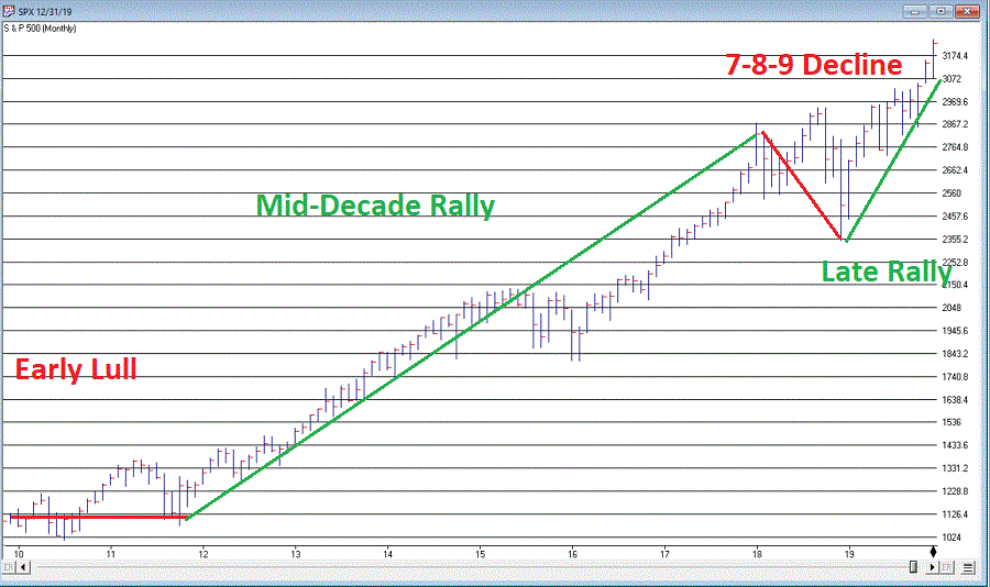
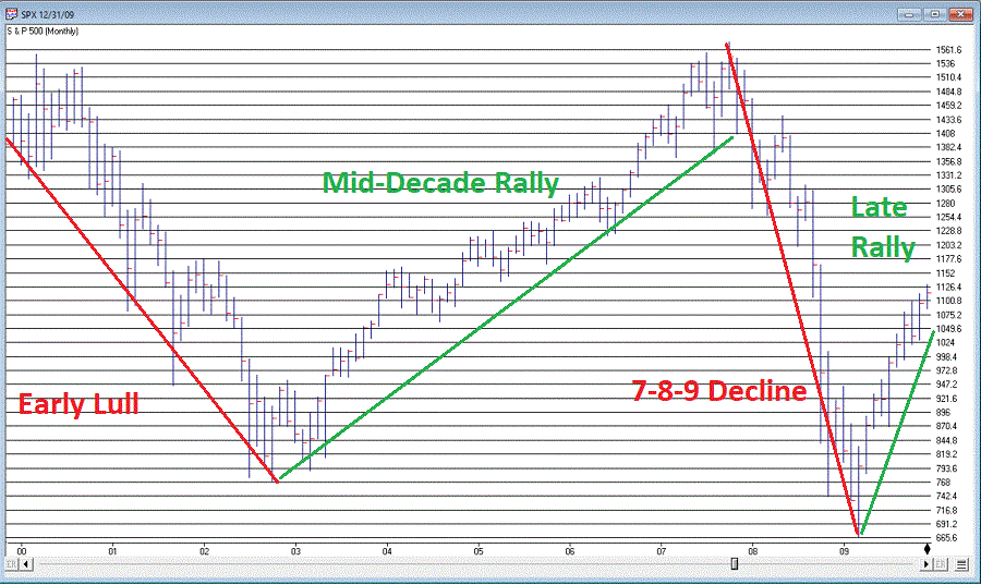
In my book “Seasonal Stock Market Trends” I have a section that talks about the action of the stock market across the average decade. The first year (ex., 2010) is Year “0”, the second year (ex., 2011) is Year “1”, etc.
In a nutshell, there tends to be:
The Early Lull: Often there is weakness starting in Year “0” into mid Year “2”
The Mid-Decade Rally: Particularly strong during late Year “4” into early Year “6”
The 7-8-9 Decline: Often there is a significant pullback somewhere in the during Years “7” or “8” or “9”
The Late Rally: Decades often end with great strength
Figures 3 and 4 display this pattern over the past two decades.
(Charts courtesy of WinWayCharts)
Figure 3 – Decennial Pattern: 2010-2019
(Charts courtesy of WinWayCharts)
Figure 4 – Decennial Pattern: 2000-2009
Focusing on October
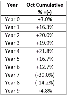
So now let’s look at October performance based on the Year of the Decade. The results appear in Figure 5. To be clear, Year 0 cumulates the October % +(-) for the S&P 500 Index during 1950, 1960, 1970, etc. Year 9 cumulates the October % +(-) for the S&P 500 index during 1949, 1959, 1969, 1979, etc.
Figure 5 – October S&P 500 Index cumulative % +(-) by Year of Decade
What we see is that – apparently – much of the “7-8-9 Decline” takes place in October, as Years “7” and “8” of the decade are the only ones that show a net loss for October.
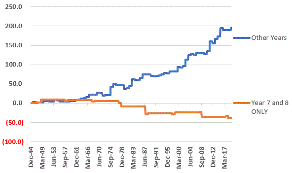
Let’s highlight this another way. Figure 6 displays the cumulative % return for the S&P 500 Index during October during all years EXCEPT those ending “7” or “8” versus the cumulative % return for the S&P 500 Index during October during ONLY years ending in “7” or “8”.
Figure 6 – S&P 500 cumulative October % +(-); Years 7 and 8 of decade versus All Other Years of Decade
For the record:
*October during Years “7” and “8” lost -39%
*October during all other Years gained +196%
Summary
So, does this mean that October is now “green-lighted” as bullish until 2027? Not necessarily. As always, that pesky “past performance is no guarantee of future results” phrase looms large.
But for an investor looking to maximize long-term profits while also attempting to avoid potential pain along the way, the October 7-8 pattern is something to file away for future reference.
Jay Kaeppel
Disclaimer: The information, opinions and ideas expressed herein are for informational and educational purposes only and are based on research conducted and presented solely by the author. The information presented does not represent the views of the author only and does not constitute a complete description of any investment service. In addition, nothing presented herein should be construed as investment advice, as an advertisement or offering of investment advisory services, or as an offer to sell or a solicitation to buy any security. The data presented herein were obtained from various third-party sources. While the data is believed to be reliable, no representation is made as to, and no responsibility, warranty or liability is accepted for the accuracy or completeness of such information. International investments are subject to additional risks such as currency fluctuations, political instability and the potential for illiquid markets. Past performance is no guarantee of future results. There is risk of loss in all trading. Back tested performance does not represent actual performance and should not be interpreted as an indication of such performance. Also, back tested performance results have certain inherent limitations and differs from actual performance because it is achieved with the benefit of hindsight.
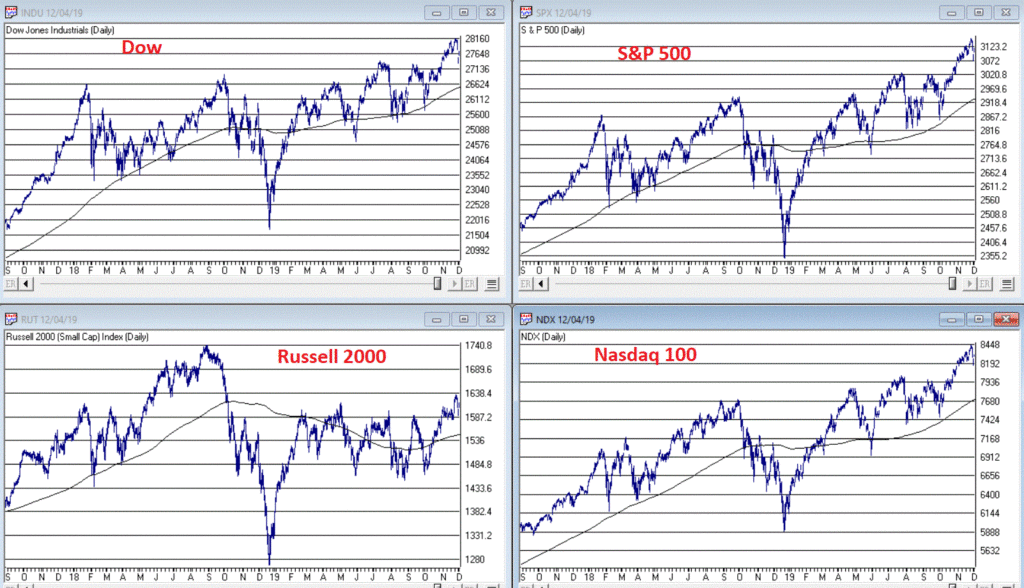
I haven’t written a lot lately. Mostly I guess because there doesn’t seem to be a lot new to say. As you can see in Figure 1, the major market indexes are in an uptrend. All 4 (Dow, S&P 500, Russell 2000 and Nasdaq 100) are above their respective 200-day MA’s and all but Russell 2000 have made new all-time highs.
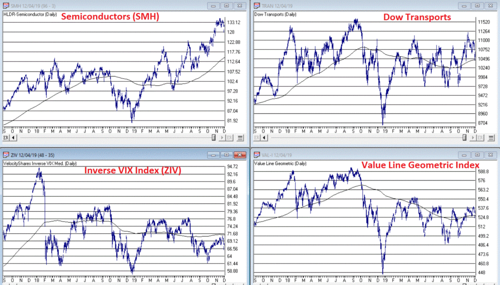
As you can see in Figure 2, my market “bellwethers” are still slightly mixed. Semiconductors are above their 200-day MA and have broken out to a new high, Transports and the Value Line Index (a broad measure of the stock market) are holding above their 200-day MA’s but are well off all-time highs, and the inverse VIX ETF ticker ZIV is in a downtrend (ideally it should trend higher with the overall stock market).
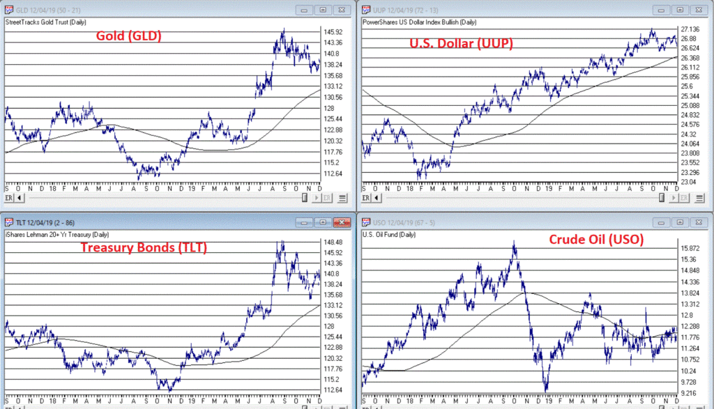
As you can see in Figure 3, Gold, Bonds and the U.S. Dollar are still holding in uptrends above their respective 200-day MA’s (although all have backed off of recent highs) and crude oil is sort of “nowhere”.
Like I said, nothing has really changed. So, at this point the real battle is that age-old conundrum of “Patience versus Complacency”. When the overall trend is clearly “Up” typically the best thing to do is essentially “nothing” (assuming you are already invested in the market). At the same time, the danger of extrapolating the current “good times” ad infinitum into the future always lurks nearby.
What we don’t want to see is:
*The major market averages breaking back down below their 200-day MA’s.
What we would like to see is:
*The Transports and the Value Line Index break out to new highs (this would be bullish confirmation rather the current potentially bearish divergence)
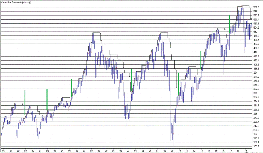
The Importance of New Highs in the Value Line Index
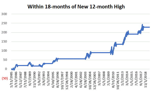
One development that would provide bullish confirmation for the stock market would be if the Value Line Geometric Index were to rally to a new 12-month high. It tends to be a bullish sign when this index reaches a new 12-month high after not having done so for at least 12-months.
Figure 4 displays the cumulative growth for the index for all trading days within 18 months of the first 12-month new high after at least 12-months without one.
Figure 4 – Cumulative growth for Value Line Geometric Index within 18-months of a new 12-month high
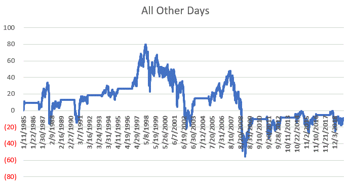
Figure 5 displays the cumulative growth for the index for all other trading days.
Figure 5 – Cumulative growth for Value Line Geometric Index during all other trading days
In Figure 4 we see that a bullish development (the first 12-month new high in at least 12 months) is typically followed by more bullish developments. In Figure 5 we see that all other trading days essentially amount to nothing.
Figure 6 displays the Value Line Geometric Index with the relevant new highs highlighted.
The trend at this very moment is “Up.” So sit back, relax and enjoy the ride. Just don’t ever forget that the ride WILL NOT last forever. If the Value Line Geometric Index (and also the Russell 2000 and the Dow Transports) joins the party then history suggests the party will be extended. If they don’t, the party may end sooner than expected.
So pay attention.
Jay Kaeppel
Disclaimer: The information, opinions and ideas expressed herein are for informational and educational purposes only and are based on research conducted and presented solely by the author. The information presented does not represent the views of the author only and does not constitute a complete description of any investment service. In addition, nothing presented herein should be construed as investment advice, as an advertisement or offering of investment advisory services, or as an offer to sell or a solicitation to buy any security. The data presented herein were obtained from various third-party sources. While the data is believed to be reliable, no representation is made as to, and no responsibility, warranty or liability is accepted for the accuracy or completeness of such information. International investments are subject to additional risks such as currency fluctuations, political instability and the potential for illiquid markets. Past performance is no guarantee of future results. There is risk of loss in all trading. Back tested performance does not represent actual performance and should not be interpreted as an indication of such performance. Also, back tested performance results have certain inherent limitations and differs from actual performance because it is achieved with the benefit of hindsight.