*”Every situation in life represents an opportunity”
*”Opportunity is where you find it”
Nowhere is this truer than in the financial markets.
To wit, in this article dated 3/26/2020 (cue the scary music) – when things looked their absolute worst – I highlighted four tickers in the energy sector (yes, THAT energy sector, the one that has been a disaster and loathed and unloved for some time now). Now it would have taken a true “Buy when there is blood in the streets” mentality, and/or almost foolhardy nerves of steel to actually pile into those issues at the time.
But that is sort of the point.
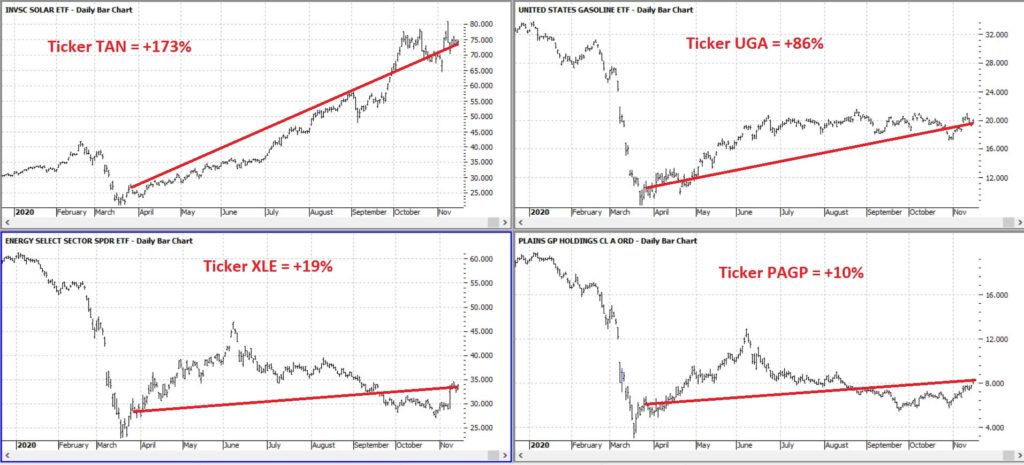
Figure 1 displays the tickers and their price action since the close on 3/26/2020.
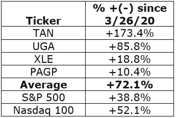
Figure 2 displays the comparative performance versus the S&P 500 and the Nasdaq 100.
Figure 2 – “Blood in the Streets” energy stocks versus major indexes
As you can see in Figure 2 these four stocks as a whole have actually outperformed both the S&P 500 Index and the Nasdaq 100 Index.
Now the point IS NOT that I am some great stock-picker (because I am not). The point is that, well, see the two quotes above.
A Broader Look at Energy
For someone with less of the “buy when there is blood in the streets” mentality and more of “trend-following” mentality, a simple trend-following method may soon (at long last) swing to the bullish side.
It works like this:
*Two “tickers” see their respective 5-week average cross above their respective 30-week average
*Ticker 1 is ticker XLE (the SPDR energy ETF)
*Ticker 2 is an index (I created) of securities that have an inverse correlation to the U.S. Dollar
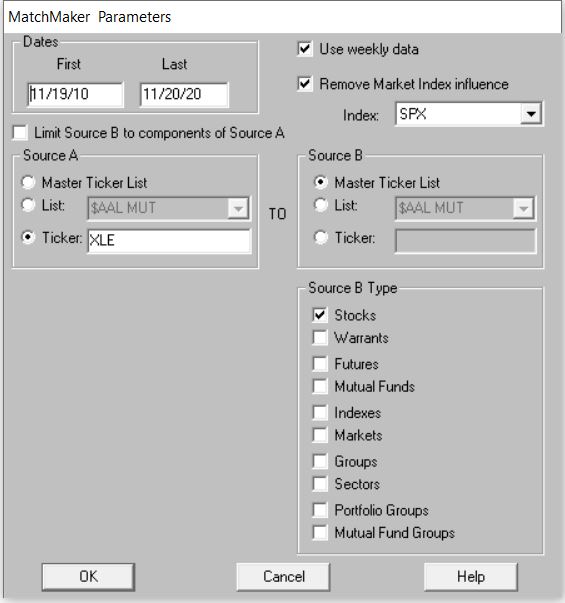
Editors Note: To create an inverse index of the ticker XLE, you’ll first need to use the Matchmaker tool and run a correlation between XLE and your database of stocks. The stocks that correlate the least with have the highest negative correlation.
To create the index. Make a new list in AIQ Data Manager, create a new group ticker called ANTIUS3 and add it to the list. Add the least correlated tickers from Matchmaker to this group, then use Compute Group/Sector Indices to compute all dates for this list. You’ll now have an equivalent to the ANTIUS3.
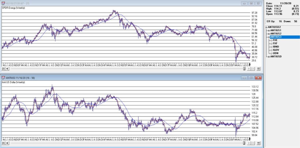
You can see these two – along with their respective 5-week and 30-week – in Figure 3.
Figure 3 – Ticker XLE and Jay’s ANTIUS3 index w/5-week and 30-week averages (Courtesy TradingExpert)
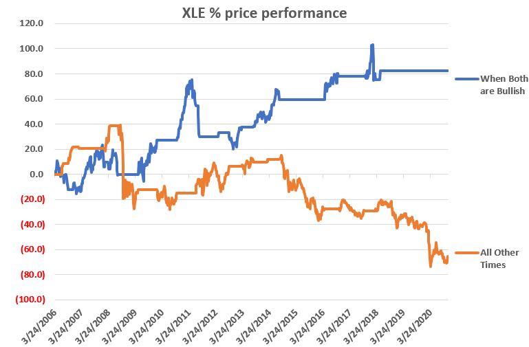
As you can see in Figure 3 the two have a tendency to often move together. At other times they do not. The key point here is that we ONLY pay attention when the two tickers are both trending in the same direction.
Why is this important?
Figure 4 displays the cumulative price growth for ticker XLE (as a proxy for the broad energy sector) under two separate circumstance:
*When BOTH XLE and ANTIUS3 are in uptrends (i.e., 5-week average ABOVE 30-week average)
*When EITHER XLE or ANTIUS3 is NOT in an uptrend (i.e., 5-week average BELOW 30-week average)
Figure 4 – XLE cumulative %+(-) depending on trend status for XLE and ANTIUS3
To put it in numbers:
When BOTH are in Uptrends: XLE = +82.3%
When EITHER is NOT in an Uptrend: XLE = -65.5%
Summary
Another glance at Figure 1 reveals that ANTIUS3 is in an uptrend and that XLE is not quite there yet. So, at the moment there is no bullish signal from the method described above. However, energy does appear to be “trying” to rally. Investors looking for “opportunity” may be wise to keep an eye on the 5-week and 30-week averages of ticker XLE in the weeks and month ahead.
Jay Kaeppel
Disclaimer: The information, opinions and ideas expressed herein are for informational and educational purposes only and are based on research conducted and presented solely by the author. The information presented represents the views of the author only and does not constitute a complete description of any investment service. In addition, nothing presented herein should be construed as investment advice, as an advertisement or offering of investment advisory services, or as an offer to sell or a solicitation to buy any security. The data presented herein were obtained from various third-party sources. While the data is believed to be reliable, no representation is made as to, and no responsibility, warranty or liability is accepted for the accuracy or completeness of such information. International investments are subject to additional risks such as currency fluctuations, political instability and the potential for illiquid markets. Past performance is no guarantee of future results. There is risk of loss in all trading. Back tested performance does not represent actual performance and should not be interpreted as an indication of such performance. Also, back tested performance results have certain inherent limitations and differs from actual performance because it is achieved with the benefit of hindsight.
It’s been a couple of months since we last looked at the Market Timing AI Expert System. Since that time the 400 rules that make up this AI system have generated a cluster of 3 down signals, followed by a buy signal and then most recently another down signal.
In this 7 minute video Steve Hill, CEO of AIQ Systems explores the signals and the confirmation techniques used to verfiy the ratings, together with the primary rules that fired.
The Expert System in TradingExpert Pro gave a 1 – 99 down signal on the Dow Jones on 8-27-20. The market internals based on the advancing vs declining issue in the New York market continue to diverge from the market price action.
The phase indicator used to confirm Expert Ratings turned down on 8-31-20. We usually look for a phase confirmation of an Expert Rating to occur within 3 days of the rating.
The changes made in the constituents of the Dow 30 effective 8-31-20
You may have seen some of the articles out there analyzing the skewed nature of the current market rally. As Joe Bartosiewicz in his August 8 Bartometer pointed out:
“The Top 15 Stocks in the S&P 500 account in Market Value 35% of the entire S&P 500 stock market. The Bottom 420 Stocks in the S&P 500 account in Market Value 33.8% of the entire S&P 500 stock market. This means that 15 stocks are controlling the entire S&P 500..”
The Dow Jones 30 index uses a price weighted criteria as part of it’s calculation, and also includes Apple; AAPL has more than doubled in price in under 5 months.
Given that there appears to be only a small basket of stocks leading this rally, we had a look back at the last time tech related stocks were driving the market higher; the dotcom bubble that ran through the 90s into the early 00s.
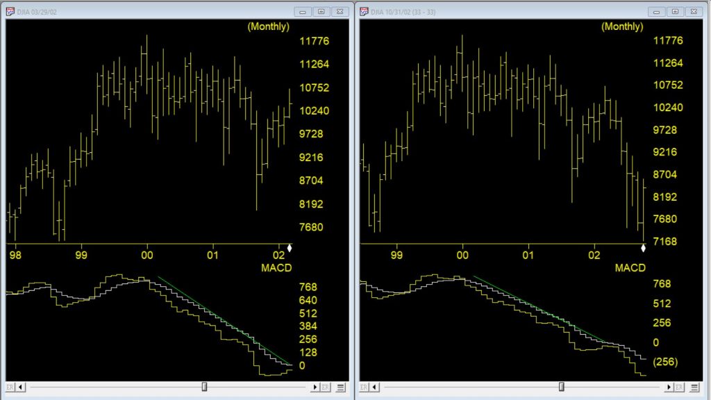
Monthly DJIA and MACD – left through 3/2002 – right through 10/2002
The first chart is a monthly of the Dow 30 with MACD indicator comparing the market 03/29//2002 as the dotcom bubble rolled over vs 7 months later. Students of divergence analysis, will tell you that MACD in late March 2002 clearly showed prices should be much lower still despite the @33 % rally from the September 2001 low. By late October 2002 the market had fallen again by @33%. At that time the market was close to @40% lower than the high at the start of 2000.
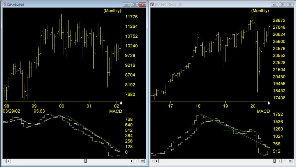
Monthly DJIA and MACD – left through 3/2002 – right through 8/2020
The second chart is a monthly of the Dow 30 on the right through 8/10/20 vs the rally peak of 03/29/2002. The current market has had a @50% rally from the low at the end of March 2020. The original correction was @37% from high to low, slightly bigger than the dotcom correction. The MACD, similar to 2002, is strongly diverging.
The decline in 2002, after the rally, took prices lower than the the prior bottom. If a similar pattern happens this time and the decline is @40% from the high of 29568, the Dow would at the 17700 level.
In a few recent articles (for example here) I suggested that one day we would look back on this period as a terrific buying opportunity for energy related issues. At the same time, I still have yet to become comfortable “pulling the trigger”. Thank goodness for small favors.
Anyway, the overall sentiment still holds. Energy is dirt cheap as are shares of most energy related stocks/ETFs etc. Again, that doesn’t necessarily mean that now is the exact moment to “load up”. To say that there is a wee bit of uncertainty regarding the future would be about the greatest understatement one could presently make. Still, it is important to plan ahead and to be prepared when the time comes. So, what follows should be considered “food for thought” and not “an immediate call to action.”
A Few Things Energy
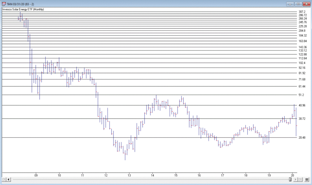
Ticker TAN
According to conventional wisdom, the future is “green”. I’ll be candid – I am all for green energy, as long as when I flip the switch the lights come on AND when I look at my energy bill I don’t faint. So, let’s start with a “green” play.
Turth be told, ticker TAN (Invesco Solar Energy ETF) has never been much of a performer. Still, its in the solar business which people keep telling me is “the future.” In reality the primary thing it has going for it is that it hasn’t completely cratered to the same degree as just about every other stock in the energy sector. As you can see in Figure 1, TAN actually bottomed out at $12.60 in 2012 and – despite a near 50% decline during the recent panic – is presently trading around $26 a share. Not necessarily a screaming buy signal, but a nice relative performance as we will see in a moment.
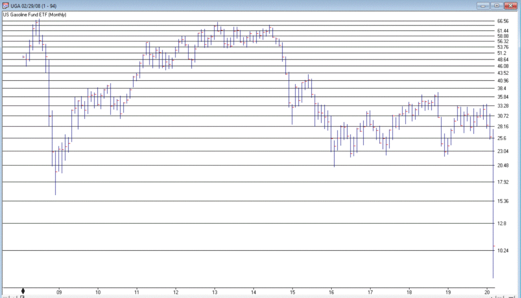
In a sure “Sign of the Times”, the Good News is that gasoline prices are at their lowest levels in year, while the Bad News is that we don’t have anywhere to drive to except the grocery store. Figure 2 displays the chart for ticker UGA – the United States Gasoline Fund, and ETF that tracks the price of gasoline.
While attempting to “pick a bottom” is a fool’s errand, the primary point is that it is not that hard to envision the price of this ETF being significantly higher at some point in the years ahead. Whether an investor has the fortitude to weather whatever the short-term uncertainty and the patience to see how the long-term plays out are the primary issues associated with contemplating this ticker at the moment.
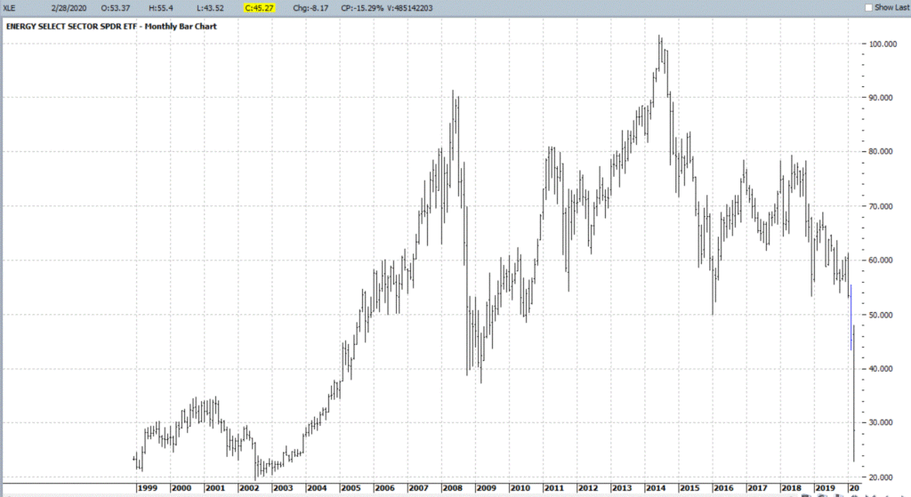
Ticker XLE is a play on the broad (mostly fossil fuel related) energy sector. As you can see in Figure 3, XLE has plunged to price levels not since 2004. In addition, it presently yields roughly 8.8%. That being said, an investor has to realistically expect that dividend payments in the hard-hit energy sector will see some significant cuts as things play out in the months ahead.
With an oil price war in full swing, not to mention a sharp decline in demand for the foreseeable future due to the coronavirus pandemic, the fundamentals for this sector are unlikely to improve soon. Nevertheless, the reality is that – at least for the time being – the world runs on crude oil. As a result, the current price range may one day be looked back upon as a once-in-a-generation buying opportunity.
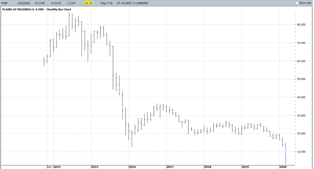
OK, let’s throw in one obscure, totally speculative – yet fundamentally intriguing – thought for consideration. Ticker PAGP (Plains GP Holdings, L.P.). Here is what they do (straight from their website):
“Plains engages in the transportation, storage, terminalling, and marketing of crude oil and refined products, as well as in the storage of natural gas, and the processing, transportation, fractionation, storage, and marketing of natural gas liquids.
Assets include:
*17,965 miles of active crude oil and NGL pipelines and gathering systems (emphasis mine as these things will continue to function as long as crude and NG need to be moved – which they do)
*50 barges and 20 transport tugs
*109 million barrels of storage capacity
*1,600+ trucks and trailers
*9,100 rail cars”
The bottom line is that as long as crude oil and natural gas needs to be moved, PAGP has a niche in which to operate. For the record, at $6.35 a share the stock’s present dividend comes to a yield of 22.7%. Certainly, the prospect of a significant dividend cut is a Signiant risk associated with this stock. But for the moment anyway the price is near an all-time low and the dividend yield is attractive.
As allows, DO NOT look upon what I have written as “recommendations.” Particularly in the current environment. They are simply “food for thought.”
Given current fundamentals:
*An ongoing oil price war (making drilling and refining unprofitable for many companies)
*An economy on shutdown (which cripples demand)
*An existential struggle between “green” energy and “traditional” fossil fuel-based sources (which creates uncertainty about future expectations)
All combine to make the energy sector a giant question mark at the present time. But if the old adage that the time to buy is when there is “blood in the streets”, than investors might be well served in the long run to start thinking now about how much capital they might be willing to commit to energy, and what type of catalyst might prompt them to actually “take the plunge.”
Jay Kaeppel
Disclaimer: The information, opinions and ideas expressed herein are for informational and educational purposes only and are based on research conducted and presented solely by the author. The information presented does not represent the views of the author only and does not constitute a complete description of any investment service. In addition, nothing presented herein should be construed as investment advice, as an advertisement or offering of investment advisory services, or as an offer to sell or a solicitation to buy any security. The data presented herein were obtained from various third-party sources. While the data is believed to be reliable, no representation is made as to, and no responsibility, warranty or liability is accepted for the accuracy or completeness of such information. International investments are subject to additional risks such as currency fluctuations, political instability and the potential for illiquid markets. Past performance is no guarantee of future results. There is risk of loss in all trading. Back tested performance does not represent actual performance and should not be interpreted as an indication of such performance. Also, back tested performance results have certain inherent limitations and differs from actual performance because it is achieved with the benefit of hindsight.
The old adage is that we should “buy when there is blood in the streets.” It basically means to buy when things look their worst. Well, for the record I am not actually a fan of this intonation. While it is probably a fair statement, I for one prefer to see some sign of hope – some sign of a trend reversal at the very least – before taking the plunge.
One historically useful indicator suggests we may be nearing that point.
I refer to this indicator as JKHiLo. I included my initials in the acronym because I “developed” it. OK, all I really did was take one guy’s useful indicator and multiply it by another guy’s useful indicator and voila.
In a nutshell JKHilo multiplies Norman Fosback’s HiLo Logic Index by Gerald Appel’s High/Low Indicator.
The Fosback HiLo Logic Index (FHLLI)
I wrote two articles here and here about this indicator. In short, a very low number of stocks making new lows is bullish for the stock market – it indicates that stocks overall are going up and is bullish. At the same time, a very low number of stocks making new highs is also (typically) ultimately bullish going forward, as it tends to signal a “washed out” market.
So this indicator:
*takes the lower of new highs and new lows each day
*divides that number by the total number of issues trades
*takes a 10-day moving average of daily readings
Specifically, the Fosback HiLo Logic Index (HLLI) is calculated as follows:
A=Daily Nasdaq New Highs
B=Daily Nasdaq New Lows
C=The lower of A and B
D=The total number of Nasdaq issues traded
E = (C / D) * 100
FHLLI = 10-day average of E
Readings above 2.15% are considered a sign of “churning”, i.e., a lot of new highs AND new lows. Reading below 0.40% are considered “bullish” because either new highs OR new lows is very low.
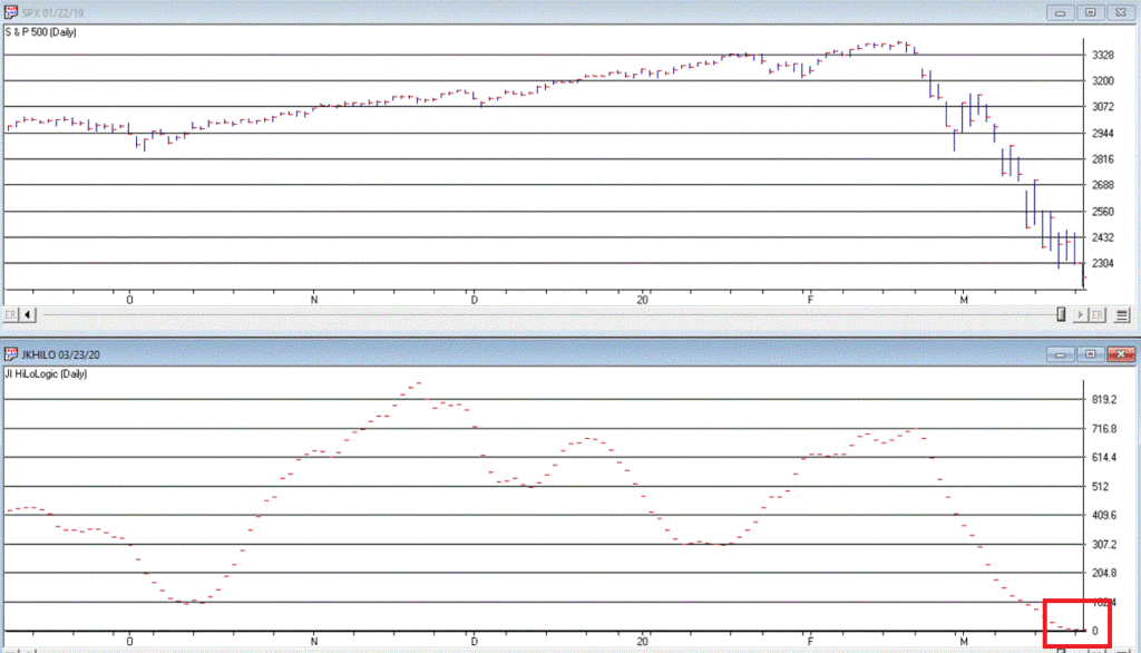
The Fosback HiLo Logic Index finally dropped below 0.40% on 3/23/20. Figure 1 displays the OTC Composite Index with this indicator through 12/31/2019.
Figure 1 – Fosback HiLo Logic Index
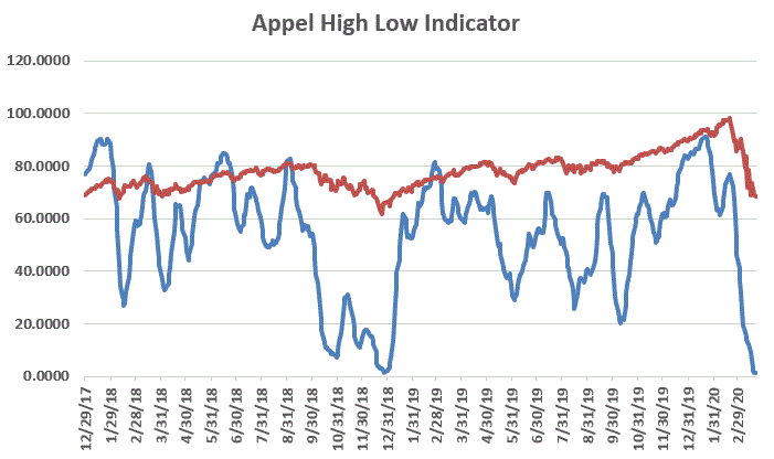
The Appel High/Low Indicator
This indicator (heretofore AHLI) is more of a trend-following indicator. It simply divides the number of new highs each day by the total of new highs AND new lows, then takes a 10-day average.
The AHLI is calculated as follows:
A=Daily Nasdaq New Highs
B=Daily Nasdaq New Lows
C = A / (A+B)
AHLI = 10-day average of C
Figure 2 displays this indicator versus the OTC Composite from 12/29/17 through 3/23/20.
Figure 2 – Appel High/Low Indicator (x100; blue line) with OTC Composite (/100; red line); Dec17 through 3/23/20
Extremely low readings tend to highlight oversold market conditions. For the record, an actual “buy signal” for this indicator occurs when it drops below 0.20 (or 20 in Figure 3 since the blue line is the indicator x 100) and then rises back above that level.
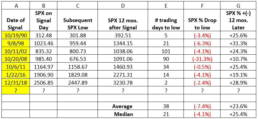
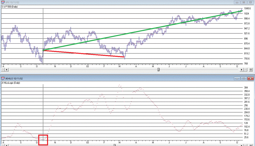
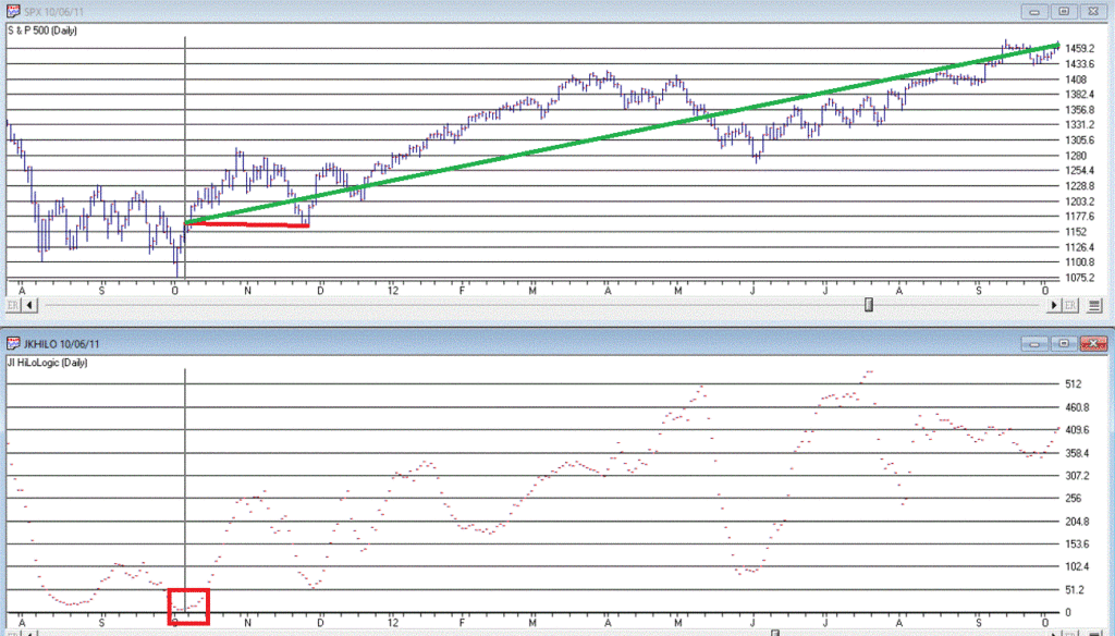
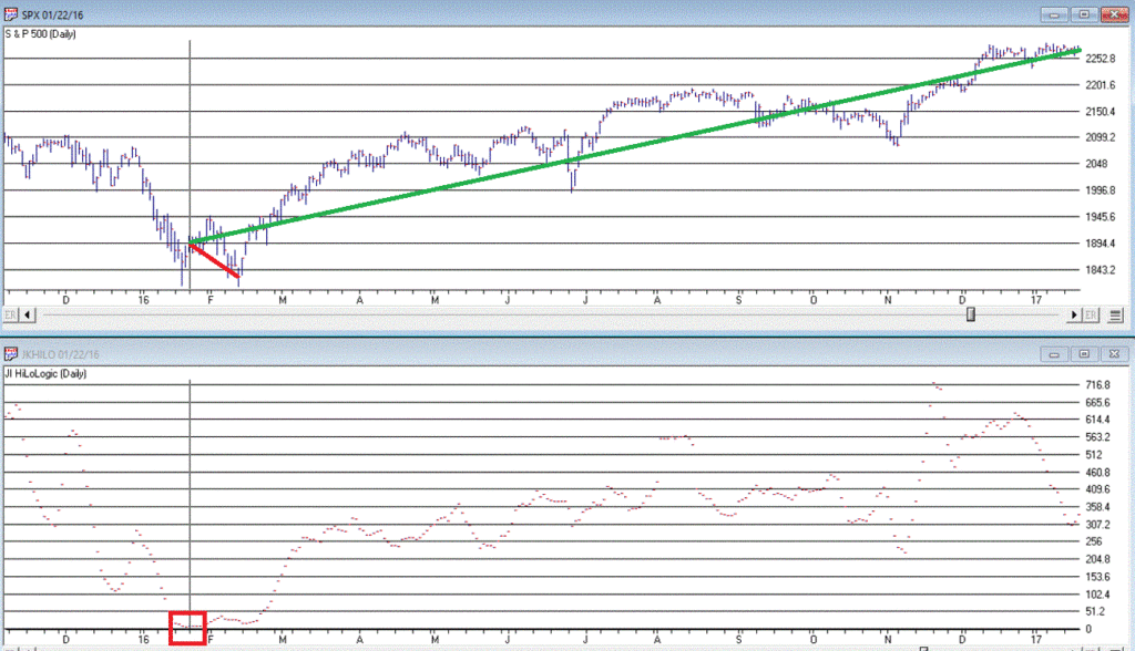
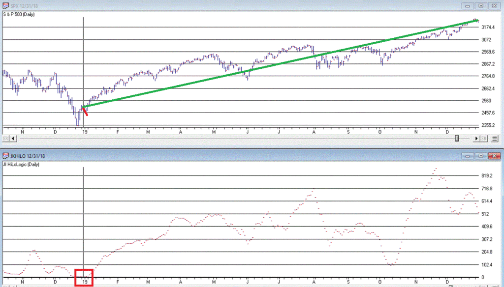
The JK Hilo Index (JKHiLo)
So then one day some young punk comes along and multiplies the Fosback indicator by the Appel indicator and has the audacity to add his own initials. Some people. Anyway:
JKHiLo = (FHLLI x AHLI) x 500
A “12-month Buy Signal” occurs when this indicator:
*drops below 5.00
*then turns higher for one day
The first part of this signal has happened. As of the close on 3/23/20 JKHL has plunged to 1.8.
Let’s look at previous instances when JKHL fell below 5.00 and then ticked higher for one day.
IMPORTANT: This upside reversal technically constitutes a “12-month buy signal”. What does that mean? It means:
*We expect the market to be higher 12-months later
*HOWEVER, it is NOT an “All Clear, Everything is Great, You Can’t Lose” signal
The bottom line is that it typically does NOT mark the actually bottom. In most cases, another new low or at least a retest of the low follows within a few months. But not always.
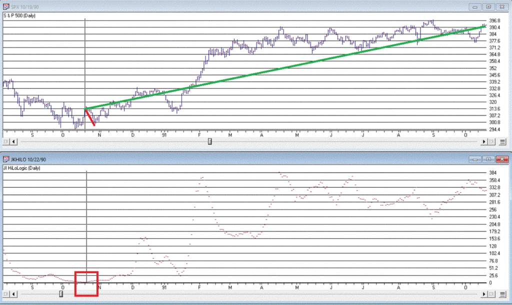
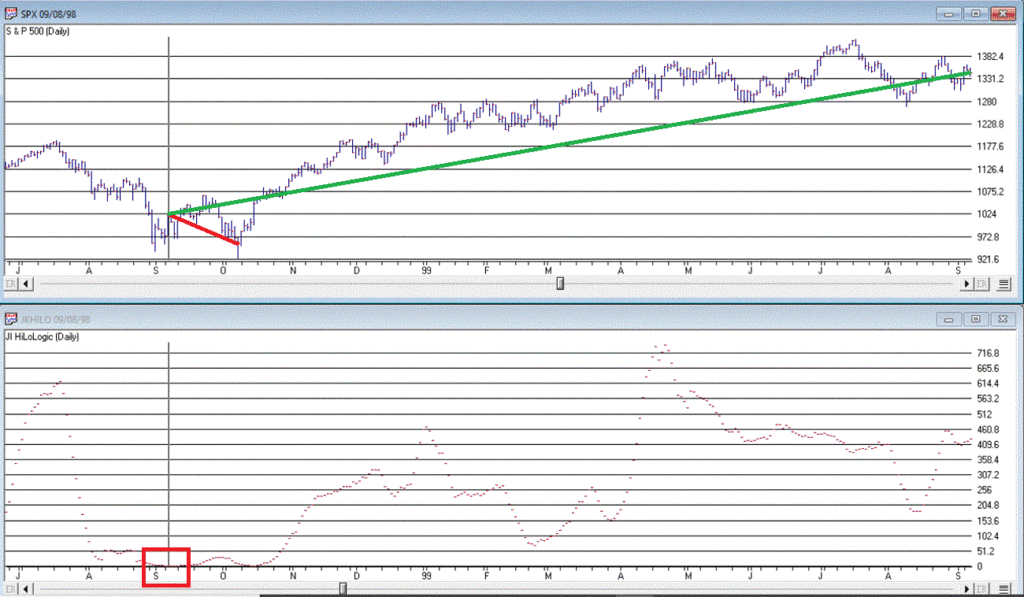
Figure 3 displays the 7 buy signals that have occurred since 1990.
A = Date of signal – i.e., date the JKHL indicator ticked up one day after dropping below 5
B = SPX closing price on date of signal
C = Subsequent low closing price for SPX
D = SPX closing price 12 months after signal date
E = # of trading days between date of signal and ultimate low
F = % decline by SPX from date of signal to ultimate low
G = % change in SPX closing price 1 year after date of signal
Figure 3 – JKHL 12-month buy signals
It is important to note that each previous “buy signal” was followed by further downside price movement prior to the ultimate low. It ranged from 2 trading days in 2018 to 101 trading days in 2008. 6 of the 7 signals saw a further decline of no more than -6.3%. But the 2008 signal saw the market continue to plunge another -31% of the following 3+ months.
So, like I said earlier, even when this indicator does turn up and generate a new signal, that DOES NOT mean “All Clear”. Still, to get an idea of what we might expect, each of the previous signals are displayed in the Figures below.
We DO NOT have a new signal yet, but JKHiLo is below 5, so it is just a matter of waiting for the daily value to tick higher for one day (and then – if history is a guide – waiting for the ultimate low to be put in before a subsequent rally).
Are we on the cusp of a new opportunity? Or on the edge of a cliff? In this time of unprecedented uncertainty, I can’t pretend to know the answer. So, I rely on objective indicators to guide me.
At this moment in time the “trend-following” indicators are bearish and so caution is undoubtedly in order. But other indicators such as the one discussed here remind us to remain alert to new opportunities.
Jay Kaeppel
Disclaimer: The information, opinions and ideas expressed herein are for informational and educational purposes only and are based on research conducted and presented solely by the author. The information presented does not represent the views of the author only and does not constitute a complete description of any investment service. In addition, nothing presented herein should be construed as investment advice, as an advertisement or offering of investment advisory services, or as an offer to sell or a solicitation to buy any security. The data presented herein were obtained from various third-party sources. While the data is believed to be reliable, no representation is made as to, and no responsibility, warranty or liability is accepted for the accuracy or completeness of such information. International investments are subject to additional risks such as currency fluctuations, political instability and the potential for illiquid markets. Past performance is no guarantee of future results. There is risk of loss in all trading. Back tested performance does not represent actual performance and should not be interpreted as an indication of such performance. Also, back tested performance results have certain inherent limitations and differs from actual performance because it is achieved with the benefit of hindsight.