Dec 21, 2016 | educational newsletters, ETFs, jay kaeppel, stock market
In this seemingly ever more divided and ever more electronic age, “perspective” is not a word (or action) that gets mentioned (or employed) with as much frequency as it used to. The default approach for a lot of things appears to be:
a) Decide ones opinion
b) Take to the internet to shout categorically that said opinion is the only possible “correct” opinion
c) Excoriate anyone who disagrees
Well, sure that is one approach. But when it comes to investing it is fairly important to raise one’s head and take a look around every once in awhile.
Hey, how about now?
The U.S. Stock Market Post Election
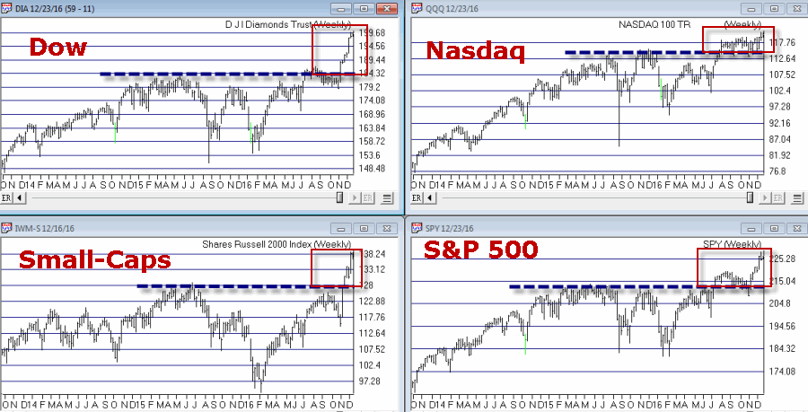
Since the election in November the U.S. stock market has been on a quite a tear, with the major market averages breaking out to new all-time highs as seen in Figure 1.
Figure 1 – Major market U.S. averages breakout to new highs (Courtesy
TradingExpert)
Now per a, b and c above, some will argue that this is a testament to the booming economy that #44 is leaving #45 while others will argue that it is a sign of new hope for the U.S. economy under a new adminstration.
My response: Whatever
Don’t get me wrong, I am all for a bull market. I hung in there all year despite a lot of doubts mostly because my trend-following indicators just kept staying bullish. And they remain thus. But like I said before a little perspective can sometimes go a long way.
A New (Republican) Administration
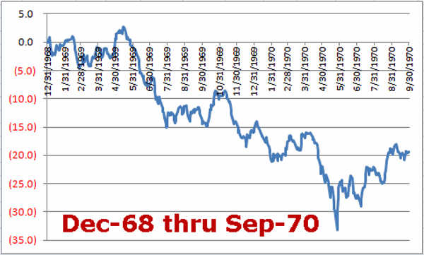
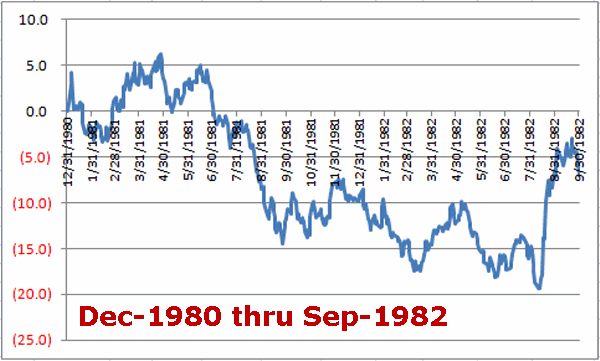
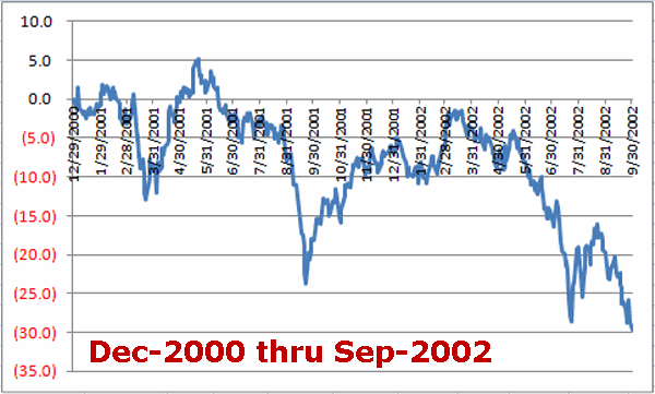
The historical fact is that the last 3 Republican administrations that followed Democratic administrations (Nixon, Reagan, Bush 43) did not experience great “stock market joy” during their first two years in office. Specifically, the first 21 months of the new four-year election cycle (i.e., starting on Dec. 31st of the election year through the end of September of the mid-term year) for each of these prior administrations witnessed a fair amount of “pain.”
Peruse Figures 2, 3 and 4 (which displays the % gain or loss for the Dow Jones Industrials Average for 21 months starting on December 31st of the election year) and see if you notice a trend.
Figure 2 – Dow % +(-); Dec-1968 thru Sep-1970 (Nixon – 1st 21 months)
Figure 3 – Dow % +(-); Dec-1980 thru Sep-1982 (Reagan – 1st 21 months)
Figure 4 – Dow % +(-); Dec-2000 thru Sep-2002 (Bush 43 – 1st 21 months)
The Good News is that there is no reason why this history has to repeat itself this time around. The Bad News is….that it very well could.
The Current Euphoria
As I stated earlier, when it comes to bull markets, I vote “YES”. I will take one anytime I can get it. And I also try to avoid being one of those “know it all types” (in the interest of full disclosure I am actually more one of those “sneaky” types who tries to intimate that he actually does know it all by trying not to act like a know it all – which is technically probably worse. But, hey, at least now you know) who routinely “talks down” a bull market (“Oh sure, things are great now but just you wait….” And so on). That “just you wait” stuff gets really old after a short while.
So here we stand. The major U.S. averages are bursting forth to new highs – so who am I to be a naysayer? Still, there is that pesky “perceptive” thing I mentioned earlier. Before getting too carried away with bullish euphoria please sear Figures 2, 3 and 4 above somewhere into the back of your brain – just in case.
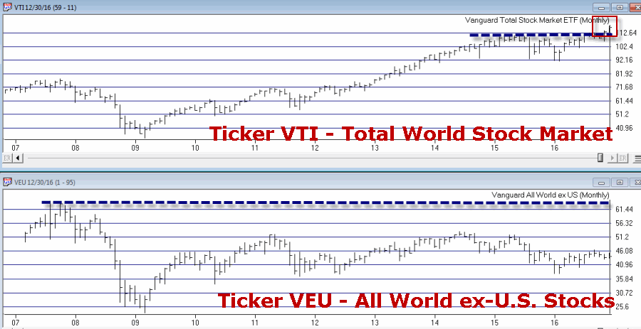
Also note that the U.S. stock market is virtually alone in the world in terms of making new highs. Figure 5 displays:
Ticker VTI – Vanguard Total (U.S.) Stock Market ETF
Ticker VEU – Vanguard All World ex-U.S. Stock Market ETF
To be clear, ticker VTI essentially covers the entire U.S. stock market. Ticker VEU covers a broad array of major world stock markets BUT does not include U.S. stocks.
Figure 5 – U.S. Total Stock Market = New Highs; World Total Stock Market = NOT New Highs (Courtesy
TradingExpert)
Note that the U.S. market has broken out strongly to new highs while the “whole world” of markets is nowhere close to doing so. Certainly one can adopt the “What, me worry?” approach and argue that “the U.S. market will lead the other world markets to reach new highs.” And maybe that will prove to be the case.
But as I will highlight soon – and as reflected by tickers VTI and VEU – the U.S. stock market looks great while virtually the rest of the markets around the globe look pretty not so great. So please check back for Part II soon
In the meantime, enjoy the rally and the Holidays – I know I will.
Dec 8, 2016 | bonds, educational newsletters, ETFs, jay kaeppel, trading strategy
If you have read any of my stuff in the past then you probably know that I spend a lot of time trying to determine “what goes up (or down) when”. What follows are the results of one such test.
While the results are initially impressive on the face of it (if I do so say myself, and I think I just did) there are a number of important caveats. To put it another way, do NOT be impressed with the results WITHOUT first seriously considering some of the significant caveats mentioned below. To put it in the most standard terms possible – past results DO NOT guarantee future results.
The Test
*I looked at variety of assets classes (listed at the end of the article) using mutual fund data and/or index data from January 1993 through April 2007. The data was monthly total return data from Callan Associates.
*I’ve created my own proprietary formula for measuring performance during a specific month. The factors include: average monthly return, median monthly return, standard deviation, largest monthly decline and a variety of ratios amongst these factors (but I am a lot of fun at parties. No seriously.)
*I used my proprietary formula to rank performance for each asset class for each month and took my “top pick”. In a nutshell, the “top pick” is not the one that showed the largest average monthly gain but the one that showed the best tradeoff between risk and reward.
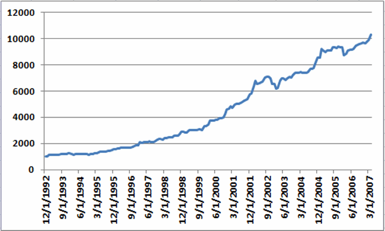
*I ran a backtest using mutual fund and/or index data for the top ranked asset for each month from January 1993 through May 2007. The results for Jay’s One Asset Class per Month strategy (heretofore JOAC) appear in Figure 1.
Figure 1 – Equity Curve for Jay’s One Asset Class per Month Strategy; 12/31/92-5/31/2007
The average 12-month return was +17.8% and the maximum drawdown (using month-end data) was -12.7%
While the results look good it is now time for those dreaded “caveats”:
*These results could not be exactly duplicated in real trading for a couple of reasons: First, some of the results were generated using index data and not mutual fund data.
*Also, many of the mutual funds used in the test (particularly Vanguard and Fidelity funds) cannot be traded one month at a time. Most have a minimum holding period of 30 to 90 calendar days). So buying in one month and selling out the next would likely result in fees and/or future trading restrictions.
Moving Forward JOAC using ETFs
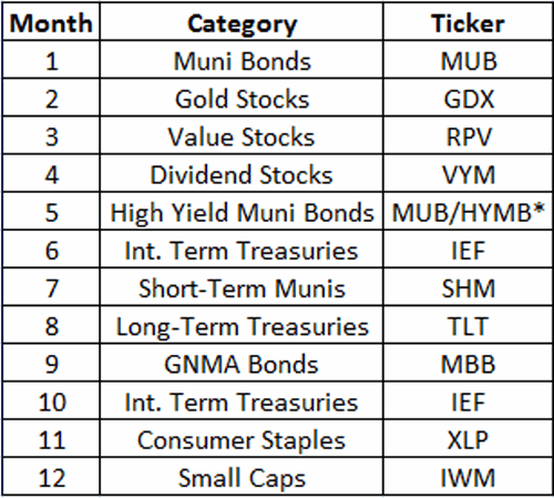
ETFs have no switching restrictions so starting in May 2007 I switched to an all ETF portfolio, using a particular ETF each month to attempt to track the top asset class for that month. That portfolio appears in Figure 2.
Figure 2 – JOAC monthly ETF Portfolio
*-MUB traded in May 2007-2010; HYMB traded in May starting in 2011
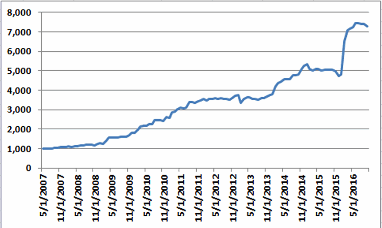
Once again using monthly total return data from Callan Associates I tested the 2007-2016 period using the tickers listed in Figure 2. The results appear in Figure 3.
Figure 3 – Equity Curve for Jay’s One Asset Class per Month Strategy; 5/31/2007-10/31/2016
*The average annual gain starting in 2008 (the 1st full year of data) is +25.8%
*The maximum drawdown (using monthly data) is -11%.
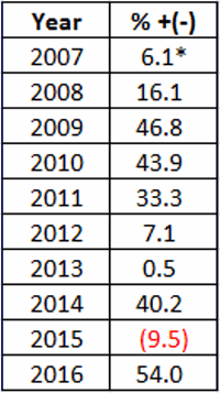
Annual results in appear in Figure 4. These results do not include any transaction fees
Figure 4 – JOAC ETF Strategy Annual Results
*May 31st/2007-12/31/2007
So is this the greatest thing since sliced bread? Probably not. Why not? Time for more of those pesky caveats:
*Buying and holding only one ETF per month does not offer a lot of diversification (or any diversification at all for that matter)
*The test period using ETFs is relatively short
*Intramonth volatility and drawdowns will undoubtedly be greater than what appears in the Figures above
This strategy fits squarely in the “(almost certainly) high risk, (potentially) high reward” category.
Summary
So as I stated earlier, no one should assume that they can just start buying the ETFs listed above and start making 25% a year ad infinitum into the future. The results displayed in this article should probably be thought of more as a starting point for further analysis rather than a finished product.
In essence, the real point is that – as with all things – there is a time and a place or everything, including (apparently) asset classes.
Nov 11, 2016 | bonds, chart patterns, educational newsletters, ETFs, indexes, jay kaeppel
In real estate, it’s “Location, Location, Location.” In the financial markets it’s “the Trend, the Trend, the Trend.” There is a great deal of certainty about what will happen next in stocks, bonds and gold. But the key to successfully navigating these turbulent times starts not with predicting the future but rather with identifying the current trend in the here and now and going from there. So let’s take a look at, well, what else, the trends.
I have certain trend-following models that I follow to help me to determine which way to be leaning in the markets. Like any trend-following method they are far from perfect (my stock market model for example, suffered not one but two significant whipsaws in the last year+). But for me there is no expectation that they will be perfect. The only goal is to catch most of the upside during major bull markets, and miss much of the downside during major bear markets.
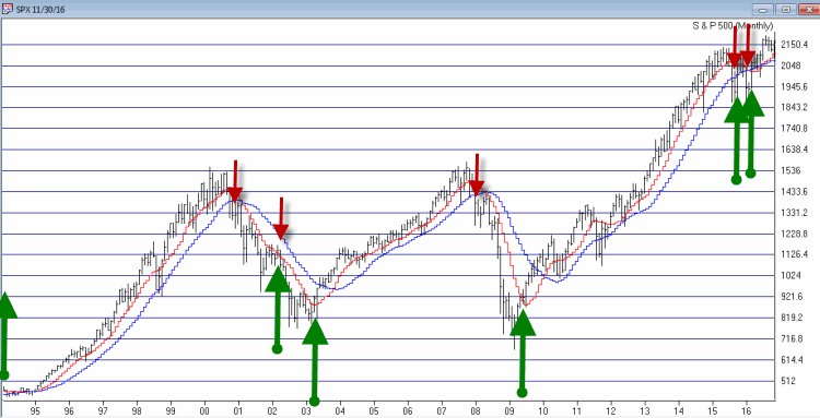
Stocks
For stocks I look at the 10-month and 21-month moving averages for the S&P 500 Index and use the following rules:
*A sell signal occurs when the S&P 500 closes 2 consecutive months below its 21-month moving average AND is also below its 10-month moving average
*Following a sell signal a new buy signal occurs when the S&P 500 registers a monthly close above its 10-month moving average
Figure 1 – Stock Market trend-following signals (Courtesy TradingExpert)
This method avoided much of the 1973-1974, 2000-2002 and 2008 bear market destruction. That’s the good news. The bad news is that it sold at the end of September 2015 and at the end of February 2016 – both just prior to powerful upside reversals (like I said, trend-following models ain’t perfect).
The most recent signal was a buy signal on 3/31/2016.
So the trend for stocks is presently BULLISH
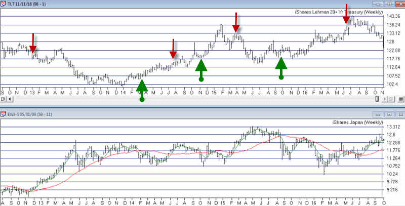
Bonds
I have written several posts about this in the past. My favorite bond timing indicator is Japanese stocks. No seriously. They have a string tendency to trade inversely to the 30-yr US t-bond. I track ticker EWJ and watch the 5-week and 30-week moving averages. Because Japanese stocks and t-bonds trade inversely I use the following rules:
*A buy signal for bonds occurs when the 5-week moving average for EWJ drops below the 30-week moving average for EWJ
*A sell signal for bonds occurs when the 5-week moving average for EWJ rises above the 30-week moving average for EWJ
The most recent signal was a sell signal for t-bonds on 6/10/2016
So the trend for bonds is presently BEARISH
Figure 2 – Bond trend-following signals(Courtesy TradingExpert)
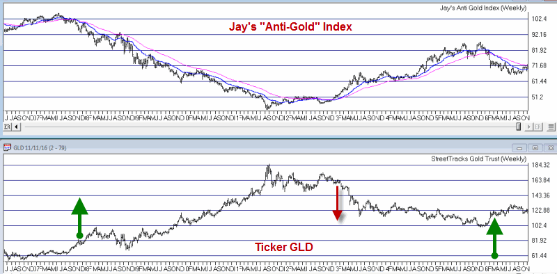
Gold
For gold I use two moving averages on a weekly chart for something I refer to as Jay’s Anti-Gold Index. Rather than go into a long explanation I will link to the
original article on the topic and offer a short explanation. In AIQ TradingExpert I created a ticker comprised of 4 other tickers (GLL, RYSDX, SPX and YCS) which all trade in a negatively correlated manner to the price of gold (er, usually).
One moving average I call the “FrontWeighted36DayMA” (“FrontWeightedMA” for short. The calculations are based on someone else’s work – unfortunately I cannot recall the person’s name so cannot give proper credit. Hopefully Karma will work and somewhere that person will Have a Nice Day without really knowing why. The calculations are a bit long-winded so the AIQ TradingExpert code appears at the end of this article.
The other is the 55-week exponential moving average.
(CAVEAT: Because some of these tickers did not exist until 2006 trading signals began on 12/31/1996, so yes, it is by my standards a relatively short test period for a long -term moving average method. To put it another way, don’t bet the ranch on gold basedon this one indicator)
The trading rules are as follows:
*When the FrontWeightedMA closes a week BELOW the 55-week MA then a BUY signal for gold occurs.
*When the FrontWeightedMA closes a week ABOVE the 55-week MA then a BUY signal for gold occurs.
Figure 3 – Gold Trading Signals (Courtesy TradingExpert)
The most recent signal was a buy signal on 3/18/16.
So the trend for gold is presently BULLISH.
Summary
These indicators represent “my opinion as to where the markets are headed next” (because the truth is I don’t know). There are objective, mechanical measures of where things stand today. Nothing more, nothing less.
Also, none these indicators falls into the “World Beater” or “You Can’t Lose in Investing” categories. But then again they are not really designed to (BTW if you do posses methods that do fit into either of the aforementioned categories, I would love to hear from you – off the record, of course). What they do achieve is to offer a decent frame of reference during times of doubt.
And that is one of the most powerful tools any investor can possess.
So in sum, the current trend (at least according to what you’ve seen here) for stocks and gold is bullish and the current trend for bonds is bearish.
How long any of these trends will remain in place is anyone’s guess. So enjoy them while they last.
Jay Kaeppel
Chief Market Analyst at JayOnTheMarkets.com
Sep 2, 2016 | educational newsletters, ETFs, jay kaeppel, seasonal
Recently Jay Kaeppel of Jay On The Markets posted an update on the Seasonal Bonds Strategy using TMF. The gist of the strategy is straightforward, “Long TMF on the last 5 day of each month”
I’ve posted the article below.
Here’s a seasonal chart of the last 3 years with the average of the 3 years (black line). I colored the last 5 trading days of the average line in yellow to see what Jay was referring to. 8 of the 12 months were positive, 2 flat and 2 negative. Looks pretty good. At the bottom of the page you can see the returns this strategy yields.
BTW this Chart type, known as a seasonality chart will be included in the next AIQ TradingExpert Pro release this fall (OK marketing bit over)
So of course the bond market
rewarded my “brilliance” with a swift kick in the you know where in the months of March and April 2015 and especially in August 2015.
This would typically be enough to cause many people to go, “Well that guy’s and idiot” and to move on. But fortunately in this case, the market is a marathon and not a sprint.
Update
Figure 1 displays the results generated by:
*Holding long 1 t-bond futures contract ONLY for the last 5 days of each month since 12/30/1983
*Holding long 1 t-bond futures contract during all other days since 12/30/1983
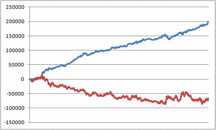
Figure 1 – Long 1 t-bond futures contract ONLY during last 5 trading days of month (blue) versus long 1 t-bond futures contract on all other days (red); 12/31/1983-8/12/2016
The results sort of speak for themselves.
After I wrote about my aggressive TMF strategy, TMF (of course)
got hit very hard (as triple leveraged ETFs will do from time to time, hence the use of the words “aggressive” and “risky”), in March 2015 (-4.5%), April 2015 (-5.3%) and especially in August 2015 (-11.5%).
Still, as you can see in Figure 2, things have rebounded nicely since (hmmm, maybe I should be worried).
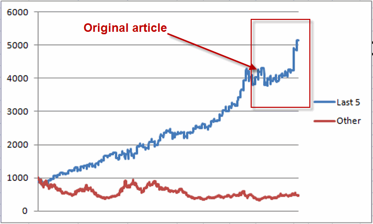
Figure 2– Growth of $1,000 Long ETF ticker TMF ONLY during last 5 trading days of month (blue) versus long TMF all other days; (red); 12/9/2009-8/12/2016
So far the “Long TMF on the last 5 day of each month” strategy is up +31.8% for the year in 2016.
| Year |
Last 5 TDM Long TMF |
| 2009* |
+12.9% |
| 2010 |
+33.4% |
| 2011 |
+15.2% |
| 2012 |
+35.7% |
| 2013 |
+6.7% |
| 2014 |
+45.7% |
| 2015 |
+6.8% |
| 2016** |
+31.8% |
*-Starting 4/16/2009 when TMF started trading
**-Through 8/12/2016
Summary
So did this odd little strategy “weather the storm” and “take the market’s best shot” in 2015 and now it is “smooth sailing”? Probably not. Make no mistake – this is a strategy that entails a great deal of risk. Still, for aggressive traders looking for an “edge”, it might be worth a closer look.
Jay Kaeppel
Jul 29, 2016 | educational newsletters, ETFs, jay kaeppel, trading strategy
It pains me to say that I don’t know where the stock market is going next. You would think that after being in the markets for so long and following a bunch of indicators and systems etc., that by now I would have developed some ability to divine what is coming next.
Alas, I have not.
But I do know three things:
*My trend-following stuff is bullish so I need to give the bullish case the benefit of the doubt (no matter how nervous or cynical I may be).
*Based on a variety of indicators the market is certainly getting overbought
So, a thought today for those who might be wishing to hedge away some of their market risk.
Ticker TZA
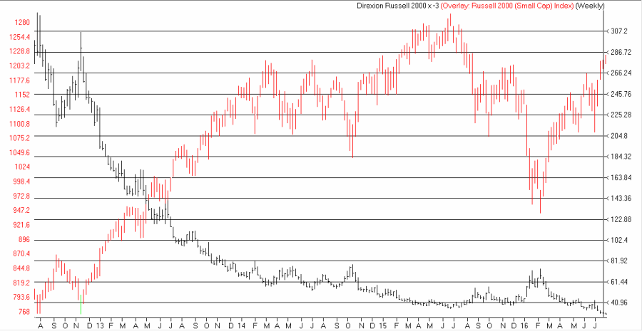
Ticker TZA is not necessarily one of my favorites. It is an ETF that tracks 3 times the inverse of the Russell 2000 small-cap index. In other words, if ticker RUT falls 1% today then TZA should rise 3%. There are two primary concerns to keep in mind before considering buying shares of TZA are:
*The shares are extremely volatile
*The shares have experienced a serious downside bias – even when RUT is headed sideways (See Figure 1).
Figure 1 – Ticker TZA (black bars) versus Ticker RUT (Russell 2000) (Courtesy
AIQ TradingExpert)
So if you are going to buy TZA you’d better pick your spots. As I discussed here we are entering an “interesting” time for the market. So let’s explore the possibility of buying a call option on ticker TZA as a hedge against a potential market decline.
Call Option on TZA
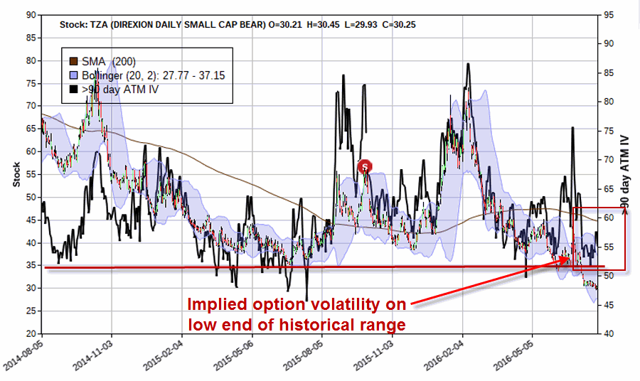
Remember, TZA should increase in value if the Russell 2000 declines. Therefore, a call option on TZA should also increase in value if the Russell 2000 declines.
As you can see in Figure 2, the “implied volatility” (which generally tells you whether there is a lot of time premium built into the price of the options for a given security) for options on TZA is near the low end of the historical range. This tells us that there is relatively little time premium built into TZA options, therefore they are “cheap”.
Figure 2 – Implied option volatility for options on TA near the low end of the historical range (Courtesy
www.OptionsAnalysis.com)
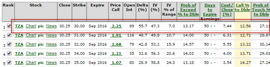
Next I ran the “Percent to Double” routine in
www.OptionsAnalysis.com (see output in Figure 3. The phrase “percent to double” tells us what percentage the underlying stock must rise in order for the call option to double in price.
Figure 3 – Percent to Double routine suggests buying Sep30 TZA call which will double in price if TZA rises 12.56% (i.e., if RUT declines by roughly -4.19%) (Courtesy
www.OptionsAnalysis.com)
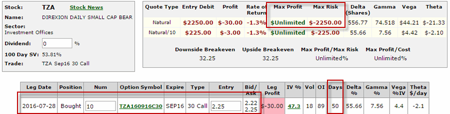
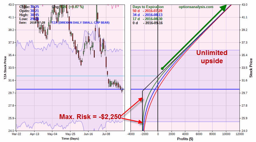
Figures 4 and 5 display the particulars and risk curves for buying 10 TZA Sep 30 calls.
A few things to note:
*The cost to buy 10 is $2,550.
*TZA is trading at $30.25/share.
*The breakeven price for this trade is $32.25 (if TZA is below $32.25 at expiration and we still hold this position then we will lose -$2,250)
*There are 50 days left until September expiration
*The trade has unlimited profit potential
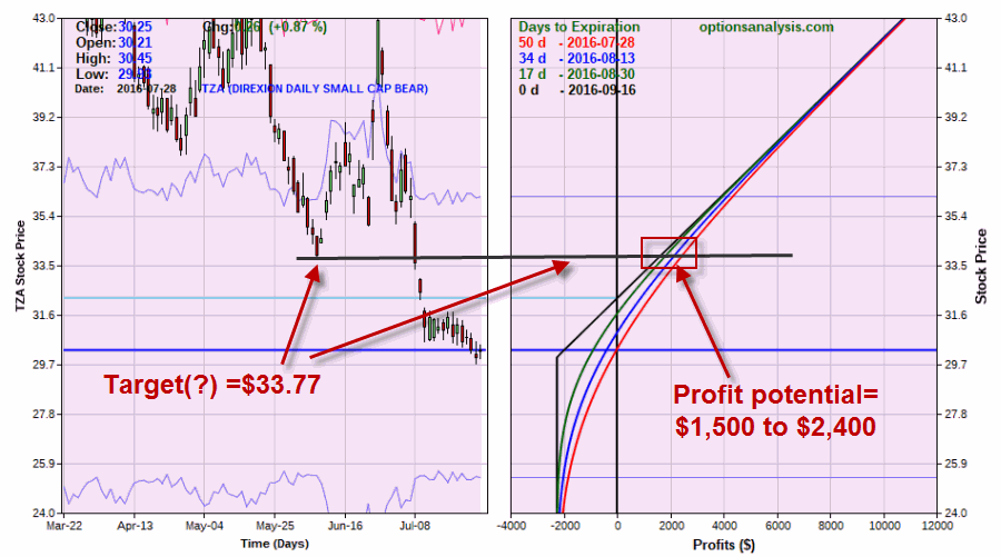
Regarding potential, in Figure 6 we see that if TZA rallies back to its June low of $33.77 this trade will generate a profit of between $1,500 and $2,400 depending on how soon that price is reached
Summary
Is this a good trade? I can’t say for sure that it is. In fact, the only way this trade makes money is if the broader market suffers a hit, so a good part of me would prefer to see this trade “not work out”.
But the point of all of this is simply to point out that it is possible to hedge against a significant market decline by buying call options on an inverse leveraged ETF.
Mr. Market, you take it from here.
Jay Kaeppel
May 23, 2014 | ETFs, gold, trading strategies
Well, OK, maybe not. But life here in the Good Old US of A may be affected profoundly. Which of course, would ripple out and affect much of the rest of the world. So maybe it’s not that outrageous.
In any event, it sure is a catchy title, no? In truth this piece is not an immediate call to action, but rather one of those short “hey, you might want to keep your eye on this” type pieces. I am writing about the U.S. Dollar.
There are pro’s and con’s to a strong U.S. Dollar and there are pro’s and con’s to a weak U.S. Dollar. If you would like to know what they are please see the steps below:
Step 1) Go to your web browser. Type www.google.com and press Enter
Step 2) Type “pros and cons of strong U.S. dollar” and press Enter.
Step 3) Browse among the approximately 308,000 or so links until you find your answer.
Step 4) Type “pros and cons of weak U.S. dollar” and press Enter.
Step 5) Repeat Step 3.
Since at least the end of the gold standard in 1971 the U.S. dollar has served as the world’s “reserve currency”. (This basically means that if you could only hold one currency you would want to hold the dollar.) This has become one of those things that most people take for granted and assume will go on forever.
Still, given that we are now the most indebted “We the People” in the history of the planet, perhaps we shouldn’t be surprised that there has been a lot of talk recently (granted mostly among intentionally frightening and mostly annoying infomercials) about how the days of enjoying “reserve currency” status are numbered, and how this will trigger a panic out of the dollar, which will lead to all kind of bad things like, well, see Step 4 above.
Will the Dollar Collapse?
For me to pretend that I have the slightest idea whether or not the U.S. dollar will someday collapse would be a joke, and not the funny kind. But as a trader and investor my “thing” is not so much “what will happen” as it is “what could happen and what the heck do I plan to do about it if it does?”
Which leads me to the following distractions:
Jay’s Trading Maxim #235: It’s not so much how much you make when things go right, but how much you keep when thing goes wrong.
Jay’s Trading Maxim #236: If you take care of the losing trades, the winning trades will take care of themselves (OK, for the record, this is not mine, I just gave it number 236 so I could use it as a segue into…..)
Jay’s Trading Maxim #237: Successful traders worry less about “Kicked Ass” and more about “Ass Kicked”, if you get my drift.
So why am I bringing all of this up? Take a look at Figure 1 which displays a monthly chart of continuous U.S. dollar futures. While the history of U.S. dollar trends is all very interesting and I would love to recap it for you, I am going to opt for the “a picture is worth a thousand (likely incredibly boring) words” mantra and encourage you simply to glance at Figure 1 if you want to know where the dollar has been in the past.
And when you do – here is the important part – note that the dollar is forming a narrowing triangle (is there another kind?) pattern. In other words, starting with the high in 2006 the dollar has been fluctuating in an ever smaller range.
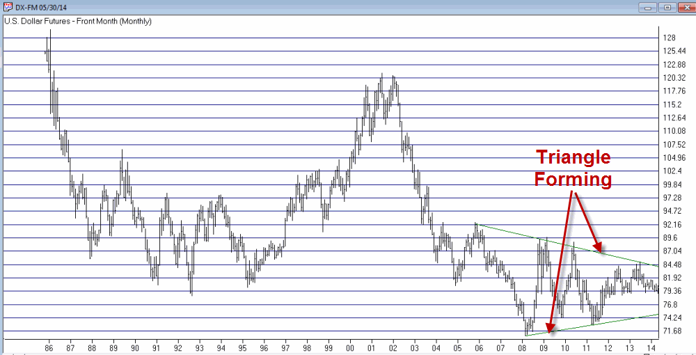
Figure 1 – A large triangle forming (Courtesy: AIQ TradingExpert)
We “market analyst types” refer to this as “coiling” action. Now if you are like me chances are you just squirmed slightly when you read that last sentence. Because we all know what happens when something stops coiling – that’s right, it “uncoils”. And “uncoiling” is typically not a quiet affair.
So here is the bottom line. At some point – and just for the record it might not be for several years – the U.S. dollar will break out of this triangle one way or the other. And chances are it will move sharply in price from that point. And whether it breaks out to the upside or the downside it will have significant implications for the quality of life here in the U.S. If you don’t believe me, see the 308,000 links referenced in Step #3 above.
So make a note to check in on the dollar once in awhile. Because one of these days something profoundly significant is going to happen.
Jay Kaeppel
Chief Market Analyst at JayOnTheMarkets.com and AIQ TradingExpert Pro (http://www.aiq.com) client
Jay has published four books on futures, option and stock trading. He was Head Trader for a CTA from 1995 through 2003. As a computer programmer, he co-developed trading software that was voted “Best Option Trading System” six consecutive years by readers of Technical Analysis of Stocks and Commodities magazine. A featured speaker and instructor at live and on-line trading seminars, he has authored over 30 articles in Technical Analysis of Stocks and Commodities magazine, Active Trader magazine, Futures & Options magazine and on-line at www.Investopedia.com.