An Obscure but Potentially Useful Oversold Indicator

Trend-following is essentially a “tried and true’ approach to investing.  But overbought/oversold (i.e., attempting to buy low/sell high) – that’s where the “excitement” is.  Of course, when it comes to trading and investing, “excitement” can be highly overrated.  Nevertheless, in this piece I want to talk about a relatively obscure indicator that may be useful in identifying vastly oversold situations.


EDITORS NOTE: The WinWay EDS file for Jay Kaeppel’s indicator is available to download here


The VixRSI14 Indicator


Part of the reason this indicator is obscure is because I think I “invented” it – but only by mashing together an indicator from Larry Williams and an indicator from Welles Wilder.  The first part is the standard Welles Wilder 14-day Relative Strength Index, more commonly referred to as “RSI”.


The 2nd part of VixRSI14 is an indicator created by famed trader Larry Williams which he dubbed “VixFix”.  This indicator is an effort to create a “Vix Index-like” indicator for any security.


WinWay TradingExpert code for these indicators appears at the end of the article.


A Few Notes


*For the record, VixRSI14 is calculated by taking a 3-day exponential average of VixFix and dividing that by a 3-day exponential average of RSI14 (are we having fun yet?).  Please see code at the end of the article.


*I prefer to use VixRSI14 using weekly data rather than daily data


*(Unfortunately) There are no “magic numbers” that indicate that a completely risk-free, you can’t lose, just buy now and watch the money roll in” buying opportunity is at hand (Disclaimer: If there was, I would probably just keep it to myself and not bother writing the article – sorry, it’s just my nature).  That being said, a decent “rule of thumb” is to look for a reading above 3.5 followed by a downside reversal.


(Click any chart below to enlarge)


With those thoughts in mind, Figure 1 displays a weekly chart of Wynn Resorts (WYNN) with the two indicators plotted separately below the bar chart.

1


Figure 1 – WYNN with William’s VixFix and Wilder’s RSI 14-day (Courtesy WinWay TradingExpert)


Note that as price declines, VixFix tends to rise and RSI14 tends to fall.  VIXRSI14 essentially identifies “extremes” in the difference between these two.  Figure 2 displays WYNN with VixRSI14 plotted below the bar chart.


2


Figure 2 – WYNN with VixRSI14 (Courtesy WinWay TradingExpert)


More “examples” appear in Figures 3 through 8 below.


3


Figure 3 – AMD (Courtesy WinWay TradingExpert)


4


Figure 4 – BAC (Courtesy WinWay TradingExpert)


5


Figure 5 – DISH (Courtesy WinWay TradingExpert)


6


Figure 6 – GRMN (Courtesy WinWay TradingExpert)


7


Figure 7 – NTAP (Courtesy WinWay TradingExpert)


8


Figure 8 – YHOO (Courtesy WinWay TradingExpert)


Summary


As always, I merely present “ideas” here at JOTM.  So, do not assume from the charts above that you have found the “keys to the kingdom”.  But if used in conjunction with other confirming indicators – and remembering to employ some sort of risk control for those instances when a stock price decline fails to arrest itself even after VixRSI4 peaks above 3.5 – VixRSI14 may hold some value.


Indicator Code


EDITORS NOTE: The WinWay EDS file for Jay Kaeppel’s indicator is available to download here


Below is the code for VixFix, RSI14 and VixRSI14 from AIQ Expert Design Studio.

!#######################################

!VixFix indicator code

hivalclose is hival([close],22).

vixfix is (((hivalclose-[low])/hivalclose)*100)+50.

!#######################################

!#######################################

!RSI14 code

Define days14 27.

U14 is [close]-val([close],1).

D14 is val([close],1)-[close].

AvgU14 is ExpAvg(iff(U14>0,U14,0),days14).

AvgD14 is ExpAvg(iff(D14>=0,D14,0),days14).

RSI14 is 100-(100/(1+(AvgU14/AvgD14))).

!#######################################

!#######################################

!VixRSI14 code

VixRSI14 is expavg(vixfix,3)/expavg(RSI14,3).

!#######################################


Jay Kaeppel


Disclaimer:  The data presented herein were obtained from various third-party sources.  While I believe the data to be reliable, no representation is made as to, and no responsibility, warranty or liability is accepted for the accuracy or completeness of such information.  The information, opinions and ideas expressed herein are for informational and educational purposes only and do not constitute and should not be construed as investment advice, an advertisement or offering of investment advisory services, or an offer to sell or a solicitation to buy any security.

Watch This Indicator

So, the big question on every investor’s mind is “What Comes Next?”  Since this is not an advisory service (and given the fact that I am not too good at predicting the future anyway) I have avoided commenting on “the state of the markets” lately.  That being said, I do have a few “thoughts”:


*The major averages (as of this exact moment) are still mostly above their longer-term moving averages (200-day, 10-month, 40-week, and so on and so forth).  So, on a trend-following basis the trend is still “up”.


0

Figure 1 – The Major Index (Courtesy WinWayCharts TradingExpert)


*We are in the most favorable 15 months of the 48-month election cycle (though off to a pretty awful start obviously) which beings Oct.1 of the mid-term year and ends Dec. 31st of the pre-election year.


*Investors should be prepared for some volatility as bottoms following sharp drops usually take at least a little while to form and typically are choppy affairs.  One day the market is up big and everyone breathes a sigh of relief and then the next day the market tanks.  And so on and so forth.


An Indicator to Watch


At the outset let me state that there are no “magical” indicators.  Still, there are some that typically are pretty useful.  One that I follow I refer to as Nasdaq HiLoMA.  It works as follows:


A = Nasdaq daily new highs

B = Nasdaq daily new lows

C = (A / (A+B)) * 100

D = 10-day moving average of C

C can range from 0% to 100%.  D is simply a 10-day average of C.


Nasdaq HiLoMA = D


Interpretation: When Nasdaq HiLoMA drops below 20 the market is “oversold”.


Note that the sentence above says “the market is oversold” and NOT “BUY NOW AGGRESSIVELY WITH EVERY PENNY YOU HAVE.”  This is an important distinction because – like most indicators – while this one may often give useful signals, it will occasionally give a completely false signal (i.e., the market will continue to decline significantly).


A couple of “finer points”:


*Look for the indicator to bottom out before considering it to be “bullish”.


*A rise back above 20 is often a sign that the decline is over (but, importantly, not always).  Sometimes there may be another retest of recent lows and sometimes a bear market just re-exerts itself)


*If the 200-day moving average for the Dow or S&P 500 is currently trending lower be careful about using these signals.  Signals are typically more useful if the 200-day moving average for these indexes is rising or at least drifting sideways rather than clearly trending lower (ala 2008).


Figures 2 through 8 displays the S&P 500 Index with the Nasdaq HiLoMA indicator.  Click to enlarge any chart.


1

Figure 2 – SPX with Jay’s Nasdaq HiLoMA ending 2006 (Courtesy WinWayCharts TradingExpert)


2

Figure 3 – SPX with Jay’s Nasdaq HiLoMA ending 2008 (Courtesy WinWayCharts TradingExpert)

3

Figure 4 – SPX with Jay’s Nasdaq HiLoMA ending 2010 (Courtesy WinWayCharts TradingExpert)


4

Figure 5 – SPX with Jay’s Nasdaq HiLoMA ending 2012 (Courtesy WinWayCharts TradingExpert)


5

Figure 6 – SPX with Jay’s Nasdaq HiLoMA ending 2014 (Courtesy WinWayCharts TradingExpert)


6

Figure 7 – SPX with Jay’s Nasdaq HiLoMA ending 2016 (Courtesy WinWayCharts TradingExpert)


7

Figure 8 – SPX with Jay’s Nasdaq HiLoMA ending 2018 (Courtesy WinWayCharts TradingExpert)


Summary


The stock market is in a favorable seasonal period and is oversold.  As long as the former remains true, react accordingly (with proper risk controls in place of course).


Jay Kaeppel


Disclaimer:  The data presented herein were obtained from various third-party sources.  While I believe the data to be reliable, no representation is made as to, and no responsibility, warranty or liability is accepted for the accuracy or completeness of such information.  The information, opinions and ideas expressed herein are for informational and educational purposes only and do not constitute and should not be construed as investment advice, an advertisement or offering of investment advisory services, or an offer to sell or a solicitation to buy any security.

A Technical Method For Rating Stocks

The WinWayCharts EDScode based on Markos Katsanos’ article in this issue, “A Technical Method For Rating Stocks,” is shown below.
Synopsis from Stocks & Commodities June 2018
I’s it possible to create a stock rating system using multiple indicators or other technical criteria? If so, how does it compare with analyst ratings? Investors around the world move billions of dollars every day on advice from Wall Street research analysts. Most retail investors do not have the time or can’t be bothered to read the full stock report and rely solely on the bottom line: the stock rating. They believe these ratings are reliable and base their investment decisions at least partly on the analyst buy/sell rating. But how reliable are those buy/sell ratings? In this article I will present a technical stock rating system based on five technical criteria and indicators, backtest it, and compare its performance to analyst ratings.
!A TECHNICAL METHOD FOR RATING STOCKS
!Author: Markos Katsanos, TASC June 2018
!Coded by: Richard Denning, 4/18/18
!www.TradersEdgeSystems.com

!INPUTS:
  MAP is 63. 
  STIFFMAX is 7. 
  VFIPeriod is 130. 
  MASPY is 100. 
  MADL is 100.
  SCORECRIT is 5.
  W1 is 1.
  W2 is 1.
  W3 is 1.
  W4 is 1.
  W5 is 2.
 
!VFI FORMULA: 
  COEF is 0.2.
  VCOEF is 2.5.
  Avg is ([high]+[low]+[close])/3.
  inter is ln( Avg ) - ln( Valresult( Avg, 1 ) ). 
  vinter is sqrt(variance(inter, 30 )).
  cutoff is Coef * Vinter * [Close].
  vave is Valresult(simpleavg([volume], VFIPeriod ), 1 ).
  vmax is Vave * Vcoef.
  vc is Min( [volume], VMax ).
  mf is Avg - Valresult( Avg, 1 ).
  vcp is iff(MF > Cutoff,VC,iff(MF < -Cutoff,-VC,0)).
  vfitemp is Sum(VCP , VFIPeriod ) / Vave.
  vfi is expavg(VFItemp, 3 ).

!STIFFNESS 
  ma100 is Avg. 
  CLMA if [close] < MA100.
  STIFFNESS is countof(CLMA,MAP).

!CONDITIONS:
 ! MONEY FLOW:
   COND1 is iff(VFI>0,1,0). 
 !SIMPLEAVG:
    SMA is simpleavg([close],MADL).                              
    COND2 is iff([close]>SMA,1,0).  
 !SIMPLEAVG DIRECTION:                       
    COND3 is iff(SMA>valresult(SMA,4),1,0).  
!STIFFNESS:                          
    COND4 is iff(STIFFNESS<= STIFFMAX,1,0).  
!MARKET DIRECTION:
    SPY is TickerUDF("SPY",[close]).
    COND5 is iff(EXPAVG(SPY,MASPY)>= 
 valresult(EXPAVG(SPY,MASPY),2),1,0).            

SCORE is  W1*COND1+W2*COND2+W3*COND3+
   W4*COND4+W5*COND5.

 buy if Score>=SCORECRIT and hasdatafor(300)>=268. 
Figure 11 shows the summary results of a backtest using NASDAQ 100 stocks during a generally bullish period from April 2009 to April 2018. Figure 12 shows the backtest using the same list of NASDAQ 100 stocks during a period that had two bear markets (April 1999 to April 2009). The average results are similar except that there are fewer trades during the period that contained the two bear markets. Both backtests use a fixed 21-bar exit.

Sample Chart

FIGURE 11: AIQ, BULL MARKET. Here are the summary results of a backtest using NASDAQ 100 stocks during a generally bullish period from April 2009 to April 2018.

Sample Chart

FIGURE 12: AIQ, BEAR MARKET. Here are the summary results of a backtest using NASDAQ 100 stocks during a period from April 1999 to April 2009 that contained two bear markets.
—Richard Denning info@TradersEdgeSystems.com for AIQ Systems

Harness your trading potential – using Darren Winters preferred trading software

Harness your trading potential April 26, 2018

Join us at Wealth Training offices for a full day seminar using  WinWayCharts

Darren Winters preferred trading software ​​​​​​​

New to WinWayCharts or a veteran looking for a refresher, this seminar is for you. We’ll be covering in detail the application of Darren Winters indicators and strategies within the trading software and taking you through some of the powerful tools that will make your analysis easier and save you time.

Now more than ever, stock traders need an edge to successfully trade stocks

We really don’t care if the market goes up or down. With the right tools, used the right way, there are always opportunities to make money trading stocks.

In this full-day seminar, Steve Hill, founder of WInWayCharts, will start at the top with the powerful Market Analysis tools, Sector Rotation and Stock Selection, plus he’ll recap technical indicators that Darren uses and reveal additional confirming indicators that are essential for making good trading decisions, .

All of this will build up to developing a trading strategy that suits your trading style. Finally he’ll take you through trade execution and trade management with live market action and trades. With this traders blueprint, you’ll have the tools you need to take your trading efficiency to a new level.


Rare opportunity to spend the day with

WinWayCharts founder Steve Hill

Those of you have had an opportunity to spend time with Steve at sessions at Wealth Training will appreciate his broad and in-depth knowledge and experience in trading analysis. Darren and Steve have worked together to develop and improve the WinWayCharts software throughout the last 10 years. Today the WinWayCharts platform is one of the fastest and most comprehensive stock analysis tools in the world.

You’ll need to be on your toes for this seminar. Every session is designed to enhance your current trading skill and take you to the next logical step as a trader.


Topics covered in this action-packed day include:

Market Timing – a thorough breakdown of WinWayCharts Market Timing and how to use it effectively

Sector Rotation – Tools for identifying leading and lagging sectors and how to maximize your investments

Technical indicators you have in WinWayCharts that every trader and investor must use

Hidden tools in your WinWayCharts that can save you time and make you money

Steve trading account, establishing positions, portfolio management of established positions, exiting positions and live trades in action


This opportunity won’t be available again this year!

Seats are limited. Don’t hesitate, fast track your way to trading success PLUS early bird pricing now applies.

ONLY a few more days left to lock in the early bird price

Book your seat before March 31, 2018 and you’ll pay

ONLY $649

$499

a $150 saving

 
or call 0207-749-2205 Mon-Fri 08:00-4:00pm
PLUS your seminar comes with the entire course manual in PDF format. Find out more about this seminar and WinWay Charts TradingExpert software analysis tools at https://winwaycharts.com/wordpress/about-us/london-seminar/

Biotech + Gold (Updated)

In this article I wrote about an index I follow that combines the biotech sector with the gold stock sector. I also wrote about “one way” to trade that index.  This article builds on that piece and adds a new “rule” to create more trading opportunities.
The BIOGOLD Index
Figure 1 displays the index that I created using TradingExpert.  It combines ticker FBIOX (Fidelity Select Biotech) with ticker FSAGX (Fidelity Select Gold).
1
Figure 1 – Jay’s BIOGOLD Index (Courtesy TradingExpert)
Also included in the lower clip is an indicator referred to as RSI32, which is the 2-day average of the standard 3-day RSI.
The Old System
In the original article I tested an approach that works as follows using monthly data:
*When the RSI32 drops to 32 or below, buy BOTH FBIOX and FSAGX
*After a buy signal, sell both funds when RSI32 rises to 64 or higher
For results, please see the original article.
The New System
The “new rules” are as follows:
A “buy signal” occurs when either:
*The RSI32 drops to 32 or below
*The RSI32 drops below 50 (but not as low as 32) and then reverses to the upside for one month
After either of the buy signals above occurs, buy BOTH FBIOX and FSAGX
*After a buy signal, sell both funds when RSI32 rises to 64 or higher
Figure 2 displays the BIOGOLD Index with various buy and sell signals marked.
2
Figure 2 – Jay’s BIOGOLD Index with RSI32 signals (Courtesy TradingExpert)
To test results we will:
*Assume that after a buy signal both FBIOX and FSAGX are bought in equal amounts
*We will assume that both funds are held until RSI32 reaches 64 or higher (i.e., there is no stop-loss provision in this test)
For testing purposes we will not assume any interest earned while out of the market, in order to highlight only the performance during active buy signals. Figure 3 displays the hypothetical growth of $1,000 (using monthly total return data) using the “system”.
3
Figure 3 – Hypothetical Growth of $1,000 using Jay’s BIOGOLD System (1986-present)
Summary
For the record, I am not “recommending” that anyone go out and initiate trading biotech and gold based on what I have written here.  Before trading using any approach it is essential for a trader to do their own homework and carefully consider all of the pro’s and con’s associated with any specific approach.  For example, while the trade-by-trade results for the above look reasonably good, it should be noted that there have been 4 separate drawdown’s in excess of -19% along the way, including a maximum drawdown of -37% in 2008.  In considering any approach to trading it is essential to first think long and hard about how well one would “weather the storms”, BEFORE focusing on potential profitability.
To put it more succinctly is the simple phrase “Don’t cross the river if you can’t swim the tide.”
Jay Kaeppel
Disclaimer:  The data presented herein were obtained from various third-party sources.  While I believe the data to be reliable, no representation is made as to, and no responsibility, warranty or liability is accepted for the accuracy or completeness of such information.  The information, opinions and ideas expressed herein are for informational and educational purposes only and do not constitute and should not be construed as investment advice, an advertisement or offering of investment advisory services, or an offer to sell or a solicitation to buy any security.

Is a Reprieve for Bonds in the Offing?

The question on many investors’ minds is “are we in a bond bear market?”  Given that long-term treasuries have lost roughly 17% since July of 2016 it is a fair question.
The main model that I use is still bearish on bonds (more on this topic below).  Still, there are a few potential “lights at the end of the bond tunnel” – at least potentially in the near-term.
Long-Term Rates
My mega long-term “fail-safe” bond trend indicator appears in Figure 1.  It is the yield on 30 year treasuries (ticker TYX – which is multiplied by 10 for some unknown reason) with a 120-month exponential moving average.
0
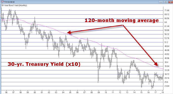
Figure 1 – 30-Yr. Treasury yields (Ticker TYX) with 120-month average (Courtesy TradingExpert)
When the day comes that TYX breaks out above the 120-month moving average I for one will officially designate the great bond bull market as “over.”  And that day is coming.  But for what it’s worth – it’s not quite here yet.
Metals Positive for Bonds
In this article I wrote about a bond timing model that uses the relationship between gold and copper.  Like a lot of timing models of all stripes it does a good job of differentiating good times for bonds from bad times for bonds, but is very far from perfect.
It goes like this:
A = Gold / Copper
B = 30-day moving average of A
C = 80-day moving average of A
D = B – C
If D > 0 = Bullish for bonds*
If D < 0 = Bearish for bonds*
*- with a 1-day lag
This indicator flipped to bullish at the close on 2/7/18 after being bearish since 7/10/2017.
Figure 2 displays the action of ticker TLT since the last “sell” signal in July 2017.  As you can see, in the end it ended up being “correct” as TLT was lower on 2/7/18 than it was on 7/10/17.  But that was not the case until the last week or so.  So for most of the time during this bearish period TLT traded higher.
1
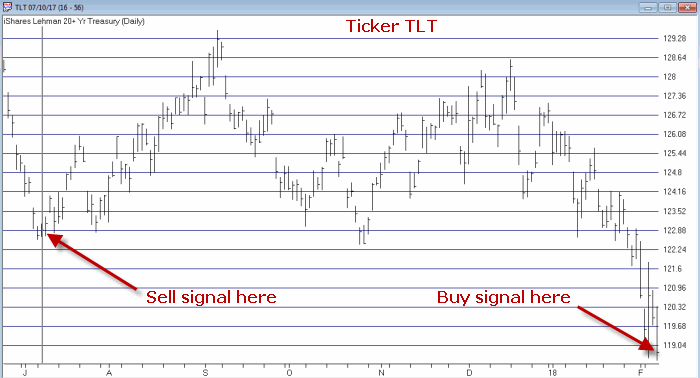
Figure 2 – Ticker TLT with recent Jay’s Metal Model signals (Courtesy TradingExpert)
What is most important however is to focus on the long-term results. In Figure 2 the blue line depicts the growth of equity achieved by holding long 1 t-bond futures contract ONLY when the model is bullish while the red line depicts the growth of equity achieved by holding long 1 t-bonds futures contract ONLY when the model is bearish (red line).
2a
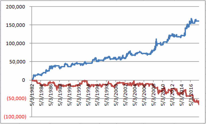
Figure 2 – T-bond futures $ gain/loss when Jay’s Metal Model is bullish (blue line) versus when model is bearish (red line)
The long-term difference in performance is fairly obvious.  That being said it should also be noted that the blue line is by no means a series of straight line advances, i.e., there is no guarantee that this latest bullish signal will prove fortuitous, especially given that we may be transitioning from a long-term bond bull market to a long-term bond near market.
One More Possible Piece of Good News
In this article I applied an indicator I originally learned from Tom McClellan at http://www.mcoscillator.com to weekly TLT.  This indicator looks at the number of times TLT has been up minus the number of times down over the past 20 weeks. Very often a drop to -2 or below followed by an upside reversal of 2 points (i.e., it drops to -2 then subsequently rises to 0, or drops to -3 then rises to -1 and so on) has presaged a favorable up move in bonds. This indicator applied to TLT recently fell to -2 and may flash a favorable signal soon (please note that it HAS NOT given a buy signal yet and that it  could take several weeks before it does).
3
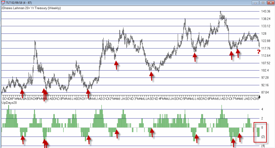
Figure 3 – Weekly TLT with UpDays20 Indicator (Courtesy TradingExpert)
One Piece of “Still Bad News”
In this article I wrote about one of the main bond models I use that uses the trend in Japanese stocks to trade bonds inversely, i.e., if Japanese stocks are bearish it is bullish for bonds and vice versa. I use a 5-week and 30-week moving average to quantify Japanese stocks as “bullish” or “bearish”.
In Figure 4 when the blue line in the top clip is above the red line this is considered bearish for bonds and when the blue line is below the red line it is considered bullish for bonds. For now the blue 5-week average line is still well above the red 30-week average, so this indicator still  designates the trend for bonds as “bearish”.
4a
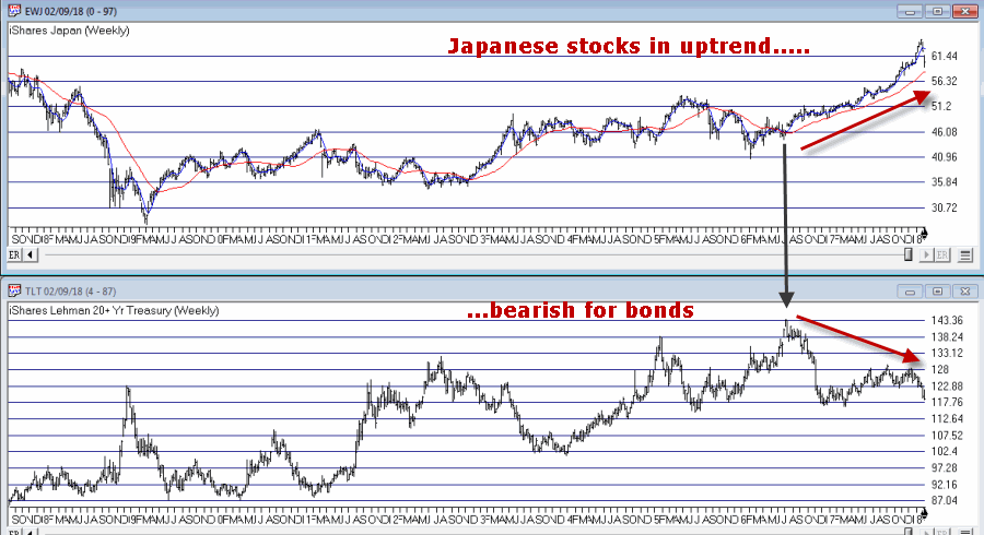
Figure 4 – Ticker TLT tends to trade inversely to ticker EWJ (Courtesy TradingExpert)
Summary
So are bonds due to rally?  Well, it seems like at least a short-term bounce could be in the offing.  That being said, with bonds breaking down sharply at the moment, 1) this “idea” is geared for “traders” who are not afraid of (and are unacquainted with) taking risks, 2) it might make sense to wait for the UpDays20 indicator discussed above to tick higher by two points – which could take up to several weeks to play out – before “taking the plunge.”
As always I am not “recommending” anything, just highlighting what I see.  For longer-term investors the “Boring Bond Index” bond strategy I wrote about here remains a viable  long-term approach to bond investing.
Jay Kaeppel
Disclaimer:  The data presented herein were obtained from various third-party sources.  While I believe the data to be reliable, no representation is made as to, and no responsibility, warranty or liability is accepted for the accuracy or completeness of such information.  The information, opinions and ideas expressed herein are for informational and educational purposes only and do not constitute and should not be construed as investment advice, an advertisement or offering of investment advisory services, or an offer to sell or a solicitation to buy any security.
en_GBEnglish
en_GBEnglish