Jul 30, 2018 | EDS, EDS code, Stocks & Commodities Traders Tips
The WinWayCharts EDScode based on Markos Katsanos’ article in this issue, “A Technical Method For Rating Stocks,” is shown below.
Synopsis from Stocks & Commodities June 2018
I’s it possible to create a stock rating system using multiple indicators or other technical criteria? If so, how does it compare with analyst ratings? Investors around the world move billions of dollars every day on advice from Wall Street research analysts. Most retail investors do not have the time or can’t be bothered to read the full stock report and rely solely on the bottom line: the stock rating. They believe these ratings are reliable and base their investment decisions at least partly on the analyst buy/sell rating. But how reliable are those buy/sell ratings? In this article I will present a technical stock rating system based on five technical criteria and indicators, backtest it, and compare its performance to analyst ratings.
!A TECHNICAL METHOD FOR RATING STOCKS
!Author: Markos Katsanos, TASC June 2018
!Coded by: Richard Denning, 4/18/18
!www.TradersEdgeSystems.com

!INPUTS:
  MAP is 63.
  STIFFMAX is 7.
  VFIPeriod is 130.
  MASPY is 100.
  MADL is 100.
  SCORECRIT is 5.
  W1 is 1.
  W2 is 1.
  W3 is 1.
  W4 is 1.
  W5 is 2.

!VFI FORMULA:
  COEF is 0.2.
  VCOEF is 2.5.
  Avg is ([high]+[low]+[close])/3.
  inter is ln( Avg ) - ln( Valresult( Avg, 1 ) ).
  vinter is sqrt(variance(inter, 30 )).
  cutoff is Coef * Vinter * [Close].
  vave is Valresult(simpleavg([volume], VFIPeriod ), 1 ).
  vmax is Vave * Vcoef.
  vc is Min( [volume], VMax ).
  mf is Avg - Valresult( Avg, 1 ).
  vcp is iff(MF > Cutoff,VC,iff(MF < -Cutoff,-VC,0)).
  vfitemp is Sum(VCP , VFIPeriod ) / Vave.
  vfi is expavg(VFItemp, 3 ).

!STIFFNESS
  ma100 is Avg.
  CLMA if [close] < MA100.
  STIFFNESS is countof(CLMA,MAP).

!CONDITIONS:
 ! MONEY FLOW:
   COND1 is iff(VFI>0,1,0).
 !SIMPLEAVG:
    SMA is simpleavg([close],MADL).
    COND2 is iff([close]>SMA,1,0).
 !SIMPLEAVG DIRECTION:
    COND3 is iff(SMA>valresult(SMA,4),1,0).
!STIFFNESS:
    COND4 is iff(STIFFNESS<= STIFFMAX,1,0).
!MARKET DIRECTION:
    SPY is TickerUDF("SPY",[close]).
    COND5 is iff(EXPAVG(SPY,MASPY)>=
 valresult(EXPAVG(SPY,MASPY),2),1,0).

SCORE is  W1*COND1+W2*COND2+W3*COND3+
   W4*COND4+W5*COND5.

 buy if Score>=SCORECRIT and hasdatafor(300)>=268.
Figure 11 shows the summary results of a backtest using NASDAQ 100 stocks during a generally bullish period from April 2009 to April 2018. Figure 12 shows the backtest using the same list of NASDAQ 100 stocks during a period that had two bear markets (April 1999 to April 2009). The average results are similar except that there are fewer trades during the period that contained the two bear markets. Both backtests use a fixed 21-bar exit.
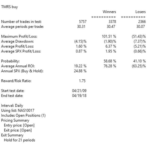
FIGURE 11: AIQ, BULL MARKET. Here are the summary results of a backtest using NASDAQ 100 stocks during a generally bullish period from April 2009 to April 2018.
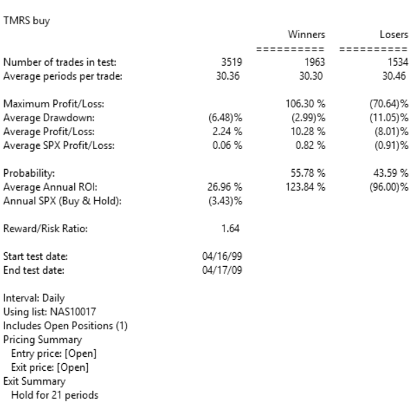
FIGURE 12: AIQ, BEAR MARKET. Here are the summary results of a backtest using NASDAQ 100 stocks during a period from April 1999 to April 2009 that contained two bear markets.
Apr 30, 2018 | Charts, EDS code, indexes, indicators, jay kaeppel
Last week I wrote an article purporting to highlight significant levels of support and resistance across a variety of financial markets. Well, it turns out there are more.
More Notes on “Lines”
I certainly look at the markets more from the “technical” side than the “fundamental” side (not even a conscious choice really – I just never really had much success buying things based on fundamentals. That doesn’t mean I think fundamentals are useless or that they don’t “work” – they just didn’t work for me).
Once I settled on the technical side of things, I started reading books about technical analysis. All the classics. I learned about chart patterns and trend lines. By definition, a trend line is a line drawn on a price chart that connects two or more successive lows or highs.
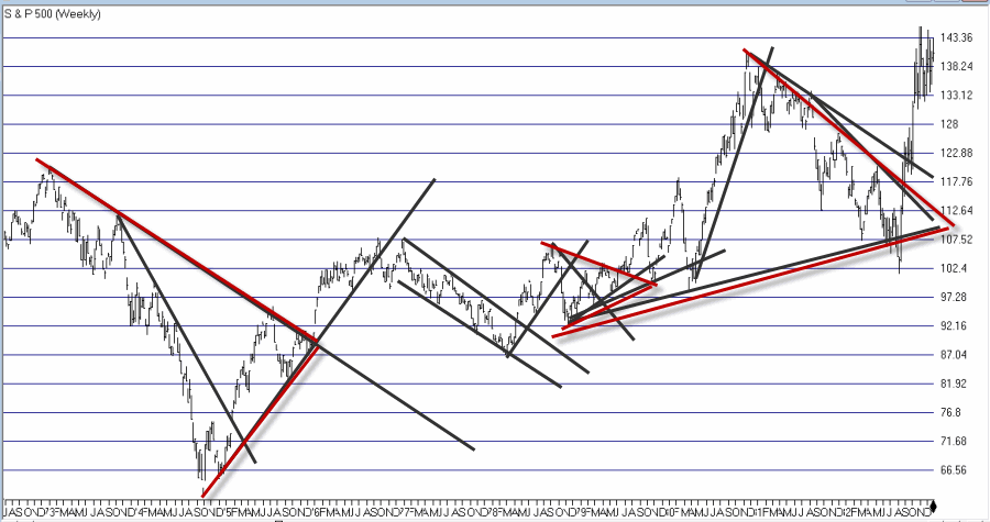
And then I got to work looking through charts and applying everything that I thought I had learned. And like a lot of “newbie” technicians – and a surprising number of seasoned ones – I typically ended up drawing “lines on charts” that would resemble something like what you see in Figure 1.
Figure 1 – “Important” trend lines (or not?) (Courtesy
TradingExpert)
For a technical analyst this is sort of the equivalent of “throwing up” on a chart (and the real pisser was that back in the day a fresh updated booklet of charts would show up in the mail each week – so you had to “throw up’ all over all the charts again and redraw every #$^& “important” line!!).
At some point I realized that perhaps every “important” line that I was drawing on a multitude of charts was perhaps maybe not so “important” after all. This revelation led me to establish the following maxim (as much to force me to “fight the urge” as anything:
Jay’s Trading Maxim #18: If you draw enough lines on a bar chart, price will eventually hit one or more of them.
True Confession Time
There are certain dirty little secrets that no respectable technician should ever utter. But just to “get a little crazy” (OK, at last by my standards – which are quite low, apparently) I’m going to put it down in print:
I hate trend lines
There, I said it. Now for the record, up sloping and down sloping trend lines are a perfectly viable trading tool if used properly. I personally know plenty of people trading successfully using trend lines drawn on a price chart. Sadly, I’m just not one of them.
So remember the lesson I learned the hard way – “There is no defense for user error.”
The full truth is that I have nothing against trend lines, and yes I understand that there are “objective” methods out there detailing the “correct” method for choosing which two points to connect to draw a proper trend line (DeMark, Magee, I think Pring to name a few). But I somehow seem to have failed that lesson.
One Line I Do Like
I still draw slanting trend lines from time to time. But the only lines I really like are lines that are drawn horizontally across a bar chart – i.e., “support” and “resistance” lines. A multiple top or a multiple bottom marks a level where the bulls or the bears made a run and could not break through. Now that’s an “important” price level. If that price level ultimately holds it means the charge failed and that a significant reversal is imminent. If it ultimately fails to hold it means a breakout and a possible new charge to ever further new highs or lows as the case may be (for the record, it could also mean that a false breakout followed by a whipsaw is about to occur. But, hey, that’s the price of admission).
I also like horizontal lines because even if very single horizontal line does not prove to be useful as a trading tool, it can still serve a purpose as a “perspective tool”. Rather than explaining that theory let’s just “go to the charts.”
More “Lines in the Sand”
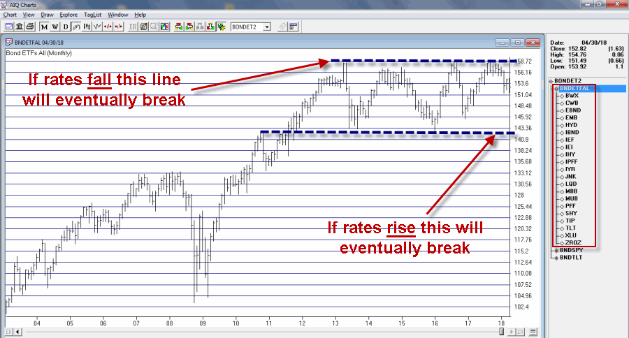
Figure 2 displays an index of bond and income related ETFs that I created. Roughly half of the ETFs have a higher correlation to treasury bonds and the other half to the S&P 500 Index (i.e., CWB – convertible bonds, JNK – high yield corporate, PFF – preferred stock and XLU – utilities all react to interest rates but are more correlated to the stock market than to treasury bonds).
Figure 2 – Bond and Income Related ETF Index (Courtesy
TradingExpert)
This monthly chart clearly illustrates the struggle going on in the interest rate related sector. Interest rates mostly bottomed out in 2013 and have been grinding sideways to higher since. As you can see, interest rate related securities have been trapped in a sort of large trading range for years. Eventually, if the long-term trend in rates turns higher this chart should be expected to break through the lower (support) line Figure 2.
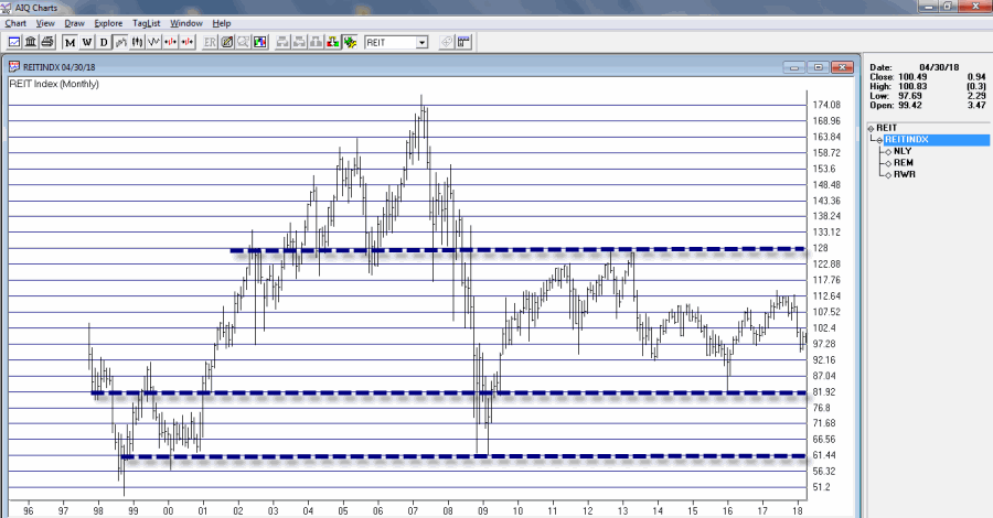
Still focusing on interest rate related sectors, Figure 3 displays a monthly index comprised of 3 REITs. Talk about a market sector trapped in a range.
For what it is worth, Figure 4 displays a weekly chart of the same index with an indicator I call Vixfixaverage (code for this indicator appears at the end of the article). Typically, when this indicator exceeds 60 and then tops out, a decent rally often ensues (one word of warning, there is also often some further downside before that rally ensues to caution is in order).
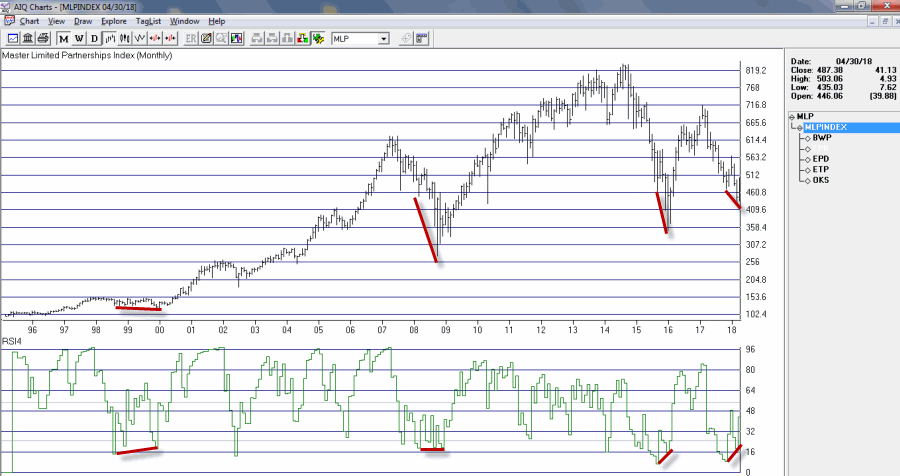
Speaking of oversold “things”, Figure 5 displays an index of Master Limited Partnerships (MLP’s). As you can see in Figure 5, a) divergences between price and the 4-month RSI are often followed by significant rallies, and b) a new such divergence has just been established. Does this mean that MLP’s are destined to rally higher? Not necessarily, but given the information in Figure 5 and the fact that everybody hates MLP’s right now, it’s something to think about.
AIQ TradingExpert Code for Vixfixaverage
hivalclose is hival([close],22).
vixfix is (((hivalclose-[low])/hivalclose)*100)+50.
vixfixaverage is Expavg(vixfix,3).
Jay Kaeppel
Disclaimer: The data presented herein were obtained from various third-party sources. While I believe the data to be reliable, no representation is made as to, and no responsibility, warranty or liability is accepted for the accuracy or completeness of such information. The information, opinions and ideas expressed herein are for informational and educational purposes only and do not constitute and should not be construed as investment advice, an advertisement or offering of investment advisory services, or an offer to sell or a solicitation to buy any security.
Mar 29, 2018 | Charts, EDS, EDS code, Risk management
Harness your trading potential April 26, 2018
Join us at Wealth Training offices for a full day seminar using WinWayCharts
Darren Winters preferred trading software
New to WinWayCharts or a veteran looking for a refresher, this seminar is for you. We’ll be covering in detail the application of Darren Winters indicators and strategies within the trading software and taking you through some of the powerful tools that will make your analysis easier and save you time.
Now more than ever, stock traders need an edge to successfully trade stocks
We really don’t care if the market goes up or down. With the right tools, used the right way, there are always opportunities to make money trading stocks.
In this full-day seminar, Steve Hill, founder of WInWayCharts, will start at the top with the powerful Market Analysis tools, Sector Rotation and Stock Selection, plus he’ll recap technical indicators that Darren uses and reveal additional confirming indicators that are essential for making good trading decisions, .
All of this will build up to developing a trading strategy that suits your trading style. Finally he’ll take you through trade execution and trade management with live market action and trades. With this traders blueprint, you’ll have the tools you need to take your trading efficiency to a new level.
Rare opportunity to spend the day with
WinWayCharts founder Steve Hill
Those of you have had an opportunity to spend time with Steve at sessions at Wealth Training will appreciate his broad and in-depth knowledge and experience in trading analysis. Darren and Steve have worked together to develop and improve the WinWayCharts software throughout the last 10 years. Today the WinWayCharts platform is one of the fastest and most comprehensive stock analysis tools in the world.
You’ll need to be on your toes for this seminar. Every session is designed to enhance your current trading skill and take you to the next logical step as a trader.
Topics covered in this action-packed day include:
– Market Timing – a thorough breakdown of WinWayCharts Market Timing and how to use it effectively
– Sector Rotation – Tools for identifying leading and lagging sectors and how to maximize your investments
– Technical indicators you have in WinWayCharts that every trader and investor must use
– Hidden tools in your WinWayCharts that can save you time and make you money
– Steve trading account, establishing positions, portfolio management of established positions, exiting positions and live trades in action
This opportunity won’t be available again this year!
Seats are limited. Don’t hesitate, fast track your way to trading success PLUS early bird pricing now applies.
ONLY a few more days left to lock in the early bird price
Book your seat before March 31, 2018 and you’ll pay
ONLY $649
$499
a $150 saving
or call 0207-749-2205 Mon-Fri 08:00-4:00pm
Jan 20, 2018 | EDS, EDS code, educational newsletters, jay kaeppel
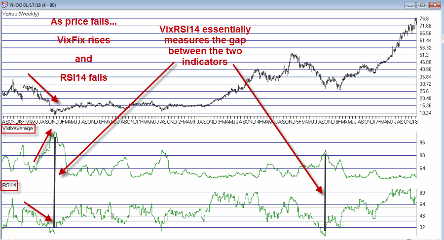
In this article I detailed an indicator I refer to as VixRSI14 using monthly charts. Today let’s apply the same method to weekly bar charts. Before we do that a quick look at how this indicator functions.
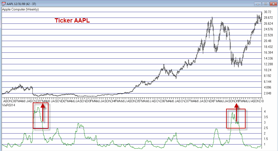
VixRSI combines two indicators – Larry William’s VixFix and Welles Wilder’s Relative Strength Index (RSI). In Figure 1 you see a weekly bar chart for YHOO. Notice that as price declines the VixFix indicator rises and RSI falls. VixRSI14 essentially measures the difference between the two and looks for extremes as a sign of a potential reversal. See Figure 5 for YHOO with VixRSI14.
Figure 1 – YHOO with Williams VixFix (with 3-day exponential smoothing) and Wilder’s 14-period RSI (Courtesy
TradingExpert)
The Weekly Version of VixRSI14
We will use the same method I described in the previous article, i.e.:
*We will calculate the VixRSI14 indicator (see code at end of article) on a weekly basis
*A “buy alert” occurs when VixRSI14 drops below 3.00 after first rising to 3.50 or higher
Once again, please note that:
*There is nothing magic about 3.50 or 3.00
*Not every “buy alert” is followed by an immediate rally (or even any rally at all for that matter)
*Any actually trading”results” will depend heavily on what you trade, how much of it you trade, when you actually get in, when you get out with a profit and/or when you get out with a loss.
*This VixRSI14 alert signal is simply serving notice that a given security may be overdone on the downside and may be ready soon to reverse to the upside. Nothing more, nothing less.
Summary
In 2018 I intend to try to share a few more trading “ideas” that maybe are not quite “finished products”. VixRSI14 fits neatly into the “Idea” category. Sometimes the alerts are early. Sometimes the alerts are late. Sometime the alerts don’t really pan out at all. Sometimes alerts are followed by one more sharp decline which is then followed by a major rally. So maybe some sort of trend reversal confirmation would be helpful. I don’t know.
Hey, that gives me an idea….
Code:
William’s VixFix is simply the 22-period high price minus today’s low price divided by the 22-day period price (I then multiply by 100 and then add 50). That may sound complicated but it is not.
The code for AIQ TradingExpert appears below.
########## VixFix Code #############
hivalclose is hival([close],22).
vixfix is (((hivalclose-[low])/hivalclose)*100)+50.
###############################
####### 14-period RSI Code ###########
Define periods14 27.
U14 is [close]-val([close],1).
D14 is val([close],1)-[close].
AvgU14 is ExpAvg(iff(U14>0,U14,0),periods14).
AvgD14 is ExpAvg(iff(D14>=0,D14,0),periods14).
RSI14 is 100-(100/(1+(AvgU14/AvgD14))).
###############################
VixRSI14 is then calculated by dividing the 3-period exponential average of VixFix by the 3-period exponential average of RSI14
####### VixRSI14 Code ###########
VixRSI14 is expavg(vixfix,3)/expavg(RSI14,3).
###############################
Jay Kaeppel
Disclaimer: The data presented herein were obtained from various third-party sources. While I believe the data to be reliable, no representation is made as to, and no responsibility, warranty or liability is accepted for the accuracy or completeness of such information. The information, opinions and ideas expressed herein are for informational and educational purposes only and do not constitute and should not be construed as investment advice, an advertisement or offering of investment advisory services, or an offer to sell or a solicitation to buy any security.
Jan 17, 2018 | EDS, EDS code, educational newsletters, jay kaeppel
While the bulk of the financial world focuses most of its attention on whether or not Bitcoin will turn to sh, er, something that rhymes with Bitcoin, a lot of “old timers” continue on with trying to look at markets in a more traditional way. Unfortunately, some people who try to look at markets in a more traditional way also spend an inordinate amount of time “dividing one number by another” thinking there is some purpose to it (“Hi. My name is Jay”)
The only good news is that every once in awhile something useful – or at least potentially useful (since no single calculation guarantees profitability which also involves other “minor” issues such as which securities to trade, allocation size, entry method, profit taking criteria, stop loss triggers and so on and so forth). A number of years ago I stumbled upon a calculation that I ultimately refer to as VixRSI (for reasons that will become fairly obvious soon). More specifically I have a few different versions but one I like is call used VixRSI14.
First the Good News: In this and some future articles I will detail how I apply VixRSI14 to monthly, weekly and daily price charts.
Now the Bad News: Nothing that I will write in any of those articles will detail a “simple automated system that generates you can’t lose trading signals guaranteed to make you rich beyond the dreams of avarice.” Sorry about that. But I thought you should know.
The truth is that the indicator generates signals – and yes, a certain percentage of the time those signals aren’t that great. And even on occasions when the signals are decent all of the factors I mentioned above (securities traded, capital allocation, etc.) still hold the key to turning a “signal” into a “profit”.
VixRSI14 is calculated by combining Larry William’s “VixFix” indicator with the standard old 14-day RSI from Welles Wilder. I’ve decided to put the calculations at the end of the article in order to avoid scaring anyone off.
For now let’s look at what to look for on a monthly price chart.
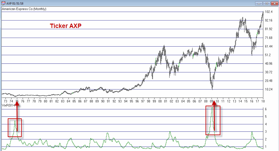
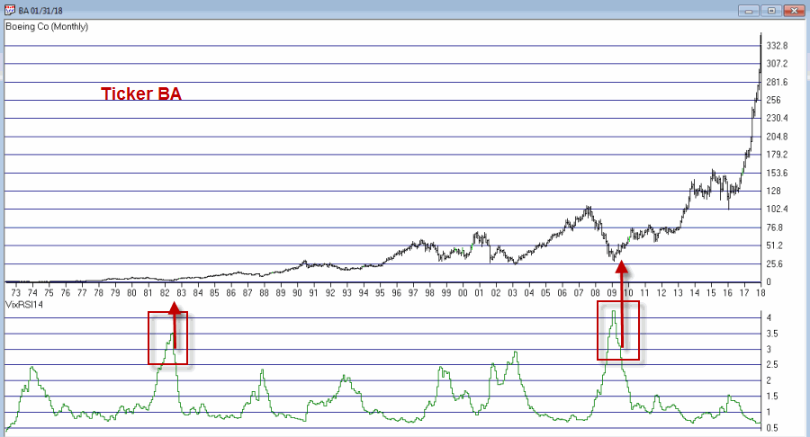
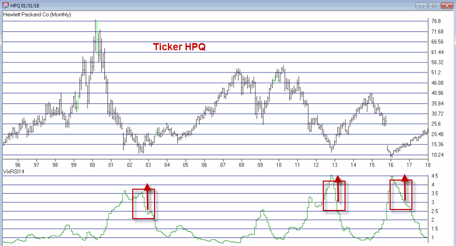
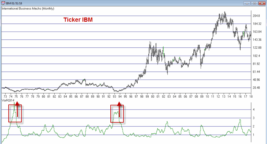
VixRSI14 on a Monthly Chart
OK, true confession time: there is (at least as far as I can tell) no “one best way” to use VixRSI14 on a monthly chart. So I will simply show you “One way.”
*A “buy alert” is triggered when the monthly value for VixRSI14 first rises to 3.5 or higher and then drops back to 3.0 or below
*Before going on please note that there is nothing “magic” about 3.5 or 3. Different values can be used and will generate varying results.
*Also, some may prefer to simply look for a drop from above 3 to below 3 without requiring a move above 3.5
*Finally please note the use of the phrase “buy alert” and the lack of the phrase “BUY AS MUCH AS YOU CAN RIGHT THIS VERY MINUTE!!!!”
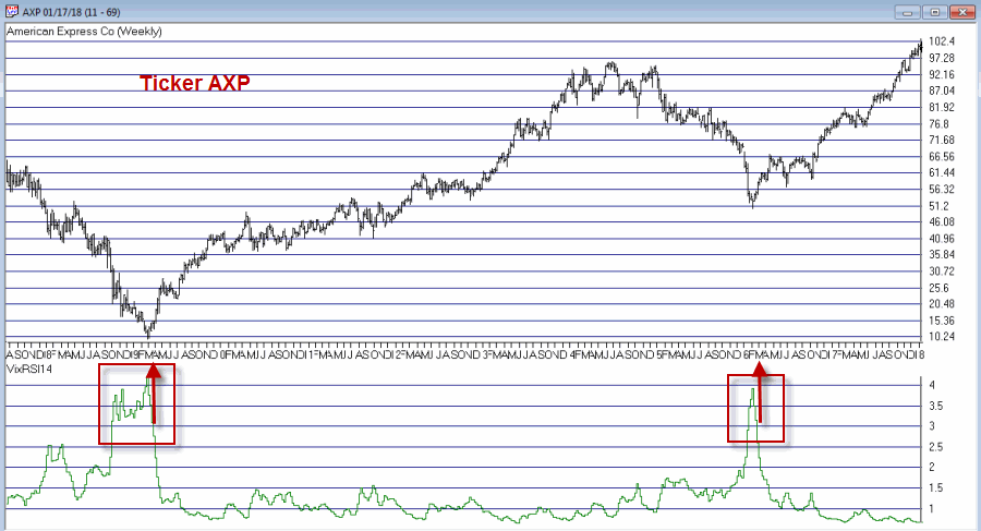
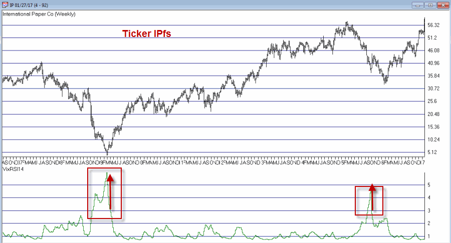
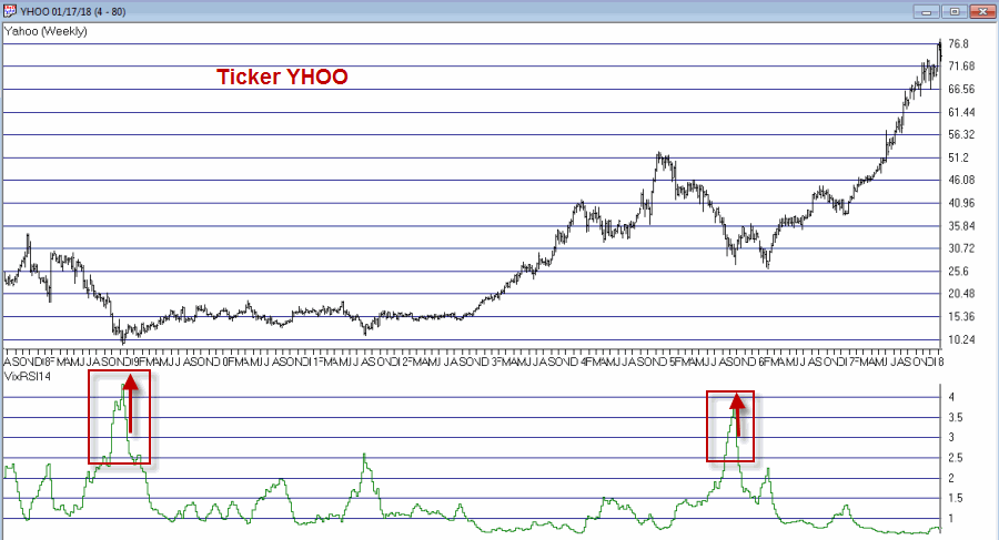
Figures 1 through 4 show several different Dow30 stocks “through the years.
Buy alerts on monthly charts using the criteria I described are obviously very rare. In fact many securities never see the VixRSI14 rise high enough to trigger an alert. Likewise, not every 3.5 then 3 event for every stock will work out as well as those depicted in Figures 1 through 4.
Still, remember that I am just presenting an “idea” and not a finished product.
William’s VixFix is simply the 22-day high price minus today’s low price divided by the 22-day high price (I then multiply by 100 and then add 50). That may sound complicated but it is not.
The code for TradingExpert EDS appears below.
########## VixFix Code #############
hivalclose is hival([close],22).
vixfix is (((hivalclose-[low])/hivalclose)*100)+50.
###############################
####### 14-period RSI Code ###########
U14 is [close]-val([close],1).
D14 is val([close],1)-[close].
AvgU14 is ExpAvg(iff(U14>0,U14,0),periods14).
AvgD14 is ExpAvg(iff(D14>=0,D14,0),periods14).
RSI14 is 100-(100/(1+(AvgU14/AvgD14))).
###############################
VixRSI14 is then calculated by dividing the 3-period exponential average of VixFix by the 3-period exponential average of RSI14
####### VixRSI14 Code ###########
VixRSI14 is expavg(vixfix,3)/expavg(RSI14,3).
#########################
Disclaimer: The data presented herein were obtained from various third-party sources. While I believe the data to be reliable, no representation is made as to, and no responsibility, warranty or liability is accepted for the accuracy or completeness of such information. The information, opinions and ideas expressed herein are for informational and educational purposes only and do not constitute and should not be construed as investment advice, an advertisement or offering of investment advisory services, or an offer to sell or a solicitation to buy any security.
Jan 12, 2018 | EDS, EDS code, educational newsletters, jay kaeppel
First the brutal disclaimers: What follows is NOT a trading “system.” It is merely an “idea.” Even more brutally, I can’t even claim that it “works”. All the testing I have done so far is more anecdotal. Also to an extremely huge degree, the actual entry trigger and exit trigger that trader might choose to use will have – as always – at least as much if not more impact on overall trading results as the actual “alert” signal detailed below.
Got that? OK, then let’s proceed.
The Debate
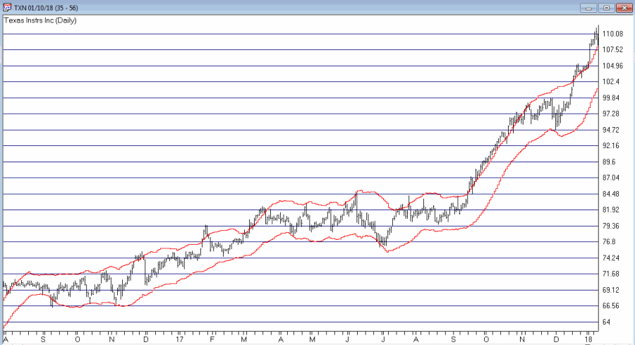
The ongoing debate in trading is always – trend-following or countertrend? Which is the way to go? There are (conservatively) at least a bazillion and one ways to argue one way or the other. Figure 1 displays ticker TXN with upper and lower “Acceleration Bands” (code for TradingExpert Expert Design Studio EDS appears after disclaimer at end of article) drawn.
Want to start a debate? Ask this question: Is it better to buy when price hits the upper band or the lower band? Sometimes price hits the upper band and just keeps going. Sometimes it hits the upper band and the move peters out and reverses fairly quickly.
Going with the trend can lead to some big winning trades along the way, but typically involves a lot of whipsaws as well. Trading countertrend can lead to some great, quick profits – expect of course for when the initial trend never quite reverses and quick losses accrue instead.
What to do, what to do?
So the “idea” I mentioned at the outset generally goes like this:
*In an uptrend (which we will define in a moment)
*Wait for price to hit the Upper Band
*Then wait for a pullback
*Then wait for the uptrend to reassert itself
Got that? OK, me neither exactly. So let’s try to define things a little more clearly.
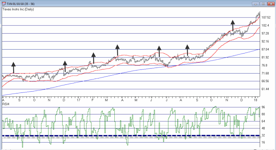
1. As long as the closing price remains above the 200-day moving average, we will call that an “uptrend”
2. Within an uptrend wait for the high of a trading day to reach or exceed the Upper Acceleration Band.
3. Following #2, wait for the 4-day RSI to drop to 32 or lower with the following caveats:
*If price touches the Lower Acceleration Band OR closes below the 200-day moving average
*Then the setup is invalidated
This is the “Setup”. For sake of example I will add an entry trigger as follows:
4. Following a valid #3 Alert Signal, buy when price exceeds the previous day’s high
I am going to purposely NOT add an exit trigger – just so that no one decides to “try it out” without at least giving it some thought on their own.
So Figure 2 shows the “Alerts” and “Entry Triggers” for the chart in Figure 1.
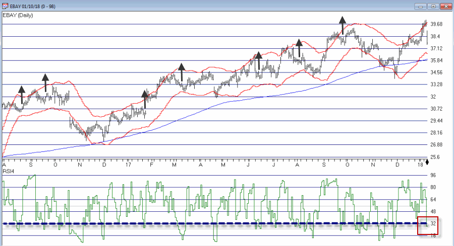
So Figure 3 shows the “Alerts” and “Entry Triggers” for ticker EBAY
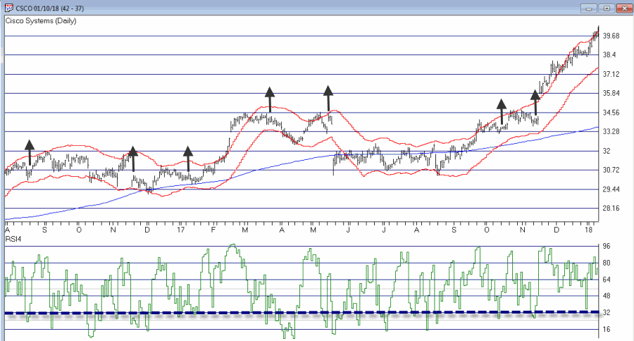
So Figure 4 shows the “Alerts” and “Entry Triggers” for ticker CSCO
So are these signals any good? Well, like a lot of trading methods, some look pretty good and others do not. As I also mentioned earlier, a lot depends on the method or methods you use to exit each trade.
Summary
The reality is that there is a chance that the “idea” contained herein is just no darn good.
But also remember that there are other “trend filters” (besides the 200-day moving average), there are other “bands” (besides Acceleration Bands”), there are other oversold indicators (besides 4-day RSI) and there are other entry and exit triggers.
As such, this piece is essentially for people who are willing to do a little digging on their own and, a) become comfortable (or not) with the idea, and b) develop some position sizing, stop-loss and profit-taking criteria.
Jay Kaeppel
Disclaimer: The data presented herein were obtained from various third-party sources. While I believe the data to be reliable, no representation is made as to, and no responsibility, warranty or liability is accepted for the accuracy or completeness of such information. The information, opinions and ideas expressed herein are for informational and educational purposes only and do not constitute and should not be construed as investment advice, an advertisement or offering of investment advisory services, or an offer to sell or a solicitation to buy any security.
Acceleration Bands Code for AIQ Expert Design Studio EDS
a is ([high]-[low]).
b is ([high]+[low])/2.
c is (a / b).
d is (c*2).
e is (1+d).
f is (1-d).
g is ([high]*e).
h is ([low]*f).
AccelUB is Simpleavg(g, 20).
AccelLB is Simpleavg(h, 20).