Feb 27, 2017 | educational newsletters, ETFs, trading strategies
The stock market is off to a flying start in 2017. We have a buy signal from the January Barometer, the 40-Week Cycle just turned bullish and most of the major U.S. indexes soaring to new all-time highs. See Figure 1.
Figure 1 – Major U.S. Average hitting new highs (charts courtesy WinWay TradingExpert)
With the turn of the month near, what lies ahead for March and April? Well, it’s the stock market, so of course no one really knows for sure. Still, if history is an accurate guide (and unfortunately it isn’t always – and I hate that part), the odds for a continuation of the advance in the months just ahead may be pretty good.
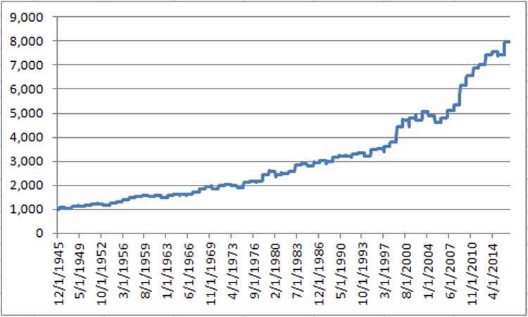
Figure 2 displays the growth of $1,000 invested in the Dow Jones Industrials Average ONLY during the months of March and April starting in 1946.
Figure 2 – Growth of $1,000 invested in the Dow Jones Industrials Average ONLY during the months of March and April (1946-2016)
For the record, the months of March and April combined:
*Showed a gain 53 times (75% of the time)
*Showed a loss 18 times (25% of the time)
*The average UP year showed a gain of +5.2%
*The average DOWN year showed a loss of (-3.3%)
*The largest Mar/Apr gain was +15.9% (1999)
*The largest Mar/Apr loss was (-6.0%) (1962)
So is the stock market train sure to “roll on” during the March/April timeframe? Not at all. But with “all systems Go” at the moment and with a historically favorable period approaching – and despite a lot of overly bullish sentiment beginning to bubble up – I feel compelled to stay on board at least until the next stop..
Disclaimer: The data presented herein were obtained from various third-party sources. While I believe the data to be reliable, no representation is made as to, and no responsibility, warranty or liability is accepted for the accuracy or completeness of such information. The information, opinions and ideas expressed herein are for informational and educational purposes only and do not constitute and should not be construed as investment advice, an advertisement or offering of investment advisory services, or an offer to sell or a solicitation to buy any security.
Feb 16, 2017 | EDS, EDS code, indicators, Stocks & Commodities Traders Tips
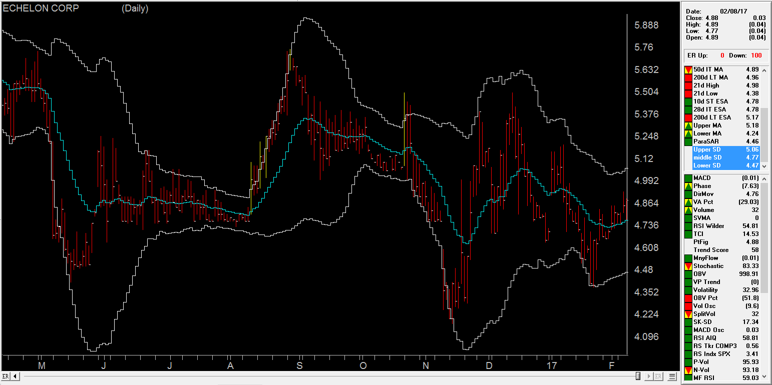
The AIQ code based on Vitali Apirine’s article in the 2017 issue of Stocks & Commodities magazine, “Exponential Standard Deviation Bands”
Editor note: “Author Vitali Apirine presented a method intended to help traders see volatility while a stock is trending. These bands, while similar to Bollinger Bands, are calculated using exponential moving averages rather than simple moving averages.
Like Bollinger Bands, they widen when volatility increases and narrow as volatility decreases. He suggests that the indicator can be used as a confirming indication along with other indicators such as the ADX.
Here’s a WinWay Chart with the Upper, Lower and Middle Exponential SD added as custom indicators.”
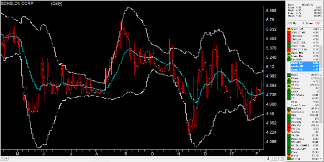
To compare the exponential bands to Bollinger Bands, I created a trend-following trading system that trades long only according to the following rules:
- Buy when there is an uptrend and the close crosses over the upper band. An uptrend is in place when the middle band is higher than it was one bar ago.
- Sell when the low is less than the lower band.
Figure 8 shows the summary test results for taking all signals from the Bollinger Band system run on NASDAQ 100 stocks over the period 12/9/2000 to 12/09/2016. Figure 9 shows the summary test results for taking all signals from the exponential band system on NASDAQ 100 stocks over the same period. The exponential band system improved the average profit per trade while reducing the total number of trades.
FIGURE 8: WinWay EDS. Here are summary test results for taking all signals from the Bollinger Band system run on NASDAQ 100 stocks over the period 12/9/2000 to 12/09/2016.

FIGURE 9: WinWay EDS. Here are summary test results for taking all signals from the exponential band system run on NASDAQ 100 stocks over the period 12/9/2000 to 12/09/2016.
!Exponential Standard Deviation Bands
!Author: Vitali Apirine, TASC February 2017
!Coded by: Richard Denning 12/11/2016
!INPUT:
xlen is 20.
numSD is 2.
!INDICATOR CODE:
ExpAvg is expavg([close],xlen).
Dev is [close] – ExpAvg.
DevSqr is Dev*Dev.
SumSqr is sum(DevSqr,xlen).
AvgSumSqr is SumSqr / xlen.
ExpSD is sqrt(AvgSumSqr).
!UPPER EXPONENTIAL SD BAND:
UpExpSD is ExpAvg + numSD*ExpSD. !PLOT ON CHART
!LOWER EXPONENTIAL SD BAND:
DnExpSD is ExpAvg – numSD*ExpSD. !PLOT ON CHART
!MIDDLE EXPONENTIAL SD BAND:
MidExpSD is ExpAvg.
!BOLLINGER BANDS FOR COMPARISON:
DnBB is [Lower BB]. !Lower Bollinger Band
UpBB is [Upper BB]. !Upper Bollinger Band
MidBB is simpleavg([close],xlen). !Middle Bollinger Band
!REPORT RULE TO DISPLAY VALUES:
ShowValures if 1.
!TRADING SYSTEM USING EXPPONENTIAL SD BANDS:
UpTrend if MidExpSD > valresult(MidExpSD,1).
BreakUp if [close] > UpExpSD.
BuyExpSD if UpTrend and BreakUp and valrule(Breakup=0,1).
ExitExpSD if [Low] < DnExpSD. ! or UpTrend=0. !TRADING SYSTEM USING BOLLINGER BANDS: UpTrendBB if MidBB > valresult(MidBB,1).
BreakUpBB if [close] > UpBB.
BuyBB if UpTrendBB and BreakUpBB and valrule(BreakupBB=0,1).
ExitBB if [Low] < DnBB. ! or UpTrend=0.
Feb 2, 2017 | educational newsletters, jay kaeppel, seasonal, Stock trading
I’ve been seeing a number of panicked missives lately regarding the retailing sector. They typically go something like this:
“Despite new highs for most of the major market indexes, the retailing sector has been struggling – and in some cases hit hard – therefore it is clearly (paraphrasing here) THE END OF THE WORLD AS WE KNOW IT, AHHHHHHHHHHHHH……………………..”
Or something along those lines. And the truth is that they may be right. But as it turns out, with the retailing sector it is typically more a question of “when” and not “what” (or even WTF
Recent Results
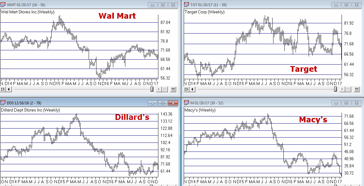
The concerns alluded to above are understandable given recent results in certain segments of the retailing sector. Figure 1 displays the stock price action for four major retailers. It isn’t pretty.
(click to enlarge)
So if major retailers are performing poorly one can certainly see why someone might extrapolate this to conclude that the economy is not firing on all cylinders and that the recent rally to new highs by the major averages is just a mirage. And again, that opinion may ultimately prove to be correct this time around.
But before swearing off of retailing stocks, consider the following.
Retailers – When not What
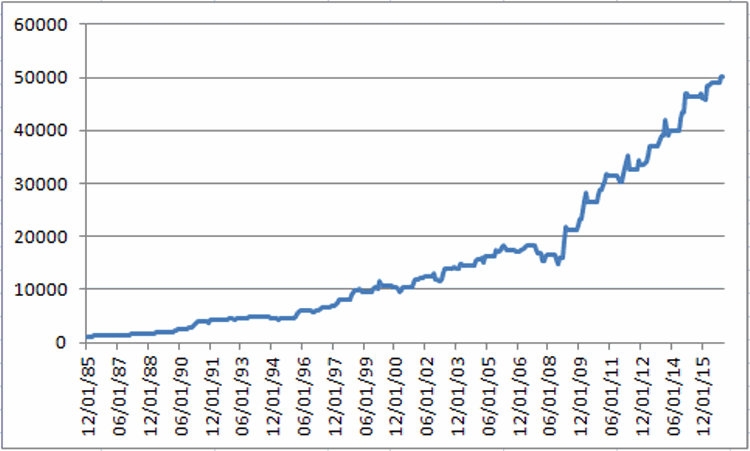
For our test we will use monthly total return data for the Fidelity Select Retailing sector fund (ticker FSRPX). Figure 2 displays the growth of $1,000 invested in FSRPX only during the months of:
*February, March, April, May, November, December
Figure 2 – Growth of $1,000 invested in ticker FSRPX only during the “favorable” months since 1986
For the record:
*An initial $1,000 grew to $50,274, or +4,927% (this test does not include any interest earned during the months out of FSRPX).
*# of years showing a net gain = 27
*# of years showing a net loss = 4
*Average UP year = +17.0%
*Average DOWN year = (-3.4%)
*Maximum UP Year = +50.0% (1990)
*Maximum DOWN Year = (-5.9%) (1994)
The Year-by-Year Results appear in Figure 3
| Year |
% +(-) |
| 1986 |
26.2 |
| 1987 |
15.8 |
| 1988 |
12.2 |
| 1989 |
16.9 |
| 1990 |
50.0 |
| 1991 |
45.5 |
| 1992 |
8.0 |
| 1993 |
4.6 |
| 1994 |
(5.9) |
| 1995 |
3.0 |
| 1996 |
26.1 |
| 1997 |
18.1 |
| 1998 |
45.7 |
| 1999 |
4.0 |
| 2000 |
1.8 |
| 2001 |
12.5 |
| 2002 |
(0.1) |
| 2003 |
18.5 |
| 2004 |
11.3 |
| 2005 |
10.3 |
| 2006 |
0.1 |
| 2007 |
(2.8) |
| 2008 |
(4.7) |
| 2009 |
44.9 |
| 2010 |
24.5 |
| 2011 |
4.6 |
| 2012 |
10.8 |
| 2013 |
16.6 |
| 2014 |
11.5 |
| 2015 |
6.1 |
| 2016 |
9.2 |
Figure 3 – Year-by-Year Results for “Favorable” Months since 1986
The Rest of the Year
If for some reason you had decided to skip the months above and hold FSRPX only during all of the other months of the year, your results appear in Figure 4.
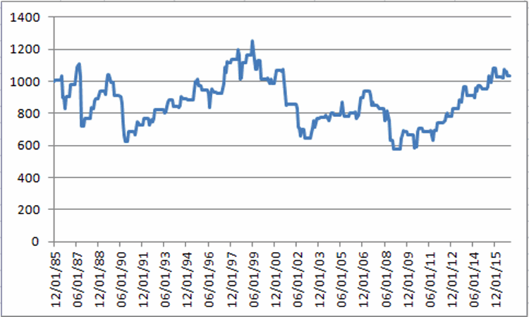
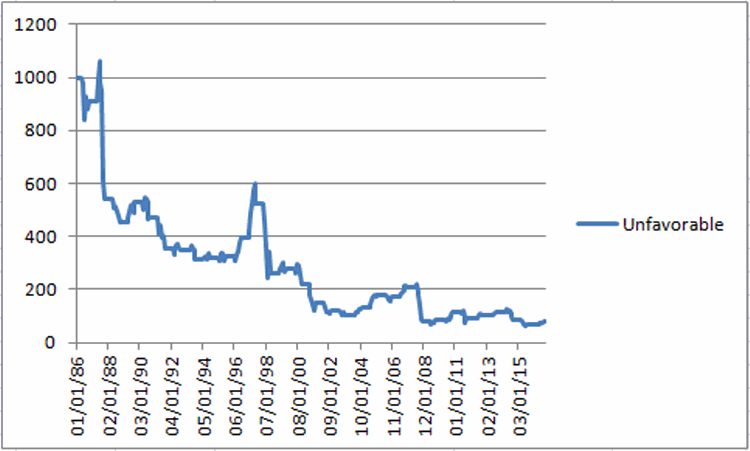
Figure 4 – Growth of $1,000 invested in ticker FSRPX only during the “unfavorable” months since 1986
For the record:
*An initial $1,000 grew to $1,037, or +3.7% (this test does not include any interest earned during the months out of FSRPX).
Summary
Is the retailing sector guaranteed to generate a gain during our “favorable” months in 2017? Not at all. Still, given that retailing is presently beaten down a bit and the fact that the worst full year loss during the favorable months was -5.9%, it may be time to think about taking a look (although – as always, and for the record – I am not “recommending” retailing stocks, only pointing out the historical trends).
Still, as the old saying goes, the results below are what we “quantitative types” refer to as “statistically significant”.
*Favorable months since 1986 = +4,927%
*Unfavorable months since 1986 = +3.7%
Jan 20, 2017 | educational newsletters, ETFs, jay kaeppel, seasonal, Seasonality
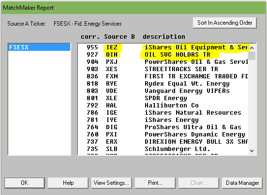
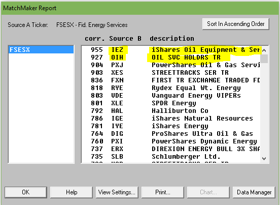
If you follow jay Kaeppel’s posts in this blog, you’ll know that he’s the master of research on all things seasonal. This past week he posted a seasonal article on energy using FSESX – Fidelity Select Energy Services. Previously he had noted the bullish tendency for ticker FSESX during the months of February, March and April. In his follow up piece, he added one more “favorable” month and then also looked at a 6-month “unfavorable” period. The article is included at the end of this post so you can see the results.As Mutual funds are not for everyone, we went in search of alternative tickers that could closely match FSESX in performance characteristics. Using WinWay Matchmaker we compared the price action of FSESX against our universe of stocks and ETFs looking for a match.
Matchmaker uses Spearman Rank Correlation analysis to identify a close match to FSESX. The closer the result to 1000, the higher the correlation. Anything over 950 is a very close match. Here’s the results.
Figure 1. MatchMaker correlation for last 4 years – FSESX vs stocks and ETFs
The ETF IEZ – iShares Oil and Equipment & Services showed a very high correlation over the 4 years we tested. OIH – Oil Service Holders, another ETF, also showed high correlation.
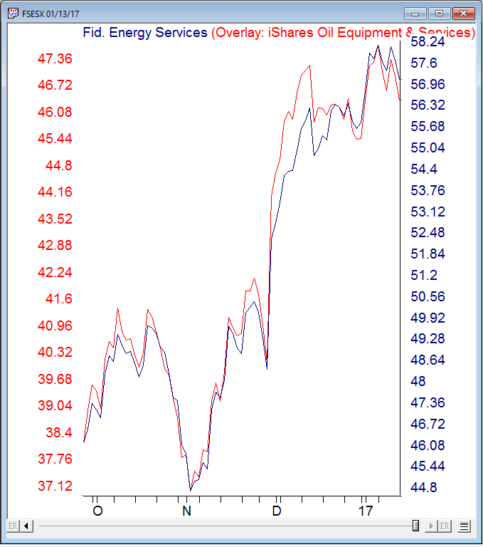
Here’s a WinWay overlay chart of recent daily price action comparing FSESX vs IEZ.
Figure 2. Recent daily price action comparing FSESX vs IEZ.
IEZ appears to be a good surrogate for FSESX at least over the last 4 years.
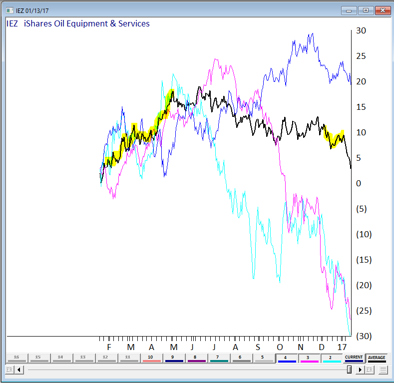
We also wanted a visual of the seasonal pattern in action. Fortunately we have a tool still in development at WinWay that’s just right for this. Basically it provides a price comparison of ‘x’ numbers of years of the same ticker overlaid on each other.
Here’s 3 of the last 4 years on IEZ, the average of the years displayed is in black. We highlighted the Feb, Mar, Apr and Dec in yellow. We could have included more years but for illustration purposes it was easier to show the 3 years (the chart gets busy with too many lines on it!)
Figure 3 – IEZ seasonal chart (beta) for 3 years with average.
The Feb, Mar, Apr period has a definite bullish tendency, the Dec period does Ok too. You’ll notice the tendency for IEZ to fall sharply in January. Conclusion? IEZ is a reasonable surrogate for FSESX if you’re contemplating this seasonal move.
_________________________________________________________
The article this follow up is based upon is by Jay Kaeppel and is included below. Jay is
Chief Market Analyst at JayOnTheMarkets.com and TradingExpert Pro client. http://jayonthemarkets.com/If you are looking for a market sector with some serious seasonal trends, look no further than the energy sector. Previously I had noted the bullish tendency for ticker FSESX during the months of February, March and April. In this piece, we will add one more “favorable” month and then also look at a 6-month “unfavorable” period.
For the record, the information that follows is not being recommended as a standalone strategy. It is presented simply to make you aware of certain long-term trends that have been very persistently bullish (or bearish as the case may be) in the energy sector.
4 Favorable Months
*The four “favorable” months for our test are February, March, April and December
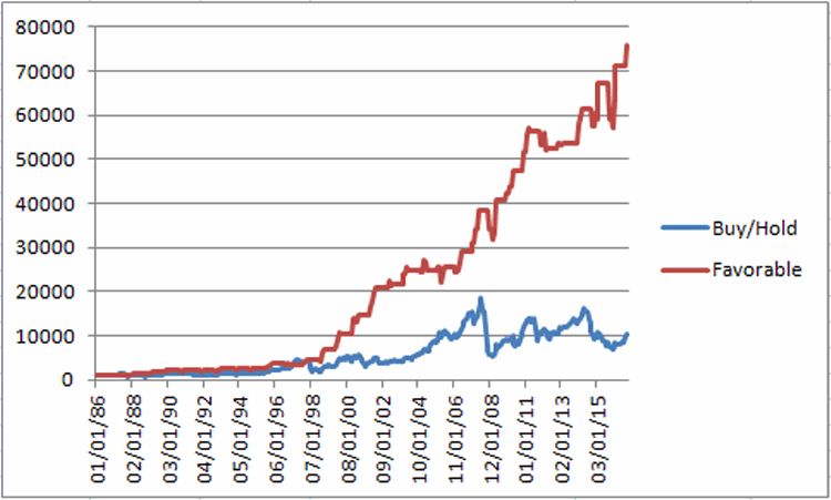
Figure 1 displays the growth of $1,000 invested in ticker FSESX only during these four months every year since 1986 versus simply buying-and-holding ticker FSESX.
Figure 1 – Growth of $1,000 invested in FSESX only during Feb, Mar, Apr, Dec every year since 1986
Starting in 1986, an initial $1,000 investment grew to $76,019 (or +7,500%) versus $10,237 (or 923%) using a buy-and-hold strategy.
6 Unfavorable Months
The six “Unfavorable” months are June, July, August, September, October and November.
First the “positive” news:
*This 6-month period has managed to show a gain 14 times in 31 years – so by no means should you consider this period a “sure thing” loser
*During 4 separate years – 1997, 2003, 2004 and 2010 – the “unfavorable” months registered a cumulative gain in excess of +30%.
Doesn’t sound all that “unfavorable” so far does it? But here’s the catch: Despite the occasional 30%or more gain, it is fair to refer to this 6-month period as “unfavorable” as the cumulative long-term results of buying and holding FSESX during these months has been nothing short of devastating.
Figure 2 displays the growth of $1,000 invested in ticker FSESX only between the end of May and the end of November every year starting in 1986.
Figure 2 – Growth of $1,000 invested in FSESX only during June through November every year since 1986
Starting in 1986, an initial $1,000 investment declined to just $82, or a cumulative loss of -91.8%
Figure 3 displays some comparative data between favorable and unfavorable periods as well as using a Buy-and-Hold strategy.
| Measure |
Buy-and-Hold |
4 Favorable Months |
6 Unfavorable Months |
| Average Annual % +(-) |
12.8 |
16.5 |
(-4.2) |
| Median Annual % +(-) |
8.7 |
15.5 |
(-1.8) |
| Standard Deviation |
33.4 |
20.1 |
24.6 |
| # Years UP |
18 |
26 |
14 |
| # Years DOWN |
13 |
5 |
17 |
| Worst Year |
(-55.4) 2008 |
(-7.6) 1994 |
(-62.8) 2008 |
| $1,000 becomes |
$10,237 |
$76,019 |
$82 |
| Cumulative % +(-) |
+923% |
+7,500% |
(-92%) |
Figure 3 – Comparative Results
Figure 4 displays the year-to-year results for a Buy-and-Hold approach versus holding only during the 4 “favorable” months or the “Unfavorable” 6 months.
| Year |
All 12 months % +(-) |
4 Favorable % +(-) |
6 Unfavorable % +(-) |
| 1986 |
(8.9) |
(5.2) |
(9.2) |
| 1987 |
(20.7) |
22.9 |
(40.1) |
| 1988 |
(4.2) |
22.8 |
(16.3) |
| 1989 |
50.3 |
27.1 |
16.2 |
| 1990 |
8.7 |
4.9 |
(11.2) |
| 1991 |
(19.9) |
4.1 |
(25.0) |
| 1992 |
4.9 |
(1.6) |
(1.3) |
| 1993 |
16.4 |
24.5 |
(10.7) |
| 1994 |
(0.5) |
(7.6) |
3.1 |
| 1995 |
40.0 |
33.7 |
2.0 |
| 1996 |
45.9 |
22.5 |
20.8 |
| 1997 |
43.9 |
(4.9) |
32.9 |
| 1998 |
(41.4) |
26.5 |
(50.5) |
| 1999 |
80.9 |
74.1 |
7.5 |
| 2000 |
51.7 |
77.6 |
(21.1) |
| 2001 |
(22.4) |
20.8 |
(32.4) |
| 2002 |
2.2 |
26.2 |
(18.0) |
| 2003 |
13.1 |
15.5 |
(16.0) |
| 2004 |
26.2 |
1.2 |
30.2 |
| 2005 |
47.4 |
4.8 |
34.0 |
| 2006 |
(9.1) |
(4.1) |
(1.8) |
| 2007 |
58.3 |
25.6 |
16.7 |
| 2008 |
(55.4) |
10.5 |
(62.8) |
| 2009 |
60.4 |
24.5 |
9.6 |
| 2010 |
31.7 |
21.6 |
33.7 |
| 2011 |
(18.5) |
3.1 |
(16.8) |
| 2012 |
(3.9) |
0.7 |
9.6 |
| 2013 |
14.1 |
0.3 |
11.5 |
| 2014 |
(19.5) |
7.2 |
(26.7) |
| 2015 |
(19.7) |
2.9 |
(17.9) |
| 2016 |
44.2 |
28.4 |
20.1 |
Figure 4 – Yearly % +(-) for Buy-and-Hold versus 4 Favorable Months versus 6 Unfavorable Months
Summary
There is no guarantee from year-to-year results of buying and holding ticker FSESX during the “Favorable 4” months will show a gain and/or outperform the “Unfavorable 6” months. And there is by no means any guarantee that the “Unfavorable 6” will show a loss during any given year (note that 2016 saw the Unfavorable 6 generate a cumulative gain of +20.1%!). So just remember that we are talking about some very long-term trends here.
Still, most investors can discern the difference between:
*Favorable 4 months gain = +7,500%
*Unfavorable 6 months loss = (-92%)
This type of difference is what we “quantitative types” refer to as “statistically significant.”
Jan 4, 2017 | ETFs, jay kaeppel, stock market, trading strategies
Before moving on to 2017 I want to revisit a couple of “old” ideas I wrote about recently.
One 9/23/16 I wrote
this article detailing a very aggressive bond trading strategy. The model detailed essentially combined two other models that I have used for a number of years – one a “timing” model, the other a “seasonal” model. If either model is bullish then ticker TMF (a triple leveraged long-term treasury bond fund) is held.
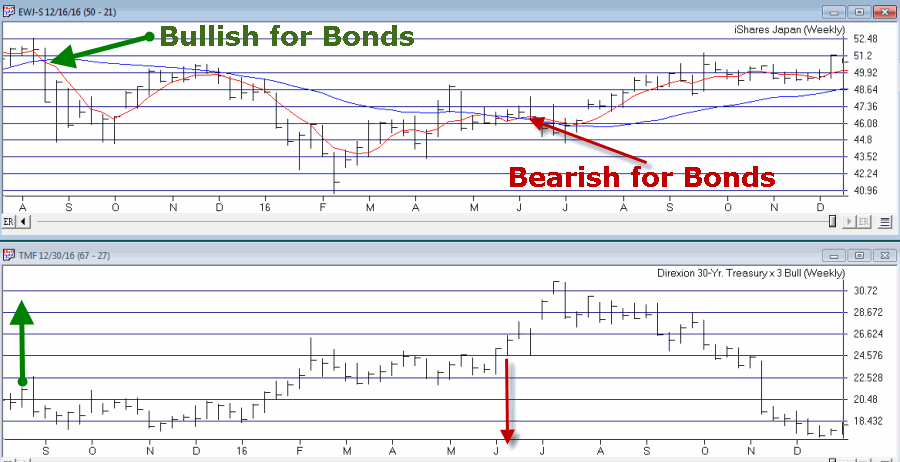
As shown in Figure 1, the first model turns:
*Bullish for Bonds when the 5-week moving average for ticker EWJ drops below the 30-week moving average for ticker EWJ
*Bearish for Bonds when the 5-week moving average for ticker EWJ rises above the 30-week moving average for ticker EWJ
Figure 1 – Bond Bull and Bear signals using ticker EWJ (Courtesy
TradingExpert)
The second model simply holds bonds during the last 5 trading days of each month
The rules for Jay’s Very Risky Bond Model (JVRBM) are as follows:
Bullish for TMF if:
*Ticker EWJ 5-week MA < Ticker EWJ 30-week MA, OR
*Today is one of the last 5 trading days of the month
Bearish for TMF if:
*EWJ 5-week MA > EWJ 30-week MA AND today IS NOT one of the last 5 trading days of the month
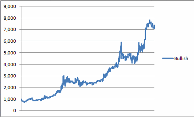
Figure 2 displays the growth of $1,000 invested in TMF if the bullish conditions above apply since 4/16/2009 (when TMF started trading).
Figure 2 – Growth of $1,000 invested in ticker TMF when JVRBM is Bullish (4/16/2009-12/30/2016)
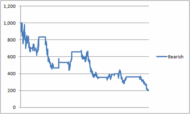
Figure 3 displays the growth of $1,000 invested in TMF is the bearish conditions above apply since 4/16/2009 (when TMF started trading).
Figure 3 – Growth of $1,000 invested in ticker TMF when JVRBM is Bearish (4/16/2009-12/30/2016)
For the record:
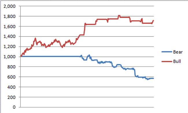
*During the Bullish periods in 2016 ticker TMF gained +72%
*During the Bearish periods in 2016 ticker TMF lost -43%
Figure 4 displays the growth of $1,000 invested in ticker TMF during the Bullish versus Bearish periods in 2016.
Figure 4 – Growth of $1,000 invested in TMF during Bullish versus Bearish periods (12/31/2015-12/31/2016)
All in all not a bad year (Just don’t forget high degree of risk).
Summary
Make no mistake, this is a trading method that entails a great deal of risk. One can reasonably ask if a long position in a triple leveraged fund of any kind is really a good idea.
But, hey, the phrase “high risk, high reward” exists for a reason.

 English