Feb 24, 2018 | jay kaeppel, market timing, stock market
In the article linked below, investor and Forbes columnist Kenneth Fisher writes about what to look for at a market top (How to Tell a Bull Market from a Bear Market Blip). One piece of advice that I have heard him offer before is to wait at least 3 months after a top in price to worry about whether or not we are in a bear market. That is good advice and provided the impetus for a simple trend-following model I follow based on that “wait 3 months” idea.
First, a few key points:
*Trend-following is NOT about picking tops and bottoms or timing the market with “uncanny accuracy”. So don’t expect any trend-following system to do so.
*The primary edge in any trend-following method is simply missing as much of the major soul – and capital – crushing bear markets as possible, with the understanding that you will miss some of the upside during bull markets.
*Starting in November 1970 this system has beaten a buy and hold strategy
*This system requires no math. There are no moving averages, etc. Anyone can look at a monthly S&P 500 bar chart and generate the signals. And it literally takes less than 1 minute per month to update.
*Every trend-following method known to man experiences whipsaws, i.e., a sell signal followed by a buy signal at a higher price. This system is no exception.
*Due to said whipsaws this system has significantly underperformed the S&P 500 buy-and-hold since the low in early 2009.
For what it’s worth, my educated guess is that following the next prolonged bear market, that will change. But there are no guarantees.
OK, all the caveats in place, here goes.
Jay’s Monthly SPX Bar Chart Trend-Following System
*This system uses a monthly price bar chart for the S&P 500 (SPX) to generate trading signals.
*For the purposes of this method, no action is taken until the end of the month, even if a trend change is signaled earlier in the month.
*A buy signal occurs when during the current month, SPX exceeds its highest price for the previous 6 calendar months.
A sell signal occurs as follows:
a) SPX registers a month where the high for the month if above the high of the previous month. We will call this the “swing high”.
b) SPX then goes 3 consecutive monthly bars without exceeding the “swing high.” When this happens, note the lowest low price registered during those 3 months. We will call this price the “sell trigger price.”
c) An actual sell trigger occurs at the end of a month when SPX register a low that is below the “sell trigger price”, HOWEVER,
d) If SPX makes a new monthly high above the previous “swing high” BEFORE it registers a low below the “sell trigger price” the sell signal alert is aborted
Sounds complicated right? It’s not. Let’s illustrate on some charts.
In the charts that follow:
*An Up green arrow marks a buy signal
*A Down red arrow marks a sell signal
*A horizontal red line marks a “sell trigger price”.
Sometimes a sell trigger price is hit and is marked by a down red arrow as a sell signal. Other times a sell trigger price is aborted by SPX making a new high and negating the potential sell signal.
To demonstrate results we will use monthly close price data for SPX. If the system is bullish then the system will hold SPX for that month. If the system is bearish we will assume interest is earned at an annual rate of 1% per year.
Figure 6 displays the results of the System versus Buy and Hold starting with $1,000 starting November 1970 through 1994 (roughly 24 years).
Figure 6 – Growth of $1,000 invested using System versus Buy-and-Hold; Nov-1970 through Dec-1994
Figure 7 displays the results of the System versus Buy and Hold starting with $1,000 starting at the end of 1994 through the most recent close.
Figure 7 – Growth of $1,000 invested using System versus Buy-and-Hold; Dec-1994 through Feb-2018
Figure 8 displays the growth of $1,000 generated by holding the S&P 500 Index ONLY when the trend-following system is bearish. In Figure 8 you will see exactly what I mentioned at the outset – that the key is simply to miss some of the more severe effects of bear markets along the way.
Figure 8 – Growth of $1,000 invested ONLY when trend-following model is Bearish; 1970-2018
Finally, Figure 9 displays trade-by-trade results (using month-end price data).
Figure 9 – Trade-by-trade results; Month end price data
So is this “The World Beater, Best Thing Since Sliced Bread” system? Not at all. If you had started using this system in real time in March of 2009 chances are by now you would have abandoned it and moved on to something else, as the whip saw signals in 2011-2012 and 2016 has the System performing worse than buy and hold over a 9 year period.
But here is the thing to remember. Chances are prolonged bear markets have not been eradicated, never to occur again. 100+ years of market history demonstrates that bear markets of 12 to 36 months in duration are simply “part of the game”. And it is riding these bear markets to the depths that try investors souls – and wipe out a lot of their net worth in the process.
Chances are when the next 12 to 36 month bear market rolls around – and it will – a trend-following method similar to the one detailed here may help you to “save your sorry assets” (so to speak).
Disclaimer: The data presented herein were obtained from various third-party sources. While I believe the data to be reliable, no representation is made as to, and no responsibility, warranty or liability is accepted for the accuracy or completeness of such information. The information, opinions and ideas expressed herein are for informational and educational purposes only and do not constitute and should not be construed as investment advice, an advertisement or offering of investment advisory services, or an offer to sell or a solicitation to buy any security.
Feb 18, 2018 | educational newsletters, ETFs, indexes, jay kaeppel, market timing, stock market
In this article titled “World, Meet Resistance” – dated 12/21/2017 – I noted the fact that many single country ETFs and regional indexes were closing in on a serious level of potential resistance. I also laid out three potential scenarios. So what happened? A fourth scenario not among the three I wrote about (Which really pisses me off. But never mind about that right now).
As we will see in a moment what happened was:
*(Pretty much) Everything broke out above significant resistance
*Everything then reversed back below significant resistance.
World Markets in Motion
Figure 1 displays the index I follow which includes 33 single-country ETFs. As you can see, in January it broke out sharply above multi-year resistance. Just when it looked like the index was going to challenge the all-time high the markets reversed and then plunged back below the recently pierced resistance level.
(click to enlarge)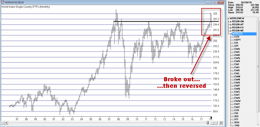
Figure 1 – Jay’s World Index broke out in January, fell back below resistance in February (Courtesy TradingExpert)
The same scenario holds true for the four regional indexes I follow – The Americas, Europe, Asia/Pacific and the Middle East – as seen in Figure 2.
(click to enlarge)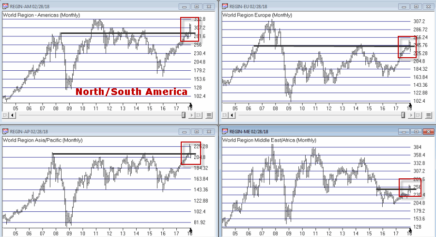
Figure 2 – Jay’s Regional Index all broke above resistance, then failed (Courtesy TradingExpert)
So where to from here? Well I could lay out a list of potential scenarios. Of course if history is a guide what will follow will be a scenario I did not include (Which really pisses me off. But never mind about that right now).
So I will simply make a subjective observation based on many years of observation. The world markets may turn the tide again and propel themselves back to the upside. But historically, when a stock, commodity or index tries to pierce a significant resistance level and then fails to follow through, it typically takes some time to rebuild a base before another retest of that resistance level unfolds.
Here’s hoping I’m wrong
Jay Kaeppel
Disclaimer: The data presented herein were obtained from various third-party sources. While I believe the data to be reliable, no representation is made as to, and no responsibility, warranty or liability is accepted for the accuracy or completeness of such information. The information, opinions and ideas expressed herein are for informational and educational purposes only and do not constitute and should not be construed as investment advice, an advertisement or offering of investment advisory services, or an offer to sell or a solicitation to buy any security.
Jan 23, 2018 | bonds, educational newsletters, jay kaeppel
There is a lot of hand-wringing going on these days regarding the bond market. And rightly so given that interest rates have been (were?) in a downtrend for 35+ years. Given that, given the long-term cyclical nature of interest rates and given that rates are at a generational low level, “concern” is understandable.
However, needless hand-wringing over events that have yet to occur is not.
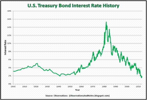
Figure 1 – Long-term treasury yields through the years (Courtesy: ObservationsanNotes.blogspot.com)
(The chart in Figure 1 is updated only through about 2012. Nevertheless, it effectively highlight the long-term cyclical nature of interest rates.)
The problem is the “well, interest rates are destined to rise therefore I should immediately [fill in your defensive action here].”
Many analysts and investors are following and attempting to interpret every tick in bond yields. In fact, some very well known bond “people” have proclaimed a “bond bear market”. And they may be right. But still…
What I Follow in the Bond Market
What follows are a few random thoughts on some of the things I look at when tracking the bond market.
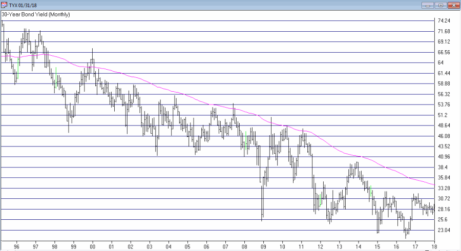
#1. 30-Year Yield versus 120-month Exponential Moving Average
Figure 2 displays ticker TYX, an index which tracks the yields on 30-year bonds (for some reason it multiplies by 10 – so a yield of 3% appears on the chart as 30.00).
Figure 2 – 30-year treasury yields versus 120-month exponential moving average (Courtesy
TradingExpert)
Using the data from Figure 1 I have found that a 120-month (i.e., 10-year) average does a pretty good job of riding the major trends in interest rates. As you can clearly see in Figure 2, TYX is still noticeably below its 120-month EMA. This could obviously change quickly but for the moment by this objective measure the long-term trend in interest rates right at this very moment is still “down.”
Please note that I am not saying that interest rates will not rise and move above this MA. I am saying two things:
1. Until the crossover occurs try not to focus too much attention on dire predictions.
2. Once the crossover does occur the bond market environment that most of us have known throughout all or most of our investment lives will change dramatically (more on this topic when the time is right).
#2. The Yield Curve(s)
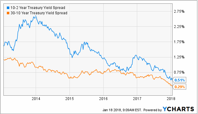
Figure 3 displays the yield curves for 30-year yields minus 10-year yields and 10-year yields minus 2-year yields. The narrowing trend is obvious. This is causing great consternation because historically when the yield curve “inverts” (i.e., when shorter-term rates are higher than longer-term rates) it is a very bad sign for the economy and the financial markets.
Figure 3 – 10-yr yield minus 2-year yield (blue) and 30-year yield minus 10-year yield (orange); (Courtesy: YCharts)
The problem here is that there is still an important difference between “narrowing” and actual “inverting”. Many people seems to look at Figure 3 and assume that an inverted yield curve (i.e., if and when these lines go into negative territory) is “inevitable” and that things are therefore doomed to get worse for the economy and the markets.
Repeating now: There is still an important difference between a “narrowing” yield curve and an actual “inverted” yield curve. Until the yield curve actually does invert try not to focus too much attention on dire predictions.
#3. The Current Trend in Bonds
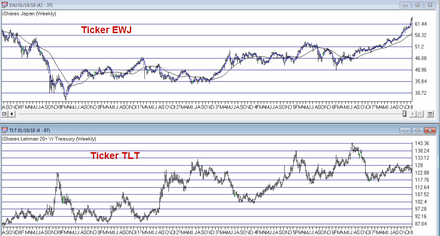
One trend following indicator that I follow (and have written about in the past) is the inverse relationship between long-term t-bonds and Japanese stocks. Figure 4 display ticker EWJ (an ETF that tracks an index of Japanese stocks) versus ticker TLT (an ETF that tracks the long-term treasury bond).
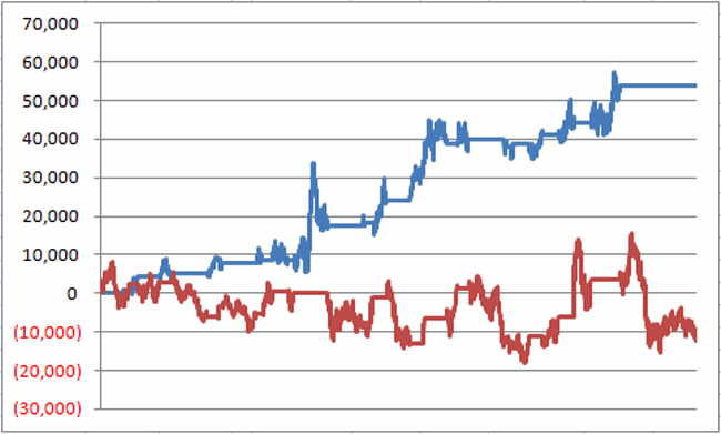
Figure 5 displays two equity curves. The blue line represents the $ gain achieved by holding long 1 treasury bond futures contract ONLY when the EWJ 5-week moving average is below the EWJ 30-wek moving average and the red line represents the $ loss achieved by holding long 1 treasury bond futures contract ONLY when the EWJ 5-week moving average is above the EWJ 30-week moving average.
Figure 5 – Holding long t-bond futures when EWJ is in a downtrend (blue line) versus holding long t-bond futures when EWJ is in an uptrend (red line); December 2003-present
Notice anything different about the blue line versus the red line? With EWJ trending strongly higher, caution remains in order or the long-term treasury bond. If the trend in EWJ reverses things may look better for long-term bonds.
#4. Short and Intermediate Term Bonds remain a Viable Alternative
As I wrote about here an index of short and intermediate treasury and high grade corporate remains a viable long-term approach for income investors. Figure 6 displays the growth of $1,000 invested using the “Boring Bond Index” I wrote about in the aforementioned article.
This index has gained in 38 of the past 42 years.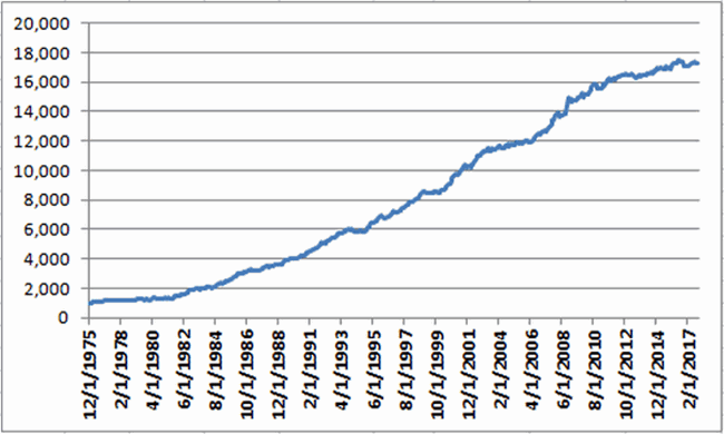
Figure 6 – Growth of $1,000 invested using “Boring Bond Index” Method; 12/31/1975-11/30/2017
Summary
There are good reasons to be wary of interest rates and bonds. At the same time overreacting to dire headlines also remains a very poor approach to investing.
So in sum:
*The very long-term trend in interest rate is still technically “down”
*The yield curve is narrowing but still has a ways to go before it inverts
*The current trend in long-term bonds is bearish
*Short and intermediate term bonds experience much less volatility than long-term bonds (and reinvest more frequently, which may come in handy if rates do begin to rise in earnest).
*If and when TYX pierces its long-term average and/or when the yield curve inverts, the time will arrive for investors to make some wholesale changes in how they approach their bond market investments.
*If and when EWJ starts to fall, things may improve for the current plight of the long-term treasury.
*And through it all, a boring approach to bonds may still prove very useful.
Jay Kaeppel
Disclaimer: The data presented herein were obtained from various third-party sources. While I believe the data to be reliable, no representation is made as to, and no responsibility, warranty or liability is accepted for the accuracy or completeness of such information. The information, opinions and ideas expressed herein are for informational and educational purposes only and do not constitute and should not be construed as investment advice, an advertisement or offering of investment advisory services, or an offer to sell or a solicitation to buy any security.
Jan 20, 2018 | EDS, EDS code, educational newsletters, jay kaeppel
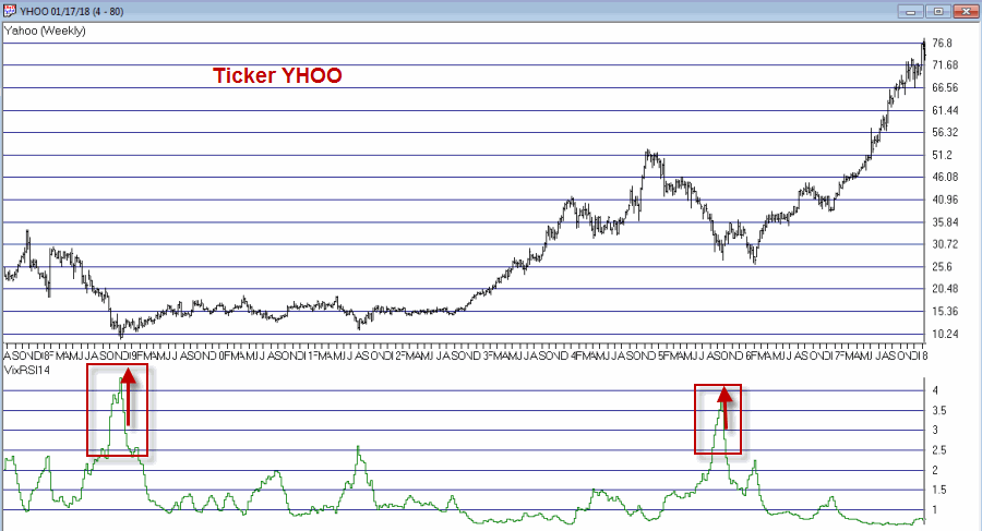
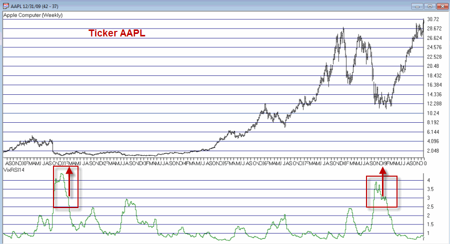
In this article I detailed an indicator I refer to as VixRSI14 using monthly charts. Today let’s apply the same method to weekly bar charts. Before we do that a quick look at how this indicator functions.
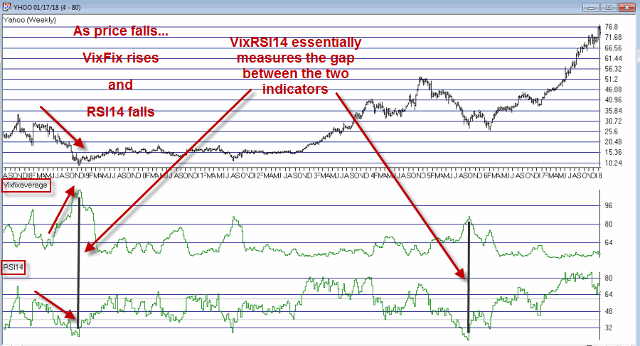
VixRSI combines two indicators – Larry William’s VixFix and Welles Wilder’s Relative Strength Index (RSI). In Figure 1 you see a weekly bar chart for YHOO. Notice that as price declines the VixFix indicator rises and RSI falls. VixRSI14 essentially measures the difference between the two and looks for extremes as a sign of a potential reversal. See Figure 5 for YHOO with VixRSI14.
Figure 1 – YHOO with Williams VixFix (with 3-day exponential smoothing) and Wilder’s 14-period RSI (Courtesy
TradingExpert)
The Weekly Version of VixRSI14
We will use the same method I described in the previous article, i.e.:
*We will calculate the VixRSI14 indicator (see code at end of article) on a weekly basis
*A “buy alert” occurs when VixRSI14 drops below 3.00 after first rising to 3.50 or higher
Once again, please note that:
*There is nothing magic about 3.50 or 3.00
*Not every “buy alert” is followed by an immediate rally (or even any rally at all for that matter)
*Any actually trading”results” will depend heavily on what you trade, how much of it you trade, when you actually get in, when you get out with a profit and/or when you get out with a loss.
*This VixRSI14 alert signal is simply serving notice that a given security may be overdone on the downside and may be ready soon to reverse to the upside. Nothing more, nothing less.
Summary
In 2018 I intend to try to share a few more trading “ideas” that maybe are not quite “finished products”. VixRSI14 fits neatly into the “Idea” category. Sometimes the alerts are early. Sometimes the alerts are late. Sometime the alerts don’t really pan out at all. Sometimes alerts are followed by one more sharp decline which is then followed by a major rally. So maybe some sort of trend reversal confirmation would be helpful. I don’t know.
Hey, that gives me an idea….
Code:
William’s VixFix is simply the 22-period high price minus today’s low price divided by the 22-day period price (I then multiply by 100 and then add 50). That may sound complicated but it is not.
The code for AIQ TradingExpert appears below.
########## VixFix Code #############
hivalclose is hival([close],22).
vixfix is (((hivalclose-[low])/hivalclose)*100)+50.
###############################
####### 14-period RSI Code ###########
Define periods14 27.
U14 is [close]-val([close],1).
D14 is val([close],1)-[close].
AvgU14 is ExpAvg(iff(U14>0,U14,0),periods14).
AvgD14 is ExpAvg(iff(D14>=0,D14,0),periods14).
RSI14 is 100-(100/(1+(AvgU14/AvgD14))).
###############################
VixRSI14 is then calculated by dividing the 3-period exponential average of VixFix by the 3-period exponential average of RSI14
####### VixRSI14 Code ###########
VixRSI14 is expavg(vixfix,3)/expavg(RSI14,3).
###############################
Jay Kaeppel
Disclaimer: The data presented herein were obtained from various third-party sources. While I believe the data to be reliable, no representation is made as to, and no responsibility, warranty or liability is accepted for the accuracy or completeness of such information. The information, opinions and ideas expressed herein are for informational and educational purposes only and do not constitute and should not be construed as investment advice, an advertisement or offering of investment advisory services, or an offer to sell or a solicitation to buy any security.

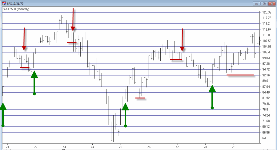
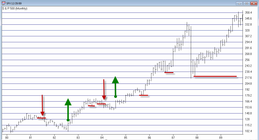
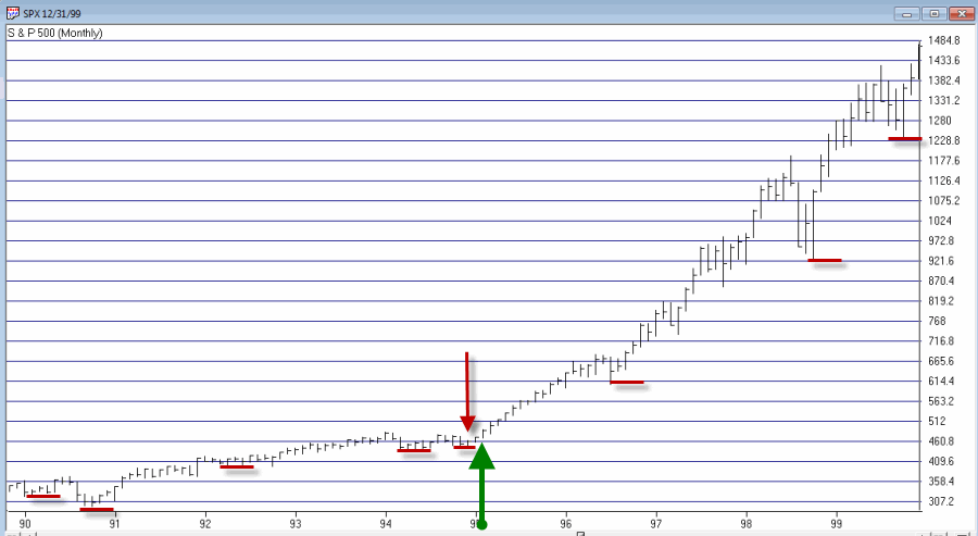
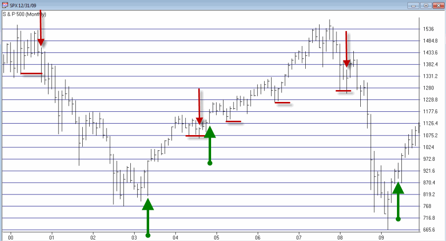
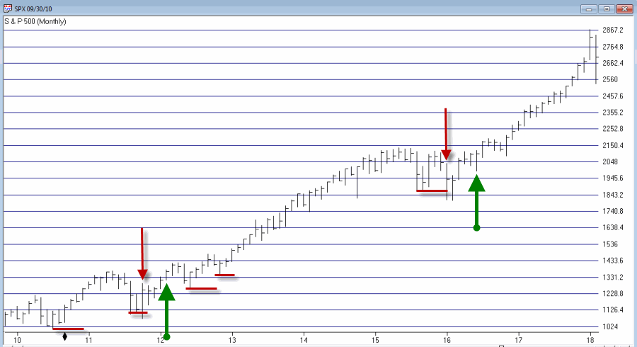
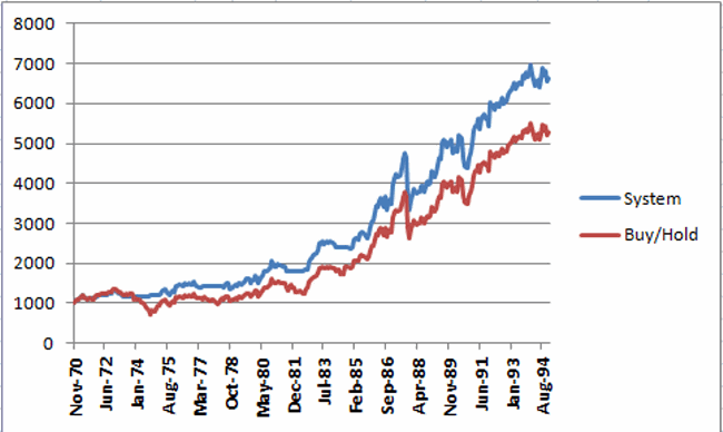
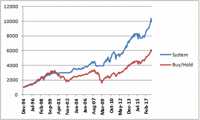
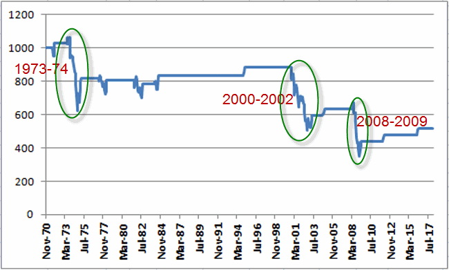
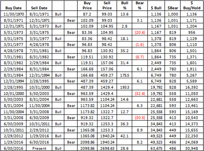
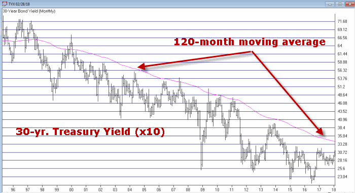 Figure 1 – 30-Yr. Treasury yields (Ticker TYX) with 120-month average (Courtesy TradingExpert)
 Figure 2 – Ticker TLT with recent Jay’s Metal Model signals (Courtesy TradingExpert)
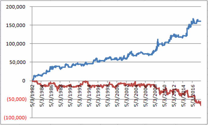 Figure 2 – T-bond futures $ gain/loss when Jay’s Metal Model is bullish (blue line) versus when model is bearish (red line)
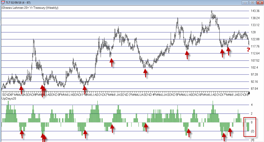 Figure 3 – Weekly TLT with UpDays20 Indicator (Courtesy TradingExpert)
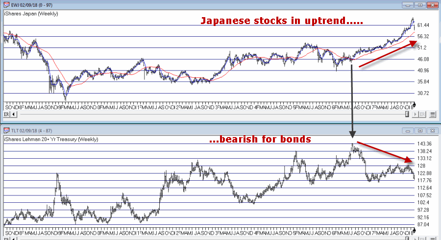 Figure 4 – Ticker TLT tends to trade inversely to ticker EWJ (Courtesy TradingExpert)