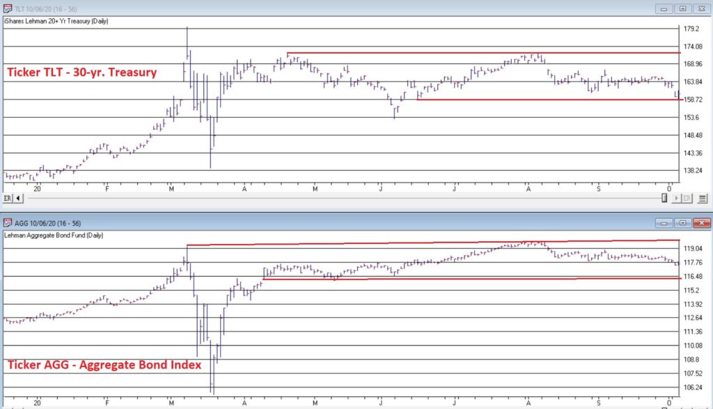
The bond market was very quiet in the 3rd quarter. Figure 1 displays ticker IEF (7-10 year treasuries ETF) in the to clip and ticker AGG (Aggregate Bond Index ETF) in the bottom clip.
Essentially the entire bond market has been flat since early June. The market seems to be assuming that “the Fed will take of everything” and keep interest rates low and stable for the foreseeable future so…..ZZZZZZZZ.
But this type of activity often breeds complacency. I am not making any predictions here but I do want to raise a question that investors might wish to ponder, i.e., “what would be more shocking that a spike in interest rates?” OK, yes, I realize it is 2020 and it is pretty much hard to be shocked by anything anymore. But still, on a relative basis how many investors are even thinking about the potential risk of higher interest rates at the moment?
Could it Happen?
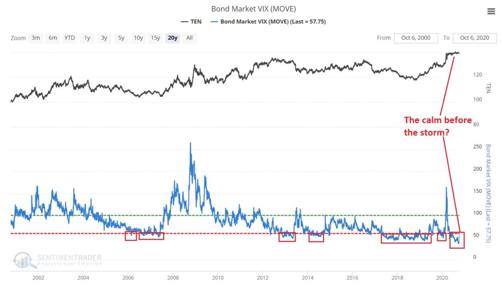
The Bond Market VIX (ticker MOVE) recently fell to its lowest level ever (before spiking sharply higher on 10/5/20). As you can see in Figure 2 this type of “quietness” often precedes a significant move in the bond market. For the record, low readings in MOVE can be followed by large up moves in price as easily as large down moves in price. So, a low MOVE reading is not “bearish” per se, but rather merely suggests that we are experiencing the “calm before the storm.”
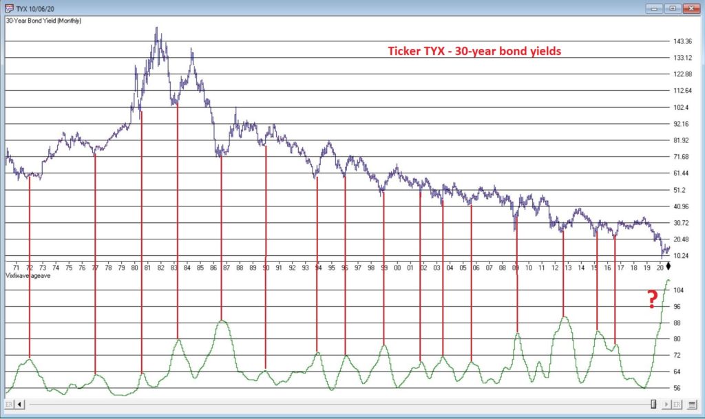
So why is my “Spidey sense” tingling? Figure 3 displays the yield on 30-year treasuries (ticker TYX) on the bottom and an indicator I refer to as VFAA on the bottom (the calculation appears at the end of this piece). VFAA is a derivative on a Larry William’s indicator he calls VixFix.
Figure 3 – 30-year treasury yields with VFAA suggesting a potential bottoming area (Courtesy TradingExpert)
As you can see in Figure 3, peaks in the VFAA indicator often occur near intermediate term lows in bond yields (reminder: bond prices move inversely to yield, so a bottom in interest rates indicates a top in bond prices). As you can also see on the far-right hand side, the stage clearly appears to be set for “the next go round.”
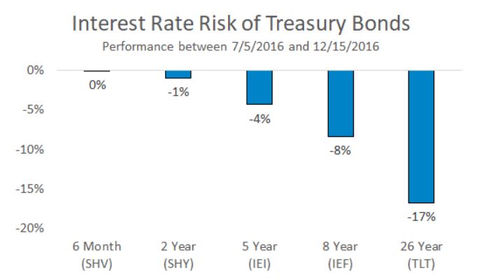
Why does this matter? If interest rates do rise in the months ahead bond prices – particularly long-term bond prices can get hit hard. To illustrate the potential risks, Figure 4 displays the action of treasury security ETFs of various maturity during a 5-month rise in rates back in 2016.
Figure 4 – Bond ETF action during rate rise in 2016
Summary
It is possible for long and short-term bonds to “de-couple”. In other words, the possibilities are:
*Short-term rates remain stable (as the Fed keeps pumping) while long-term rates rise (as inflation fears arise as a result of all the Fed pumping)
*Short-term rates remain stable while long-term rates plummet (if the economy appears to be weakening). This would result in gains for long-term bonds only
*None of the above
The bottom line: Bonds have fallen asleep – but DO NOT fall asleep on bonds.
VFAA Formula
Below is the code for VFAA
VixFix is an indicator developed many years ago by Larry Williams which essentially compares the latest low to the highest close in the latest 22 periods (then divides the difference by the highest close in the latest 22 periods). I then multiply this result by 100 and add 50 to get VixFix.
*Next is a 3-period exponential average of VixFix
*Then VFAA is arrived at by calculating a 7-period exponential average of the previous result (essentially, we are “double-smoothing” VixFix)
Are we having fun yet? See code below:
hivalclose is hival([close],22).
vixfix is (((hivalclose-[low])/hivalclose)*100)+50.
vixfixaverage is Expavg(vixfix,3).
vixfixaverageave is Expavg(vixfixaverage,7).
VFAA = vixfixaverageave
Jay Kaeppel
Disclaimer: The information, opinions and ideas expressed herein are for informational and educational purposes only and are based on research conducted and presented solely by the author. The information presented represents the views of the author only and does not constitute a complete description of any investment service. In addition, nothing presented herein should be construed as investment advice, as an advertisement or offering of investment advisory services, or as an offer to sell or a solicitation to buy any security. The data presented herein were obtained from various third-party sources. While the data is believed to be reliable, no representation is made as to, and no responsibility, warranty or liability is accepted for the accuracy or completeness of such information. International investments are subject to additional risks such as currency fluctuations, political instability and the potential for illiquid markets. Past performance is no guarantee of future results. There is risk of loss in all trading. Back tested performance does not represent actual performance and should not be interpreted as an indication of such performance. Also, back tested performance results have certain inherent limitations and differs from actual performance because it is achieved with the benefit of hindsight.
Truth be told I am not much of a “stock picker”. Oh, I can pick ‘em alright just like anyone else. They just to don’t go the right way as often as I’d like. I also believe that the way to maximize profitability is to follow a momentum type approach that identifies stocks that are performing well and buying them when they breakout to the upside (ala O’Neil, Minervini, Zanger, etc.) and then riding them as long as they continue to perform. Unfortunately, I’m just not very good at it.
Back when I started out, there was such a thing as a “long-term investor.” People would try to find good companies selling at a decent price and they would buy them and hold them for, well, the long-term. Crazy talk, right? As I have already stated, I am not claiming that that is a better approach. I am just pointing out that it was “a thing.”
An Indicator
There is an indicator (I will call it VFAA, which is short for vixfixaverageave, which – lets face it – is a terrible name) that I follow that was developed as an extension of Larry William’s VixFix Indicator. There is nothing magic about it. Its purpose is to identify when price has reached an exceptionally oversold level and “may” be due to rally. The code for this indicator appears later.
For the record, I DO NOT systematically use this indicator in the manner I am about to describe, nor am I recommending that you do. Still, it seems to have some potential value, so what follows is merely an illustration for informational purposes only.
The Rules
*We will look at a monthly bar chart for a given stock
*A “buy signal” occurs when VFAA reaches or exceeds 80 and then turns down for one month
*A “sell (or exit) signal” occurs when VFAA subsequently rises by at least 0.25 from a monthly closing low
Seeing as how this is based solely on monthly closes it obviously this is not going to be a “precision market timing tool.”
Some “Good Companies” with “Troubled Stocks”
So now let’s apply this VFAA indicator to some actual stocks. Again, I AM NOT recommending that anyone use this approach mechanically. The real goal is merely to try to identify situations where a stock has been washed out, reversed and MAY be ready to run for a while.
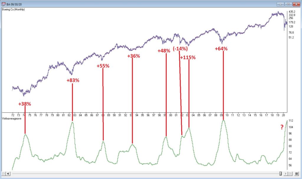
Ticker BA
Figure 1 displays a monthly chart for Boeing (BA) with VFAA at the bottom. The numbers on the chart represent the hypothetical + (-) % achieved by applying the rules above (although once again, to be clear I am not necessarily suggesting anyone use it exactly this way).
From March 2019 into March 2020 BA declined -80%. It has since bounced around and VFAA has soared to 110.88. VFAA has yet to rollover on a month-end basis, so nothing to do here except exhibit – what’s that word again – oh right, “patience.”
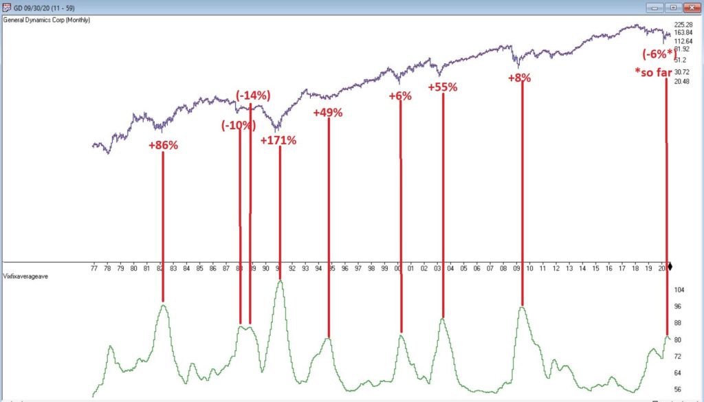
Ticker GD
Figure 2 displays a monthly chart for General Dynamics (GD) with VFAA at the bottom.
Are these “world-beating numbers”? Not really. But in terms of helping to identify potential opportunities, not so bad. VFAA gave a “buy signal” for GD at the end of July. So far, not so good as the stock is down about -6%.
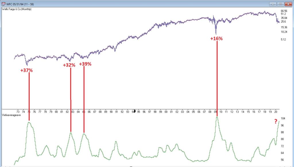
Ticker WFC
Figure 3 displays a monthly chart for Wells Fargo (WFC) with VFAA at the bottom.
There are not many “signals” but the ones that occurred have been useful. Between 2018 and 2020 WFC declined -65%. It has since bounced around and VFAA has soared to 102.44. VFAA has yet to rollover on a month-end basis. But at some point it will, and a potential opportunity may arise.
VFAA Formula
Below is the code for VFAA
VixFix is an indicator developed many years ago by Larry Williams which essentially compares the latest low to the highest close in the latest 22 periods (then divides the difference by the highest close in the latest 22 periods). I then multiply this result by 100 and add 50 to get VixFix.
*Next is a 3-period exponential average of VixFix
*Then VFAA is arrived at by calculating a 7-period exponential average of the previous result (essentially, we are “double-smoothing” VixFix)
Are we having fun yet? See code below:
hivalclose is hival([close],22).
vixfix is (((hivalclose-[low])/hivalclose)*100)+50.
vixfixaverage is Expavg(vixfix,3).
vixfixaverageave is Expavg(vixfixaverage,7).
VFAA = vixfixaverageave
EDITORS NOTE: The WinWay Expert Design Studio code for the indicator is available to download from here. Save this file to your /wintes32/EDS Strategies folder https://aiqeducation.com/VFAA.EDS
Summary
One thing to note is that VFAA “signals” on a monthly chart don’t come around very often. So, you can’t really sit around and wait for a signal to form on your “favorite company”. You have to look for opportunity wherever it might exist.
One last time let me reiterate that I am not suggesting using VFAA as a standalone systematic approach to investing. But when a signal does occur – especially when applied to quality companies that have recently been “whacked”, it can help to identify a potential opportunity.
Jay Kaeppel
Disclaimer: The information, opinions and ideas expressed herein are for informational and educational purposes only and are based on research conducted and presented solely by the author. The information presented represents the views of the author only and does not constitute a complete description of any investment service. In addition, nothing presented herein should be construed as investment advice, as an advertisement or offering of investment advisory services, or as an offer to sell or a solicitation to buy any security. The data presented herein were obtained from various third-party sources. While the data is believed to be reliable, no representation is made as to, and no responsibility, warranty or liability is accepted for the accuracy or completeness of such information. International investments are subject to additional risks such as currency fluctuations, political instability and the potential for illiquid markets. Past performance is no guarantee of future results. There is risk of loss in all trading. Back tested performance does not represent actual performance and should not be interpreted as an indication of such performance. Also, back tested performance results have certain inherent limitations and differs from actual performance because it is achieved with the benefit of hindsight.
They always say you should buy when there is “blood in the street.” They also say, “buy them when nobody wants them.” So, let’s consider today what could be the most unloved, bombed out, everybody hates it “thing” in the world – coal.
Ugh, just the mention of the word coal elicits a recoiling response. “Dirty energy!” “Climate change inducing filth!” “Ban coal!”. And so and so forth. And maybe they have a point. But “they” also say “facts are stubborn things” (OK, for the record, I think it’s a different “they” who says that but never mind about that right now).
So here is a stubborn fact: coal supplies about a quarter of the world’s primary energy and two-fifths of its electricity. As I write, two of the fastest growing economies (at least they were as of a few months ago) – China and India – are not only heavily reliant upon coal for energy, but are still building more and more coal-fired plants. Now I am making no comment on whether this is a good thing or a bad thing but the point is, it most definitely is a “thing.”
So however one feels about coal, the reality is that it is not going to go away anytime soon. Does this mean it will “soar in value” anytime soon – or even ever for that matter? Not necessarily. But as an unloved commodity it’s sure is hard to beat coal. And as “they” (they sure are a bunch of know it all’s they?) say, “opportunity is where you find it.”
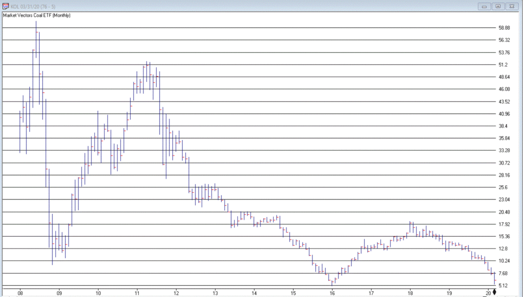
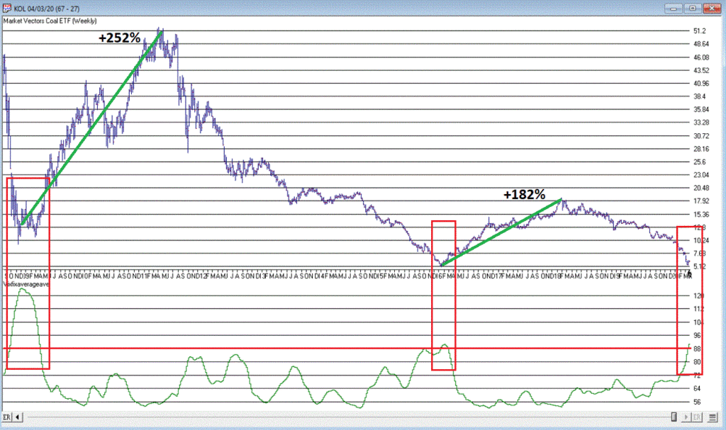
Ticker KOL is an ETF that invests in coal industry related companies. And what a dog it has been. Figure 1 displays a monthly chart of price action. Since peaking in June 2008 at $60.80 a share, it now stands at a measly $6.29 a share, a cool -89.6% below its peak. And like a lot of things it has been in a freefall of late.
So, is this a great time to buy KOL? That’s not for me to say. But for argument’s sake, Figure 2 displays a weekly chart of KOL with an indicator I call Vixfixaverageave (I know, I know), which is a version of an indicator developed a number of years ago by Larry Williams (Indicator code is at the end of the article).
Note that Vixfixaverageave is presently above 90 on the weekly chart. This level has been reached twice before – once in 2008 and once in 2016. Following these two previous instances, once the indicator actually peaked and ticked lower for one week, KOL enjoyed some pretty spectacular moves.
To wit:
*Following the 12/19/08 Vixfixaverageave peak and reversal KOL advanced +252% over the next 27.5 months
*Following the 2/19/16 Vixfixaverageave peak and reversal KOL advanced +182% over the next 23.5 months
When will Vixfixaverageave peak and reverse on the weekly KOL chart? There is no way to know. One must just wait for it to happen. And will it be time to buy KOL when this happens? Again, that is not for me to say. None of this is meant to imply that the bottom for KOL is an hand nor that a massive rally is imminent.
Still, if there is anything at all to contrarian investing, its hard to envision anything more contrarian that KOL.
Vixfixaverageave Calculations
hivalclose is hival([close],22). <<<<<The high closing price in that last 22 periods
vixfix is (((hivalclose-[low])/hivalclose)*100)+50. <<<(highest closing price in last 22 periods minus current period low) divided by highest closing price in last 22 periods (then multiplied by 100 and 50 added to arrive at vixfix value)
vixfixaverage is Expavg(vixfix,3). <<< 3-period exponential average of vixfix
vixfixaverageave is Expavg(vixfixaverage,7). <<<7-period exponential average of vixfixaverage
Jay Kaeppel
Disclaimer: The information, opinions and ideas expressed herein are for informational and educational purposes only and are based on research conducted and presented solely by the author. The information presented does not represent the views of the author only and does not constitute a complete description of any investment service. In addition, nothing presented herein should be construed as investment advice, as an advertisement or offering of investment advisory services, or as an offer to sell or a solicitation to buy any security. The data presented herein were obtained from various third-party sources. While the data is believed to be reliable, no representation is made as to, and no responsibility, warranty or liability is accepted for the accuracy or completeness of such information. International investments are subject to additional risks such as currency fluctuations, political instability and the potential for illiquid markets. Past performance is no guarantee of future results. There is risk of loss in all trading. Back tested performance does not represent actual performance and should not be interpreted as an indication of such performance. Also, back tested performance results have certain inherent limitations and differs from actual performance because it is achieved with the benefit of hindsight.
In a few recent articles (for example here) I suggested that one day we would look back on this period as a terrific buying opportunity for energy related issues. At the same time, I still have yet to become comfortable “pulling the trigger”. Thank goodness for small favors.
Anyway, the overall sentiment still holds. Energy is dirt cheap as are shares of most energy related stocks/ETFs etc. Again, that doesn’t necessarily mean that now is the exact moment to “load up”. To say that there is a wee bit of uncertainty regarding the future would be about the greatest understatement one could presently make. Still, it is important to plan ahead and to be prepared when the time comes. So, what follows should be considered “food for thought” and not “an immediate call to action.”
A Few Things Energy
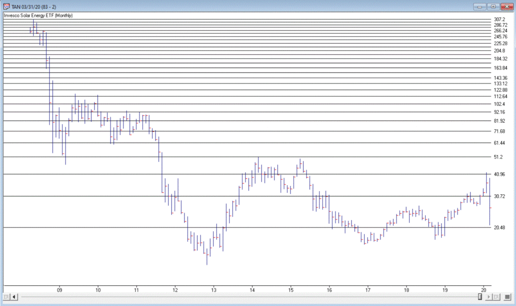
Ticker TAN
According to conventional wisdom, the future is “green”. I’ll be candid – I am all for green energy, as long as when I flip the switch the lights come on AND when I look at my energy bill I don’t faint. So, let’s start with a “green” play.
Turth be told, ticker TAN (Invesco Solar Energy ETF) has never been much of a performer. Still, its in the solar business which people keep telling me is “the future.” In reality the primary thing it has going for it is that it hasn’t completely cratered to the same degree as just about every other stock in the energy sector. As you can see in Figure 1, TAN actually bottomed out at $12.60 in 2012 and – despite a near 50% decline during the recent panic – is presently trading around $26 a share. Not necessarily a screaming buy signal, but a nice relative performance as we will see in a moment.
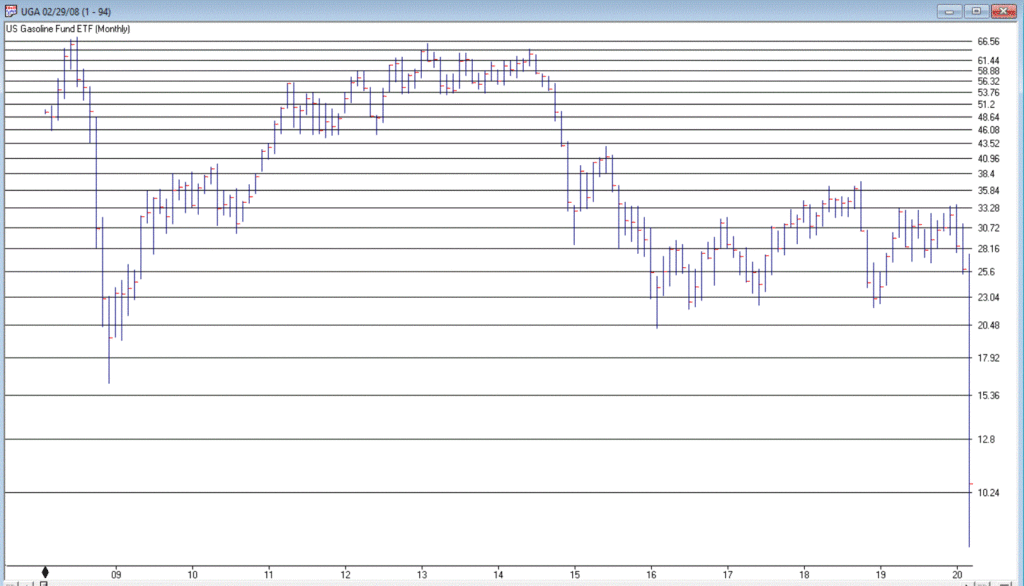
In a sure “Sign of the Times”, the Good News is that gasoline prices are at their lowest levels in year, while the Bad News is that we don’t have anywhere to drive to except the grocery store. Figure 2 displays the chart for ticker UGA – the United States Gasoline Fund, and ETF that tracks the price of gasoline.
While attempting to “pick a bottom” is a fool’s errand, the primary point is that it is not that hard to envision the price of this ETF being significantly higher at some point in the years ahead. Whether an investor has the fortitude to weather whatever the short-term uncertainty and the patience to see how the long-term plays out are the primary issues associated with contemplating this ticker at the moment.
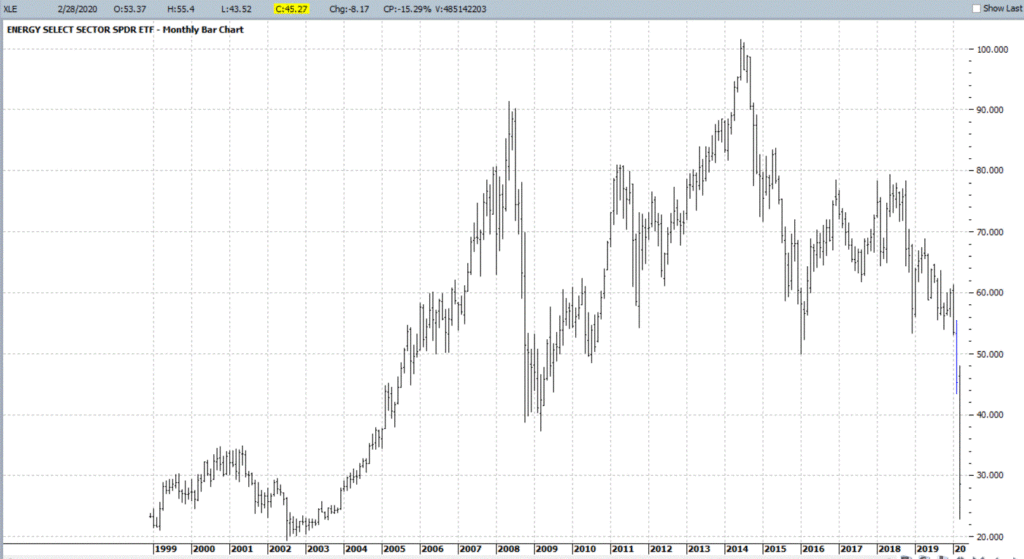
Ticker XLE is a play on the broad (mostly fossil fuel related) energy sector. As you can see in Figure 3, XLE has plunged to price levels not since 2004. In addition, it presently yields roughly 8.8%. That being said, an investor has to realistically expect that dividend payments in the hard-hit energy sector will see some significant cuts as things play out in the months ahead.
With an oil price war in full swing, not to mention a sharp decline in demand for the foreseeable future due to the coronavirus pandemic, the fundamentals for this sector are unlikely to improve soon. Nevertheless, the reality is that – at least for the time being – the world runs on crude oil. As a result, the current price range may one day be looked back upon as a once-in-a-generation buying opportunity.
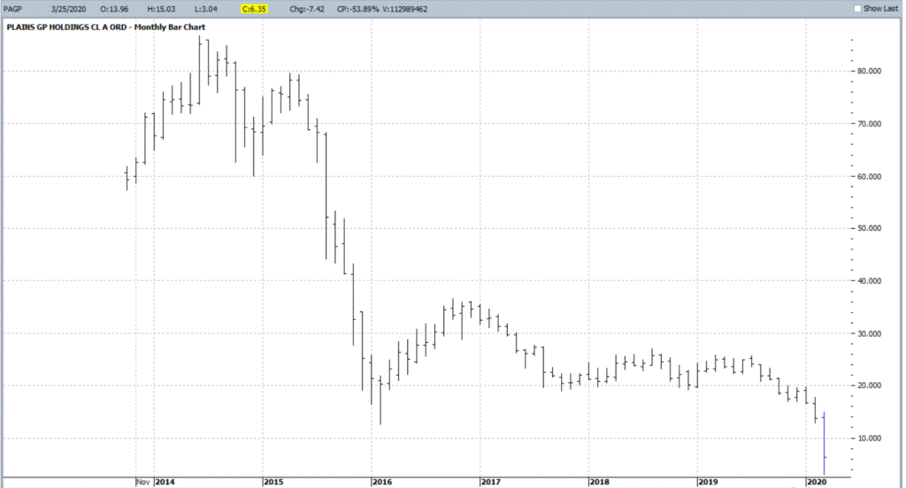
OK, let’s throw in one obscure, totally speculative – yet fundamentally intriguing – thought for consideration. Ticker PAGP (Plains GP Holdings, L.P.). Here is what they do (straight from their website):
“Plains engages in the transportation, storage, terminalling, and marketing of crude oil and refined products, as well as in the storage of natural gas, and the processing, transportation, fractionation, storage, and marketing of natural gas liquids.
Assets include:
*17,965 miles of active crude oil and NGL pipelines and gathering systems (emphasis mine as these things will continue to function as long as crude and NG need to be moved – which they do)
*50 barges and 20 transport tugs
*109 million barrels of storage capacity
*1,600+ trucks and trailers
*9,100 rail cars”
The bottom line is that as long as crude oil and natural gas needs to be moved, PAGP has a niche in which to operate. For the record, at $6.35 a share the stock’s present dividend comes to a yield of 22.7%. Certainly, the prospect of a significant dividend cut is a Signiant risk associated with this stock. But for the moment anyway the price is near an all-time low and the dividend yield is attractive.
As allows, DO NOT look upon what I have written as “recommendations.” Particularly in the current environment. They are simply “food for thought.”
Given current fundamentals:
*An ongoing oil price war (making drilling and refining unprofitable for many companies)
*An economy on shutdown (which cripples demand)
*An existential struggle between “green” energy and “traditional” fossil fuel-based sources (which creates uncertainty about future expectations)
All combine to make the energy sector a giant question mark at the present time. But if the old adage that the time to buy is when there is “blood in the streets”, than investors might be well served in the long run to start thinking now about how much capital they might be willing to commit to energy, and what type of catalyst might prompt them to actually “take the plunge.”
Jay Kaeppel
Disclaimer: The information, opinions and ideas expressed herein are for informational and educational purposes only and are based on research conducted and presented solely by the author. The information presented does not represent the views of the author only and does not constitute a complete description of any investment service. In addition, nothing presented herein should be construed as investment advice, as an advertisement or offering of investment advisory services, or as an offer to sell or a solicitation to buy any security. The data presented herein were obtained from various third-party sources. While the data is believed to be reliable, no representation is made as to, and no responsibility, warranty or liability is accepted for the accuracy or completeness of such information. International investments are subject to additional risks such as currency fluctuations, political instability and the potential for illiquid markets. Past performance is no guarantee of future results. There is risk of loss in all trading. Back tested performance does not represent actual performance and should not be interpreted as an indication of such performance. Also, back tested performance results have certain inherent limitations and differs from actual performance because it is achieved with the benefit of hindsight.
Everybody likes it when an asset that they hold goes up in price. In fact, the more the better. But only to a point as it turns out. When price gets carried away to the upside – we trader types typically refer to it as a “going parabolic”, i.e., a situation when prices are essentially rising straight up – it almost invariably ends very badly. We have seen a couple of examples recently.
Palladium
Palladium is a metal that according to Bloomberg’s “About 85% of palladium ends up in the exhaust systems in cars, where it helps turn toxic pollutants into less-harmful carbon dioxide and water vapor. It is also used in electronics, dentistry, medicine, hydrogen purification, chemical applications, groundwater treatment, and jewelry. Palladium is a key component of fuel cells, which react hydrogen with oxygen to produce electricity, heat, and water.”
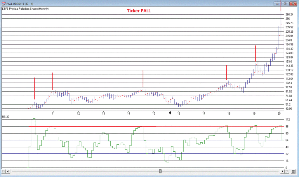
And it was pretty hot stuff for some time. At least until it wasn’t. As a proxy we will look at the ETF ticker symbol PALL, which attempts to track the price of palladium.
*From January 2016 into January 2018, PALL rose +139%
*In the next 7 months it declined by -26%
*And then the fun really began – Between August 2018 and February 2020 PALL rose +245%, with a +110% gain occurring in the final 5+ months of the advance
What a time it was. Until it wasn’t anymore.
Since peaking at $273.16 a share on 2/27/2020, PALL plunged -50% in just 12 trading days. To put it another way, it gave back an entire year’s worth of gains in just 12 trading days.
Was there any way to see this coming? Maybe. In Figure 1 we see a monthly chart with an indicator called “RSI32” in the bottom clip. This indicator is derived by taking the 2-month average of the standard 3-month Relative Strength Index (RSI).
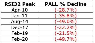
During the panic sell-off in the stock market in recent weeks, treasury bonds became very popular as a “safe haven” as investors piled out of stocks and into the “safety” of U.S. Treasuries. What too many investors appeared to forget in their haste was that long-term treasury can be extremely volatile (for the record, short and intermediate term treasuries are much less volatile than long-term bonds and are much better suited to act as a safe haven). Likewise – just an opinion – buying a 30-year bond paying 1% per year is not entirely unlike buying a stock index fund when the market P/E Ratio is over 30 – there just isn’t a lot of underlying value there. So you are essentially betting on a continuation of the current trend and NOT on the ultimate realization of the underlying value – because there really isn’t any.
Anyway, Figure 3 displays a monthly chart of ticker TLT – an ETF that tracks the long-term treasury – with the RSI32 indicator in the bottom clip.
Bond price movement is typically not as extreme and volatile as Palladium, so for bonds a RSI32 reading above 80 typically indicates that potential trouble may lie ahead.
As of the close of 3/17/20, TLT was almost -15% off of its high in just 6 trading days. We’ll see where it goes from here.
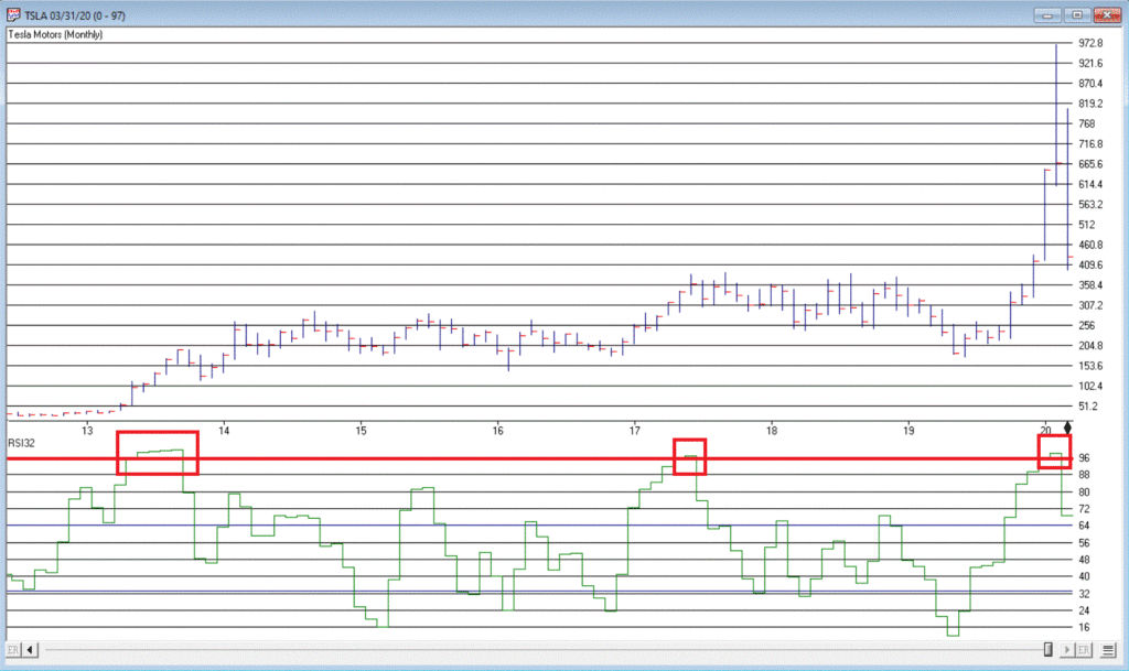
Tesla (Ticker TSLA)
Anytime you see what is essentially a manufacturing company – no matter how “hot”, “hip”, or “cool” the product they build – go up 200% in 2 months’ time, the proper response is NOT giddy delight. The proper response is:
*If you DO own the stock, either set a trailing stop or take some profits immediately and set a trailing stop for the rest
*If you DO NOT own the stock, DO NOT allow yourself to get sucked in
Take TSLA in Figure 4 for instance. By February 2020 TSLA was up almost 200% in 2 months and almost 450% in 8 months. The RSI32 indicator was above 96 – a stark warning sign.
19 trading days after making its closing high, TSLA is down -59%.
Typically, the security in question gives back months – or in some case, years – worth of gains in a shockingly short period of time.
Beware the parabola.
Jay Kaeppel
Disclaimer: The information, opinions and ideas expressed herein are for informational and educational purposes only and are based on research conducted and presented solely by the author. The information presented does not represent the views of the author only and does not constitute a complete description of any investment service. In addition, nothing presented herein should be construed as investment advice, as an advertisement or offering of investment advisory services, or as an offer to sell or a solicitation to buy any security. The data presented herein were obtained from various third-party sources. While the data is believed to be reliable, no representation is made as to, and no responsibility, warranty or liability is accepted for the accuracy or completeness of such information. International investments are subject to additional risks such as currency fluctuations, political instability and the potential for illiquid markets. Past performance is no guarantee of future results. There is risk of loss in all trading. Back tested performance does not represent actual performance and should not be interpreted as an indication of such performance. Also, back tested performance results have certain inherent limitations and differs from actual performance because it is achieved with the benefit of hindsight.
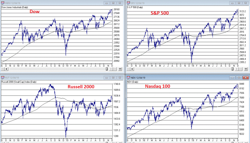
I haven’t written a lot lately. Mostly I guess because there doesn’t seem to be a lot new to say. As you can see in Figure 1, the major market indexes are in an uptrend. All 4 (Dow, S&P 500, Russell 2000 and Nasdaq 100) are above their respective 200-day MA’s and all but Russell 2000 have made new all-time highs.
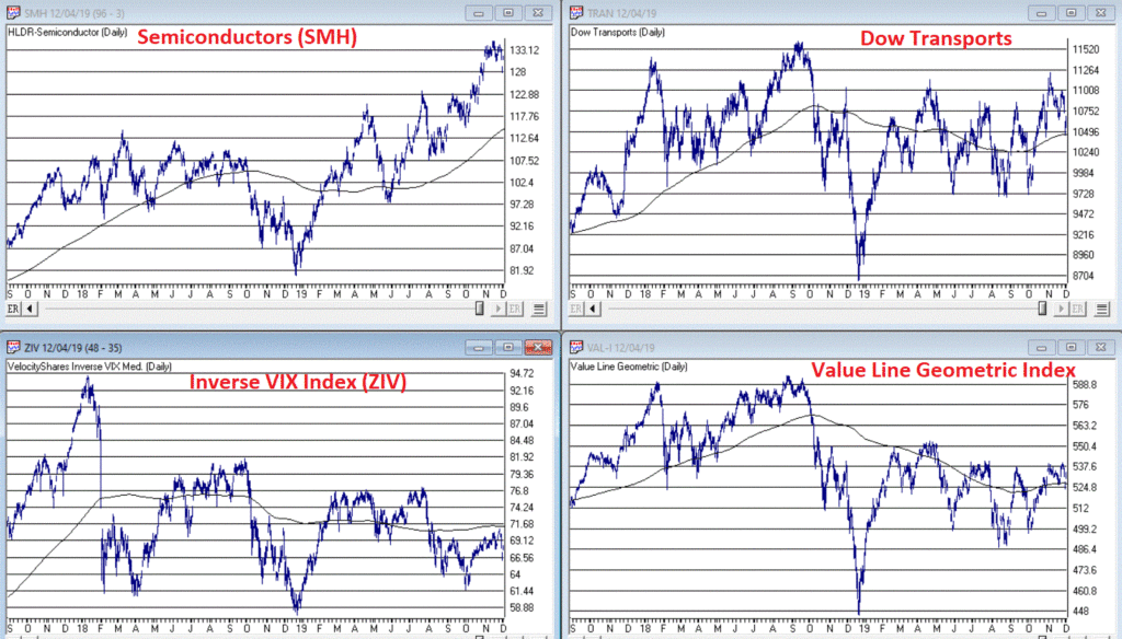
As you can see in Figure 2, my market “bellwethers” are still slightly mixed. Semiconductors are above their 200-day MA and have broken out to a new high, Transports and the Value Line Index (a broad measure of the stock market) are holding above their 200-day MA’s but are well off all-time highs, and the inverse VIX ETF ticker ZIV is in a downtrend (ideally it should trend higher with the overall stock market).
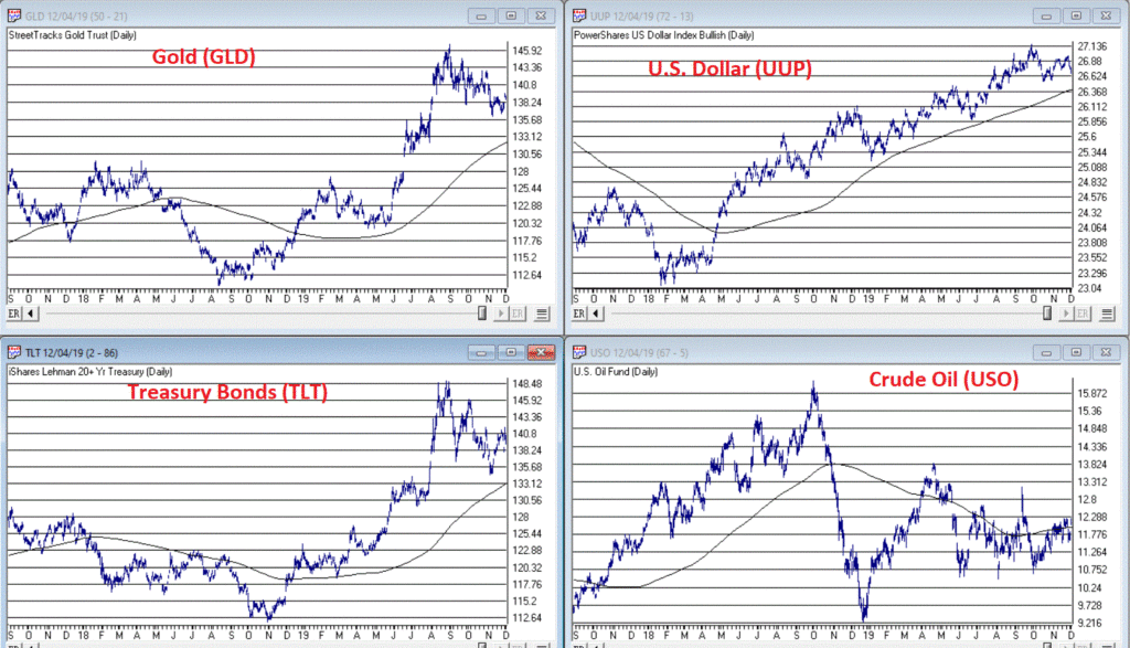
As you can see in Figure 3, Gold, Bonds and the U.S. Dollar are still holding in uptrends above their respective 200-day MA’s (although all have backed off of recent highs) and crude oil is sort of “nowhere”.
Like I said, nothing has really changed. So, at this point the real battle is that age-old conundrum of “Patience versus Complacency”. When the overall trend is clearly “Up” typically the best thing to do is essentially “nothing” (assuming you are already invested in the market). At the same time, the danger of extrapolating the current “good times” ad infinitum into the future always lurks nearby.
What we don’t want to see is:
*The major market averages breaking back down below their 200-day MA’s.
What we would like to see is:
*The Transports and the Value Line Index break out to new highs (this would be bullish confirmation rather the current potentially bearish divergence)
The Importance of New Highs in the Value Line Index
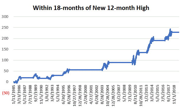
One development that would provide bullish confirmation for the stock market would be if the Value Line Geometric Index were to rally to a new 12-month high. It tends to be a bullish sign when this index reaches a new 12-month high after not having done so for at least 12-months.
Figure 4 displays the cumulative growth for the index for all trading days within 18 months of the first 12-month new high after at least 12-months without one.
Figure 4 – Cumulative growth for Value Line Geometric Index within 18-months of a new 12-month high
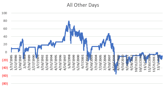
Figure 5 displays the cumulative growth for the index for all other trading days.
Figure 5 – Cumulative growth for Value Line Geometric Index during all other trading days
In Figure 4 we see that a bullish development (the first 12-month new high in at least 12 months) is typically followed by more bullish developments. In Figure 5 we see that all other trading days essentially amount to nothing.
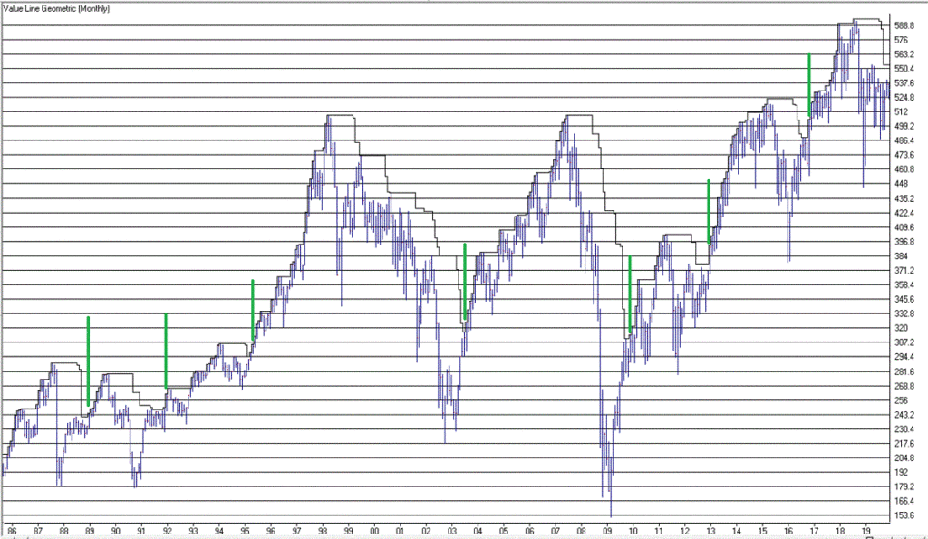
Figure 6 displays the Value Line Geometric Index with the relevant new highs highlighted.
The trend at this very moment is “Up.” So sit back, relax and enjoy the ride. Just don’t ever forget that the ride WILL NOT last forever. If the Value Line Geometric Index (and also the Russell 2000 and the Dow Transports) joins the party then history suggests the party will be extended. If they don’t, the party may end sooner than expected.
So pay attention.
Jay Kaeppel
Disclaimer: The information, opinions and ideas expressed herein are for informational and educational purposes only and are based on research conducted and presented solely by the author. The information presented does not represent the views of the author only and does not constitute a complete description of any investment service. In addition, nothing presented herein should be construed as investment advice, as an advertisement or offering of investment advisory services, or as an offer to sell or a solicitation to buy any security. The data presented herein were obtained from various third-party sources. While the data is believed to be reliable, no representation is made as to, and no responsibility, warranty or liability is accepted for the accuracy or completeness of such information. International investments are subject to additional risks such as currency fluctuations, political instability and the potential for illiquid markets. Past performance is no guarantee of future results. There is risk of loss in all trading. Back tested performance does not represent actual performance and should not be interpreted as an indication of such performance. Also, back tested performance results have certain inherent limitations and differs from actual performance because it is achieved with the benefit of hindsight.