Apr 23, 2010 | Uncategorized
An advantage of chart pattern analysis is that it is always valid. Mechanical trading systems and indicator readings gain and lose their effectiveness over time but proper chart analysis remains consistent. Chart pattern analysis is subjective, however, so practice helps to achieve reliability. Chart patterns do not call market tops or bottoms. In each chart, the analyst waits for a sign, such as a trendline break, to indicate that the trend has actually reversed. Instead of calling tops or bottoms, pattern analysis gives an early indication as to when a new trend has emerged.
In this article, we will cover four important chart patterns – the Rectangle, Right Triangle, Wedge, and Symmetrical Triangle.
Rectangle Pattern
A Rectangle pattern is formed when a security fluctuates back and forth in a narrow range. One horizontal line is drawn connecting the highs and another horizontal line is drawn connecting the lows. The upper trendline represents resistance and the lower trendline represents support. The more times a trendline is touched and a reversal occurs, the more powerful its support or resistance becomes. When a Rectangle pattern is forming, the security is often said to be consolidating, or in a trading range.
The direction of the breakout from this pattern cannot be predicted. On the bet that the pattern will continue intact, short-term traders can enter long positions when the security is near its lower support line and enter short positions when the security is near its upper resistance line. Stops are placed just outside the pattern. Most traders, however, wait for the eventual breakout from the pattern. Typically, the longer the security remains in the pattern, the bigger the move after the breakout. Ideally, the breakout comes with heavy volume.
In the image below, beginning in the summer 2002, the market stopped falling and a Rectangle pattern was formed.Trendlines are drawn at the upper and lower extremes of the price range.
Right Triangle Pattern
The Right Triangle is a pattern that exhibits a series of narrower price fluctuations. On one side of the fluctuation, the boundary of price action is horizontal. The boundary on the other side slopes toward the opposite (horizontal) boundary. An Ascending Triangle is a Right Triangle with a horizontal top and an ascending bottom. A Descending Triangle is the reverse.
In most cases, it is the horizontal trendline that is broken in this pattern. Therefore, caution should be exercised when a Descending Triangle is developing. Likewise, be ready to buy long when an Ascending Triangle is developing. If the security breaks the sloping trendline instead of the horizontal trendline, then the resulting move has less significance. If the downward sloping trendline on a Descending Triangle is broken, the stock may only rally to its previous reaction high.
The image below shows a daily chart of the Dow and an Ascending Triangle pattern. Notice the four occasions where the high point on the Dow touched the upper trendline but failed to break through it. Each sell-off, however, was less than the previous sell-off. Since this is an Ascending Triangle, this suggests the eventual break will be to the upside. In fact, that’s what happened.
Unfortunately there are false breakouts where a breakout occurs but the security reverses direction and heads lower. When this happens, the upward sloping trendline can work as a good stop loss. If the security crosses this trendline, positions can be closed.
Wedge Pattern
A Wedge is a pattern bounded by trendlines that are not parallel and that both slope in the direction of the overall trend. The range of the price fluctuation narrows as price approaches the point where the trendlines intersect. Wedges are typically formed after a strong upward or downward move. For a stock in an uptrend, a break below the Wedge means the security should begin a sideways consolidation or move lower. The opposite is true for a downtrending stock. Ideally, volume dries up when the security is in the Wedge and then the breakout occurs on heavy volume.
The image below shows the S&P 500 with a Wedge pattern. Since this is an upward sloping Wedge, the pattern is fulfilled when the lower support trendline is broken. That happened on May 19.
Symmetrical Triangle Pattern
Whereas the Right Triangle has one horizontal trendline and one sloping trendline, the Symmetrical Triangle pattern has two sloping trendlines that form two sides of the triangle. Since they slope in opposite directions, the trendlines intersect somewhere around the middle of the existing price range. That is, the price fluctuates up and down but each move is smaller than its predecessor.
The descending tops in the price movement are defined by a downward sloping boundary line (resistance line) and the low points in the fluctuation are defined by an upward sloping line (support line). The upper and lower lines need not be of equal length.
The image below shows the S&P 500 02/17/09, the day the index broke below the symmetrical pattern. Each rally was less than the previous rally and each decline was less than the previous decline. The S&P 500 eventually fell below its support. The pattern turned bearish and the market continued to fall.
We’ve shown several important chart patterns covering recent market activity. Our examples use weekly, daily, and real-time charts. The length of the chart is significant. A completed pattern on a weekly chart implies a long-term move while a pattern on a real-time chart may forecast a move that will last only part of that trading day.
All of our examples use market indexes. The same patterns work for stocks as well as other traded securities.
Apr 23, 2010 | Uncategorized
An Excerpt from the Timely Trades Letter.
The trading plan from the last Letter was to continue
trading longs while the market remains above the ascending
trend line drawn through the lows of 02/05 and 02/25 and
04/01; with a note that ‘the best time to pick up new trades
is during retests and bounces from this trend line’. I
followed the plan and picked up several long positions on
Mondays trend line bounce. The markets bounce generated
profitable moves in several of our setups including PNRA,
LPX, DLM, AVID, TWX, and HNR. I took profits in DLM when
it hit the upper band, and will continue to use that as
a successful exit strategy on swing trades, until the market
breaks above minor horizontal resistance in the 2555 area.
Since the market is approaching minor horizontal resistance,
I do not want to overstay my welcome in any particular trade;
so I take profits on trades that hit the upper Bollinger Band,
a horizontal resistance area, or are moving up on declining
volume. I would rather take profits on those types of positions
and then put them to work in another stock that is just
breaking out and starting its move.
The market price pattern is positive, it is moving up between
the ascending trend line noted above, which acts as support;
and the upper Bollinger Band, which acts as resistance.
The volume pattern turned positive, since we have now seen
three above average accumulation days in the last ten sessions.
As long as the market remains above this ascending trend line
I will be trading longs and avoiding short positions. When
the market becomes extended above the upper Bollinger Band
I will hold off on new long positions, because significant
extensions above the upper band usually do not last long,
and are typically resolved with a sideways movement or
retracement of the market. No move lasts forever, at some
point this ascending trend line will be broken. If the market
breaks below the ascending trend line, I will stop taking new
long trades and take profits on at least some of any remaining
long positions. A break below the ascending trend line noes
not necessarily imply the beginning of a bearish environment.
Trend line breaks imply that conditions are changing, and
there are three options for the markets next move. The
market may change to a trading range environment, a bearish
environment, or the break may just signal a simple retracement.
If the ascending trend line is broken, the volume pattern at
the time will provide clues on what is next. More on that if,
and when, it happens.
Shorts are not attractive while the market is trading above
the ascending trend line. If the market breaks below the
ascending trend line on light volume I will hold off on trading
shorts unless the market shows follow through or strong
distribution. On a strong volume break of the ascending trend
line I would look at a couple of good volume short triggers.
This is not a time to be aggressively going after shorts since
the intermediate term trend is still positive.
In summary, the markets price pattern is positive, and the
volume pattern just turned from mixed to positive. My focus
for swing trades remains on longs, while the market is above
the ascending trend line. The best time to pick up new trades
is during retests and bounces from this trend line. The least
favorable time to add new positions is when the market is above
the upper Bollinger Band. When the market breaks below this
ascending trend line, or starts to show distribution, I will
be taking profits on most open longs. Short positions are not
attractive while the market is above the ascending trend line.
I am maintaining the watch list of short setups, but will not
be taking short positions.
Steve Palmquist a full time trader who invests his own money
in the market every day. He has shared trading techniques and
systems at seminars across the country; presented at the Traders
Expo, and published articles in Stocks & Commodities, Traders-
Journal, The Opening Bell, and Working Money. Steve is the author of,
in which he shares backtesting research on popular candlestick
patterns and shows what actually works, and what does not. Steve
is the publisher of the, ‘Timely Trades Letter’ in which he shares
his market analysis and specific trading setups for stocks and ETFs.
provides additional trading information and market adaptive trading
techniques.
Terms of Use & Disclaimer:
This newsletter is a publication for the education of short term
stock traders. The newsletter is an educational and information
service only, and not intended to offer investment advice. The
information provided herein is not to be construed as an offer
or recommendation to buy or sell stocks of any kind. The newsletter
selections are not to be a recommendation to buy or sell any stock,
but to aid the investor in making an informed decision based on
technical analysis. Readers should always check with their licensed
financial advisor and their tax advisor to determine the suitability
of any investment or trade. Trading stocks involves risk and you
may lose part or all of your investment. Do not trade with money
you cannot afford to lose. All readers should consult their registered
investment advisor concerning the risks inherent in the stock market
prior to investing in or trading any securities.
Apr 20, 2010 | Uncategorized
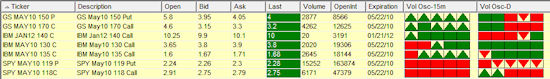
Option symbology changes to reflect Options Industry Council new format
The OIC symbol format changes provide a common sense method for option ticker symbols. Several format styles were recommended. AIQ has adopted the following compliant format for options symbols:
| Underlying ticker symbol |
Month/Year |
Strike |
Call/Put |
| XYZ |
May10 |
170 |
C |
For example the Goldman Sachs [GS] May 10 170 call symbol is GS May10 170 C
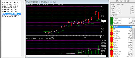
AIQ Charts real-time, AIQ RTAlerts and AIQ Quotes Barometer will accept the new symbol format. The first screen shot below shows AIQ Quotes/Barometer with several option tickers in the new format, the second screen shot shows the same tickers in AIQ RTAlerts.
This upgrade is for clients of the TradingExpert Pro on the monthly lease plan, all other TradingExpert or TradingExpert Pro clients please contact AIQ at 1-800-332-2999 for details. If you are not on the monthly plan and install the upgrade your key number may be invalidated.
If you are also a client of AIQ OptionExpert, please click here for the OptionExpert 9.32 upgrade.
Apr 7, 2010 | Uncategorized
Risk denotes the probability of an outcome, when an individual places an investment of value in the path of forces outside their control. Straightaway the madness of this practice is revealed, yet the pages of history are littered with those that have brought about the greatest advances mankind has ever made in return for risking something of value.
It may be interesting to note that the volatility of the recent global financial crisis saw the advent of many newcomers onto the BRW Rich List in 2008, and the contention that risk is defined by the market falling is not to the point. Today, due to the very existence of derivatives such as options, swaps and forward rate agreements, an individual can direct risk and return to almost every possible market contingency, regardless of the volatility exhibited.
The Bell Curve represents a distribution of events, with the ‘bell’ representing those events that are most likely; events that are in close proximity to present market price. These resemble at-the-money options.
As we get further away from conditions prevailing at the time, the likelihood of particular events occurring will not only decrease, but will decrease in probability at an increasing rate. These less likely events take their place along the tapering edges of the bell, extending to both extremes. A pricing model attributes time value in this very fashion.
The standard deviation is the unit used to measure the probabilities transgressed from the status quo, to the market price when a particular event occurs. These measured intervals decrease in size, as the two poles of this dimension are approached; the difference between a movement of one standard deviation and two standard deviations will be far greater than that of seven deviations and eight standard deviations.
Primarily, this is due to the fact that there is little difference between probabilities that are small with other probabilities of that class, and similarly, little difference between probabilities that are high with members of that class also. They are described at a high level of abstraction that classifies them broadly as ‘high’ or ‘low’ probability.
However, when events of low probability are compared with those that are of high probability, a happening may be for example, said to be effected by a movement across seven standard deviations. In this event it is a rare occurrence indeed. When volatility is high, it is useful to note that not only are the entire bell and its tapered edges lifted higher on the plane, but the edges of the bell, move closer in gradient to the body. In higher volatility, this is directly due to the indiscriminate application of an increased probability in all possible events. The opposite will be found in low volatility with in this case, the actual bell of the curve becoming much smaller.
Accordingly, a matrix of probabilities is able to be placed in perspective.
Heavily reliant on reason, the contention that price and quality are inexorably attached is well founded in history. Even more so in perfect markets, at very least we can state with confidence that low risk and high risk are not uniformly priced. While the perception of value is a personal value judgment, what is most definite is that markets provide returns that are commensurate with the risk undertaken.
Consideration of the capital needed to fund a position, and also a variety of possible market outcomes must firmly occupy the consciousness of every trader. Insight into one’s own ability to function under the weight of risk is also crucial to profitability, as decision making needs to be carried out as free of subjective influences as possible. At any length, a good rule of thumb will be to allow 25% of risk capital to remain free for unexpected contingencies.


